
September 17, 2023
by Stephen Stofka
This week’s letter is about wages and income and the real purchasing power in our pockets. The auto workers’ union (UAW) went on strike limited to three auto plants while they continued negotiations with the auto companies. Nurses at Kaiser Permanente have voted to go out on strike by September 30th if they cannot resolve outstanding differences with Kaiser’s management. Executive compensation at the auto companies is now more than 300 times the average worker’s pay, the UAW points out, claiming that workers have as much right to share in the profits as executives and shareholders.
Legislation passed after the financial crisis required that publicly held companies report their CEO-to-Worker pay ratios. A recent analysis of companies in the SP500 estimated a pay ratio of 272-1 in 2022. The auto industry is part of the consumer cyclical industry, whose median executive compensation in 2021 was $13.7 million, as reported by Equilar. In 1965, the pay ratio was approximately 20-1. In the 1980s, the Reagan administration adopted a relaxed regulatory stance to corporate mergers and companies have grown much larger in the past decades. The pay ratio, however, has grown out of all proportion to the growth in corporate size.
A combination of factors contribute to high relative CEO pay. Thomas Greckhamer (2015) identified six paths – configurations of various factors – that are present in countries with high CEO pay and those without high CEO pay. He found that the relative pay of CEOs is high in countries where equity markets are well developed and highly liquid. Ownership is widely dispersed so that the CEO enjoys more power relative to stock owners and can negotiate higher compensation packages. CEOs do not have high relative pay in high welfare states where there are strong worker rights. A cultural acceptance of inequality and hierarchical authority, termed “power distance” by Geert Hofstede in 1980, contribute to high relative CEO pay. Here is a quick explainer. As a comparative example, the power distance factor in the American culture is low, half that of Mexico.
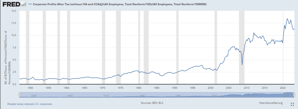
Companies today derive their revenue and profits globally. For that reason it is not accurate to divide corporate profits by the number of employees in the U.S. I am going to do it anyway just to show the profound change that has taken place since the 1970s, a benchmark decade often cited as the beginning of growing inequality in the pay ratio. In the chart below I have adjusted after-tax corporate profits (FRED Series CP) for inflation, then divided that by the number of employees reported by the BLS (FRED Series PAYEMS). The trend is more important than the actual figures. Even though the 2010s were relatively flat the level of profits per employee was about double the level of the 1990s. Let’s compare that to worker incomes.
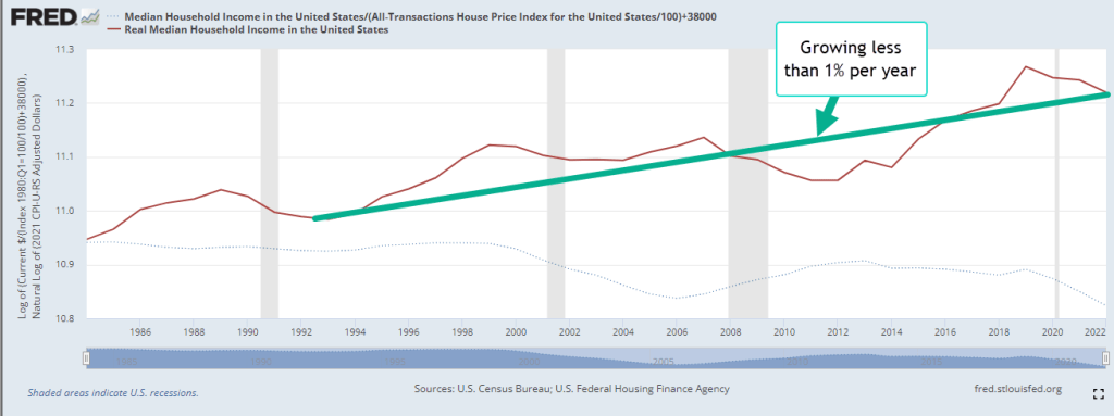
Since 1992, median household income adjusted for inflation has risen 23%, a level that is far below the rise in profits per worker. The chart below shows the gain on a log scale. Real incomes have gained less than 1% per year.
A few weeks ago I proposed adjusting prices by a broad index of house prices instead of the CPI. Two-thirds of American households own their home and home values reflect the discounted flow of housing services that we get from a home during our lifetimes. Housing costs are already almost half of the CPI and trends in home prices capture the feel of inflation on household budgets more accurately than the many CPI measures economists currently use.
During the 1980s and 1990s, housing prices increased 4% annually. The chart below describes the median household income adjusted by the all-transactions home price index (FRED Series USSTHPI). Notice that household incomes during those two decades stayed on an even keel.

Had the Fed structured their monetary policy to keep home price growth at the same level as the 1980s and 1990s, real incomes would be near the level of the green line, 10% higher today. Instead, workers feel as though they are on the path of the red line, regardless of what official measures of real household income indicate. The red line reflects a sense of discomfort and tension in many American households that plays out in our politics. The trend began with housing and finance policies enacted by both parties in Congress across five Presidential administrations.
///////////////////
Photo by Charles Chen on Unsplash
Keywords: home prices, labor unions, wages, income, household income
Greckhamer, T. (2015). CEO compensation in relation to worker compensation across countries: The configurational impact of country-level institutions. Strategic Management Journal, 37(4), 793–815. https://doi.org/10.1002/smj.2370
