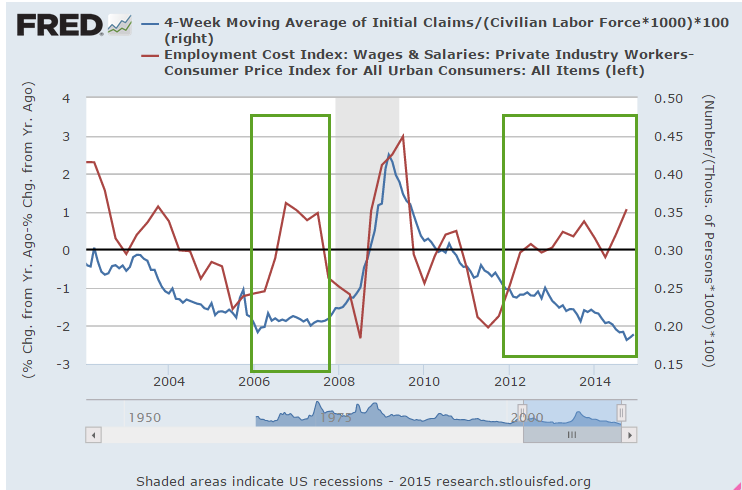
Financial Obligations

February 22, 2015

Consumer Debt

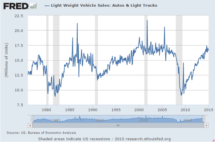
On the one hand, the economy continues to grow steadily and moderately.  Sales of cars and light trucks are strong.

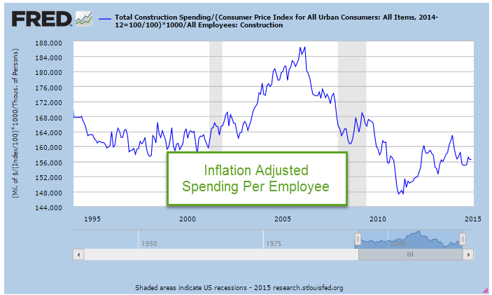
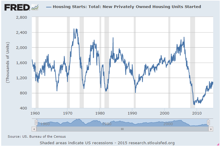
Housing Starts of new homes are slow.  While homebuilders remain confident, there is a noticeable decrease in traffic from first time home buyers.

The debt levels of American households have not reached the nosebleed levels of 2007 before the onset of the financial crisis.  However, they are more than a third higher than 2005 debt levels.

Historically low interest rates have enabled families to leverage their monthly payments into higher debt.  As a percent of disposable income, monthly morgage, credit card and loan payments are the lowest they have ever been since the Federal Reserve started tracking this in 1980. As long as the labor market grows at a moderate pace and interest rates remain low, families are unlikely to default on these higher debt loads.

In addition to household debt, the Federal Reserve includes other obligations – auto leases, rent payments, property taxes and insurance – to arrive at a total Financial Obligations Ratio (FOR), currently about 15%. (Explanation here)  The highest recorded FOR was 18% in 2007. The amount of income devoted to servicing the total of these obligations – 15.28% –  is near historic lows.  (Historical table ) In the past, when this rato has climbed above 17% there has been a recession, a stock market crash, or both.

So there are three components of a family’s monthly obligations: mortgage payments – currently less than 5%; credit card and loans, currently 5.25%; and other obligations, also about 5.25%.  Should interest rates rise in the next two years, credit card and loan payments will rise above the current 5.25% but are unlikely to cause a crisis in household finances.  The percentage of home mortgages which are adjustable have been rising in the past few years but the growing number of these mortgages have been so-called jumbo loans to households with larger incomes. (Daily News  and Wall St. Journal ).  Rising rates will put increasing pressure on homeowners with these types of mortgages but are unlikely to generate a crisis similar to 2008.

**********************

Currency Market

When someone says the dollar is strong, what does that mean?  Investopedia has a fairly concise explanation of the foreign exchange market (Forex) and the history of attempts to structure this market, the largest in the world.

**********************

Medicare Spending

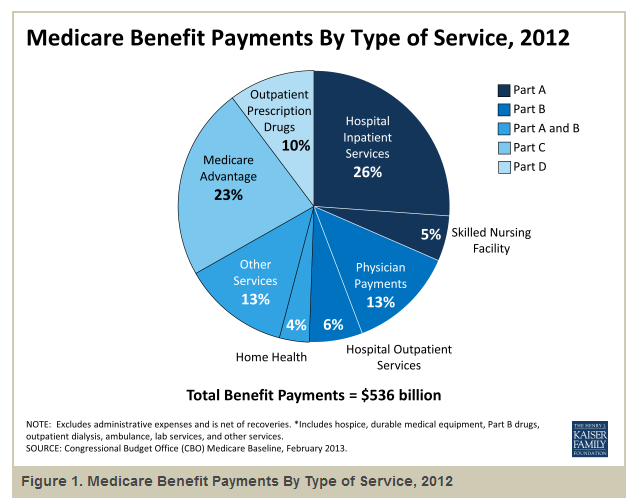
Costs for Medicare and private insurance have grown at annual rates more than double inflation since 1969, as shown in a 2014 analysis of 35 years of Medicare (CMS) data by the Kaiser Family Foundation.  The only good news is that Medicare annual growth has been 2% less than private plans.

The majority of the benefits go to a small group of patients.  “Medicare spending per beneficiary is highly skewed, with the top 10% of beneficiaries in traditional Medicare accounting for 57% of total Medicare spending in 2009—on a per capita basis, more than five times greater than the average across all beneficiaries in traditional Medicare ($55,763 vs. $9,702).”

In its 2013 annual report (highlights) CMS noted that Medicare spending for the past five years had grown at a relatively tame 4% or less – almost double the inflation rate.  This is what passes for good news in federal programs – spending that is only slightly out of control.  Medicaid costs are growing at 6% per year.  Congress and CMS know that they have got to improve spending controls but the players in the health care industry spend a lot of money in Washington so elected and non-elected officials tread carefully when proposing any reforms.

Last month, Health and Human Services (HHS) announced that, by 2018, they would like to make half of Medicare payments to doctors based on the quality of care they provide, not the number of procedures they do.  Under the ACA, 20% of Medicare payments are based on outcomes, not fee for service.  Although HHS says it has saved $700 million over the past two years, few provider organizations meet the guidelines to share in the savings as originally designed.

When Medicare Advantage programs were introduced in 2003, Congress approved additional subsidies to health care providers to reimburse providers for promoting the new plans.  Like all “temporary” subsidies, no one wants to give them up. Because of the subsidies, the plans are relatively low cost and provide a good benefit for the dollar.  Uwe E. Reinhardt, a Princeton professor writing in the NY Times economics blog, referred to a 2010 report on the cost of the popular Medicare Advantage (MA) program: “In 2009, Medicare spent roughly $14 billion more for the beneficiaries enrolled in MA plans than it would have spent if they had stayed in FFS [Fee For Service, or regular] Medicare. To support the extra spending, Part B premiums were higher for all Medicare beneficiaries (including those in FFS).”

As the population ages, Medicare will consume an ever larger percentage of total health care spending.  CMS noted that Medicare’s portion of health care spending in 2013 has been relatively steady over the past few years. A pie chart from 2009 spending illustrates the cost breakdown.  In 2013, we spent 17.4% of GDP on health care, a figure that has remained stable for a few years.  In 2001, the U.S. spent a shocking (at the time) 13.7% of GDP on health care (CMS Source).

The Gathering

February 14, 2015

In January of this year, the SP500 finally rose above the inflation adjusted high set in 2000.  Here is a chart from multpl.com that I have overlaid with a few boxes.  Long term market trends are dubbed “secular” to contrast them with the shorter cyclical swings in valuation.  A secular bear market is a prolonged market downturn in which the inflation adjusted price of the SP500 never gets above a certain historical peak.

These long term periods are easier to define in hindsight.  They have begun with some peak and ended at some trough.  Years after the trough when the market has made a new inflation adjusted high price, market watchers get out their crayons and set the end of the bear market just after that trough.  Based on that historical rule, we would then say that the secular bear market that began in 2000 ended in 2009 at a market low six months after the onset of the financial crisis.

If history is any guide, an investor could expect further price increases for another 2 years (as in the late 1920s), or another 10 years (as in the late 1950s to late 1960s), or another 8 years (as in the 1990s).  In other words, history may not be much of a guide.

If the market tanked in 2017, two years after setting a new high, some sages would nod soberly and say it was just like the 1920s and was to be expected.  If the market continued rising another eight years before falling, ah yes, just like the 1990s.  The signs were all there if you knew where to look.

Secular bear markets share characteristics other than long term price swings.  During past prolonged downturns there have been five recessions within each period.  We have had two recessions since 2000.  Price to earnings, or PE, ratios went really low – about 6 – at the lowest trough of past downturns.  This is also the approximate low in the Shiller CAPE ratio.  Since 2000, the PE ratio has fallen to 10; the CAPE ratio to 13.  The current PE ratio based on the trailing twelve months earnings is almost 20, about 25% above the average. The number of years from peak to trough has been 19.  2000-2009 would be only 9 years, the shortest secular bear period on record.  The number of years from peak to peak has been about 26 years, much longer than the current 15 year period.

 This has led some to predict a further final crushing decline in the market to end the secular bear.  If the doomsayers are correct and we are only two-thirds through a secular bear market, we would expect market prices to plateau this year.  Then will come some shock – China’s real estate market implodes, or its regional banks collapse.  The so called PIGS – Portugal, Ireland, Greece, and Spain – could exit the euro.  There could be a major armed conflict with Russia or Iran that causes investors to abandon equities in droves.  The stronger dollar can put strains on countries whose currencies are pegged to the dollar. Such strains can cause a financial crisis similar to the one in Mexico in 1995 and the Asian and Russian crises of 1997 – 1998.  In the summer of 1998, the SP500 fell 15% in one month as fears grew that regional monetary imbalances would infect the economies of the entire world.

Secular bear markets come in types.  The two that started in 1929 and 2000 arose from what I call discovery shocks.  Investors lose conviction in their own hopes of future gains and leave the market.   The bear market that began in the late 1960s was a series of conflict shocks that spurred erratic changes in inflation.   As the country borrowed money to fund the Vietnam war, inflation rose above 3%, peaking at 6% in the spring of 1970.  The 1970s was marked by domestic and international conflict: the Watergate scandal and the oil supply wars with OPEC drove inflation to a high of 12% in late 1974.  As oil prices quadrupled through the 1970s, inflation spiked at almost 15% in the spring of 1980.  Through most of the decade, inflation stayed above 5% – a low that was almost double the historical average.

The SP500 made new records again this week although FactSet notes that the blended earnings growth for the fourth quarter of 2014 was only 3.1%.  The forward P/E of the SP500 is 17.1%, substantially above both the five and ten year averages (see paragraph below for illustration of changes in forward P/E). FactSet reports that nine out of ten sectors have forward P/E ratios that are above their ten year averages.  Only the telecom sector is selling slightly below its ten year average.  The forward P/E of the SP500 is based on projected earnings over the next year and volatile oil prices have made such earnings estimations difficult.  First quarter earnings by energy companies have been revised downwards by 50%, resulting in a 7.4% decrease in earnings estimates for the SP500.

Small changes in earnings estimates are multiplied 10 to 30 times to reach an evaluation of fair market price.  If 2015 earnings for SP500 companies are estimated at $100, an index price of 2000 is a forward P/E of 20.  If estimates are revised upwards to $110, then an index price of 2000 reflects a forward P/E of 18.  If the forward P/E of the SP500 is above the five and ten year averages as it is today, it means that investors and traders are betting that estimates of forward earnings will be revised upwards, resulting in a lower forward P/E ratio.

Long-term Treasuries (TLT) rose up 11.5% in the five weeks from late December to the end of January – too much, too fast.  After falling back in the last two weeks from their peaks, they are priced at the same level as in July 2012.  In 2014, traders who bet against long term bonds in anticipation of rising interest rates got slaughtered as long term Treasuries rose 25%.  Investors who moved out of long term and into shorter term bonds were disappointed as well.

*****************

Retail Sales

Investors regard the monthly employment report and the retail sales report as the most important barometer of a consumer driven economy.  As an example of the correlation, consider a graph of inflation adjusted retail sales and the SP500 index.

Retail sales in January declined slightly from December.  Investors were somewhat heartened by the 2.4% annual gain, at least 1% above inflation, but remember that last January was particularly poor and was an easy benchmark to beat.  On the other hand, lower gasoline prices lowered this year’s total,  offsetting the comparison with a weak benchmark.

Sales at food and drinking establishments rose more than 11% y-o-y in January.

Large y-o-y gains in food and drink usually occur in the winter months.  January 2000, 2001, 2004, 2006, December 2006, January 2012, and these past two months all peaked at more than 8% y-o-y gains.  Eating and drinking out are largely discretionary for most of us.  A change in the pace of growth in this behavior signals  changes in consumer attitudes that are more real than a consumer confidence survey.  Changes in this discretionary budget item is a survey of wallets. In the past year, the growth of food and drink sales has accelerated, indicating a more confident, less fearful consumer.

While the various consumer sentiment surveys indicate what we tell interviewers, the wallet survey indicates what we really think.  In early 2009, the U. of Michigan Consumer Sentiment Survey showed a rebound of confidence.  What the survey indicated was more a rebound of hope, not confidence.  Consumer spending on eating and drinking out was still declining.

2011 is an indication of the opposite – plunging sentiment according to a survey but growing spending at food and drink establishments, indicating that the volatile drop in sentiment might be short lived.  The plunge in confidence was a response to the budget battles between the Republican House and the President.

Low inflation, relatively low gasoline prices, strong employment and retail sales gains all point to steady moderate growth.  Judging by the PE (19.7) and forward PE (17.1) ratios, the market may have already priced in that growth.

Growing Signs

February 8, 2015

Employment

Employment gains in January were at the midpoint of expectations but revisions to the gains of November and December were significant, adding about 70,000 jobs in each month.  After a decline in December, average hourly earnings rose to $24.75, for a year-over-year gain of 2.2% and a good 1% above inflation.

In a sign that people are becoming more optimistic about job prospects, the Participation Rate increased 2/10ths of a percent in January.  After 5 years of decline, this rate may have found a bottom over the past year.

The health or frailty of the core work force aged 25 – 54 years is  a snapshot of the underlying strength of the labor market.  This age band constitutes our primary working years.  In the first half of this thirty year period we build job skills, work and social connections, establish credit, and accumulate relationships and stuff.  Year-over-year growth in the 1 to 2% zone is the preferred “Goldilocks” growth rate.

As the graph below shows, the growth rate has been above 1% for most of the past year.

Monthly gains in construction employment have overtaken professional business services and the health care industry.

The construction industry accounts for less than 5% of employment but each employee accounts for a total of $160,000 in spending so changes affect other industries.  As you can see in the graph below, real or inflation-adjusted construction spending per employee was relatively stable during the 1990s.  As the housing market boomed, spending per employee rose dramatically in the 3-1/2 years from late 2002 to early 2006.  In the worst throes of the recession when the industry shed almost a quarter of its employees, per employee spending stabilized at the same level as the 1990s.

Stimulus spending and Build America projects helped cushion the decline in construction spending but as those programs concluded, spending fell to a multi-decade low in the spring of 2011.  Despite historically low interest rates and increasing state and municipal tax revenues, both residential and commercial construction are below the benchmark set in the 1990s.  Despite strong gains in the past two years, the industry still has room to run.

As the economy improves, those working part time because they can not get full time work has decreased significantly from the nosebleed heights of five years ago.

That total includes those whose hours have been cut back because of slack business conditions.  A subset of that total are the number of workers who are working part time because they can not find a full time job.  This segment of workers has seen little change during this recovery.

*****************************

Purchasing Manager’s Index

Each month I update a composite index of the ISM Purchasing Manager’s indexes (PMI) first introduced by economist Rolando Pelaez in 2003.  This composite, the Constant Weighted Purchasing Index, or CWPI, reached record highs in October 2014.  It is no surprise that, this month, the BLS revised November’s employment gains upwards by 70,000 to over 420,000.  As expected, the composite has declined but remains robust.

The wave like pattern of present and anticipated industrial activity has quickened since early 2013, the troughs and crests coming closer together.  If this pattern continues, we should expect gradual declines over the next two months before rising up again.  A combination of employment and new orders in the service sectors continues to show healthy growth, although it has also declined from the strong growth of the past few months.

GDP, Unemployment, Wage Growth

Feb. 1st, 2015

GDP

The first estimate of 4th quarter GDP growth was 2.6%.  This figure is truly a guesstimate and is sometimes heavily revised in the following months. Last October, the first estimate of third quarter GDP growth was 3.5%.  As data continued to roll in, that estimate was revised upwards by a whopping 42% to 5.0%.

The year over year growth in inflation-adjusted, or real GDP was 2.5%, more or less following a trend that is four years old.

On a per capita basis, GDP growth is near 2%, the average rate of growth since World War 2.

Let’s get in the wayback machine and look at per capita GDP growth over the past four decades.  Reagan and Clinton groupies can leave the room now.  The adults are going to talk.  The 1970s and first half of the 1980s were a period of high inflation and erratic growth – up 5%, then down 3%.

Growth above 3% for any length of time leads to distortions in investment and the labor market which generates a subsequent downward correction lasting several years.  Above average growth in the late 1980s was followed by a three year period of below average growth in the early 1990s.  The strong growth of the late 1990s was fueled by a boom in dot-com investment and telecom coupled with ever rising house prices.  The above 3% growth of those years sparked an inevitable correction lasting three years, bringing us back to the 2% average.

The housing boom of the 2000s generated above average growth followed yet again by a three year correcting downturn. For those families who have struggled to recover from the recession, average growth may be too slow and too small.  On the other hand, average growth is less likely to lead to a rebalancing recession.

*************************

Unemployment

Much ado this week when the Labor Dept announced that new claims for unemployment dropped more than 40,000 to 265,000.  The week after the Martin Luther holiday is typically volatile each year with little consensus on the reasons.  The somewhat erratic weekly numbers are smoothed by using the four week average of new claims.  That average has been just below 300,000 since September.

Low numbers for the newly unemployed is good, right?!  As with GDP, too much of a good thing for a period of time may be a precursor to an offsetting period of not so good.  Such is the law of averages.  As a percent of the labor force, new claims are at the same low level as in mid-2000 and late 2006.

As the demand for labor increases, employers make compromising decisions out of necessity.  They hold onto low productivity workers. Workers who are let go can more readily find new jobs.  The number of new claims remains low.  Re-entrants into the job market help to reduce the pressure for wage increases but eventually wages begin to move upward.  Employers may cut margins to pay workers more than their productivity is worth.  Real wage growth climbs as the percentage of new unemployment claims remains low.

In the graph above I have highlighted two previous periods where new unemployment claims were low as real wage growth climbed.  The graph below illustrates the point a bit clearer.  It is based on the Employment Cost Index, a relatively new series about ten years old, that tracks the total employment cost, including benefits and required employment taxes and insurance.

Historical data suggests that a growing divergence between these two factors may play some part in generating an imbalanced economic environment – one that, unfortunately, soon rights itself.

*************************

Market Timing

The link to Doug Short’s blog is on the right side of this page but in case you might miss it, here is Doug’s monthly update of moving averages and the simple allocation model of the Ivy Portfolio.    The 10 month simple moving average crossover is similar to the 50/200 day crossover system I have mentioned numerous times: i.e. the Golden Cross and Death Cross.  Either system will help a person avoid the worst of a protracted downturn as we saw in the early 2000s and 2008 – 2011, and capture the majority of a long term upswing.

For those of you who have not read it, the Ivy Portfolio is a keep-it-simple allocation and timing model of domestic and foreign stocks, real estate, commodities and bonds using low cost ETFs.