Rebound

October 25, 2015

Last week we looked at two components of GDP as simple money flows.  In an attempt to understand the severe economic under-performance during the 1930s Depression, John Maynard Keynes proposed a General Theory that studied the influences of monetary policy on the business cycle (History of macoeconomics).  In his study of money flows, Keynes had a fundamental but counterintuitive insight into an aspect of savings that is still debated by economists and policymakers.

Families curtail their spending, or current consumption, for a variety of reasons.  One group of reasons is planned future spending; today’s consumption is shifted into the future.  Saving for college, a new home, a new car, are just some examples of this kind of delayed spending.  The marketplace can not read minds.  All it knows is that a family has cut back their spending.  In “normal” times the number of families delaying spending balances out with those who have delayed spending in the past but are now spending their savings.  However, sometimes people spend far more than they save or save far more than they spend, producing an imbalance in the economy.

When too many people are saving, sales decline and inventories build till sellers and producers notice the lack of demand. To make up for the lack of sales income, businesses go to their bank and withdraw the extra money that families deposited in their savings accounts.  Note that there is no net savings under these circumstances.  Businesses withdraw their savings while families deposit their savings.  After a period of reduced sales, businesses begin laying off employees and ordering fewer goods to balance their inventories to the now reduced sales.  Now those laid off employees withdraw their savings to make up for the lost income and businesses replace their savings by selling inventory without ordering replacement goods.  As resources begin strained, families increasingly tap the several social insurance programs of state and federal governments which act as a communal savings bank,   Having reduced their employees, businesses contribute less to government coffers for social insurance programs.  Governments run deficits.  To fund its growing debt, the Federal government sells its very low risk debt to banks who can buy this AAA debt with few cash reserves, according to the rules set up by the Federal Reserve.  Money is being pumped into the economy.

As the economy continues to weaken, loans and bonds come under pressure.  The value of less credit worthy debt instruments weakens.  On the other side of the ledger are those assets which are claims to future profits – primarily stocks.  Anticipating lower profit growth, the prices of stocks fall.  Liquidity and concern for asset preservation rise as these other assets fall.  Gold and fiat currencies may rise or fall in value depending on the perception of their liquidity.

Until Keynes first proposed the idea of persistent imbalances in an economy, it was thought that imbalances were temporary.  Government intervention was not needed.  A capitalist economy would naturally generate counterbalancing motivations that would auto-correct the economic disparities and eventually reach an equilibrium.  Economists now debate how much government intervention. Few argue anymore for no intervention.  What we take for granted now was at one time a radical idea.

While some economists and policymakers continue to focus on the sovereign debt amount of the U.S. and other developed economies, the money flow from the store of debt, and investor confidence in that flow, is probably more important than the debt itself.  As long as investors trust a country’s ability to service its debt, they will continue to loan the country money at a reasonable interest rate.  While the idea of money flow was not new in the 1930s, Keynes was the first to propose that the aggregate of these flows could have an effect on real economic activity.

***********************

Stock market

A very good week for the market, up 2% for the week and over 8% for October.  A surprising earnings report from Microsoft lifted the stock -finally – above its year 2000 price.  China announced a lower interest rate to spur economic activity.  ECB chair Mario Draghi announced more QE to fight deflation in the Eurozone. Moderating home prices and low mortgage rate have boosted existing home sales.

The large cap market, the SP500, is in a re-evaluation phase.  The 10 month average, about 220 days of trading activity, peaked in July at 2067 and if it can hold onto this month’s gains, that average may climb above 2050 at month’s end.

The 10 month relative strength of the SP500 has declined to near zero.  Long term bonds (VBLTX) are slightly below zero, meaning that investors are not committing money to either asset class.  The last time there was a similar situation was in October 2000, as the market faltered after the dot-com run-up.  In the months following, investors swung toward bonds, sending stocks down a third over the next two years.  This time is different, of course, but we will be watching to see if investors indicate a commitment to one asset class or the other in the coming months.

Investment Flows

October 18, 2015

When economists tally up the output or Gross Domestic Product (GDP) of a country, they use an agreed upon accounting identity: GDP = C + I + G + NX where C = Consumption Spending, I = Investment or Savings, G = net government spending, and NX is Net Exports, which is sometimes shown as X-M for eXports less iMports. {Lecture on calculating output}

In past blogs I have looked at the private domestic spending part of the equation – the C.  Let’s look at the G, government spending, in the equation.  Let’s construct a simple model based more on money flows into and out of the private sector.  Let’s regard “the government” as a foreign country to see what we can learn.  In this sense, the federal, state and local governments are foreign, or outside, the private sector.

The private sector exchanges goods and services with the government sector in the form of money, either as taxes (out) or money (in).  Taxes paid to a government are a cost for goods and services received from the government. Services can be ethereal, as in a sense of justice and order, a right to a trial, or a promise of a Social Security pension.  Transfer payments and taxes are not included in the calculation of GDP but we will include them here.  These include Social Security, Medicare, Medicaid, food stamps and other social programs.  If the private sector receives more from the government than the government takes in the form of taxes, that’s a good thing in this simplified money flow model. There are two types of spending in this model: inside (private sector) and outside (all else) spending.

Let’s turn to investment, the “I” in the GDP equation.  In the simplified money flow model, an investment in a new business is treated the same as a consumption purchase like buying  a new car.  Investment and larger ticket purchase decisions like an automobile depend heavily on a person’s confidence in the future.  If I think the stock market is way overpriced or I am worried about the economy, I am less likely to invest in an index fund.  If I am worried about my job, I am much less likely to buy a new car.  In its simplicity this model may capture the “animal spirits” that Depression era economist John Maynard Keynes wrote about.

We like to think that an investment is a well informed gamble on the future.  Well informed it can not be because we don’t know what the future brings.  We can only extrapolate from the present and much of what is happening in the present is not available to us, or is fuzzy.  While an investment decision may not be as “chanciful” as the roll of a dice an investment decision is truly a gamble.

Remember, in the GDP equation GDP = C + I + G + NX, investment (the I in the equation) is a component of GDP and includes investments in residential housing. In the first decade of this century, people invested way too much in residential housing.

In the recession following the dot-com bust and the slow recovery that followed the 9-11 tragedy, private investment was a higher percentage of GDP than it is today, six years after the last recession’s end.  Much of this swell was due to the inflow of capital into residental housing.

The inflation-adjusted swell of dollars is clearly visible in the chart below.  It is only in the second quarter of this year that we have surpassed the peak of investment in 2006, when housing prices were at their peak.

Investment spending is like a game of whack-a-mole.  Investment dollars flow in trends, bubbling up in one area, or hole, before popping or receding, then emerging in another area.  Where have investment dollars gone since the housing bust?  An investment in a stock or bond index is not counted as investment, the “I” in the equation, when calculating GDP.  The price of a stock or bond index can give us an indirect reading of the investment flow into these financial products.  An investment in the stock market index SP500 has tripled since the low in the spring of 2009 {Portfolio Visualizer includes reinvestment of dividends}

Now, just suppose that some banks and pension funds were to move more of those stock and bond investments back into residential housing or into another area?

October Surprise

October 11, 2015

A good week for stocks (SPY), up over 3%.  Emerging markets (VWO) were up over 5%, but are still down 18% from spring highs and are on sale, so to speak, at February 2014 prices.

On news that domestic crude oil production had fallen 120,000 barrels per day, about 15%, in September, an oil commodity ETF (USO) rose up 8% this week.  On fears, and confirmations of fears, of an economic slowdown in much of the world, commodities have taken a beating in the past year, falling 50% or more.  A broad basket of commodities (DBC) was up 4% this week but are still at ten year lows.  An August 2010 Market Watch commentary recounted the evils of commodity ETFs as a place where the pros take the suckers’ money.  Not for the casual investor.

The Telegraph carried a brief summary of the latest IMF assessment of credit conditions around the world.  There is an informative graphic of the four stages of the macro credit cycle and which countries are at what stage in the cycle.

**************************

Social welfare

Some people say they dislike redistribution schemes on moral grounds.  The government takes money from some people based on their ability and gives it to other people based on their need, a central tenet of Communism.

In a 2014 paper IMF researchers have found that redistribution is a hallmark of developed economies.  Why?  Because advanced economies have the most income inequality.  Why?  Developed economies have greater income opportunity and opportunity breeds inequality.  A sense of human decency prompts the voters in these developed countries to even the playing field a bit.

In countries with greater equality, living standards and median income are lower.  There is less income to redistribute.  In the real world where the choices are higher income and redistribution vs an equality of poverty, I’ll take the more advanced economies.

****************************

CWPI

Since the beginning of this year the manufacturing component of the Purchasing Managers’ Index has continued to expand.  The strong dollar has made U.S. products more expensive around the world and this has hurt domestic manufacturers.  Growth has slowed from the strong expansion of the last half of 2013 and all of 2014.  September’s survey of manufacturers is right at the edge between expansion and contraction.  The CWPI weights the new orders and employment portions of each index more heavily.  Using this methodology, the manufacturing side of the equation looks stronger than the headline index indicates.

The services sector, most of the economy, is still enjoying robust growth and this strength elevates the combined CWPI.

How much will the substandard growth in the rest of the world affect the U.S. economy?  Industrial production in Germany declined last month.  China’s growth is slowing.  GDP growth in the Eurozone is barely positive.  Emerging markets are struggling with capital outflows.  Developed economies that are dependent on natural resources – Canada and Australia – are struggling.  The GDP growth rate of both countries is very slightly negative. The U.S. is probably the one economic ray of hope.  September’s lackluster labor report and the Fed’s decision to delay a rate increase has attracted capital back into the stock market. This past Monday, volatility in the market (VIX – 17) dropped down below its long term historical average of 20 but is a tiny bit above its 200 day average.  I’d like to see another calm week before I was convinced that the underlying nervousness in the market has abated.  Third quarter earnings season is here and estimates by Fact Set  are for a 5% decline in earnings, the second consecutive quarter of declines since 2009.

The Active and the Inactive

October 4, 2015

A disappointing September jobs report capped off a third week of losses a rescue from a third week of losses in the stock market.  The initial reaction on Friday morning was a 1.5% drop in the SP500. Over the past several weeks, the stock (SPY) and long term Treasury market (TLT) have become little more than speculative gambles on when the Fed will raise interest rates.  Until Friday’s jobs report, the choices were mainly restricted to October or December 2015. Janet Yellen voiced a commitment to raising interest rates this year in comments (see last week’s blog) at the U. of Massachusetts.  However, the lackluster jobs report ushered in another choice – March of 2016.  By the closing bell on Friday, the SP500 had gained 1.5%, a reversal of 3% on the day and a gain of 1% in the index for the week.

Emerging markets bounced up almost 5% this week, showing that there are enough buyers who are willing to invest at these low price levels.  The Vanguard ETF VWO formed a “W” pattern on a weekly chart and strong volume.

Despite the tepid job growth of 142,000, the unemployment rate remained steady because more than 300,000 left the work force.  Probably the biggest surprise was that July and August’s job gains were revised downward as well.  I had been expecting an upward revision in August’s numbers.

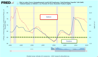
The Labor Force Participation Rate (CLF) declined .2% to 62.4%.  The CLF rate measures the (number of people working or looking for a job) / (number of people who can legally work).  There is another measurement that I have used before on this blog: the ratio of (people not working or looking for a job) / (the number of people working).  Let’s call it the Inactive Active ratio, or IARATIO.

Visually, the blue CLF rate doesn’t show us much; it is a relatively monotonic data series.  In contrast, the decades long fluctuations in the red IARATIO present some useful information.  We can see a simple answer for the federal budget surplus at the end of the 1990s, when the ratio of inactive to active workers was very low. Although politicians like to claim and blame for every data point, the simple truth is that there were almost as many adults working as not working in the late ’90s. Working people tend to put in more than they take out of the kitty.  For two decades there was a striking correlation between the Federal Surplus/Deficit and the IARATIO.

At about .75, the ratio of this past recovery was similar to that of the first half of the 1980s.  In the past two years, the IARATIO has dropped to .72, a good sign,  similar to the readings of 1986, a time of economic growth.

The ever greater number of Boomers retiring over the next decade will put upward pressure on this IARATIO.  The fix?  More jobs. Jobs solve a lot of problems, both for families and government budgets.