Happy Days

January 27th, 2013

This past week, Republicans in the House passed a bill to delay the raising of the debt ceiling till May.  The S&P500 crossed 1500, nearing the high of 1550 it set in October 2007.  This past week, money flowing into equity mutual funds finally surpassed the flows into bond funds (Lipper Source)

As the saying goes, “The trend is your friend.”  When the current month of the SP500 index is above the ten month average, it’s a good idea to stay in the market.

So, happy days are here again!  Well, not quite.  Household net worth is still climbing but has not reached the 2007 peak.

But when we step back and look at the past thirty years, household net worth is better than trend.

Asset bubbles overly inflate and deflate net worth, which includes the valuation of assets like stocks and homes.  An asset bubble is like a Ponzi scheme in that those who get in toward the end, before the bubble bursts, often suffer the worst.

CredAbility, a non-profit credit counseling service, produces a Consumer Distress score that evaluates five categories that have a significant effect on a consumer’s financial stability: employment, housing, credit, the household budget and Net Worth. It has only just broken out of the unstable range into the bottom of the frail range.

The Federal Housing Finance Administration (FHFA) released their House Price index a few days ago.  This price gauge is indexed so that 1991 prices equal $100. The index, which does not include refinancing, came in at $193, or just about 3% per year.  Although housing prices are still depressed from the heights of the housing bubble they are still above the CPI inflation index since 1991.  Housing prices generally rise about 3% – 4% per year, depending on what part of the country you live. 

When we look back twenty years, we can see that housing prices are, in fact, above a sustainable trend line established before the Community Reinvestment Act and the advent of mortgage securitization, both of which undermined rational underwriting standards.

Nationally, we are close to sustainable price trend but still a bit inside the bubble.  Sensing that home prices may have hit bottom, Home Builder stocks as a group are up about 50% in the past year.  Think that’s good?  They rose almost 100% from the spring of 2009 to the spring of 2010, only to fall back again. 

Tight credit, rigid underwriting standards and a still frail consumer will present challenges to the housing market as it climbs slowly out of the doldrums of the past few years.

Predictions and Indicators

January 20th, 2013

I was talking with someone this week who thought that, this year or next, the financial world would melt down.  This week someone else asked what I thought was going to happen this year.  The S&P 500 index is approaching the highs of 2007.  Is this a good time to invest in stocks?

I don’t know.  In the early 1970s, Alan Greenspan, who would become head of the Federal Reserve in the late 80s, called for a bull market just a few months before the market imploded and lost almost half its value.  Recently released minutes of meetings of the Federal Reserve in 2007 showed that some members were worried about contagion from the decline of the housing market to the rest of the economy but the overall sentiment was that housing and employment weakness was a needed and normal correction to an economy that had gotten a bit too frothy.  No melt down anticipated there.

All any of us can know is what has happened and even that knowledge is imperfect.  Regulators who are privy to information that might spook the markets often conceal that information and hope to contain the damage.  Brokers and managers at large investment houses actually help build bubbles, skimming off fees and derivatives profits in the process.

With an imperfect assessment of the recent events, and a non-existent knowledge of the future, investors face the choice of putting their savings under the mattress or sending out their vulnerable savings into the economic fog.

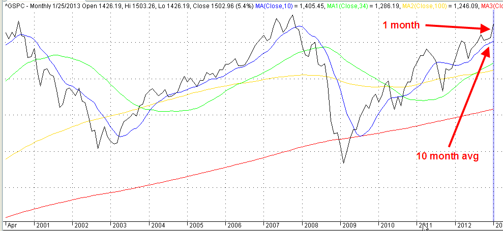
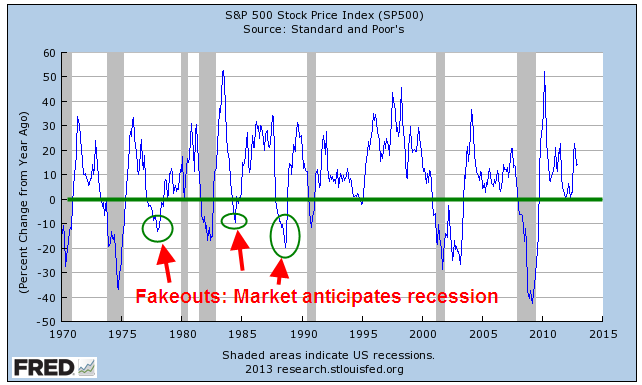
Over the past few years, I’ve looked at several indicators that have been fairly reliable foreshadowings of coming recessions.  Before I look at those, let’s look at the big daddy indicator: the stock market.  Over the course of a week, millions of buyers and sellers try to anticipate the direction of the economy and corporate profits.  The majority of the time the market does anticipate these downturns but we need to look beyond the main index, the S&P500.  Instead we look at the year-over-year percent change in the index.  Below is a monthly chart of that percentage change.

The percent change drops below zero when the majority of investors do not believe that the market will increase over the next year.  You may also notice that it is a good time to buy the market when the y-o-y percent change declines 15-20%.

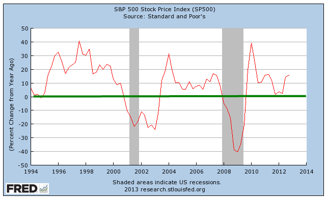
When we look at the past twenty years, the lack of confidence has been a reliable indicator of the past two recessions.  The graph below is the y-o-y percent change in a quarterly average of the S&P500.

These charts are easily available at the Federal Reserve database, FRED.  Just type in “Fred SP500” into your search engine and the top result will probably be a link to a chart of the index.  (Link here ) Click the “Edit Graph” button below the chart, then change the Frequency under the resulting graph to Monthly or Quarterly to smooth out the graph.  Just below the Frequency field is a drop down list of what you want to chart.  Select “Percent Change from Year Ago”, then click “Redraw Graph”.  Fred does all the work for you.

As of right now, the majority of investors are somewhat hopeful that there will be an increase in the index in the coming months. 

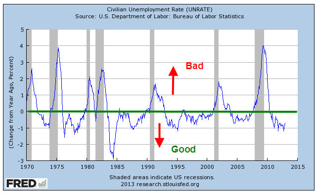
Another indicator I look at is the y-o-y percent change in the unemployment rate (UNRATE).  This is the headline number that comes out each month.  When the percentage change goes above 0, it’s probably not the best time to putting more money to work in the market.

Although the unemployment rate is still high, the yearly percent change is healthy.  As someone quipped, “It’s not the fall that kills ya, it’s the change in speed when ya hit the pavement.”  The change in each of these indicators is the key aspect to focus on.

Entering “Fred Unemployment” into a search engine should bring up as the top result a link to the unemployment chart.  Follow the instructions I gave for the SP500 and Mr. Fred will do all the number crunching.

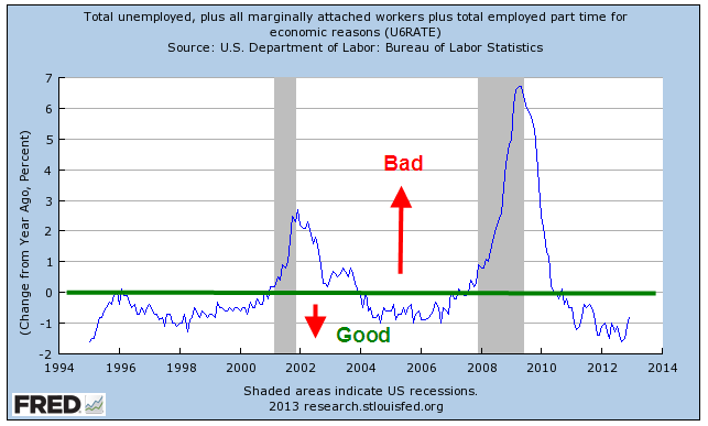
Looking at a broader index of unemployment, the U-6 rate, gives no indication of near term economic decline.  Below is the percent change in that index.

Another indicator is New Orders in Nondefense Capital Goods Excluding Aircraft.  As I noted the past few months, this has been worrisome.  We don’t have sixty years of data for this indicator but a decline in the y-o-y percent change in new orders has foreshadowed the past two recessions.  Recent monthly gains give some hope but the decline in equipment investment shows a lack of business confidence for the near term future.

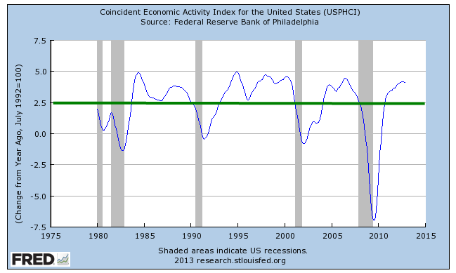
The last index I look at is a composite indicator put together by the National Bureau of Economic Research, NBER, the agency that makes the official calls on the start and end of recessions.  The Coincident Economic Index combines employment, personal income, industrial production, and manufacturing and trade sales.   In a healthy or at least muddling along economy, the percent change should stay above 2.5%.

You can access this by typing “Fred Coincident” into a search engine and the top result should be the graph for this indicator.  Follow the same instructions as above to show the percent change.

Except for New Orders there does not appear to be anything immediately worrisome.  According to Standard and Poors, (the S&P in the name of the S&P500 index), estimated operating earnings for 2013 are about $112 (Source).  At a 15.0 P/E ratio, that would put fair value of the SP500 at 1680, or 13% above its current level of 1486.  The problem is that the estimates of 2013 earnings have been drifting down from $118 last March.

For the past few years there has been a pattern of declining earnings estimates.  Something seems to be getting the way of early optimistic forecasts.  However, even if operating earnings were to actually come in at $100 for 2013, an investor with a ten year or more time horizon couldn’t say that she had overpaid at current market levels.

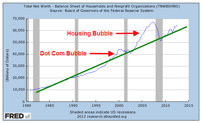
A favorite theme of 1950s sci-fi movies was the underwater creatures who had been turned by nuclear radiation into a gigantic monsters lurking on the seabed.  The tranquil calm surface of the water gave no hint of the monster swimming beneath the surface.  Then came an upswelling of water seen from the shore, a crashing crest of wave and the creature erupted from the liquid depths. For many investors, there may be that same sense of foreboding.  European banks loaded up on government debt; the Federal Reserve buying the majority of newly issued U.S. debt this past year; trillion dollar U.S. deficits; persistently high unemployment;  perhaps that is why there is so much cash floating around. 

The MZM money stock includes cash, checking accounts, savings accounts and other demand type accounts, money market funds and traveler’s checks; in short, it is money that people can demand now.  The percentage change has moderated recently and shows neither confidence or fear, of investors not knowing whether to step left or right.

For the long term investor, a showdown over raising the debt ceiling in the next few months may present another buying opportunity before the April 15th deadline to make IRA contributions for the 2012 year.

Four Foundations

Over the next two months, there will be much debate over spending cuts as the debt limit ceiling approaches in late February.  For the past four years, the Federal Government has been running $1 trillion annual deficits.

Deficits are the annual shortfall; debt is the cumulative amount of those annual deficits.  The total debt of the Federal Government, including money owed to the Social Security trust funds, is over $16 trillion, and is now more than the annual GDP, the sum of all economic activity in the country.

Republicans contend that the real problem with the budget is entitlement spending: Medicare, Social Security and Medicaid are the largest programs.  In the past ten years, spending on these three programs has almost doubled and now consumes 47% of the total Federal spending budget.

Spending increases on these programs will escalate now that the first wave of the Boomer generation has reached retirement age.  Too many rigid ideologues in the Democratic Party defiantly defend every penny of this spending.

On the other hand, defense spending is near WW2 levels.  On an annual basis, the current $700 billion we spend on defense is far less than the inflation adjusted levels of $1 trillion we spent at the height of WW2.

Wars may be won or lost at their peaks but the spending occurs over several years.  When we look at a moving five year average of defense spending, we are near the average of WW2.

Judging by the amount of money we are spending, we are fighting the third World War.  Yes, it’s a dangerous world but is it as dangerous as the state of the world during WW2?  Has Al-Qaeda, a loose coalition of stateless forces, subjugated Europe as Hitler’s armies did?  Is the threat of Iran comparable to the domination of Japan over the eastern seaboard of Asia during WW2? 

In the late 50s, President and former General Eisenhower warned that the military industrial complex would invade the halls of Washington.  Preparedness is prudence, but Eisenhower knew firsthand that the industry peddles a self-serving culture of fear to those in Washington.  As high military spending becomes entrenched in the federal budget, regions of the country become dependent on the defense industry; those people send  politiicans to Washington to vote for more military spending and the spending cycle spirals upwards.

Each year, we are spending about $250 billion more than the 70 year average of military spending.  Unlike the spike of WW2 spending, the recent five year average has surged upwards like a wave – a wave that is drowning this country in debt.  As troubling as this is, we must remember that we are running $1 trillion deficits – four times the excess amount of military spending.  Those who say that we can balance the budget by cutting defense spending simply have not looked closely at the data.  We can not balance the budget by cutting only entitlement spending or only defense spending.  Even when we combine the two, we still can not balance the budget.

Which brings us to receipts, a gentle euphemism for taxes.  Economic bubbles inflate the amount of tax revenue to the government but the resulting lack of revenues after the bubble bursts outweighs the increased revenue while the bubble was building.

When we run a projection of revenues using more sustainable averages based on longer term trends, we come up with an optimized $3 trillion in revenues for the current year, still leaving us $600 billion short of current spending. 

The solution then is a mix of four factors: more revenue from 1) economic growth and 2) tax reform; less spending for both 3) defense and the 4) social safety net.  These are not easy choices, particularly when partisans vigorously defend a particular program as though it were the last stand at the Alamo.

Laboring But Not Delivering

January 6th, 2013

No change in employment picture.  Same old, same old.  Go back to sleep.

Although the main message of the latest BLS monthly employment survey is little or no change, there are some interesting trends we can look at.    First the ho-hum stuff – stay with me for a paragraph or two.  Job gains of 155,000 this past month was essentially the average of the past twelve months; it is enough just to keep up with population growth.  The unemployment rate, number of jobless, long term unemployed, participation rate, employment-population ratio and number of involuntary part-timers all were essentially unchanged.  Can’t get more sleepy than that – but stable.

Health care employment continues to zoom upwards, gaining 45,000 this month and averaging over 28,000 monthly in 2012.  Over 2/3rds of the gains this month were in ambulatory care and nursing homes.

We are eating and drinking out at about the same pace as we did in 2011.  Food services and drinking places added an average of 24,000 workers per month this year, same as the previous year.

20% of the job gains this month were in Construction but the industry is still flat.

Now here comes the interesting stuff.  Bill McBride at his Calculated Risk blog for this past week has a chart of job recoveries after recessions.  This blog  is one I read regularly and is on my recommended blog list.  Check it out if you have not already done so.

The graph is measuring the job losses from a previous peak; in the past two recessions those employment peaks before the recession took hold were largely caused by bubbles in tech and real estate.  I wanted to get a more reasonable baseline to measure change.  Below is a 75 year graph of the rolling five year average of employment in this country.  It dramatically shows just how weak the job market has been – depression era weak.

What surprised me in this past month’s report was the further loss of 13,000 jobs in the government sector.  I was expecting few job losses, even perhaps a small gain.  When we look a little closer, it gets interesting.  Since the beginning of 2010, 300,000 teachers, administrators and other workers in local government (these are primarily K-12 schools) have been laid off.

We would expect at least some layoffs at the state education level, which consist mostly of colleges, including community colleges, and universities.  Not so.  Employment has continued to rise.

As property valuations have decreased, so have the taxes based on those valuations.  The states have taken their share of the taxes and left local county, city and village authorities to wrestle with the budget challenges.  Many K-12 teachers have been laid off as a result.

Now I’ll look at some cautionary signs.  Professional and Business Services has seen fairly strong employment gains and employment in this area has reached its prerecession peak.

There is one subcategory, Employment Services, that can often serve as a harbinger of weakness or downturn.  These are the guys whom companies hire to do the hiring.  When employment at these services weaken or fall, there may be something going bad in the fridge.

Another employment indicator is the maintenance and service of buildings.  When stores, industrial spaces and office buildings are vacant or slow, there is less to do.  Doing business takes some wear and tear on buildings.  Less business, less wear and tear.

This a truly historic downturn in both the economy and employment.  The lack of reliable, or at least comparable, data during the 1930s depression and earlier severe recessions make it difficult to do a proper assessment but we can say – to use a technical term – its a doozer.  When I hear someone comparing this recession to the 1980s and advocating, with the assertive crystal clarity that only the uninformed can summon up, that the same policies that got us out of the recession of the early 1980s will get us out of this extended recession, I know I am listening to a fool.  When I hear someone firmly pronounce that pumping vast amounts of federal money into the economy, the tactic tried with arguable success during the 1930s Depression, will solve the problem, that is the chatter of another fool.