A Proposal

May 28, 2017

The Republican led Congress has promised tax reform in the coming year.  This week I’ll introduce an income tax program that I think will clarify the debate.

Let me begin with those on the left side of the political aisle who talk about the rich paying their fair share.  The kernel of the Democratic social plan is a promise to take care of the poor by giving them benefits. Even if I don’t get any of those benefits, I like voting for politicians who help out the poor because I’m a good person.

If I ask House Minority Leader Nancy Pelosi or Senate Minority Leader Chuck Schumer “Where should the money come from?” they answer “People with too much money.” Nancy and Chuck know which people have enough money and which ones have too much.

BBLR has long been a rallying cry for those on the right. The acronym means “broaden the base, lower the rate.” As Majority Leader in the House and as Vice-Presidential candidate, Paul Ryan has espoused this philosophy. Here is a PolitiFact article on the issue during the 2012 presidential race. Tax reform champion Grover Norquist has advocated for the same principle.

The term “broaden the base” means to have more people paying at least some income tax so that they have skin in the game, so to speak. In a very progressive tax system, people who pay little or no taxes will vote for politicians who promise them benefits. After all, it is OPM, or other people’s money. In Democratic circles, BBLR stands for a mean tax system. Here’s the debate between Nancy and Chuck on the political left, and Paul and Grover on the right:

Paul and Grover: A minority of people are being forced to pay for federal programs that benefit other people who pay almost nothing into the system.  Those people will vote for more programs because it costs them nothing.

Nancy and Chuck: Republicans are bad people because they want to tax poor people. Poor people already pay Social Security and Medicare taxes so they are paying into the system.

Paul and Grover: Medicare and Social Security taxes are essentially forced saving programs that will return that money to the taxpayer in the future. Payroll taxes do not support the other functions and expenses of government like defense and the justice system.

Nancy and Chuck: Those taxes all go into the same pot.

Paul and Grover: Democrats have always been careful to separate Social Security and Medicare programs in their rhetoric. You champion the preservation of these programs as though they are separate. You can’t have it both ways. Either they are separate or they are not.

Nancy and Chuck: You Republicans are really mean and you are pawns of rich people.

These debates usually end in name calling, particularly during election season.  Some of the rhetoric is political branding but each side remains convinced that their way is the best way.

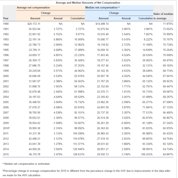
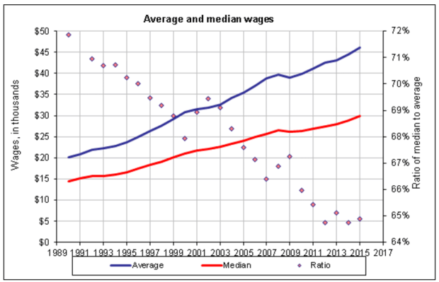
Let’s turn to recent history and take the chance that facts might get in our way. The non-partisan Congressional Budget Office (CBO) routinely analyzes proposed House and Senate laws for their estimated impact on the budget. In this report the CBO separated income, government transfers and taxes paid into income quintiles. (Click here if you want to know more about a quintile).

CBOIncTaxQuintile2013

In the table above, the lowest and highest quintiles received the least amount of money in government transfer payments like Social Security. The highest quintile had ten times more before-tax income than the lowest quintile but paid 87 times more tax than the lowest quintile. Notice that the CBO analysis includes all taxes paid to the federal government, including Social Security and Medicare.

Pretend you are a reporter. Ask House Minority leader Nancy Pelosi “How much more should the rich pay than the poor, Ms. Pelosi? If 87 times is not fair, what is fair? 100 times? 200 times?” Each of us is an expert on what “fair” means.

In the past 35 years, despite all the rhetoric, state and federal policies have had only a small effect on income inequality. The GINI index is a standardized measure of the inequality in a data set. The scale runs from zero, perfect equality, to one, or perfect inequality. The CBO report showed a 35 year history of the separate effects of benefit and tax policies on inequality. In 1980, tax policy reduced inequality by 10%. 35 years later, the reduction was 9%. Despite major tax reform in 1986, the tax increases of the early 1990s and the tax decreases of the early 2000s, tax policy has had little to no effect on inequality.

CBOGiniIndexChange

Changes in social policy that directs government transfer payments have helped ease inequality in the past 35 years, but the CBO analysis finds the combined change from tax and benefit policies negligible. They reduced inequality by 25% in 1979. 35 years later the total reduction was 26%. The difference could be a measuring error.

Tax reform is tough because it involves contentious issues. We argue about tax rates and the income brackets for those rates. We argue about deductions and tax credits. Like pornography, we may not be able to define “fair” but each of us knows it when we see it. We can agree on what “cat” means but not “fair.”

I propose something different, something that will give us less to argue about. Let’s recognize that there are socio-economic classes and assign a portion of federal tax revenues to each income quintile. Using the CBO’s analysis, the 1st and lowest quintile paid 8/10ths of 1% into the kitty. It is such an insignificant amount that we might has well make it zero. What this means is that poor people would pay no income tax and no payroll tax. Paul Ryan led the effort on last year’s Better Way tax proposal which included the same concept:  poor people should pay nothing.

If we can agree on that, we have four things left to argue about: the percentages that each of the remaining four quintiles would pay. Let’s begin the discussion by looking at the CBO analysis of the federal revenue “pie” in 2013.. The second lowest income quintile #2 paid 4% of total individual federal income and payroll taxes, the middle quintile paid 9%, quintile #4 paid 17-1/2%, and the top #5 quintile paid 69-1/2%. I rounded the percentages.

There will be a fight over these percentages but we will be fighting over four concrete numbers, not 100 million interpretations of what the word “fair” means as it relates to thousands of pages of tax code. Once that portioning is settled, a bipartisan committee representing each quintile can argue over the details of how they raise their portion of the anticipated revenue.

Taxpayers in the highest quintile may want tax breaks for angel investors who invest in early startup companies. Sounds like a worthy cause. The members of that quintile’s committee can argue amongst themselves as to whether they can afford to carve out tax breaks for that subgroup and still raise the required revenues. Should some of the income of hedge fund managers be taxed at a lower rate like capital gains? Under the current tax system, that is an emotional issue. Why should those guys get a special interest tax break? Under this proposal, I don’t care because I’m not in that quintile. A hot button issue turns into a yawner for most Americans.

A majority of taxpayers in the middle quintile might want the mortgage interest deduction. Those people can put political pressure on that quintile’s committee members to include that carve out. The majority in the next lower quintile might prefer tax breaks on child care. Should capital gains be taxed at a lower rate? This group has little in the way of capital gains so they might prefer that all income be taxed the same. Those in the lowest three quintiles who pay small tax percentages might be attracted to the simple grade school arithmetic used by some states to calculate their state income tax. Adjusted gross Income x 10% = $tax, as an example. Tax filing made simple.

Could this proposal make the tax code more complicated than it already is? Yes, but most of the complications won’t affect each person. Under the current system, my tax software asks me questions about tax credits and situations that have nothing to do with me or my family. Why? Because all of the tax code applies in theory to all of us. Under this proposal, my tax software would know what quintile I was in and the tax rules that applied to me and my family.

But what if people move from one quintile to another? How will they plan? Incomes do change. A person gets a raise, a better job, goes to school, loses a job or retires. A simple rule would help: a person’s quintile this tax year is based on their income the previous year.

The setting of the quintile brackets could be done by another simple rule. The IRS can not provide summaries and analysis of tax data for a particular tax year till about two years have passed. Each year we could adjust the income brackets of each quintile by the annual inflation rate based on the most recent tax year data available.  Families with fairly predictable income will know in advance what their tax expense will be in the coming year.

What about the Earned Income Tax Credit (EITC) program for poor people? This program largely offsets the payroll taxes that poor people pay with tax credits paid directly by a person’s employer. The program is fraught with abuse. Under this proposal, payroll taxes for the lowest income workers are eliminated so the offsetting tax credits aren’t needed.

Will those workers in the lowest quintile still be eligible for Social Security?  Sure.  There is still a record of their labor income, which is the basis for determining Social Security payment amounts.

Tax reform has come infrequently because the tax code tries to be all things to all people. The top 40% pay most of the individual income taxes so naturally they lobby for special interest tax breaks which are slipped quietly into the tax code.  Under this proposal, those special interests can lobby all they like, just as long as they meet their revenue targets.

Is it fair that someone making a half a million dollars gets a tax break on their vacation home on the Outer Banks in North Carolina? Of course not. Under the current system, I get angry about that. Under this proposal, I simply don’t care. If that person is getting a break, some other equally rich person is having to pay for that tax break. None of my business.

As it is now, we struggle to understand the various tax proposals. Politicians talk in non-specific terms about what is fair, or they speak in slogan tax talk like BBLR. Tax reform rhetoric has become a rallying cry to get out the vote.

This proposal will not stop the political fights. We will continue to debate the amount of  federal spending, the role of government and what tax revenues should be spent on. We will fight bitterly about the percentages of tax revenue expected from each quintile. But this proposal will direct the debate to specific percentages that most of us can understand. So let’s put on our debating gloves and get into it!


Circumstance

May 21, 2017

Last week I mentioned the 20 year CAPE ratio, a modification of economist Robert Shiller’s 10 year CAPE ratio used to evaluate the stock market. This week I’ll again look at equity valuation from a different perspective.  The results surprised me.

The date of our birth is circumstance.  When we retire is guided by our own actions and the circumstance of an era. We have no control over market behavior during the twenty year savings accumulation phase before we retire or the distribution of that savings during our retirement.   Let’s hope that we live long enough to spend twenty years in some degree of retirement.

The state of the market at the beginning of the distribution phase of retirement can have a material effect on our retirement funds, as many newly retired folks found out in 2008 and 2009.  Some based their retirement plans on the twenty year returns  prior to retirement.

I’ll use the SP500 total return index ($SPXTR at stockcharts.com or ^SP500TR at Yahoo Finance) to calculate the total gain including dividends. The twenty year period from 1988 through 2007 began just after the stock market meltdown in October 1987 and ended just as the 2007-2009 recession was beginning in December 2007. The total gain was 742%, or 11.3% annualized. Sweetness! Sign me up for that program.  Those high returns led many older Americans to believe that they didn’t need to accumulate more savings before retirement.  Then came the double shock of zero interest rates and a 50% meltdown in stock market valuation.

Now let’s move that time block one year forward and look at the period 1989 through 2008. Still good but what a difference one year makes. The total gain was 404%, or 8.4% annualized. That’s a drop of 3% per year! Investors missed the 16% bounce back in 1988 after the October 1987 crash, and the time block now included the 35% meltdown of 2008. There was even more pain to come in the first half of 2009 but I’ll come back to that.

1995 through 2014 was a good period with total gains of 550%, or 9.8% annualized. Shift that time block by two years to the period 1997 through 2016 and the gains fall off significantly. The total gain was 340%, or 7.7% annualized.

We can make a rough approximation of total returns during the late 1970s and into the 1980s, an ugly period for equities. In 1980, someone quipped “Equities are dead.” Twenty year periods ending during this time did not fare so well but still notched gains of more than 6%. Bonds, CDs and Treasuries were paying far more than that at the time. In today’s low interest environment, 6% seems a lot better than it did during the double digit inflation of 1980.

In past weeks I have written about the overvaluation of today’s stock market based on trailing P/E ratio and the smoothed 10 year CAPE ratio. Let’s look at the current valuation from the perspective of this twenty year return. It would come as no surprise that the total twenty year gain hit a low at the end of February 2009 when the market was about a 1/4 of its current valuation. That 20 year annualized gain was 5.7%. What surprised me was that the current valuation shows the same 20 year gain! Using this metric as an evaluation guide, the market sits at a relatively low level just like it was in 1988 and 1989.

The historical evidence shows that stock returns may be erratic but consistently make over 5% over a twenty year retirement period. Those who are newly retired or about to retire might understandably desire more safety. The safest approach is not to suddenly shift one’s portfolio entirely to safe assets.

///////////////////////

Income Inequality

Much has been written about the growth of income inequality. The GINI coefficient is the most popular but there are other measures (for those who want to get into the weeds of inequality measures). The Social Security Administration offers a simple indicator of the trend. They track the average and median incomes of millions of earners every year.

When the median and average are fairly close to each other, that indicates that the numbers in the data set are uniformly distributed. As the ratio percentage of the median to the average falls, that indicates that a few big numbers are raising the average but do not raise the median.

Here’s a simple example of an evenly distributed set. Consider a set of numbers 1, 2, 3, 4, 5, 6. The average is 3.5. The median is also 3.5 because there are three numbers in the set below 3.5 and three numbers above 3.5.  The percentage of the median to the average is 100%.

Let’s consider an unevenly distributed set: 1, 2, 3, 4, 5, 12. The median is still the same value as the earlier example: 3.5. But the average is now 4.5. The ratio of the median to the average is 3.5 / 4.5 = about 78%.

The ratio of the median to the average income has fallen from 71% in 1990 to 64% in 2015. This indicates that there is a growing number of large incomes in our data set.

SSAIncomeAvgMedian
Here’s the data in a graph form

SSAIncomeAvgMedianGraph
Median wages have doubled, or grown by 100%, while average wages have grown by more than 150% in the last quarter century.

Next week I will look at a hypothetical income tax proposal based on income. It might just blow your mind.

///////////////////////

Dividend Payout Ratio

FactSet Analytics grouped dividend paying stocks in quintiles (20% bands) by the dividend payout ratio (Chart). This is the percentage of profits that are paid to shareholders in the form of dividends. Over the last 20 years of rolling one month returns the stocks that had the highest and lowest payout ratios had the lowest total return. Think about that. Both the highest and lowest quintiles did the worst. What performed the best? Those stocks that were in the middle quintile, the companies who balanced their profit distributions between investors (dividends) and investment (future sales and profits).

//////////////////////////

CWPI

Each month I compute a Constant Weighted Purchasing Index built on a combination of the two Purchasing Manager’s surveys (PMI) each month. For the six month in a row, this composite has shown strong growth and the three year average first crossed the threshold of strong growth in January 2015.

A sub-index composite that I build from the new orders and employment components of the services survey (NMI) shows moderate growth. Its three year average has shown moderate growth since early 2014.

////////////////////////

Surprises

May 14, 2017

Surprises, the good, the bad and the ugly. When we are in retirement, we are less resilient when the bad or ugly surprises happen. There are event surprises and process surprises. An event surprise might be the damage and loss from a weather related event. A process surprise can be even more deadly because it happens over time.

Misestimates and unrealistic expectations are two types of process surprises. Let’s look at the first type – misestimates. In a recent survey, Boomers were asked to estimate the percentage of income they would have to spend on healthcare. The average estimate was a bit less than 25%. The actual average is a third of retirement income. Let’s say a couple gets $4000 in monthly income from Social Security, interest and dividends. If they had budgeted $1000 (25%) of that for healthcare costs, then discover that they are spending over $1300 a month, that extra cost will slowly eat at their savings base.

A good rule of thumb is to estimate that, in the first few years of retirement, we will spend as much if not more than we spent before we retired. If we are wrong and we spend less, that’s a good surprise. In those first years we may find that we are spending more in one area of our lives and less in another.

The second type of process surprise – unrealistic expectations. Let’s say I expect to make 8% per year on my savings with a small amount of risk. People with a lifetime of experience in managing money struggle mightily to accomplish this and all but a few fail. Either they must take on more risk or lower their expectations of return.

Vanguard and other financial companies provide the expected risk and returns of several different allocations over many decades. Here‘s a chart at Vanguard that does not include a cash allocation in its calculation.  These long term calculators have another drawback: they include rather unusual times in history – the 1930s Depression era and World War 2.

We could use the last twenty years of actual returns to guide our expectations for the next twenty years. In past articles, I have linked to the free tools available at Porfolio Visualizer and there is a permanent link on the Tools page.

I select 1997 for the starting year and 2016 for the ending year. I leave the default settings at the top of the screen alone for now. If I input 40% into the U.S. Stock Market, 40% into the Total U.S. Bond Market, and 20% into Cash, I have chosen a conservative allocation – 40/40/20. I click the Analyze Portfolios button and see that the return was a bit over 6% in the CAGR (Compound Annual Growth Rate) column. How likely am I to achieve 8% over the next 20 years? Not very likely.

I’ll input a moderate allocation of 60% stocks, 30% bonds and 10% cash. The result is an almost 7% annual return so I am getting close to my 8% but there was a nasty time when I lost 1/3 of the value of my portfolio. If I am 70 years old, how comfortable would I be if I watched my portfolio sink almost 33%? I think I would have some restless nights worrying whether I would have to go back to work. How up to date are my skills? Would my prospective employer allow me to take a short nap in the afternoon? I feel so rested and ready to rock and roll after a nap. Well maybe not.

Wait a minute, I tell myself. The past 20 years included the busting of a tech bubble, 9-11 and the 2008 financial crisis. Two of those were rather extraordinary events. So I pick a different 20 year time period, 1987 – 2006. That still includes some serious shocks like the tech bubble and its pop, as well as 9-11. My conservative allocation of 40/40/20 made 8-1/2% CAGR and the moderate allocation of 60/30/10 made 9-2/3%.

But I’m not happy with the risk. I could even decrease my risk and make my 8% return by choosing a very conservative allocation of 30% stocks, 50% bonds and 20% cash. My portfolio lost less than 10% in its worst year ever – the maximum drawdown. If I go to Vanguard’s risk return chart they estimate a 7.2% average return over 90 years, which included a horrible depression that lasted a decade and a world war. It’s to be expected that my 20 year period 1987 – 2006 would do a bit better than the 90 year average because the catastrophic shocks are not included.  I think my 20 year period is more representative of the risks I will face in the next 20 years.

I could have picked the 20 years from 1981-2000 and that would have been unrealistic. The conservative allocation earned more than 10% and the annual return on the moderate allocation was almost 12%.

So I have now set what I think is a realistic 20 year time frame that gave me the historical risk and reward that met my expectations. But that’s not realistic. Not yet. I am going to be taking money from this portfolio to supplement my retirement income. So now I go back up to the top of the screen where the defaults are and under “Periodic Adjustments” I select the “Withdraw fixed percentage” option and under that I input 4.0%. This is supposed to be the safe withdrawal percentage. The next row is the “Withdrawal frequency.” I’ll select Annual.

Since I am now taking cash out this portfolio, I will turn to the IRR column of the results because the Internal Rate of Return calculation considers cash flows. My very conservative allocation of 30/50/20 has an IRR of almost 8.5% with a drawdown of less than 15%. The column that says “Final balance” shows that I have more than double the money I started out with and I have been able to withdraw 4% per year. I would have liked to get the drawdown below 10% but I think I can live with 13-1/2%. I’ll be worried but I don’t think I will lose sleep over it. So now I have made what I think is a reasonable expectation of risk and reward based on historical returns.

There’s one last thing I need to do. I know that the 20 year period from 1929 to 1948 was bad but I can’t check that in Portfolio Visualizer because the year selection only goes back to 1972. So I select a really bad ten year period, 2000 – 2009. This was from the heights of the dot.com boom to a short time after the financial crisis. After taking 4% per year, the IRR on my very conservative allocation was 4% and I still had the money I started out with at the beginning of the ten year period. I could probably withstand a 20 year period like this as long as I stay true to my allocation.  But, the maximum drawdown (see here) was 21%, something that I am not comfortable with.

I am left with some hard choices.   In the case of another bad ten year period, I can lower my withdrawal percentage a bit or I can learn to have faith in the allocation process and accept the drawdown.  I have done this with a free tool. I could pay for more sophisticated tools that gradually transition from one allocation to another allocation over a 20 year period.  That would be more realistic still since I will probably get more risk averse as I get older. At least this gets me started.

We often can’t avoid the suprise events. Some surprises are both event and process like the diagnosis of a  life-threatening illness. We can understand and be alert to the process surprises that we may inflict on ourselves. Understanding involves some frank self-assessment and difficult questions. Am I prone to wishful thinking? Do I overestimate my tolerance for risk? How well do I live with the consequences of my decisions?

/////////////////////

CAPE

A few weeks ago I mentioned that I might calculate a 20 year CAPE ratio. The CAPE that Robert Shiller uses is a ten year period. As of the end of 2016 the 20 year CAPE was 31 vs the 70 year average of 21. Whichever calculation we use, the market is priced a good deal above average. The 20 year CAPE first crossed above the average in the late summer of 2009.

//////////////////

California

Over the past 5 years California’s economy has grown faster than any other developed country except for China. Bloomberg article

Connector Jobs

May 7, 2017

Later in this article I’ll take a long term look at connector jobs and how they can help us understand the swings in the economy as a whole.  Last week I mentioned that I might figure and graph a 20 year CAPE ratio for the past few decades.  I will post that up next week. First let’s look at the whole economy.

The initial estimate of first quarter GDP was released this week. Another quarter of meager growth. Here’s a chart of real, or inflation-adjusted, GDP growth per capita. During this recovery there has been only one quarter when annual growth has crossed the healthy benchmark of 2.5%.

GDPPerCap201703

A working paper by economists at the NBER estimates a 2.1% growth rate in OECD countries (which includes the U.S.) for the next few decades. An aging population is the major contributor to the the 25% decline from the 2.8% growth of the post-WW2 era. Promised benefits to those in OECD countries will stretch national budgets in a lower growth environment.

The Trump administration has one mandate – stronger growth – and will be judged by how well it can maintain its focus on that goal. This current second quarter of a new administration is the first one that voters count. Voters and investors will be keenly watching to see if Republicans have anything of substance behind the campaign rhetoric.

///////////////////////

Labor Report

In contrast to the slow GDP growth comes the news that payroll growth is strong. The average of the BLS (includes government jobs) estimate and the ADP (private only jobs) was a 203,000 gain in April.

Here’s an indicator that has proved to be reliable for six decades. As long as the growth in construction jobs is greater than the percentage growth of all jobs, the economy is healthy. An investor who reduced their equity holdings when construction job growth declined faster than overall employment (blue line crossing below declining red line) and overweighted equities when construction job growth was faster (blue line crosses above rising red line) would have done quite well.

ConstVsPayems201705

This might seem like a puzzle to those who do not work in real estate or construction. How does such a small part of the economy – less than 5% – provide such a key indication of the health of an economy? Because construction jobs are connector jobs. Remember Tinker Toys? Construction jobs are the round hubs with the holes in them.

They connect working people who are buying and renting homes.
They connect businesses leasing offices and stores.
They connect politicians and taxpayers to build and repair infrastructure.
They connect investment money and businesses wanting to expand.

When construction jobs decline, we can guess that new home sales are weakening, that demand for office and retail space is slackening, that tax collections are diminishing and government budgets tightening.  Factory, retail and office building construction decline as caution plays a stronger hand among institutional investors.

New unemployment claims remain at historic lows. Continuing claims for unemployment insurance have not been this low since June 1969.

UnemplClaimsPctPayems201705

The number of people voluntarily qutting their jobs for another job (the quit rate) is near the highs seen in 2005 through 2007.

People working part time jobs because they can not find full time work have declined since their peak in September 2011 but are still high. Many employers in retail and restaurants use part time employees to meet daily peaks and ebbs in the customer flow. Benefit costs for part time employees are less than full time. Even in a booming economy like Denver, people in their 20s with a college or two year degree may have to put together two or more part time jobs to make ends meet.

Throughout most of this recovery the weekly earnings of non-government employees has struggled to grow at more than a 2.5% annual pace, far below the plus 4% growth of the middle of the 2000s. On an even more sobering note: the median real weekly earnings of full time black workers is 20% less than all full time workers.

For decades to come, both the financial crisis and the recovery will be studied and written about.  Scholars will try to understand the trend to part time jobs and the slackening wage growth.  The total cost of an employee includes benefit costs and mandated payroll taxes.  As medical insurance premiums continue to rise faster than inflation,  the total cost of an employee has increased faster than inflation.  Employers have compensated by reducing the growth of the wage component of total cost.  Secondly, they have reduced benefit costs by employing more part timers where possible.

Trump was elected on the campaign promise that this so-so rate of growth would not be the “New Normal” under his administration.  Walking that talk may be much harder than he thought, or that anyone thought.

///////////////////////////

Today I heard some one say, “I’m afraid that if I don’t buy a house soon, I will be priced out of the market.” When have I heard that before? It was 2006, at the height of the housing boom.