Grandpa’s Index

May 26th, 2013

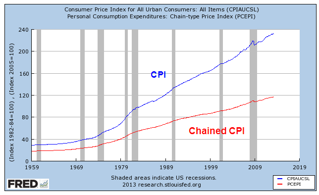
Last week I wrote about the various benefits, particularly Social Security, that are based on the Consumer Price Index and the discussions about alternative measures of increases in the cost of living.  The term “CPI” is a general term for a specific index, the CPI-U, a widely used index of prices for urban (hence, the “U”) consumers that the Bureau of Labor Statistics compiles.

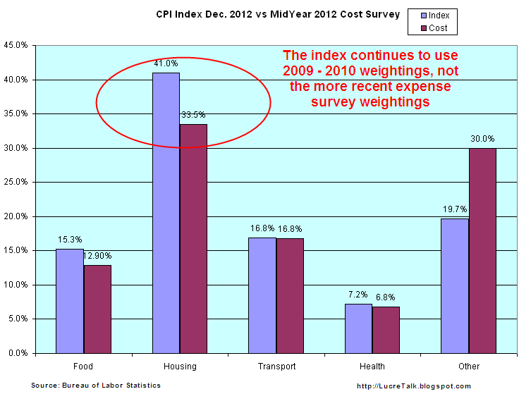
Today I’ll look at an alternative measure, the CPI-E, or Elderly index, which weights the expenditures of elderly consumers differently.  Since the sample size of this population is relatively small, the BLS warns that it is more prone to sampling error, i.e. that the sample may not accurately reflect the characteristics of the entire elderly population.  For the past decade or so, seniors have argued for cost of living increases in Social Security payments to be based on such an alternative measure.  Using the latest BLS survey comparison data, I constructed a chart to show the differences in weighting of the larger components of the CPI-U, the commonly used index, and the CPI-E, the Elderly index.

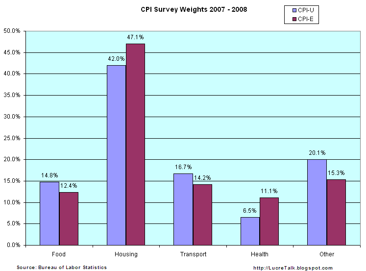
Housing and medical expenses are weighted significantly higher in the Elderly index.  A survey by the Employee Benefit Research Institute (EBRI) found that over 80% of 65 year olds own their own home.  The mortgage component of total housing costs stays relatively steady for the younger group of elderly, yet the CPI-E that the BLS compiles shows a 4% increase in this component.  The EBRI survey found that homeownership declines rapidly after 75, and it is this older group of the Elderly for whom housing costs rise.  The question is whether the CPI-E can be properly sampled and compiled to show a more accurate picture of costs for the elderly.

The medical component of the elderly index is almost twice that of the general urban population.  Although seniors have access to the subsidized Medicare program, the premiums for Medicare and costs not covered by Medicare are now borne by the elderly, rather than being fully or partially supplied as part of an employee benefit package.  In addition, people access more medical care as they age.  The combination of these two factors make it feasible that medical costs would be significantly higher for seniors.

Inaccuracies in measuring the housing component of the elderly index will be brushed aside by seniors receiving SS benefits.  Whatever measure increases benefits – well, that’s the most accurate one, of course.

An interesting note is the change in recent years of housing costs as surveyed by the BLS.  In 2007-2008, housing was 42% of total expenses.  After the housing and financial crises, that component had dropped to about a third of total expenses. (Source)

But the December 2012 CPI-U index does not reflect the results of more recent findings of BLS personal expense surveys because they are using 2009 -2010 weightings. (Data)

The largest part of the discrepancy between the actual changes in cost of living expenses and the published index is probably the “Owners Equivalent Rent” portion of housing costs which don’t reflect actual costs at all.  Instead they are a calculation of what a home owner would have to pay herself to rent her own home from herself.  No doubt, BLS economists would defend this phantom calculation as accurate but this calculation was never designed to allow for the precipitous drop in housing prices that we have experienced in the past few years.

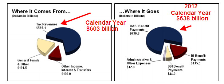
Based on BLS surveys of actual, not the adjusted, cost of housing changes, there is a good case to be made that the economy is experiencing a continuing mild deflation, not mild inflation. Deflation has become an ugly word. Social Security payments, labor contracts and a host of benefits are tied to the CPI and rely on the cost of living to increase, not decrease.  Lawmakers in Washington have, in fact, mandated that Social Security payments can not decline if the CPI turns negative.  Deflation is reviled almost as much as too much inflation.  The Federal Reserve has a target of 2% inflation, meaning that it should start pulling money out of the economy if inflation rises above 2%.  On the other hand, the Federal Reserve should be pumping money like there’s a five alarm fire if inflation has turned negative.  Has the Fed been pumping money?  Yes.  Ben Bernanke, Chairman of the Fed, prefers to look at Real Personal Consumption Expenditures.  Per capita expenditures have just now risen above 2007 levels.

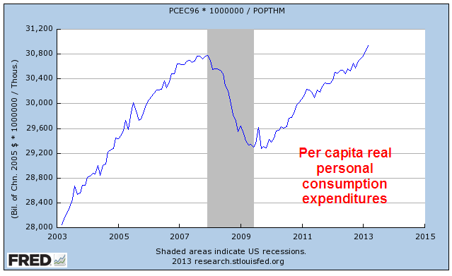
While some inflation watchers are shouting “The sky is falling” as the Fed continues to pump money into the economy, Mr. Bernanke is looking at the big picture and its tepid.  Tepid means fragile.  Here’s the big pic of the last 15 years or so.

Growth has moderated.  Bernanke has to be worried that low interest rates and continued purchases of mortgage securities by the Fed is helping inflate a stock bubble but he is equally concerned at the slower growth of the economy.  Despite the headline CPI numbers of below 2% inflation, the reality is that it may be closer to 0% than the headline index indicates.

What’s behind that slower growth of spending?  Look no further than something I write about each month, the lack of growth in the core work force, those aged 25 – 54.  These are the people who buy stuff and if a smaller percentage of them are working, then they buy less stuff.  Less stuff buying reduces inflationary pressures.

Bennies From Heaven

May 19th, 2013

During the past several years, a demographic and economic shift crossed below the zero line.  For decades, Social Security taxes collected exceeded Social Security benefits paid.  The Federal Government “borrowed” this excess and used it for other programs.  Since 2010, there has been nothing to borrow.  The Social Security Administration (SSA) has several sources of revenue, but the bulk of its revenues is what we commonly call the Social Security tax, or FICA.  However, this tax has several components.  The largest portion of the tax – the Old Age and Survivors Insurance tax (OASI) – is to pay out social security benefits and it is this component I wanted to look at.  SSA gives a pie chart of its revenue and benefits paid.

I have shown the latest revisions to the pie chart but it gives you a sense of the revenue and expense components.  A table of SSA income and outgo shows only the total receipts and expenditures.  When we look at the OASI component, we can get a sense of the upcoming political debates and financial pressures.  SS benefits paid are already exceeding OASI tax receipts.  Below is a chart of SSA data showing the surplus and deficit for the past ten years.

On January 1st, the Congress let lapse the 2% reduction in payroll taxes.  In the first quarter of 2013, that has meant an additional $245 billion in revenue to the Treasury. (Source).  Since the money all goes into the same Federal pot, the additional revenue has forestalled the debt limit debate till this fall.

The SSA records other income, including income taxes on the SS benefits paid out.  This is a “pencil” income entry: the IRS keeps track of taxes paid on SS benefits and “transfers” them to the SSA.  For decades, this pencil entry has increased the SS surplus and Congress borrowed it.  The SSA charges interest income to the Federal government and records this pencil income as more money that the Federal government owes the SS trust funds.

The bottom line is that SS is a “pay go” system.  Current taxes pay for current benefits.  When benefits exceed the taxes devoted to pay for those benefits, the money has to come from somewhere.  That “somewhere” is the Federal government, but it can only get those funds from you and I and the companies who pay corporate taxes.  More troubling is the ever increasing percentage of federal tax receipts devoted to paying social benefits of one form or another.  These include, SS, Disability, SSI, TANF, SNAP and a host of other programs.

As people become increasingly dependent on the government for their welfare, they will put increasing pressure on politicians to maintain or increase these benefits.  This political pressure only heats up the political debate over how to pay for these benefits.  At the federal level, benefits have increased by $800 billion over the last ten years.

Including the states and local governments, the increase is over $1 trillion.

Any cuts in calculating benefits are met with a firestorm of protest from those who are, or will, collect those benefits.  Few care about the accuracy of calculating cost of living adjustments to these benefits.  Whatever calculation provides the best benefit becomes the most “accurate” calculation.  The current debate is whether to use the CPI or what is called a Chained CPI.  Over several decades, the CPI gives the most increase in benefits.

40% of the calculation of the CPI is housing cost and the calculation of that cost, called Owner’s Equivalent Rent, has almost tripled in the past thirty years, boosting the CPI.

Census data shows that 2/3rds of the 132 million households in this country own their homes.  Before the housing boom, a primary reason for owning a home was to lock in a monthly payment, avoiding rent increases.  Taxes, upkeep, and energy costs do go up, but the majority of a house expense, the mortage payment, is a fixed cost for many homeowners.  However, the Bureau of Labor Statistics, which compiles the CPI, calculates the housing component of the CPI as though a homeowner was renting from herself.

according to the National Association of Realtors, between 1983 and 2007 the monthly principal and interest payment required to purchase a median-priced existing home in the United States rose by 79 percent, much less than the rental equivalence increase of 140 percent over that same period.” (BLS Source)

We will continue to have a lively debate over the calculation of the CPI because it influences millions of Social Security checks each month.  We can anticipate that this debate will be at the forefront of the upcoming 2014 elections.  Why?  Because the debate stirs passions on both sides and that is what politicians need – passion.  Passion provokes people to vote.  Passion promotes donations.  Passion ignites political volunteer efforts.

The trend of worsening deficits between SS contributions and the benefits paid will only worsen as we get into the latter half of the decade.  Before the 2010 elections, we were treated to the spectacle of angry old people – without makeup – yelling at politicians to keep their stinkin’ government hands off their Medicare, itself a government program.  In the upcoming years, the debates over Social Security will make those earlier demonstrations seem rather mild.  Old people vote.  Angry old people vote a lot.

Out Of the Tent and Into the Forest

May 12, 2013
We can take some steps to reduce our susceptibility to adverse events but if our primary aim is to reduce uncertainty as much as possible, our lives suffer in quality and our wallets suffer in quantity.  In our financial lives, we must try to find a balance between risk and reward.  There is a high demand for low risk, high reward investments.  Unfortunately, there is little supply of such investments and the few that are offered are usually scams.

There is a good supply of low risk, low return products. In the past ten years, conservative savers have taken a beating.  There have been only two periods where the interest on one year CDs has exceeded the percentage increase in inflation.

Challenged by low interest rates on CDs, savers have fled the market.

Older people who rely on their savings to generate income continue to search for yield, or the income generated by an investment.  The iShares High Yield Corporate Bond ETF, HYG, and the iShares Dividend Select Index ETF, DVY, have posted strong gains.  As more investors chase yield and drive up prices, the yields correspondingly become lower.   In December 2007, DVY paid out an annualized 4.7% yield on a price of about $53.  In March 2013, the yield was 3.4% on a price of $65 (Source)

Despite the fact that the Federal Reserve has held interest rates at historic lows, the amount of household savings continues to climb.  Some of this is due to an aging population which has more in savings and tends to be more conservative.

The Federal Reserve is essentially kicking people out of the tent and into the forest where the wild animals live.  It’s risky out there in the forest.  How come the banks don’t want our money?  Some people do not realize that a CD or savings account is essentially a loan to the bank.  Through the FDIC, the U.S. government insures most of these loans.  Loan your brother in law money for a  year and you might not get it back.  Loan your bank the money and you are assured that you will get it back.

In the simplified models of banking we learned in grade school, the bank pays us interest for the money we loan it (deposits) and loans that money out to other people at a higher rate of interest.  The difference in the two interest rates is how banks pay their employees and other business costs and make a profit. The reality is much more complex.  A bank does not take a $10 deposit from Mary and loan it to Joe.  The bank takes the $10 deposit from Mary and loans $100 to Joe.  Where did the other $90 come from, you ask?  It is created out of thin air in a process called fractional reserve banking, which allows a bank to leverage the $10 deposit by ten times, in this example.  Because banks are leveraging money, there is a labyrinth of financial metrics of stability to insure that the banks are not taking too much risk.  Some of these metrics include the risk weighting of assets (deposits, loans and securities, for example) and capital asset ratios.

In a 1985 paper by Federal Reserve economists, they note that “There is remarkably little evidence, however, that links the level of capital or the ratio of capital to assets with bank failure rates.”  This paper was written before the S&L crisis of the 1980s.

The financial crisis in 2008 led to a surge of bank failures, peaking at more than 150 in 2010.  In this past year, failures have dropped to a level that can be counted with two hands.

 During the recession, the amount of commercial and industrial loans declined but have risen to nearly the same level as 2008.

From a thirty year perspective, we can see just how severe the decline was.

While loans and interest bearing accounts, or assets, at the largest banks are nearing 2007 levels, assets at small banks have declined.

The banking industry has been consolidating, larger banks eating up the smaller ones.

This past Friday, the Chairman of the Federal Reserve, Ben Bernanke, expressed concern that some of the larger banks are still prone to failure.  The ever increasing size of the big banks has enabled them to have an even greater voice in the halls of Washington.  Bernanke’s remarks hint that he is a proponent of further regulations which would reduce the amount of leverage that banks can use to increase their profits.  Banking industry lobbyists are making the case that if they are required to reduce their leverage, it will hurt the economy by reducing the amount of loans they can make.

The banks are feeling squeezed and they are sure to let lawmakers know.  Their net interest margin, or the spread between what they pay to depositors and what they charge to borrowers, has fallen to pre-recession levels, putting pressure on banks to take more risk to increase their bottom line.

I am reminded of a comment made by Raymond Baer, chairman of Swiss private bank Julius Baer, in 2009 who warned: “The world is creating the final big bubble. In five years’ time, we will pay the true price of this crisis.”  Let’s see: 2009 + 5 = 2014.  Hmmmm….

But we can’t live our lives waiting for the next catastrophe.  We must take some risk, be diversified and be vigilant.  As the stock market reaches new highs with each passing day, more investors will reassess their risk profile.  Some will curse their caution of the past few years and move money from safe but low yielding assets to the market, helping to fuel rising market prices.  The demand for yield creates a feedback loop that actually makes it harder to achieve yield.  If only we could live in a world where they didn’t have these darn feedback loops.

Job Trends

This past Wednesday the payroll firm ADP released their monthly report of private employment with a rather tepid 119,000, prompting an equally tepid sell off in the market, which lost about .7% by the end of Wednesday.  Although the price move was under 1%, the volume of trading was high.  Was this the end of the 6+ month run up in stock prices?  Was the economy slowing down? 

Came Thursday and a very cheery weekly report of new claims for unemployment and moods brightened.  The market regained the ground lost Wednesday and then some, but on rather low volume.  Standing on the sidewalks of Wall Street, traders repeatedly opened up their umbrellas, then closed their umbrellas, put on their sunglasses, then took off their sunglasses. 

[And now a pause from our sponsor.  A trader tells his doctor he’s anxious and asks for a prescription.  The doctor gives him some advice: “stop looking at the market so much.”]

Back to our story. Friday morning dawned, the heavens opened and the sun shone.  The Bureau of Labor Statistics issued its monthly weather – er, labor – report and traders threw down their umbrellas and put on their shades.  Huzzahs rang throughout the canyons of lower Manhattan.  Some slacker dudes cooly tossed their stocking caps in the air, while men dressed in crisp suits wished that they too had hats.

The labor report is released an hour before the market opens at 9:30 AM.  The market opened up 1%, drifted higher but ended the day at about the same price as it opened.  So, huh? We’ll get to the huh part later.

The reported job gains of 165,000 for April were just slightly above the 150,000 jobs consensus estimate and the replacement rate needed to keep up with population growth.  Spurring the initial enthusiasm was relief that job gains were not as weak as some had feared (100,000 or so) and the revisions to previous months job gains, adding 114,000 to February and March’s job gains. But February’s revision from strong to very strong job growth provokes some head scratching.

What good things happened in February to inspire such strong job growth?  Hmmmm….here’s a table of the past 12 months data from the establishment survey. 

There was a lot to like in this month’s report.  The unemployment rate dropped a tenth of a percent to 7.5%.  We just passed employment levels of February 2006 – yep, it’s been a slow recovery.

To get the big picture, let’s look at the last forty years.

From this perspective, we can see just how deep the job losses have been since 2008.  From this rather sobering point of view, let’s look at some of the positives from this month’s report.

Professional and Business services added a whopping 73,000 jobs this month, far above the 49,000 average of the past 12 months.  Restaurant and bar jobs were up 50% above their 12 month average, showing gains of 38,000. Temp help posted strong gains of 31,000, its highest of the past year.

Construction jobs showed little change, a surprise at this time of year.  Construction has been averaging gains of 27,000 a month for the past six months. This past week, I spoke to a woman at a Denver branch of a national temp agency.  This branch focuses on manual labor, mostly for the construction industry.  She confirmed that business has been brisk but most of the calls are for road repair and rebuilding and some commercial construction.  When I asked her about calls for helpers and job site clean up for residential construction, she said it had been sporadic.

Job gains in health care were somewhat below their 12 month average of 24,000 but any slack in health care was made up by strong growth in retail.  Government jobs continue to contract slightly each month.

Underlying the positive aspects of the job market are some anemic indicators.  The average of weekly hours dropped .2 hour to 34.4; the average has lost .1 hr in the past year.  The ranks of the long term unemployed dropped by 258,000 workers but the number of people working part time who would like a full time job jumped 278,000.  The ranks of the “involuntary” part timers – those who would like a full time job but can’t find one – is about 5 million.  Here’s a surprise. Today’s levels of involuntary part timers as a percent of total employment is only the third highest in the past fifty years; the late 1950s and the early 1980s were worse.  But this only means that the ranks of part timers have fallen mercifully from nose bleed levels.

The diffusion index is showing some weakness; this is the share of employers who are reporting job gains vs. job losses, with a value of 50 being neutral.  Manufacturing employers are already reporting more job losses than gains.  Overall, employers are slowly drifting toward neutral in their hiring for the past several months.

The core work force aged 25 – 54 is still limping along.

Even more disturbing is the participation rate of this core work force.

Shortly after the market opened on Friday came the report on factory orders and it muted some of the enthusiasm generated by the labor report.  New orders for durable goods, a barometer of business confidence, fell 5.8%, confirming the slowdown in manufacturing.  Employment in this sector has been flat the past two months.

While the monthly labor report makes headlines, it is not a leading indicator. Professional investors watch the squiggles of daily and weekly economic and news reports, trying to anticipate developing trends.  Many of us have neither the time or inclination.  For the long term “retail” investor, continuing job gains are positive, particularly if they are at or above the replacement level of 150,000. The long term investor is more concerned about significant losses in their retirement portfolio.

What if an investor lightened up on their stock holdings shortly after the BLS reported the first job losses?   I looked back at historical employment releases ; I wanted to use the original releases, not the revised figures of later months, to capture the sentiment at the time.  We must make decisions in the present.  We don’t have the luxury of going into the future, looking at data revisions, then coming back to the present and making our investing decisions.  That would be a good time machine, wouldn’t it?  Here’s an example of how employment data can be reported initially and later revised.  The graph shows the later revisions.

In early August 2000, the BLS reported job losses of 108,000 in July.  But this was due to the layoff of 290,000 temporary Census workers.  Do census workers really count in our strategy?  Let’s say not.  We wait till next month’s report, which shows a loss of 105,000. Should we use our strategy?  Again, those darn census workers.  Without them, there would have been a small gain in jobs.  So we don’t sell in September.  Then, in the beginning of October comes the news of strong job gains in September, followed by more job gains in October, November and December.  Good thing we didn’t sell at that first downturn, we tell ourselves.  Meanwhile the stock market has been slipping and sliding since that first negative job report.  Eventually, it will fall about 40%.

Wow, we should have taken that first signal and avoided all those losses!  But if our strategy is to then buy back in when there are positive job gains reported, then we could be in and out of the market like a yo-yo in years when the economy is struggling to find direction or strength. We were looking for a more even tempered strategy.

To emphasize how the revisions in employment can mean the difference between job gains and job losses,  take a look at the chart below.  These are the revised figures.  I have noted months where the initial monthly labor report showed positive job gains but were later revised to job losses.  Some of these revisions can happen months later.

From the first reported job losses in mid 2000, more than three years passed before job gains would exceed the “replacement” level of 150,000.  That is the number of jobs needed for the growth in the labor force. While many, myself included, have blamed the knucklehead politicans who enacted the Bush tax cuts in 2003, it is understandable that they were beginning to wonder if the labor market would ever turn around.  Three years of job losses is a long time.

Let’s move on to the last decline.  The market had already begun its decline before the first job losses were announced in early February 2008.

In this past recession, the job losses were severe but the first job increases were announced about two years after the first decrease, in early April 2010.  When reviewing the historical BLS releases, this really surprised me that the 2000 – 2003 labor downturn lasted longer than this last one, though it was much less severe.  By the time the first job increases had been announced in 2010, the market had already been on an upswing for a year. 

In short, the headline monthly job gains don’t appear to offer a long term casual investor any particular insight or advantage.  In a work force of 143 million, a hundred thousand jobs can be a slip of the pencil.  But reported job gains of 150,000 or more do offer an investing hint – quit worrying about your retirement portfolio for at least another month.  Go fishin’, play with the kids, hang out with friends.

A labor indicator that seems to be more reliable is the year over year percent change in the unemployment rate, which I have discussed in earlier blogs.

Although the unemployment rate – or percentage – is derived from the count of total employment, the revisions are much smaller.  Secondly, we are using a percentage gain in that percentage, further reducing swings.

The stock market continues to post new highs in anticipation of good corporate profits in the latter part of the year.  What is a bit troublesome is the number of revenue shortfalls reported by companies in the first quarter.  Reducing expenses and boosting productivity can only get a company so far.  Profit growth becomes harder and harder to come by without revenue growth.