Homes

July 27, 2014

This week I’ll take a look at the latest home sales reports, a few trends in Social Security, and the latest reading in the Consumer Price Index.  Lastly, I’ll ask whether a home should be included in an investor’s bond allocation.

*************************

Home Sales

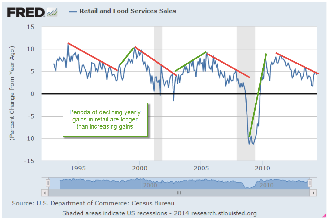
Existing home sales rose in June, topping 5 million but are still down 2.3% on  a year over year basis.  The Federal Housing Finance Agency reported that home price increases have slowed slightly, notching a 5.5% year over year gain.

The bad news this week was the 12% year-over-year drop in single family new homes sold in June, falling from 459,000 in June 2013 to 406,000 in June of this year.

The comparison was a tough one because June 2013 was the best month for new home sales in the post recession period.  However, the year-over-year comparison of the three month moving average of new home sales shows a falling trend as well, down 6% from last year.  The decline began in January and shows little signs of improvement.

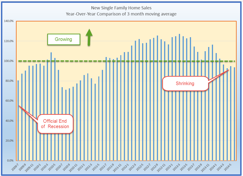
I will remind readers of a 2007 paper presented by economist Ed Leamer in which he demonstrated that falling new home sales tends to precede a recession by three to four quarters.  I wrote about it in February this year.

************************

Jobless Claims

In contrast to the disappointing report on new home sales, jobless claims fell unexpectedly to 284,000, dropping the 4 week moving average to a post-recession low of 302,000.  No doubt this will raise expectations for a strong employment report next Friday.

*************************
Social Security Trust Funds

When the U.S. Treasury collects more in Social Security taxes than the Social Security Administration (SSA) pays out in benefits, the Treasury “borrows” the money from the Social Security Trust Fund by selling it non-marketable Treasury bonds that the SSA holds.  The interest rate for each new bond is an average of the yields on intermediate and long term Treasuries. The Treasury credits this interest to the trust funds every month.  SSA has a web page where a reader can select a year and month and see the average interest rate that the trust funds were earning on that date.  In December 2013, the average annual yield was about 3.6%, down significantly from the 5.25% being credited at the end of 2005, when interest rates were higher.  At the end of 2012, the trust funds had a balance of about $2.7 trillion, earning about $100 billion annually, enough to make up the $75 billion shortfall each year projected by the Trustees of the fund.

The Disability Insurance (DI) portion of the trust fund is projected to run out of money by 2016.  This Do-Nothing Congress will not resolve the problem in this mid-term election year,  promising to make the issue a contentious one for the 2016 election cycle.  If the problem is not resolved by then, current law requires that benefits be reduced accordingly.  The Trustees estimate that Disability beneficiaries will get about 80% of their scheduled benefit.  Democrats will likely use the issue to paint Republicans as Meanies who care only about the rich and big corporations while Republicans portray Democrats as tax-and-spenders who buy votes with government charity.  It’s all coming to a TV screen in our homes.  Can’t wait.

************************

Consumer Price Index

June’s inflation numbers from the BLS notched a 2.1% year-over-year gain, slightly above the Fed’s 2% target.  The core CPI, which excludes more volatile energy and food prices, is up 1.9% y-o-y.  Gasoline jumped 3.3% in June but year over year gains are at target levels of 2%.

Over the next few years, we will hear increasing calls for a switch to what is called a chained consumer price index, or C-CPI.  The chained index attempts to more closely replicate a cost of living index by taking into account the substitutions that consumers make in response to changes in price.  The CPI may calculate that the Jones Family bought the same amount of hamburger meat even when it rises 20% in price.  The Chained CPI calculates that the Jones Family may buy a little bit less hamburger meat and a bit more chicken if chicken remains relatively stable in price.  The two indexes closely track each other but the CPI tends to be slightly higher than the Chained CPI.

At various times in budget negotiations with the Republican controlled House over the past two years, President Obama has said that he was open to a discussion on transitioning from the CPI as it is currently calculated to the chained CPI.  Social Security payments are one of the many benefits indexed to the CPI.  The current political climate and the upcoming mid-term elections undermine the chances of any adult conversation on the topic.   Republicans are likely to retain the House and want to take the Senate.  A discussion of the CPI invites accusations from Democrats that Republicans – yes, The Cold Heartless Ones – are going to throw seniors under the bus if Social Security payments are decreased by even $5 a month because of a change in the calculation of the CPI.

The reason younger people don’t vote much may be that they hear the rhetoric of most political campaigns and realize that the discussions are much like those they heard in middle school.

***********************

House = Bond?

Let’s crank up the wayback machine and travel to those heady days of 1999 when the stock market was booming.  Current profits did not matter.  New metrics were invented. Customers were revenue streams whose future value could be used to justify the present value of customer acquisition costs. Investments were made to position a company as the dominant player in the sector space of the internet frontier.  These metrics have some validity but the stumbling block was the simple fact that current profits do matter.

About that time some finance professors made the case in a Wall St. Journal editorial (sorry, no link.  WSJ doesn’t go back that far) that most households were overweighted in bonds. How so? A house is like a bond, they argued, relatively stable in price and pays the owner the equivalent of 6% – 7% annually.  House prices do average about 15 – 16 times annual rents according to the real estate analytics firm Jacob Reis.  At the height of the housing boom in the mid-2000s, houses were selling for 25x annual rents.

Secondly, it did not matter whether the house was paid for or not.  To illustrate this rather dubious viewpoint, let’s consider a renter who pays $12,000 annually in rent for an apartment.  She has a $500,000 portfolio, $300,000 of it in stocks, $200,000 in bonds, a 60/40 allocation split.  The bonds generate a 6% annual return of $12,000 which she uses to pay her rent.  A responsible financial advisor would not say “Oh, those bonds don’t count to your allocation mix because the income they earn is used for rent.”

Now, let’s look at a homeowner with the same $500,000 portfolio and the same allocation, 60% stocks, 40% bonds.  She owns a home valued at $200,000 which, if she rented it out, would net her $12,000 annually.  Her PITI  (mortgage payment and taxes) and maintenance repairs is also $12,000 annually.  Like the renter, the homeowner uses the $12,000 in income from her bonds to pay the house costs.  Unlike the renter, she is building some equity in the house by paying down principal.  On average, the value of her house is gaining about 3 – 4% per year based on historical patterns.  In short, the house is generating an unrealized gain that is ignored in conventional allocation models.

So, how would one compute the asset value of the house?  By imputing it from the income and unrealized gains that the house generated.  So, if a homeowner paid $3000 annually toward principal reduction and the house appreciated 3%, or $6000, the house generates a value to the homeowner of $9,000.  Using the historical 6% average return on a house, this would make the asset value of the house $150,000.  Adding that to the stock and bond portfolio gives a new total of $650,000, $350,000 of which is in bonds and the house, a bond-like asset.  Using this method, the allocation mix is 46% stocks, 54% bonds, perhaps more conservative than the homeowner desired.

After reappraising their portfolio in this manner, the professors suggested that homeowners might sell some bonds and buy more stocks to get the desired allocation mix.  To achieve a true 40% bond mix in this example, the target total would be $260,000 in the house and bonds.  Subtracting the $150,000 house value, the homeowner would want to have $110,000 in bonds.  To achieve this, the homeowner would sell $90,000 in bonds and invest in the stock market.  The investor would then have $390,000 stocks and $110,000, slightly above a 75/25 stock/bond allocation mix.  Older readers may shudder at this mix, thinking that it is quite risky.

So, let’s come back to the present day, after the housing bubble.  The calculations are not based on the actual price of the house but 1) on the income that it would generate if it were rented out and, 2) the principal pay down.  The finance professors did not factor in homeowners who were “under water,” i.e. owing more on the house than its current market value, because the debt on a house or any asset did not count in this model.

Let’s say that a homeowner bought at the height of the market in 2005, paying an inflated $300,000 for a house that would later be valued for $200,000.  The principal paydown is so small in the early years of a mortgage that it has only a small effect on the calculation.  Secondly, rent prices were under pressure during the housing boom, making the calculation of the asset value of the house lower.  In fact, a person using this method and contemplating the purchase of a house at that time might have asked themselves “Why am I paying $300,000 for an asset whose income and unrealized gain generates an asset value of $200,000 at most?”

As to the timing, whoa, boy!  What a bad call, selling $90,000 in bonds and putting it into the stock market right before the dot-com bubble popped.  By June 2001, long term bonds (VBLTX as a proxy) had gained almost 10% in value and were paying about 6%.  Our homeowner was not a happy camper.  Over two years, she had lost about $9K in value and another $10K in dividends on that $90,000 in bonds that she sold.  At mid-2001, she had lost an additional  $4,000 in value on the $90K that she invested in stocks near the height of the dot-com boom.

By the end of 2013, twelve years later, she still had not made up for those initial losses.

By including a housing value in the allocation calculations, our investor had an approximately 75/25 mix of stocks and bonds.  During those 14 years, a 75/25 stock/bond mix had about the same total return as a 60/40 stock/bond mix.  There is one clear advantage to the 60/40 mix, however: the risk adjusted return is much better.  The average annual return as a percentage of the maximum drawdown, or the CAR/MDD ratio,  was much higher and the higher the better.

This ratio could be called the sleep ratio.  Let’s say an active investor makes $50K profit in a year on a $500,000 portfolio, but during the year, the investor’s portfolio lost half its value before recovering.  Then the sleep ratio is $50K/$250K, or .2.  Not much sleep for all that activity.  As a benchmark, a buy and hold strategy in the stock market had a CAR/MDD ratio of .2 from 2001 – 2013.

The conventional 60/40 mix had a sleep ratio of .6 during this period.  The 75/25 mix had a sleep ratio of .35, making it the poorer risk adjusted model.  Interestingly, a buy and hold strategy in long term bonds had a sleep ratio of .48, showing that some balance between bonds and stocks produces a better risk adjusted return.

While the rationale for including a house in one’s bond portfolio mix might seem to be a good one, there was a timing disadvantage over this 14 year period.  Long term investors should remember that the past 15 years have been a rather unique combination of two severe downturns in the stock market and a housing bubble.  Such a combination is sure to test even the soundest theory.

***********************

Takeaways

New home sales are down while existing home sales continue their moderate growth trend.  Jobless Claims are at a post-recession low.  Fixes to the Disability trust fund and any transition to a chained CPI are off the discussion table till 2015, at least.  An allocation model that includes a home’s value in an investor’s bond portfolio may have merit over a long time horizon.

Next week come four reports that are sure to fire up the market if any of them surprises to either the upside or downside:  GDP growth for the 2nd quarter, Employment gains, Motor Vehicle Sales, and the Purchasing Manager’s Index for the manufacturing sector.  

Retail Sales and the Stock Market

July 20th, 2014

This week I’ll take a look at the latest retail sales numbers and revisit a familiar valuation metric for the stock market.

*******************

Retail Sales

Retail sales were a bit of a disappointment this week because of a monthly decline in auto sales.  As strong as vehicle sales have been, we can see a pattern that echoes a trend in employment – the best of this post-recession period is near the low of past recessions.  As a percent of the population, the number of cars and light trucks sold is tepid at best.

In total, retail sales gained more than 4% year-over-year but here again we can see a familiar pattern – declining yearly percentage gains.  Periods of rising gains are about half the length of periods of falling gains.  Over the next several months, we would like to see higher highs in the yearly gains.  Further declines, i.e. lower highs, would be a cause for concern.

*************************

Malaysian Airline Disaster

Oil prices had fallen more than 5% over the past three weeks.  The news of an apparent missile strike on a Malaysian passenger jet over a conflict zone in eastern Ukraine sent oil prices up about 2.5% over two days this week before falling back slightly on Friday.  As families mourn the deaths of almost 300 people on the plane, a fusillade of accusations and denials were launched.  Some accuse Russia of launching the missile that struck the passenger jet flying at 33,000 foot altitude, some blame Russian-backed separatists in eastern Ukraine, others hold Ukranian forces accountable.  Economic sanctions already in place against Russia may be broadened.

Unrest in Ukraine, Iraq and Libya puts upward pressure on oil prices but the effect is moderated by a global supply that is able to meet demand with a safety buffer capable of absorbing these geopolitical conflicts.

***************************

Stock Market Valuation

The stock market continues its two year run to try and meet up with the trend channel of the mid-2000s as though the financial crisis never happened.

Last month I wrote about the Shiller CAPE ratio, introduced by economist Robert Shiller in his book Irrational Exuberance. Some writers also refer to the CAPE ratio as PE10 or the Shiller P/E ratio.

Portfolio Visualizer (PV) has a free tool that lets viewers backtest portfolios using various strategies. An optional timing model based on the CAPE ratio flips the allocation of a portfolio from 60% stocks and 40% bonds (60/40) to a 40/60 mix when the CAPE is high, as it is today.  In the model, “high” is a CAPE above 22, but as I wrote last month, the CAPE has averaged 22.91 for the past 30 years.  In the relatively low interest environment of the past thirty years, investors are willing to pay more for stocks.  The 50 year average is 19.57, within the normal range of the timing model. One could make the point that “high” should be set upward about 3 points, which is the spread between the 30 and 50 year averages (22.91 – 19.57).  In that case, the trigger high would be 25.

Below is a chart of the CAPE ratio and the inflation adjusted or real price of the SP500 index.  As you can see we are far below the nosebleed valuation levels of the late 90s and early 2000s.

The current CAPE ratio is about 26, above even the modified high point.  Using this model, an investor with a $500,000 portfolio with $300,000 in stocks and $200,000 in bonds, would sell $100,000 of stocks and buy bonds with the proceeds.  Over the past twelve years, the Shiller model would have generated an 8.44% annual return vs the 7.21% return of a 50/50 balanced portfolio.  I included an additional two years to capture half of the downturn in the early 2000s when stocks lost 43% of their value.  More importantly, the risk adjusted return of the Shiller model is much better than the 50/50 portfolio.

The Shiller model also did better than the 8% annual returns of a crossing strategy. This is a variation of the 50 day/200 day “Golden Cross” strategy, which I wrote about in February 2012, a week or so after the occurrence of the last Golden Cross.  In this monthly variation using the Shiller model, an investor exits the market when the SP500 monthly index drops below its 10 month moving average.

Keep in mind that a backtested portfolio generates higher than actual returns since they often don’t include trading fees, slippage or a real life re-balancing.  In backtest simulations, an investor may re-balance all in one day following the signal day.  While that may be the case sometimes, many investors are not so quick and some financial advisers will recommend making a gradual transition when re-balancing.  Still, backtests can be useful in comparing strategies.

An investor who puts money into the stock market today is – or should be – more concerned about what that money will be worth 5, 10 and 20 years from today when they might need the money for retirement, children’s college, or other events in a person’s lifetime.

There is a definite negative correlation between the CAPE and the 10 year return, without dividends, of an investment in the SP500.  Since World War 2, the correlation is -.70.  Since 1902, the correlation is -.65, reflecting the greater portion of earnings that were paid out as dividends to investors before WW2.  In short, it is likely that an investor will experience lower returns the higher this CAPE ratio.

*****************************

How much can I take each year from the piggy bank?

There is also a Shiller model for sustainable withdrawals from a portfolio based on the CAPE ratio.  You can read about it here.  Keep in mind that this model uses a 30 year horizon for retirement.  The same author, Wade Pfau, has a separate article on the various time horizons used in withdrawal models.

*****************************

Takeaways

Two steps forward, one step back is a familiar trend in this post-recession period.  Retail sales are healthy but below the 5% threshold of a strong upward trend.

Using the Shiller CAPE ratio as a metric of market valuation, stocks are overvalued.

Summer Signs

July 13, 2014

Small Business

Optimism has been on the rise among small business owners surveyed monthly by the National Federal of Independent Businesses (NFIB).  Anticipating a growing confidence, consensus estimates were for a reading of 97 to 98, topping May’s reading of 96.8.  Tuesday’s disappointing report of 95 dampened spirits.  The fallback was primarily in expectations for an improving economy.  Mitigating that reversal of sentiment was a mildly positive uptick in hiring plans. The majority of job growth comes from small and medium sized companies.

*******************************
Job Openings and Labor Turnover Survey (JOLTS)

Speaking of job growth…There is a one month lag in the JOLTS report from the Bureau of Labor Statistics so this week’s report summarized May’s data.  The number of job openings continues to climb as does the number of people who feel confident enough to voluntarily quit their job.  Job openings have surpassed 2007 levels. If I were President, I would greet everyone with a hand shake and “Hi, job openings have surpassed 2007 levels.  Nice to meet you.”

Still, the number of voluntary quits is barely above the low point of the early 2000s downturn.  Let’s not mention that.

We can look at the number of job quits to unemployment, or the ratio of voluntary to involuntary unemployment.  This metric reveals a certain level of confidence among workers as well as the availability of jobs.  That confidence among workers is relatively low.  The early 2000s look like a nirvana compared to the sentiment now.  The country looks positively depressed using this metric.

If I were President, if I were a Congressman or Senator, I would post this chart on the wall in my office and on the chambers of Congress where it would remind myself and every other person in that chamber that part of my job is to help that confidence level rise.  Instead, most of our elected representatives are voicing or crafting a position on immigration ahead of the midterm elections.  Washington is the site of the largest Punch and Judy show on earth.  Like the little train, I will keep repeating to myself “I think I can, I think I can…stay optimistic.”

*******************************

Government Programs

Most social benefit programs are on autopilot, leaving Congress with little discretion in determining the amount of money that flows out of the U.S. Treasury.  These programs include Social Security, Temporary Assistance to Needy Families, Food Stamps, Unemployment Benefits, etc.   Enacted over the past eighty years, the ghosts of Congresses past are ever present in the many Federal agencies that administer these programs.

During the recent recession, payments under social programs shot up, consuming more than 70% of all revenues to the government.  Political acrimony in this country switched into high gear as the U.S. government became the largest insurance agency in the world. As the economy improved, spending fell below the 60% threshold but has hovered around that level.

 That percentage will surely rise as the boomer generation retires, taking an ever increasing share of revenues to pay out Social Security, Medicare and Medicaid benefits.  As the percentage rises again toward the levels of the recession, we can expect that social benefit spending will take center stage in the 2016 Presidential election.

*******************************
Indicators

Back in ye olden days, soothsayers used chicken bones and tea leaves to foretell the future.  We now have powerful computers, sophisticated algorithms and statistical techniques to look through the foggy glass of our crystal ball.  Less sophisticated algorithms are called rules of thumb.  In the board game Monopoly, a good rule of thumb is that it is wiser to build hotels on St. James, Tennessee and New York Ave than on the marquee properties Park Place and Boardwalk.

I heard a guy mention a negative correlation between early summer oil prices and stock market direction for the rest of the year. In other words, if one goes up the other goes down. I have a healthy skepticism of indicators but this one intrigued me since it made sense.  Oil is essentially a tax on our pocketbooks, on the economy.  If oil goes up, it is going to drive up supplier prices, hurt the profits of many companies, reduce discretionary income and drag down economic growth. The market will react to that upward or downward pressure in the next few quarters. But a correlation between six weeks of trading in summer and the market’s direction the rest of the year? Is that backed up by data, I wondered, or is that just an old saw?   I used the SP500 (SPY) as a proxy for the stock market, the U.S. Oil Fund (USO) as a proxy for the oil market and threw in Long Term Treasuries (TLT) into the mix.  I’ll explain why the treasuries in a minute.

A chart of recent history shows that there is some truth to that rule of thumb.  When oil (gray bars) has dropped in price in the first six weeks of summer trading, the stock market has gained (yellow bars) during the rest of the year in five out of the past seven years.   A flip of a coin will come up heads 50% of the time, tails 50% of the time. An investor who can beat those 50/50 chances by a margin of 5 wins to 2 losses will do very well.

Whether this negative correlation is anything but happenstance is anyone’s guess.  If you look at the chart again, you’ll see that there is also a negative correlation between long term Treasuries (TLT) and oil the the first half of summer trading. When one is up, the other is down.  The last year these two moved in tandem was – gulp! – in the summer of 2008.  Oh, and this year.  We know what happened in the fall of 2008.  So, is this the sign of an impending financial catastrophe?  Let me go throw some chicken bones and I’ll let you know.

*************************

Takeaways

Small business sentiment eased back from its recent optimism.  Spending on government social programs exacerbates political tensions and aging boomers will add fuel to the fire.  Job openings and confidence continue to rise from historically low levels.  Do summer oil prices signal market sentiment?

Wage and Industrial Growth

July 6, 2014

This week I’ll take a look at the monthly employment report, update the CWPI and introduce a surprising medium term trading indicator.

***********************

Employment

On Wednesday, the private payroll processor ADP gave an early forecast that this month’s labor report from the BLS would be robust, near the tippy-top of estimates of job gains that ranged from 200K to 290K.  The BLS reported $288K i net job gains, including 26K government jobs added. 17,000 of those jobs were in education at the local level.  Rising sales and property tax revenues have enabled many city and county governments to replace education jobs that were lost during the recession.

Job gains may be even better than the headline data shows.  ADP reports that the large majority of hiring is coming from small and medium sized firms.  The headline number of job gains each month comes from the BLS Establishment Survey, which underestimates job growth in really small firms.  The Household Survey estimated about 400K job gains this past month.  Usually, the Establishment Survey is thought to be the more reliable estimate but in this case, I would give a bit of a bump up toward the Household Survey estimate and guesstimate that job gains were closer to 330K this past month.  The BLS also revised April and May’s job gains upward.

The unemployment rate decreased .2% to 6.1% and the y-o-y decline in the rate has accelerated.

Excellent news, but let’s dig a bit deeper. The BLS tracks several unemployment rates.  The headline rate is the U-3 rate.  The U-4 rate includes both the unemployed who have looked for work in the past month, and those who have not, referred to as discouraged workers.  The trend in discouraged workers has been drifting down, although it is still above the normal range of .2 to .3% of the work force.

I would be a whole lot more optimistic about the labor market if the employment rate of the core work force aged 25 – 54 were higher.

Slowly and inexorably the employment level of this core has been rising in the past few years but the emphasis is on the word slowly.

The number of workers who usually work part time seems to have reached a high plateau, close to 18% of the Civilian Labor Force (CLF).  The CLF includes most people over the age of 16.  June’s Household Survey shows a historic jump of 800,000 additional part time jobs added in the past month.

A closer look at the BLS data makes me doubt that number. The unseasonally adjusted number of part timers shows only a 400,000 gain, leading me to question any seasonal adjustment that doubles that gain.  Secondly, the BLS did not seasonally adjust last month’s tally of part time workers, leading me to guess that June’s figure includes two months of seasonal adjustment.

That same survey shows a one month loss of more than 500,000 full time jobs lost (Table A-9 BLS Employment Situation).  The year-over-year percent change in full time workers is 1.8%.  As you can see in the graph below this is in the respectable range.  The unseasonally adjusted y-o-y gains is close to the seasonally adjusted gain, leading me to believe that the losses, if any, have been overstated due to month-to-month fluctuations in seasonal adjustments.

However, if you are selling a newsletter that says the stock market is grossly overvalued and the end is coming, then you would want to highlight the change in June’s seasonally adjusted numbers, to wit:  500,000 full time jobs lost;  800,000 part time jobs gained.

While the Civilian Participation Rate has steadied, it is rather low.  The Participation Rate is the number of people working or looking for work as a percent of most of the population above 16. Below is a chart showing the declining participation rate and the unemployment rate.

Now let’s divide the Participation Rate by the Unemployment Rate and we see that this ratio is still below the 34 year average.

                                                                                      
********************

Wage Growth

Each month the BLS reports average weekly earnings as part of the labor report. Year-over-year inflation adjusted wage growth is flat but has probably declined below zero.

An investor would have done very well for themselves if they had paid attention to this one indicator.  (There is a week lag between the end of the month price of SP500 and the release of the employment report for that month but it is close enough for this medium to long term analysis.)

The SP500 has gained almost 50% since the first quarter of 2006.  An investor going in and out of the market when inflation-adjusted wage growth crossed firmly above and below 0% would have made 134% during that same period.  “Ah, ha!  The crystal ball that will give me a glimpse into the future!” The problem with any one indicator is that it may work for a period of time.  This one has worked extremely well for the past eight years.  This series which includes all employees goes back only to March 2006.  The series that includes only Production and Non-Supervisory employees goes back to 1964.  The two series closely track each other.  I have left the CPI adjustment out of both series to show the comparison.

However, an investor using this strategy in the mid-1990s would have been out of the market during a 33% rise.  She would have been in the market during half of the 2000-2002 downturn and been mostly out of the market during an almost 50% rise from 2003-2005.  In approximately twenty years, she would have made half as much as simply staying in the market.

The ups and downs of wage growth may not be a reliable indicator of the market’s direction but it does indicate positive and negative economic pressures.  Poor wage growth in the mid-2000s probably fueled speculation in real estate and the stock market.

From the mid-1980s to the mid-1990s, a decade of negative inflation adjusted wage growth exerted downward pressure on labor income, which naturally led to a stratospheric increase in household debt.

The stock market quintupled as inflation adjusted wages stagnated.  During this period an investor would have been better to do the opposite: buy when wage growth fell below zero, sell when it crossed above.  As long as workers were willing and able to borrow to make up for the lack of wage growth, company profits could continue to grow and it is profits that ultimately drive stock market valuations.

Wage growth ultimately influences retail sales which impacts GDP growth.  The difference between the growth in retail sales and wage growth roughly tracks changes in GDP.

If retail sales growth is more than wage growth for a number of years, the imbalance has to eventually correct.  We are in a period of little wage growth and modest sales growth which means that GDP growth is likely to remain modest as well.

**********************

Constant Weighted Purchasing Index (CWPI)

Purchasing Managers surveyed by the Institute for Supply Management continue to report strong growth.  The CWPI index, based on both the Manufacturing and Services surveys, continues to rise as expected.

A composite of new orders and employment in the services sector remains strong.  February’s dip below 50 was an anomaly caused by the severe winter weather which coincided with inventory adjustments.

We see that this is a cyclic indicator, responding to the push and tug of new orders, employment, deliveries and inventories.  If the pattern continues, we would expect a decline in activity in the several months before the Christmas shopping season, a cycle that we have not seen since 2006.

The CWPI generates buy and sell signals when the index crosses firmly above and below 50 and has generated only 8 trades, or 16 separate transactions, in the past 17 years.  It is suited more to the long term investor who simply wants to avoid a majority of the pain of a severe downturn in the market.  Because it charts a composite of economic activity, it will not generate a signal in response to political events like the budget disagreement in July 2011 that led to an almost 20% drop in the market.  A strategy based on the CWPI gained 180% over the past 17 years as the market gained about 110%.

************************

Takeaways

Strong employment report but wage growth is flat and declining on a year over year basis.  CWPI indicator continues to rise up from the winter doldrums and should peak in two months.