Post War Productivity

July 26, 2015

Each year, the Council of Economic Advisors (CEA) submits the Economic Report of the President  to the Congress.  They compile a number of data series to show some long term trends in household income, wages, productivity and labor participation.  Readers should understand that the report, coming from a committee acting under a Democratic President, filters the data to express a political point of view that is skewed to the left.  When the President is from the Republican Party, the filters express a conservative viewpoint.  Has there ever been a neutral economic viewpoint?

In this year’s report the Council identifies three distinct periods since the end of WW2: 1948-1973, 1973-1995, and 1995-2013.  In hindsight, this last period may not be a single bloc, as the report acknowledges (p. 32).

The most common measure of productivity growth is Labor Productivity, which is the increase in output divided by the number of hours to get that increase.  Total Factor Productivity, sometimes called Multi-Factor Productivity (BLS page), measures all inputs to production – labor, material, and capital.  As we can see in the chart below (page source), total factor productivity has declined substantially since the two decade period following WW2.

In the first period 1948-1973, average household income grew at a rate that was 50% greater than total productivity growth, an unsustainable situation.  This post war period, when the factories of Europe had been destroyed and America was the workshop of the world, may have been a singular time never to be repeated.  What can’t go on forever, won’t.  In the period 1973-1995, real median household income that included employer benefits grew by .4% per year, the same growth rate as total productivity.

The decline in the growth rate of productivity hinders income growth which prompts voters to pressure politicians to “fix” the slower wage growth.  If households enjoyed almost 3% income growth in the 1950s and 1960s, they want the same in subsequent decades.  If the rest of the world has become more competitive, voters don’t care.  “Fix it,” they – er, we – tell politicians, who craft social benefit programs and tax programs which shift income gains so that households can once again enjoy an unsustainable situation: income growth that is greater than total productivity growth.

“Where Have All The Flowers Gone?” was a song written by legendary folk singer Pete Seeger in the 1950s. It was  a song about the folly of war but the sentiment applies just as well to politicians who think that they can overcome some of the fundamental forces of economics.  Seeger asked: “When will they ever learn?”

Spending Flows

July 19, 2015

In the past few weeks I have been unfolding an origami of sorts. In the past 7 years, the Federal Reserve has created almost $4 trillion of new money.  Contrary to centuries of history that this would cause prices to rise dangerously, inflation has been muted during the five years of this recovery.  Core inflation, which excludes more volatile food and energy items, has been below the 2% target inflation rate that helps guide monetary policy decisions at the Federal Reserve.

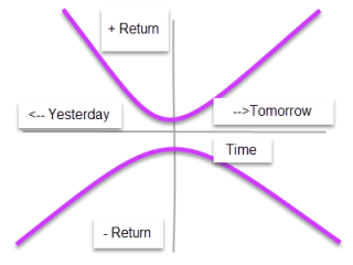
In a standard expenditures or spending model, personal saving is presumed to flow through the banking system into business investment.  This approach can be helpful in understanding changes in investment spending and the difference between planned and unplanned investment.  However, that model presumes that consumers have little choice in the direction of their personal savings; that these savings flows are controlled entirely by the investment spending decisions made by business owners. I proposed a different way of looking at savings – as a form of spending shifted backwards in time.  We anticipate different rates of return based on the amount of time we shift investment forward or backward in time.

Economist John Maynard Keynes proposed that one person’s income is some else’s spending.  In the private domestic economy then, consumption spending, investment and savings are forms of spending.  We can combine them into one simple accounting identity.

If these components of total spending add up to 1, then

If we subtract yesterday’s and tomorrow’s spending from total spending we get the percentage that is today’s spending.

This concept was proposed by Keynes as the Marginal Propensity to Consume, or MPC.  In the example below the MPC is .9.  If there is an extra $1 of spending in the economy, people will tend to spend 90 cents of that extra $1 on today’s consumption.

Where does that extra $1 of spending come from?  Keynes proposed that the government could step in and spend money when there was a lack of consumption spending in the economy.  Last week I said that I would cover the role that government plays in the economy but I will leave that for next week.

Keynes, Income, Spending

July 12, 2015

In the past few weeks, I have looked at savings and investment as forms of spending shifted in time.  Now let’s examine the idea of income.  We earn money, spend most of it, and hopefully save a little of it.

In the 1930s John Maynard Keynes proposed an income expenditure model to explain business cycles. (More here) Although Keynes’ model was mathematically simple by today’s standards, it showed an interlocking relationship between employment, interest rates and money.  Keynes popularized his ideas in lectures, debates and magazine articles.  Although he died shortly after World War 2, financial institutions and economic policies still bear his mark.  It was he who first proposed and then co-developed the framework for the International Monetary Fund (IMF) and World Bank.

One of Keynes many seminal insights was that one person’s income is another person’s spending.  If I decide to save $5 by not buying a latte at the neighborhood coffee shop, I am in effect putting my $5 in a savings account at my local bank.  But the coffee shop owner has $5 less in income.  $5 less in income is $5 less profit, keeping all else the same.  The owner of the coffee shop must go to the local bank and take $5 out of their savings account to make up for the lost income.  There is no net savings when a person decides to not spend money and we see the relationship between savings and profit; namely, savings = profit.

We are now ready to develop that insight of Keynes, that income = spending.  As we discussed in previous weeks, the amount that we don’t spend on current consumption is savings.  Savings = spending, either yesterday’s spending, i.e. an investment in someone’s debt, or tomorrow’s spending, i.e. an investment in someone’s future profits, or savings.  When we spend for tomorrow, we are effectively moving our savings into the future.  Likewise, when we spend for yesterday, we move our savings into the past to replace the savings that someone else did not have at the time they borrowed the money.

All of these categories – income, spending, saving, investment – are all forms of spending shifted in time.  Next week we’ll look at the GDP accounting identity and the government component of that equation.

*****************************

CWPI

The manufacturing sector stumbled during the harsh winter and strengthening dollar.  The service sectors fell somewhat but remained strong.  In June, the manufacturing sector regained strength, helping offset a slight slackening in the service economy.  The composite index remains strong in a several month growth trough.

Some are of the opinion that the stock market can be overvalued or undervalued.  In my opinion, liquid markets are usually fairly valued.  Expectations of buyers and sellers change, causing a recalculation of future growth and a change in valuations.  Comparing an index like the SP500 to a valuation model can help identify periods of investor optimism and pessimism.

I built a model based on a 930 average price of the SP500 in the 3rd quarter of 1997.  At the end of 2014, the 10 year total return of the SP500 was 7.67% (Source) which I used as a base growth rate modified by the change in growth shown by the CWPI index.  The CWPI measures a number of factors of economic growth but measures profits indirectly as a function of that economic growth.  Profit growth may outpace or lag behind economic growth and investors try to anticipate those varying growth rates when they value a company’s stock.

Until mid-2013, the SP500 lagged behind the model, indicating a degree of pessimism.  In 2013, the SP500 gained 30% and it is in that year that we see the crossover of investor sentiment from pessimism to optimism.  In the first six months of this year, the SP500 has changed little and we see the index drifting back toward the model, which was only 4% less than the closing price of the SP500 index at the end of June.

In hindsight, we can identify periods when investors were too exuberant and miscalculated future growth.  But we can only do so because in that future, profits and growth were not as hoped for.  That is the problem with futures.  We never know which one we are going to get.

Independence is Money

July 5th, 2015

In past weeks I have been digging into a perplexing problem.  Since early 2008, the Federal Reserve has heaped almost $4 trillion of government debt on its books and the supply of money has doubled, yet inflation remains subdued.  Why?

There are several measures of money. For several decades the Federal Reserve branch published Modern Money Mechanics (book or PDF). M1 is a measure of transactional money, and includes cash and money held in checking accounts. This category of money has doubled in the past 7-1/2 years.

Supply of money goes up.  Inflation goes up, right? From the Federal Reserve paper:

Assuming a constant rate of use, if the volume of money grows more rapidly than the rate at which the output of real goods and services increases, prices will rise. This will happen because there will be more money than there will be goods and services to spend it on at prevailing prices. [emphasis added]

If inflation is not going up, then the output of goods and services must be going up as much as the supply of money, right?  It’s not.

Some economists have argued that the various measures of money don’t measure demand for goods and services.  Rather, the money supply measures uncertainty.  Shown in the chart below is the annual percent change in both GDP and the M1 money supply.

The first thing we notice about the M1 chart above – when the growth in the money supply falls below zero, get worried.  People are too confident in the future.  It would be nice if we could craft a long term trading rule like “Buy stocks when the blue line crosses below the red line” but that has not been a successful strategy.  What does stand out is that money growth, the blue line, crossed above GDP growth, the red line, in the summer of 2008 and has not crossed below.  That is the longest period of time since this money measure began. Clearly, there is a lack of confidence among families and businesses.

In the quote from the Federal Reserve paper above, I passed over a key phrase that began the paragraph.  Yes, very sneaky of me to do that. The phrase is “Assuming a constant rate of use.” I wanted to focus separately on the growth in the money supply and the growth in GDP.  Economists often look at the rate of use of money to produce a given level of GDP.  They call it the velocity of money.  In the chart below, I have included the velocity of money, the ratio of GDP/MONEY (red line in the chart), and the amount of money in the system as a percentage of output, MONEY/GDP (blue line) to show how the two are mirror images of each other.

When economists worry that the velocity of money (red line) continues to fall during this recovery, they are worried that there is simply too much money sitting around for the amount of output in the economy (blue line).  Why are people and businesses holding over 17% of output in readily available money today? We are in a low inflation, low growth economy.  In the 1970s we held the same percentage of money but the ’70s was a high inflation, low growth economy.  The similarity of then and now is low growth.

In these past weeks I have looked at two places to put savings – yesterday’s spending, debt, and tomorrow’s spending, equity.  When people and businesses hold onto more money, which kind of spending are they investing in?  They are concerned about tomorrow’s income.  What does tomorrow’s income pay for?  Both tomorrow’s AND yesterday’s spending.

Next week – if saving is just a form of spending, what is income?

***********************

Employment

Good job numbers. Not good labor participation numbers.  Bill McBride at Calculated Risk did a good job this week of putting a long term perspective on the job numbers.  Underscores the theme I just touched on.  Low growth.  For 12 years, from 2000 – 2012, there was almost NO job growth and the effect of that does not pass quickly as things improve.  Caution prompts us to hold onto more money just to be on the safe side.