Price Plateau

October 30, 2016

Market watchers use several indicators to gauge the valuation of the broader stock market.  The P/E ratio (Price/Earnings), P/D ratio (Price/Dividend) and Shiller CAPE ratio (Cyclically Adusted Price/Earnings) are quite common and I will look at a fourth indicator, the percentage gain in the SP500 index over a six year period.  As we will see, when gains reach a certain height, there are two alternatives that follow:  1) a crash or other steep decline in price, and 2) a flattening of price for approximately 18 months.

Use of any of these indicators – PE, PD, CAPE or this one – would not have helped an investor avoid the 2008 crisis.  Why?  Because they gauge valuation.  The 2008 crisis was a financial crisis based on bad judgment and fraud.  At the time of the crisis, the index had  gained 40% in the past six year period, about the average six year gain over the past 140 years.

Average annual gain – 6%

The average annual gain is a bit under 6%.  The median gain is 29% over a six year period, or a 4.2% annual rate.  Add in the current 2% dividend rate and the median expectation is 6.2% annual gains in the stock market based on the past 140 years. Some public pension funds are still using 7.5% expected annual gains and that will probably be the next crisis in the coming decade.

Five Year Rule

Methodology. Why did I choose a six year period?  Did I run a bunch of simulations to get the most dramatic period?  No.  It’s the first number I picked and the reason I picked it is simple:  it is one year more than the five year rule.  Financial advisors will usually recommend that their clients do NOT keep money in the stock market that they will need in the next five years.  Why? The volatility in the market could cause an investor to sell at precisely the wrong time in order to access funds.  Even at the worst depths of the 2008 crisis, after more than 50% losses, the SP500 index was only 11% less than it had been six years earlier.  This is why advisors use the five year rule.

SP500 Data

Below is a chart of the percent gains in the SP500 index after a 6 year period.  I’ll call the six year gains “6Gain” to save some typing.  The data is courtesy of Robert Shiller who wrote the book “Irrational Exuberance” which first introduced the concept of the Shiller CAPE ratio, an inflation adjusted P/E ratio.
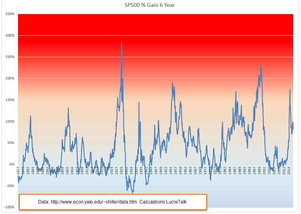
1929 Peak

Let’s look at examples of steep price declines when the percent gains have just gotten too high. The 1929 crash was truly historic.  That’s the highest spike in the chart above.  In November 1928, the 6Gain first crossed above the 150% mark that signals an strong overvaluation.  The market should have started to flounder but lax lending rules probably helped fuel further price gains.  Many people with acceptable credit could borrow money against stocks and many did, chasing the strong upward trend in the market.  Over the next ten months the market climbed another 20%.  The decline began in mid-September 1929 (Dow chart) but was seen as a well deserved correction to the summer exuberance. At the end of September 1929, the market had gained 284% in six years, the highest 6Gain on record and a percentage gain that may go unbroken.

…and Crash

In October 1929 the market continued to lose ground, forcing the sale of borrowed securities to meet margin calls.  Margin selling contributed to the downward momentum but the sustained selling woke investors up to the fact that the market had climbed too far and too fast.  The selling culminated in a gut wrenching 23% loss on Black Tuesday, October 29th (Account of crash – I disagree with the author on valuation).

Seeking Average

It took 18 months for the market to correct to a 6Gain that was average (39% over 140 years). By that time in May 1931, the market had lost 55% of its value.  From 1931 to 1936 any money invested in the stock market six years earlier had shrunk. In 1934, six year LOSSES, not gains, approached 60%. My parents grew up during the Depression and were taught that the stock market was a reckless gamble made only by rich people who could afford to lose some of their savings.

Black Monday

These overvaluation crashes are rare, thank God.  The next one came more than 50 years later, on “Black Monday” in  October 1987, when the index lost 20% in ONE DAY, almost as much as Black Tuesday in 1929.  At that time, the 6Gain was 169%.  I can still remember where I was when that one went down. Traders could not get some of their orders filled and that began a panic in the market. Some radio pundits warned of another depression.  I had no savings in the market but I was worried that my relatively new business would go belly-up. Most of the 24% lost in two months was done in that one day.  It took a whopping six years for the 6Gain to fall to average.

The Plateau

Those are the only two examples of severe price crashes because of overvaluation.  The more common result of overvaulation is a plateau, a flattening of prices for about 18 months, followed by by a fork – up or down.  The price plateau simply tells us that a fork in the road is coming.  The over-valuation tells us to expect a price plateau.

The dot-com boom

Let’s look at the dot-com boom in the late ’90s. At the end of 1994, the SP500 index closed at 460.  Less than six years later, in the fall of 2000, the index crossed above 1500, more than triple the price in that short six year period. The 6Gain peaked at 227%. At mid-1999 the SP500 started to stall out above 1350.  Promises of huge profits to be made by internet companies were beginning to evaporate as those companies burned through cash at an alarming rate in their effort to capture a segment of the market. It would take another year before the market peaked near 1500.  By the end of 2000, eighteen months on this rounded plateau, prices were about 1350 again.  For almost two years they declined till the index had lost more than 40% of its value.  Coincidentally, this low was reached when the 6Gain finally dropped to the 140 year median of 29%.

The Fabulous Fifties

Let’s look at some older and milder examples to develop some context. In mid-1955, the index had gained almost 190% in six years. It continued to climb for another 6 – 8 months before falling back.  In the spring of 1957, the index stood at the same level as it had eighteen months earlier.

In mid-1959 the index had gained almost 150% in six years.  The index lost 10% over the next 6 months but by early 1961, about 18 months later, the index had gained back its lost ground.

In mid-1938, we see the same price plateau after a six year gain of 150%.

Recent

As we can see on the chart, these 6Gain spikes are infrequent.  Now let’s look at the most recent spike in the 6Gain – March 2015.  The SP500 index was near where it is today.  In fact, this may be the flattest price plateau in history.  The stock market was overvalued but with bond yields so low, where was an investor to go?  Real estate, commodities, gold and other alternative investments have gone up and down the past 18 months as traders tried to take advantage of mis-matches between expectations and reality.  The trend for the average investor?  No trend.

During this 18 month plateau, the 6Gain has fallen to 82% – a good sign – but still twice the average 6Gain.   Wouldn’t it be nice if there was a law that the 6Gain must fall to the average before the stock market takes on a definite trend in either direction?  No such law.  What we do see with ironclad regularity is a price plateau when the 6Gain crosses above 150% and that the plateau lasts about 18 months.  It has been 18 months and we should be nearing the edge of that plateau.

Closing Thoughts

As October draws to a close, we may have three months in a row where the month ending price (Close) is less than the price at the beginning of the month (Open).  Normally, 3 down months in a row would be a sign of more pain to come but the differences each month have been negligible and could be pre-election hesitation.  There is enough to be hesitant about.  The Shiller CAPE ratio is about 26, 10 points above the median of 16.  Due to declining oil prices, profits in the SP500 aggregate of companies have fallen for five quarters in a row and…

The Election

Trump has been losing ground in recent polls, enough so that the Senate seems more likely to turn Democratic.  This Senate cycle favors Democrats who have fewer seats up for re-election than Republicans.  In 2018, the cycle will favor Republicans.  As the gap in the polls widens, some begin to fear that a rout in the Presidential race could cascade into the House where Republicans hold what seemed to be an impregnable lead of 60 seats (Wikipedia article).  If the Democrats should take the House, they will control the Presidency, Senate and House.  Tax increases on those with upper incomes would be a certainty for 2017, as Hillary has promised.  This could cause a rush of selling in 2016 to avoid higher capital gains tax rates.  An unlikely but not impossible scenario may be contributing to the hesitation.

Portfolio Mix

October 23, 2016

About 30 years ago, after a series of social security and income tax increases in the early ’80s, I had a spirited discussion with my dad about what I thought was a transfer of money from my generation to his.  Extremely low interest rates for the past eight years have reversed that process.  Millions of older Americans who have saved throughout their working years are getting paid almost nothing on that part of their savings held in safe accounts.  Older Americans take less risk with their savings and it is precisely these safer investments that have suffered under the ZIRP, or Zero Interest Rate Policy, of the Federal Reserve.  That money is implicitly transferred to younger generations who pay less interest for their auto loans, for their mortgages, for funds to start a business.

The chairwoman of the Fed, Janet Yellen, is at the leading edge of the Boomer generation born just after WW2.  No doubt she and other members of the FOMC are well aware of the difficulties ZIRP  has had on other members of her generation. Because the Boomers have been a third of the population as they grew up, they had a consequential effect on the country’s economy and culture.  Their income taxes have funded the socialist policies of the Great Society.  They have funded the recovery from the Great Recession.  Ten years from now politicians will regretfully announce that, in order to save Social Security, they must means test Social Security benefits to reduce payments to retirees with greater assets.  Once again, politicians will tap the Boomers for money to fund the policy mistakes that politicians have made for the past few decades.

//////////////////////////

Portfolio Mix

Each year Warren Buffett writes a letter to shareholders of Berkshire Hathaway, the holding company led by Buffett.  His 2013 letter made news when Buffett recommended that, after this death, his wife should invest their personal savings in a simple manner: 90% in a low-cost SP500 fund, and 10% in a short term bond fund, an aggressive mix usually thought more appropriate for younger investors.  Earlier this year, a reader of CNN Money asked if that would be a practical idea for an older investor approaching or in retirement.

After running several Monte Carlo simulations, the advice was NO, but the reason here is interesting.  The 90-10 mix does quite well but has a lot of volatility, more than many older investors can stomach.  An investor in their late 40s or early 50s who is making some good money might relish a market downturn.  Could be twenty years to retirement so buy, buy, buy while stocks are on sale.  If they go down more, buy more.

The sentiment might be entirely different if the investor is ten years older.  Preservation of principle becomes more of a concern.  Why is this?  Let’s look at a sixty year old woman who plans on working till she is seventy so that she can collect a much bigger Social Security (SS) check.  During her retirement years she will have to sell some of the equities she has in a retirement fund or taxable account to supplement her SS check.  However, the majority of those sales won’t take place for 15 – 20 years.  Why then is she more concerned about a market downturn than she might have been at 50 years old?  Do we simply feel more fragile at 60 than we do at 50?  I suppose it’s different for each person but, in the aggregate, older investors are more cautious even if the probability math says they don’t have to be as careful.

With two weeks to go before the election, the stock market has lost some of its spring/summer fire.  Looking back 18 months, the market has had little direction and is now about the same price it was in January 2015.  Companies in the SP500 have reported five consecutive quarters of losses, and the analytics firm Fact Set estimates that there will be a small loss in this third quarter of the year, making six losses.  Energy companies have been responsible for the bulk of these losses, so there has not been a strong reaction to the losses in the index as a whole.

BND, a Vanguard ETF that tracks a broad composite of bonds, is just slightly below a summer peak that mimicked peaks set in the summer of 2012 and again in January 2015.  However, this composite has traded within a small percentage range for the past two years.  In fact, the same price peaks near $84 were reached in 2011 and 2012.  Once the price hits that point, buyers lose some of their enthusiasm and the price begins to decline.  Most of us may think that bonds are rather safe, a steadying factor in our portfolio.  Few people are alive that remember the last bear market in bonds because this current bull market is about thirty years old.

Oil has been gaining strength this year.  An ETF of long-dated oil contracts, USL, is up about 15% this year.  Because it has a longer time frame, it mitigates the effects of contango, a situation where the future price of a commodity like oil is less than the current price.  As the ETF rolls over the monthly contracts, there is a steady drip-drip-drip loss of money. Short term ETFs like USO suffer from this problem.  Of course, long term bets on the direction of oil prices have been big losers.  In 2009, USL sold for about $85.  Today it sells at about $20. Here is a monthly chart from FINVIZ, a site with an abundance of fundamental information on stocks, as well as charting and screening tools. The site gives away a lot of information for free and there is a premium version for those who want it.

These periods of low volatility may entice investors into taking more chances than they are comfortable with so each of us should re-assess our tolerance for volatility.  In early 2015 there was a 10% correction in the market over two months.  How did we feel then?  The last big drop was almost 20% in the summer of 2011, more than five years ago.  The really big one was more than eight years ago and memories of those times may have dimmed.  If you do have easy access to some of your old statements, a quick look might be enough to remind you of those bad old days when it seemed like years of savings just melted away from one monthly statement to the next.

Yes, we are due for a correction but we can never be really sure what will trigger it and these things don’t run on schedule.  On a final, dark note – price corrections are like our next illness. We know it’s coming.  We just don’t know when.

The Political Battle

October 16, 2016

State and local governments provide the infrastructure of our daily lives, from the streets we drive on to the legal and judicial institutions that maintain a sense of order within our communities, yet we pay far more of our paychecks to a distant capital in Washington.  Why?  To understand we must look at a two century long battle of  opposing ideas, two ideological forces fighting for power.

We can judge the pervasive impact of state and local government by the amount of taxes that they collect to provide that infrastructure.  I’ll count the primary taxes –  sales, corporate and peronal income and property tax.  In the past four quarters, state and local governments collected $1.2 trillion, about 6.5% of the nation’s GDP.

On the other hand, Washington has a much reduced impact in our lives and, we might hope, an accordingly smaller tax bite.  Unfortunately, that is not the case.  In the past four quarters, the Federal Government collected almost three times the state and local amount, close to $3.6 trillion. (Chart link).  For the past eighty years, the Federal Government has assumed an ever larger role as a national insurance company. In the past year, the Federal Government collected $1.2 trillion – the same amount as primary state and local government taxes – in pension and medical insurance receipts alone. (Graph link)

The two major political parties in this country have different ideological approaches.  Democrats prefer to have the bulk of tax collections come into a central authority like the Federal Government, where a number of central committees decide on the allocation of those funds.  Republicans favor a system where the majority of tax collections come into the states.  Decisions over the allocation of those tax funds should be more responsive to the voters in that state.
 
In the Democratic system representatives from each state in both the Congress and Senate must vie with each other for access to tax funds under an ever growing number of programs that the Federal Government oversees.  States are administrative and geographical branches of the Federal Government and have limited autonomy. In the House, this competition exists within a system of seniority so that junior members must compete for favors from senior members who control committee assignments and access to discretionary funds.

The Republican system recognizes state borders and autonomy to a greater degree that promotes competition among states for the hearts, minds and pocketbooks of businesses and individuals.  Within each state, elected members of both parties should compete with each other for tax funds.  Because each state must adhere to a balanced budget by law, spending has more constraints than the Democratic system.

The responsibilities and powers of the Federal Government are more constrained under the Republican system.  When Article 1, Section 8 of the Constitution gives Congress the power to provide for the “general Welfare of the United States,” Republican politicians and conservative justices read the clause literally, that this provision applies to the states, not the people in the states.

Democratic politicians and liberal justices interpret the clause as meaning that the Federal Government has a direct responsibility for the welfare of each citizen within each state and gives the Federal government greater oversight of state and local communities, which are more easily influenced by local economic interests and disciminations. These two competing interpretations were hotly debated at the drafting and ratification of the Constitution so it is likely that the argument may never be resolved as long as this country exists.

Again let’s come back to that pot of money that makes our cities and counties go.  In the current system we take that same amount and give it to the Federal Government, which spends most of it on older people.  This massive transfer of resources from younger generations to an older generation is likely to permanently hobble our economic growth. Under a broader scope of social insurance programs, the people in European nations have reluctantly accepted the tradeoff of economic growth for increased sense of security in their personal lives – more health, job, educational and child rearing protections.  French people have become accustomed to a 10 – 12% unemployment rate.  In the U.S. such a high rate provokes political upheaval.

Do Americans want to follow the European model?  Half of the citizens of this country say yes, half say no.  What we do know from the European and Japanese models is that, as social insurance programs get larger, the transfer of money from the productive element of society to the less productive segment of society hampers growth.  This in turn makes it more difficult to fund those  insurance programs. There is a tried and true maxim that applies here – what can’t last forever, won’t.

Older Americans should understand that there is no social contract other than the informal contract of the ballot box.  Each generation pays into “the system” and waits until it is their time to collect.  Each generation relies on earlier generations to honor the promise but, just in case, the older generations vote far more than younger generations because they want to insure that pension (Social Security) and health (Medicare) benefit laws are protected.

Insurance companies must keep assets in order to pay future claims.  The Federal Government is not an insurance company and keeps no assets to pay future benefits.  Instead, it collects taxes under the Social Security system and puts those funds in the general pot of money, leaving a little slip of paper in the Social Security fund that says “We owe you.”  Really, it is little more than this – an accounting entry. From that big pot of money, benefits are paid.  This is a cash based system called “Pay Go” or “Pay As You Go.”  The lack of an asset base for future benefits means that it is extremely difficult to convert the current system to another type.  Former President George Bush learned this harsh lesson ten years ago when his political talk of privatizing Social Security ran into the harsh realities of actually making the transition. Oops.  Bush dropped the idea.

This election season is another episode in a continuing series, a battle between the forces who want the Federal Government to take an ever greater role in our individual lives, and those who want to roll back national control in favor of state, local and private solutions.  The election will take place shortly before the debut of the next Star Wars movie.  Some Republican voters see the Democratic vision of the political system as the Empire of rigid Federal oversight and conformity, where everyone must come under the authority of a central command.  Some Democratic voters may see themselves as part of the Rebel Alliance, fighters for the vision of the Old Republic, a constitutional democracy of worlds that is similar to the European Union, and, like the EU, was bogged down in bureaucracy.

On November 8th, 130 million people will unsheath their political swords and continue the battle. (Presidential election stats http://www.presidency.ucsb.edu/data/turnout.php).  Starting December 15th, more than 80 million people will fire up their light sabres at the coming Start Wars movie. (Star Wars box office stats).  En garde!

Third Quarter Rebound

October 9, 2016

Last month I reviewed the background and history of the CWPI index based on the monthly survey of purchasing managers.  I was a bit concerned that this index might continue to decline.  Instead it showed a big upsurge in new orders and employment in the service sectors, sending an index of these two components above its five year average. This may be a sign of a third quarter rebound after a lackluster first half of the year.

September’s stronger manufacturing survey lifted its index from the contractionary reading of the previous month. The CWPI composite of the manufacturing and non-manufacturing surveys is a smoothed average to dampen any month-to-month erraticness and give a truer picture of trend. Although the CWPI indicates strong growth, this is the longest period of time since 2011 that the CWPI has registered below 60, a mark of fairly robust expansion.

The height of this last wave was over a year ago, in August 2015.  The downward trend is stil in place but this month’s survey gives some hope of a turnaround.

////////////////////////////

Households

A Pew analysis of Census Bureau data shows that 18-34 year olds are living with their parents in even greater numbers – 32% – than during the Great Recession. This bests the previous record set in 1940, between the Great Depression and World War 2. In the EU, almost half of 18-34 year olds are living with their parents. In a consumer driven economy, growth depends on children moving out of their parents’ home to form new households, to buy furniture and home furnishings, to consume electricity and water, to pay property taxes and all the many expenses involved in running a household.  Here is a recent paper published by the Federal Reserve.

////////////////////////////

Infrastructure
There is not much that Hillary Clinton and Donald Trump agree on.  However, both candidates are calling for a big infrastructure spending program to repair roads, bridges, airports, dams, water pipes, schools, etc.  The American Society of Civil Engineers has given a D+ grade to this country’s  infrastructure and has estimated that $3.6 trillion of repairs are needed by 2020.  $3.6 trillion is the entire Federal budget, or about $12,000 per person.

A Liberal Idea Adopted by A Republican Candidate

It is unlikely that either candidate can get a bill through a Republican Congress.  In 2011, Robert Frank, Paul Krugman and several liberal economists called for a $2 trillion infrastructure spending bill.  The goverment could borrow at rock bottom interest rates, the repairs were needed and the spending would have been good for employees and businesses at a time when unemployment was 9% and real GDP had finally reached the same pre-recession level four years earlier.  Citing large budget deficits and a Federal debt that had increased 50% in three years, Republicans squelched any infrastructure bill.

The Current Distribution of Highway Trust Fund Dollars

Included in the price of each gallon of gas is a Federal excise tax that is paid into the Highway Trust Fund (HTF) to pay for repairs to the interstate highway system. The allocation of tax revenue is currently based on the amount of gallons of gasoline that each state sells but that presents another set of complications.  Exclusions to the allocation computation are jet fuel, fuel used by tribal lands and a host of other exceptions that are peculiar to each state.  This results in a spider’s web of adjustments to the gallons reported by each state. As you can imagine, the instructions for the adjustments are complicated.

Alternative Distribution Models

 An easy formula for distributing the tax revenues to the states could be a simple one: allocate the money based on the number of miles of interstate highway in each state.  But that would treat a low traffic route like U.S. 90 through Montana the same as the heavily traveled U.S. 495 running through part of New York City.  One suggestion has been to count only the interstate highways that pass through more than one state, and to exclude secondary highway routes designated by a three digit number.  For instance, US 495 is a route from US95 through New York City.  US 635 is a highway that goes around Dallas, Texas and connects with the primary north-south highway US 35.

An allocation scheme based on actual mileage driven has been proposed but would require the reporting of one’s travels to a government agency via a transponder, a step too far for many.  While newer cars and many trucks already have a GPS locator in the vehicle, the logistics and cost  of upgrading older commercial and passenger vehicles are daunting.

Twenty Years Without An Increase in the Highway Tax

The last increase in the Federal exice tax occurred in 1993 and efforts to rate the rate have met fierce resistance from Republicans, most of whom have taken an oath not to raise taxes of any sort.  Even though gas prices have come down in recent years, there seems to be little enthusiasm for bringing this subject back from the dead. (More info on the gas tax)

Every four years we have a Presidential election, a contest to choose the next Peter Pan who will magically overcome an entrenched bureaucracy, a recalcitrant Congress and a horde of fat cat lobbyists feasting on the power and money flowing into Washington.

Pool and Flow

October 2, 2016

A few weeks ago, I introduced two concepts: stock and flow. I’ll develop that a bit to help the reader analyze their portfolio with a bit more clarity.  To avoid confusion between stocks, as a type of investment, and the concept of a stock as in a reservoir or pool of something, I’ll refer to the concept as a pool and stocks as a type of investment.

Leverage

Each month we might check our investment and bank statements to find that the value has gone up or down.  In any one day only a tiny portion of stocks and bonds trade, yet these transactions determine the value of all the unsold assets, including the ones on our statement.  As I mentioned a few weeks ago, the flow from a reservoir of water determines the value of all the water in the reservoir.  It is like the butterfly effect, the idea that the fluttering of a butterfly’s wings in Mexico can cause a typhoon in southeast Asia.  In financial terms, when a small event has a large influence it is called leverage. A flow, a transaction, is the  catalyst for a transfer of value from one asset to another.

Let’s look at an example.  We buy a 1000 shares of the XYZ biotech firm for $10 a share, for a total investment of $10,000.  The next day the FDA announces that, contrary to expectations, they will allow a drug trial to proceed to Phase 3.  XYZ’s stock price rises 10% in response to the news.  The market price of our investment is now worth $11,000.  Where did the other $1000 come from?

Transfer of Value 

An asset value rose, so the value of another asset pool fell as the value is transferred from one asset to pool to another. Yesterday $10,000 of cash was worth 1000 shares of XYZ.  Today, that $10,000 of cash is worth only 909 shares of XYZ.  This is a different way of looking at cash – not as a liquid medium with  a stable value – but as an asset with an erratic value.

Cash = Investment 

What is cash?  It is an investment of faith in the United States.  We might give it a stock symbol like CASH and I’ll use that stock symbol to distinguish cash when it acts as an asset.  Stockcharts.com allows users to track the relationship between two stocks, or to price one stock in terms of another. We do by typing in the a stock symbol ‘A’ followed by a colon and a second stock symbol ‘B’.  Stockcharts will then show us the value of A priced in B units.  Below is the chart of Google (GOOG) priced in Apple (AAPL) units, or GOOG:AAPL.

On the left side of the chart in early 2014, Google’s stock was worth about 6.25 “Apples.”  By mid-2015, Google’s stock had fallen to 4.25 Apples.  Did Google’s value fall or Apple’s value rise?  Let’s imagine that we live in a world without money, as though we had taken the red pill as in the movie “The Matrix.”  Without a fairly constant measure like cash, we simply don’t know the answer to that question.  Imagine that each investor gets to choose which asset they want their monthly statement priced in and that our choice is Apple.  Over a year and a half, we see that we have lost about a third of the value of our portfolio of Google (6.25 / 4.25 = about 2/3).  We can’t stand the continuing losses anymore and sell our Google stock and get 4.25 units of Apple. It is now September 2016 and we still have 4.25 units of Apple because Apple is our measure of value.  Had we continued to hold the Google stock, we would have 7.29 Apple units.

What is CASH worth?

Now let’s turn to a slightly different example.  We are going to price CASH in Apple units, the inverse or reciprocal of how we normally do things.  When we say that Apple’s stock is $100, for example, we are pricing Apple stock in CASH units, or AAPL:CASH.  Instead we are going to look at the inverse of that relationship: pricing CASH in Apple units.  Remember, we are no longer in the matrix.

We begin with the same portfolio, 6.25 Apple units in early 2014.  We think that this CASH asset is going to do better than Apple, so we sell our Apple units for CASH and get 68 cash units for each Apple unit, a total of 425 cash units.  In mid-2015, we find that our CASH units are now worth only 3.5 Apple units.  We have lost about 45% in a year and a half!  We sell our CASH units and get 3.5 Apple units which is what we still have in this latest statement 15 months later.

Our losses are even worse than that.  Each year, Apple gives the owners of its shares another 2/100ths of a share as a dividend.  The owners of CASH get only 1/100th of a cash share each year.  Apple pays those dividends from its profits.  For owners of CASH, a financial institution pays the dividends from its profits. While the Federal Reserve, a creation of the Federal Government, doesn’t directly “set” interest rates it effectively does so through the purchase of bank securities.  Each dollar bill is equivalent to a share in an entity called the United States and it is ultimately the U.S. government that largely determines the dividend rate that is paid on safe investments like savings accounts.

Stock dividends compete with cash dividends

To remain competitive with safe investments, Apple only has to pay a little more than the very low dividend rate that savings accounts are currently paying.  If interest rates were 5% instead of the current 1%, Apple would have to devote more of its profits to dividends to appeal to income oriented investors.  By keeping interest rates low, the Federal government effectively allows Apple to retain more of its profits.  Where does Apple keep that extra money?  Overseas and out of the reach of the IRS.  That’s only part of the irony.  If Apple had to pay more of its dividends to the share owners, the share owners would pay taxes on the income. So the U.S. government loses twice by keeping rates low (See footnote at end of blog).

So CASH is effectively owning the stock of an entity called the United States, which doesn’t make a profit.  In the long run, owning the stocks of companies that do make a profit generates much more return to the owner.  Let’s look again at the leverage aspect of stocks and cash.  Earlier I noted the huge leverage involved in stock and other non-CASH asset transactions.  A tiny number of transactions affects the value of a large pool of assets.  On the other hand, millions of CASH transactions take place each day and have little effect on the nominal value of CASH.  So we price highly leveraged assets – stocks, bonds, etc. – in terms of an unleveraged asset – cash.

The functions of cash  

Cash plays several roles. First, as a medium of exchange, it acts as a measuring stick of economic flow in a society. This first role has a symbol – $.  Secondly, as an asset pool, CASH acts as a holding pond, a reserve in the waiting, the first in the asset reservoir to be tapped. Lastly, it acts as an insurance on the principal of other assets, like stocks and bonds.  Let’s call that INS.

Insurance

As an insurance, let’s consider a portfolio of $900 in stocks, $100 INS.  A 10% fall in stocks is reduced to a 9% fall because of the INS position.  Let’s consider the exact same portfolio, except that the investor’s intention is that the $100 is a CASH investment, a reservoir of asset buying power.  The same 10% fall in stocks is now a trigger for additional purchases.  In the first case the $100 is an anxiety reduction fee; in the second, a prediction of a market correction.

An investor might blur the distinction between the functions. Retired people who want to preserve the nominal value of their savings may tend to keep the majority of their nest egg in cash without distinguishing the different functions.  Cash = safety and liquidity. Because cash is used as a yardstick, its nominal value is kept constant.  But what that cash can buy, its purchasing power, changes.  When they need some of that CASH ten years from now, the purchasing power of that asset may have fallen by 30% but the nominal value is the same as it was ten years earlier.

Cash Analysis

As noted before, companies must make a profit or go out of business. Not so the U.S. government. Over time, the rate of a company’s profit growth must exceed the inflation rate, so that stocks give the best investment return in the long run.  Investors would benefit by separating their cash position into its functions, $ and CASH and INS, to understand more clearly what their intentions and needs are for the coming year.  This can be as simple as a piece of paper that we review each year.

Analysis Example 

An example – Cash needs:
1) income for the next year including emergency fund – $50K – $ function.
2) stock market seems awfully high and it has been a while since there has been a 10% correction – $100K CASH function.
3) $30K INS function to help me sleep at night in case there is more than a 10% correction.
Total: $180K.

Why write it down?  Believe it or not, we forget things.

////////////////////////

As a footnote:

Offsetting the tax losses to the government is the fact that some of Apple’s cash consists of cash-like equivalents like Treasury bonds which pay a very low dividend.  Apple loses income because of the low dividend and the U.S. government gains by being able to borrow money from Apple at low rates.