Returns and the Law of Averages

February 26, 2017

Value.  How do we gauge it?  What if we know that we are probably not getting the best value at the time?  What should we do?  A common metric used to value stocks – the Shiller CAPE ratio – indicates that we can expect lower returns in the future.  Should we change our behavior?

We calculate a Price/Earnings (P/E) ratio by dividing the current price of a stock by the last 12 months of the stock’s earnings. The Shiller Cyclically Adjusted P/E ratio (CAPE) searches for the signal amid the noisy static of quarterly earnings, the divisor in the P/E formula. Seasonal variations and the normal fluctuations in the business cycle give some erraticness to quarterly earnings. To uncover the signal, we divide the inflation-adjusted average of the past ten years of earnings. With that more stable figure as the divisor, we can more easily understand the variations in price relative to that stable base.

pevscape
As I wrote last week, the CAPE is at the third highest peak of the past century, just below the peak at the 1929 market crash.

Conclusion: stocks are seriously overvalued.

Argument: The past ten years of earnings include the financial crisis, the 2nd most severe downturn of the past century. That skews the CAPE ratio higher, so stocks aren’t overvalued.

CounterArgument: OK fine. Let’s use a 5 year CAPE ratio which excludes the financial crisis and the following two years. In the chart below, both ratios are shown. We are missing firm figures for last quarter’s earnings from S&P, but 82% of companies have reported earnings for the 4th quarter. Based on that known data, FactSet projects 4.6% earnings growth for the index as a whole. I have used that as a reasonably close estimate.

shillercape510comp
The 40 year average of the conventional 10 year CAPE, or CAPE10, is 20.8. The current CAPE10 is about 29 based on earnings estimates. The 40 year average of the 5 year CAPE, or CAPE5, is 19.6. The current CAPE5 is 24.8. Even the 5 year average indicates that the market is priced to perfection, about 26% more than the 40 year history.

Revised Conclusion: Based on the past 40 years of historical data, the market is over-priced, using both a short and long term approach.

There’s one more metric: ROI, or Return on Investment, a simple guideline that we can compute by excluding dividends and dividing today’s stock price by a previous price. For example, if I bought a stock at $100 on January 1, 2000 and sold it at $120 on January 1, 2005, I have made 20% / 5 years = 4% per year.

Over the past 40 years, the average of this simple 5 year ROI is 10.46%. The current 5 year ROI is 14%, 3.5% above the average. The 7% correction of last winter, from early January to early March, brought us to within range of the 40 year average.

Revised and Confirmed Conclusion: Mr. Market is over-priced.

There is a data tidbit that makes future returns a little bit more predictable, and it involves the law of averages. As I noted, the current 5 year ROI is computed by dividing today’s price by the price 5 years ago. Future ROI is a stock price 5 years in the future divided by the current price. In the 35 years from 1977 through early 2012, the average of the future ROI + current ROI is 10.9%, just slightly above the 40 year average of current ROI.

What this means is that if the current 5 year ROI is 14%, or 3.5% above average, there is a tendency toward a lower than average  return for the next 5 years. However, returns can be far above average and below average for an extended period of time. The dot-com boom from 1995 to 2001 had a series of extremely high 5 year ROI values, and might have convinced some investors that they were stock-picking geniuses.

roi95-01

Returns were astronomically high.  Unfortunately, the following 6 years from late 2001 to 2007 had low returns.

roi01-07
After several months of above average 5 year ROI returns, another 6 year depression on the heels of the financial crisis.

roi08-13
Conclusion with Reflection: For the long term investor (more than 5 years), a broad based index of stocks like the SP500 provides consistent returns that beat most passive investments. The cyclic ups and downs should not distract us from this central fact.  The law of averages can help us develop reasonable expectations of future returns.  By understanding the balance of above and below average, we do not become overly optimistic or pessimistic.



Money Flows

Since the election, the SP500 index has risen about 10%. A broad bond composite has lost about 3%. Investors are clearly willing to take on a bit more risk. Prices are generally a good indicator of trend, but let’s take a few minutes to look at the flows of money into various investment products to understand the shifts in sentiment and confidence.  In the first two weeks of February the flows of money have been staggering.

The Investment Company Institute (ICI) tracks (Stats) the money flows into long-term equity and bond mutual funds as well as hybrid funds that contain both stocks and bonds (Target date funds, for example).  ICI also includes data on ETFs that can be bought and sold like stocks during the trading day. To avoid confusion, I’ll use “products” to describe combined data of mutual funds and ETFs. These long-term products reflect investors’ broader outlook on the market and economy rather than a short-term trading opportunity. For most of 2016, investors withdrew money from equities. Since the election, there has been a surge of $45 billion into equity products, causing a surge in prices.

icifundflows2014-2016

Financial advisors recommend some combination of both stocks and bonds for most investors. Let’s look at the money flows into bond products over the past year. When investors withdraw money from stocks, they tend to put them in bonds or money market funds, a shift from risk to safety.

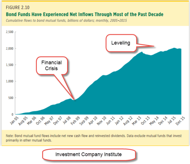
Older people are more cautious and have more of a preference for the price stability and dividends of bond products. The aging population and the painful memories of the financial crisis prompted a rush into bond mutual funds. The cumulative money flows into bond funds has increased from $500 billion in the summer of 2008 just before the financial crisis to over $2 trillion in 2015. (ICI chart)

icibondflows2005-2015

In the chart below we can see inflows into bonds during 2016, counterbalancing the outflows from equities. Since the election, investors have shifted $17 billion from bonds to riskier equity products. Not shown here was a further outflow of $20 billion from balanced hybrid products containing both stocks and bonds.

icibondflows2014-2016
Let’s review those totals. In November and December, there was a net INflow of $8 billion. Compare that with the $43 billion OUTflow in November and December 2015. Clearly, there was an increased appetite for risk. In 2015 and 2016, inflows into stock, bond and hybrid products declined rather dramatically from 2014’s totals.

icistockbondhybrid2014-16

In the first six weeks of this year, that lack of confidence has disappeared. Investors have pumped $63 billion into stock, bond and hybrid products, almost as much as the $74 billion invested in ALL of 2016. Should that pace continue – unlikely, yes – the inflow would be about $550 billion, far outpacing the inflows of 2014.  Over $40 billion of that $63 billion has come in during the first two weeks of February.  That is a $1.1 trillion annual pace. Where has this 2 week surge of money gone?  Half into equity – about $20 billion – and half into bonds -about $20 billion.

Had that money surge gone mostly into equities or mostly into bonds, I would be especially worried of a mini-bubble.  As I wrote last week, I am concerned that anticipated profits have already been priced in. Somewhat reassuring is the Buddha-like balance of flows – the “middle way.”

///////////////////////////

Tools

I have added some resources on the Tools page.  You can click on the menu item at the top of this page to access.  If you have any suggestions or additions, please let me know.


An Interest-ing Debt

February 12, 2017

Republicans used to talk about the country’s debt load but such talk is so inconvenient now that they control the House, Senate and Presidency. Perhaps it was never more than a political ploy, a rhetorical fencing. Now there is talk of tax cuts and more defense spending, and a $1 trillion dollar infrastructure spending bill. 48 states have submitted a list of over 900 “shovel-ready” projects.

House Speaker Paul Ryan used to be concerned about the country’s debt. Perhaps he has been reading that deficits don’t matter in Paul Krugman’s N.Y. Times op-ed column. For those of us burdened with common sense, debts of all kinds – even those of a strong sovereign government like the U.S. – do matter. The publicly held debt of the U.S. is now more than the country’s GDP.

debt2016q3

In 2016, the Federal interest expense on the $20 trillion publicly held debt was $432 billion, an imputed interest rate of 2.1%. Central banks in the developed world have kept interest rates low, but even that artificially low amount represents 11% of total federal spending. (Treasury)  It represents almost all the money spent on Medicaid, and more than 6 times the cost of the food stamp program. (SNAP)

The latest projection from the CBO estimates that the interest expense will double in eight years, an annual increase of about 9%. The “cut spending” crowd in Washington will face off against the “raise taxes” faction at a time when a growing number of seniors are retiring and wanting the Social Security checks they have paid toward during their working years.

In the past twenty years the big shifts in federal spending as a percent of GDP are Social Security and the health care programs Medicare and Medicaid. These are not projections but historical data; a shift that the CBO anticipates will accelerate as the Boomer generation enters their senior years. Ten years ago, 6700 (see end of section)  people were reaching 65 each day. This year, over 9800 (originally 11,000, which is a projection for the year 2026) per day will cross that age threshold.

cbospendcomp1996-2016
CBO Source

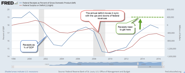
A graph of annual deficits and federal revenue shows the parallel paths that each take. The trend of the past two years is down, promising to accelerate the accumulation of debt.

fedreceiptsdeficit1998-2016

More borrowing and higher interest expense each year will crowd out discretionary spending programs or force the scaling back of benefits under mandatory programs like Social Security, Medicare and Medicaid. President Trump can promise but it is up to Congress to do the hard shoveling.  They will have to bury the bodies of some special interests in order to get some reform done.

[And now for a bit of cheer.  Insert kitten video here.]

We already collect the 4th highest revenue in income taxes as a percent of GDP. Canada and Italy head the list at 14.5%.
South Africa 13.9%,
U.S. 12.0%,
Germany 11.3,
and France 10.9 all collect more than 10%. (WSJ) Those who already pay a high percentage in income taxes will lobby for a VAT tax to increase revenues. Income taxes are progressive and impact higher income households to a greater degree. Poorer households are more affected by a VAT tax.  Cue up more debate on what is a  “fair share.” Many European countries have a VAT tax and the list of exclusions to the tax are bitterly debated.

Adding even more social and financial pressure is the lower than projected returns earned by major pension funds like CALPERS. For decades, the funds assumed an 8% annual return to pay retirees benefits in the future. In the past ten years many have made 6% or less. Several years ago, CALPERS lowered the expected return to 7.5% and has recently announced that they will be gradually lowering that figure to 7%.

Each percentage point lower return equals more money that must be taken from state and local taxes and put into the pension fund to make up the difference. Afraid to call for higher taxes and lose their jobs, local politicians employ some creative accounting to avoid the expense of properly funding the pension obligations. In a 2010 report, Pew Charitable Trust analyzed the underfunding of many public pension funds like CALPERS and found a $1 trillion gap as of 2008. (Pew Report) The slow but steady recovery since then may have helped annual returns but the inevitable crisis is coming.

In December 2009, I first noted a Financial Times Future of Finance article which quoted Raymond Baer, chairman of Swiss private bank Julius Baer. He warned: “The world is creating the final big bubble. In five years’ time, we will pay the true price of this crisis.”
That warning is two years overdue. Sure hope he’s wrong but … here’s the global government debt clock. The total is approaching $70 trillion, $20 trillion of which belongs to the U.S.  We have less than 5% of the world’s population and almost 30% of the world’s government debt.  As Homer Simpson would exclaim, “Doh!”

Correction:  Posted figure for 10 years ago was originally 9000.  Current figure was originally posted at 11,000.  Projected for the year 2026 is 11,000.)

///////////////////////

Market Valuation

Comments by President Trump indicating a “sooner than later” schedule for tax cuts helped lift the stock market by 1% for the week. The Shiller CAPE ratio currently stands at 28.7, just shy of the 30 reading on Black Tuesday 1929. (Graph) Since the average of this ratio is about 16, earnings have some catching up to do. Today’s reading is still a bargain compared to the 44 ratio at the height of the dot com boom. Still, the current ratio is the third highest valuation in the past century.

The Shiller Cyclically Adjusted Price Earnings (CAPE) ratio
1) averages the past ten years of inflation adjusted earnings, then
2) divides that figure into the current price of the SP500 to
3) get a P/E ratio that is a broader time sample than the conventional P/E ratio based on the last 12 months of earnings.

The prices of long-dated Treasury bonds usually move opposite to the SP500.  In the month after the election, stocks rose and bond prices went lower.  Since mid-December an ETF composite of long-dated Treasury bonds (TLT) has risen slightly.  A number of investors are wary of the expectations that underlie current stock valuations.

The casual investor might be tempted to chase those expectations.  The more prudent course is to stick with an allocation of various investments that manages the risk appropriate for one’s circumstances and goals.


Productivity And Labor Unions

February 5, 2017

About 10% of all workers, public and private, belong to a union. Today the percentage of private sector employees who are unionized is the same as in 1932, eighty years ago. (Wikipedia) The rise and fall of unon membership looks like the familiar bell curve, with the peak in the 1970s. The causes of the decline are debated but some attribute the erosion of union power as an important factor in wage stagnation.

The major factor is not declining union membership but declining productivity, and that persistent decline has economists and policymakers baffled.  Higher productivity should equal higher wage growth and, in the 30 year post-war period 1948-1977, multi-factor productivity (MFP) annual growth averaged 1.7%. MFP includes both labor and capital inputs. In the 40 year period from 1976-2015, MFP growth averaged about half that rate – .9%.

prodmfp1948-2015

In the debate over the causes of the decline, some contend that all the easy gains were made by 1980.  Productivity is now returning to a centuries long growth trend that is less than 1%. In an October 2016 Bloomberg article, Justin Fox picked apart BLS data to show that growth has been flat in some key manufacturing areas for the past three decades. The ten-fold surge in productivity growth in the tech sector is largely responsible for any growth during the past 30 years. OECD data indicates that other developed countries are experiencing a similar lack of growth (OECD Table) When no one can conclusively demonstrate what the causes are for the decline, policymakers face tough challenges and even tougher debate over the solutions.

//////////////////////////////

LoanGate

LoanGate may the next scandal. A few months ago, the Dept of Education (DoE) revealed that they had seriously undercounted student loan delinqencies because of a programming error. When the Wall St. Journal analyzed the revised data, they found that the majority of students at 25% of all colleges and trade schools in the U.S. had defaulted on their student loan or failed to make any repayment.  (WSJ article)

The Obama administration forced the closure of many private institutions whose students had low repayment rates. In 2015, Corinthian Colleges shuttered the last of its schools and filed for bankruptcy. The revised data show that many more institutions, both public and private, should be shut down.

This latest programming error at the DoE follows other embarrassing episodes during the two Obama terms. In October 2013, the rollout of Obamacare was riddled with programming errors that blocked many applicants from enrolling in a plan with healthcare.gov.

In 2010, the IRS delayed many applications for 501(c)3 tax status from mostly conservative political groups. Lois Lerner, the head of the agency, first claimed that these had been innocent clerical mistakes by an overworked staff, but a series of hearings uncovered the fact that employees at the IRS had acted on their own political feelings and deliberately targeted these groups. (Mother Jones)

In yet another incident, the Office of Personnel and Managment (OPM), the HR dept for thousands of Federal employees, revealed in 2016 a data breach involving 22,000,000 personnel records, including Social Security numbers.  Unchecked programming errors and data breaches erode the public’s faith in public institutions.  That these mistakes happened under a Democratic administration favoring ever bigger public institutions to solve ever bigger social problems is especially embarrassing.

When Obama first took office in 2009, the inflation adjusted total of student debt had quadrupled in the 15 year period (DoE paper – page 1) since 1993. By the time he left office eight years later, student debt had grown ten-fold to $1.3 trillion. The delinquency rate on that debt is 11% but the repayment rate is considered a better predictor of future delinquencies. The revised data reduced the combined repayment rate to a little more than 50% (Inside Higher Ed), far lower than the 75% plus repayment rates of a few decades ago.

The defaults are coming and there will be an inevitable call for a taxpayer bailout.  A popular element of Bernie Sanders’ Presidential platform was that a college education should be free. In the real world, nothing is free, so somebody pays.  Who should pay and how much will further aggravate tensions in an already divided electorate.

///////////////////////////////////

Five Year Rule

A few weeks ago I wrote about the 5-year rule, a backstop to any allocation rule. Any money needed in the next five years should be in stable assets like short to intermediate term bonds, CDs and cash. Why 5 years of income? Why not 2 years or 10 years? Answer: History.

Let’s look back at 80 years in 5 year slices, or what is called 5-year rolling periods. As an example, the years 2000 – 2004 would be a 5-year rolling period. 2001 – 2005 would be the next period, and so on.

Saving me the time and effort of running the data on stock market returns is a blogger at All Financial Matters who put together a table of this very data for the years 1926-2012. The table shows that the SP500 has held or increased its inflation adjusted value (very important that we look at the real value) almost 75% of the time. So the 5-year rule guards against a loss of value the other 25% of the time.

The 5-year rule can apply whenever there are anticipated income needs from our savings: retirement, college expenses, sickness or disability, and even a greater chance of losing our jobs. In a retirement span of 25 years, 6 of those years will fall into that 25% category. The 5-year rule minimum usually kicks in toward the end of retirement when a person’s reserves are lower and prudence is especially important.