A Choice of Money

July 30, 2017

Gresham’s law states that an overvalued form of money will drive out an undervalued form of money. Let’s say that both gold and silver are accepted as money and the government fixes a ratio of 1:20 between the two metals. One ounce of gold thus equals twenty ounces of silver. Let’s say that people and businesses hold ten times as much silver as gold. The exchange ratio that the government has set is higher than the ratio of the stores of the two metals. Gold is overvalued. Gresham’s law states that people will start using gold as an exchange medium to the extent that eventually silver will be driven out of circulation.

I wanted to explore this concept and substitute two things that are not currencies or commodities: liquidity and debt.  Liquidity is today’s money.  Debt is tomorrow’s money. Today’s money is stable and available.  Tomorrow’s money is not. As soon as money is loaned, it can’t be readily converted to cash.  It’s future money.

Gresham’s law is about people’s preferences and the value of money.  When millions of individual circumstances are added up,  a preference for liquidity or debt emerges. When tomorrow’s money is overvalued, people use it, and drive down the use of present money. “Don’t save up to buy what you want.  Buy it now with future money.  Here I’ve got some,” say businesses and banks.

Let’s look at two representations of present and future money.  M2 is a broad measure of the money supply that includes cash, checking and savings accounts, as well as money market accounts and CDs that can be quickly converted to cash. Future money is the amount of business and household debt.

During recessions (gray areas in the chart below), M2, the numerator in the ratio, goes up and debt goes down. Economists call this a greater preference for liquidity. Banks are more reluctant to lend money, which tightens credit and restrains the growth of debt.  People charge less and stick more money in checking and savings. Businesses don’t borrow to expand their operations and keep more cash on hand to pay present obligations.

In the chart below, I chart the ratio of the yearly change in today’s money, or what the Federal Reserve calls M2 money, and tomorrow’s money, the amount of business and consumer debt.

M2DebtCLIRatio1960-2007

In the recessions of the 1970s and 1980s, the graph shows what I would expect. There was a greater preference for liquidity and the ratio of present to future money rose above 1, a clear sign that people and businesses were worried about the future.  As the recessions ended, the ratio declined as debt, the denominator in the fraction, grew at a faster rate than M2 money, the numerator. The recessions of the early 1990s and early 2000s were fairly mild in comparison and the uptick in a preference for liquidity was mild.

The chart ends in 2007, just before the recession and financial crisis. Let’s now turn to that period. During the early part of 2008, the ratio began to climb to 1, indicating that people and businesses were preferring liquidity over debt. During the first six months of 2008, 700,000 jobs had been lost but this was only 1/2% of the workforce. Almost 300,000 of those lost jobs were in construction, which had become overheated by the building of so many homes. Retail sales growth had gone flat but was probably just a pause in the normal course of the business and credit cycle. Not to worry.

Then a funny thing happened to the economic engine of the country, something that had never happened before in post-WW2 America. The ratio spiked upward, registering nosebleed readings.
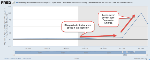
M2DebtCLIRatio2006-2008

The preference for present money continued upward but the change in debt, the bottom number in the ratio, plunged downward and this drove the ratio higher. The Federal Reserve began buying some of this debt until it held about $2 trillion.
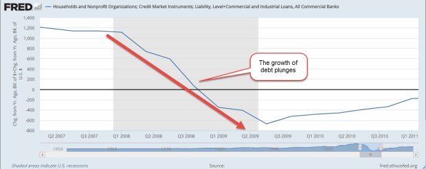
Debt2008-2010

As the change in debt turned negative, the ratio turned negative, a post Depression first. Month after month, old debts soured.  People and businesses shunned new debt. People who were saving more of today’s money were being offset by those who had to tap their savings accounts to make up for lost income. Toward the end of 2008, the economy lost as many jobs each month as it lost in total for the first six months of 2008. Retail sales dropped a few percent each month.

M2DebtCLIRatio2008-2011

Like a car whose brakes have failed, the ratio continued its downward slide. In a program called Quantitative Easing (QE_, the Federal Reserve began buying more debt in an effort to get this ratio into the positive zone.

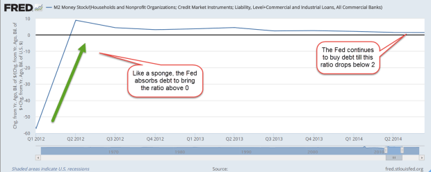
By the middle of 2012, the ratio broke into the positive zone as debt stopped contracting. The preference for liquidity was strikingly high, going up above 8, more than three times higher than the 2.5 level of the 1980s recession.
M2DebtCLIRatio2012-2014

The Federal Reserve continued to buy debt as the economy staggered to its feet.  In 2013, the stock market finally surpassed its inflation adjusted value at the start of the recession.  In the early part of 2014, the ratio of liquidity to debt, of present money to future money, finally fell below 2. At mid-2014, the Fed had accumulated $4.5 trillion in debt, $3.7 trillion of which had been added during the financial crisis. After 6-1/2 years, the number of people employed finally rose above its pre-recession level.  The Fed ended its debt buying program.

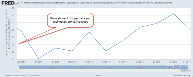
So where do we stand today? The stock market and house prices continue to make new highs but the current reading of this ratio show that people continue to prefer today’s money over tomorrow’s money.
M2DebtCLIRatio2014-2017

In short, the economy is still healing. During the expanding economy of the 1960s, the ratio was a bit over 1 for half the decade.  People who had grown up during the Depression were understandably a bit cautious. However, both present and future money grew at a steady rate during the 1960s. Today’s households and businesses have been scarred by the financial crisis and are cautious.  Into this cautious confidence, the Fed has a lot of debt to unload.  It must maintain a balance between money preferences as it feeds the debt it bought during the crisis back into the economy.
Reading the Signs

July 23, 2017

This week I begin with market volatility, or VIX, an index that reflects the price range of short term options on the SP500 index. As I wrote last week, the market has been on a wonderful ride down the river. The waters are strong but calm. No nasty rocks that might upset my raft. As Alfred E. Neuman of Mad Magazine asked, “What, me worry?”

How low can volatility go? The VIX is below 10, a level not seen since a brief moment in November 1993. The market makes new highs while volatility makes historic lows. Some warn of impending doom as though the market were the Titanic. Others predict Dow 30,000.

I’ll look at a 20 year period of both the VIX and the SP500 index, from 1990 to 2010. (If you are reading this on a cell phone, the few charts below will be more easily viewed by turning the phone sideways.) The period is marked by 3 strong price trends: 1) the extraordinary price rise in the late 1990s during the dot-com boom; 2) the 50% fall in prices from 2000 – 2003 as the bubble punctured and investment declined; and 3) the recession and financial crisis that began in 2008.

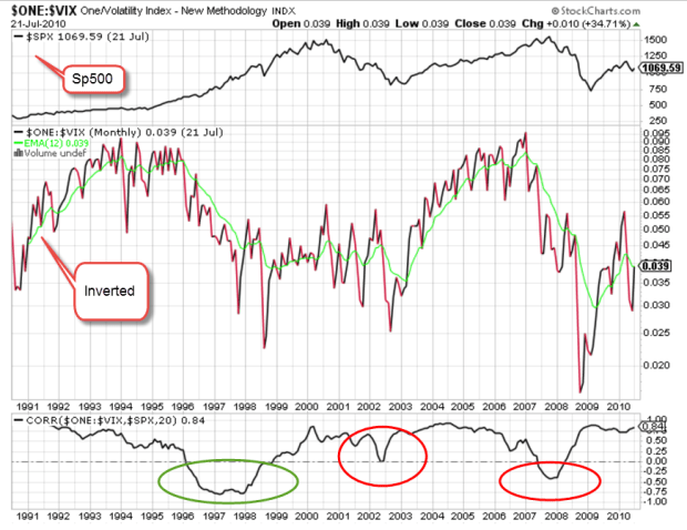
According to models, volatility should move inversely to stocks.  When one zigs, the other zags. By inverting a chart of volatility, I should see a volatility pattern that is somewhat similar to the pattern of SP500 index prices. I’ve added a chart of correlation between the two. I should expect to see a correlation of greater than 50 if things go according to the model.

For most of the twenty years, I do see what we expect. It’s those periods of unusual moves in the SP500 that the relationship breaks down. There is no consistency when the correlation breaks the model.

SPYVIXCorrelation
The green circle highlights the run up in prices of the dot-com boom. If I were to try to form a rule based solely on this mid-1990s behavior, I might say that when the VIX doesn’t behave inversely to prices, I should anticipate a run up in prices.

I’ll now take a look at the financial crisis years 2007 – 2009, the second red circle above. Just as in the late 1990s, the correlation veered away from expectations but this time prices moved in the opposite direction, falling 50%.  So much for my rule making.

The behavior is more complicated still when I look at the correlation pattern in the early 2000s.  The correlation wandered away from what I expected but never fell into the negative, yet prices also fell 50%.

Short-term options on the direction of the SP500 may offer no consistent clues to the long-term casual investor. But then again….maybe I should go long – averages, that is.

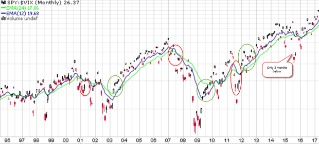
Below is a chart of SPY, a popular ETF that mimics the SP500.  Visual presentations can help me digest a lot of information and relationships. I have divided SPY by the VIX to get a ratio. If the top part of the fraction is supposed to go up when the bottom part of the fraction goes down, the resulting ratio should emphasize any price moves. Here I see a bit more predictability if I concentrate on the 12 and 24 month averages and disregard the noise. There is a lot of noise.

SPY-VIX1995-2017

The 12 month average (blue) runs higher than the 24 month average (green) in upturns and lower during downturns. The transitions may not always be as evident until I turn to the noise. When the current ratio runs below the 12 month average for several months, a downturn is likely. The opposite is true for an upturn. Here’s a chart with these turning points highlighted.

SPY-VIXTurnPoints

Some readers may occasionally want to check this pattern on their own. Without an account at stockcharts.com, someone can still call up weekly charts for free. Type in SPY:$VIX and call up the default daily chart. Above the chart, select the weekly button, then click the Update button to the right. Below the graph, change the default 200 day average to 100 and click Update. You should get a chart similar to the one below.

SPY-VIXWeeklyTurnPts

I have highlighted the turning points. Notice that there is a fairly consistent pattern. For the not so casual investors, you can bring up a daily chart and see similar turning points.

We have not had a 5% price correction in stocks for the past year. Here’s a chart showing twenty years of average performance during the year. We should not be surprised if we see a correction in the next few months but this market continues to befuddle even the most experienced investors.

Across the plains of Africa, the annual migration of wildebeest has crossed into Kenya. To tourists riding in jeeps through the grasslands, the movements of these animals may seem quite random and fragmented.  Tourists riding in hot air balloons above the plains can see the relationship between geography and the animals.  They can see the patterns of movement as the wildebeest follow the valleys and cross the rivers through the grasslands.  Likewise, a few charts of price and volatility can help us visually understand some part of investor behavior.

River Rafting

July 15, 2017

After a good year of snowfall in the Rockies, the rivers run strong. A popular spot for rafting is the Colorado River as it runs through the dramatic scenery of the Glenwood Canyon in western Colorado. Investing is a lot like rafting. We can’t control the amount of snowfall, the change in elevation, where the rocks are or the streams that feed into the river.

Our individual and group behavior on the river can help or hinder our progress. In a good year, rafting companies charge more for a rafting adventure. As more people come onto the river, we must pause in quiet water at the river’s side to give a safe distance between rafts. This crowding effect is made worse by stretches of river that require more caution to navigate. We can steer right or left to avoid some rocks but we are largely at the mercy of the river and each other.

Since the budget crisis in the late summer of 2011, the stock market has enjoyed a fairly strong run, more than doubling since that time. The financial crisis nine years ago was like a winter of extraordinarily deep snowfall. The Fed has kept interest rates abnormally low to thaw that snow, and equity investors have had a wonderful ride.

The Federal Reserve has committed to a series of gradual rate increases. Despite the low rates, people continue to pour their extra money into savings accounts and CDs. Wells Fargo is paying almost 1% below the Fed discount rate on their savings accounts. Why? As long as their customers are willing to accept savings rates of .3%, Wells Fargo has no incentive to raise rates. Discover, Goldman Sachs, American Express, Ally and Synchrony are paying about 1.15%, the Fed rate. (Bankrate) Savings account balances are near $9 trillion, more than double the balances in late 2007 before the recession began. The fear lingers.  Many people stand on the shore, too cautious to ride the river’s tumble and flow.

Until 2015, retail sector stocks (XRT) have been on a fast raft, quintupling from the market lows of March 2009. Over the past two years they have drifted into a side pool, losing about 20%. This year the stocks have been quite volatile as investors gamble on the future of the retail industry. Will Amazon continue to take sales from traditional brick and mortar stores?

June’s retail sales (RSXFS) were disappointing. Year over year growth was 3%, less than the 5 year average of 3.3%, and far below the near 5% growth of the 1st quarter. Excluding auto sales and auto parts (RSFSXMV), annual growth was only 2.4%, a 1/2% below the five year average and half of the 1st quarter rate.

The Trump administration and the Republican Congress have aimed for 3% real – inflation adjusted, that is – GDP growth. In an economy that depends so heavily on consumer sentiment, slowing retail sales will make that growth goal difficult to achieve.

For now, the sun is shining, the river is running strong and I am enjoying myself.  As long as I don’t look around the next bend in the river, everything looks fine!


Package Me

July 9, 2017

Two weeks ago I looked at a long term trend of consolidation and concentration. Technology companies now dominate the top spots in the SP500, the number of retail outlets is shrinking, the number of banks is dwindling, and the population itself is concentrating in urban areas. This week, I’ll look at a companion trend – categorization.

The essential business model of some leading technology companies is the selling of advertising to us and the selling of us – our interests and choices – to other companies. We are the consumers and the products. We are the components of the business models of companies like Facebook (FB) and Google.

A business model is a plan to provide and capture value. FB and Google provide value by connecting us to each other and to a vast trove of information, most of which we ourselves provide. FB and Google capture value by selling us. To sell us, the unique composite of all of our choices must be packaged into algorithmic categories.

We consume information and we are information. We are part of the network of information. When I travel, Google Maps tells me where I am and how to get where I want to go. Where is a grocery or sporting goods store along the way? Google knows. Within hours, Google has sold that information to companies who offer me deals on hotels and restaurants. I am part of the network.

Listen to a forty year old song from Pink Floyd, Welcome to the Machine. It is a cynical vision of being absorbed into the dream machine of the entertainment industry. This is a brave new world of information – and maybe some disinformation and some anger and scams and sexploitation but I want to focus on the positive.

As I drive to work or the store, I give a wave to the mobile purchasing unit in the car next to me. Hi, neighbor! I don’t mind that my entertainment, dining and transportation choices are for sale. I do mind that my political and religious beliefs are packaged and sold like commodities. That is the price that I pay for being in the information club.

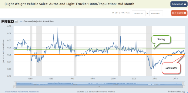
Talking about travel….annualized sales of autos and light trucks has fallen below 17 million for several months now. On a per capita basis, sales never reached the levels of past economic recoveries. We are buying about 5 cars for each 100 people, and that is less than the 5.8 cars we have bought in previous periods of economic strength. The auto industry would have to sell almost 19 million cars and light trucks each year to meet those per capita levels.

AutoSalesPerPop

I heard someone remark that cars are becoming like appliances. As I drive down the highway, I see that there are only a few body styles. Engineers have gradually perfected those designs that minimize wind resistance in order to increase gas mileage enough to meet EPA requirements. I drove next to a Ford Fairlane 500, a boat of a car from the era when car designers and advertising guys – always guys – teamed up and let their creative juices flow. Those were the days when a car was a signature. Now I drive down the highway in a category of vehicle. Hey, ma, look at me!

In order to sell me stuff, Google and FB need my attention. Unfortunately, I must devote a lot of my attention to driving. As a mobile purchasing unit, this is an unproductive use of my attention. A self-driving car will be the final step in the appliancification of the automobile. “Google, when will I arrive at work?” “In approximately 8 minutes.” Beam me up, Scotty.

Over a million people in the U.S. die in automobile accidents each year, and approximately 10% of the entire population are injured in a year. The major car companies have committed to having a driverless car by 2020 or soon after. The cost to add driverless capabilities is only a few thousand dollars. Some research companies are predicting (Motley Fool article) a gradual transition to driverless cars with 10% being fully autonomous in 15 years.

I think that the changeover will happen more quickly because Google and FB need my attention. Thousands of vendors want the dollars in my pocket to join the network. For the next 10 minutes only I can get a deal on a fresh pastry and a coffee at the Starbucks just down the street. Say or press “Yes” to accept this deal and my car will drive itself into the Starbucks’ drive-up lane.  Would I like to order ahead?  The car can do that for me. Well, sure.  Hey, I like this new world.

I wrote about consolidation and concentration a few weeks ago. Soon to come will be an integration to package us as mobile purchasing units. A big technology company could partner with or absorb a finance company to help me buy a driverless car in order to market to me. Google could subsidize a better interest rate on my auto loan or lease as a cost of packaging my choices to other vendors. I hear the sound of dollar bills stirring in my pocket. They want to be part of the network as well.

Next week, the stream and the pool…

Healthcare Quicksand

July 2, 2017

Last week I looked at the ten year anniversary of the iPhone. This week I’ll take a brief holiday look at a five year anniversary.

In June 2012 the Supreme Court ruled on the constitutionality of Obamacare. As expected, the vote was a close 5-4 decision. Many Republicans expected the five conservative justices to overturn the ACA on the grounds that the Federal government could not force people to buy insurance. John Roberts, the head justice on the court, sided with fellow conservative justices on this position at first, but the arguments of the liberal justices convinced Roberts that, regardless of the language in the ACA, the penalty for not having health insurance was a tax no matter what it was called. Roberts’ vote was the deciding vote in upholding the constitutionality of the act.

This interpretation was not without precedent. In 1937, the cout ruled that the Federal government could force people to pay Social Security insurance premiums. The reasoning was the same. Payments could be called an insurance premium or a penalty or an incentive. No matter the language that legislators used, the payments were a tax and well within the rights of the Federal government.

In 2012, Republicans released a position paper on healthcare legislation. The key features were: Affordable and accessible, no refusal of insurance based on pre-existing conditions, and allow people to keep the plan they have. Five years later, Republicans hold the Presidency, House and Senate, and are discovering the difficulties of implementing those simply stated principles.

Health care is almost 20% of the nation’s economy. There are many stakeholders. They are vocal and well funded. Because Republicans do not have a 60 vote majority in the Senate, the legislation must conform to budget rules that will permit a simple majority vote. In 2009, the Democrats had a 60 seat majority when they began the process of crafting the ACA and found that they had to make a lot of compromises. When Massachusetts Senator Ted Kennedy died in August 2009 and Republican Scott Brown won the special election to replace Kennedy, the Democrats lost their filibuster proof majority and had to make more compromises to get the ACA passed.

For seven years Republicans in both the Senate and House have run quite successfully on repealing Obamacare. Strong and principled opposition to the ACA has become less fervent.  Senators must appeal to a broader constituency than House members.  Some were reluctant to vote for legislation that could jeopardize the availability of health care for vulnerable seniors, children and low income families.

Senate Majority Leader Mitch McConnell had set a deadline for a Senate vote before legislators went to their home districts for the July 4th holiday but could not assemble the votes needed to pass the legislation. McConnell is still committed to the joint task of repeal and replace. He has rejected calls from some in his party to pass a repeal bill now and continue to work on replacement legislation.

There remain more legislative hurdles in the next few months but the most pressing is the raising of the debt limit.  The Treasury is already doing a few accounting tricks to pay bills but has notified Congress that even those tricks will no longer suffice by October.  For now, the market continues to shrug.

Last week I finished up with a teaser and I hope to have that fully developed by next week. For now, Happy Independence Day!