Who Owes and Who Owns

June 24, 2018

by Steve Stofka

Total debt levels are high relative to income, but the payments on that debt, the Debt to Income ratio, are at historic lows. Why? The absurdly low interest rates of the past decade play a significant role. What could happen as interest rates rise?

An explanation of terms first. The Debt to Income ratio (CFPB  page) measures the monthly flow of debt service payments to the flow of monthly income. Lenders use this ratio to judge the capacity of a borrower to repay a loan. Let’s call this ratio DTI.

The aggregate household debt to income ratio measures the pool of total debt to the flow of yearly income. Lenders and economists use this measure to assess the leverage of income, i.e. how much debt can the average income buy? Let’s call this ADTI.

As the DTI rose to historic highs before the recession, the average household was paying more than 13% of their disposable income to service their debt.  7.2% of that was mortgage payments. After the recession, the DTI has fallen to historic lows just above 10%. 4.4% of that was mortgage payments, which are near historic lows. Rock bottom interest rates have been the chief factor in that reduction. The percentage of disposable income going to non-mortgage debt payments have remained stable at 6%.

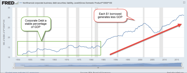
The ADTI shows the leverage of income to debt. Before the recession, each household had debt to income ratio of 1.2:1 (1.2 to 1), as shown in the chart below. (Federal Reserve paper).  The aggregate debt to income ratio is now 1:1. During and following the recession, some households reduced their debt voluntarily; some had their debt reduced involuntarily through home foreclosure and credit card debt write-offs. Although the current ADTI level is just about 1:1, this is far above the debt levels of the 1980s and 1990s when the ratio fell as low as .6:1. Households have transitioned from overleveraged before the recession to fully leveraged after the recession.

DebtToIncomeAgg

Households with higher incomes are more leveraged and raise the aggregate ratio of debt to income. Those with lower incomes have less credit available to them and less debt. They lower the aggregate ratio. Lower income households may not qualify for a mortgage, the greatest source of most household debt and a point of high leverage. The current mortgage leverage is more than 3-1; a $77K income is needed for a $260K mortgage at 4.5% for thirty years (calculator).

To reach the average 1:1 ratio of debt to income using the example above, there must be $183K of income with no debt. For one $77K household to get overleveraged to get that mortgage, there must be fifteen households with $50K incomes who are underleveraged (.25:1 debt to income). Where are those people? Many of them are in rural areas, particularly in the vertical middle of the country and several mountain states. See the 2006 county map of aggregate debt to income in the Federal Reserve paper linked above.

“It’s the economy, stupid!” read the banner that James Carville posted in Bill Clinton’s campaign office during the 1992 election race. In a series of articles published in 2004, journalist Bill Bishop coined the term “the big sort” and published a book by that name in 2009. This is one more example of the sorting that is taking place in this country.

Many people in rural areas live a penny-wise life because they don’t like to be in debt. Some are living frugally because credit is not available to them. In either case, their low levels of debt relative to income are enabling those in urban and suburban areas to maximize their debt leverage. Those living in urban areas may complain – quite rightly – that they must borrow more than they would like because the cost of living in some cities is so high. Regardless, people in one set of circumstances and making do with less are effectively enabling the income to debt leverage of another set of people who are enjoying more. That dissonance adds to the cacophony of the current debate in this country.

Less Bang For The Buck

June 17, 20918

by Steve Stofka

There are two types of inputs into production, human and non-human. Over a hundred years ago, Henry Ford realized that he had to invest in his human inputs as well as his equipment, land and factories. Once he started paying his employees a decent wage, they were able to buy the very cars they were producing on Ford’s assembly line.

The total return on our stock investments depends on two inputs: dividends and capital gains, which is the increase in the stock price. Both are dependent on profits. Dividends are a share of the profits that a company returns to its shareholders. Capital gains arise from the profits/savings of other investors who are willing to buy the shares we own (see end for explanation of mutual funds).

In the past three decades, a growing share of total return has come from capital gains. Because of that shift from dividend income to capital gains, market corrections are harsh and swift.

In the 1970s, stocks paid twice the dividend rate that they do today. It took an oil embargo and escalating oil prices, a continuing war in Vietnam, the impeachment of President Nixon, a long recession and growing inflation to sink the market by 50% beginning in early 1973 to the middle of 1974.

In 2000, the dividend rate or yield was a third of what it was in 1973. Total return was much more dependent on the willingness of other investors to buy stocks. In 2-1/2 years, the market lost 45% because of a lack of investor confidence in the new internet industry, a mild recession and 9-11. Dividends act as a safety net for falling stock prices and dividends were weak.

In 2008, the dividend yield was about the same as in 2000. In 1-1/2 years, the market again lost 45% of its value because of a lack of confidence brought on by a financial crisis and a long and deep recession.

Other bedrock shifts have occurred in the past three decades. Corporate debt is an input to production. In the post-WW2 period until 1980, corporate debt as a percent of GDP was a stable 10-15%. $1 of debt generated $7 to $10 of GDP. Following the back-to-back recessions of the early 1980s until the height of the dot-com boom in 2000, that percentage almost doubled to 27%. Each $1 of corporate debt generated less than $4 of GDP.

CorpDebtPctGDP

Today $1 of corporate debt generates just $3 of GDP. Debt is a liability pool. GDP is a flow. That pool of debt is generating less flow. It is less efficient. In 1973, $1 of corporate debt generated 46 cents in profit. Now it generates just 30 cents.

To hide that inefficiency and make their stocks appealing to investors, companies have used some of that debt to buy back their own stock. This reduces the P/E ratio many investors use to gauge value, and it increases the leverage of profit flows.

Here’s a simple example to show how a stock buyback influences the P/E ratio. If a company makes a $10 profit and has 10 shares of stock outstanding, the profit per share is $1. If the company’s stock is priced at $20, then Price-Earnings (P/E) ratio is $20/$1 or 20. If that company borrows money and buys back a share of stock, then a $10 profit is divided among 9 shares for a per-share profit of $1.11. The P/E ratio has declined to 18. When the company buys stock back from existing shareholders, that often drives up the price, and thus lowers the P/E ratio further.

The P/E ratio values a company based on the flow of annual profits. A company’s Price to Book (P/B) ratio values the company based on a pool of value, the equity or liquidation value of the firm. If we divide one by the other, we get an estimate of how much profit is generated by each $1 of a company’s equity, or Return On Equity (ROE).

1982 was the worst recession since the Great Depression. Stocks were out of favor with investors and were at a 13 year low. In 1983, $8.70 of equity generated $1 of profit for companies in the SP500. Seventeen years later, at the height of the dot-com boom in 2000, companies had become more efficient at generating profits. $6 of equity generated $1 in profit. In the last quarter of 2017, companies have become less efficient. $7.30 of equity generated $1 of profit.

Let’s look at another flow ratio, one based on the flow of dividends. It’s called the dividend yield, and the current yield is 1.80, about the same as a money market account. I can put my $100 in a money market account or savings account and earn $1.80. If I need that $100 a year from now, it will still be there. I could use that same $100 and buy a fraction of a share of SPY, an ETF that represents the SP500. I could earn the same $1.80. However, if I wanted my $100 back in a year, it might be worth $120 or $50. A stock’s value can be very volatile over a short time like a year, and the current dividend rate does not compensate me for that extra risk.

Why don’t investors demand more dividends? After the early 1980s, economists at the Minneapolis Federal Reserve noted (PDF) that, on a global scale, companies’ profits grew at a faster rate than the dividends they paid to shareholders. The dividend yield of the SP500 companies fell from 6% in the early 1980s to 1% in 2000 (chart).

Those extra profits are counted as corporate savings. The same paper showed that global corporate savings as a percent of global GDP increased from 10% in the early 1980s to 15% this decade. Each year companies were adding on debt at a faster pace than during the post-war decades, but undistributed profits were growing even faster. The net result was an increase of 5% in the rate of corporate saving. Companies around the world were able to shift dividends from the savings accounts of shareholders to the savings of the companies themselves.

From the early 1980s to the height of the dot-com boom, stock prices increased more than ten-fold. Investors that had depended on company dividends for income in previous decades now depended on other investors to keep buying stocks and driving up the price. The source of an investor’s income shifted slightly from the pocketbooks of corporations to the pocketbooks of other investors. Investors adopted a shorter time horizon and now look to other investors to read the mood of the market.

The bottom line? If investors rely on each other for a greater part of their total return, price corrections will be dramatic.

///////////////

Notes: Price to Book (P/B) ratio was 1.5 in 1983 (article).
P/B graph since 2000
When mutual funds sell some of their holdings, they assign any capital gains earned to their fund holders. This amount appears on the mutual fund statements and the yearly 1099-DIV tax form.

A November 2017 article on share buybacks at the accounting firm DeLoitte


Study Dollars

June 10, 2018

by Steve Stofka

In the past forty years, inflation-adjusted per student spending on higher education has increased by 40%. Despite this, the number of tenured professors has fallen by half. Two-thirds of instruction is now carried out by adjunct faculty with no job security and few benefits. State and federal dollars subsidize workers training for the banking and insurance industries, but not those entering the construction and manufacturing industries. No wonder people express their grievances at government for a lack of funding (Alternet article) . Where is the money going? Maybe the question is: who is the money going to?

In 1940, just 5% of Americans had a four-year college degree (NCES, Dept. of Ed).  In 2015, 75 years later, a third of Americans reported having a college degree.

CollegeDegreePct

A few years after WW2 and the enactment of the GI Bill’s education benefits, 2.7 million were enrolled in a two or four-year degree granting institution. By 1959, enrollment had grown 33% to 3.6 million students (NCES). About 60% were enrolled in a public institution. According to the Bureau of Economic Analysis (BEA), total Federal, State and Local spending in 1959 was $12.4B, about $3400 per student in 2016 dollars.

In 2016, there were 20.2 million students enrolled in college, a third of them in two-year programs. They were sharing a pot of $241B federal and state dollars, about $12,000 per student. That’s inflation-adjusted dollars: apples to apples. Here is a chart covering the past 50 years.

EdSpendPerStudentReal

Confronted by escalating Medicaid costs and uncooperative taxpayers, the state portion of higher education spending has fallen over the past two decades.

StateLocalEdSpendPerStudent2016$

In Colorado, the taxpayer rebellion started in the 1990s when the Denver Post reported that a University of Colorado (UC) faculty member was retiring with an annual pension almost eight times the average yearly income in Colorado. The abuse has not stopped. Last year, the L.A. Times reported that UC continued to hand out generous pensions to faculty members.

In the 1990s, UC and other public and private universities planned that the future annual investment returns on their endowment funds would continue to be generous. They stopped making contributions to meet the future obligations of the equally generous pensions they promised to faculty. “Our accountants told us we would be all right,” was the lament of one city official in California. After a decade of rock bottom interest rates and single digit returns for college endowments, students, parents and taxpayers must now pick up the tab for the Polyanna thinking of politicians and college administrators.

In 1959, state and local governments spent 98% of higher education funding. In 2016, they spent less than 60%. Because public and private institutions are tax-exempt, state and local governments provide billions in forgone tax revenue that is not counted.

StateLocalPctEdSpend

About 9% of total spending goes to private for-profit institutions (NCES). Because the for-profit institutions grab headlines, some might think that they receive a greater percentage of education dollars than they do. I did.

Inflation-adjusted per student spending has risen 27% in the past twenty years. Where is all that money going? Not to today’s instructors. Less than a third of spending goes to instruction (NCES). About 40% goes to administration and student support.

Public and private non-profit institutions do not detail the expenses for maintenance and operation of their buildings and grounds, nor their interest and depreciation expenses. This gap is about 28-30% of spending, so we can conservatively estimate that they spend at least 25% of their budget on these items. As buildings continue to age, operations expenses will grow faster than the rate of inflation and eat up more education dollars. Each year, colleges and universities spend more time and dollars in their outreach to a growing cohort of “non-traditional” students.

An educational system designed for the children of the landed elite in the 19th century is trying to catch up to the needs of a diverse student population in the 21st century. That earlier system wasn’t much good to start with. That’s a topic for another time.  Entrenched political and financial interests now hinder any substantive changes in these institutions as they prepare the students of today for the world of tomorrow.

About 3 million students are graduating high school this year. Two thirds of those graduates are enrolled in a two or four-year college (BLS), and the majority are female. Out of every 100 college students, 56 are female (NCES). There are not enough state or federal educational programs to meet the skills training for the million students who will not go on to college this year, or the million who may drop out before getting a degree.

Discrimination – Education policy in this country subsidizes the training of workers employed by a large bank like J.P. Morgan Chase, but has little support for the workers in the construction and manufacturing industries. The subsidized workers at Chase are more likely to lose their jobs to automation than the unsubsidized workers at a large homebuilder like Pulte.

Fifteen percent of all employees are in the BLS category of Professional and Business Services. This percentage has grown from 8% of the work force in 1980. Employees work for private companies and government, enjoy lower unemployment rates and much higher incomes. (BLS profile ) The great majority have college degrees. College enrollees are attracted by these numbers, but the numbers are changing. The growth of this category in the 1990s lessened during the 2000s and has lessened again since the Great Recession. I’ve highlighted the trend changes in the graph above.

ProfBusSvcPctPayems

In the past year growth is relatively flat. The number of institutions with job growth has offset those with declining job growth.

ProfBusSvcEstablish
The world is changing rapidly, and for some the changes are too much and too quick. That reaction against change underlies the support for Donald Trump in the rust belt states.

Current college enrollees and graduates may find that they have prepared for a world that existed a decade ago, and will be materially changed a decade hence. The college debt is permanent but not the state of the job market. Be versatile, be flexible, be prepared.


Building A Peak

June 3, 2018

by Steve Stofka

First I will look at May’s employment report before expanding the scope to include some decades long trends that are great and potentially destructive at the same time. In the plains states of Texas, Oklahoma, Kansas, and Nebraska, summer rain clouds are a welcome sign of needed moisture for crops. That’s the good. As those clouds get heavy and dark and temperatures peak, that’s bad. Destruction is near.

May’s employment survey was better than expected. The average of the BLS and ADP employment surveys was 203K job gains. The headline unemployment rate fell to an 18 year low. African-American unemployment is the lowest recorded since the BLS started including that metric in their surveys more than thirty years ago. As a percent of employment, new unemployment claims were near a 50-year low when Obama left office and are now setting records each month.

During Obama’s tenure, Mr. Trump routinely called the headline unemployment rate “fake.” It’s one of many rates, each with its own methodology. Now that Mr. Trump is President, he takes credit for the very statistic that he formerly called fake. The contradiction, so typical of a veteran politician, shows that Mr. Trump has innate political instincts. A President has little influence on the economy but the public likes to keep things simple, and pins the praise or blame on the President’s head.

The wider U-6 unemployment rate includes discouraged and other marginally attached workers who are not included in the headline unemployment rate. Included also are involuntary part-time workers who would like a full-time job but can’t find one. Mr. Trump can be proud that this rate is now better than at the height of the housing boom. Only the 2000 peak of the dot com boom had a better rate.

Let’s look at a key ratio whose current value is both terrific and portentous, like a summer’s rain clouds. First, some terms. The Civilian Labor Force includes those who are working and those who are actively seeking work. The adult Civilian Population are those that can legally work. This would include an 89-year old retiree and a 17-year old high school student. Both could work if they wanted and could find a job, so they are part of the Civilian Population, but are not counted in the Labor Force because they are not actively seeking a job. The Civilian Labor Force Participation Rate is the ratio of the Civilian Labor Force to the Civilian Population. Out of every 100 people in this country, almost 63 are in the Labor Force.

While that is often regarded as a key ratio, I’m looking at a ratio of two rates mentioned above: the Labor Force Participation Rate divided by the U-3, or headline, Unemployment Rate. That ratio is the 3rd highest since the Korean War more, ranking with the peak years of 1969 and 2000. That is terrific. Let’s look at the chart of this ratio to understand the portentous part.

CLFUIRatio
Whenever this ratio gets this high, the labor economy is very imbalanced. Let’s look at some previous peaks. After the 1969 peak, the stock market endured what is called a secular bear market for 13 years. The price finally crossed above its 1969 beginning peak in 1982. In inflation-adjusted prices, the bear market lasted till 1992 (SP500 prices). Imagine retiring at 65 in 1969 and the purchasing power of your stock funds never recovers for the rest of your life. Let’s think more pleasant thoughts!

For those in the accumulation phase of their lives, who are saving for retirement, a secular bear market of steadily lower  asset prices is a boon. Unfortunately, bear markets are accompanied by higher unemployment rates. The loss of a job may force some savers to cash in part of their retirement funds to support themselves and their families. Boy, I’m just full of cheery thoughts this week!

After the 2000 peak, stock market prices recovered in 2007, thanks to low interest rates, mortgage and securities fraud. Just as soon as the price rose to the 2000 peak, it fell precipitously during the 2008 Financial Crisis. Finally, in the first months of 2013, stock market prices broke out of the 13-year bear market.

We have seen two peaks, followed by two secular bear markets that lasted thirteen years. The economy is still in the process of building a third peak. Will history repeat itself? Let’s hope not.

May’s annual growth of wages was 2.7%, strengthening but still below the desirable rate of 3%. The work force, and the economy, is only as strong as the core work force aged 25-54. This age group raises families, starts companies, and buys homes. For most of 2017, annual employment growth of the core fell below 1%. It crossed above that level in November 2017 and continues to stay above that benchmark.

Overall, this was a strong report with job gains spread broadly across most sectors of the economy. Mr. Trump, go ahead and take your bow, but put your MAGA hat on first so you don’t mess up your hair.

///////////////////////////////

Executive Clemency

This week President Trump pardoned the filmmaker Dinesh D’Souza, serving a five-year probation after a 2014 conviction for breaking election finance laws. He helped fund a friend’s 2012 Senate campaign by using “straw” contributions. D’Souza complains that he was targeted by then President Obama and General Attorney Holder for being critical of the administration. A judge found no evidence for the claim but if he didn’t see the conspiracy against D’Souza, then he was part of the conspiracy, no doubt. I reviewed the 2016 movie in which D’Souza unveiled the perfidious history of the Democratic Party and its high priestess, Hillary Clinton.