April 30, 2017
This week I’ll look at the savings, retirement and asset cycle, which all have a similar lifetime. Let’s look first at asset pricing.
Long term moving averages can serve as a safety benchmark for asset prices, and a 50 month, or 4 year average, is one such average. If the price falls below that very slow moving average, there has already been a sizeable repricing of that asset and there may be more to come. It should prompt some caution or review.
Here’s a recent example. In the summer of 2011, a basket of Brazilian stocks (EWZ) crossed below its 4 year average. Six years later it is just nearing that long term benchmark. Its been a long hard slog for long term holders of Brazilian stocks, and supports the recommendation that an investor keep funds needed in the next five years out of the stock market.
Emerging markets (EEM, VWO, VEIEX) just crossed above their 4 year averages and are now at the same price as they were in August 2008. This nine year “flatline” period came after a growth spurt from 2003 to 2007 when emerging market prices grew at 36% per year! Even after nine years of no growth, an emerging market index has returned 10.5% annually in the the past 14 years.
The S&P500 has fallen below its 4 year average twice in the past three decades. Once was during the dot com bust in 2002 and the financial crisis in 2008. Each time, the index stayed below that benchmark for two or more years. During the 1969 – 1982 bear market, the SP500 fell below that benchmark four times! During that downturn, the index gained only 15% in 14 years. After adjusting for inflation, the loss was 40%, or 3% per year.
Bond prices have been more stable and provide an anchor to a portfolio. Let’s compare the stock market to Vanguard’s total bond market index fund (VBMFX ). In the last three decades, the fund has NEVER fallen below its 4 year average. Dividend paying stock stalwarts like Johnson and Johnson (JNJ) can also serve as anchors since they fall below their benchmark less frequently than the SP500 index. When these stable stocks do fall, the price rebounds more quickly than broader indexes because investors are attracted to fairly reliable sales and dividends.
So how does a casual investor without a charting program chart a 4 year average? Stockcharts.com has free charts available. In the example below, I input “SPY,” a popular ETF that tracks the SP500 into the “Enter A Symbol” box on the upper right portion of the screen, then I clicked the Go button. Stockcharts displayed a daily chart for this ETF with default 50 and 200 day averages. Above the chart, I clicked the selection box from Daily to Weekly and pressed the Update button. I left the default 50 and 200 averages alone. The red line is now the 200 week, or approximately 4 year average. The blue line is the 50 week, or one year, average. The chart below is an example.
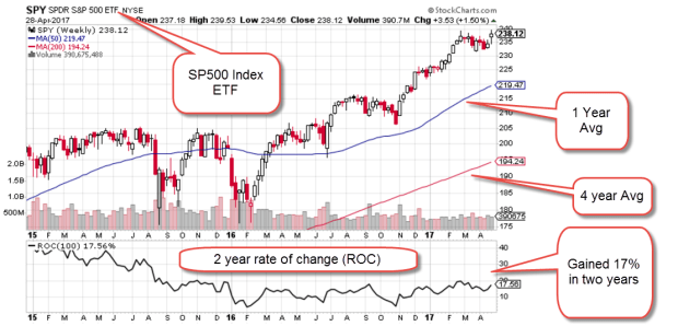
This particular screen shot includes a Rate of Change indicator in the pane below the chart. Set at 100 weeks, it shows the percentage gain over two years. Both gold (GLD) and mining stocks (XME) are struggling to get back above their 4 year averages. You can change the symbol and compare their graphs.
In the earlier example, emerging markets had a five year spurt upwards, then a nine year flatline. Let’s look at a broad index like the SP500 in inflation adjusted dollars and we will see a similar pattern. $100K invested in the SP500 index in January 1997 was worth $183K in real dollars, real buying power, in April 2000. That was almost a doubling in real value in a small time frame. Easy money!
In 2012, twelve bruising years later, that inflation adjusted portfolio value FINALLY rose above $183K. Here is a free chart from PortfolioVisualizer.com

In the past four years, we have had another 62% spurt upwards in real value. The length of these spurts and flat periods are unpredictable, but the flat periods last longer than the spurts.
Let’s go back to the previous twenty year period, from 1977 – 1997. In the first four years, from 1977 – 1983, the SP500 flatlined. In the following 14 years, the index grew by 570%! (Exclamation marks for these growth spurts.)

We can see now that the strong asset price growth from 1997 to April 2000 was in addition to the extraordinary price growth from 1983 to 1997. But doesn’t this example disprove the point I made earlier that flatline periods are longer than the growth spurts?
Let’s look back to those years before 1977 and we will see one of the reasons for that long growth period of the 1980s and 90s. The six year flatline from 1977 – 83 was the tail end of a much longer period of flat or declining asset prices that lasted for 14 years, from 1969 through 1982. The introduction of tax deferred IRA accounts brought many individuals into the stock market during the 80s and 90s and helped to lift stock prices. The introduction of the internet in the early 90s helped fuel a boom in asset prices much like the development of radio did in the 1920s.
Let’s turn from the long term 15+ year cycle of the stock market to the savings and retirement cycles. We spend at least forty years working. We may have just the last twenty years of our working career to save up for retirement. We hope to spend fifteen to twenty years in some stage of retirement.
We do not control when we are born nor the timing of these long term asset pricing cycles. An awareness of these cycles may help guide us to wiser allocation choices.
The Nobel economist Robert Shiller builds an inflation adjusted ten year P/E ratio (CAPE) that is meant to smooth the ups and downs of company earnings. If I get some time next week, I may construct a 20 year ratio that corresponds to the 20 year cycle of 1) saving for retirement, 2) spending in retirement, and 3) the long term ebb and flow in the stock market.
////////////////////
Margin Debt
Investors meeting certain liquidity requirements can borrow money from their broker to buy assets, including stocks. When stock prices start falling, investors without sufficient collateral in their brokerage accounts to cover the paper losses from falling stock prices may be subject to what is called a margin call. The broker simply sells some of the client’s stock to replenish collateral.
Here’s an example and I will make the figures simple to avoid some of the complex rules involved. An investor has $80,000 in stocks that she has bought and paid for. She applies for a margin account with her broker who agrees to loan her $100,000 to buy other assets. Thinking that the coming tax cuts will boost stock prices in the coming months, she buys $100,000 on margin in SPY, an ETF that replicates the SP500 index. Two weeks later, the European Union moves to disband in the coming months which makes investors very nervous and the stock market drops 20% in one day. Yes, I told you I would make it simple. The $80,000 in stocks that the investor owns outright is now worth $64,000 and the $100,000 of stocks she just bought on margin are worth $80,000. The brokerage automatically sells $20,000 of the stock at the lower price to cover the shortfall in collateral. This is known as a margin call. One margin call does not create a selling wave. Thousands of margin calls puts more downward pressure on stock prices and they continue to fall. This again requires more selling to meet margin calls.
Because margin debt can ignite a selling frenzy in a crisis, the amount of margin debt is monitored. Two years ago, the level of margin debt surpassed an earlier peak in 2000 at the height of the dot com bubble. A graph from Doug Short at Advisor Perspectives shows the tight correlation between stock prices and margin debt. After a brief decline, debt levels have again hit an all time high in real dollars.
There are a number of volatile situations around the world that could start a selling wave. The level of debt will naturally accelerate that selling. Now comes the news that there is a pool of margin debt that is not even reported and may add another 20 – 40% onto the reported total. Here’s an article from Business Insider.