Political Horses in Harness

January 29, 2023

by Stephen Stofka

This week’s letter is about the debt ceiling. It has been ten days since Janet Yellen, Secretary of the Treasury, began using “extraordinary measures” to pay federal obligations as the nation waits for Congress to raise the debt ceiling. The U.S. is the only country in the world that requires legislative authorization of its debt after the legislature has already authorized the spending, then appropriated the money for that expense.

Each year, the federal government and each of the states conducts an annual appropriations process that allocates money to each state or federal department or agency. By law, states must balance their budgets – in a pro forma manner, at least. They sometimes employ accounting mechanisms to defer expenses to a later year or accelerate revenues into a current fiscal year to achieve that balance. The federal government does not have a balanced budget constraint but Congress does occasionally play a dangerous game of budget “chicken” when it wants to send a message to the other party.

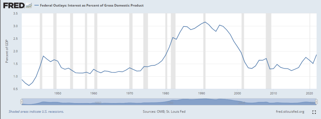
Political parties are ever conscious of their branding and each claims to be a good financial steward of the public’s taxes. Each claims that the other party is irresponsible. Paying the interest on the debt takes funding from other programs without doing anything. While this may be true and the interest on the debt is rising, it is less than 2% of GDP, far below the 2.5% – 3% of GDP during the 1980s and 1990s.  

The press, politicians and public argue over who is responsible and whether to cut programs or increase revenues. When Republicans are out of power, as they are now, they call for spending cuts. Democrats call for revenue increases, particularly higher taxes on the rich. When Republicans were in power from 2017-2019, they increased the deficit each year, ending 2019 with a deficit of almost $1 trillion. In 2020, the deficit was $3.1 trillion. A month after the 2020 election was over, Congress added another $920 billion for Covid relief. The Trump administration added $6.5 trillion to the debt, or 21% of today’s total debt of $31 trillion.

Shortly after Mr. Biden took office in January 2021, Congress passed the American Rescue Act which provided another $1.9 trillion in relief. The two relief packages before and after the start of Biden’s term added up to $2.8 trillion and was responsible for the entirety of the 2021 deficit of $2.775 trillion. The Republican House will pin the blame for the debt on the Biden administration and programs like Social Security and Medicare. When a party is out of power, they can indulge in what is called position-taking. The firebrand rhetoric is popular with the Republican base and, since there is no possibility that those programs will be cut, politicians can claim to be prudent or for small government. When a party is actually in power, politicians have to be careful with political blustering. Their constituents are more likely to think that such cuts are possible and will vote them out of office.

For forty years, the Republican party has run on a theoretical assumption that tax cuts will spur enough economic activity that the increased tax revenue will more than pay for the cuts. There is no evidence supporting that claim but claims do not need evidence to be effective at raising funds and winning votes. For almost sixty years, Democrats have touted federal social programs as a path to greater equality and equitability.

In any game of chicken, the danger is that neither side gives in. Relying on estimates of income tax revenue in the next few months, some economists project that Secretary Yellen can continue to take ever more extraordinary measures until June. At the last big debt limit showdown in 2011, people argued over the constitutionality of the Treasury printing a $1 trillion coin and handing it over to the Federal Reserve to cover any expenses, including interest payments and bond redemption. This year, the idea is again a popular debating point on social media.

Like the filibuster, the debacle of the debt limit debate continues because each party wants to have power yet check the other party’s power, a dilemma that neither can escape. They are two horses harnessed together pulling the wagon of state. With reins in hand, the public is under the impression that it is driving the wagon but it is not. The parties pay attention only to the harness that binds each to the other.  

/////////////////////

Photo by Jacek Ulinski on Unsplash

Investing, Not Gambling

January 22, 2023

by Stephen Stofka

This week’s post is about expectations, investing and gambling. After last year’s slump in asset prices, investors may be disappointed in the recent performance of their portfolio. A 60/30/10 (U.S. stocks/bonds/cash) had a 3-year return* of 3.65%. A 5-year return was 5.53%, according to Portfolio Visualizer (2023).  Investors tend to weight losses more than they do gains. Following portfolio losses during the financial crisis, many investors turned to more conservative assets, selling their beaten down stocks at a low. Following this past year’s selloff in both bonds and stocks, investors might be tempted to shed both. Let’s take a look at the averages.

Only three years out of the past fifteen has a balanced portfolio had a negative return. When a stock fund loses 35% in a year, investors can feel the loss so deeply that they liken stock investing to gambling. A gamble is a win or lose event with a high return and a low probability of winning, a probability so low that it outpaces any winnings I might get. For example, if I could bet a $1 and win a million, that is a 1,000,000 to 1 leverage. But my chances of winning might be 1 out of 300,000,000. Take that probability and turn it upside to get its inverse of 300,000,000 to 1. Compare that to the leverage and the ratio is 300 to 1. The gambler is at a distinct disadvantage. That’s how lotteries raise money for parks and common areas and how casinos stay profitable.

A prudent portfolio is not a win or lose bet but a series of erratic steps, the familiar model of the random walk. In any year, our expectations should be guided by historical averages, not the last erratic step. In the fifteen years since the year of the financial crisis, the average of the annual returns of a 60/30/10 portfolio, rebalanced annually, was almost 7.2%. (Note: this is slightly higher than the annualized growth rate). A more conservative 50/40/10 asset mix averaged 5.6%. Last year’s portfolio loss of 15.55% was unusual and not likely to be repeated. Investors who were spooked by market losses last year risk losing positive gains in the following years if they let one year’s return dictate their allocation targets.

Losses in both the stock and bond markets last year made rebalancing counterintuitive. In a simplified model, bonds go up when stocks go down. To rebalance, an investor sells some bonds and buys stocks, selling high and buying low. Likewise, when stocks climb, bonds show a negative return. For twenty years, Callan (2023) has charted seven asset classes and their returns, demonstrating the wisdom of asset diversification. In 2021, a mix of large and small cap stocks returned about 21% while a mix of domestic and foreign bonds fell 3-4%, depending on the mix. Rebalancing toward a target allocation, an investor would have sold some stocks and bought bonds. In 2022, both stocks and bonds had approximately similar negative returns. An investor may have found that their allocation changed little except that the cash portion of their portfolio might have grown a bit.

An unusual year like 2022 can distract or confuse an investor’s strategy. A casino or lottery wants to draw our attention to the unusual event – the win – and away from the average – the loss. If gamblers were to focus on the averages, few would play. Investing is the opposite of gambling and our focus should be trained on the averages.

//////////////////////

Photo by Kaysha on Unsplash

*CAGR – compound annual growth rate

Callan. (2023, January 16). Periodic table. Callan. Retrieved January 21, 2023, from https://www.callan.com/periodic-table/ Note: this chart ranks the annual returns of seven asset classes for the past twenty years. Go to the web site, then click the PDF link for the free chart.

Portfolio Visualizer. (2023). Backtest portfolio asset class allocation. Portfolio Visualizer. Retrieved January 20, 2023, from https://www.portfoliovisualizer.com/backtest-asset-class-allocation

Employment Curves

January 15, 2023

by Stephen Stofka

For millennia people have claimed a power of divination by various methods, including the casting of bird bones on the ground, the magic of numbers or certain word incantations. As the New Year begins, there is no shortage of predictions for 2023. Will the Fed taper its rate increases now that inflation has moderated? Will the U.S. go into a recession? Will falling home prices invite a financial crisis like the one in 2007-9? Will bond prices recover this year? Other animals see only a few moments into the future. We have developed forecasting tools that try to time-travel weeks and months into the future, but we should not judge a tool’s accuracy by its sophistication.

Statistics is a series of methods that constructs a formula explaining a relationship between variables. Each data point requires a calculation, a tedious task for human beings but a quick operation by a computer. Before the introduction of the computer in the mid-20th century, investors used simpler tools like the comparison of two moving averages of a time series like stock prices. These simple tools are still in use today. An example is the MACD(12,26) trend that compares the 12-day and 26-day moving averages, noting those points where the short 12-day average crosses the long 26-day average (Stockcharts.com, 2023). We can apply a similar technique to the unemployment rate.

In the chart below I have graphed the 3-month and 3-year moving averages of the headline U-3 unemployment rate. The left side of each column faintly marked in gray marks the beginning of a recession has noted by the NBER (2023). These beginnings roughly coincide with the crossing of the 3-month (orange) above the 3-year (blue) average. With the exception of the 1990 recession, the end of the recessions is near the peak of the 3-month orange line, after which unemployment declines. Today’s 3-month average is well below the 3-year trend, making a recession less likely. However, except for the pandemic surge of unemployment, the 3-month average is quite low and has been below the 3-year average for the longest period in history.

I did not do any laborious trial and error of various averages to find a fit. I chose these periods because they fit my story, something I wrote about last week. A 3-year average should provide a stable long term trend line of unemployment. A 3-month average should reflect current conditions with some of the data noise removed. The crossing should capture an inflection point in the data.

The low unemployment rate implies that workers have more wage bargaining power but wage increases have lagged inflation, robbing workers of purchasing power. If inflation continues to decline in 2023, some economists predict that wage increases may finally “catch up” and surpass the inflation rate.

There are two trends that have weakened the wage bargaining power of workers. Since World War 2, an economy dominated by manufacturing has transitioned to a service economy with lower average wages. In that time, the percent of workers employed in agriculture fell from 14% to less than 2% as production and harvesting became more mechanized. The labor market has undergone structural changes that may invalidate or weaken the lessons of earlier decades.

Since WW2, self-employment has declined. Half of those employed now work for large companies with 500 or more employees (Poschke 2019, 2). Few are unionized and able to bargain collectively for wages. According to the Trade Union Dataset (2023), most European countries enjoy much higher trade union participation than in the U.S. where only 10% of workers belong to a union. Large American companies enjoy a wage-setting power that smaller companies do not have and this enables them to resist wage demands. American workers do not have enough wage bargaining power to make a significant contribution to rising prices. Stock owners, able to move money at the stroke of a computer key, hold more bargaining power.

To keep their stock prices competitive, publicly traded companies must maintain a profit margin appropriate to their industry. Investors will punish those companies who do not meet consensus expectations. Company executives rarely take responsibility for falling profit margins. Instead, they blame rising wages or material costs, shifting consumer tastes or government regulations. Interest groups like the U.S. Chamber of Commerce, a private lobbying organization funded by the largest companies in America, champion a narrative that inflation is the result of rising wages, not rising profit margins. Like any interest group, their job is to assign responsibility for a problem to someone else, to convince lawmakers to act favorably to their cause or industry. The Chamber has far better funding than advocates for labor and it uses those funds to block policies that might favor workers.

There are economists and policymakers who still believe in the Phillips Curve, a hypothetical inverse relationship between unemployment and inflation. High unemployment should coincide with low inflation and high inflation with low unemployment. Shortly after Bill Phillips published his data and hypothetical curve, Guy Routh (1959), a British economist, published a critique in the same journal Economica, pointing out the flaws in Phillips’ methodology. The chief flaw was Phillips’ lack of knowledge about the labor market itself. Despite that, American economists like Paul Samuelson, who favored an activist fiscal policy, liked the implications of a Phillips Curve. Policy makers could fine tune an economy the way a car mechanic tuned a carburetor.

In the past year, some economists and policymakers have advocated policies to drive unemployment higher and wring inflation out of the economy. Despite rising interest rates, the labor market has been strong and resilient. In January 2020, Kristie Engemann (2020), a coordinator at the St. Louis Fed, explored the debate about whether this relationship exists or not. For the past five decades, the “curve” has been flat, a statistical indication that there is no relationship between inflation and unemployment. Policymakers will continue to cite the Phillips Curve because it serves an ideological and political purpose.

We don’t need statistical software to debunk the Phillips curve. In the chart I posted earlier, there were several points where the 3-month average unemployment rate was near or below 4%. These were in the late 1960s, the late 1990s, and the late 2010s. The inflation rate was 3%, 2.5%, and 1.4% respectively. If the Phillips Curve relationship existed, inflation would have been much higher.

As our analytical tools become more sophisticated we risk being fooled by their power. With a few lines of code, researchers can turn the knobs of their statistical software machines until they reach a result that is publishable. We should be able to approximate if not confirm our hypothesis with simpler tools.  

///////////////////

Photo by Augustine Wong on Unsplash

Engemann, K. M. (2020, January 14). What is the Phillips curve (and why has it flattened)? Saint Louis Fed Eagle. Retrieved January 13, 2023, from https://www.stlouisfed.org/open-vault/2020/january/what-is-phillips-curve-why-flattened

National Bureau of Economic Research. (2022). Business cycle dating. NBER. Retrieved January 13, 2023, from https://www.nber.org/research/business-cycle-dating

Poschke, M. (2019). Wage employment, unemployment and self-employment across countries. SSRN Electronic Journal, (IZA No. 12367). https://doi.org/10.2139/ssrn.3401135

Routh, G. (1959). The relation between unemployment and the rate of change of money wage rates: A comment. Economica, 26(104), 299–315. https://doi.org/10.2307/2550867

Stockcharts.com. (2023). Spy – SPDR S&P 500 ETF. StockCharts.com. Retrieved January 13, 2023, from https://stockcharts.com/h-sc/ui?s=spy  Below the price chart is the MACD indicator pane.

Trade Union Dataset. OECD.Stat. (2023, January 13). Retrieved January 13, 2023, from https://stats.oecd.org/Index.aspx?DataSetCode=TUD

U.S. Bureau of Labor Statistics, Employment Level [CE16OV], retrieved from FRED, Federal Reserve Bank of St. Louis; https://fred.stlouisfed.org/series/CE16OV, January 11, 2023.

U.S. Bureau of Labor Statistics, Employment Level – Agriculture and Related Industries [LNS12034560], retrieved from FRED, Federal Reserve Bank of St. Louis; https://fred.stlouisfed.org/series/LNS12034560, January 11, 2023.

////////////////////

Price Illusion

January 8, 2023

by Stephen Stofka

This week’s letter is about price illusions. The past two weeks I have written about the need to sort through past events to find the lessons. The past is a teacher, not a goal. Those who idealize and revere the past must eventually be swept down the drain of time. During this week’s struggle to elect Kevin McCarthy as House Speaker, the more conservative members of the Republican Party voiced their desire to return the country to the past of more than a hundred years ago when the population of 112,000,000 was a third the current size. Instead of learning from the past, we often use elements of history to tell a story. We discard events that do not fit our narrative. Historical analysis serves political interests. Asset analysis suffers from similar distorting strategies.

Technical analysis studies price movements with little regard for the circumstances that prompted the supply and demand, the buying and selling that underlie those movements. I will pick a few such variants at random. Elliott Wave theory bases its interpretation of price movement on the Fibonacci sequence of numbers. Beginning with 1, 1 this number series is constructed from the sum of the previous two numbers in the series. Thus 1 + 1 = 2, 2+1 = 3, and so on. This simple rule produces a sequence found in plant growth and the development of nautilus shells, for example.

Elliot Wave analysis claims that price movements come in waves. Understanding the current position within a wave can help an investor predict subsequent price action. The system is famously prolific in its prophecy, indicating several interpretations. It is better suited to a post hoc narrative. An investor can believe that if they just got better at interpreting the waves, they could time their buying and selling. As the physicist Richard Feynman said, “The first principle is that you must not fool yourself, and you are the easiest person to fool.”

Another technical system relies on the recognition of price trends, identifying those to follow and those that signal a likely reversal. These are visual and geometric, full of rising wedges, head and shoulders price patterns, double tops and bottoms. Much human behavior is repetitive, tempting an investor to perceive a pattern then extend it into the future. The repetition hides the recursive or evolutionary nature of human thinking. Inertia, Newton’s First Law of Motion, may apply to inanimate objects but not to human behavior. Biological systems have built-in dampeners that counteract a stimulus. Without repeated stimulus, the formation of any possible pattern decays.

Price behaves like a biological organism, not an inanimate object. We can see beautiful symmetries in graphical chart analysis but each pattern formation has a unique history. Price is the visible point of a response to events, needs and expectations. Price is a story of people. George Soros, a highly successful investor, constructs a predictive story, then watches price only as a confirmation or refutation of the story. If Soros thinks his story is not unfolding as he predicted, he exits his position.

In school we encountered various branches of mathematics where we were given formulas and plotted data points or intersections, the solutions to a set of equations. Statistics is the reverse of that process. We are given data sets and try to derive formulas to explain relationships within the data. A data set might be the test scores of students before and after the initiation of a certain curriculum. We may represent the test scores on a graph, but the scores reflect a complex set of individual behavior and circumstances, institutional policies, cultural background and economic resources. A statistical analysis tries to include some of these aspects in its findings. A student population is likely more homogenous than the companies in the SP500 stock index who represent a variety of industries. Just as test scores cannot fully explain the efficacy of a school policy or curriculum, asset prices do not reflect the complexity of a day’s events. In our longing for predictability and our fondness of patterns, we prefer analysis that explains price action as a rational sequence of responses to economic, political and financial events. Much financial reporting is happy to oblige.

//////////////////

Photo by FLY:D on Unsplash

Bray and Begone

January 1, 2023

by Stephen Stofka

This week’s letter is about an unusual year and the lessons we can and can’t learn from it. As I wrote last week, we must carefully sift through the unique circumstances in a time series to learn any lessons that we can carry into the future. Sometimes we bray at the passing of an unusual year and continue on our course. Other times, like 9-11 and the 2008 financial crisis, we sort through the debris of an unusual year to understand how we can avoid a repeat occurrence.

What made this year so unusual was the bond market’s loss of almost 13% in addition to the stock market’s loss of 18%. Normally, bonds zig when stocks zag but not this year. This year’s loss in the bond market was the steepest drop ever. This year has been a good test of an investor’s allocation but a long term perspective is encouraging.

During our working years we accumulate assets. In retirement we distribute the price appreciation and income from those assets. In a down market like this past year, a younger investor must balance the opportunity to buy assets at lower prices with the probability they will need liquidity, i.e. cash for living expenses. A basic recommendation is to have six month’s income in cash for emergencies and loss of job. Someone in an executive position might store up to two years of cash or highly liquid investments in anticipation of a much longer job search to find a comparable position.

This past year has tested retired investors who have relied on the historical stability of bond prices. An aggregate bond mix lost 12.8%, surprising investors who may have used bond funds as a substitute for cash funds that paid little interest in the previous years. A bit of historical perspective – in 1994, after five years of relatively low rates, the Fed began raising rates. An intermediate term bond fund lost 4.2%, while an average treasury bond lost 8% that year. The Fed has kept rates far lower and far longer than that five year period and the market reaction has been greater as well. A 60-40 portfolio (60% stocks, 40% bonds) has moderate risk and good long term returns, making it a choice of many money managers. That typical portfolio weighting lost 16.5% this year.

An asset’s ultimate value is measured in the goods and services that they can buy. Today’ retiree might live 20 – 25 years or more, tapping their assets for their income needs. A few months ago, Gupta et al (2022), researchers at McKinsey & Company, found that the SP500 index has returned about 9% since 1994, including the dot-com frenzy of the late 1990s. To measure the purchasing power of the SP500 index over a 23 year period, I adjusted the index by the CPI index in January 2000, near the height of the dot-com bubble. In that span of time, we have endured a dot-com meltdown, the Great Financial Crisis and its slow recovery, followed by a once-in-a-century pandemic and a disruption of the global supply chain. The wide adoption of the internet in commerce has prompted a fundamental shift in jobs and revenue. Despite those disruptions, the purchasing power of stocks has increased 1.8% above annual inflation since 2000. Including an average dividend return of 2.02%, the broad stock market has grown in purchasing power almost 4% every year.

The SP500 index is a compilation of companies that have survived tough economic conditions. Companies that fail the adversity test are discarded from the index and replaced by another company. It is like a game of “King of the Hill” that we played as kids but the stakes and price volatility are far  higher. A broad index of bonds usually offsets that volatility, sacrificing a little return for a big reduction in the value of a portfolio. In the past 23 years, a 500 index fund had a standard deviation – or wag of the tail – of more than 15%. According to Portfolio Visualizer (2022), a simple 60-40 portfolio had less than 10% deviation. That lack of volatility cost .25% per year in return, about the same as the annual cost to insure a house. Investors with a 6-30-10 portfolio, setting aside 10% in cash, paid an additional .25% less return in exchange for a slight reduction in price volatility.

For the first time since records began, bonds did not offset the volatility of stock prices this past year. Depending on their age, health, location and available resources, some investors have a greater tolerance for risk than others. Investors with exactly the same circumstances may perceive their risk differently and comparisons between individuals are difficult and ill-advised. Some investors feel more fragile, giving greater weight to unique outcomes like this past year. Others give more weight to average trends, taking comfort in the probability that this year was an anomaly.

////////////////////////////

Photo by Mary Farrell on Unsplash

Backtest portfolio asset allocation. Portfolio Visualizer. (2022). Retrieved December 31, 2022, from https://www.portfoliovisualizer.com/backtest-portfolio#analysisResults. Stocks: an SP500 index fund. Bond: an intermediate term broad bond fund. Cash: money market.

Gupta , V., Kohn, D., Koller, T., & Rehm, W. (2022, August 4). Markets will be markets: An analysis of long-term returns from the S&P 500. McKinsey & Company. Retrieved December 31, 2022, from https://www.mckinsey.com/capabilities/strategy-and-corporate-finance/our-insights/prime-numbers/markets-will-be-markets-an-analysis-of-long-term-returns-from-the-s-and-p-500