Jobs, Spending and Income

October 27th, 2013

Before I take a short look at the delayed release of the employment report this week, let’s look at the growth in personal income and spending, which move in tandem.  This is the y-o-y percent change in nominal after tax income and spending.

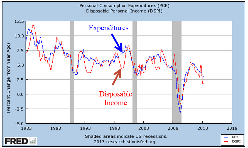
Income growth can be a bit more erratic than spending, bouncing around the more stable trend of spending.

The anemic growth in both income and spending has dampened hopes of a strong rebound of consumer spending.  The ratio of an ETF composite of retail stocks versus the overall SP500 market index shows the recent doubt.  Retail stocks have not participated in the larger market rebound.

A wholesale clothing sales rep I spoke with a week ago has noticed the caution in her buyers since mid-August.  In September, some in the industry laid the blame at the prospect of a government showdown.  For those of us in private business, the political shenanigans only muddy the water and make it difficult to read the consumer mood.  Reports of sales at major retail centers – about 10% of retail sales – showed strength this week after a month of lackluster growth.  Maybe it was the government shutdown.

However, the U. of Michigan Consumer Sentiment Index released this past Friday showed a sizeable drop in sentiment.

Was this decline in confidence due primarily to the shutdown or is this a forewarning of less than cheery holiday shopping season?  The knuckleheads in Washington are like people who stand up at a concert, blocking the view of those seated behind them.  The business community in general must plan around the politicians on both sides of the aisle in Washington who relentlessly pursue an anti-job agenda.  Politicians can puff and posture on their principles – like so many in government service, they are not subject to the constraints and discipline of profit and loss.  Sure, there are some whose intentions are good, who give their best effort but, unlike private business, their efforts and intentions are voluntary – a sense of personal virtue.  Most will not lose their jobs because of a lack of performance.  There are few incentives to improve efficiency.  In fact, it is the reverse.  The incentives are to promote more regulations, more layers of bureaucracy, as a program of job security and job growth in Washington at the expense of the rest of the country. Many of us in the private sector have the same sense of personal virtue but we also have that profit and loss whip.

Since the temporary resolution of the government shutdown and the raising of the debt ceiling, the market has shot up over 6% in twelve trading days.  The late release of September’s labor report showed less than expected net job gains of 148,000, which dashed any further fears that the Fed might ease their bond buying program this year.  The trends of employment growth have been fairly stable, with a few exceptions – health care, for one.

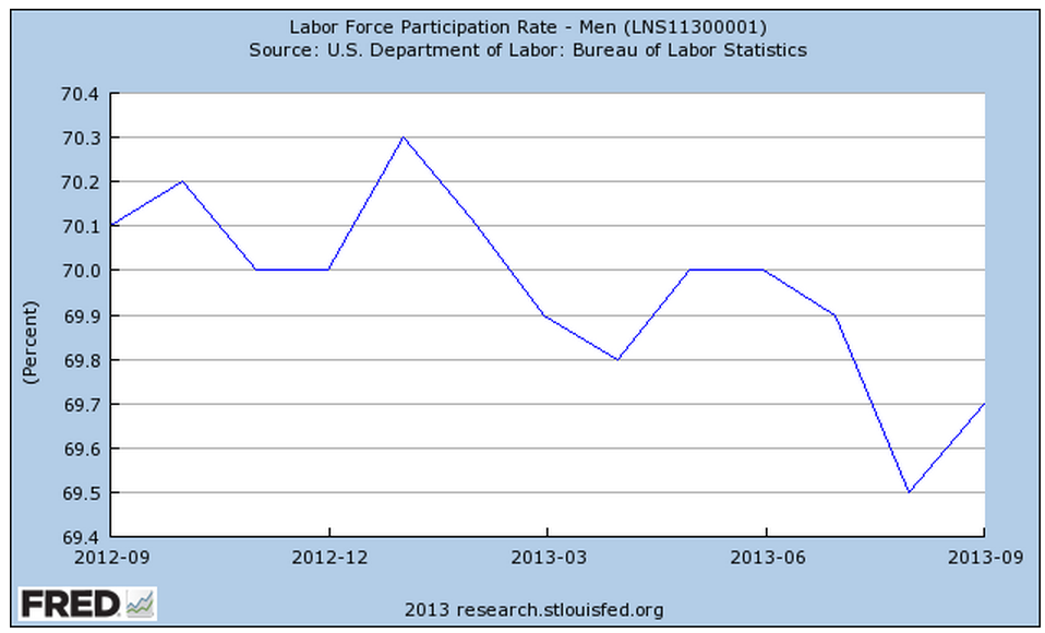
After six months of little growth, employment in construction rose by 20,000 this past month.

The rise in construction jobs helped the labor force participation rate for men, reversing a decline.

But the participation rate for the core labor force, those aged 25 – 54, shows no signs of reversing the decline of the past four years.

Demographic changes, combined with persistent job weakness among younger workers, is silently eroding the foundations of the Social Security system.  The older half of the population, particularly the Woodstock generation, are growing faster than the younger population, as this table from the Census Bureau shows.

From the Census Bureau report: “the population aged 65 and over also grew at a faster rate (15.1 percent) than the population under age 45.”  At the end of 2012, the Federal Government owed the Social Security trust fund $2.7 trillion (SSA Source)

The number of workers in the core labor force has declined by 5 – 6 million.

Let’s do some math.  [5 million fewer workers paying into Social Security each year] x [$8000 guesstimated combined annual contribution] = $45 billion per year not  collected.  This is just the Social Security taxes, not including the income taxes, on a portion of the population that represents two thirds of the work force.  That $45 billion represents the benefits paid to over 3 million people in 2012. (SSA Source) To put that figure in perspective, Congress is arguing over the medical device tax clause of Obamacare which is projected to raise just $29 billion over the next ten years.

It will take five to ten years for the crisis of funding to develop.  In the meantime, the budget debates will grow more contentious, politicians will pontificate at their podiums with more frequency and the clouds of these dusty debates will make it more difficult for business people to plan ahead.

Shoot Out At the OK Corral

October 20th, 2013

This coming Saturday is the 132nd anniversary of the gunfight at the OK corral.  We got our own OK corral in Washington and there was a whuppin’ this week – a Washington style whuppin’, which means that no one got whupped but everyone agreed on an appointment date for a  future whuppin’.

Congress passes a continuing budget resolution with the same frequency that many of us get our teeth and gums cleaned.  Many government reports were not released this past week but the National Assoc of Homebuilders (NAHB) released a very positive monthly report of the national housing market, showing a slight decline over the past few months last month but still a strong index reading of 55.  Two years ago this October, that index stood at 15.  In fact since the latter part of 2007, the index oscillated in the range of 15 – 20, so this has been a strong and sustained growth surge.

Over the past hundred years, house prices have risen at about the same rate as inflation, so that the real price of homes stays about the same.  Most homeowners finance their home purchase and it is this interest cost that determines the total capital cost of the home.  That capital cost and the interest cost is divided over the life of the mortgage into monthly payments.  PITI is a familiar acronym to many home owners and buyers; the initials represent the components of a monthly house payment. The ‘P’ stands for Principal – the monthly capital cost of the home.  The ‘I’ is interest on the amount of the loan.  The ‘T’ represents the local real estate taxes which are included in the monthly house payment sent to the mortgage servicer who forwards them on to the local taxing agency. The ‘I’ represents Insurance.  This can be both house insurance and, for those with an FHA loan, the amount of the loan insurance.  The interest rate on the home loan is a key component and although there has been an increase in mortgage rates since the spring, they are near all time lows.  A 30 year mortgage is a common benchmark.

Let’s index the CPI and the house price index to 1991 and look at the divergence.

Declining interest rates have enabled many more people to qualify for a home purchase, thus driving up home prices. In 1995, Congress made some major revisons to the 1977 Community Reinvestment Act, making home loans more available in distressed urban and rural districts.  This further exacerbated the rise in home prices, creating a large divergence between the CPI and the housing price index.

As every homeowner knows, the cost of a home includes maintenance, repairs, utilities, and improvements.  As I discussed last week , real median household incomes plateaued during the 2000s.  The rise in home values and changes in banking laws enabled homeowners to tap the equity in their homes to meet these additional obligations and to augment stagnant incomes.

In the past dozen years, many people discovered that housing is not a reliable source of income.  At the turn of the century, stock traders who quit their jobs to trade stocks during the tech bubble, discovered the same truth about the stock market, whose price returns are a few percent above inflation.  A nifty calculator at  DQYDJ illustrates the average returns of the SP500 over the past 100 years.


At the heart of the financial follies of past centuries is that a surge in price for some asset, be it tulip bulbs, Florida real estate or tech stocks leads people to conclude that they can hop on the gravy train.  What is the gravy train?  As an asset increases in value, more people invest in the asset bubble, the valuation continues to rise and – for a time – it is possible to convert a stock, a store of value, into a flow of income by either buying and selling the asset or borrowing money against the asset.  There is always some constraint – the rise of inflation, or the rise of personal incomes, or the growth rate of profits – that eventually brings an asset valuation down to earth.  Einstein famously quipped that the most powerful force in the universe was compound interest.  He might have mentioned  what may be the most powerful force – reversion to the mean.

The Outcome of Income

October 13th, 2013

“Use words not fists” a parent might say to a child.  For the second weekend during the government show down – I mean shut down, the children – er, representatives – in Washington have taken that to heart.  In a contest of dueling podiums, members of each party in both houses of Congress assure the public that their party is the reasonable one.  On Thursday, the market shot up on the news that – no, not a deal – but the likelihood that the two parties might talk to each other instead of mouthing platitudes and principles at their separate podiums.  About three weeks ago, speculative talk of a government shut down began to surface and where was the market after Friday’s close?  Back where it started three weeks ago and just 1.5% below the high on September 19th.

 In the Washington Irving tale, Rip Van Winkle fell asleep for twenty years only to wake up to a new United States of America.  In this version of the tale, an investor goes to sleep for three weeks, wakes up and there’s a whole new United States of Closed For Remodeling.  In a townhome association I belonged to many years ago, the tenants argued for several months over the choice of roofing contractor, color and style of roof for the townhomes.  A large Federal government may take a while longer.   In fact, it has been years since the Congress passed an actual budget.  The Treasury department used up the debt limit last May and has been running on fumes since then, grateful that the housing loan agencies Fannie Mae and Freddie Mac have been paying back some of the cash they “borrowed” from the taxpayers a few years back.

Because of the shut down there have been few government reports.  Commodities traders have been buying and selling in the dark,  guesstimating what the weekly and monthly government reports on the sales and production of corn and other commodities would have been if there had been an actual report.  We can only hope that traders have been fairly accurate.  If there are some notable surprises, duck.

There have been some private reports, one of them the monthly manufacturing and services reports from the Institute for Supply Management (ISM).  I updated the combined weighted index (CWI) that I have been showing the past few months.  Unlike the environment during the August 2011 budget negotiations, business activity shows strength this year and the resilience of the S&P500 index reflects that underlying strength.  Although 10 of 14 trading days were down, the index lost only about 4% from the recent high.

The CWI has been in expansion territory since the summer of 2009, which coincided with the NBER’s official call of the recession’s end.  You’ll notice that there is a rolling wave like movement to the index since then, an ebb and flow of strong and not so strong growth.  Since this is a coincident indicator of the fundamental strengths in the economy, it might not be a good predictor of short term market swings but has been a reliable predictor for the longer term investor.   Despite the recent highs in the market index, the market has been in a downtrend since the highs of thirteen years ago.  It is approaching the high set in 2007, a sign of renewed optimism.

The Federal Reserve recently posted up Census Bureau median household – not individual – income figures for the past thirty years.  Continuing on our theme from last week – the story we tell depends on how we adjust for inflation.  In this case, neither story is particularly cheerful.  Median household income adjusted for inflation using the Personal Consumption Expenditure measure has fallen  to 1998 levels, declining 7% from 2007 levels.

In 1983, the Bureau of Labor Statistics changed their methodology for computing the cost of owning a home, or owner equivalent rent.  Over the years, some economists and financial writers have made the case that the official measure of inflation, the CPI, overstates inflation.  This tells an even bleaker story: a decline of almost 9% from 2007 levels, an annual growth rate over 28 years  of just 1/4% per year.

Now, let’s compare the two.  Does the CPI overstate income by 5% or does the PCE Deflator understate inflation by the same amount?

The methodology influences many people in this country, from seniors on Social Security to working people who rely on cost of living increases.  Yet there will be more debate about whether the manager of a baseball team should put in a fastball pitcher who sometimes struggles with accuracy or go with a pitcher who throws less hard but has good location and change up.  There are political consultants who spend late night hours trying to figure out how to present the problem to the public so that they can understand it and get passionate about it.

The slow growth in household incomes arises because there is a greater supply of people who want work than employers offering work that people can or want to do.  Slow growth in the economy means less demand for labor, which puts downward pressure on the wages that workers can demand.  Smoothing the quarterly percent change in GDP growth for the past thirty years gives a clear picture of this less than robust growth.

While that may be the chief reason for slow income growth, the negative real interest rate of the past five years has played some role, I think.  When the economy is in a recessionary funk,  the Federal Reserve keeps the interest rate low to spur growth.  In the past two recessions, the Fed kept interest rates low for a considerable period of time after GDP growth began to rise.  Now it is easy to look in the rear view mirror at GDP growth, which is revised several times and may be revised again a year later as more information becomes available.  The Federal Reserve has to guess what the growth is and lately they have been overestimating the growth in the economy.

As long as the Fed keeps interest rates low, banks can make easy, safe profits in the spread between buying Treasury bonds and borrowing from the Fed and other banks.  There is less incentive for banks to take the additional risk of investing in business loans.  Although climbing up from the trough of several years ago, business loans in real dollars are still below the levels of mid 2008.

During the past twenty-five years, the rise and fall of commercial loans has become more pronounced.  Have the banks become that much more cautious at each recession, are businesses circling the wagons at the first hint of a downturn, and what part do low interest rates play?

This past week President Obama confirmed his pick of Janet Yellen as the new chairwoman of the Federal Reserve.  Larry Summers had been Mr. Obama’s first choice but Summers withdrew after learning that he would have a difficult confirmation process.  Although very smart, Summers is not a concensus builder.  Many in Congress and the market preferred Yellen to Summers.  Ms. Yellen takes a dovish stance, meaning that she is likely to further the current policy of low interest rates for the near future.  A cautious investor might want to rethink rolling over that 5 year CD that comes up for renewal in the next few months.  Rates are currently 1.5 – 2%, so that after inflation an investor is losing a little money.

Employment and Government Shut Down

Earlier this past week there were rumors that, due to the government shut down,  the Bureau of Labor Statistics (BLS) might not release the monthly employment report on Friday.  The employment report is probably the foremost key indicator that guides stock and bond market action as well as a prime metric used by the Federal Reserve in the determination of future monetary policy. On Thursday, the BLS confirmed that they would not release the report, which prompted a drop in the stock market, followed by an almost equal rise over the next day.

On Wednesday, ADP released a tepid 166,000 estimate of net job gains for September accompanied by a downward revision of their August estimate.  On Thursday, the weekly report of new unemployment claims held no surprise.  Traders probably figured that they had enough information to guesstimate the BLS number of net job gains – tepid growth a bit above the 150,000 needed to keep up with population growth.  In short, there was less likelihood that the Federal Reserve would be tapering their QE program before the end of the year.

So this is a good opportunity to take a look at some historical employment trends.  Measuring wage growth and inflation adjustments to wages is a complex task, far more complex than the gentle reader wants to delve into.  Labor economists crunch a lot of regional employment data gathered by the BLS.  Whenever there is a wealth of data, there is also a wealth of ways to treat that data, which data to focus on, etc.  Some economists focus on median compensation.  The median represents the middle, i.e. 50% of workers make more than the median, 50% make less.

In a 2011 paper published by the Economic Policy Institute (EPI), author Lawrence Mishel states  “Between 1973 and 2011, the median worker’s real hourly compensation (which includes wages and benefits) rose just 10.7 percent.”

“Real” means inflation adjusted but there are different methods used to calculate inflation.  One method, the Consumer Price Index, or CPI, has been changed over the years, making it difficult to make comparisons of data.

For a longer term perspective into the controversy over measurement, let’s turn to a graph of real output and total compensation per hour worked for the business sector.  Here we see a narrowing between compensation and output until output crosses above compensation in the mid-2000s.

The flattening of compensation growth is shown when we focus on the past twenty years.

But the hourly data seemingly contradicts the claim that there has been only an 11% increase in real compensation over the past forty years.  Looks like the total compensation of all workers has risen about 40% or more in the past forty years.  How can the median growth be so far below the total?  To understand that, a reader would have to examine the data sources behind the claim.  We might find that median weekly, not hourly, compensation has risen only 11%.  This could be due to more part time workers, or the rising percentage of women in the labor force who generally work fewer hours than men. What we do know is that a competent economist can find or crunch the data to prove his or her point.

The ability to work empirical magic with data often leads to contradictory claims by noteworthy economists.  The contentiousness of the discussion among economists baffles the intelligent reader.

Let’s return to that bugaboo mentioned earlier: measuring inflation. Twenty years ago, economists Brian Bosworth and George Perry noted the trending gap between output and productivity: “In an economy where real wage growth has paralleled the rise in productivity over the long run, this apparent divergence implies that the benefits of increased productivity have not been distributed in the expected way over the past two decades.”  A chart from their paper illustrates the trend.

A notable trend in the numbers is the steep rise of employee taxes and benefits, or non-wage employer costs.  Economists or politicians sometimes point to the decline in the real hourly wage over the past forty years, without bothering to note the growing non-wage costs of employment, a convenient omission.

Bosworth and Perry document problems and changes in measuring inflation in both consumption and output but noted that “the prices that workers pay as consumers have been rising significantly more rapidly than the prices of the products they produce.”  Further analysis by the authors shows that the wage growth in that twenty year period 1973 – 1993 did not flatten till after 1983.  They conclude that the major reason for the divergence is the difference between how inflation was measured before and after 1983. The authors recommended the use of a Personal Consumption Expenditure (PCE) deflator instead of the CPI, which overstates inflation relative to output.

Let’s look at wage growth over the past twelve years using two methods to see the difference.  The BLS calculates real wage growth using the CPI-U inflation index (Source).  Here is a graph from their data.

Now let’s use the PCE deflator to get a slightly different picture of the same Employment Cost Index.

Now let’s compare the two.

They tell two different stories.  Using the CPI inflation adjustment, the blue line, I could tell a story that wage growth has stagnated over the past ten years.  Using the PCE inflation adjustment, I could tell a story that wage growth has stagnated since the financial crisis.

Now imagine a politician who wants to bash the policies of former President George Bush and exalt the policies of the current administration.  That politician would use the blue line to tell the story of how the Bush Administration undercut the wages of American workers and that this led to the worst recession since the Great Depression.

On the other hand, if a politician wanted to criticize the Obama administration, she would point to the red line.  Worker’s wages grew during the Bush years.  Since Obama took office, wages have stagnated, indicating that Obama’s policies are hurting American workers.

Thus a dense and complicated argument on how to measure inflation becomes a talking point for a politician.  Even worse, noteworthy and popular economists who understand the difficulties of measuring both employment and inflation choose one line or the other to tell a simple story based on their own bias.

During this ongoing government shut down, we will hear a lot of spin and invective.  The profusion of TV, radio and internet media sources ensures that anyone can choose exactly – to a ‘T’ – the version of reality that they want to hear.  Of course, our sources and opinions are unbiased and perfectly reasonable.  But can you believe what the other side is saying?  Boy, are they crazy!