Marching Forward

April 28, 2019

by Steve Stofka

When former President Obama took the oath of office, the economy was in the worst shape since the Great Depression 75 years earlier. Tax receipts plunged and benefit claims soared. Millions of homes and thousands of businesses fell into the black hole created by the Financial Crisis. In sixteen years of the Bush and Obama presidencies, the country added $16 trillion to the public federal debt, more than tripling the sum at the time Clinton left office in early 2001.

Although growth has remained slow since the financial crisis (see my blog last week), the economy has not gone into recession. Despite the fears of some, a recession in the next year does not look likely. The chart below charts the annual percent change in real GDP (green) against a ratio called the M1 money multiplier, the red line (Note #1). Notice that when the change in GDP dips below the money multiplier for two quarters we have been in recession.

The money multiplier seems to act like a growth boundary. While some economy watchers have warned of an impending recession, GDP growth has been above 2.5% for more than a year and is rising. In 2018, real disposable personal income grew nearly 3%. This is not the weak economic growth of 2011 or the winter of 2015/16 when concerns of recession were well founded.

The number of people voluntarily quitting their job is near the 1999 and 2006 highs. Employees are either transferring to other jobs or they feel confident that they can quickly get another job. An even more important sign is that this metric has shown no decline since the low point in August 2009.

In 2013, the Social Security disability fund was in crisis and predicted to run out of money within a decade. As the economy has improved, disability claims have plunged to all-time lows and the Social Security administration recently extended the life of the fund until 2052 (Note #2).

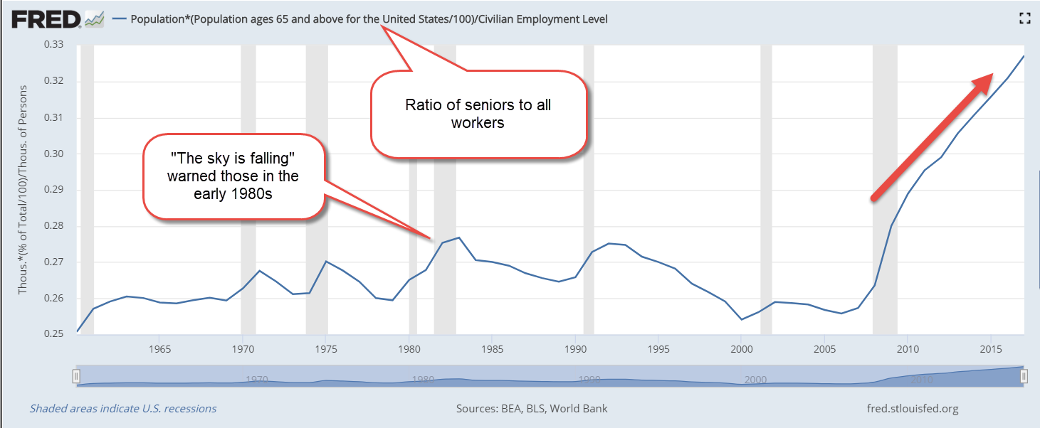
Approximately 1 in 6 (62 million) Americans receive Social Security benefits and that number is expected to grow to 78 million in a decade. However, the ratio of workers to the entire population is near all time highs. The number of Millennials (1982-1996) has surpassed the number of Boomers. This year the population of iGen, those born after 1996, will surpass the Millennial generation (Note #3). Just as a lot of seniors are leaving the work force, a lot of younger workers are entering. The ratio of worker to non-worker may reach 1 to 1. 45 years ago, one worker supported two non-workers.

As the presidential cycle gets into gear, we will hear claims that there are not enough workers to pay promised benefits. Those claims are based on the Civilian Employment Participation Rate, which is the ratio of workers to adults. While the number of seniors is growing, the number of children has been declining. To grasp the total public burden on each worker, we want to look at the ratio of workers to the total population. As I noted before, that is at an all time high and that is a positive.

Raising a child is expensive. The average cost of public education per child is almost $12K (Note #4).  Public costs for housing, food and medical care can push average per child public cost to over $20K annually.

Let’s compare to public costs for seniors. The average person on Social Security receives $15,600 in benefits (Note #5). In 2018, the Medicare program cost an average of $10,000 per retiree (Note #6). The public cost for seniors is not a great deal more than those for children.

As a society, we can do this.

/////////////////

Notes:

  1. The M1 money multiplier is the ratio of cash and checking accounts to the amount of reserves held at the Federal Reserve.
  2. SSDI solvency now extended to 2052. Here’s a highlight presentation of the trustee’s report.
  3. Generation Z will surpass the numbers of Millennials in 2019. Report
  4. Public education costs per pupil
  5. Social Security costs
  6. Medicare program cost $583 billion. There are approximately 60 million on the program. CMS

Slow Growth

April 21, 2019

by Steve Stofka

Happy Passover and Happy Easter. Now that tax day is past, let’s raise our heads and look at long-term growth trends of real, or inflation-adjusted, GDP. For the past seventy years real GDP has averaged about 3% annual growth. In the chart below, I’ve charted the annual percent change in a ten-year average of GDP (GDP10, I’ll call it). As you can see on the right side of the graph, growth has been below average for the past decade.

In 2008, growth in the GDP10 crossed below 3%. Was this due to the Financial Crisis (GFC) and the housing bust? No. The GFC barely figured into the computation of the ten-year average. The housing market had been running hot and heavy for four to five years, but this longer-term view now puts the housing boom in a new perspective: it was like lipstick on an ugly pig. Without the housing boom, the economy had been faltering at below average growth since the 1990s tech boom.

The stock market responds to trends – the past – of past output (GDP) and the estimation of future output. Let’s add a series of SP500 prices adjusted to 2012 dollars (Note #1).

For three decades, from the late 1950s to the mid-1980s, the real prices of the SP500 had no net change. The go-go years of the 1960s raised nominal, but not real, prices. Investors shied away from stocks, as high inflation in the 1970s hobbled the ability of companies to make real profit growth that rewarded an investor’s risk exposure. From the 2nd quarter of 1973 to the 2nd quarter of 1975, real private domestic investment lost 27% (Note #2). In less than a decade, investment fell again by a crushing 21% in the years 1979 through 1982.

In the mid-1980s, investors grew more confident that the Federal Reserve understood and could control inflation and interest rates. During the next decade, investors bid up real stock prices until they doubled. In 1996, then Fed chairman Alan Greenspan noted an “irrational exuberance” in stock prices (Note #3). The “land rush” of the dot-com boom was on and, within the next five years, prices would get a lot more exuberant.

The exuberance was well deserved. With the Fed’s steady hand on the tiller of money policy, the ten-year average of GDP growth rose steadily above its century-long average of 3%. A new age of prosperity had begun. In the 1920s, investment dollars flowed into the new radio and advertising industries. In the 1990s, money flowed into the internet industry. Construction workers quit their jobs to day trade stocks. Anything less than 25% revenue growth was the “old” economy. The fledgling Amazon was born in this age and has matured into the powerhouse of many an internet investor’s dream. Thousands of other companies flamed out. Billions of investment dollars were burned.

The peak of growth in the ten-year average of GDP output came in the 1st quarter of 2001. By that time, stock prices had already begun to ease. In the next two years, real stock prices fell almost 50%, but investment fell only 12% because it was shifting to another boom in residential housing. As new homes were built and house prices rose in the 2000s, long-term output growth began to climb again.

From the first quarter of 2006 to the 3rd quarter of 2009, investment fell by a third, the greatest loss of the post-war period. In the first quarter of 2008, growth in the GDP10 fell below 3%. In mid-2009, it fell below 2%. Ten years later, it is still below 2%.

The Federal Reserve has had difficulty hitting its target of 2% inflation with the limited tools of monetary policy. There simply isn’t enough long-term growth to put upward pressure on prices.  Despite the low growth, real stock prices are up 150% since the 2009 lows.  A prudent investor might ask – based on what?

The supply side believers in the Trump administration and Republican Party thought that tax cuts would spur growth. In the first term of the Obama administration, believers in Keynesian counter-cyclical stimulus thought government spending would kick growth into gear. Faced with continued slow growth, each side has doubled down on their position. We need more tax cuts and less regulation, say Republicans. No, we need more infrastructure spending, Democrats counter. Neither side will give up and, in a divided Congress, there is little likelihood of forging a compromise in the next two years. The stock market may be waiting for the cavalry to ride to the rescue but there is no sign of dust on the horizon.

Economists are just as dug in their ideological foxholes. The Phillips curve, the correlation between employment and inflation, has broken down. The correlation between the money supply and inflation has also broken down. High employment but slow output growth and low inflation. Larry Summers has called it secular stagnation, a nice label with only a vague understanding of the underlying mechanism. If an economist tells you they know what’s going on, shake their hand, congratulate them and move to the other side of the room. Economists are still arguing over the underlying causes of the stagflation of the 1970s.

A year ago, I suggested a cautious stance for older investors if they needed to tap their assets for income in the next five years. The Shiller CAPE ratio, a long-term evaluation of stock prices, is at the same level as 1929. At current prices in a low growth environment, stock returns may  struggle to average more than 5-6% annually over the next five years.

//////////////////////

Notes:

  1. Adjusted for inflation by the Federal Reserve’s preferred method, the Personal Consumption Expenditures Price Index (FRED series PCEPI). Prices do not include dividends
  2. Real Gross Private Domestic Investment – FRED Series GPDIC1.
  3. A video of the 1996 “irrational exuberance” speech

Trends

April 14, 2019

by Steve Stofka

In the current housing market, there are .4 new homes started for every 100 people, near century long lows. The Millennials (1981-1996) are now the largest generation in history but home builders are not responding to the population boom (Note #1). In the 1970s, home builders started triple that number of homes in response to the swelling number of Boomers coming of age.

Have you heard that there won’t be enough workers to support Social Security and Medicare payments for the retiring Boomer generation? Here’s the ratio of seniors to the core work force aged 25-54. Yes, it has gone up since the Financial Crisis.

Here’s the ratio of seniors to all workers. Each worker’s social security taxes are “funding” benefits for three seniors. The Social Security fund was never a separate fund, only an accounting gimmick that politicians enacted eighty years ago. As former Fed chairman Alan Greenspan explained, the federal government can continue to make payments to seniors (Note #2).

Have you heard that the interest on the debt is going to grow so large that it will crowd out all other spending? As a percentage of total expenses, it is at a low level.  Each year the federal government runs a deficit of about 2.4% (Note #3). Can it continue to do that indefinitely? Yes.

Each day we hear a lot of half-truths and outright lies. As the 2020 Presidential election gets nearer, half-baked versions of reality will grow like mold on bread. The Constitution was structured to encourage debate as an alternative to war among ourselves. The 1st Amendment guarantees everyone a right to spout half-truths and lies. Two dominant political parties compete for our belief in their version of the truth. This is the land of argument.

/////////////////////
Notes:

  1. Pew Research has redefined the Millennial generation as those born 1981-1996.
  2. YouTube video of Alan Greenspan explaining to Representative Paul Ryan that the Federal Gov’s checks are good
  3. The 80-year average of deficits is 2.4%. Not including debt for wars, it is 2.2%, per Steve Keen, author of Debunking Economics.

The Start of the Beginning

April 7, 2019

by Steve Stofka

In 1971 former President Nixon announced that the U.S. was abandoning the gold standard of fixed exchange that had existed for almost thirty years. Within a short time, other leading nations followed suit. Each nation’s currency simply traded against each other on a global currency, or FX, market.

Since oil was priced in dollars and the world ran on oil, the U.S. dollar became the world’s reserve currency. Each second of every day, millions of US dollars are traded on the international FX markets. The demand for US dollars is strong because we are a productive economy. The euro, yen and British pound are secondary currency benchmarks.

When the U.S. wants to borrow money from the rest of the world, the U.S. Treasury sells notes and bills collectively called “Treasuries” to large domestic and foreign banks who “park” them in their savings accounts at the Federal Reserve (Fed), the U.S. central bank (Note #1). The phrase “printing money” refers to a process where the Federal Reserve, an independent branch of the Federal Government, buys Treasury debt on the secondary market. It may surprise many to learn that the Fed owns the same percentage of U.S. debt as it did in 1980. The debt in real dollars has grown seven times, but the percentage held by the Fed is the same. That is a powerful testament to the global hunger for U.S. debt. Here’s the chart from the Fed’s FRED database.

FedResHoldTreasPctDebt

In 1835, President Andrew Jackson paid off the Federal debt, the one and only time the debt has been erased. It left the country’s banking system in such a weak state that subsequent events caused a panic and recession that lasted for almost a decade (Note #2). Government debt is the private economy’s asset. Paying down that debt reduces those assets.

About a third of the debt of the U.S. is traded around the world like gold. It is better than gold because it pays interest and there are no storage costs. Foreign businesses who borrow in dollars must be careful, however. They suffer when their local currency depreciates against the dollar. They must earn even greater profits to convert their local currency to dollars to make payments on those dollar-denominated loans.

Each auction of Treasury debt is oversubscribed. There isn’t enough debt to meet demand. In a world of uncertainty, the U.S. government has a long history of respect for its monetary obligations. As the reserve currency of the world, the U.S. government can spend at will. Even if there were no longer a line of domestic and foreign buyers for Treasuries, the Federal Reserve could “purchase” the Treasuries, i.e. print money. Let’s look at the difference between borrowing from the private sector and printing money.

When the private sector buys Treasuries, it is effectively trading in old capital that cannot be put to more productive use. That old capital represents the exchange of real goods at some time in the past. In contrast, when the government spends by buying its own debt, i.e. printing money, it is using up the current production of the private sector. This puts upward pressure on prices. Let’s look at a recent example.

Quantitative Easing (QE) was a Fed euphemism for printing money. During the three phases of QE that began in 2009, the Fed bought Treasury debt. That was an inflationary policy that countered price deflation as a result of the Financial Crisis. In August 2009, inflation sank as low as -.8% (Note #3). It was even worse, but inflation measures do not include the dividend yield on money. To many households, inflation felt like -2% (Note #4). The Fed’s first round of QE did provide a jolt that helped drive prices up by 3% and out of the deflationary zone.

During the five years of QE programs, the Fed continued to fight itself. The QE programs pushed prices upwards. Near zero interest rates produced a deflationary counterbalance to the inflationary pressures of printing money. Because inflation measures do not include the yield on money, the Fed could not read the true change in the prices of real goods in the private sector. The economy continues to fall below the Fed’s goal of 2% inflation. There are still too many idle resources.

Leading proponents of Modern Monetary Theory (MMT) remind people that yes, the U.S. can spend at will, but that it must base its borrowing on policy rules to avoid inflation. A key component of MMT is a Job Guarantee (JG) program ensuring employment to anyone who wants a job. A JG program may remind some of the WPA work programs during the Great Depression. Visitors to popular tourist attractions, from Yellowstone Park in Wyoming to Carlsbad Caverns in New Mexico, use facilities built by WPA work crews. Today’s JG program would be quite different. It would be locally administered and targeted toward smaller public works so that the program was flexible.

The U.S. government has borrowed freely to go to war and has never paid that debt back. Proponents of MMT recommend that the U.S. do the same during those times when the private economy cannot support full employment. That policy goal was given to the Fed in the 1970s, but it has never been able to meet the task of full employment through crude monetary tools. With an active program of full employment, the Fed would be left with only one goal – guarding against inflation.

There are two approaches to inflation control: monetary and fiscal. Monetary policy is controlled by the Fed and includes the setting of interest rates. If the Fed’s mandate was reduced to fighting inflation, it could more readily adopt the Taylor rule to set interest rates (Note #4).

Fiscal policy is controlled by Congress. Because taxation drains spending power from the economy, it has a powerful control on inflation. However, changes in tax policy are difficult to implement because taxes arouse passions. We are familiar with the arguments because they are repeated so often. Everyone should pay their “fair share,” whatever that is. Some want a flat tax like a head tax that cities like Denver have enacted. Others want a flat tax rate like some states tax incomes. Others want even more progressive income taxes so that the rich pay more and the middle class pay less. Some claim that income taxes are a government invasion of private property rights.

Because tax changes are difficult to enact, Congress would be slow to respond to changes in inflation. The Fed’s control of interest rates is the more responsive instrument. The JG program would provide stability to the economy and reduce the need for corrective monetary action by the Fed. The program would help uplift those in marginal communities and provide much needed assistance to cities and towns which had to delay public works projects and infrastructure repair because of the Financial Crisis. As sidewalks and streets get fixed and graffiti cleaned, those who live in those areas will take more pride in their town, in their communities, in their families and themselves. This makes not just good economic sense but good spiritual sense. We can start small, but we must start.

////////////////////////
Notes:

1. Twenty to twenty-five times each month, the Treasury auctions U.S. government debt. Many refer to the various forms of bills and notes as “treasuries.” A page on the debt
2. The Panic of 1837
3. The Federal Reserve’s preferred measure of inflation is the Personal Consumption Expenditure Index, PCEPI series.
4. The annual change in the 10-Year Constant Maturity Treasury fell below -1% at the start of the recession in December 2007 and remained below -1% until July 2009. FRED series DGS10. John Maynard Keynes had recommended the inclusion of money’s yield in any index of consumer demand. In his seminal work Foundations of Economic Analysis (1947), economist Paul Samuelson discussed the issue but discarded it (p. 164-5). Later economists did the same.
5. The Taylor rule utility at the Atlanta Federal Reserve.