It is fitting that the Memorial Day holiday weekend should follow this week’s shooting of nineteen fourth-graders in Uvalde, Texas. As we honor those who died in war, we should acknowledge the schoolchildren and two teachers who died on the killing field of our American hostility. Respect the parents whose hearts lie in the grave with their child.
In 2020, 55% of gunshot deaths in this country were suicides (CDC, 2022a). 53% of 46,000 suicides were committed with a gun (CDC, 2022b). Most mass shooters use an AR-15 style weapon designed for military assault in war. Since the assault weapon ban expired in 2004, the Congress has been unable to pass legislation restricting the sale and carry of these weapons. The children in Uvalde died on that battlefield.
In 1863, President Lincoln spoke on the Gettysburg battlefield, calling us to “highly resolve that these dead shall not have died in vain; that this nation shall have a new birth of freedom” (Library of Congress, 1995). Let us stop listening to the sound of our thoughts and listen to the wind as it blows over their graves.
CDC. (2022a, January 5). FastStats – Homicide. Centers for Disease Control and Prevention. Retrieved May 28, 2022, from https://www.cdc.gov/nchs/fastats/homicide.htm. Almost 20,000 died by gunshot.
CDC. (2022b, March 25). FastStats – suicide and self-inflicted injury. Centers for Disease Control and Prevention. Retrieved May 28, 2022, from https://www.cdc.gov/nchs/fastats/suicide.htm. Out of 46,000 suicides in 2020, 24,000 were committed with a gun.
Consumer spending during the pandemic and in the post-pandemic recovery has been strong. Inflation adjusted retail sales have averaged 5.6% annual growth since December 2019 (FRED, 2022a). However, the disruptions caused by the once-in-a-century pandemic have made the annual growth rates erratic, particularly those in the spring months when the pandemic hit. In spring 2021, retail sales numbers showed an annual increase of 48% over the previous year. Older Americans had been getting vaccines in the first months of 2021, shops were reopening and people were spending money. The economy was recovering but the size of the recovery was a “base effect.” Retail figures in 2021 were compared to retail sales in March and April 2020 when the economy was largely shut down. The American economy is so large that it is not capable of producing 50% annual growth in real sales.
Because the spring 2021 numbers were so strong, the numbers this spring look shaky. When the April retail numbers were released this week, traders began to mention the word recession and the market sank several percent. When people swarmed into stores in the spring of 2021, Target (Symbol: TGT) reported an increase of 22% in same store sales. A realistic portrayal of a customer behavior trend? No, it was an artifact of the pandemic disruption. In the first quarter of this year, the company reported a slight decline compared to those year-ago numbers. The reaction? The company’s stock fell 25%, an overreaction in a thinly traded market, and its worse loss since October 1987 when the broader stock market fell more than 20% in one day.
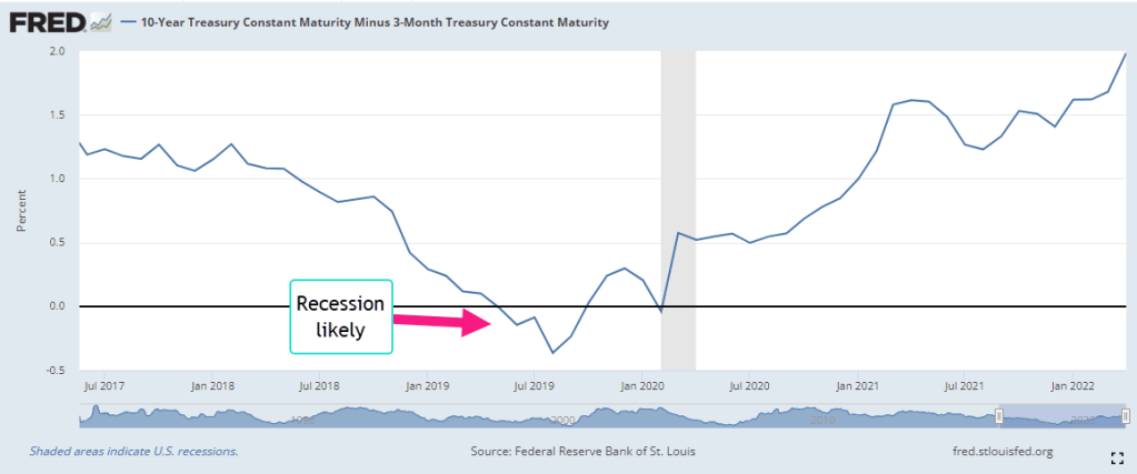
The stock market gets all the headlines each day but it is small in size relative to the bond market where the world’s lifeblood of debt and credit is traded. Over time the differences in interest rates between various debt products indicate trends in investor sentiment. These differences are called spreads. A common spread is a “term spread” between a long-term Treasury bond – say ten years – and a short-term Treasury of three months (FRED, 2022b). Short-term interest rates are usually lower than long-term rates because there is less that can go wrong in the short-term. When that relationship is turned upside down, it indicates a recession is likely in the near-term like a year or so. Why? Financial institutions are now expecting the opposite – that there is more that can go wrong in the short term than in the long term. They will be less likely to extend credit for new investments, business or residential.
For the past forty years, this spread has been a reliable predictor of recessions and it does not confirm the market’s recent concern about a recession. There are a few shortcomings with this indicator. With a wide range of several percent over five years, it has a lot of data “noise” that might obscure an understanding of the stresses building in the bond market and economy. Secondly, Treasury bonds are a small part of the bond market and carry no risk of default. We would like a risk spread between the rates on corporate bonds and those on Treasury bonds. Thirdly, the Federal Reserve has much less influence over corporate bond rates than it does on Treasury bond rates. Comparing corporates and Treasuries would give us a better sense of the broader market sentiment.
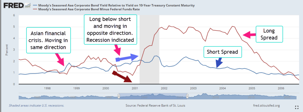
Moody’s Investors Service, a large financial rating company, computes the yield, or annualized interest rate, of an index of highly rated corporate bonds in good standing with a term longer than one year. The yield spread between corporate and long-term Treasury bonds usually lie in a range or channel of 1-1.5%. Like the lane markings on a highway, channels help us navigate data. The upper bound of 1.5% indicates a stress point. Let’s call that the long spread (FRED 2022c).
The Fed Funds rate is an average of rates that banks charge each other for overnight loans and the Federal Reserve tightly manages the range of this rate. For most of the past decade it has been below 1% and has often been close to zero. Let’s call the difference between the yield on corporate debt and the overnight rate the short spread (FRED, 2022d). Most of the time, the short spread is larger than the long spread. Just as with our first indicator of term spread, this relationship flips in the near term preceding a recession. Importantly, they continue to move in opposite directions for a while. The short spread keeps getting smaller while the long spread goes higher. In the graph below is the short recession after the dot-com bust.
In the right side of the graph the pattern will telegraph the coming recession in 2008. The graph below highlights the years after the financial crisis. The short term spread remained elevated above 1.5%, an indication of the persistent stress in the bond market. During Obama’s two terms in office, the short spread fell only once into the “everything is OK” range. Helped by the prospect of tax cuts in 2017, the spread declined to a lasting lull.
In the last half of 2019, the conjunction of these two time-risk spreads indicated a coming recession. The term spread we saw in the first graph also indicated a recession. They suggest that a 2020 recession was likely even if there was no pandemic. The Fed had been raising rates through mid-2019 to curb inflationary trends, then eased back a bit in the final months of that year. Were they seeing signs of economic stress as well?
How would the 2020 Presidential campaign have evolved if there had been no pandemic but a short recession lasting six to nine months? The Republican tax cuts enacted at the end of 2017 would have been shown to be a bust, doing little more than transferring wealth to the already wealthy. Mr. Trump would have certainly blamed the recession on Jerome Powell, the Chairman of the Fed, whom he had appointed. Powell would have been characterized as a Democratic stooge, part of an underground political plot to get Donald Trump out of the White House. The stories of what could have happened are entertainment for a summer’s campfire.
FRED. 2022a. Federal Reserve Bank of St. Louis, Advance Real Retail and Food Services Sales [RRSFS], retrieved from FRED, Federal Reserve Bank of St. Louis; https://fred.stlouisfed.org/series/RRSFS, May 18, 2022.
FRED. 2022b. Federal Reserve Bank of St. Louis, 10-Year Treasury Constant Maturity Minus 3-Month Treasury Constant Maturity [T10Y3M], retrieved from FRED, Federal Reserve Bank of St. Louis; https://fred.stlouisfed.org/series/T10Y3M, May 19, 2022.
FRED. 2022c. Federal Reserve Bank of St. Louis, Moody’s Seasoned Aaa Corporate Bond Yield Relative to Yield on 10-Year Treasury Constant Maturity [AAA10Y], retrieved from FRED, Federal Reserve Bank of St. Louis; https://fred.stlouisfed.org/series/AAA10Y, May 19, 2022. The “long” spread.
FRED. 2022d. Federal Reserve Bank of St. Louis, Moody’s Seasoned Aaa Corporate Bond Minus Federal Funds Rate [AAAFF], retrieved from FRED, Federal Reserve Bank of St. Louis; https://fred.stlouisfed.org/series/AAAFF, May 19, 2022. The “short” spread.
Millennials have witnessed several market selloffs where investors put every kind of asset in their wheelbarrow and bring them to market. Stocks and bonds, equity and debt assets, are supposed to have different risk profiles that are uncorrelated. No matter. Into the wheelbarrow they go. What was valuable a few months ago has become infected with fear, a saleable surplus. The market is neither equitable nor smart, but it is efficient at distributing surplus. Investors sold their fear and bought cash. Cash represents certainty, the antidote to fear.
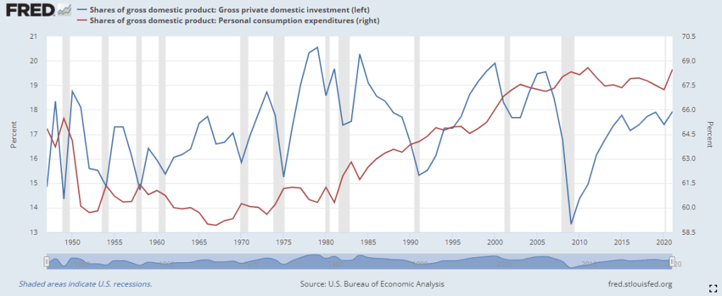
Last year private investment was 19% of the economy, near the top of the historical range of 15-20%. At that level, investment competes with consumption for real resources. The graph below compares consumption and investment as a percent of output. The blue line is investment, including residential housing, the red line household consumption.
Investment looks to the future and is more volatile because it rides on the bumpy road of expectations, a central component of human behavior. People respond not to their current environment but to a forecast of their environment, the uncertainty of further interest rate hikes to combat inflation. The expectation of rising interest rates reduces investment and that helps reduce inflation and the rationale for the Fed’s raising of interest rates – a case of simultaneous causality.
The rise and fall in inflation lags changes in investment by about three months. That does not indicate an “investment causes inflation” causality but signals that they are running around the economic racetrack together. Rising investment brings jobs and higher wages and more spending income. An interruption in the supply chain causes a divergence between supply and demand, between investment and consumer spending. That divergence causes inflation.
A surplus of misplaced investment needs to be redirected to other parts of the economy. Some investment cannot be redeployed and is lost. As the level of investment falls from 19% to 15%, the economy experiences negative growth – a recession. The market distributes saleable surpluses; it doesn’t correct the causes of the surpluses. People, institutions and policies produce surpluses and it is they who have to correct those surpluses. Why doesn’t the market distribute excess wealth? It does, but not where some people would like. People respond to shortages, inequalities of circumstances. The market responds only to surpluses.
In some cities there are a lot of homeless people crowding downtown streets. There is a surplus of little used backyard space to house the homeless. Is there a surplus of homeless people or a shortage of housing? At the heart of a persistent problem is a shortage.
A monetarist like Milton Friedman claimed that inflation was a surplus of money in the system. He argued the root cause of high and erratic inflation in the 1970s was the Fed feeding too much base money into the system. This is “high-powered” money that banks multiply when they make loans. In the peak of the oil shock and recession of 1973-75, the percentage of base money to GDP (bmg) was almost 7%. This level, far above the historical average of 5%, looked like a likely target as the cause for inflation. In the recovery after the financial crisis, bmg was nearly 23% in 2014, more than three times higher. Inflation was low – too low. Cautious bank management had parked that high-powered money at the Fed as excess reserves. The percent of deployed bmg never reached 8%. Today bmg is at 25% but the deployed level of base money has not reached 10%.
Although the Fed controls the money supply, over 4,000 banking institutions control the effect of changes in the money supply. They direct credit to where they think the losses will be the least and the gains the most. Total bank credit is up more than 9% this year and is at 68% of the economy, a historic high. Growth in businesses loans remains negative after the pandemic and at the level of loans outstanding at their historical norm of 10% of the economy. Consumers have a surplus of purchasing power that the credit market is distributing. Where does that money go? Consumers take the money they get from the banks and spend it at their local businesses. Those businesses do not have to go to the banks to get money as long as their customers have access to bank money and the businesses can attract the customers.
By now Millennials feel like bystanders at a long parade, looking down the street for a empty space that signals the end. 9-11, housing crash, financial crisis, slow recovery with too much unemployment and not enough inflation, then an overheated housing market, a once-in-a-century pandemic and now a period with too much inflation. The oldest Millennials are just approaching middle age and might be wondering if the last half of their lives is going to be as eventful as the first half. No, of course not. Everything will be fine as long as you don’t answer the phone or open the door or say, “I’ll be right back.” It’s just a scary movie.
Base money is the FRED Series BOGMBASE. Bgm is BOGMBASE / GDP. Deployed bgm is bgm – excess reserves EXCSRESNS / GDP. That series was discontinued in 2020 at the start of the pandemic.
Gross Private Domestic Investment as a share of GDP is FRED Series A006RE1Q156NBEA. Consumption is DPCERE1Q156NBEA.
Total bank credit is TOTBKCR. Business loans is BUSLOANS.
A second round of the pandemic in key areas of China, continuing bottlenecks at ports and the war in Ukraine have played a key part in the persistence of inflation over the past few months. Supply shocks give companies a chance to raise prices faster than their production costs and increase profits – at first. This gives companies a chance to make up for lost profits during the pandemic. The rise in costs will hurt eventually and companies will blame rising wages.
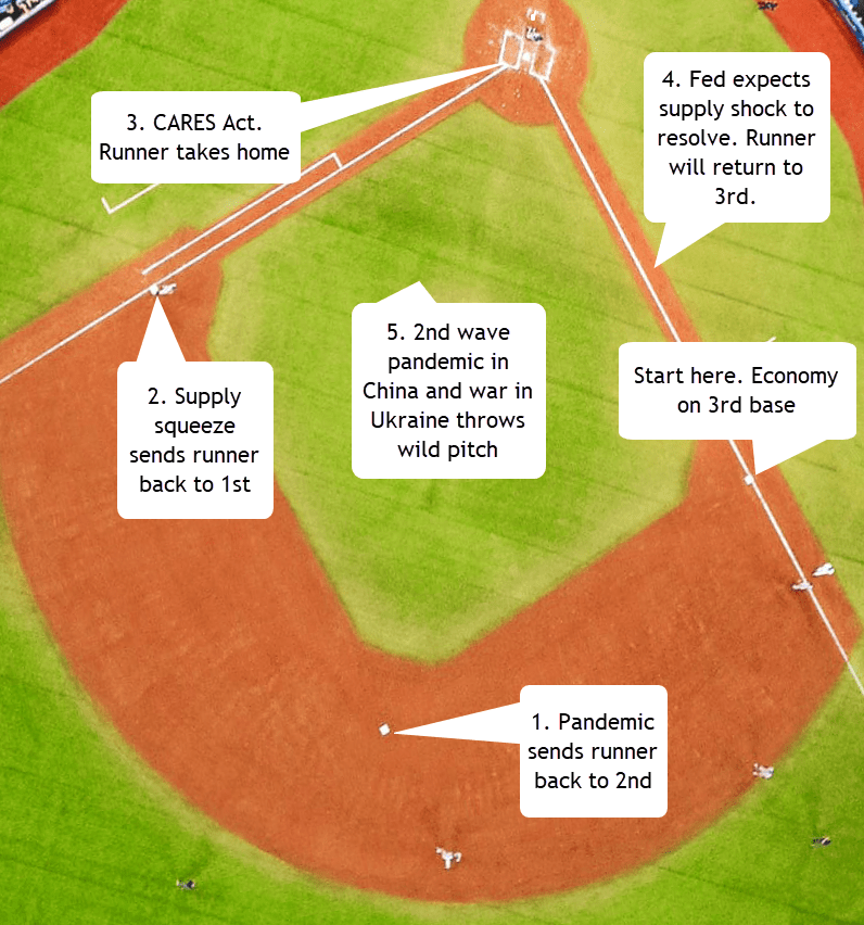
Some people are blaming the Fed, accusing them of being behind the curve. I’ll present a model that helps readers understand the sequence of events over the past two years. Economists study how events, people and money interact. Like a football coach drawing out a strategy for a defensive backfield, economists use graphs with diagrams of solid and dashed lines with arrows to describe the dynamics of a process. For the layperson, it can be confusing. To make it fun, I sketched the dynamics on a baseball field. The action starts in the spring of 2020 with the runner – the economy – on 3rd base. Governments around the world dampened or shut down their economies to arrest the spread of the Covid-19 virus. I’ll put the graphic up here. Economists will recognize the bases as equilibrium points, and the left and right shifts of demand and supply.
The pandemic sent the runner to 2nd base, a shift of demand. Supply constraints then sent the economy back to 1st base, a shift of supply. The CARES act and other government support programs could only send the runner to home, a shift of demand. Why not back to 2nd? Let’s keep it simple and say that those are the rules. The Fed’s monetary policy has already consisted of large measures in response to the pandemic. That is on another graph with DD and AA curves that would give a casual reader a headache.
The Fed knew that the economy should be on 3rd – not home base – but expected the supply constraints to resolve enough to shift the economy back to 3rd base. If the Fed took monetary action when it was not needed, the runner might get injured and have to rest. That’s a recession. So the Fed waited, ready to take action if the existing supply chain problems didn’t resolve.
Another wave of pandemic struck key manufacturing areas in China. In the U.S., ports on the west coast and transportation links to those ports were still not working properly. Russia attacked Ukraine, driving up the price of gasoline by more than 50%. Natural gas prices rose 160% (DHHNGSP https://fred.stlouisfed.org/graph/fredgraph.png?g=P3jr ). As the war continued for several weeks, it became clear that there would be no spring planting of crops in Ukraine, a country that is a global food supplier. Futures prices rose, increasing grocery store prices and exacerbating the sharp rise in oil prices.
The Covid-19 virus, the many people and businesses in the supply chain, and Vladimir Putin did not pay attention to the informed expectations of the Federal Reserve. The Fed is a convenient target for pundits. Before the Fed was created in 1913, people blamed gold and anonymous speculators for panics and price instability. However, anonymous speculators do not show up for Congressional committees. A bar of gold just sits silent in the chair while committee representatives rant on at finance hearings. That’s no fun. The Fed has a chairperson, Jerome Powell, a punching bag for Congress and pundits. Taking verbal abuse is part of the job of being Fed Chair.
Congressional representatives often use charts in the main chamber. An aide slides a cardboard chart on an easel while the Congressperson explains the whole idea in 5 minutes. At a finance subcommittee hearing, Mr. Powell can bring in an easel with a diagram of a baseball field. He can point to the economy on 3rd base and explain the whole process in a simple but more eloquent way than I can. Once the committee members understood the idea, they would apologize to Mr. Powell for their earlier criticism and Washington would be a more peaceful place. If baseball players and managers could resolve their differences this spring, why can’t the folks in Washington? Play ball and a shout out to moms everywhere!
On NBC News this week a reporter mentioned that a living wage was $35.80 an hour for someone with a child. M.I.T.’s Living Wage Calculator (2022) confirmed that approximate amount near where I live. That’s an annual income of $71,000, about $4,000 more than the median household income (MHI) today. In the past few decades incomes have been falling behind by just a little bit in inflation-adjusted income. In 1987, the MHI was $26,600, about $69,000 in today’s money (Series in footnotes). Today’s MHI is just a bit below off that figure. So what’s the problem?
Although incomes have kept up with inflation, they have not kept up with productivity gains. Most economists believe that a worker gets paid the value of her marginal product. If that is so and there have been productivity gains since 1987, then incomes should reflect some of those gains.
The BLS calculates a Total Factor Productivity that includes capital and labor. A 2018 study by the BLS calculated 2.9% annual output growth since the late 1980s. Estimating the sources of growth, they found that capital had contributed 40% more to productivity than labor but, even so, labor’s share of the gains should be at least 1% annually. If so, the MHI would be considerably higher today.
There are several reasons why American household income has not kept pace with productivity gains. They include:
A smaller percentage of workers belong to a union and so have less bargaining power. According to the BLS (2022), only 10.3% of all workers belong to a union. Among public sector workers the rate is far higher – 34%, but only 1 out of 7 employees are in the public sector.
Critics argue that greedy business owners are keeping all the productivity gains. Perhaps so, but that requires market power. Why have workers continued to work for less than a livable wage? Business owners complain that they have little pricing power. If workers and businesses have no pricing power, who has it? It may be buried in the garbage heap where capital goes to die in a competitive and fast changing marketplace. Before 2000, consumption of fixed capital accounted for 15% of GDP. Today, it has risen to 17%. In a $24 trillion economy, a 2% change is a lot. In a world where companies must innovate to survive, we notice only what survives. Growth comes at a cost.
Some say that the job mix has changed so that it is difficult to compare incomes, job skills and productivity with those of 35 years ago. There are now more lower paying service jobs, fewer high paying manufacturing jobs.
Making comparisons tough are the smaller household size today. With fewer people per household, incomes won’t be as high. The 1960s and 1970s saw explosive growth in household formation and this helped fuel the high inflation of the 1970s. Since then household formation has trended upward at a slow pace. The ratio of households to population today (.39) is only slightly higher than it was 40 years ago (.36). That slight difference does not account for the lost income in unpaid productivity gains.
Some argue that illegal immigrants are taking American jobs. They are willing to work for lower wages, and are reducing the bargaining power of American workers. There are an estimated 12 million undocumented immigrants in this country, including children and people past working age. Many of those who do work do so in agriculture which is not counted in the payroll numbers. Some work in construction but those jobs are only 5% of the workforce. There wouldn’t be any noticeable effect on the incomes of 150 million workers.


