Heaven On Earth

May 31, 2015

Although the unemployment rate has fallen below 5.5%, the labor participation rate is still rather low and wage growth is slow, prompting renewed calls for government stimulus. A 2010 article laid out the justifications for more government borrowing to spur the economy. Let’s review a few points made by these economists.

“Spending by the federal government always creates new money in the system, while taxation destroys it.”

The nature of money and the government’s relationship to money is certainly beyond the scope of a blog post. In short, money in all its forms is a claim. A central bank (called the Federal Reserve in the U.S.) is a government created institution which regulates and administers the supply of money and credit within a country, and manages the reserves of foreign currencies held within that country.  It acts as the government’s banker and is the lender of last resort both to the public and the government.  If the public will not buy all of the debt issued by the Treasury of a government, the central bank steps in and buys it, a practice known as “printing money” although there is no new money printed.

In a fiat (unbacked by any hard metal or asset) money system, a sovereign government has the power to create and destroy money claims at will.  As the 2010 article notes, all taxation is a destruction of money.  A $100 tax voids a taxpayer’s ability to make a $100 claim for some good or service.   A thief takes money with no promises.  A government takes money with some implied promise or threat but no exchange of value at the time of the taking.  Taxation is not an exchange, but a taking, a destroying, like letting a little bit of air out of a balloon.  As long as the government pumps in the same amount of air that it took out, the size of the balloon changes only in proportion to the change in population.

In 1960, two economists, Gurley and Shaw, coined the terms Inside Money and Outside Money to capture this unique license of government (Federal Reserve paper on this subject). Treasury bills and forms of government debt are claims on government, and termed outside money, as in outside the private marketplace. Money exchanges between people and companies in the private sector are termed inside money. Each dollar of inside money represents a debt by someone else within the private sector.  When government spends more than it taxes, it borrows and pumps outside money into the private sector balloon. Many of us might think inflation is the net change in the size of the balloon but it might be more helpful to imagine that the size of the balloon, or volume, is the size of the population and grows slowly and constantly, about 1% in the U.S.  Inflation, then, is a measure of the pressure inside the balloon. (Boyles’ Law  and other fun facts with gases)

Various economists in this article asserted that the government should pump more outside air into the balloon, which will cause the economy, the molecules inside the balloon, to speed up.  Is there any limit to the amount of outside money that a government can pump into the balloon?

“[A] government cannot become insolvent with respect to obligations in its own currency.”

If a government can make up money out of thin air, why not just give $100K to each of the 300 million citizens in the U.S.?  People who couldn’t afford a newer car could buy one, which would boost the sales of car manufacturers. New homes, new appliances, vacation trips – a shot in the arm for so many industries. Unemployment would practically vanish. Imported goods into the U.S. would soar, helping the workers and businesses in other countries.  People could pay off their credit card and student loan debts but banks might suffer because not as many people would want loans.  Stock prices would soar in value as families searched for a place to invest some of their windfall.  People who had already owned stocks and other assets before the boon would see their net worth increase exponentially.  Housing prices would climb as more people could afford to buy a house.

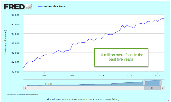
What about inflation?  Well, the government has already pumped in $8 trillion since the recession started in late 2007.

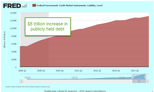
$8 trillion divided by a 300 million population is almost $27,000 per person.  Contrary to predictions of runaway inflation, it has been moderate or below the 2% target rate.  In fact, if we use the method of calculating inflation used in the Eurozone, we have had deflation in the first quarter of this year.   So any inflationary effect from a one time $100K boon would be less than disastrous.  Even if inflation climbed to a 1990s level, about 4 – 5%, what is the harm?

Most of us instinctively look at this scheme, furrow our brow, and get suspicious.  But why?  Why can’t a government with a fiat money system simply create heaven on earth?

Stay tuned till next week….

Procession, Not Recession

May 24, 2015

Existing home sales of just over 5 million (annualized) in April were a bit disappointing.   Since the recession, there have been only about six months that sales have been above a healthy benchmark of 5.2 million set in the late 1990s to early 2000s.

***********************

Procession, not Recession Indicator

When reporting first quarter results, many of the big multi-national companies in the Dow Jones noted that sales had declined in Europe.  The broader stock market, the SP500, has not had a 5% decline for three years and is due for a correction.  Greece is likely to default on their Euro loans in June.  Combine all of these together and some pundits predict a 30 – 40% market correction this summer and/or a recession this year.  Corrections can be overdue for a long time.  Some treat the stock market as though its patterns were almost as predictable as a pregnancy.  Here’s an early 2014 warning that finds a chilling similarity between the bull market of today and, yes, the one before the 1929 crash.

Bull and bear markets tend to confound the best chart watchers.  The bear market of 2000 – 2003 was not like that of 2007 -2009.  Some argue that market valuations are like a rubber band.  The longer prices become stretched, the harder the snapback.  However, the data doesn’t show any consistent conclusion.

The 2003 – 2007 bull market ran for 4-1/2 years without a 5% correction.  That one didn’t end well, as we all know.   The mid-1990s had a three year stampede from the summer of 1994 to the summer of 1997 before falling more than 5%.  After a brief stumble, the market continued upwards for a few more years.  Turn the dial on the wayback machine to the early 1960s for the previous stampede, from the summer of 1962 to the spring of 1965.  That one ended much like the 1990s, dropping back before pushing higher for a few more years. These long runs occur infrequently so there is not much data to go on but the lack of data has never stopped human beings from predicting the end of the world.

April’s Leading Economic Indicator was up .7%, above expectations, but this increase was helped along by an upsurge in building permits.  This series has been unreliable in predicting recessions and its methodology has been revised a number of  times to better its accuracy.  Doug Short does a good job of tracking the history of this composite and here is his update of April’s reading.

A much more consistent indicator of coming recessions is the difference in the interest rates of two Treasury bonds.  The time to start thinking about recessions is when the 10 year interest rate minus the two year rate drops below zero.  The current reading simply doesn’t support concerns about recession in the mid-term.

The Federal Reserve has made it easy for us to track this flattening of the yield curve.  They even do the subtraction for us.  The series is called T10Y2Y, as in “Treasury 10 year 2 year.”

Social Security Age Cohorts

May 17, 2015

Life expectancy (LE) is often measured at birth (CDC).  The great increases in LE during the 20th century can be largely attributed to rapidly declining childhood mortality rates.  Advancements in medical practice have certainly played an important role but clean drinking water and modern sanitation disposal and treatment have had the most effect. Improvements in life expectancy at age 65 have been much less dramatic.

Last week’s Calculated Risk blog presented LE with more clarity – by graphing age cohorts, a group of people born in a particular year or range of years.  If 100 people were born in 1950 – an age cohort – how many of that cohort were alive in 2000?  The chart convincingly illuminates several problems with Social Security funding and payouts in the future.

One of the cohorts shown in the first graph (blue line) are those born in the years 1900 – 1902.  This age group was in their mid–thirties when Social Security was enacted.  Many funded the Social Security system through their working years but only 40% reached the age of 65 to become eligible for Social Security.  Just over 70% of the early Boomer cohort (gold line) born in 1950 is still alive this year, their 65th birthday.  More than 85% of the people born in 2010 are expected to reach 65.

When the Social Security act was written, what if the language of the act reflected life expectancies at that time?  Instead of setting a specific retirement age, it could have specified that every five years, for example, Congress would revise the retirement age based on the half life of an age cohort, that age when half of a generation is alive and half is dead.

For the 1900-1902 cohort, the retirement age would have been 59.  For early Boomers, those who just turned 65, retirement would still be almost a decade away, at 74.  The 2010 generation could expect to retire at around age 83.

As important as the age of eligibility is the number of years that retirees collect Social Security.  What is the half life of an age cohort once they have reached 65?  If 50 out of 100 of a cohort are alive at age 65, how many years before only 25 are alive?  I’ll call this the age-65 half life. I marked up the chart at Calculated Risk to show the current and projected increases in age for these retirees who will be funded by Social Security.

Although life expectancy at birth has increased dramatically, the half life of people who manage to reach the age of 65 shows much slower increases.  The difference between the age-65 half lives of the 1900 and 1950 cohorts is projected to grow only slightly, from 12 to 14 years. That’s just a two year increase for two generations born 50 years apart.  The growth of that half life is projected to quicken for the 2010 generation but we should be suspicious of estimates eighty years in the future.

Of the 76 million boomers born, 65 million were still alive in 2012 (Source) Even though the age-65 half life of people had changed by only two years, that is a lot of people eligible for Social Security payments.   Politicians find it difficult to discuss changes in this program, the “third rail” of politics. People who have paid taxes into the program during a lifetime of work feel that they have earned the payments they receive in retirement.  Any changes have to be done incrementally, like raising the temperature of a pot of water so that the frog doesn’t jump out.  Voters will probably punish lawmakers who suggest wholesale changes.  Former Senator Rick Santorum discovered that brutal truth when he endorsed former President Bush’s proposal to privatize Social Security.  Bush was a lame duck President with little to lose but quickly withdrew the idea in response to the angry response to the idea.  Santorum lost his seat.

Congress might initiate some rules based approach like the half life criteria to setting the retirement age for future decades. This would help avoid political repercussions for any changes to Social Security.  If Congress set the retirement age criteria at 60% instead of 50% (half life), the retirement age would be 69 for this generation, just two years more than current law for the late Boomers.

Spring is springing

May 10, 2015

CWPI

The dollar’s appreciation against the euro and other currencies in the first quarter of this year caused a natural slowdown in exports, which has hurt manufacturing businesses in this country.  U.S. products are simply more expensive to customers in other countries because dollars are more expensive in other currencies. The PMI manufacturing survey showed a decline in employment for the month.  The non-manufacturing sector, which is most of the economy, rallied in April.  As I noted last month, the CWPI should have bottomed out in March-April, reaching the trough in a wave-like series that has been characteristic of this composite index during the past six years of recovery.  Any change to this pattern – a continuing decline rather than just a trough – would be cause for concern.

April’s resurgence in the non-manufacturing sector more than offset the weakness in manufacturing. In fact, there was a slight gain in the CWPI from March’s reading.

Employment and new orders in the non-manufacturing sector are two key components of the composite index and leading indicators of movement in the index.  They have been on the rise since the beginning of the year.  While the decline in the overall index lasted 5 – 6 months, this leading indicator declined for only 3 months, signalling a probable rebound in the spring. Now we get some confirmation of the rebound.

*************************

Employment

Released at the end of the week a few days after the PMI surveys, the monthly employment report from the BLS confirmed a renewal in job growth after rather poor job gains in March.  April’s estimated job gains were over 200K, spurring a relief rally in the stock market on Friday.  Gains were strong enough to signal that the economy was on a growth track but not so strong that the Fed would be in any rush to raise interest rates before September.

March’s job gains were revised even lower to below 100K, but the story was that the severe winter weather was responsible for most of that dip.  As the chart below shows, there was no dip in year over year growth because the winter of 2014 was bad as well.  Growth has been above 2% since September of last year.

During the 2000s, the economy generated plus 2% employment growth for a short three month stretch in early 2006, just before the peak of the housing boom.  The past eight months of plus 2% growth hearkens back to the strong growth of the good ole ’90s.  Like the 90s, Fed chair Janet Yellen warned this week that asset prices are high, recalling former Fed chair Alan Greenspan’s 1996 comment about “irrational exuberance.” Prices rose for another four years in the late 90s after Greenspan’s warning so clairvoyance and timing are not to be assumed simply because the chair of the Federal Reserve expresses an opinion.  However, history is a teacher of sorts.  When Greenspan made that comment in December 1996, the SP500 was just under 600.  Six years later, in late 2002, after the bursting of the dot-com bubble, a mild recession, the horror of 9-11 and the lead up to the Iraq war, the SP500 almost touched those 1996 levels.  An investor who had pulled all their money out of the stock market in early 1997 and put it in a bond index fund would have earned a handsome return.  Of course, our clairvoyance and timing are perfect when we look backward in time.

For 18 months, growth in the core work force, those aged 25 – 54, has been positive.  This age group is critical to the structural health of an economy because they spend a larger percentage of their employment income than older people do.

Construction employment could be better.  Another 400,000 jobs would bring employment in this sector to the recession levels of the early 2000s before the housing sector got overheated.

In the graph below, we can see that construction jobs as a percent of the total work force are at historically low levels.

Every year more workers drop out of the labor force due to retirement, or other reasons.  The population grows by about 3 million; 2 million drop out of the labor force.

The civilian labor force (CLF) consists of those who are employed or unemployed (and actively looking for work).  The particpation rate is that labor force divided by the number of people who can legally work, those who are 16 and over who are not in some institution that prevents them from working.  (BLS FAQ)  That participation rate remains historically low, dropping from 65% five years ago to under 63% for the past year.

That lowered rate partially reflects an aging population, and fewer women in the work force relative to the surge of women entering the work force during the boomer “swell.”  A simpler way of looking at things shows relatively stable numbers for the past five years:  those who can work but don’t, as a percentage of those who are working.  The population changes much more than the number of employed, and the percentage of those who are not working is rock steady at about 66%.  This percentage is important for money flows, the vitality of economic growth and policy decisions.  Those who are not working must get an income flow from their own resources or the resources of those who are working, or a combination of the two.

The late 90s was more than just a dot-com boom.  It was a working boom where the number of people not working was at historically low levels compared to the number of people working.  The end of the dot-com era and the decline in manufacturing jobs that began in the early 2000s, when China was admitted to the WTO, marked the end of this unusual period in U.S. history.  Former Secretary of Labor Robert Reich (Clinton administration) sometimes uses this unusual period as a benchmark to measure today’s environment.

Not only was this non-working/working ratio low, but GDP growth was rather high in the 1990s, in the range of 3 – 5%.

Let’s look at GDP growth from a slightly different perspective.  Real GDP is the country’s output adjusted for inflation.  Real GDP per capita is real GDP divided by the total population in the country.  Real GDP per employee is output per person working.  As GDP falls during a recession, so too do the number of employees, evening out the data in this series.  A 65 year chart reveals some long term growth trends.  In the chart below, I have identified those periods called secular bear markets when the stock market declines significantly from a previous period of growth.  I have used Doug Short’s graph  to identify these broader market trends.  Ideally, one would like to accumulate savings during secular bear markets when asset prices are falling and tap those savings toward the end of a secular bull market, when asset prices are at their height.

In the chart above note the periods (circled in green) of slower growth during the 1968-82 secular bear market and the last few years of the 2000-2009 secular bear market.  After a brief upsurge at the end of this past recession, we have continued the trend of slower economic growth that started in 2004.  A rising tide raises all boats and the tide in this case is the easy monetary policy of the Federal Reserve which buoys stock prices.  In the long run, however, stock prices rise and fall with the expectations of future profits.  Contrary to previous bull markets, this market is not supported by structural growth in the economy, and that lack of support increases the probability of a secular bear market in the next several years, just at the time when the boomer generation will be selling stocks to generate income in their retirement.

Earthquakes in some regions of the world are inevitable.  In the aftermath of the tragedy in Nepal, we were reminded that risky building practices and regulatory corruption can go on for decades.  There is no doubt that there will be  horrific damage and loss of life when the inevitable happens yet the risky practices continue.  The fault lines in our economy are slower per employee GDP growth and a greater burden on those employees to pay for programs for those who are not working. The worth of each program, who has paid what and who deserves what is immaterial to this particular discussion.  Growth and income flow do matter. Asset prices are rising on shaky growth foundations that will crack when the fault lines slip.  Well, maybe the inevitable won’t happen.

A Lack of Giddyup

May 3, 2015

The first estimate of GDP growth in the January to March quarter was almost flat.  Not a big surprise given the severe winter in the eastern part of the U.S. but an annual rate of just .2% growth was lower than most estimates.  It would be a mistake to attribute all of the slow down to the weather.  Lower gas prices have delayed new drilling projects and idled more costly operations.  Some economists have not fully appreciated the positive influence that shale oil drilling has had on a tepid economic recovery.

Growth has not only slowed. It has shifted lower.  The Shiller P/E ratio, or CAPE, uses a 10 year period as a base.  A common measure of inflation expectations is the 10 year Treasury bond.  Let’s look at the change in real per capita GDP over rolling ten year periods starting in 1970.  Below I’ve graphed the logarithm, or log, of current GDP using the GDP 10 years ago as a base.  We can see a fairly consistent trend over forty years until 2008.

Some economists build models – partial derivatives – in which quantity of output fluctuates as a function of price, or F(p).  The thinking goes that price changes are part of a self-reinforcing mechanism. The problem is that price is a reaction to events, not a cause of them.  Prices distribute the effects of changes in supply, demand, and expectations in an economy or market.

The Fed believes that the economy has too much inventory – of savings, of caution.  Just as any store merchant would do, the Fed has lowered the price of savings, the interest rate, in the hopes that  customers will come in and borrow some of that savings.  Blue light special in Housing, Aisle 3!  The sale has been going on for almost seven years but demand in some sectors, particularly housing, is still very low.   The total of outstanding mortgage debt remains subdued no matter how much the price, or interest rate, is lowered.

Last week I showed a chart of new home sales per 1000 people.  I’ll overlay the thirty year mortgage rate over it.

Higher mortgage rates reduce the demand for new homes.  The exceptionally low rates of the past few years should accelerate the demand for new homes.  Let’s do a quick and dirty adjustment by multiplying new home sales by 1 + the interest rate.  This will have a greater effect on sales when interest rates are higher, helping offset the lowered demand.  The actual amounts are not relevant- it’s the comparison.  This chart shows the exceptionally low demand of the past several years.

The total of loans and leases has been growing about 2% annually on average since the end of 2008, from $7.2 trillion to $8.1 trillion, a total of a little over 12% during the period.  To put that in perspective, that total grew by 75% in the previous 6 year period 2003 through 2008, rocketing up from $4.1 trillion to $7.2 trillion.  Since 1995, our economy has shifted and has been running on borrowed money more than in past decades.  These loan totals don’t include the huge, no strike that, call it prodigious, government borrowing that has propped up GDP growth in the past dozen years.

The Fed finished its April meeting this week and decided to keep the fire sale going. “The Committee currently anticipates that, even after employment and inflation are near mandate-consistent levels, economic conditions may, for some time, warrant keeping the target federal funds rate below levels the Committee views as normal in the longer run.” Fed statement 

Even if conditions do meet labor market and inflation targets, the Fed wants to make sure they can stay stable at those targets for a few months before taking action on interest rates.  The sale has been going on for so long now that the anxiety over the end of the sale has acted as a counter balancing force to the sale price.  Models of thinking as well as patterns of behavior are habit forming. One of the greatest scientists of all time, Isaac Newton, continued to believe in the principles of alchemy until he died.  Like other central banks, the Fed believes in the alchemy of interest rates, the price of money – that they can turn a leaden economy into gold.