Health Care Republican Style

This week the Supreme Court is scheduled to give their verdict on the constitutionality of 1) the individual mandate; 2) whether the Supreme Court can make a ruling at this time (are the penalties a tax or not a tax?); 3) if they rule against the individual mandate, is the mandate “separable” from the health care bill and can the Court let the rest of the bill stand; and 4) are changes to Medicaid eligibility rules an imposition on the states that effectively forces the states to accept the new rules or lose funding for their entire Medicaid program.

Jerry sent me a link to a 2009 set of Republican proposals  for health care reform.  here was my response:

Jer,

This is a Republican position paper from June 2009.  At that time Republicans were chiefly concerned about proposals for a single payer system.  If you read the paper, you will see that many of the Republican reforms were incorporated in the final health care bill.  So why the Republican push back against the health care law?

Dick Armey is a former Texas Congressman who was (and still is?) chairman of Freedom Works, which provided the financial and organizational resources for the formation of the Tea Party.  Armey fought against the individual mandate in 1993 under “Hilarycare” and prodded Tea Party members to protest against the individual mandate in “Obamacare” (why isn’t Medicare called “JohnsonCare”?).  While not a staunch conservative, he felt that the Republican Party had drifted too much to the left.  Armey retired after staunch conservatives continued to challenge him for his seat so he is not one of the wacko conservatives, despite what some Democratic pundits say.

The protest against Obamacare was a wedge issue used by Karl Rove and other Republican strategists as a way to take back the House in 2010 and it worked.

Republican reforms incorporated into the bill may not have been done exactly as Republicans wanted but they were included:

Affordable and accessible health care of all Americans with no refusal for pre-existing conditions.

Enable people to keep the current health care plan they have with their employer.

Give people a choice of health plans and allow small businesses access to affordable health plans (state insurance exchanges)

Prevention, wellness and disease management programs – emphasis on primary care (Bernie Sanders’ amendment that funded Community Health Clinics)

Tax fairness – credits for those buying individual plans so that they have the same tax benefits as people who have employer sponsored plans. (Republican Dan Issa’s committee now finds that this would help too many poor people)

Republican proposals that were not included in the health care bill:

Tort reform that some say causes doctors to order additional tests just to cover their liability.  Estimates of the savings under tort reform run from 1% – 10%.  My own personal experience with my parents’ doctors is that they order additional tests to confirm their diagnosis before starting a definitive treatment program.  The general idea of tort reform is good but the devil is in the details.  If your epileptic child becomes a vegetable after your doctor treats her for the epilepsy, do you want there to be a $100K cap on damages that you can get from the doctor?  Probably not.

Expansion of health savings accounts

I don’t know if these were included:

Additional oversight and authority to Medicare and Medicaid to stop waste and fraud.  One proposal was that Medicare should change its policy of paying bills received within 30 days.  Fraudulent clinics bill Medicare, take the money and have closed up shop by the time Medicare investigators discover the fraud (featured on 60 Minutes program).  The problem with this proposal is that this would also make it difficult for smaller clinics and individual physicians to manage their cash flows.

Financial help for family members who provide in-home care for a relative.

Republicans have successfully used the emotional issue of the individual mandate to decry the entire health care bill.  Should Republicans “repeal and replace”, many of the elements that are in the current health care bill will also be in the Republican bill.  But Republicans will claim that it is theirs and it is substantively different than the current bill.  That is how a party wins elections.  The health care debate is not primarily about health care – it is about elections and power.

GDP and Recession

So you’re sitting at a picnic table in the park, having a barbecue with friends and family and one of your kids starts complaining about how life is so unfair because of something or other and you find your mind drifting off to the state of the economy.  You feel like telling your kid that, as they grow older, they are going to find that life is full of unfair and to just get over it.  But you don’t tell your kid that because they are not strong enough for it yet, which reminds you of Jack Nicholson’s line in the movie A Few Good Men: “You can’t handle the truth!”  But you don’t tell that to your kid because it would scare them so you act sympathetic and give your kid a little hug and pretty soon everything is OK again except that about eight feet away from the table Uncle Bob is having an argument with your friend about the money the government is spending.

Uncle Bob is saying that Obama and the Democrats are bringing down this country and your friend counters that it is Obama who trying to resurrect the country after Bush’s eight years as President.  You begin to turn your shoulders to them as though to insert yourself into the debate but notice that your wife is looking at you kinda funny from across the picnic table and, while you are not that good at mind reading, there is something in her look that raises a flag of caution in your mind.  Your father in law is busy at the barbecue and calls out that the burgers will be ready in five minutes – which gives you just enough time to whip out your iPad and check the Federal Reserve data site to answer a nagging question:  what is GDP per person in this country?

Gross Domestic Product accounts for most of the private and government economic activity in a country.  GDP doesn’t take into account the money that a government borrows to fund its spending;  GDP only includes the spending.  GDP doesn’t care what the money was spent for, whether it was to build a bridge in Iowa or destroy a bridge in Afghanistan.  Regardless of these and other faults,  GDP serves as a report card on a country’s economy.

Real GDP is an inflation adjusted GDP, a way of comparing apples to apples over the years.  Real GDP per capita is the inflation adjusted economic output per person.

You type in “Real GDP” into the search box  and the Federal Reserve database, or FRED to its many users, obliges you with a list of GDP reports and you select the first one. The full graph comes up showing the years 1947 to 2012.  You touch the Edit Graph button, then change the beginning date to 1960.

Both Uncle Bob and your buddy have had a few beers, a beverage which adds certainty to a man’s opinion.  You wonder how many of these political-economic debates have occurred this week at the dinner table, at the office, while taking a break on a construction site.

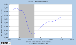
Your iPad screen shows the rise in real GDP with the “hook” starting in late 2007.  It is that hook that has got a lot of people arguing.  Its the hook that has pulled home values down and given a hard yank on the retirement dreams of  many people.  That hook tugged away the after school program your kid was in as the school district tightened its belt.  That hook took your wife’s job away; it almost took yours.

Now your buddy is talking loudly and pointedly about higher education cuts, but is barely able to finish his sentence as Uncle Bob interrupts him with the tale of the state university vice-president who is getting $300K a year in pension benefits.  Bob is sick of paying higher taxes for the fat cat retirements of the elite government employees.

Although the Bureau of Economic Analysis called an end to the recession in June of 2009, every adult with half a brain knows that the recesson didn’t end then. The billionaire investor Warren Buffett uses a rule of thumb that a recession ends when real GDP gets above the high point before the recession began.  You touch the “5 year” range button on the screen and see that real GDP has in fact surpassed that high point in 2007 so Buffett probably called and end to the recession in the fall of 2011.


FRED conveniently colors in the recessions, highlighting the periods in gray, but they are the “official” periods of recession, when GDP rises or falls for two consecutive quarters.  GDP could fall from $100, for example, to $60, signalling a recession, then increase to $65 over six months and the BEA would say it was the end of the recession, even though any sane person would say “Hey, we’re still down a third from the $100 high point.”

Has the GDP per person surpassed its 2007 high?  Your mother-in-law leans over and asks whether you want lettuce and tomato, glances down at the iPad screen with just a hint of disapproval in the set of her mouth and tells you that everyone will be eating soon.  OK, just a minute, you tell her.

Touching the screen, you click the “Add Data Series”, then touch line 1.  In the box you type “POPTHM”, the population census figures.  The other night, you couldn’t remember Bruce Willis’ name from the Die Hard movies but you can remember the label for the population series.  You’re not old yet but this is probably what happens to old people’s brains.  To get the GDP, which is in billions, per capita, which is in thousands, you need to multiply the GDP dollars by a million before dividing so you type into the formula box: “a * 1000000 / b” and touch the “Redraw Graph” button below it.

FRED redraws the graph, showing that the per capita GDP has still not risen above the 2007 high point.


For four and half years we have been in recession, you think.  No wonder we are arguing.

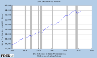
Was it as bad as the recession in the early eighties, you wonder.  That was a double dip recession.  You touch the starting date box and click on 1960 and a new expanded graph appears on the screen. “Hey, hon, why don’t you help me with the ice?” your wife asks.  “Ok, just a sec,” you reply, not looking up from the screen.

You see that this recession on a per capita basis is about the same as the early eighties, lasting about four and a half years, from late 1978 to mid 1983, with an upward hiccup during that period.  The period was the same but the decline in the late 70s and early 80s was much shallower than this current recession. 

You want to show both your friend and Uncle Bob why they are arguing, that the recession really hasn’t ended, the comparison of this recession and the 1980s but your wife needs help with the ice so you close the iPad cover.  Maybe you can show them the graph after the meal.  “Burgers are up!” your father-in-law shouts and the whole group sits down to chow down. 

After the meal, your friend hauls out an old croquet set. There are a few hoops missing and one mallet has a head but no handle, but the kids are delighted.  At some point in the game, Uncle Bob sends your friend’s ball far afield with a taunt “Out in left field where the liberals belong!” but your friend doesn’t take the bait.  On second thought, you muse, showing these guys the graphs would only reignite the debate.

“Daddy, it’s your turn.  You can use my mallet,” your kid says and you reach for the mallet, thinking  We try to teach our kids to be considerate and cooperative on the playground and in school.  So what happens to that sense of cooperation when we grow up?

The Personal Income Problem

Last week, I looked at Obama’s GDP problem.  This week I’ll look at the Disposable Personal Income (DPI) problem.  DPI is after tax income, what’s left to spend and save.  The following chart (thanks to the FRED database at Federal Reserve) showd the real, or inflation adjusted, rise in per person disposable income since 1960.

Zooming in on the past thirty years shows just how severe this recession has been.  Real disposable income flattened out or declined only slightly in past recessions; in this recent recession, it fell sharply.

Looking closer at the last ten years shows the 2008 – 2009 decline more clearly and the stalling out of income growth over the past two years.

Now the bad news for the 99% of us.  Remember, this is inflation adjusted income, in 2005 constant dollars. When we look at the annual increase in income, we see a steady decline in the peaks.  The chart below shows a three year smoothed average of that yearly increase in real income.  We are working more and making less.  Higher paying manufacturing jobs have been lost to foreign countries and more of us are working in the service sector, whose average wages and productivity gains are below that of manufacturing workers.

Next, let’s look at Obama’s problem in this election year.  Below is that same chart with the results of re-elections over the past 40 years.

Voters cast their ballots with their guts and the level of personal income and financial security is both a dollar figure and a gut feeling.  President Obama can make a good case, as Ronald Reagan did, that the poor to middling economic performance of the past few years is due largely to the severity of the downturn he inherited.  The chart also shows the decline in personal income during Reagan’s second term and helps to explain why Reagan received poor poll numbers from the public on his management of the economy in the mid to late eighties.  Many are not old enough to remember those days and some who are old enough were not paying much attention at the time.  With a tripling of the nation’s debt and personal incomes falling during Reagan’s second term, Reagan’s vice-president, HW Bush, felt he had to run away from Reagan’s economic policies to get elected.  In a two decade effort to lift up Reagan’s legacy, the mainstream conservative media has consistently glossed over, rationalized or neglected much of the economic history of those times. 

Ross Perot, running as an Independent, kept the 1992 election focus on the economy.  HW Bush would have been re-elected had not Perot taken enough Republican votes that he cost Bush his re-election.  Obama can learn from HW Bush’s experience.  With no substantive third party challenger to take away votes, Obama will need to broaden the political conversation to include more than the economy.

Obama’s most ardent supporters have become lukewarm but Romney has not won much enthusiasm either.  This election will be one of trench warfare, each side carrying their banner, hoping to rally voters to the banner, not the man.

Obama’s GDP Problem

In these home stretch months before the election, President Obama and Republican nominee Mitt Romney will be repeatedly challenging each other’s economic performance; Obama as President and Romney as Governor of Massachusetts.  Already the initial attack ads of both campaigns are running and each has plenty of factual ammo they can aim at the other.  Contrary to all common sense, we continue to measure Presidents by the health of the economy.  Although Congress is largely responsible for the laws that govern the economic dynamo of a country, we look to the President to set priorities for Congress – or at least that’s what we tell ourselves.  In truth, we are rather simple minded and prefer to hold one man responsible rather than a group of 535 Congress people and Senators. 

For some background, let’s take a look at a chart showing the real GDP, that is GDP in constant 2010 dollars, per capita over the past five decades.

Then zoom in on the last ten years, showing the severe decline of per capita GDP during this recent recession.

Now let’s look at the total per capita GDP growth by President.  If real GDP per capita was $100 when a President took office and $120 when he left office, then total real GDP growth was 20% during that President’s watch.  We’re not going to look at the annual percentage of growth, only the total.  For the most recent GDP data I have used BEA estimates of $15,454 trillion as of the first quarter of 2012. I have used Census Bureau estimates of a total population of 313 million and a BLS inflation factor of 2.186 since 2010.

Almost by instinct, the voters do not re-elect Presidents who are at the helm of a low growth country.  Below is a chart of the first term total real GDP growth of Presidents who were re-elected.  I have not included Johnson because he only served for a year before he was re-elected.

As you can see, GW Bush was the only President re-elected with a total growth gain less than 10% and Bush won re-election by winning Ohio by two percentage points or 118,775 votes.  Had 60,000 voters cast their ballot for Kerry, GW Bush would have lost Ohio’s 20 electoral votes and the election.  As the first Presidential election after 9/11, the election focused more on national defense and foreign policy, not the economy.  A barrage of attack ads, the Swift Boat campaign, against Kerry in the last weeks leading up to the election proved to be a decisive factor in Bush’s re-election.  Had the election concentrated more on the economy, Bush probably would have lost the election.

I have listened to several conservative pundits who criticize Obama for continuing to run against Bush’s economic policies, contending that it has been 3-1/2 years since Obama took office.  Many conservatives are devotional acolytes of the Ronald Reagan legacy and their devotion often clouds their memory.  Obama is using the same strategy that Reagan did in 1984, who ran against Carter’s former Vice President, Walter Mondale.  I will paraphrase a common refrain of Reagan during his re-election bid: “Do you want someone (Mondale) who helped get us in this mess in the first place?” Reagan asked.  The voters answered a resounding “No” and sent Mondale down to a crushing defeat.  Reagan employed this tactic of running against a former President despite the relatively strong growth during his first term. 

Although Obama’s total GDP growth is better than GW Bush’s total, it is less than former President Carter, a guy who lost his job over relatively weak growth and Obama’s 1st term growth numbers are less than Bush’s first term growth. A strong 1st quarter of economic growth in 2012 has helped pull up the President’s economic growth numbers but the first reading of 2nd quarter GDP growth that comes in July may further weaken his chances just before the election.  By the time 3rd quarter GDP numbers come out in October, many voters will have already made up their minds.

For his part, Romney’s tenure as governor of Massachusetts was hardly exemplary.  We will have two contenders for the Presidency running on an economic platform and neither one of them has a strong record of economic growth while in office.  Both campaigns will have plenty of arrows in their quivers and each candidate presents an inviting target.  Enjoy the show!

Manufacturing Rising

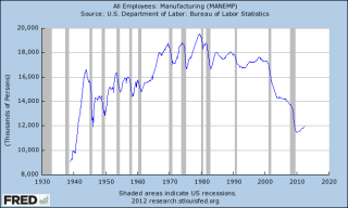
Manufacturing Employment has been increasing since the recession officially ending in mid 2009 but it remains at historically low levels. (Click to enlarge in separate tab)

As a percentage of the Civilian Labor Force (those working and those looking for a job), there has been a decades long decline.  Almost 1 in 4 employees worked in manufacturing in the 1960s.  Today, the ratio is 1 in 12. 

When China joined the World Trade Organization (WTO) in 2001, it began taking a lot of what are called “low value added” manufacturing jobs.  These are jobs which do not require specialized skills or knowledge.  Many rural and urban U.S. workers with high school degrees or less lost their jobs to mainly rural Chinese workers who migrated to large cities in China and staffed the recently built factories.

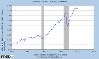
While employment in manufacturing has gone down, sales have climbed, enjoying positive year over year gains except for the two recessions in the 2000s.

Adjusted for inflation over the past twenty years, each manufacturing worker is producing almost twice the value of goods. 

Investment in factories and production equipment, more streamlined processes and a higher skilled workforce have led to these productivity gains.  Since 2006, workers have seen a 16% increase in earnings, almost as much as the 18% real productivity gains during those years.

Democratic politicians and commentators often criticize business owners and executives for taking all the profits from productivity gains by workers.  In this industry, the facts simply do not support those criticisms.

Economic Overview

The U.S. Treasury web site has a good slideshow of various components of the economy.  The first couple of slides detail the net budget impact of TARP, Federal Reserve and other government programs.  Subsequent charts illustrate the depth of the recession, the decades long accumulation of household debt, the headline and long term unemployment rates, and auto and home sales.

Auto Sales

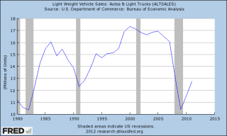
Auto sales have been one of the strong parts of the economic recovery in the past couple of years, as shown in the graph below.

The industry had been beaten down during the recession as consumers got by with whatever they were driving.  Looking back over the last thirty years, we can see that we are still below a healthier annual average of about 14 million cars and trucks sold, and far from the peak levels of 17 million.

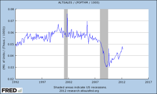
But something more fundamental has changed.  We are simply buying fewer new cars per capita.  Below is a graph of the number of new cars sold divided by the population.

We are making our cars last longer.  The quality and safety of cars has certainly improved but we are simply spending less money per capita on automotive transport.  Below is a graph of per capita spending on new autos and auto parts.  In 2012, we are spending about the same amount of money as in 1998, despite 14 years of inflation.  In real inflation adjusted dollars, we are spending a little less than what we did in 1992.

What these figures do not include is a comparison of the cost of repairs, car insurance and, chief of all, the cost of gas to feed our four wheeled beasts of burden.

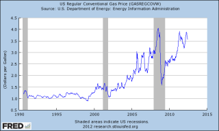
Below is a chart of the weekly average price of gasoline in the U.S. since 1990.

If a gallon of gas cost $1 in the early nineties and the price of gas went up with the rate of inflation, we would expect to pay about $2.30 today.  Instead we are paying closer to $4 a gallon.  Indexed to inflation, the cost of gas reached its peak under the Bush administration but gas prices are approaching that 2008 peak.

I have already heard several political ads saying that when Obama came into office, gas was $2.50 a gallon and now the price of gas if $4.00 a gallon.  Sure, gas was $2.50 a gallon when Bush left office.  Oil prices had plummeted in reaction to the global financial crisis.  Political ads trust that our memories are short and that we have forgotten just how high gasoline prices had climbed during the Bush administration.  Since the average of gasoline prices are relatively lower during the Obama administration than the 2nd Bush term, should we then conclude that Bush’s energy policies were bad and Obama’s are good?  The fact is that presidential policies have a teeny tiny effect on the price of gasoline.  Political ads and the money machines behind them are like the shell game operators on Times Square in New York City.  They hope we are gullible enough to believe their illusions.

May Labor Report

May’s monthly Labor Report headlined a seasonally adjusted job gain of about 70K, less than half of the 150K expected.  The stock market response was swift and worsened as the day’s trading progressed.  By the time the dust cleared Friday evening, the broader S&P500 index had lost about 2.5%, it’s worst daily performance since Oct. 3, 2011.

On Feb. 5th, I wrote in response to the January labor report showing a gain of 234,000 jobs: “With the S&P500 index at 1344, some market pundits are whispering the 1500 mark that the S&P could take a run at this year.  Holy moly, macanoli, what a buzz about one labor report!” and later “Any job growth is good, but when I see a better improvement in the employment numbers for [the core work force aged 25 – 54], I will know that we are building a resilient economy, one that can withstand some shocks.”

Remember, the headline numbers are seasonally adjusted.  For the past three years, market watchers and economists have been warning about the seasonal adjustment factors used by the Labor Dept.  The severe job losses in the fall and winter of 2008/2009 have probably skewed the adjustment factors, leading the Labor Dept to overstate job gains during the winter and understate job gains in the spring and summer months.  The unusually warm winter of 2011/2012 further skewed job gains, pushing some normal spring hiring forward into the winter months.  That’s why I look at year over year gains in unseasonally adjusted numbers, particularly in the core work force aged 25 – 54.

Below is a graph of the percent gains of the core work force, which accounts for about 2/3 of the total work force.  The FED has conveniently saved me the trouble of running the graphs from the Labor Dept – but mine are more colorful :-).

The headline numbers of monthly job gains of more than 200K led many investors to bid up stock prices a bit more than the job gains in the core work force warranted.  Friday’s stock market reaction was probably a bit much but many investors simply bailed.  The same stock price and labor market patterns of 2010 and 2011 are emerging again this year.  Last June, I wrote about a backtest of investing based on the old “Sell In May and Go Away” mantra. While that investment strategy underperformed regular monthly investing, it has been disturbingly profitable for the past two years and looks to repeat again this year.  The disappointing labor figures only compounded the worries about the ongoing recession and financial woes in Europe, causing many to bail out of the market.

Let’s “zoom out” on the core work force, looking at the past year and a half.  There is a definite positive trend in place.

Let’s fly up like little birdies and look at the core work force for the past 12 years to see this recent upward trend in perspective.

Let’s look at the larger work force, those aged 25+, which accounts for 88% of employment in this country.  The year over year gains have leveled off at about 1.6% in the past few months.

Looking back the past 12 years, we see that this gain is moderately healthy.  The housing bubble produced employment gains of over 2% – gains concentrated in construction.

Now let’s look back to the “roaring nineties,” before China joined the WTO in 2001, leading to a loss of 4 million manufacturing jobs in this country.  The country enjoyed a tech boom in that decade, eventually leading to the dot-com bubble as we approached the millennium mark.

The job gains these past 6 – 8 months are respectable, averaging what they were in the nineties; core work force numbers are still growing.  The job losses of this past recession were historic.  Most of the 8.13 million jobs lost happened before Obama took office and the job losses were staggering when compared to other recessions.  The 1982-84 recession, for comparison, suffered total job losses of 2.84 million, about a third of the job losses of this past recession. Below is a graph of the year over change in employment levels since 1948.  This past recession makes all the past recessions look like small wrinkles.  Job losses of this size severely weakened the structure of our economy.

The employment growth of the past few years has been respectable, even more so given the deep hole our economy is climbing out of.  We are a people who have become accustomed to instant gratification.  We want change and we want it now, dammit.  The political and media machines of both parties know this and play to it.  George Bush played to it in the 2000 campaign, promising to bring the parties closer together, only to drive them further apart.  Obama played to it in his 2008 run for the White House, promising to usher in a new era of honest and accessible government, of community of government and the middle classes, where everyone enjoyed a more even playing field.  Romney’s run for the Presidency will highlight his business experience, promising unspecified growth policies.  What all of these people and their advisors know is that the American public is a sucker for change, reaching for the brass ring of change as we whirl around on the political merry-go-round.  We can be easily lied to because we trust our guts, not our brains.  If we trust someone or agree with their ideology, we will believe almost any data they throw at us.  Most of us don’t check the data.  We’re too busy for that or we don’t know how to check the data.  It all becomes a blur of he said this and the other guy said that and we get confused and vote with our guts.  The parties play to our prejudices.  Think you don’t have any?  Think again.

This election season we will hear a lot of claims, accusations and refutations.  Moderators of the upcoming Presidential debates rarely challenge a candidate with data.  The moderators ask policy questions; the candidate responds with mostly rehearsed answers.  Then on to the next question.  It is up to us to do our homework but most of us won’t.  Too many of us may be like the caller to a talk show recently.  When confronted with government statistics that refuted the caller’s opinion, he responded “That can’t be right” and countered that the government data is wrong.  We do love our opinions and that is the number one prejudice we all share.