Golden Cross

A few weeks ago, I wrote about a long term trading strategy using the 200 day moving average of a popular index, the S&P500, which captures 75% of the corporate activity in the U.S.  As corporate profits of larger companies increasingly come from overseas, the S&P provides some foreign stock exposure as well.  Over the past decade, the strategy worked pretty well, getting out of the market before the 2008 downturn, enabling an investor to pick up shares at a cheaper price in 2009.  That is, after all, the point of adopting any type of trading strategy – sell when shares are expensive, buy them back when they are cheap.

Today, I’ll look at a variation of the 200 day strategy called the “Golden Cross”, which I have mentioned in a few past blogs.  A Golden Cross buy signal occurs when the 50 day moving average crosses above the 200 day moving average.  A sell signal occurs when the 50 day average crosses below the 200 day average. A buy signal just occurred at the end of January. You can chart the S&P index for free at StockCharts.  I will compare this Golden Cross strategy to the buy and hold strategy. 

The Golden Cross strategy investor must overcome two major problems: tax attrition and the return on cash while out of the market.  The first problem is formidable. The IRS takes their pound of flesh out of profits that the trading strategy produces.  The downturn in prices when the strategy is out of the market may not be enough to compensate for the 20% (or more?) tax bite, which reduces the investor’s capital pool when he buys back into the market.  Thus the investor may buy fewer shares on the next buy date, and those fewer shares generate less profits as market prices climb.  The second problem is almost as formidable.  Over the 50 years that I will explore, the investor would be out of the market about a third of the time.  The interest rate one earns on one’s capital while out of the market is an important factor in total returns.

Here are the assumptions of the study:

20% Effective Tax Rate – capital gains taxes are “taken out” at the time of the sale.

3% Average Dividend Yield (see here for historic dividend yields)- dividends are recorded and taxes paid for those dividends for both strategies at buy and hold dates.  While not entirely accurate, it largely accounts for the value of dividends to a portfolio.

Interest – 4% on cash while out of the market.

Reinvest – For the conservative buy and hold strategy, the investor pays taxes on the dividends received and puts the money in some cash equivalent fund earning the stipulated interest.  The Golden Cross strategy accumulates and reinvests the dividends at the next stock purchase date. (Click to enlarge in separate tab)

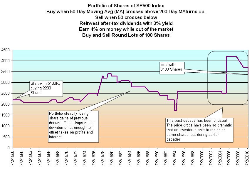
The market downturn during the 70s was severe enough that the Golden Cross investor could book profits, pay taxes and buy back more shares than he had before.  In the early 80s, the downturns were not significant enough to overcome tax attrition.  Had we ended this exploration in the year 2000, this strategy would have done poorly when compared to a buy and hold strategy, even after accounting for the deferred taxes owed by the buy and hold investor.  During the two severe bear markets of the 2000s, the Golden Cross strategy shined, exceeding the returns of the buy and hold strategy.

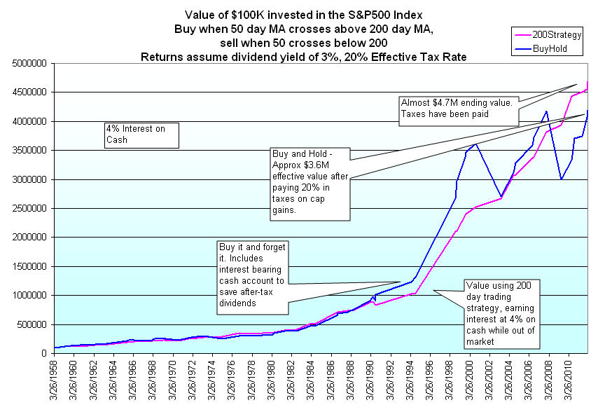
The lesson is that the downturn must be strong enough that the Golden Cross strategy can overcome the tax attrition by buying shares back at greatly reduced prices.  Although the Golden Cross strategy produced only 5 losses out of 27 round trip (buy/sell) trades, a winning percentage of about 80%, the tax obstacle is a formidable barrier to increased profits over buy and hold.  The buy and hold strategy is about 25% invested in cash at the end of this study, a conservative approach consistent with a buy and hold investor.  If the buy and hold investor were to periodically reinvest dividends instead of holding cash, it would probably equal the after tax returns of the Golden Cross strategy.

The Golden Cross strategy is much more dependent on finding a good return on cash when the investor is out of the market.  In these times, that is not an easy task.  As a retirement strategy, it might be wise to choose a combination of the Golden Cross and buy and hold.  A buy and hold investor in or approaching retirement would assess their income needs for the next 3 – 5 years and sell just enough shares to fill the cash account when a Golden Cross sell signal arrives.  During their working years, a buy and hold investor would add shares when a Golden Cross buy signal arrived.

The Core Work Force

The Bureau of Labor Statistics (BLS) released their monthly Employment Summary this past Friday and the market cheered, the Dow jumping up 100 or so at the open.  The Sunday talk shows have been abuzz about the report, which showed a January gain of 243,000 jobs.  After 5 months of increasing job gains, how improved are Obama’s chances of re-election?  Does the improving job picture cause the Republican Presidential contenders to change course a bit?  Wanting not to appear as though they are rooting against the American economy, do the contenders aim at specific policies of Obama in the coming months?  With the S&P500 index at 1344, some market pundits are whispering the 1500 mark that the S&P could take a run at this year.  Holy moly, macanoli, what a buzz about one labor report!

The labor report is only part of the picture puzzle that shows an improving economy.  The ISM manufacturing report was slightly below expectations but still growing.  Two key components of the index, new orders and backlogs, showed a robust increase, hinting at continuing improvement in the coming months.  The recent durable goods report shows that businesses are building inventories, a sign that expectations are improving.   Retail sales tapered off in December, but Personal Income was slightly above expectations, growing .5% over November.  Caterpillar, the large equipment maker, is looking forward to revenue and profit increases in 2012, reducing earlier concerns of a global recession.  A recent report indicates that the ongoing contraction in China’s manufacturing has slowed and is close to the neutral mark between contraction and growth. 

So, what’s not to like?

Looking past the monthly headline numbers of job growth, let’s look at this country’s core work force, men and women aged 25-54.  The BLS just made several census adjustments which resulted in upward revisions to seasonally adjusted job growth from April to December.  Instead of looking at seasonally adjusted numbers, I’ll take a look at the raw numbers from the BLS employment report for January and compare them to BLS January data for the past ten years.

A unseasonably warm winter throughout much of the U.S. gave a boost to construction jobs in the office building and multi-family residential construction.  Although the construction industry is still far below 2007 levels, that boost shows up in a comparison of employed men aged 25 – 54 from last January to this January. (Click to enlarge in separate tab)

The ongoing attrition in government jobs, which disproportionately employs women, has slowed but is still evident in comparisons with past Januaries.

This rather tepid growth, or lack of it, in our core work force is troubling.  This age demographic forms the backbone of a healthy economy, raising children, buying furniture and homes, saving for retirement and their kid’s college. Any job growth is good, but when I see a better improvement in the employment numbers for this group, I will know that we are building a resilient economy, one that can withstand some shocks.  We know of some possible shocks – the probable default of Greece, the ongoing recession in Europe and the possibility of some armed conflict with Iran, to name but three.  The shocks we don’t forsee are what can push our economy off balance.  Last year was a reminder of the impact of unforeseen shocks.  The tsunami  in Japan and the flooding in Thailand not only devastated those countries and their people but impacted supply chains in Asia and consequently sent after shocks throughout the world.

Recently fashionable has been talk of a decoupling of the U.S. and emerging countries’ economies from the sovereign debt and financial troubles in Europe.  If recent history has taught us nothing, it is that much of the world is joined together by interdependent webs of financial conglomerates and the monetary policies of nation states, by the tension between global consumer demand and multi-national supply chains to meet that demand.

200 Day Nudges Higher

The market is a reflection of hope and fear, of world events that affect each of us, our jobs, our families, our schools, churches and neighborhoods.  The 200 day moving average moves through the minute gyrations of the daily market like a great leviathan, changing its course only gradually.  If you are a Star Wars fan, think of the 200 day as The Force.

For the long term investor, it is wise to buy or sell as this average changes direction.  When we compare a month’s (21 trading days) average of the 200 day to the previous month’s average, we can see these changes in direction.  At the onset of the recession in 1990, the S&P 500 index dropped about 17%.  The recession was fairly short but it was a jobless recovery.  From the October 1990 trough to the end of 1993, the index climbed 60%, then paused and stumbled.

Almost 3 years after the recession had officially ended in March 1991, the unemployment rate was still a lofty 6.5%.

Due in part to the jobless recovery, the federal debt had risen 50% in the four years of 1990 through the end of 1993 and would continue it’s relentless march upwards for several more years.


In 1994, the 200 day average waggled in indecision, barely moving during that summer before nudging upwards in August, then falling again in November, before making its decisive move upwards in 1995.  In six years, the index would more than double.  When the 200 day began to roll over in the fall of 2000, the wise long term investor listened to that slow heartbeat and headed for the exits.  In the middle of May 2003, the 200 day began another 4-1/2 year climb up before rolling over in Jan. 2008.  18 months later, the 200 day began yet another climb after the steep descent of the financial crisis of 2008.  Just this past September, the 200 day signaled exit after a tumultuous summer and before continuing unrest in the fall.

A person investing in the S&P500 index who turned when the 200 day average turned would have made 460%, including dividends, on their money since 1994, 81% in the past ten years and that doesn’t include money that could be made in interest while their money sat safely outside of the market mayhem. 

In the last quarter of 2011, the 200 day moving average had been slightly declining but largely flatlining – unchanged – since the beginning of August. A week ago, it nudged higher.  Will this be like the nudge higher in August 1994 that may reverse in a month or two?  Could be. Although the signals of the 200 day average are relatively few, a prudent investor would monitor the situation every week in case this is a “waggle” and not the beginning of a move up.