The Great Moderation

June 30th, 2013

Economists cite a number of factors to account for the growth during the 1980s and 1990s, a period some call the “Great Moderation” because it is marked by more moderate policies by politicians and central bankers.  Causes or trends include less regulation, lower taxes, lower inflation than the 1970s, the rise of emerging economies,  and a more consistent rules based monetary policy by the Federal Reserve.  Often underappreciated, but significant, was the huge increase in consumer credit. Household spending accounts for 2/3rds of the economy.  A new generation, the boomers, emerging fully into adulthood in the early ’80s, welcomed the broader availability of credit.  Like their parents, the boomers took on the burden and responsibility of owning a home, the largest portion of a household’s debt load, but unlike the previous generation, the boomers sucked up as much credit as they could get for cars, clothes, vacations, home furnishings and the growing array of electronic devices.

When we look at the non-mortgage portion of household debt, the rate of growth is more restrained – a mere 80% increase in per capita real dollars.

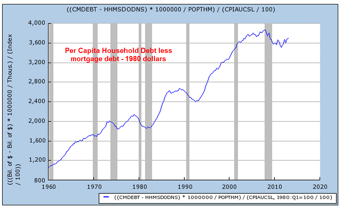
The parents of the boomer generation, dubbed by newscaster Tom Brokaw as the “Greatest Generation”,  had been habitual savers.  By 1980, the personal savings rate was about 10% of disposable income.  By the middle of that decade, the Greatest Generation began retiring and withdrawing some of that savings.  Their children, the boomers, did not have a similar sense of frugality.

Rapid advances in technology led to the introduction of new electronic toys for adults.  Credit cards, once reserved for the well to do, became ubiquitous.  Consumers parted with their money more painlessly when charging purchases.  Financing terms for automobiles became more generous,  allowing more people to purchase new cars, which became increasingly expensive as regulators mandated more safety controls.

After thirty years of gorging on credit, households threw up.  The past six years could be called the “Great Diet” or the “Great Purge” to get over the three decade credit binge.

We can expect rather lackluster growth for several more years as households continue to shed those ungainly pounds debts.  Not only are households shedding debt but also certain kinds of assets. In 2009, the Federal Reserve reported that households and non-profit corporations owned $400 billion in mortgage securities like Fannie Mae and Freddie Mac.  In the first quarter of 2013, the total was $10 billion.  (Table of household assets and liabilities)

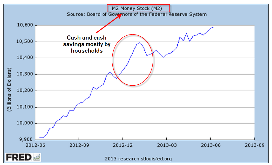
Households continue to keep ever higher balances in low yielding savings accounts and money market funds, indicating the high degree of caution. The big jump in deposits was probably due to higher dividends and bonuses paid in the last quarter of 2012 to avoid higher taxes in 2013.

For the past two weeks, global markets shuddered at the prospect of the Federal Reserve easing up on their quantitative easing program of buying government bonds.  Some have proclaimed that it is the end of the thirty year bull market in bonds, causing many retail investors to pull money out of bonds.  In several speeches this past week, Reserve Board members have reassured the public that quantitative easing will be here for several years.

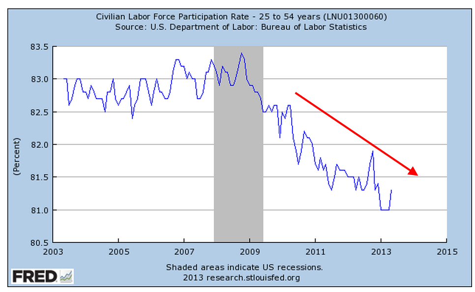
As we have seen, households still shoulder a lot of debt weight, making it unlikely that either this economy or interest rates will experience a surge upward in the next several years.  An aging and more cautious population together with a declining participation rate in the work force indicates that another “Great Moderation” is upon us.  The previous moderation was one of political policy.  This moderation is led by consumers.  We can expect – yes, moderate, or lackluster – growth over the coming years.  The positive tradeoff for this subdued growth is the probability that the underlying business cycle of growth surges and corrective declines in economic activity will be subdued as well.

Summer Sale

June 23rd, 2013

It would be a mistake for the casual investor to think that the decline in the market this week was due entirely to Fed chairman Ben Bernanke’s comments regarding future Fed policy.  There was little that was not anticipated.  The Fed will continue to follow a rules based approach to its quantitative easing program, scaling back its purchases of government securities if employment improves or inflation increases above the Fed’s target of 2%.  Bernanke also reiterated that the Fed would increase its purchases if employment does not improve and inflation remains subdued.  So why the drop?

Shortly after the conclusion of each Fed meeting, Bernanke holds a press conference, where he issues a ten minute or so summary of the meeting and issues discussed.  He then takes about twenty questions.  At the start of this past Wednesday’s press conference at 2:30 PM EDT, the market was neutral as it had been all morning.  The Fed chairman was more specific about the anticipated timeline of the wind down of quantitative easing if the economy continued to improve.   Although he was essentially repeating himself, the voicing of a specific and concrete timeline evidently jolted some sleeping bulls who surmised that the party was over; in the final hour of trading the SP500 fell a bit more than 1% in the final hour.  For many traders, it was time to take profits from the eight month run up in prices.  “Quadruple witching”, a quarterly phenomenon that occurs when stock and commodity options and futures expire, was approaching.  The few days before this event usually see a spike in volume as traders resolve their options and futures bets.

With much of the Eurozone in a mild recession and slow growth in emerging markets, the rest of the world perked up their ears as the central banker of the largest economy envisioned an easing of monetary stimulus sometime in 2014.

Overnight (Wednesday/Thursday) came the news that the Shanghai interbank rate had shot up from about 4% to 13%, a rate so high that it threatened to seize up the flow of money between Chinese banks.  This bit of bad news from the second largest economy added additional downward pressure on world markets.  For some time, analysts covering China have been warning about the amount of poorly performing loans at China’s biggest banks.  The spike in interbank rates, prompted by the Chinese government, was an official warning to Chinese banks to be more cautious in their lending practices.

On Thursday morning came the news that jobless claims had increased, adding more downward pressure.  The SP500 opened up another 1% lower that morning and dropped a further 1.5% during the trading day. This classic “one-two” punch knocked the market down about 4%.  European markets fell about 5%, while emerging markets endured a 7.5% drop in two days.

In the past four weeks, there has been a decided shift in market sentiment.  When the market is bullish, it tends to shrug off minor bad news.  As it turns toward a bearish stance, the market reacts negatively to news that just a few months ago it largely ignored.

Over the past two months, long term bonds have declined 10% and more.  Here is a popular Vanguard long term bond ETF that has declined 12% since early May.

For the long term investor, periods of negative sentiment can be an opportunity to put some cash to work.

Business Cycles

June 16th, 2013

The manufacturing sector accounts for less than 20% of the economy but is probably the major cause of business cycles in the economy.  In the 1990s, the growing development of technology and business services in the U.S., together with what was called “just in time” inventory management, led some economists to declare an end to the business cycle. Cue the loud guffaws.

May’s monthly report on industrial production released Friday showed no monthly gain, after a decline of .4% in April.  The year over year change in the index was just under 2%.  In a separate report from the Institute for Supply Management (ISM) released a week ago, the Manufacturing Purchasing Managers Index (PMI) index for May fell into contraction, its lowest reading since June 2009, when the recession was ending.


New Orders and Production components of this index saw sizeable decreases.  Computer and electronic businesses reported a slowdown that they attributed to the sequester spending cuts enacted a few months ago.

The latest data for non-defense capital goods excluding aircraft from the U.S. Dept of Commerce showed an uptick after a period of decline in the latter half of 2012; however, there is a month lag in this data set.


The sentiment among small businesses improved somewhat, as shown by the monthly National Federation of Independent Businesses (NFIB) survey.  The overall index of 94 indicates rather tepid expectations of growth by small business owners.  Plans for capital spending to expand business are still at recession levels.

A business builds inventory in anticipation of sales growth.  Since the beginning of this year the net number of small businesses expanding inventory has finally turned positive.

  In a 2003 paper, economist Rolando Pelaez tested an alternative model of the Purchasing Managers Index that would better predict business cycles, specifically the swings in GDP growth.  Assigning varying constant weights to several key components of the overall PMI index, his Constant Weighted Index (CWI) model is more responsive to changes in business conditions and expectations.  In early 2008, the PMI showed mild contraction but Pelaez’ CWI model began a nose dive. It would be many months before the National Bureau of Economic Research (NBER) would mark the start of a recession in December 2007 but the CWI had already given the indication.  In May of 2009, the CWI reversed course, crossing above the PMI to indicate the end of the contractionary phase of the recession.  It would be much later that the BEA would mark the recession’s end as June 2009.


The CWI index is rather erratic.  We lose a bit of its ability to lead the PMI when we smooth it with a three month moving average but the trend and turning points are more apparent in a graph.

Before the 2001 recession the CWI index led the PMI index down.

OK, great, you say but what does this have to do with my portfolio?  Smoothing introduces a small lag in the CWI but it is a leading, or sometimes co-incident indicator of where the stock market is headed over the next few months.

Let’s look at the last six years.  In December 2007, the smoothed CWI crossed below the PMI, which was at a neutral reading of about 50.  The stock market had faltered for a few months but as 2008 began, the CWI indicated just how weak the underlying economy was.  The NBER would eventually call the start of the recession in December 2007.  In June 2009, the CWI crossed back above the PMI.  Coincidentally, the NBER would later call this the end of the recession.

The period 2000 – 2004 was a seesaw of broken expectations, making it a difficult one to predict because it was, well, unpredictable.  I did not show this example first because this period is a difficult one for many indicators.  Before 9-11, we were already in a weak recession.  Although the official end was declared in November 2001, the effects were long lasting, a preview of what this last recession would be. In 2002, we seemed to be pulling out of the doldrums but the prospect of an Iraq invasion and a general climate of caution, if not fear, prompted concerns of a double dip recession.

An investor who bought and sold when the smoothed CWI crossed above or below 50 would have had some whipsaws but would have come out about even instead of losing 15% over the five year period.

The present day reading of both the CWI and PMI are at the neutral reading of 50.  Given the rather lackluster growth of the manufacturing sector, the robust rise of the stock market since last November indicates just how much the market is riding on expectations and predications of the future decisions of the Federal Reserve regarding future bond purchases and interest rates. Over the past thirteen years, when the year over year percent change in the stock market hits about 22%, the percentage of growth in the index declines.

So what is a normal run of the mill investor to do?  The CWI, a predictor of business cycles, is not published anywhere that I could find. This and many other indicators are used by the whiz kids at investment firms, pension funds, by financial advisors and traders, to anticipate business conditions as well as the movements of the markets.  But look again at the SP500 chart above and remember that it is the composite of millions of geniuses and not so geniuses trying to anticipate the market.  As I have mentioned in previous blogs, when that percentage change drops below zero, it is time for the prudent investor to consider some portfolio adjustments.  Since 1980, the average year over year percent change in the SP500 is 9.7%, using a monthly average of the SP500 index. Despite the recent 20% gains, the average year over year percent gain during the past ten years is only 4.9%.  If we look back to the beginning of the year 2000, the average is only 3.1%.  Those rather meager gains look robust when compared to the NASDAQ index, which is still 25% below its January 2000 high.  Think of that – thirteen years and still 25% down. The Japanese market index, the Nikkei 225, is at the same level as it was in early 1985, almost thirty years ago.  Both of these examples remind us that we need to pay some  attention or pay someone to do it for us.

Goldilocks Jobs

June 9th, 2013

In the long running comedy series “Frasier,” Frasier or Niles would often order a latte  in their local neighborhood bar, being careful to note exactly how they wanted the drink made.  Friday’s employment report was made to order – not too strong so as to hasten the end of the Fed’s latest bond buying program and not so weak as to confirm fears of another summer swoon.

Slowly and inexorably the number of employed trudges up the recovery hill.  The unemployment rate ticked up a scosh to 7.6% as more people tried to find work.  The year over year percent change is still in good territory.

On the not so good side, the percent of the total population that is working is still below the 30 year average of almost 44%.

The unemployment rate of those with a college degree is far below that of the general labor force but is still 50% above the average of the early 2000s.

Student aid loans have passed a trillion dollars (source).  To put that figure in perspective,  student loan debt is about 10% of the $11 trillion in outstanding debt of residential mortgages (source)

Changes in the bankruptcy laws in 2005 exempted student loan debt from bankruptcy.  Over the next decade or so, will the investment in education pay off?  Let’s hope so.  100 years, an 8th grade education became a standard used by employers to winnow job applicants in a tough job environment.  70 years ago, the new standard became a high school education.  For the past 30 years, we have moved to a 4 year degree as the new standard.
We now spend more on defense and more on Medicare that the $500 billion total amount spent by the state and the federal government on K-12 education. (source) Community college educators are painfully aware that many students are simply not prepared to take college courses.  Local communities used to fund 70% of K-12 education.  Thirty years ago, homeowners protested ever rising property taxes to fund K-12 education and, since that time, local funding has dropped below 50%.

If we expect our children to develop the skills for a college education, we are going to have to find an alternative model of funding.  The states have relied on an ever increasing share of Federal funding for K-12 education.  Although the percentage of Federal spending on K-12 is small, less than 10%, the aging Boomer generation will command ever more spending of general tax dollars in addition to the Medicare taxes collected.

The core work force aged 25 – 54 struggled upwards

but the participation rate, the percentage of the population in the labor force, is still weak.

The “total” unemployment rate, which includes those working part time for economic reasons, continues to drift down but is still high.

Understand that this represents over 20 million people, a bit more than the entire population of New York State.  Turn on C-Span sometime and tell me how many committee hearings on jobs there are.  Immigration, federal surveillance and the targeting of conservative groups by the IRS are important matters, yes, but why aren’t politicians in Washington talking about jobs?  There are several reasons: no one has a clue; no clear political advantage to be gained; constituents are not writing letters to their representatives and senators about jobs.

Welcome to the “New Abnormal.”

Stocks vs Bonds

June 2nd, 2013

As the market makes new highs this past month, I am reading articles and seeing charts on asset allocation that reminded me of those I saw in 2000.  Here is a chart that appeared in the WSJ this weekend.

Mutual Funds typically report their performance over several time periods, usually 1, 3, 5, and 10 year periods.  This spring, as the SP500 index continue to peak, a ten year lookback window begins near a trough in the index in the spring of 2003.

Why did the WSJ writer pick 25 year and 35 year time periods as a comparison?  We can only guess but it just so happens that the starting points of these two lookback periods were also troughs in stock prices.  Why not pick 20 and 30 year time periods? Let’s look at the 25 year period which starts in April 1988.

What if the writer had used a 20 year lookback?  They would have started in April 1993, when the stock market was 72% higher.  I don’t want to take the time to calculate the difference in returns, including dividends, between the different strategies shown in the chart, but the reader can imagine that the difference would be significant.

Why use a 35 year lookback?  Why not a 30 year lookback?  In 1978, the SP500 index was again pulling out of a trough in prices after a slow slide in values during 1977.

Had the WSJ writer picked a 30 year window starting in April 1983, the stock market index was – again – 72% higher than in April 1978.  Again, we can imagine that the comparison of strategies would be significantly different.

Being aware of these peaks and troughs can help us evaluate past performance of various investment allocations.  Consider an example of a 10 year comparison of the SP500 vs a bond index fund like Vanguard’s VBMFX

The SP500 index shows the better return but, if we know that spring of 2003 was a trough in this index, we can view such a comparison with some skepticism.  A five year comparison tells a different story.

Now we are comparing performance starting with a downslide in the index, when the SP500 had fallen about 11% from its peak.  It is also close to the 3 year moving average of the SP500 index.

Based on a five year window and the fact that our starting point was a 3 year average in the SP500, we might conclude that our portfolio should contain mostly bonds.  Who needs the aggravation of the volatility in the stock index when we can make the same return with a boring bond index?

In a 3 year time frame, stocks have clearly outperformed bonds.

Our starting point of this 3 year window also happens to be the 3 year average of the SP500 index.  Not only that, it is just  a bit above the midpoint between the 2007 index peak and the trough in the spring of 2009.  We couldn’t ask for a more reliable starting point to make our comparison.

So we have a second reliable starting point but the conclusion we draw is significantly different from the conclusion we drew in the 5 year comparison.  Let’s look closer at this stronger performance of the SP500 vs a bond index.

Half of the better 3 year performance of stocks has come in just the last 6 months after the Federal Reserve announced their open QE program of buying government bonds until the unemployment index reaches a target of 6.5%.  The recent upsurge in stocks has “goosed” the comparison numbers upwards in favor of stocks.

Our conclusion is that historical performance numbers presented by mutual funds or an investment advisor cannot be taken at face value.  It is important to understand the starting point of the historical comparison, which can have a significant effect on the numbers.