Strong Reactions

December 30, 2018

by Steve Stofka

Happy New Year!

Dramatic trading days signal a down market. In the week prior, the SP500 index lost over 7%. On Monday, Christmas Eve, the stock market fell to a level that would traditionally signal the beginning of a bear market, which is 20% below a recent high closing price. After a huge rally on Wednesday and a lot of volatile trading this week, the index gained 3%.

A disruptive stock market underscores the importance of asset allocation. The SP500 has lost 10% in December. A conservatively balanced fund like Vanguard’s Wellesley Income (VWINX) lost 1.8%. The fund is actively managed and has 40% stocks, 60% bonds/cash. A fund of index funds, VTHRX, lost 7.8%. It has a more aggressive mix of 65% stocks and 35% bonds/cash.

As I noted a few weeks ago (Hat Trick), there have been repeated signs of a struggle between hope and fear, between competing estimates of future earnings. 7% weekly price falls occur at crises or turning points. In the past sixty years, there have been only fifteen such weeks. Let’s take a look at the most recent.

In August 2011, then President Obama walked away from an informal budget deal with House Speaker John Boehner. The market lost almost 20% but fell short from hitting that mark. Once a budget deal was negotiated, the market recovered but it took five months to make up the losses.

SPY4YR2011-2018

Three years earlier, in October 2008, the market lost more than 7% in a week when negotiations for a bank bailout fell apart. This was a month after the bankruptcy of investment firm Lehman Brothers ignited the financial crisis. The market would take 39 months to recover that October price level. On February 17, 2009, President Obama signed the American Recovery and Reinvestment Act (Note #1). Senate Democrats made many concessions to win a few Republican votes for the bill to gain passage. Once it became clear that the stimulus funds would be trickled into the economy over several years, the market tanked, losing 11% during the month of February. In a final week of capitulation, the market lost 7% in the first week of March. This was the turning point.

A 10% weekly price drop in April 2000 heralded the end of the dot-com boom. The market would not recover for 83 months, almost seven years. An even worse fall came after the market opened following the 9-11 attack. The indictment of the international accounting firm Arthur Anderson sparked doubts about the financial statements of other companies and helped fuel an 8% drop in July 2002.

With six weeks of 7% price drops, the 2000s was the most tumultuous decade since the Great Depression. Strong reactions in the market deserve our attention and caution.

//////////////////////
Notes:
1. The American Recovery and Reinvestment Act 

Stormy Seas

December 23, 2018

by Steve Stofka

For the past two months, the stock market’s volatility has doubled from late summer levels. The Fed announced its intent to continue raising interest rates in 2019 at least two times, and the market nosedived in response. It had been expecting a more dovish policy outlook from Chair Jerome Powell.

What does it mean when someone says the Fed is dovish, or hawkish? Congress has given the Fed two mandates: to manage interest rates and the availability of credit to achieve low unemployment and low inflation. That goal should be unattainable. In an economic model called the Phillips curve, unemployment and inflation ride an economic see-saw. One goes up and the other goes down. To rephrase that mandate: the Fed’s job is to keep unemployment as low as possible without causing inflation to rise above a target level, which the Fed has set at 2%.

There are periods when the relationship modeled by the Phillips curve breaks down. During the 1970s, the country experienced both high unemployment and high inflation, a phenomenon called stagflation. During the 2010s, we have experienced the opposite – low inflation and low unemployment, the unattainable goal.

Convinced that low unemployment will inevitably spark higher inflation, the Fed has been raising interest rates for the past two years. The base rate has increased from ¼% to 2-1/2%. The thirty-year average is 3.15%. Using a model called the Taylor Rule, the interest rate should be 4.12% (Note #1).  After being bottle fed low interest rates by the Fed for the past decade, the stock market threw a temper tantrum this past week when the Fed indicated that it might raise interest rates to average over the next year. Average has become unacceptable.

FedFundVsTaylorRule

In weighing the two factors, unemployment and inflation, the Fed is dovish when they give greater importance to unemployment in setting interest rates. They are hawkish when they are more concerned with inflation. The Fed predicts that unemployment will gradually decrease to 3.5% this coming year. Unemployment directly affects a small percentage of the population. Inflation affects everyone. The Fed’s current policy stance is warily watching for rising inflation.

The stock market is a prediction machine that not only guesses future profits, but also other people’s guesses of future profits. As the market twists and turns through this tangle of predictions, should the casual investor hide their savings in their mattress?

These past five years may be the last of a bull market in stocks; 2008 – 2012 was the five-year period that marked the end of the last bull period that began in 2003 and ran through most of 2007. Here are some comparisons:

From 2014-2018, a mix of stocks returned 7.7% per year (Note #2). A mix of bonds and cash returned 1.96%. A blend of those two mixes returned 4.91% per year.

From 2008-2012, that same stock mix returned just 2.66% per year. The bond and cash mix returned 5.5%, despite very low interest rates. A blend of the stock and bond mixes returned 5.26%.

For the ten-year period 2008 thru 2017, the stock mix earned 7.7%. The bond and cash mix returned 3.54% and the blend of the two gained 6.35% annually. On a $100 invested in 2008, the stock mix returned $13.5 more than the blend of stocks and bonds. However, the maximum draw down was wrenching – more than 50%. The $100 invested in January 2008 was worth only $49 a year later. Whether they needed the money or not, some people could not sleep well with those kinds of paper losses and sold their stock holdings near the lows.

The blend of stock and bond mixes lost only a quarter of its value in that fourteen-month period from the beginning of 2008 to the market low in the beginning of March 2009. The trade-off between risk and reward is an individual decision that weighs a person’s temperament, their outlook, and the need for to tap their savings in the next few years.

A rough ride in stormy seas tests our mettle. During the market’s rise the past eight years, we might have told ourselves that our stock allocation was fine because we didn’t need the money for at least five years.  If we are not sleeping because we worry what the market will do tomorrow, then we might want to lower our stock allocation. Sleeping well is a test of our portfolio balance.

///////////////////

Notes:
1. The Atlanta Fed’s Taylor Rule calculator
2. Calculations from Portfolio Visualizer: 30% SP500, 30% small-cap, 20% mid-cap, 20% emerging markets. Bond mix: 70% intermediate term investment grade bonds, 30% cash. The blend of the two was half of each percentage: 15% SP500, 15% small-cap, 10% mid-cap, 10% emerging markets, 35% bonds, 15% cash.

Income Inequality Up, No Down

December 16, 2018

by Steve Stofka

Up or down?

According to a recently updated analysis of 2015 income data by the Economic Policy Institute (EPI), Jackson, Wyoming leads the list of census statistical areas for income disparity (Note #1). Jackson is a ski resort and a natural wonderland where rich families live in expensive homes. It is a micropolitan, not a metropolitan statistical area (MSA) like Columbus, Denver or New York City. Most of the top statistical areas for income disparity in this study are resort areas. Workers in resort towns are typically low income, skewing measures of income disparity higher.

The Brookings Institute (BI) filtered out these resort data outliers in their analysis (Note #2). Large coastal cities topped the list of MSAs. The EPI study used the ratio of the top 1% of incomes to the bottom 99% to calculate disparity. They found that it was increasing, a common trope of the political left. BI calculated their disparity by using a ratio of the top 5% of incomes to the bottom 20% of incomes. BI found that disparity remained the same overall. They did note that more cities saw a declining disparity. Methodology matters.

Wealthy people are attracted to states with no income tax, and most of the top statistical areas listed by EPI are in such states. Wyoming is one of nine states that do not tax most or all personal income (Note #3). Taxpayers who claim some of their income as earned in that state can save a good deal of money on taxes. Taxpayers can meet the rules of residency used by the Census Bureau and IRS by living the most days in a certain state (Note #4). Individual states may require that a person have that state’s drivers license, voting record or other proof of residency (Note #5).

States with no income tax have high sales and gasoline taxes to help fund local infrastructure and services. Those on the political left claim that these regressive taxes hurt working families. Conservatives reject the progressive definition of “fair” taxation. On principle, tax rates for common goods and services should be equal. In addition, homeowners with expensive homes contribute more to the commonweal in higher property taxes and their employment of service labor for upkeep maintenance, repair and remodel.

The BI study highlights a problem that will continue to divide the country. The states with the highest income inequality are in states that vote Democratic. Representatives in those states are responding to a real problem, but Democrats want higher federal tax rates for taxpayers in all states to fix a problem in a few densely populated coastal states. A consistent feature of Democratic platforms are national solutions to local problems. Republicans counter that states should solve their own problems. However, Democratic politicians have already jacked up tax rates in states with high income disparity.  They are concerned that wealthy taxpayers will flee high tax states and make the problem worse. They are right. Wealthy taxpayers are leaving high tax states like New Jersey.

If you think you have a solution to this political problem, please mail your solution to “Santa Claus, c/o North Pole” and have a wonderful Christmas.

//////////////////////

Notes:
1. EPI analysis of 2015 income data, updated in July 2018 https://www.epi.org/publication/the-new-gilded-age-income-inequality-in-the-u-s-by-state-metropolitan-area-and-county/
2. Brookings Institute analysis of income data https://www.brookings.edu/research/city-and-metropolitan-income-inequality-data-reveal-ups-and-downs-through-2016/
3. Alaska, Florida, Nevada, S. Dakota, Texas, Washington and Wyoming do not tax personal income. New Hampshire and Tennessee tax investment income only. Those states have higher sales and gasoline taxes. Bankrate (https://www.bankrate.com/finance/taxes/state-with-no-income-tax-better-or-worse-1.aspx)
4. Census Bureau residence rules – count people where they live for most of the year. If they have no permanent residence(s), use their residence on April 1st of the census year. Snowbirds and others who split their residence should use the place where they spend the most days. https://www.census.gov/population/www/cen2010/resid_rules/resid_rules.html
5. Colorado residency rules for tax purposes https://www.colorado.gov/pacific/sites/default/files/Income6.pdf. Also, Intuit’s guidelines on multi-state tax filing https://turbotax.intuit.com/tax-tips/state-taxes/multiple-states-figuring-whats-owed-when-you-live-and-work-in-more-than-one-state/L79OKm3jI

Hat Trick

December  9, 2018

by Steve Stofka

For the third time in six weeks, the SP500 fell below its 200-day moving average. This ten-month average of trading activity is a benchmark that indicates mid to long-term sentiment. It is a tug of war between the bulls and the bears, the buyers and sellers, over the developing trade war between the U.S. and China.

Technical market watchers call a crossing below the 200-day a Death Cross, a too dramatic name for something that may occur once or twice a year. Less frequently does it happen twice in a two-month period – a Double (Note #1). Rarely does it occur three times in such a short period of time – a Hat Trick (Note #2).

Hat Tricks signal strong investor worry about one or more structural conditions that will impact future earnings. The situation may resolve, and the market regain its upward trend. If the situation does not resolve, expect further price declines.

What does this mean for the casual investor? Contributions to an IRA at current prices will be priced as though you had dollar-cost averaged (DCA) each month of this year. As I showed in 2011 (Note #3), the DCA strategy has produced the highest long-term returns on the SP500. Look at the monthly bar on the chart below.

5de57-iracontribspy1993-2010sharesmonthly
History is the only guide we have to investor behavior. Previous Doubles occurred in 2015 and 2012. Previous Hat Tricks developed in 2011 and 2010, producing strong price corrections (Note #4) in response to budget duels between Republicans and President Obama (2011), and debt crises in the Eurozone (2010).

In hindsight, the Hat Trick that occurred during four weeks in August 2007 signaled that this was more than a well-deserved correction in the housing market. Don’t we wish we had the clarity of a rearview mirror? Another Hat Trick a few months later in November and December 2007 coincided with the beginning of the recession that lasted 20 months and chopped 60% off the price of the SP500. Another Hat Trick in May and June 2008 came just months before the onset of the Financial Crisis in September 2008.

A Hat Trick accompanied the peak of the housing market in 2006, and the peak of the dot-com market in 2000. It signaled the start and end of the 1990 recession.

Lesson: be cautious.

////////////////

Notes:
1. In technical analysis, this double bottom forms a ‘W’ and indicates a possible exhaustion of selling before a reversal to the upside.
2. Hat Trick is a name I made up for 3 dips below the 200-day in a two-month period.
3. I compared various IRA investing strategies in May 2011
4. Price declines in 2010 and 2011 barely escaped being classified as bear market corrections, defined as a closing price 20% below a previous closing high price.

Deepening Debt

December 2, 2018

by Steve Stofka

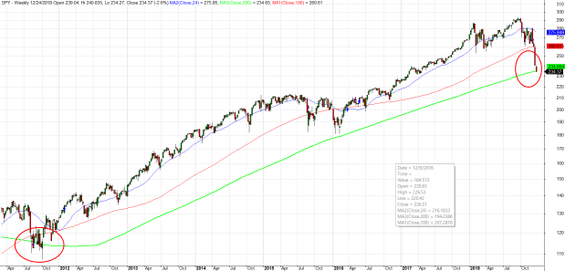
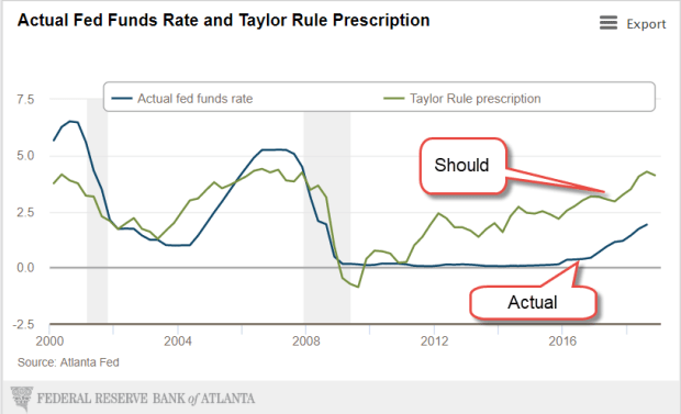
Each time the Federal Reserve raises interest rates, the President tweets out his disapproval. This week Fed Chair Jerome Powell indicated that interest rates increases might be slowing and the Dow Jones average jumped up more than 2% in a few hours (Note #1). Presidents don’t like rising interest rates because they contribute to a slump in housing and car sales, two relatively small pieces of the economy that create ripples throughout a community’s economy. Trump’s strategy relies on strong growth.

The passage of the tax law last December reduced Federal tax revenues, which contributed to a rising deficit. The gamble was that the repatriation of corporate profits plus a reduced corporate tax rate would spur higher GDP growth which would offset the falling revenues. It hasn’t so far.

Let’s get away from dollars and use percentages. Economists track the annual budget deficit as a percent of GDP. I’ll call it DGDP. Let’s say a family made $50,000 last year and had to borrow $1000 because they spent more than they made, their DGDP would be $-1,000/$50,000 or -2%. In a growing economy, the DGDP rises, or gets less negative. It falls, or gets more negative, as the economy nears a recession.

DeficitPctGDP

A DGDP below the 60-year average of -2.5% indicates an unhealthy economy and, by this measure, the economy has not been healthy since 2007. The DGDP was the same in the last year of Bush’s presidency as it was in the last year of the Obama presidency. By 2014, it had risen above -3% and rose slightly again in 2015 but fell again the following year.

In 2016, the last year of the Obama presidency, the DGDP was -3.13%. In the first year of the Trump presidency it fell slightly to -3.4%. As I said earlier, the administration and Congressional Republicans hoped the tax law passed at the end of 2017 would spur enough GDP growth to offset declining corporate revenues. So far, that has not happened. The 2018 budget year just ended in September. Preliminary figures indicate that the deficit will be 3.9% of GDP this year (Note #2). Some economists project a DGDP near -5% in 2019.

Japan’s economy for the past two decades strongly suggests that an aging population weakens GDP growth. The U.S. economy must flourish against that demographic headwind. By December this year, Social Security (SS) benefits will surpass the $1 trillion mark, equal to or surpassing SS taxes collected (Note #3). For years, the excess in SS tax collections has lessened the amount that the Federal government had to borrow from the public. Each year, the government has left an I.O.U. in the SS trust fund. The total of those IOUs is almost $3 trillion.

Now the Federal government faces two challenges: interest on the ever-growing Federal debt and the government’s need to borrow more from the public to “pay back” those IOUs. The interest on the debt will soon overtake defense spending. Politicians could reduce cost of living increases in SS benefits by indexing benefits to the chained price index, a flexible measure of inflation that assumes that human beings alter their consumption in response to changing prices. Benefits are currently indexed to the Consumer Price Index (CPI) whose fixed basket of goods never changes. The CPI overstates inflation, but seniors are sure to lobby against any changes that would reduce cost of living increases. Politicians are reluctant to face angry seniors who might boot some of them out of office at the next election.

Trump has a better alternative than strategically lowering benefit increases for the swelling ranks of retiring Boomers – increase SS tax collections. The only way to do that is jobs, jobs, jobs. Jobs that are “on the books,” that take out SS taxes with each paycheck; not the jobs of the underground economy that flourish in immigrant communities. More jobs to draw in the half million discouraged workers who are sitting on the sidelines of the job market (Note #4).

Jobs, jobs and more jobs take care of a lot of budget problems. Campaign strategist James Carville stressed that point to Bill Clinton during the 1992 Presidential campaign. Higher interest rates hurt the construction, auto and retail industries, and blue collar small business service industries. All of these are more likely to reach out and hire marginal workers.

The headwinds are more than demographic. The economy has been stuck in low for a decade. In the eleven years since the 3rd quarter of 2007, just before the 2007-2009 recession, real GDP has averaged only 1.6% annual growth (Note #5). That is barely above population growth. Sectors that were strong, housing and auto sales, have slowed. Housing sales have declined for six months. Auto sales have declined for 18 months. Fed interest rate policy has been very supportive but that is slowly being withdrawn.

The DGDP is one more indicator that we should already be in a recession or approaching one. A recession will add to the demographic headwinds, increase the annual budget deficit and swell the accumulated federal debt. Job growth must counter job loss due to automation. Good policies are those likely to add jobs. Bad policies are those that thwart job growth. It doesn’t matter how well intentioned the policies are. Good or bad for job growth is all that matters in the next decade.

Here’s why. Another credit crisis is building. Low interest rates transferred billions of dollars in interest from the savings accounts of older people to businesses and government, who were able to go on a borrowing binge. Defaults and delinquency on business loans will probably be the source of our next crisis. After that is the coming pension crisis in several cities and states. Let’s hope those two don’t hit simultaneously.

////////////////////
Notes:

  1. Within a day, interest rate futures that had priced in a 1/2% increase in the Fed Funds Rate during 2019 fell to just .3% for next year.
  2. Estimates of 2018 Fed deficit and GDP
  3. Social Security trustees’ summary report for fiscal year 2017.
  4. BLS series LNU05026645 discouraged workers. After ten long years, there are now as many discouraged workers as October 2008, just as the financial crisis sent the economy into shock. Within two years after the onset of the crisis, the number of discouraged workers had exploded 250%, reaching 1.25 million in October 2010.
  5. Real GDP: 3rd quarter 2007 – $15,667B. 3rd quarter 2018 – $18,672B. Constant 2012 dollars.