March 9th, 2012
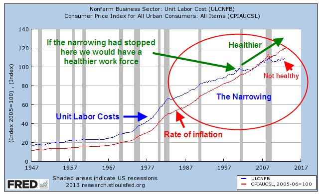
Labor costs are the major share of the expense of producing goods and services. While the percentages vary by industry, a rule of thumb is that labor is about 70% of the final cost of a product. The cost of labor to produce one widget should keep rising with inflation. With the passage of time, widgets sell for more and employees demand more pay to produce those widgets. Not surprisingly, the Bureau of Labor Statistics keeps track of the labor cost to produce widgets; they call it Unit Labor Cost. In laymen’s terms we can think of it as the Widget Labor Cost. The cost is indexed to a particular year year; in this case it is 2005. If the labor cost of a widget was $2.43 in 2005, we’ll set that to 100. Indexing makes what might seem like arbitrary numbers more uniform. If the labor cost of a widget in 2012 is $2.67, then the index would read 110, or 10% more than 2005.
Widget labor costs typically fall or flatten out in a recession. A graph of the past ten years shows that we still have not reached 2007 levels.

Keynesian economists say that labor costs are “sticky”, i.e. they do not decline in proportion to the downturn in the economy and the reduced demand during a recession. Wages are the price of labor. Union contracts and employment laws do not allow these prices to fall to what is called the market clearing level. Labor prices thus become too expensive and employers want less labor, resulting in higher unemployment.
Several decades of data allows us to see some changing growth trends in the labor costs to make widgets.
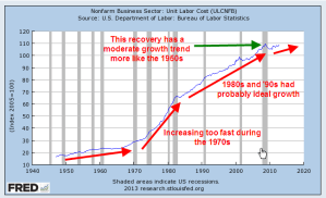
As I noted earlier, labor costs rise with inflation. The graph below shows the relationship between the two.
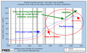
After WW2, the rise in labor costs was just slightly ahead of the rise in inflation, allowing workers a greater standard of living and to put away some money for the future. During the “stagflation” of the 1970s, this gap widened as workers demanded more pay in response to rising inflation while economic growth stagnated. When the economy recovered in the mid-1980s, we began to see a narrowing between unit labor costs and the rate of inflation. Had this narrowing stopped around the year 2000 and labor costs continued rising with inflation we would have a healthier work force and a healthier economy. But the gap narrowed further until labor costs were no longer keeping up with inflation. Dwindling increases in labor costs have resulted in more profits for companies. Although the labor market has a strong influence on the stock market, it is an indirect influence. Stock prices are directly influenced by rising corporate profits and the perception that future profits will increase at a faster or slower rate.
Because wages do not rise and fall in proportion to the swings in the business cycle, companies took the only course of action left. They reduced the labor component cost of their goods and services where they could. Union contracts offer a company less flexibility in responding to downturns in the economy. Companies reduced their exposure to union labor by outsourcing production to other countries, or by subbing out production to smaller companies with non-union workforces.

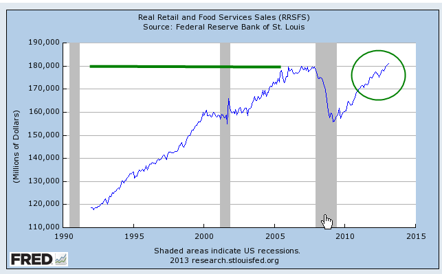
Many people have been waiting several years for employment to recover. As the chart above shows, there has been a systemic decrease in labor needed to produce each widget. There is little indication that this trend will end as the economy continues to recover. Since this economy is consumer driven, it is dependent on a healthy labor market. A stumbling labor force will not produce robust gains in the economy.
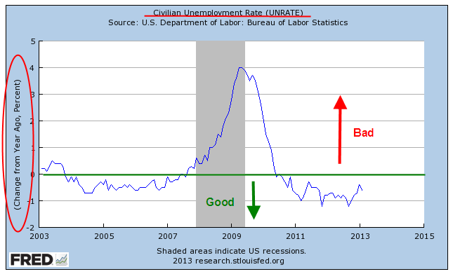
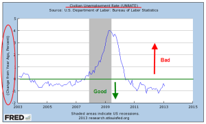
That is the background, the context for a look at February’s monthly labor report from the BLS, a better than expected report. The headline job gain was 236,000, far above the 170,000 anticipated employment gain. The unemployment rate dropped to 7.7% and the year over year decrease in the unemployment rate indicates little chance of recession.
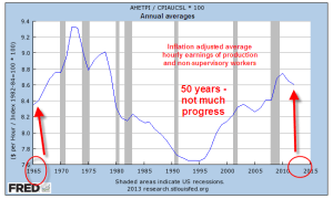
There were other positive signs in this latest report. Average hourly earnings of private-sector production and nonsupervisory employees broke above $20, increasing to $20.04. After rising and stuttering last year, earnings have increased steadily since August 2012. Despite these gains, hourly earnings of production employees are little changed from 1965 levels.
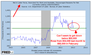
A slowly improving economy gave some hope that we might see the number of discouraged unemployed workers decline below 800,000 this month. Instead the number rose from 804,000 to 885,000.
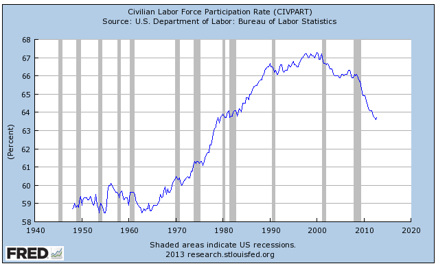
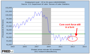
The Labor Force participation rate dropped another .1%. Fewer and fewer workers are being asked to shoulder the benefits of the retired and unemployed. The core work force aged 25-54 is still showing no substantial improvement.
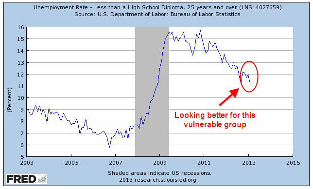
While employment gains in the 25 – 54 age group have stagnated, the larger group aged 25+ continues to show improvement. The unemployment rate for this larger group declined another .2% and now stands at a respectable 6.3%. The employment picture for new entrants into the labor force, those aged 16 – 19, remains bleak. This past month, the rate of the unemployed in this group increased and now stands at 25%. Hispanics have seen a 10% decrease in unemployment during the past year but there are still almost 10% unemployed. The minority group that has suffered the most through this recession has been African-Americans, whose unemployment rate has stayed subbornly high. There have some small declines in unemployment over the past year, but almost 14% of this group is unemployed.
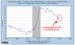
However, a group that has had persistently high unemployment, those without a high school diploma, saw a significant decline from 12% to 11.2%.
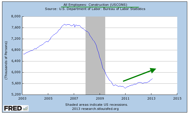
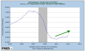
A significant contributor to that decrease is the steady rise in construction employment.
Perhaps not so widely followed is the “Craigslist indicator of construction activity.” No, you won’t find this one charted anywhere but it does give a clue to what it going on in your area. Search for “work van”, “work truck”, “step van” or “cube van” in your local Craigslist. If there are a lot of listings, it means things are not good. A few years ago, the Denver area used to have pages of work vehicles for sale by both owners and dealers. This month there are few listings.
Other positives were the increase in the weekly hours worked to 34.5, in the pre-recession range. Health care enjoyed strong gains as usual. Professional and business services enjoyed strong gains, offsetting the unusually flat gains of January. A rise in retail hiring was a nice surprise.
A bit of a head scratcher was the revision of January’s job gains, erasing 25% of the 160,000 job gains that month. Revisions of that size leads to doubts about the winter seasonal adjustments that the BLS makes to the raw data.
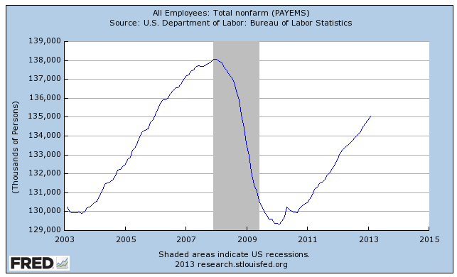
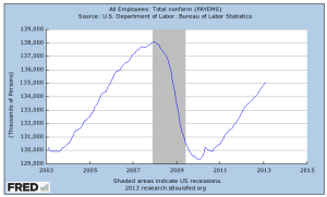
There are still 3 million fewer people working than in January 2008, when the BLS reported employment of 138 million.
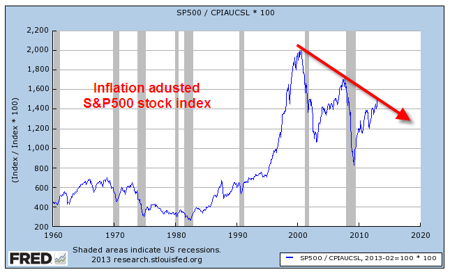
In the past week the Dow Jones Industrial average crossed above the high mark of 2007. On an inflation adjusted basis, the Dow is still well below the level it attained in 2000 and has still not passed 2007 price levels. Some argue that the average 2.2% in stock dividends paid out each year partially compensates for the 3% loss in purchasing power. Others argue that the dividend is compensation for the risks the investor assumes in the stock market and should not be taken into account. If we disregard dividends, the inflation adjusted SP500 index is – well, it’s better than it was in 1990.
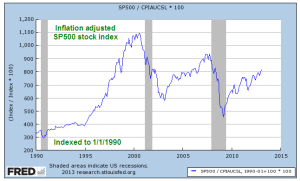
If a buy and hold investor has been in the market since 1990, she has gained 4% per year after inflation. Adding in a dividend yield of about 2.5% over that time results in a total gain of 6.5%. Had she bought a 30 year Treasury note in 1990, she would have been making about 8% per year for the past 23 years. There are three lessons to be learned from this: Diversify, diversify, diversify.