The Puff

February 25, 2018

by Steve Stofka

Each week I’m hunting scat, the data droppings that a society of human beings leaves behind. This week I’m looking for a ghost ship called the Phillips Curve, a relationship between employment an inflation that has had some influence on the Federal Reserve’s monetary policy. The ideas and policies of others, some long dead, have a daily impact on our lives. I’ll finish up with a disturbing chart that may be the result of that policy.

A word on the word “cause” before I continue. As school kids we learned a simplistic version of cause and effect. Gravity caused my ball to fall to the ground. As kids, we like simple. As adults, we long for simple. As we grow up, we learn that cause-effect is a very complex machine indeed. The complexity of cause-effect relationships in our lives are the chief source of our disagreements.

So, “cause” is nothing more than shorthand for “has an important influence on.” The dose-response mechanism is a key component of a causal model in biology. If A causes B, I should be able to give more of A, the dose, and get more of B, the response, or a more frequent response.

Let’s turn to the Phillips Curve, an idea that has influenced the Federal Reserve’s monetary policy since it was proposed sixty years ago by economist A.W. Phillips. Simply stated, the lower the unemployment rate, the higher the inflation rate. There is an inverse relationship between unemployment and inflation.

Inverse relationships are everywhere in our lives. Here’s one. The lower the air temperature, the more clothes I wear. I don’t say that air temperature is the only cause for how many clothes I wear. There is wind, humidity, sex, age and fitness, my activity level, social protocols, etc. While there is a complex mechanism at work, I can say that air temperature has an important effect on how many clothes I wear. If I measure the varying air temperatures throughout the year and weigh the amount of clothes that people have on, I will get a strong correlation. High temps, low clothes.

Now what if the temperature got colder and people still wore the same amount of clothes? I would need to come up with an explanation for this discrepancy. Perhaps there never was much of a relationship between air temperature and clothes? That seems unlikely. Perhaps clothes fabrics have been improved? I would need to look at all the other factors that I mentioned above. If I could find no difference, then I would have to conclude that air temperature had little to do with clothes wearing. Headlines would herald this new discovery. Important areas of our economy would be upended. Retail stores would stop stocking coats or bathing suits a few months in advance of the season. Businesses around the country who depend on warm weather clothing would go out of business.

Unlike air temperature and clothes, the relationship between inflation and employment is two-way. The change in one presumably has some influence on the other. During the 1970s, inflation and unemployment both rose. The hypothesis behind the Phillips curve posits that one should go up when the other goes down. Some economists threw the Phillips curve in the trashcan of ideas. Milton Friedman, an economist popular for his lectures and his work on monetary policy, proposed a concept we now call NAIRU. This is a “natural” level of unemployment. If unemployment goes below this level, then inflation rises.

Some economists complained that NAIRU was a statistical figment designed to fit the Phillips curve to existing data. Economic predictions based on the Phillips curve have been consistently wrong. Still, the Congress has mandated that the Federal Reserve maintain “maximum employment, stable prices, and moderate long-term interest rates” (Federal Reserve FAQs). Economists at the Fed must consider both employment and inflation when setting interest rates. The models may not accurately describe the relationship, but many will instinctively feel that the relationship, in some form or another, is valid.

For the past several years, the economy has been at or near maximum employment. In January 2018, the unemployment reading was 4.1%. Whenever that rate has been this low, the country has either been at war or within a year of being in recession. The puzzlement: only lately have there been signs of an awakening inflation.

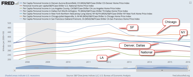
Because inflation was below the Fed’s 2% benchmark while unemployment declined, the Fed kept its key interest rate near zero for seven years. For its 105 year history, the Fed has never kept interest rates this low for as long as it did. Low interest rates fuel asset bubbles. Such low rates cause people and institutions who depend on income to take inappropriate risks to earn more income. The financial industry develops and markets new products that hide risk and provide that extra measure of income. We can guess that these products are out in the marketplace, waiting to blow up the financial system if a set of circumstances occurs. What set of circumstances? We will only know that in the rear view mirror.

Here’s a chart that tracks price movement of the SP500 ETF SPY for the past twenty years. I’ve shown the tripling in price that has occurred during the past five years.  Notice the long stalk of rising prices. That growth has been nurtured by the Fed’s policy.  Well, maybe this time is different.  Maybe not.

SPYPF20180223

The Un-Crash

February 18, 2018

by Steve Stofka

The stock market did not go down 4% this past Wednesday.  It could have. The annual inflation reading for January was above expectations and confirmed fears that inflation forces are heating up. January’s retail sales report was also released Wednesday. It showed the second weakest annual increase in the past two years. If consumers are moderating their spending a bit, that would counteract inflation pressures.  Instead of dropping 2 – 4% on Valentine’s day, the SP500 went up 2.7%.

The labor report and the retail sales report each month have a significant sway on the market’s mood because they measure how much people are working and getting paid, and how much they are spending.

On a long-term basis, I think (and hope) that consumers will remain relatively cautious in their use of credit. Families today carry a higher debt burden relative to their income. By 2004, household debt levels had surpassed their annual level of income. As housing prices continued to rise, many families overextended themselves further and paid a horrible price when jobs and housing prices declined during the recession.

Families during the 1960s and 1970s carried far less debt relative to their income. People saved their income and bought many items when they could afford it. High inflation in the late 1970s and more relaxed lending standards in the 1980s helped cause a shift in thinking. Why wait? Charge it. Businesses learned that consumers are more likely to spend plastic money than real money. Consumers were encouraged to take another credit card. Buy that new car. Your family deserves it. We have a good interest rate for you.

Following the recession, families have kept the ratio of debt to income at a steady level, so that their debt is slightly below the level of their annual income. Prudent consumers will help keep inflation in check.  Here’s a chart of the debt to income ratio.  See how low it was during the decades after World War 2.

BuyingPower

/////////////////////

Housing

In the past year, tenant groups in California have been lobbying to loosen rent control laws in that state. You can read about it here (Sacramento Bee). To illustrate the economic pressures on many middle-class California residents, I’ll show you a few graphs. The first one is per capita income in six cities. All of them are above the national average. San Francisco and New York top the income list, followed by Denver, Chicago, Los Angeles and Dallas.

PerCapIncomeMSA

Now I’ll divide these income figures by an index of housing costs, the largest expense in most household budgets. In the past few years Chicago has edged into the top spot.  San Francisco is still in the top 3, but has shifted downward as housing costs have climbed.  The housing adjusted income of Los Angeles has dropped even further below the national average.

PerCapitaIncomeHousingMSA

Feeling the fatigue of keeping up with escalating costs, some Angelenos are reaching out to their local politicians for help. Some have thrown up their hands and left the state.

Stress Test

February 11, 2018

by Steve Stofka

The recent market correction, defined as a 10% decline, has been a real time stress test for our portfolios. There hasn’t been a stock market correction since the 11% drop in December 2015 to January 2016. Because the end of January was near the height of the stock market, you can more easily find out how much your portfolio declined relative to the market. As of the close Friday, the SP500 had fallen 7.2% since the end of January. That is your benchmark. Later in this blog, I’ll review a few reasons for the decline.

You can now compare the decline in your portfolio to that of the market.  If you use a personal finance program like Quicken, this is an easy task. If you don’t, then follow these steps:
1) Write down your January ending balances at your financial institutions, including any savings accounts or CDs that you own.
2) Write down the current balances and calculate the difference in value since the end of January.
3) Divide that difference by the balance at the end of January to get a percentage decline.

For instance, let’s say your balances at the end of January added up to $100K and your current balance is $95K (Step 1). The difference is $5K (Step 2). Your portfolio has declined 5% (Step 3) compared to the market’s 7.2%, or about 70% of the market. If the market were to fall 50% as it did from 2000-2002 and 2007-2009, you could expect that your portfolio would fall about 35%. Are you emotionally and financially comfortable with that? A safety rule of investing is that any money you might need for the next five years should not be invested in the stock market.

The next step is to compare the gains of your portfolio in 2017 to the market’s gain, about 24%. The gain should be approximately the same as the loss percentage you calculated above. If the gain is slightly more than the losses, you have a good mix.

The chart below compares two portfolios over the past ten years: 1) 100% U.S. stock market and 2) 60% stocks/ 40% bonds (60/40 allocation). Notice that the best and worst years of the 60/40 portfolio are nearly the same while the best year of the 100% stocks is 10% less than the worst year.

StressTest2008-2017
The 60/40 portfolio captured 80% of the profits of the 100% stock portfolio ($101,532 / $128,105) but had only 60% of the drawdown, or decline in the portfolio. Compare that with the chart below, which spans only nine years and leaves out most of the meltdown of value during the Financial Crisis. There is no worst year! La-di-da! Investors who are relatively new to the stock market may underestimate the degree of risk.

StressTest2009-2017
The 60/40 portfolio captured 58% of the profits of the 100% stock portfolio ($152,551 / $262,289) but the drawdown was 63% (11.15% / 17.84%).  If the drawdown is more than the profits, that doesn’t look like a very good deal for the 60/40 portfolio, does it?  That is how bull markets entice investors to take more risk than might be appropriate for their circumstances.  Come on in, the water’s fine!  An investor might not see the crocodiles. Markets can be volatile. This has been a good reminder to check our portfolio allocation.

///////////////////

Why?

So, why did the market sell off? Let me count the ways. It began on Friday, February 2nd, when the monthly labor report showed an annual gain of 2.9% in hourly wages. For much of this recovery, economists have been asking why wage growth was sluggish as unemployment fell. Economists who like their idealized mathematical models don’t like it when reality disagrees with those models. Finally, wage growth showed some healthy gains and the market got spooked. Why?

As wages take more of the economic pie, profits decline. Companies respond by raising prices, i.e. higher inflation. As interest rates rise, there are several negative consequences. Companies must pay more to borrow money. Fewer consumers can afford mortgages.  Homebuilders and home improvement centers like Home Depot and Lowe’s may see a decline in sales. Car loans become more expensive which can cause a decline in auto sales. There is one caveat: even though hourly wages increased, weekly earnings remained stable because weekly hours declined slightly.  Next month’s reports may show that inflation concerns were overestimated.

This past Monday, ISM released their monthly survey of  Non-Manufacturing businesses and it was a whopper. 8% growth in new orders in one month. Over 5% growth in employment. These are two key indicators of strong economic growth, and confirmed  the fears stirred up the previous day’s labor report. Inflation was a go and traders began to sell, sell, sell.

For the past year, market volatility was near historic lows. Volatility is a measure of the predictability of the pricing of SP500 options. A profitable tactic of traders was to “short” volatility, i.e. to bet that it would go lower. There were two exchange traded funds devoted to this: XIV and SVXY. Traders who bought XIV at the beginning of 2017 had almost tripled their money by the end of the year. When volatility tripled this past week, the whole trade blew up. People who had borrowed to make these bets found that their brokers were selling assets to meet margin calls.  Within days, XIV was closed and investors were given 4 cents on the dollar. SVXY may soon follow. Investors had been warned that these products could blow up. Here’s one from 2014.

The stock market is both a prediction of future profits and a prediction of other investor’s predictions of future profits! The prospect of stronger interest rate growth caused traders to reprice risks and returns. Much of the impact of the selling this past week was in the last hour on Monday and Thursday, when machine algorithms traded furiously with each other. The last hour of trading on Monday saw an 800 point, or 3% , price swing in just a few minutes. In the closing ten minutes of that hour, Vanguard’s servers had difficulty keeping up with the flow of orders.

Contributing to the decline were worries over the government’s debt.  The new budget deal signed into law this week will likely increase the yearly deficit to more than $1  trillion.  There was soft demand for government debt at this week’s Treasury bill auction.  Even without a recession in the next ten years, the accumulation of deficits will increase the total debt level to about $33 trillion.

This correction is an opportunity for the casual investor to make some 2017 or 2018 contributions to their IRA. Profit growth is projected to be strong for the coming year. The correction in prices this week has probably brought the forward P/E ratio of the SP500 to just below 20, a more affordable level that we haven’t seen in few years.


Smackdown

February 4, 2018

by Steve Stofka

We tell ourselves stories. Here’s one. The stock market fell over 2% on Friday so I sold everything. Here’s another story. After the stock market fell 2+% on Friday, the SP500 is up only 21% since 2/2/2017. Wait a second. 21%! What was the yearly gain just a few days earlier? 24%! Yikes! How did the market go up that much? Magic beans.

Here’s another story. Did you know that there has been a rout in the bond market? Yep, that’s how one pundit described it. A rout. Let’s look at a broad bond composite like the Vanguard ETF BND, which is down 4% since early September, five months ago.  The stock market can go down that much in a few days. Bonds stabilize a portfolio.

Two stories. Story #1. The Recession in 2008-2009 produced a gap between actual GDP and potential GDP that persists to this day. To try to close that gap, the Federal Reserve had to keep interest rates near zero for almost eight years and is only gradually raising interest rates in small increments.

Story #2. The Great Recession was an overcorrection in a return to normal. The GDP gap was closed by 2014. Here’s a chart to tell that story. It’s GDP since 1981. I have marked the linear trends. The first one is from 1981 through 1994. The second trend is an uptick in growth from 1995 to the present.

GDP1981-2018

What do these competing narratives mean? For two years the economy has been growing at trend. Should the Federal Reserve have started withdrawing stimulus sometime in 2015, instead of waiting till 2017? Perhaps chair Janet Yellen and other members were worried that the economy might not sustain the growth trend. A do-nothing incompetent Congress could not agree on fiscal policy to stimulate the economy.  The extraordinary monetary tools of the Federal Reserve were the only resort for a limping economy during the post-Recession period.

Ms. Yellen’s last day as Fed chair was Friday. She served four years as vice-Chair, then four years as chair. During her tenure, she was the most powerful woman in the history of this country. She was even-tempered in a politically contentious environment. She kept her cool when  testifying before the Senate Finance Committee.  A tip of the hat to Ms. Yellen.

////////////////

Performance

Vanguard recently released a comparison of their funds to the performance of all funds.

///////////////