Then and Now

January 25, 2015

Valuation

Blogger Urban Carmel has written a thorough article on current market valuation, focusing on Tobin’s Q as a metric.  This is the market price of equities divided by the replacement cost of the companies themselves.  During the past 65 years, the median ratio is .7, meaning that the market price of all equities is about 70% of the replacement cost.  At the end of December, the Tobin’s Q ratio was more than 1.1.

Are stocks overvalued?  Valuing the replacement cost of a company might have been more accurate when the assets were primarily land, factories and other durable equipment.  Today’s valuations consist of networks, processes, branding, and other less easily measured assets.  The valuation discussion is not new.  In 1996, before the U.S. shed much of its manufacturing capacity, economists and heads of investing firms argued about valuation, including Tobin’s Q.  You can punch the way back button here and read a NY Times article that could have been written today if a few facts were changed.

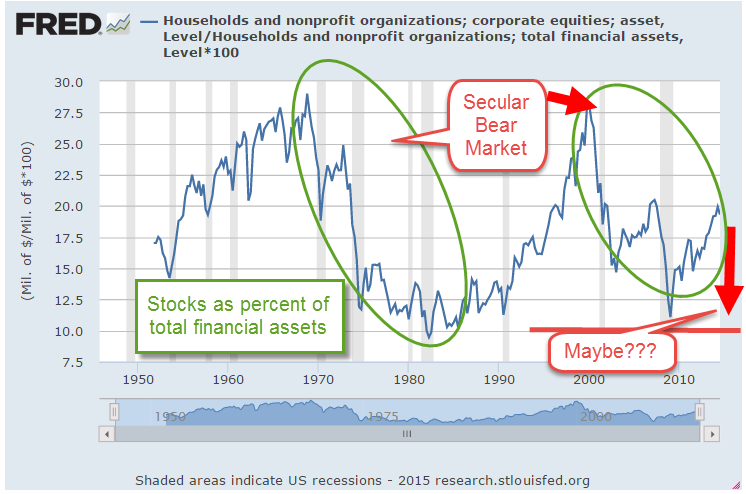
Currently, households have 20% of their financial assets in stocks, the same percentage as in 1996.  In December 1996, then Federal Reserve chairman made a comment about “irrational exuberance”  in market valuations.  Prices would continue to rise, then soar, before falling from their peaks in mid-2000.  At that peak, households held 30% of their financial assets in stocks.  At an earlier peak, 1968, households had the same high percentage of their assets in stocks.

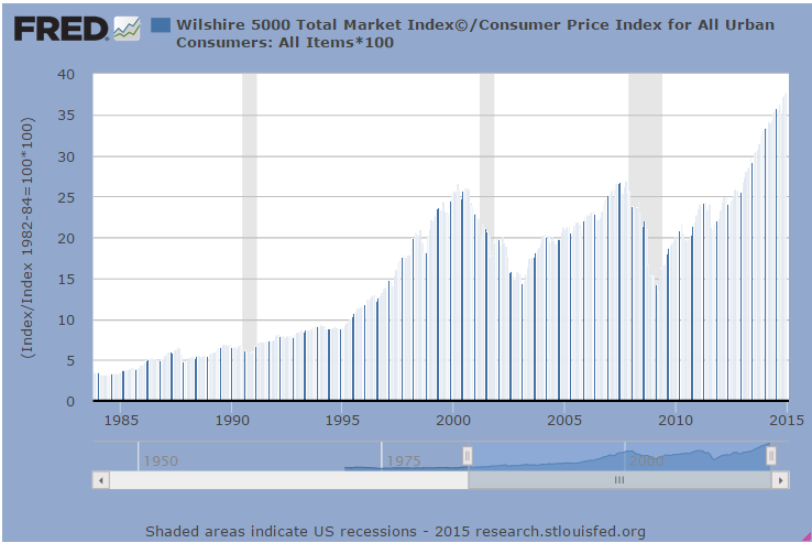
On an inflation adjusted basis, the SP500 has only recently closed above the all time high set in 2000 (Chart here).  The Wilshire 5000 is a market capitalization index like the SP500 but is broader, including 3700 publicly traded companies in its composite. On an inflation adjusted basis this wider index is 40% above the peaks of 2000 and 2007.

Long term periods of optimistic market sentiment are called secular bull markets. Negative periods are called secular bear markets. (See this Fidelity newsletter on the characteristics of secular bull and bear markets).   These long-term periods are easier to identify in hindsight.  Some say that we are nearing the end of a long-term bear market, and that there willl be a big market drop to close out this bearish period.  There have been so few long term market moves in 150 years of market data, that it is possible to tease out any pattern one wants to find.  The aggregate of investor behavior is not a symphony, a piece of music with defined structure and passages.

******************************

REIT

As Treasury yields decline, mortgage rates continue to fall.  The Mortgage Bankers Association reported  that their refinance application index had increased by 50% from the previous week.  The refinancing process involves the payoff of the previous higher interest mortgage.  Mortgage REITs make their money on the spread, or the difference, between the interest rate they pay for money and the interest on loaning that money on mortgages.  When a lot of homeowners prepay their higher interest mortgages, that lowers the profits of mortgage REITs like American Capital Agency (AGNC) and Annaly Capital Management (NLY).  Both of these companies have dividend yields above 10% and are trading below estimated book value.

*****************************

Housing

Back in ye olden days, around 1950, the world was a bit different.  The Bureau of Labor Statistics published a snapshot of incomes, housing, and other census data, including the data tidbit that people consumed fewer calories in 1950 than today, 3260 then vs. over 3700 today.

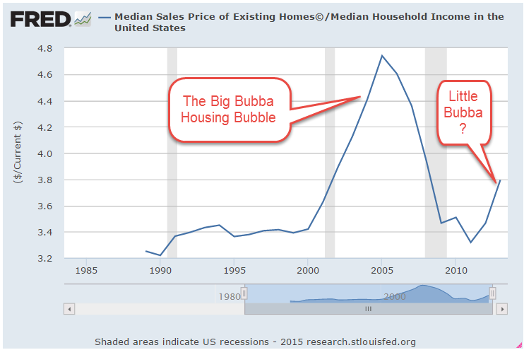
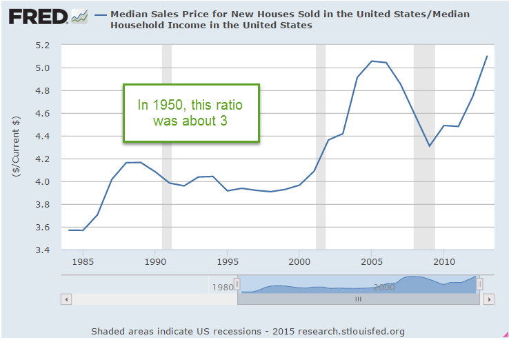
Housing and utilities averaged 27% of income in 1950 vs. 40% today.  Food costs were 33% then, 15% today.  The median house price of $9500 was about 3 times the median household income (MHI) of $3200.  For most of the 1990s, the prices of existing homes were slightly higher, about 3.4 times MHI.

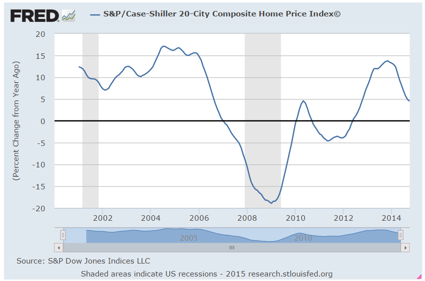
The prices of existing homes rose 6% in 2014 – healthy but not bubbly.  However, the ratio of median price to median income is now at 3.8.  Historically low interest rates have enabled buyers to leverage their income to get more house for their bucks, but the lack of income growth will continue to rein in the housing market.

The ratio of median new home prices to MHI has now surpassed the peak of the housing bubble.

*******************************

Retirement Income

Wade Pfau is a CFA who has written many a paper on retirement strategies and occasionally blogs about retirement income.  Here is an excellent paper on the change in psychology, risk assessment and strategies of people before and after retirement.  Wade and his co-author summarize the critical issues, the two dominant withdrawal approaches, the development of the safe withdrawal rate, and the caveats of any long term planning.  The authors review the strategies of several authors, discuss variable spending rules, income buckets and income layering,  annuities, and bond ladders.  You’ll want to curl up in an armchair for this one.

Dance Partners

January 18, 2015

When investors are grumpy, good news is not good enough or it is too good.  Confidence among small businesses climbed to levels not seen since late 2006 and the positive sentiment was broadly based, including new hiring and plans for expansion.

On the other hand…December’s 9/10% decline in retail sales was a surprise after a strong November.  However, a closer look at the retail figures shows some real positives.  The year-over-year gain was 2.6%, above the 1.7% core inflation rate, indicative of modestly  growing demand.

Excluding retail gas sales, retail sales gained 4.8% over last year.

Now, let’s put gas sales in some historical perspective.  In January 2007, the price of a gallon of gasoline was $2.10, about the same as it is now.  On average, we are driving more fuel efficient vehicles than in 2007, yet total retail gas sales are 25% higher now.

Every six weeks, the Federal Reserve releases their Beige Book survey of economic conditions around the country.  They also reported moderate growth in employment and sales.  They noted that flat wage growth and low inflation reduces any urgency in raising rates.  Friday’s release of the CPI confirmed the low inflation rate.  Including gas and food, the yearly increase was only .7%.  Core inflation, which excludes gas and food prices, rose 1.7%.  Consumer sentiment is nearing the levels of the early to mid-1980s, the beginning of a period of strong growth.

For now, stocks and oil prices are dance partners.  In a week of negative sentiment, traders were watching the 1975 level on the SP500.  This was mid-December’s bottom, a short-term key level of support.  After Thursday’s close near 1990, stocks rallied on the strong consumer sentiment and a report from the International Energy Agency that lower prices are causing some oil production cuts. Fourth quarter earnings season has just begun but if volatility in oil prices remains strong, this may drive market sentiment at least as much as earnings reports.

************************

Job Openings (JOLTS)

November’s job openings showed a slight increase, getting ever closer to the 5 million mark and nearing an all time high set in the beginning of 2001 as the dot-com boom was ending.  This summer open positions surpassed the mark set in June 2007 at the end of the housing boom.

The  economy grows stronger on many fronts – labor, retail, housing and industrial production – and is near multi-year high marks without the help of a widespread boom in any one sector of the economy.  The surge in oil  shale production is confined to a few states.

*************************

Portfolio Allocation

As the market remains somewhat volatile, it’s time to revisit a familiar theme – allocation.  Let’s look at a selection of portfolios with moderate allocation. How much difference has there been between a portfolio with 60% stocks and 40% bonds (60/40), and one with 40% stocks, 60% bonds (40/60)?

Earlier in the year, I mentioned a site  that can backtest a pretend portfolio.  In the free version, the re-balancing rules are fairly simple but it does allow us to make some comparisons of long term trends.

All of the following tests include the years 2000 – 2014, a period which covers two downturns.  The first, from 2000 to 2003, was a protracted decline after the dot com bubble.  The second, from late 2007 to 2009, was severe.

The test includes an annual re-balancing to get to the target percentages, and assumes a modest investment of $100 each year into a $10,000+ portfolio.  Because of the two downturns, it’s no surprise that the portfolio weighted toward bonds did better than the portfolio weighted toward stocks.

The difference between the 60/40 and 40/60 was about 7/10% in annual return.  If we were to use intermediate term bonds as a proxy for the bond component of the portfolio, the difference would be even less.  In the middle range of allocation models, the differences in returns over a long period of time are probably smaller than what we worry about.

The importance of moderate allocation is illustrated by the following two examples.  Let’s consider the period from 1995 – 2014, which includes three market rises and two downturns.  Note the ratio: three up to two down.  If we compare a portfolio of all stocks to a balanced portfolio of 50% stocks and 50% long term bonds, we see that it is only in the past five years that the all stock portfolio finally meets the return of the balanced portfolio.

Long term bonds are especially sensitive to changes in interest rates so let’s look at a balanced portfolio of stocks and intermediate term bonds.

In this case, it is only in the past two years that the total return of the all stock portfolio has outperformed the balanced portfolio.  One of the those years included an unusual 30% gain in one year.  In short, it is hard to argue against a balanced portfolio over a long period of time.

Lastly, the example below shows a slight advantage to re-balancing a portfolio.  However, the additional .2% gain each year should not cause us to lose sleep if we forgot to do this for a few months.

****************************

Oil Prices

Oil suppliers are pumping down their inventories as global demand for oil weakens.  More product, less demand = lower prices. In a standard economic model, customers want more of a good at a lower price.  Suppliers are less willing to supply a good at a lower price.  Eventually, suppliers and customers reach an equilibrium at a certain price.

What happens in a price war does not follow this simplified textbook model.  Suppliers with deep reserves try to drive out other suppliers by flooding, or at least over supplying, the market, thus driving the price down.  More units are bought but at lower prices, so the value of gross sales may be lower even though the units sold is higher than before.  The profit on each unit sold, or marginal profit, gets lower and may get negative for a time till the more vulnerable suppliers leave the market.

The governments of Venezuela, Russia and Nigeria depend on oil revenues for much of their income.  Should oil prices stay below $50 for half a year or more, these countries will be pressed to curtail social benefit programs and infrastructure projects.  The interest rates on their bonds will increase as investors price in a greater risk of default.

Sudden changes produce fractures.  Fractures produce frictions. Frictions dissipate in a cascade of minor adjustments or suddenly in a violent upheaval.

Rollercoaster

January 11, 2015

Price movement continued to be volatile in this second week of the year.  Despite all the price gyration, the SP500 is down only 1% since the first of the year.  On Monday, light crude oil broke below the $50 price barrier, helping to usher in a rush to safety, namely U.S. government debt.  As the prices of long term Treasuries climb upwards, who is buying this Federal debt?  As the chart below shows, foreigners already hold the majority of Federal Debt.

As the dollar continues to strengthen, institutional investors around the world buy Federal Debt to enhance the return on their savings. Let’s say a European investor bought $132 of Treasury debt on September 1, 2014 for €100. Now that same investor cashed in that U.S. Treasury bill this past Friday.  What does the investor get back?  €111.46, without any accrued interest or fees included. In a little over 3 months, they have made almost 11-1/2% return, an annual rate of more than 40%.

On the other hand, the “carry trade” is getting squeezed.  The carry trade involves borrowing money in a country with a low interest rate, or borrowing low, and buying debt in another country with a higher interest rate, or loaning high.  This is a great deal – easy money – IF the currency of the country where an investor borrowed the money doesn’t start rising in value as the U.S. dollar has done recently. The problem is particularly acute in emerging countries which have higher interest rates to attract capital.

To keep the example simple, let’s use the euro again.  On September 1st, a European investor bought €100 of  French BTFs paying 5%.  Because interest rates are so low in the U.S., the  European investor was able to borrow the money in the U.S. for 1/2%, making 4.5% for doing nothing.  The investor borrowed $131.30, converted it to €100 and bought the BTFs.

This past Friday, the U.S. bank calls the investor’s loan so the investor cashes in her €100 BTF and gets only $118.42 at the current exchange rate.  They are short $12.88, an annualized loss of almost 36%.  What makes this simple scenario even more dangerous is that, in the real world, the investor has often leveraged their money, multiplying the losses.

The problem becomes particularly acute for companies headquartered in an emerging market (EM) country but which have a U.S. subsidiary.  The subsidiary borrows money at a low interest rate in the U.S., much lower than the prevailing rate in the EM country, then converts those dollars to the currency of the EM country to fund expansion.  If the EM currency loses value against the dollar, the company finds it increasing difficult to make payments on their loan because each time they convert their EM currency to U.S. dollars, the EM currency buys fewer dollars.  This is another kind of squeeze that may cause the bank to call the loan, or escalate the loan to a higher interest rate, creating even more financial pressure on the company.

This is the first time in fifteen years that the U.S. dollar has gained in strength against all major currencies.

***********************

Purchasing Manager’s Index 

As expected a few months ago, a composite of employment and new orders in the services sector continued to moderate in December.  In September, these two key factors of production were at the highest levels in 17 years, so some decline was anticipated toward the end of the year.

The CWPI, a composite of manufacturing and services sector activity in the country, continues to run strong, although it has also moderated from the higher peak set in October 2014.  The wave like pattern of economic activity is getting stronger over the past several years.  The peaks are coming closer together and now the strength of activity has quickened.

Despite these strong economic indicators, investors are worrying again (see October blog)  that the rest of the global economy is faltering. Why investors showed less concern about the global economy in November and December remains a puzzle. To longer term investors, the market seems to have the attention span – and frenetic activity – of a three year old.

************************

Employment

In December, employment rose 2.1% year over year, almost besting the high set in March 2006 for yearly growth.

There were several positives in this report.  Job gains for October and November were revised up 50,000 total.  The core work force, those aged 25 – 54, continued a steady rise. The number of people employed at part time jobs because they couldn’t find full time work fell again in December by 60,000 and is down 13% over the past year.  However, there are still 50% more involuntary part-timers than during the 2000s.

The number of long term unemployed people has fallen 28% in the past year but – that word “but” rears its ugly head again – are still high.

Investors tended to focus on the negatives in this month’s report.  The number of discouraged workers, those who are available for work but haven’t looked in the past month, was up 42,000.

As a percent of the labor force, the long term unemployed and discouraged are still at historically high levels – more than five years after the official end of the recession.

Hourly wages declined by .05 to $24.57 but the influx of seasonal and part time jobs at the holidays and year end may have had some impact.  Last month’s slight increase in hourly wages sparked hope that employees might be gaining some pricing power, indicating an underlying strong demand from employers.  This month’s data suggests that lower gasoline prices will have to substitute for wage growth in the near term.

The Labor Force Participation rate edged down .2 and seems to be stuck in a range just under 63% for the past year.  If the labor market were really growing strongly, we would expect to see some upward movement as more people tried to enter or re-enter the job market.

************************

Social Security Calculator

Last year the Wall St. Journal reviewed several social security claiming calculators.  Social Security (SSA) has some very complex rules, particularly for married couples.  Remember that this is a system designed by politicians and the Washington bureaucracy, the same people who, after 9-11, designed the multi-colored terror threat warning system that seemed permanently stuck on yellow, or elevated threat.
 
Given the complexity of the Social Security rules, noted economist Lawrence Kotlikoff heads a team that designed an online calculator  to help people maximize their benefit.  The program has a fee of $40 and looks very easy to use.  An 11 minute video demonstrates using the tool for a married couple born in 1958 and 1952.  Curl up on the couch and get out the popcorn.

The mutual fund giant Fidelity has a good discussion of various claiming options for married couples.  The third example is rather interesting.  The younger person in a married couple files early and receives a reduced benefit. The older person files and suspends his own benefits at full retirement age (FRA) but takes a spousal benefit based on the fact that his wife has already retired.  Here’s the kicker: his spousal benefit is based on what her benefit would have been at FRA, not the reduced benefit she receives because she retired early.

*************************

Allocation

We learned about allocation while playing Monopoly.  It is better to put up a few houses on both the Green and Purple property groups than put all of our money into hotels on the pricey Green group only.

Vanguard has a questionnaire to help investors determine an appropriate allocation mix of stocks, bonds and cash.  You don’t need to be a Vanguard customer to answer the questionnaire.

*************************

Final Word

The price of oil is unusually low.  The U.S. dollar is unusually strong.  Interest rates have been unusually low for several years.  Central banks around the world have provided an unusual level of support for their economies.  A confluence of unusualness, a new word, leads to greater price swings.  Market volatility (VIX) has been low – below 20 – for most of the past two years and this relative calm tends to bring more people into the market, helping to lift stock prices.  We may see a return to higher volatility levels similar to early 2012 and late 2011.

New Year, No Fear

January 4th, 2015

As the calendar flips from December to January, some favorite activities are predictions for the coming year and reviews of the past year.  Here are a few predictions I’ve heard in the past few weeks:

“We think oil will continue to drift downwards as global demand slackens.”

“We think long term Treasuries will continue to show strong gains in the coming year.”

“Output remains strong, and the labor market continues to strengthen.  We expect further gains in the stock market this year.”

“We expect gold to find a bottom in the $900 to $1000 range and we will be initiating a long position at that time.”

Predictions are foolish, of course.  They are too certain.  An expectation is a bit more sober, a pronouncement of a probability.  Did anyone hear these expectations at the beginning of 2014?

“Oil prices will decline by 40% this year.”

“We expect long term Treasuries to gain 25% in 2014.”

“We expect the euro to fall to a 4-1/2 year low against the dollar.”

I don’t remember any of those predictions at the beginning of 2014.  So here’s my expectation – er, prediction: in 2015, I will be surprised by some of the events that will unfold.

If that doesn’t satisfy your prediction craving, here are several – let’s call them guesstimates – of SP500 earnings and price predictions in 2015.

*********************

Blue Light Specials

As I mentioned a few weeks ago, there are a few stock sectors that are “on sale,” selling below their 200 week, or 4 year average.  Falling gas prices in the last half of 2014 have had a negative impact on energy stocks (XLE, VDE).  Selling below their 200 week averages in December, both ETFs are hovering at their 200 week average.  The 50 week average is above the 200 week average, indicating that this is, so far, a relatively short term trend.

Emerging markets have been in the doldrums for a year and a half.  The 50 week average is just about to cross above the 200 week, signalling that the downturn may have exhausted itself.

The mining sector (XME) is down – way down.  The 50 week average is below the 200 week average and current prices of this ETF are below the 50 week average.  The mining sector can be quite cyclical but could be quite profitable in the next six months.

In the summer of 2011, the oil commodity ETF USO lost a third of its value.  In the melt down of 2008, it lost 75% of its value, falling from $115 down to near $30.  This week USO broke below $20, losing half of its value since July.  Since September 2009, shortly after the official end of the recession, the 50 week average has been trading in a range of $34 to $38, and is currently at the low point of that five year range.  While this may not be appropriate for a casual investor, it might be worth a look for those with some play money.

Other sectors – industrials, materials, finance, health, technology, consumer staples, consumer discretionary, retail and utilities – are above both their 50 and 200 week averages.

*********************

Happiness Is An Open Wallet

The Conference Board’s Consumer Confidence gauge rose still further above 90 in December.  At some time in the distant past, in a year called 1985, all the people were happier than they are today.  That long ago time became the benchmark 100 for this index.  The index number is less important than the trend of confidence – whether it is rising, falling or staying the same.

The Case Shiller 20 City Home Price Index for October showed a 4.5% yearly gain.  The double digit gains of last year and the first six months of 2014 were unsustainable.  However, I would be concerned if this continues to fall toward zero, indicating a serious softening of demand, or a lack of affordability or both.

***************************

The non-SP500 World

The SP500 index, composed of the 500 largest companies in the U.S., was up 11.4% for 2014. An index of mid, small and micro-cap companies was up a more modest 7.1% (Standard Poors) for the year.  An index of REITs was up 25.6% in 2014 after stalling during much of 2011, 2012 and 2013. I was surprised to learn that during the past twenty years, REITs outperformed the SP500.

Conventional wisdom holds that rising interest rates are bad for REIT stocks.  A study of REIT performance shows that the impact is less than most investors think. In addition, the income growth generated by REITs has outpaced inflation in all but one out the past 15 years. VNQ and RWR are two ETFs in this market space.  VNQ has a 10 year return of about 9%, RWR a bit less.

***************************

Social Security

The Social Security program depends on current taxes to pay current beneficiaries.  In per person inflation adjusted dollars, the federal government collects twice the amount of money it did forty years ago.  Per person revenues have almost caught up to the levels of 2006.

The problem is that there are a lot of people starting to retire.  Politicians of both parties have spent the excess social security taxes collected in the past decades.  Last week I asked what you would do if the stock market lost 30% of its value.

This week’s sobering question for those in or near retirement:  what would you do if social security payments were reduced, or means tested?  With the stroke of a pen, Congress could reduce the maximum monthly benefit from $2533 to say $2100.  This would affect a relatively small percentage of voters, those with higher incomes, a favorite target for benefit cuts.  Perhaps you are taking care of an ailing child or parent and need the income.  You might submit a 4 page form listing your pensions, IRAs, the assessed value of your home and any mortgage you had against the house, your mutual funds, stocks and bonds.  Using a complex formula to factor in your age, special circumstances, the cost of living index in your area and the total of your assets, the Social Security Administration would calculate your monthly benefit.  Can’t happen here in the land of the free, home of the brave?