A Decade Of Change

June 25. 2017

This week I will review a decade of change to help illustrate a fundamental fact about investing:  most of us are clueless about the future because we are bound by comfortable habits of thinking.

Ten years ago this month, June 2007, Apple launched the iPhone. The touch screen was innovative but I found the keyboard had a lack of responsiveness. The ability to use the internet was cool but the connection was slow. There was no camera built into the phone. Cameras took pictures, not phones.  Apple did not introduce the App Store till July 2008 so users got whatever Apple thought they needed. Apple controlled both the hardware and software. People stood in line when the first phone was released because Apple people are a little bit nuts. The phone was suitable for geeks who had money to burn.  Or so it seemed.

Phones were tools, not toys. People who used their phones for work used a Blackberry, a phone with a keyboard that kicked butt over the iPhone and had a great email interface to boot. The low cost workhorse phones were Nokia models. They stood up to daily wear and tear and the little screen was adequate for reading text messages.

The previous year, a relatively new company called Facebook notched 12 million monthly users (Guardian) and their user count was growing fast. Facebook was a social networking site for people who had time on their hands and the desire to connect with their friends. A passing fancy for the kids, no doubt, just like rock and roll was to an earlier generation of parents.  Or so it seemed.

That same year, the internet search company Google developed a beta version of a phone operating system (OS) that could compete with Apple’s iOS.  In the fall of 2008, a year later, Google released version 1 of the OS.  It was built with an open source code that Google called Android. That same month, the wheels came off the global economy. As millions of people lost their jobs, they worried more about paying their bills than a phone operating system.  By November 2008, both Google and Apple had lost half of the value they had in the summer.  Blackberry lost 2/3rds of its value.

In June 2009, two years after the launch of the iPhone, the electronics division of the conglomerate Samsung introduced the Galaxy smartphone.  The phone used the new Android OS and, to compete with Apple’s App Store, hundreds of apps were available for the phone.

Clickety-click as we turn the time dial to the present.  At $10, Blackberry’s stock sells for 7% of its price in June 2008.  Hillary Clinton likes her Blackberry but too many people switched. Until the fourth quarter of 2016, Samsung sold more phones than Apple, but Apple makes more profit on their phones and is the largest company by market capitalization.   Since the iPhone launch Apple’s stock price has soared 900%. Together the two companies account for almost half of all smartphones. They have become wearable computers and cameras and music players and podcast devices.

The iPod was the marriage of a CD player and a portable radio – a consolidation of two functions. Following its introduction in 2001, the iPod became the dominant music player.  Umpteen million songs were available on the device through the iTunes store.  In April 2007, Apple announced that they had sold 100 million iPods in 5-1/2 years, and by the end of 2014, that figure stood at 390 million.  But smartphone users were now using their phones to play music.  In 2014, sales of the iPod fell by half to 15 million. In 2015, Apple stopped reporting the number of iPods sold.  Consolidation had been the key to the iPods success and its demise.

The iPhone and the various Android models of smartphones have depended on increasing network availability and quality – “can you hear me now?” – and the thousands, or millions, of apps available for the phones. I can read email on my phone as well as my newspaper, a book or magazine. Students can read their textbooks on their phones. In addition to music, I can listen to podcasts or radio stations from far away.

The sophistication and accuracy of Google maps is science fiction made fact. I was recently in the middle of beautiful Idaho. The topographic map published a few years ago indicated that a particular county road was improved but unpaved. Google maps marked the road as paved for about ten miles. Google was right. Portions of Nevada that were blurred a few years ago on Google maps now show roads that lead to where? Maybe some alien city in the middle of the desert.

As I mentioned last week, the top 5 companies in the SP500 are tech companies. Ten years ago, the top 5 were Wal-Mart, Exxon, GM, Chevron and ConocoPhillips (Fortune), a mix of retail, automotive and oil sectors. Now there is only one sector at the top: technology. As a rule, concentration is not a good thing.

Let’s turn from tech to banks.  Since 2007, America has lost a third of its banks, a continuation of a trend that began after the Savings and Loan crisis in the late 1980s. The number of commercial banks in the U.S. is about a third of what it was in 1990. New York has lost half of its banks in that time. California has lost about 60% of its banks. You can check your state at the Federal Reserve Database  and search for [postal abbreviation for state]NUM. As an example, Colorado is CONUM. New York is NYNUM. California is CANUM. The U.S. figures I mentioned earlier come from the series USNUM.

Consolidation is spreading throughout the economy. In the last 12 months, more retail stores closed than during 2008, the year of the financial crisis. The stocks of the retail sector (XRT) have fallen 20% from their highs.

Adding to the pressure on brick and mortar retail stores, Amazon recently announced that they were buying Whole Foods. Amazon’s sales have grown by more than 1000% since 2007, and America’s stores have felt the pain.

The consolidation in the retail space has been going on since the 2001 recession and the demise of the dot-com boom. The population has grown 14% since then but the number of employees in retail has grown less than 3%. Inflation adjusted sales per employee have grown by 61% in the past 16 years but the inflation adjusted wages of retail workers have declined 1%.

We ourselves are concentrating. For the first time in the nation’s history, more people live in urban areas than rural areas. That concentration has pushed home prices up in the larger metropolitan areas. The S&P/Case-Shiller 20 city home price index has doubled since 2000, easily outpacing the 45% gain in prices, averaging 2% better than inflation.
Smaller cities and rural areas have not done as well. Below is a 40 year chart of inflation adjusted residential prices for all of the U.S. The average yearly gain is 1.7% above the inflation rate, slightly below the 20 city gains of the past 16 years. But the ten year average tells a story of crisis, erratic recovery and migration. The 20 city price index has lost only 1/4% per year since the highs of 2007. The country as a whole has lost 2% per year.

ResPricePctGain

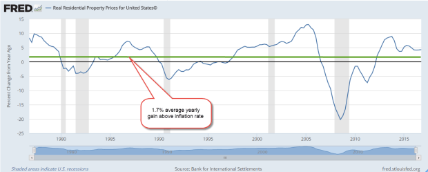
(Sources: National sources, BIS Residential Property Price database)

Where will this consolidation lead?
Less competition
Less responsiveness to customer needs
More political power to create a regulatory environment which guards against competition.

//////////////////////////////

Performance

Mutual funds and ETFs usually specify their historical performance for several time frames, i.e. 1 year, 3 year, 5 year, 10 year, Lifetime. Four years ago, I noted the diffiiculties of getting a reasonable appraisal of performance if the comparison period begins with a trough in price and ends near a peak.

It is best to disregard the five year performance of many large cap stock funds this year because they include the 13% gain of 2012 and the 33% gain of 2013. A more honest appraisal is the ten year performance. Comparisons start in 2007, near the highs of the market before the start of the 2007-2009 recession and the financial crisis.

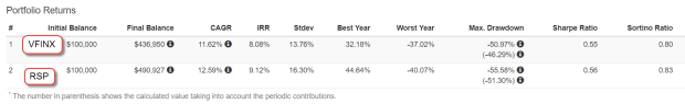
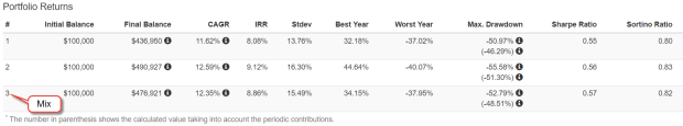
Vanguard’s SP500 index fund VFINX reports a ten year average annual return of 7.39%.  Their blended corporate bond fund VBMFX has an annual return of 4.12% over the past ten years.  If I had nothing but these two funds in my portfolio since 2007, my portfolio of 60% stocks, 40% bonds would have gained about 6.1%.  With a conservative allocation of 40% stocks, 60% bonds the annual return was about 5.5%.  The .6% percent difference in returns is slight but it adds up over ten years.  In the first case, a $100,000 portfolio would have grown to $181,000.  In the second case, about $171,000.

Let’s compare those returns to two actively managed blended funds that Vanguard offers.  VWINX is a balanced fund oriented toward income.  The mix is about 40% stocks, 60% bonds and it has earned 6.7% per year over the past ten years.  The Wellington fund VWELX has a mix of 65% stocks, 35% bonds and cash and earned 7.13% each year since 2007.  Both funds have fees that are slightly higher than Vanguard’s index funds but are relatively low at .22% and .25%.  Depending on allocation preference, either fund could serve as a core “gone fishing” fund.  You can use these as a basis for comparison with products that your fund company offers.

Next week I’ll put my ear to the ground and listen for….

High Optimism

June 18, 2017

Last week I looked at two simple rules: 1) don’t bet on which chicken will lay the most eggs, and 2) don’t put all your eggs in one basket. This week I will look at index averages and I promise I won’t mention chickens.  Lastly, I will look at a metric that disturbs me.

When I first started investing in Vanguard’s SP500 index mutual fund VFINX, I thought I was buying the average performance of the top 500 companies in America. Like many index funds, VFINX is weighted by market capitalization. With this methodology, a relatively small number of companies have more influence on the movement in the index than their numbers might warrant.

Let’s turn to Vanguard’s breakdown of the top ten stocks in their VFINX fund. These ten stocks are household names, including Apple, Microsoft, Google (Alphabet), Amazon, and Facebook. These five tech stocks are 1% of the 500 companies in the index but make up 13% of the fund. The ten companies make up 20% of the fund.

For investors who want to cast a wider net, there is an alternative: equal weighted funds. Guggenheim’s RSP is an equal weighted ETF first offered in 2003. Using Portfolio Visualizer, I started off in 2004 with $100,000 and invested $500 a month. Despite the higher expense ratio, RSP had a better return, besting a conventional market cap index by 1% annually.

VFINXVsRSP

Why does RSP outperform VFINX?  Funds that mimic the SP500 are heavily weighted to large cap stocks. Equal weight funds have a greater percentage of mid-cap companies which may outperform large caps in a particular decade but that outperformance may come at a price: volatility.

Standard deviation is a statistical measure of the zig and zag of a data series, like measuring how much a drunk veers as he stumbles along his chosen path. The standard deviation (Stdev column above) of RSP is slightly higher than VFINX, and the maximum drawdown of RSP is almost 5% higher during the 2008-2009 financial crisis.  The Sharpe ratio is a measure of risk adjusted return, and the higher the better. As we can see in the Sharpe column, the two strategies are within a few decimal points.  In the past 13 years, an equal weighted strategy produced higher returns with only a slightly higher risk.

If I want to mimic some of the diversity of an equal weight index, I can spread out my investment dollars among large-cap, mid-cap and small-cap funds. As SP500 index products, neither RSP or VFINX includes small cap stocks, but let’s add a small percentage into our mix.

Into my comparison of strategies, I’ve added a portfolio with a 40% allocation to VFINX, 40% to VIMSX, a mid-cap Vanguard index fund, and 20% to VISVX, a Vanguard-small cap value index fund. The performance is almost as good as the equal weight RSP and the Sharpe ratio, or risk adjusted return, is similar.

VFINXVsRSPVsMix

In 2011, Vanguard published an analysis (PDF) of various approaches to indexing that may be of interest to those who want to dive into the topic.

//////////////////////

Household Net Worth

Let’s turn from indexing strategies to stock market valuation. We base our expectations of the future on the recent past. Those expectations are the primary driver of valuation. If we expected an affordable self-driving car in the next few years, the current value of today’s cars would be lower.

I have written before about a store of value compared to a flow of value. Savings are a store of value. Income is a flow. The historical ratio of wealth (store) to income (flow) reveals a trend that should give us caution.  The Federal Reserve charts estimates of  both household wealth and disposable income. The current ratio of wealth to income is now higher than the peaks in 2006 and 2000 when the real estate and dot-com booms inflated wealth valuations.

HouseholdNetWorthPctIncome

The current ratio is far above the 70 year average but a moving ten year average of the ratio may better reflect trends in investment allocation over the past few decades. Using this metric, today’s ratio is still very high. Rarely does the wealth-income ratio vary by more than 10% from its 10 year average.

When the wealth-income ratio dips as low as 90% of its ten year average, extreme pessimism reigns, as in the early 1970s.  A ratio that is 10% more than the ten year average indicates extreme optimism as in the late 1990s, mid-2000s and now. Today’s ratio is 13% above its ten year average.

In early 2000, the ratio was 16% above its ten year average when the enthusiasm of dot-com expectations began to deflate and the price of the SP500 fell from its lofty heights. The ratio reached 14% above its ten year average in 2005 and remained above 10% till mid-2007 when the first cracks in the housing crisis began to surface and the SP500 said goodbye to its peak.

A picture is worth a 1000 words so here’s a chart of the Household Wealth to Income ratio divided by its ten year average. I have highlighted the periods of extreme pessimism and optimism.

HouseholdWealthRatio10Year

If history is any guide, the ratio of wealth to income can stay elevated for a few years. The “haves” keep trading with each other in a game of muscial chairs until people begin to leave the game and move their dollars into other assets, other markets, or bonds and cash. Unfortunately, many slow moving casual investors are left in the game with deteriorated portfolio values.

Economist Robert Shiller, author of Irrational Exuberance and developer of the long term CAPE ratio, recommended a strategy of shifting allocation in response to periods of exuberance and pessimism.  When valuations were historically low or average, an investor might allocate 60% or more of their portfolio to stocks.  As valuations became overextended, an investor might shift their stock allocation to 40%.  The investor is not trying to predict the future. The portfolio remains balanced but the stock and bond weights within the portfolio changes.

Using this wealth-income ratio as a guide, the casual investor might gradually implement an allocation shift toward safety in the coming year.

The Price of Mispricing

June 11, 2017

In an April 2016 Gallup poll  52% of Americans said that they had some stocks in their portfolio. In this annual survey, the two decade high occurred in 2007 when 65% of those surveyed said stocks were a part of their savings. Asked what they thought was the safest long term investment, surveyed respondents answered: stocks/mutual funds. The stock market hit a high in the fall that year.

Turn the dial to April 2008. The market had declined 10% from its October 2007 high but there was still five months to go till the onset of the financial crisis in September. Americans surveyed by Gallup said that savings and CDs were the safest (Poll ). At that time, a 5 year CD was paying 3.7% according to Bankrate . What happened to turn sentiment from rather risky stocks to safe cash and CDs? The decline in the SP500 might have been responsible. A more likely cause was the recent headlines concerning the failure of the investment firm Bear Stearns. The Fed provided a temporary bailout, then arranged a sale of the firm to JPMorgan Chase.

When real estate prices were rising in the early 2000s, people thought real estate was the safest long term investment. Each of us should ask ourselves an honest question. Do I treat relatively short term shifts in asset pricing as though they were long term trends?

Here’s another thought. Do we mentally treat changes in asset pricing as though it were cash income? If I see that the value of my stock portfolio has gone up $10,000 since my last quarterly statement, do I think of that as kind of a dividend reward for my willingness to take a bit of a risk? The statement confirms that I’m a prudent investor. Do I mentally “pocket”  that $10,000 as though someone had sent me a check?

On the other hand, if my statement shows a decrease in value, I have not only lost money but now I may question my prudence. Am I taking too much risk? I might even think that “the market” is wrong. Can I trust a market that could be wrong? What if there’s another financial crisis? Should I sell my stocks and put the money in CDs? A 5 year CD is only paying a little bit above 2% but at least I won’t lose any money.

Let’s crawl out of our heads and into the pages of history. In the early 1950s, two people published ideas that have come to dominate the investment industry.

In 1951, John Bogle wrote his Princeton college thesis “The Economic Role of the Investment Company.” The paper was an in-depth analysis of mutual funds, a product that was less than 30 years old. (Excerpts). At that time, only 8% of individual investors owned stocks.

Two decades later, Mr. Bogle would go on to found Vanguard, the giant of index mutual funds.  Contrary to the founding principle of Vanguard, Bogle’s 1951 paper did not champion indexing.  In Chapter 1, he objected to the portrayal of a mutual fund as settling for the average returns of an index of stocks.  Bogle touted the active management that a mutual fund provided to an investor.  In a quarter century after he wrote the paper, Mr. Bogle’s conviction in the superiority of active management shifted toward passive indexing. Indexing is the averaging of the decisions of all the buyers and sellers in a particular marketplace.

When Bogle wrote his paper, two types of funds competed for an investor’s attention. The earliest funds were closed end (CEF) and date back to the middle of the 19th century. The Adams Diversified Equity Fund was founded in 1854 and continues to trade today under the symbol ADX. After the initial offering a CEF is closed to new investors. The shares continue to trade on the market like a company stock but investors can no longer buy or redeem shares with the company that manages the fund.

A mutual fund is an open end product, meaning that the fund is open to new investors and investors can redeem their shares at any time. The early mutual funds touted this feature but it was not statutory until the enactment of the Investment Act of 1940.

When Bogle wrote his thesis, the market was still in what is called a secular bear market. The beginning of this period was marked by the brutal crash of 1929 and would not end till 1953, when the price of the SP500 finally rose above the highs set in 1929. The 1920s had been a decade of rapid growth in the new radio industry and manufacturing. The automobile and stock markets were fueled by easy credit. In response to this short era of explosive growth, investors elevated their long term expectations. From 1926 to 1929 the stock market doubled in price, a rapid mispricing that finally corrected in the October crash of 1929.

In 1951, Bogle summarized the previous two decades:
“The depression and the great capital losses to investors which resulted from it caused a greater desire for safety of principal, but gradually confidence in stocks (and especially in a diversified group of them) returned, and during the same period bond rates fell. The combination of high income and safe principal thus shifted in favor of the common stock element. In spite of the fact that many funds urge that part of the investor’s capital should be devoted to bonds, after he has cash reserves and insurance needs filled, it seems doubtful that this advice has been widely followed. “[my emphasis]

In his analysis, Bogle identified several metrics that gave open-end mutual funds superiority over closed-end funds: prudent management to keep the fund attractive to new investors, diversification, liquidity, and income.

Bogle concluded his thesis with a caution that is timeless: “That the market will fluctuate is certain, and merely because it has experienced a general upward trend in the decade of the investment company’s greatest growth may have made many investors fail to realize that the share value, like the market, is liable to decline.”

He looked toward the future of mutual funds, and expressed what would become the business plan of Vanguard: “perhaps [the mutual fund industry’s] future growth can be maximized by concentration on a reduction of sales loads and management fees.”

In the past 15 years, only 15% of active large cap managers have beat the returns of the SP500 index.  The performance is even weaker for small cap stock managers.  Only 11% beat their index.  Individual investors have withdrawn money from actively managed funds and put that money to work in their passive counterparts.  As more money flows to index funds, the danger is that those funds will be averaging the decisions of a smaller pool of active managers. That objection is raised by advocates for active management but it seems unlikely that the pool of active managers will diminish to the point that a few remaining managers will essentially control the direction of the market.  Although recent flows of money have favored passive indexing, actively managed mutual funds and ETFs still control two-thirds of all assets (Morningstar).

In the following year, Harry Markowitz, a graduate student at the University of Chicago, wrote a paper titled “Portfolio Selection” which proposed a systemic approach to diversification called Modern Portfolio Theory. Bogle had noted the prudent rule of thumb that an investor should devote some capital to bonds as well as stocks to stabilize a portfolio. Markowitz mathematized this rule of thumb. The key to portfolio stability was a strategy of asset selection that minimized risk in the face of uncertainty. Any two assets, not just stocks and bonds, that were normally non-correlated would provide stability. When one asset zigged in value, the other asset zagged. Both assets could be risky but if one asset responded opposite the other, then the net effect of owning both assets was to lower the risk.

The key word in any talk of historical correlation is “normal.” There is no theory which can explain investor trauma, a total lack of confidence in most assets. In October 2008, every asset but one fell. Both stocks and gold fell 16%, commodities sank 25% and REITs fell a whopping 32%. Even bonds, a safe haven in times of uncertainty, fell 3%. In a world where every asset class was losing value, investors bought short term Treasuries, which rose 1%, but avoided long term Treasuries, which declined 2%. There was no safety to be found outside of the U.S. Emerging markets fell 26%, European stocks sank 23% and international real estate nose dived 32%.

But the correlation in normally non-correlated assets could not last. During the following two months, bonds rose 9%, and gold shot up 20%. Stable or defensive stocks like health care continued to lose value but at a slower pace. Some investors stepped in to pick up quality stocks at bargain prices. The stock market continued to stagger to a bottom until the passage of the American Recovery and Reinvestment Act in February 2009, soon after the inauguration of Barack Obama.

50% market repricings are relatively infrequent. That we experienced two such events in less than a decade in the 2000s caused millions of investors to abandon risky assets entirely. The SP500 index did not recover the ground lost till January 2013, more than five years after the high set in October 2007. The recovery after the dot-com bubble burst in 2000 lasted a similar time, 5-1/2 years.

When was the last time we had back to back severe downturns? We need to turn the dial back to the fall of 1968 when the market began a 1-1/2 year decline of 33%. After a few years of recovery, stocks fell again. Provoked by the Arab-Israeli war, the oil embargo and high inflation, the market began a repricing in 1973. The recovery lasted almost seven years.

In 1975, Bogle founded Vanguard, what some called “Bogle’s Folly.”  Four years later, the SP500 was barely above its high in 1968. Investors had so little confidence in stocks as a long term investment that, in August 1979, Business Week declared that stocks were dead. Since that declaration, the price of the SP500 has gained about 8-1/2% annually.  Add in 2 – 3% in dividends and the total return exceeds 10% annually.

Bogle and Markowitz have had a profound influence on the investment industry by developing two deceptively simple ideas for investors who can’t know the future.  Bogle’s thought: don’t bet on which chicken can lay the most eggs.  The complimentary idea from Markowitz: don’t put all your eggs in one basket.

Next week – what’s so special about market averages?  They’re not your average average.

The Unemployment Delinquency Cycle

June 4, 2017

I’m scratching my head. No, it’s not dandruff. The BLS released their estimate of job gains in May and it was 100,000 less than the ADP estimate of private payroll growth. We’d all like to see these two monthly estimates track each other closely, which they tend to do. In an economy with 146 million workers, a 100,000 jobs is only 7/100ths of a percent, but this discrepancy comes just two months after a HYUUUGE spread of 200,000 job gains in the March estimates.

A simple solution to multiple surveys? I average them. The result is 191,000 job gains in May, close to that healthy growth threshold of 200,000. In the chart below I’ve shown the average of the two estimates for the past five years and highlighted the downward trend of the peaks. Reasons include a decline in oil and gas industry jobs, and a natural feature of a mature recovery.

PayemsADPAvg

We saw the same pattern of declining job gains from the early part of 2006 through late 2007 before the average dipped below zero. Boosted by a hot housing market in the early part of the decade, construction employment began to cool in 2006.

PayemsADPAvg2002-2010

Some areas of the country are particularly hot. Denver’s 2.1% unemployment rate is absurdly low as is the state’s rate of 2.3%. Both are at historic lows, less than the go-go years of the dot-com boom. Colorado’s rate is the lowest among the 50 states (BLS). While income inequality has been rising in other hot metro areas like San Francisco, it has fallen in the Denver metro area.

There is a downside to strong growth. Back in “ye olden days,” like the 1970s and 1980s, I was introduced to a rule of thumb. It stuck with me because it seemed too simple. Here’s the rule: whenever the unemployment rate gets below 5% in an area, the price of some key component of  the economy is rising much faster than its long term average.   Lower unemployment leads to a mispricing of some asset.

Let’s turn to the other component of this credit cycle: loan delinquency.  The institutions who loan money expect that a certain percentage of borrowers will default. Lenders include the cost of those defaults when they calculate interest rates and loan service fees. The non-defaulting borrowers pay for the defaulters. During recessions, the delinquency rate on consumer loans usually rises above 4%. When unemployment is low and growth is strong, the delinquency rate goes below 3%.  Lower delinquency leads to a mispricing of credit risk.

Let’s review these two mispricings. The price of an asset is a price on some future flow of use or income that will come from the asset.  The interest rate on a loan is the price of money and the price of risk.  Let’s put these two mispricing together and we have another rule of thumb: as the difference, or spread, between the unemployment rate and the delinquency rate on consumer loans gets closer to zero, the more likely that the economy is overheating. A rising spread indicates a coming recession because unemployment responds faster than the delinquency rate to economic decline and increases at a faster rate. The spread changes direction and grows.

UnemployDelinquencySpread

Here’s the process. As the unemployment rate decreases, lending terms and loan criteria become more favorable. When we buy stuff on credit, we commit a portion of our future income stream to a creditor. When an economy begins to decline and unemployment increases, some income streams become a trickle or stop altogether. A loan payment is missed, then another, and those in more fragile economic circumstances default on their loans.

As the delinquency rate rises, lending policies begin to tighten again, making it more difficult to qualify for loans. Many businesses depend on the flow of credit, so this tightening causes a decline in sales, which causes businesses to lay off a few more people, which further increases both the unemployment rate and the delinquency rate. This reinforces the downward trend.

The NBER is the official arbiter of the beginning and end of recessions but often doesn’t set these dates until several years later.  This change in the direction of the spread is a timely indicator of trouble ahead. An understanding of the credit cycle is crucial to an understanding of the business cycle, which influences the prices of our non-cash assets.

Next week I’ll take a look at the cycle of asset pricing.