To Buy Or Not To Buy

October 28, 2018

by Steve Stofka

In ten years, the number of households that own their homes has grown by only 2-1/2%. Renting households have grown by 20%.

Should you buy a home? Home prices are sky high in some cities. Mortgage rates are rising. Is 2018 a repeat of 2006? Many bought homes at high prices only to see the price fall by a third or half over the following years.

Time to discover your inner owner investor who is going to buy the house. You are going to rent the home from your owner investor. Let’s compare the annual Net Operating Income (NOI) to the purchase price of the home. To keep the math simple, let’s say the owner investor can charge the renter $2000 a month in rent for the home. Let’s say that you, the renter, are going to bear the monthly cost of utilities. You, the investor, must pay $2000 in property taxes and other city charges like garbage collection. Your annual net income from the property is $2000 x 12 = $24,000 – $2000 taxes and costs = $22,000. Let’s say that the all-in cost of the home is $360,000. $22,000/$360,000 = 6.1%. That is the cap rate of the property.

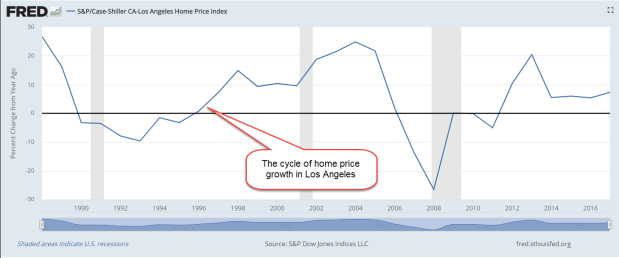
Home pricing, like many assets, behaves in a cyclic manner, as the graph below shows. In the past thirty years, the average annual growth of the Case-Shiller home price index in Los Angeles is 5.6%. The rate of the past three years is slightly above that thirty-year average, meaning that prices in the L.A. area have stabilized relative to the long-term growth average.

HPILA

Rents have risen almost 5% so the two growth rates are fairly close. Let’s subtract an inflation rate of 2.6% from that to get a real capital gains rate of 3%. Add the two rates together to get a combined rate of 9.1%. For an average home in the L.A. area, this is a pretty good total rate of return.

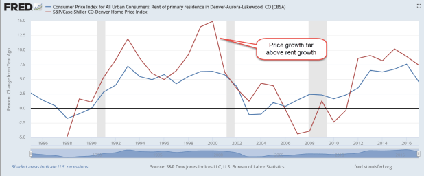
Let’s look at another area: Denver. The thirty-year average of annual growth in home prices is 4.9%. During the past five years, population growth in the Denver area has been robust. Home prices have risen more than 7.5% during each of the past five years, topping 10% in 2015. In 2017, rents rose an average of 5.33%, not enough to keep pace with the growth in prices. An investor would be buying at an above average price.

In a hot market like Denver, a family might think “I am saving 8% a year by buying now.” They assume that above average price growth will continue. The law of averages indicates the opposite – that price growth is more likely to fall below average, and even turn negative.

In making a decision, understand where current prices are in the cycle (Note #1).  Understand where current rental growth is in the cycle and compare the two (Note #2). Here is a graph comparing the two series in Denver. Note the large divergence between home prices and rents in the late 1980s, 1990s and again in the 2000s. Rental prices were much more stable.

HPIvsRentDenver

Imagine that the home purchase is a cash investment and estimate a total return on that investment, as I showed above. Some familes pick a home in a price range based on the leverage of their income and down payment. A real estate agent may present home buying choices based on the amount of house a family can qualify for. But – is the house a good deal? These rates of return are an important factor to consider in making a wise decision.

////////////////////////////////

Notes:

  1. You can search for “FRED home prices [large city name here]” to get the Case-Shiller Home Price Index for that city. Click Edit Graph button in upper right and change the units to “Percent Change From Year Ago”. To get an average, click the Download button above the Edit Graph button to download an Excel spreadsheet.
  2. You can search for “FRED cpi rent residence [large city name here]” to get the index of rental prices for that city. As above, click Edit Graph button and change units to “Percent Change From Year Ago

/////////////////////////////////

Stocks

The recent downturn in the market was overdue. Since the election almost two years ago, the year over year total return of the SP500 has been above the 10% historical average.

SP500TRYOY

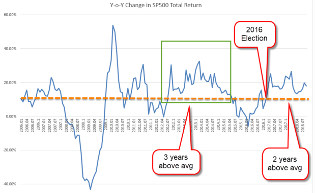
The longest above average streak under Obama’s Presidency was almost three years. In the dot-com boom under Clinton, the market had above average returns for almost 3-1/2 years. After a two-month stumble in 1998 due to the Asian Financial Crisis, the streak continued for another twenty months. Such a long period of exuberance was sure to fall hard. During the following three years, the market lost half its value. Reagan and Eisenhower enjoyed the next longest streaks of almost 2-1/2 years. The 1987 crash ended the streak under Reagan.

The Sense and Cents of a College Education

October 21, 2018

by Steve Stofka

Should a young person invest money in a college education? Let’s look at the question from a financial perspective. Building a higher educational degree is as much an asset as building a house. Let me begin with the hard numbers.

Employment: A person is more likely to be employed. Here is a comparison of those with a four-year degree or higher and those with a high school diploma. The difference in rates is 2% – 3% during good times and as much as 6% during bad times.

UnemployRateCollVsHS

Is the unemployment rate enough to justify an investment of $50K or more in a four-year degree? Maybe not. During the worst part of the financial crisis, ninety percent of HS graduates were working. Why should a diligent person with good work skills spend time in college? Most college students take six years to complete a four-year degree. They must spend four to six years of study in addition to the loss of work experience and earnings in those years. The unemployment rate is not a decision closer.

Earnings: In 1980, when those of the Boomer generation were taking their place in the workforce, college grads earned 41% more than HS grads. Today, college grads earn 80% more. That gap of $567 per week totals almost $30,000 in a year and is less than the monthly payment on a $50,000 loan (Note #1). Can a person expect to earn that much additional when they first graduate? No, and that’s why many students struggle with their loan payments in the decade after they graduate.

MedWklyEarnCollVsHS

Maybe that earnings difference is a temporary trend. The debt is permanent. Should a young person take on a lot of debt only to find out the earnings difference between college and high school graduates was temporary? Unfortunately, that’s not the case. The big shift came in the 1980s when the gap in earnings grew from 41% to 72% in twelve years.

EarnDiffPctCollVsHS

There were several reasons for the explosive growth in that earnuings gap. Many Boomers had gone to college to avoid the Vietnam War draft. As they crowded into the workforce in the late 1970s and 1980s, they wanted more money for that education.

During the 1980s, the composition of jobs changed. Steel manufacturing went overseas to smaller and more nimble plants which could adjust their outputs more economically than the behemoth steel plants that dominated the U.S.

Automobile companies in Michigan closed their old plants. Chrysler needed a government bailout. The manufacturing capacity of Asia and Europe that had been crippled by World War 2 took several decades to recover. The U.S. began to import these cheaper products from overseas. As high-paying blue-collar jobs diminished, the advantage of white-collar workers grew.

As more companies turned to computers and the processing of information, they wanted a more educated workforce that could understand and execute the growing complexity of information. Manufacturing today relies on computer programs that require a set of skills that are more technical than the manufacturing jobs of the past.

A oft-repeated story is that the signing of NAFTA in 1993 and the admittance of China into the World Trade Organization were chiefly responsible for the growing gap between white collar and blue collar workers. I have told that story as well, but it is incorrect and incomplete. As the graph above shows, that gap has grown modestly in the past twenty-five years. The big shift happened in the 1980s when the first of today’s Millennials were in diapers and grade school.

When we adjust weekly earnings for inflation, we can better understand the evolution of this earnings gap. In the past forty years, high school graduates have seen no change in median weekly earnings. From 1980 to 2000, their earnings declined. The 25% growth in the earnings of college graduates came in two spurts: in the mid to late 1980s, and during the dot-com boom of the late 1990s.

EarnInflAdjCollVsHS

Since this trend has been in place for decades, college students can assume that it will likely stay in place for the following few decades. Like the mortgage on a home, the balance on a student loan doesn’t increase every year with inflation, but the earnings from that education do and they have increased more than inflation. The payoff to a four-year degree is the difference in earnings. That is the decision closer.

Notes:

  1. Using $50,000 loan for ten years at 6% interest rate at Bank Rate.

Changing Dance Partners

October 14, 2018

by Steve Stofka

This week’s stock market activity helps us remember some simple rules of investing. Many of us confuse mass and weight. Mass is the resistance of an object to a change in speed or direction. Weight is the force of gravity on that object. Using this model, let’s compare the masses of stocks and bonds. On Wednesday, when stocks fell over 3%, the price of a broad bond composite barely moved.

Bonds act like a big cruise ship, more resistant to changes in wind and wave than a sailboat. The cruise ship’s progress is ponderous but predictable. Stocks behave like a sailboat which moves in a zig-zag fashion, changing directions to cope with wind and wave. Sometimes, the sailboat makes a lot of progress in calm waves with a favorable wind. November 2016 through January 2018 was one such period when stocks made steady progress.

On the previous Wednesday, October 3rd, a “rout” – a half-percent drop – in the bond market indicated a global unease. A half-percent move in the stock market occurs weekly. The last half-percent drop in the bond market was on March 1st 2017, eighteen months ago. Let’s look at that incident to help us understand the pattern.

BondStockMoves201703

Post-election, the stock market rose for three months, then plateaued for two weeks following that bond rout. Bonds drifted slightly lower and then, on March 15, 2017, charged higher by .6%. Within a few days, stocks lost 2-1/2%. On May 17th, bonds again surged, and stocks fell 2%.

The gigantic size of the bond market dwarfs the stock market. An infrequent daily shift in the pricing of the bond market signals a long-term recalculation of future risks and profits in both the bond and stock markets. When large shifts in the bond market happen frequently, stock investors should pay attention. Between Thanksgiving 2007 and the end of that year, the bond market experienced ten days of greater than 1/2% price swings! It signaled confusion and was a warning to stock investors that rough times were coming.

The bond market’s YTD price loss of 4% marks the probable end of a multi-decade bull market in bonds. The bond market is so stable that a small loss of 4% can mark the largest loss in decades.

We are seeing a change in dance partners. As an example, the stocks of high growth companies rose 20% from February lows. That was almost twice the gains of the SP500 broader market. Many of these are small and medium size companies whose growth is hampered by the greater cost of borrowing money in an environment of rising interest rates. The owners of growth stocks wanted to take some profits this past week but could not find buyers at those high prices. In the past week, prices of those stocks fell 8%. Cushioning the fall of some stocks is the large stockpile of cash – $350 billion – that U.S. companies have stockpiled for buybacks of their own stock. Some of that money was put to work in Friday’s recovery.

The U.S. stock market has been the one of the few bright spots in a global marketplace that has turned down this year. This week begins the reporting for the 3rd quarter earnings season so we may see more price swings in the days to come.

Consumer Credit

It is very iniquitous to make me pay my debts; you have no idea of the pain it gives one. – Lord Byron

October 7, 2018

by Steve Stofka

The total of all consumer loans, excluding mortgages, is almost $4 trillion. The Federal government owns $1.5 trillion of that total, most of which is student loans, which have tripled in the past decade. According to the Dept. of Education, 11% of student loans are in default, three times the credit card default rate and more than ten times the auto loan default rate (Note #1).

Over a five-decade period, the stock market has risen when consumer credit rose. Below is a chart of consumer debt outstanding as a percent of GDP (Note #2).

ConsCreditPctGDP

This a decade long indicator, not a timing tool. Notice that the ratio of credit to GDP (blue line) rises during recessions (shaded gray) when GDP, the bottom number in the fraction, falls. When the recession is over, credit falls as people fall behind in their payments, loans are written off, etc. Now GDP starts rising again while the top number, credit, is falling.

Auto loans make up 28% of outstanding consumer credit and currently have less than a 1% default rate. If we adjust the total of consumer credit by the extraordinary growth in student loans, auto loans make up 39% of total consumer credit (Note #3). We saw a similar percentage in the mid to late 1980s when savings and loans aggressively extended auto loans and mortgages. In the late 1980s and early 1990s, a third of all S&Ls failed.

Typically, people do not count vehicle depreciation in their budget, but they should, just as businesses do. Example: the average yearly take-home pay is $52K. Let’s say the average car, new and used, is $24K and depreciates $2400 a year (Note #4). Let’s say that the average person saves about $2400 a year to make the math easy. The $2400 that goes in the savings bank is simply offsetting the $2400 in depreciation. There is no savings.

In addition to depreciation, many of us don’t include the cost of inflation in our budget. Six years from now, a replacement car, new or old, could cost an additional 15%. Without adjusting for these “hidden” costs, we may think we are getting by. Over time, however, we add these hidden costs to our credit balances. We put less down on the next car and get longer auto loans. The average loan length is now 5-1/2 years. As soon as we are done paying off one car, it is time to get another (Note #5).

The economy is strong, and it needs to stay strong so that households can pay back their loans. The ultra-low interest rates of the past decade have reduced the monthly debt payments for many. For the past two years they have leveled at 5.6% of disposable personal income, the mid-point of the past forty years. For every $20 that a person takes home, they are paying $1 to service their consumer debt. The average yearly debt service payment would be about $3000 on a $52K take-home pay.

In response to the strong economy, the Federal Reserve has been raising interest rates to a more normal range. The 30-year mortgage rate just hit 5% this past week. Rising interest rates raise the monthly payments and reduce the loan amounts that borrowers can qualify for.  Many younger workers are unfamiliar with a world of normal interest rates.  They will have to learn a new math.

////////////////////////////

Notes:

1. Student default rates . Default rates reported by the credit agency Experian .
2. More detail on consumer credit here at the Federal Reserve ()
3. I made the adjustment by subtracting $1 trillion in Federal student loans from the current total of credit. This pretends that Federal loans grew 15% in the past decade, not 300%.
4. The average amount financed on a used car is $17,500 (FRED series DTCTLVEUANQ). New car loans average $29,800 (FRED series DTCTLVENANM).
5. A buyer of a new car holds it for 71 months according to Auto Trader.

////////////////////////////

Misc

Amy Finkelstein is a MacArthur genius award recipient who studies trends in health care. Proponents of Medicaid expansion projected that lower income families would better control and plan their medical care under Medicaid. Instead they have used the ER even more.  She found that people visit the ER more, not less. Although families report better health and more confidence in their financial security because of Medicaid expansion, measureable health outcomes have shown no change. WSJ article (paywall) is here. Her citations on Google Scholar.