Engine Flow

July 29, 2018

by Steve Stofka

“Banking was conceived in inequity and born in sin” – Josiah Stamp

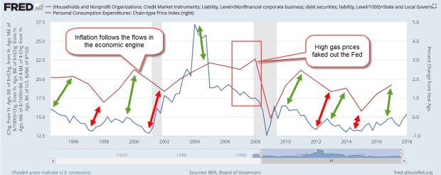
In the past two weeks, I’ve looked at the inputs and drains to the economic engine. This week I’ll look at the flow between bank credit, the largest input, and loan payments, the largest drain. Because bankers want to make a profit on the money they pump into the economy, they do a better job of managing the economy than government officials.  Banks manage access to the credit system better than governments and achieve less economic inequality. Whenever governments wrest control of credit creation away from the banks to promote greater equality, the country’s economy suffers.

Let’s begin with the first point; banks must protect their loan portfolios. To do that, they monitor the health of the economy. The Conference Board uses ten data series to construct its index of leading economic indicators to estimate the probability of recession. ECRI uses 50 data series to chart its weekly leading index. These indicators are sensitive and may give a false signal, indicating a coming recession which doesn’t occur. Watching these data series are the banks who form an emergent Artificial Intelligence machine that varies the amount of credit they input into the economic engine.

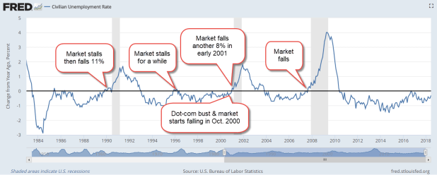
Let’s piggy back on the efforts and watchfulness of the banks. We can look for a change in the ratio of household credit, an input to the engine, to the unemployment rate, or the ability to drain the input. One quarter’s decline of 2% or greater in this ratio, or two quarters of a smaller decline has been a reliable indicator that a recession is approaching. Below is a graph of the Household Debt-Unemployment ratio during the past thirty years but this signal has been reliable since World War 2.

HouseholdDebtUnemploymentRate

Bank behavior has accurately predicted the start of every recession since WW2. Is this the holy grail for mid to long-term trading decisions? Not quite. The Federal Reserve does not release the total amount of household debt for each quarter until the end of the following quarter (see #1 at end). However, every month, the BLS releases the unemployment rate, the divisor in the Debt-Unemployment ratio. If the rate is lower than a year ago, no worries. If the year-over-year change in the rate is higher in two consecutive months, worry.

Unemploy

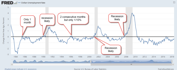
Here’s the same chart with the stock market’s reaction when the year-over-year change has been above zero for two months in a row. Insiders and market movers have lightened their exposure to equities.

UnemployStkMkt

Loans add money to the engine. Loan payments drain money from the engine. As unemployment rises, people reduce their loan payments. In managing their risk, the banks react to signs of economic weakness by reducing the amount of credit they issue. Because they are more responsive to evolving conditions than central banks and elected officials, banks manage the economy better than the government.

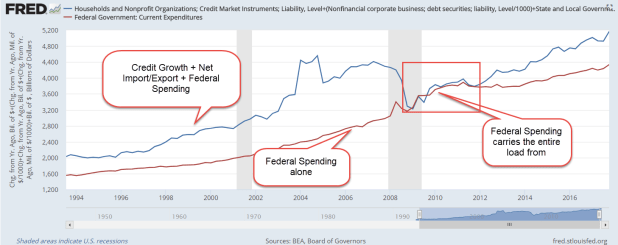
Access to credit is the key to understanding the disparity in fortunes among Americans. Let’s look at the flow of credit creation in a system where a bank can loan out ten times its deposits. Let’s say I borrow $10,000 from Bank A for a bath remodel. The contractor might have a gross profit of $2500 which he deposits in Bank B, who leverages that into a $25,000 loan to another customer, who remodels her basement. Her contractor’s gross profit of $5000 is deposited in Bank C, which leverages that into a $50,000 loan to another customer for a complete kitchen remodel. Only those people with good credit – the haves – can access this money machine. The machine is closed to the have-nots.

Governments have attempted to fix this inequality. The government borrows from the banks, acting as a substitute for the people who cannot borrow. The government then inputs the money into the economy, but this does not make the engine run because there is not enough being drained out in loan payments and taxes. The engine runs on flow – inputs and drains. One without the other damages the engine and makes the country vulnerable to a triggering event which causes collapse and the economic engine blows up. Yugoslavia (1994), Argentina (2000), Zimbabwe (2008) and Venezuela (2017) are the most recent examples.

Quoting an unnamed source, Winston Churchill said, “Democracy is the worst form of Government except for all those other forms that have been tried from time to time.”  Private bank management of credit creation is a terrible system, but far better than the other systems that have been tried.

///////////////////

Notes:
1. With a month delay, the Fed releases a monthly estimate of household debt that excludes mortgages and HELOCs.

Ten years after the recession, the amount of household debt per employee is still above trend. A ratio of debt to disposable income is below trend.

According to the credit reporting agency Experian “Transactors” are 29% of card holders and pay off their balance each month. 43% carry a balance. The rest are dormant accounts. Experian ranks states by the average credit rating of its residents.

Fannie Mae reports that, as of the end of 2017, 37% of the mortgages modified during the housing crisis had defaulted again.

Bank of America clients with High Net Worth reported that their allocations were 55% stocks, 21% bonds, 15% cash, 10% other.

In May, consumer credit increased at a seasonally adjusted annual rate of 7-1/2 percent. Revolving credit increased at an annual rate of 11-1/2 percent, while nonrevolving credit increased at an annual rate of 6-1/4 percent (Federal Reserve)


The Hunt, Part 2

July 22, 2018

by Steve Stofka

Last week, I showed the inputs to the credit constrained economy as a percent of GDP. I’ll put that up again here.

CreditGrowthFedSpendPctGDP

This week I’ll add in the drains but first let me review one of the inputs, bank loans. Focus your attention on that period just after 9/11, the left gray recession bar,  and the end of 2006, just to the left of the red box outlining the Great Recession on the right.  For those five years after 9/11, the banks doubled their loans to state and local governments, a surge of $1.4 trillion. The banks increased their household and mortgage lending by $5.3 trillion, or 67%. Why did banks act so foolishly? Former Fed chairman Alan Greenspan couldn’t answer that. We have a partial clue.

For 4-1/2 years after 9/11 and the dot-com bust, there was no growth in credit to businesses, a phenomenon unseen before in the data history since WW2. The banks reached out to households, as well as state and local governments because they needed the $1 trillion in loan business missing on the corporate side (#1 below).

There are four drains in the economic engine – Federal taxes, payments on loans, bad debts and the change in bank capital. State and local government taxes are not a drain because those government entities can not create credit. The change in bank capital reflects the changes in the banks’ loan leverage and their confidence in the economy. During the 1990s and 2010s the sum of the inputs and the drains remained within a tight range of about 1/7th of GDP.

InputLessDrains

The results of bad policy during the 2000s are shown clearly in the graph. In addition to the surge in bank loans, the Federal government went on a spending spree after 9/11. There was too much input and not enough drain. The reduction in taxes in 2001 and 2003 exacerbated the problem. There was less being drained out. Asset prices absorb policy mistakes until they don’t – a life lesson for all investors.

Let’s add in a second line to the graph – inflation. The rise and fall of inflation approximates the flows of this economic engine model with a lag time of several months. I’ve shown the peaks and troughs in each series.

InputLessDrainsVsPCE

Look at that critical period from 2006 through 2007. The Fed kept raising rates in response to rising inflation (the red line), driven primarily by increases in the price of oil.  The Fed Funds rate peaked out at 5-1/4% in the summer of 2006 and stayed at that level for a year. The Fed misread the longer term inflation trend and contributed to the onset of the recession in late 2007. The net flows in the engine model (blue line) indicated that the long term trend of inflation was down, not up.

Where will inflation go next? Using last week’s theme, follow the hounds! Who are the hounds? The banks. The inflow of credit from the banks is the primary driver of inflation. Why has inflation in the past decade been low? Because credit growth has been low. Where will inflation go next? A gentle increase – see the slight incline of the blue line at the right of the graph. Contributing to that increase were last year’s tax cuts. Less money is being drained out of the engine.

Too much flow into the economic engine or an improper setting of interest rates – these mistakes are absorbed by assets, which are the reservoirs of the engine. Stocks, bonds and homes are the most commonly held assets and most likely to be mispriced. During the early to mid 2000s, the mistakes in input were so drastic that the financial crisis seems inevitable when we look in the rear view mirror. During the past eight years, the inputs and drains have remained steady, but interest rates have been set at an inappropriate level. Again, we can anticipate that asset prices have been absorbing the mistakes in policy.


//////////////////////////

1. In the last quarter of 2001, loans to non-financial corporate business totaled $2.9 trillion and had averaged 6%+ growth for the past decade. Anticipating that same growth would have implied a credit balance of $3.9 trillion by the end of 2006. The actual balance was $3.1 trillion.

Hunt For Inflation

July 15, 2018

by Steve Stofka

Saddle up your horses, readers, because we are going on the Hunt for Inflation. I promise you’ll be home for afternoon tea. During this recovery, Inflation has been a wily fox, a real dodger. It has not behaved according to a model of fox behavior. Has Inflation evolved a consciousness?

Inflation often behaves quite predictably. The central bank lowers interest rates and pumps money into the economy. Too much money and credit chasing too few goods and Inflation begins running amuck. Tally-ho! Unleash the bloodhounds! The central bank raises interest rates which curbs the lending enthusiasm of its member banks through monetary policy. Inflation is caught, or tamed; the bloodhounds get bored and take a nap.

Not this time. Every time we think we see the tail of Inflation wagging, it turns out to be an illusion. Knowing that Inflation must be out there, the central bank has cautiously bumped up interest rates in the past two years. Every few months another bump, as though unleashing one more bloodhound ready to pounce as soon as Inflation shows itself.

Yes, Inflation has evolved a consciousness – the composite actions of the players in the Hunt. These players come in three varieties. One variety is the private sector – you and me and the business down the street. The second variety is the federal government and its authorized money agent, the Federal Reserve, the country’s central bank. Finally, there is a player who is a hybrid of the two – banks. They are private but have super powers conferred on them by the federal government. The private sector is the economic engine. The federal government and banks have inputs, drains and reservoirs that control the running of the economy.

The three money inputs into the constrained (see end) economy are 1) Federal spending, 2) Credit growth, and 3) net exports. In the graph below, the blue line includes 1, 2, and 3. The red line includes only 1. The graph shows the dramatic collapse of credit growth in this country. Federal spending accounted for all the new money flows into the economy.

CreditNXFedSpendvsFedSpend

Before the financial crisis, money flows into the economy were just over 30% of GDP. In less than a year, those inputs collapsed by almost 25%.

CreditGrowthFedSpendPctGDP

When inflation is lower than target, as it has been for the past decade, too much money flow is being drained out for the amount that is flowing in. In the case of too high or out of control inflation, as in the case of Venezuela, the opposite is true. Too much is being pumped in and not enough is being drained out. That’s the short story that gets you back to the lodge in time for a cup-pa or a pint. Next week – the inputs, drains and reservoirs of the economy.

////////////////////////////

  1. Constrained – the private economy, state and local governments who cannot create new credit.
  2. Net exports are the sum of imports (minus) and exports (plus).

The Line of the Idle

July 8, 2018

by Steve Stofka

It used to be easy for a horse to get a job. This week I’ll look at the workers who have been idled by a century of automation. As a counterpoint to the daily rhythms of being busy, a casual idleness helps us recharge our batteries. In an America whose moral foundations are the Protestant work ethic, a constant idleness taints a person’s character. Those who have retired after a lifetime of work are expected to stay active. Leisure time is a resource not be squandered.

The phrase “pull your weight” meant to act like a horse and contribute to the team effort. From the Revolutionary War for Independence to World War 1, horses fought bravely and earned a place of respect in American history. Many a statue portrays a general atop his brave steed. Horses helped turn America into the bread basket of the world. Then the gas engines came after their jobs. Motors took over the jobs of pulling horse drawn carriages, plows and work wagons. Thousands of horses joined the line of the idle.

Then the engines came for the jobs of the agricultural workers. In the first half of the 20th century, farm employment fell from 40% of the labor force to 20% in 1950, and is 2% today.

Then the robots came for the jobs of manufacturing workers. A 1987 BLS report found that “relatively few employees have been laid off because of technological change.” Thirty years later, the National Council on Compensation (NCCI) summarized data from several sources. “In 2016 the United States produced almost 72% more goods than in 1990, but with only about 70% of the workers.” This two-part report is a bit lengthy but a quick glance at the graphs on the first page tell the story of the decline in agricultural and manufacturing jobs. (Part 1 and Part 2) . As a percent of the labor force, agricultural jobs peaked in the late 1800s. Manufacturing employment peaked just after World War 2.

Robots help assemble the horseless carriages in the car factories. In businesses across the land, the robots now weld and lift, pick and sort, box and ship – jobs that humans had a monopoly on. The robots are now learning how to drive and to think. Almost 40% of adults, and 20% of adults in the prime of their lives now sit idle, joining the horses in pasture.

Electric motors, long chained by a cord to a wall, have broken free and are now taking the jobs of gas engines. Robots built by workers in other countries compete for the jobs of American-built robots. Now the machines are making other machines obsolete.

Forged by the Protestant work ethic, the retired generation of Boomers pursue their leisure in earnest. RV sales are at record levels and last year’s visits to national parks almost matched the record numbers of 2016. Each year there are more visits than there are people in the country (Nat’l Park Service link). This growth in recreation occurs at a time when continuing drought in the western states has put extraordinary pressure on plants and wildlife. Summer in the west is now the season of fire.

In 1900, people welcomed their idleness as a byproduct and hallmark of progress and prosperity. The idleness of prosperity looks very different from the idleness of poverty visible in many troubled countries around the world, including parts of America. Which line is longer and which line are we on?

Stocks and Tax Receipts

July 1, 2018

by Steve Stofka

There is a close correlation (see end) between the trend in equity prices and Federal tax receipts, as we can see in the chart below. Occasionally, the market gets too optimistic or pessimistic. When it does it inevitably corrects back to the trend in tax collections.

SP500VsTaxReceipts

Note the strong divergence between stock prices (blue line) and tax collections (red line) since the 2016 election. Tax collections grew modestly in the first year of the Trump administration; from $2.133 trillion in the first quarter of 2017 to $2.178 trillion in the fourth quarter of last year. Following the tax cuts passed at the end of last year, tax revenues in the first quarter of 2018 fell $150 billion to $2.033 trillion. In fifteen months, the trend is negative for tax collections. In that same time frame, the SP500 rose 20% on the hope – or for some, the faith – that Trump policy will spur economic activity. That greater growth should lead to greater tax collections. It hasn’t.

Some say that the taxes during the previous administrations were too high. “Lowering the rates will raise the revenue,” is the prayer of supply-siders and tax cutters. “Just wait, revenues will rise as strong economic growth kicks in,” they promise. But this correlation of equity prices and tax revenues transcends administrations: the Obama years, and the Bush years and the Clinton years and into the H.W. Bush presidency. We could go even further back. When equity prices mis-estimate future growth, they correct back to the hard trend of tax revenues. It doesn’t happen overnight. The market had been correcting for more than a year before September ‘s implosion of Lehman Brothers in 2008.

George Soros became one of the most successful traders by constructing a story in advance of his trades. The story is a prediction of what he thinks will result if event A happens. When event A doesn’t happen within a set time, or when event A does not lead to B result, he gets out of the trade. He doesn’t fall in love with his story as so many of us do. Economists and politicians fall in love with their theories and stories the way fans do a baseball or football team. This year we’re going to go all the way!

For the long-term investor, the important thing is an allocation commensurate with one’s risk tolerance, time horizon and income needs. Secondly, have patience.

/////////////////////

Since 1990, the correlation is .96. Since 1997, it is .91. Since 2008, it is .94. Since the 2016 election, it is -.45.