Re-pricing the Market

January 31, 2016

In the closing moments of one of the “big ape” films, the very large gorilla Mighty Joe Young saves the girl, placing her on a boat as an island in the Pacific, broken by a volcano, falls back into the sea.  The bandaged hand of the big ape reaching out of the roiling waters is the last we see of the movie’s star.

On Friday morning, the Bank of Japan (BOJ) surprised the world by cutting it’s funds rate to a negative .1% from a positive .1%, vowing to fight the deflation and lack of growth that has plagued the Japanese economy for two decades.  As the island’s economy collapses under the weight of its aging population and lack of immigration, the bank thrust its arm above the Pacific waters to save – well, the entire Japanese population.  Could be the script of another big ape movie or a Godzilla sequel.

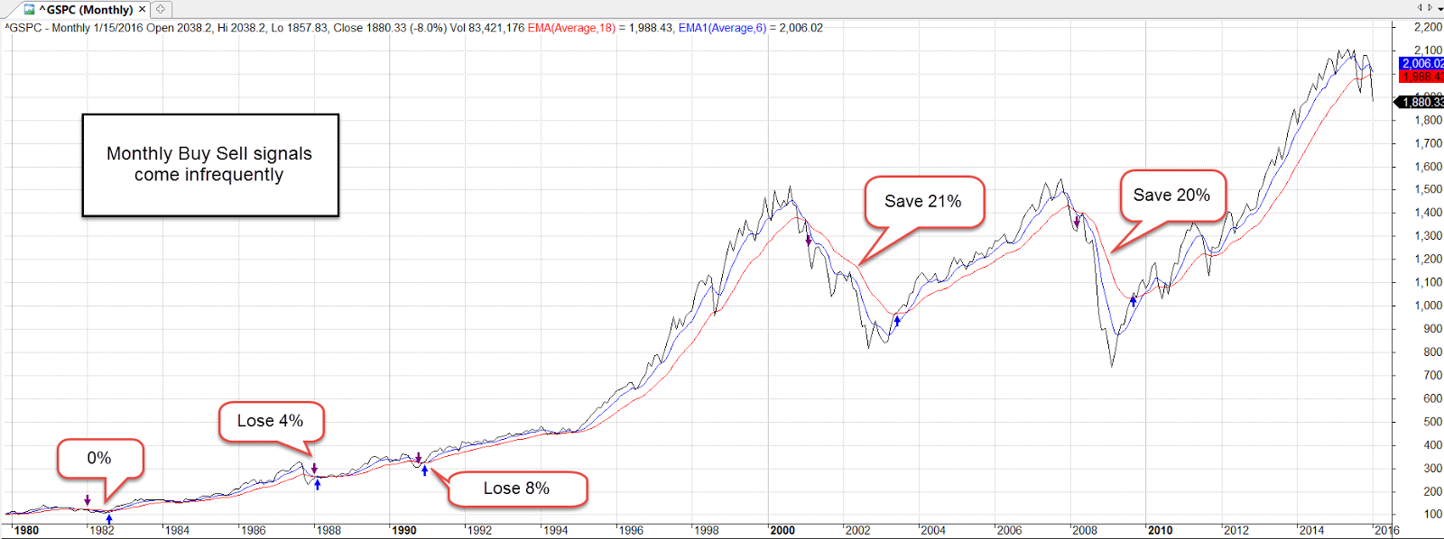
The first estimate of fourth quarter GDP was released Friday morning and the news was not good, which meant that the news was good, get it?!  GDP growth for the last quarter was positive, not negative, but less than 1%, so traders figured that the Fed will not raise interest rates again in March.

#3 in the combination was positive earnings surprises from Microsoft and Facebook, among others. Thursday was the busiest day of the earnings season.  #4 The price of oil continued to climb above the near rock-bottom benchmark of $30.  All of these factors were the impetus for a stock market surge of 2-1/2% on Friday and helped soften a really bad start to the year.  For the month, the index fell 5%.  During the month, revisions to earnings estimates for 2016 fell about the same amount – 4.7% (Fact Set).  In short, the stock market re-priced itself.

********************

Taxes

As the primary season approaches and millions of Americans receive their W-2 earnings record in the mail, Americans turn their attention to the cheery subjects of incomes and income taxes.  Here’s a Heritage Foundation chart of the effective payroll tax rates and income tax rates for the five quintiles of Americans based on income.

Those in the lowest quintile making less than $25K pay a combined rate of 2.1%.  Those in the next quintile making less than about $47K pay a combined rate of 6.6%.  Those in the next higher quintile making less than $80K pay 12.2%.  The top two quintiles pay 14.7% and 21% respectively.  It is easy to understand why many in the upper quintiles feel that they are already paying their fair share of taxes.

The fault in these calculations is that they neglect the employer’s portion of the payroll tax which is paid indirectly by the employee in the form of a lower wage.  Including that portion would add another 7.5% to 8% to the lower quintiles, a bit less to the top two quintiles.  Here’s a chart showing the total payroll tax burden since the Social Security Act was passed in the 1930s.

Should the rich pay more in taxes?  Yes, says Democratic Presidential contender Bernie Sanders.  Many Americans do not realize that we are in the top 10% of global incomes, the world’s fat cats.  Should Americans pay a global fairness tax of 10% or so?  This money would then be redistributed to poorer people around the world.  That is the world that Mr. Sanders is aiming toward.

**************************

Consumer Problem Survey

Over the past several thousand years people have developed numerous tools to predict the future.  Reading chicken bones, tea leaves and other forms of augery have given way to mathematical and statistical modeling.  The folks at Georgetown have developed a predictive tool to estimate consumer spending. Using a survey methodology researchers ask consumers what problems they have and which ones they are planning to solve in the coming months. These can be the payment of taxes, needing a new computer, iPad, or cell phone, the purchase of new home, etc.  Based on these responses, the researchers compile a Problem Driven Conumption Index (PDCI).  In the spring and early winter of 2014, the predictive index badly under-estimated retail sales.

However, the approach brings an essential understanding of the challenges American families face.  In a 2013 survey, respondents reported having many problems for which they see no solutions.  We learn that men and women have a few problems in common but confirm the axiom that each sex really does see the world differently.  The researchers are able to chart the shifting patterns of problems as we age.  This problems based approach is another statistical tool in the field of behavioral finance.

The Volatility Scare

January 24, 2016

Last week I wrote that I smelled capitulation.  When the Dow Jones (DJIA) dropped more than 500 points on Wednesday, I smelled burnt barbeque.  Historically, there is a weak correlation between the price of oil and the stock market.  In the past few weeks the 20 day correlation between the oil commodity ETF USO and the SP500 is .97, meaning that they are chained to each other in lockstep.  If that relationship continues throughout the month, investors can expect a continued bumpy ride.

Several factors helped indexes recover in the latter part of the week. After dropping near $26 a barrel, oil rebounded above $30 at the end of the week.  Mario Draghi, head of the European Central Bank (ECB), indicated that the bank was prepared for additional stimulus.  Sales of existing homes climbed in December, indicating a level of confidence among U.S. families.

Since the first of the year, investors have withdrawn $26 billion from equity mutual funds and ETFs (Lipper), offsetting the $10 billion inflow into equities in the last week of 2015.  Fund giants Fidelity and Vanguard report that their customers have been net buyers of equities despite the turbulence.

Volatility (VIX or ^VIX at Yahoo Finance) in the last half of the week dropped to the 8 year average of about 22.  We have enjoyed such low volatility in the past few years (mid-teens) that investors are especially sensitive to price swings.  For a long term perspective, here is a chart showing some multi-year averages of volatility.

A few weeks ago, I noticed an acronym for the 2008 Global Financial Crisis – GFC.  The memory wound is still fresh for many. Older investors with their working years largely behind them may feel even more vulnerable in times of higher market volatility.

*******************************

Fund Fees

Employees in 401K plans may not know how much money they are paying in fees each year.  One of the charges is what is called a 12b-1 fee, and you will need to breathe slowly into a paper bag while you read about this one.  Each fund has an investment advisor to administer the fund’s investments and the fund pays a fee for this service.  In addition, under some plans, the advisor charges the fund holders a separate marketing and distribution fee, the so called 12b-1 charge, to promote the fund through sales materials or broker incentives.  Wait, you might ask.  Shouldn’t marketing expenses be part of the advisor’s fee? Well, you would think so.

The Annual Report that accompanies your 401K statement might list one of the funds you are invested in as “Blah-Blah-Blah Growth Fund, Class R-1,” hoping you are going to sleep.  The R-1 class means the fund is charging you 1% for marketing and distribution fees. Here is a glossary of the classes of mutual funds and the percentages of 12b-1 fees.  In addition, funds have  varying sales or redemption fees which are denoted by a letter class for the fund, i.e. Class A, B, C.  The Securities and Exchange Commission (SEC) explains these here.

The  SEC has a FAQ sheet explaining the various fees.  These charges might seem small but they add up over a working lifetime.  The SEC provides an example  of the 20% difference in value between a fund that charges 1.5% fee each year and one that charges .5%.  FINRA, the industry group that certifies and regulates financial planners, has a mutual fund expense calculator that enables an investor to compare fund expenses by their ticker symbols.

I compared an American Funds Class A Balanced Fund ABALX that might be found in a 401K with a Vangard Admiral Balanced Index Fund VBIAX over a ten year period.  Taking the default assumptions of a 5% return on an initial investment of $10K, I had $1670 more in the Vanguard fund after the ten year period, or an additional 3 years of return.

Some 401K plans make it more difficult to compare performance or fees.  They may list a fund whose ticker symbol is not listed on any exchange but is a “wrapper” for a fund that is listed.  The only way to find out that information would be to look at the prospectus or other materials for the 401K fund or visit the web site of the 401K plan administrator.  How likely are many participants to do that?  That’s the point.

Ugly January

January 17, 2016

The ever-strengthening dollar and growing inventories of crude led to a plunge in the price of a barrel of West Texas Intermediate (WTI) which fell below $30.  I remember hearing some analyst on Bloomberg about a year ago saying that oil prices could go as low as the $20 range.  HaHaHaHa!  A popular basket of oil stocks, XLE, is about half of it’s July 2014 price, falling 25% in the past two months and almost 10% in the two weeks. Here’s a tidbit from the latest Fact Set earnings brief: “On September 30, the estimated earnings decline for the Energy sector for Q1 2016 was -17.7%. Today, it stands at -56.1%.”  Ouch!

Volume in energy stocks this week was more than double the three month average.  It smells like capitulation, that point when a lot of investors have left the theater.  Investors who do believe that the theater is on fire, as it was in 2008, should probably stay away.

What the heck is going on?  This Business Insider article from June 2015 (yes, six months ago) explains and forecasts the money outflows from China and emerging markets.  Pay particular attention to #4. This Bloomberg article from this week confirms the capital flight from China as investors anticipate a further devaluing of the yuan.

4th quarter earnings reports will begin in earnest in the following week.  If there are disappointments, that will magnify the already negative sentiment.

**********************

Death Cross

No, it’s not the title of a Fellini movie.  The merits of technical analysis can be more controversial than a Republican Presidential debate, but here goes.   The 50 day average of the SP500 crossed above the 200 day average, a Golden Cross, at Christmas, then crossed back below the longer average this week, a Death Cross.  A Golden Cross is a positive sign of investor sentiment.  The Death Cross is self-explanatory.  A crossing above, then below, happens infrequently – very infrequently.  The last two times were in 1960 and 1969 and the following months were negative.  After January 1960, the market stayed relatively flat for a year.  In June 1969, it marked the beginning of an 18 month downturn.  There was an almost Golden Cross followed by a Death Cross in May 2002.  A similar 18 month downturn followed.

Longer term investors might use a 6 month short term average and an 18 month longer average, selling when the 6 month crosses below the 18 month, buying back in when the one month (or 6 month average in the case of more volatile sector ETFs) crosses back above the longer average. Like any trading system, one takes the risk of losing a small amount sometimes but avoids losing big.

Trading signals are infrequent using monthly average prices.  Note that the sharp downturn of the 1998 Asian financial crisis did not trigger a sell signal.  The six month average of the SP500 as a broad composite of investor sentiment is above the 18 month average but several sectors have been sells for several months: Emerging markets (June and July 2015), Energy stocks (January 2015), and European stocks (August 2015).  Industrials (XLI) have taken a beating this month and will probably give a sell signal at the end of the month.

John Bogle, founder of Vanguard, recommends that long term investors look at their statement once a year and rebalance to meet their target allocation, one that is suitable for their age, needs and tolerance for risk.  In that case, don’t look at your January statement.  As I wrote a few weeks ago, it could look ugly.

********************

CPI

In 1998, the Boskin Commission estimated that the Consumer Price Index (CPI) over-estimates the rate of inflation by an average of 1.1%. In 2000, the NBER (the agency that determines recessions) revised their methodology and their estimate of the over-statement to .65%.  In 2006, Robert Gordon, a member of the original committee, re-examined subsequent CPI data and the methods used by the committee.  His analysis re-asserted that the over-statement was at least 1%.

Although this academic debate might seem arcane, the implications are enormous, particularly in an election year.  Presidential contender Bernie Sanders is gaining momentum on Hillary Clinton (HRC) by repeatedly asserting that the inflation-adjusted incomes of working families have declined since 1973.  Although Mr. Sanders makes no proposals to stimulate economic growth, he has many redistribution plans to achieve economic justice.  If inflation has been overstated for the past few decades, then Mr. Sanders’ argument is logically weak but emotionally strong.  More importantly, neither side of the political aisle can even agree on a common set of facts.  The other side is not evil, or stupid, or disingenuous. The disagreement over methodology is legitimate and ongoing.

Ominosity

January 10, 2016

Happy New Year!

Wait, get rid of the exclamation point.

Happy New Year.

After this week!  What are you kidding me?!  Get rid of the Happy.

New Year.

Ok, that’s better.  The New Year was not so happy when the market started its first day of trading last Monday.  For the tenth consecutive month, manufacturing activity in China contracted, which weighed down commodities (DBC down over 4%), energy stocks (XLE down 7%), emerging markets (EEM down more than 8%) and the broader market, which was down 6%.  Even stocks (Johnson and Johnson, Coca-Cola) regarded as relatively safe dividend paying equities suffered losses of more than 3 or 4%.  Investors and traders were re-pricing future profits and dividends.

December’s powerful employment report buoyed the mood for a short time on Friday morning but traders soon turned their attention again to China and the broader market fell about 1% by day’s end.

Given the decline in stocks, one would guess that the price of bonds, hard hit during the past few weeks, had showed some strong gains.  TLT, a popular ETF for long term Treasuries, gained more than 2% during the week but remains range bound since last August.  Treasuries are a safe haven for risk averse money, but the prospect of rising interest rates mutes the attractiveness of long term bonds.

Growth in the core work force aged 25 – 54 remains strong, up over 1% from last year.  The number of people not in the labor force dropped by 277,000 from last month, a welcome sign.  However, we need to put aside the politics and look at this in a long term perspective.  For the past twenty years, through good times and bad, the number of people dropping out of the workforce each year has grown.

This demographic trend is more powerful than who is President, or which party runs the Congress.  Depending on our political preferences, we can attribute this 20 year trend to Clinton, Bush, Obama, Democrats or Republicans. The job of the good folks running for President this year will be to convince voters that their policies and prescriptions can overcome this trend.  Our job, as voters, is to believe them.

The Bureau of Labor Statistics recently released a report of a ten year comparison of the reasons why people have left the work force.  Based on this BLS analysis, a Bloomberg writer who had not done their homework mistakenly reported that there has been a dramatic increase in the number of 20-24 year olds who had retired.

This “statistic” points out a flaw in BLS and Census Bureau data. BLS data is partially based on the Current Population Survey, or CPS.  Interviewers are not allowed to follow up and challenge the responder.  Both the BLS and the Census Bureau have been aware of the problem for at least a decade but I don’t think anyone has proposed a solution that doesn’t present its own challenges.

Looking at Chart 3 of the BLS report, the percentage of retired 20-24 year olds was .2% in 2004, .6% in 2014. The number of retired 16-19 year olds was .2% in 2004 and .2% in 2014. Do we really believe that there are almost 200,000 retired 16-19 year olds in this country? See page 16 for the BLS discussion of this problem.

Now, let’s put ourselves in a similar situation.  We are 22 and have recently graduated from college and are having trouble finding a job that actually uses our education.  Because of this, we are staying at our parent’s home.  We answer our parent’s landline phone (Census Bureau is not allowed to call cell phones).  Somebody from the Census Bureau starts asking us questions.  In response to the question why we are not working, we are presented with several choices, one of which is that we are retired (see pages 16 and 17)  Sarcastically we answer that yeh, we are retired.  The questioner can probably tell by our tone of voice that we are being sarcastic but is required to simply record our response.  How valid is that response?

Understand that problems of self-reporting and questionnaire design underlie all of the data from the monthly Household Survey, including the unemployment rate. This gives those with strong political views an opportunity to claim that government statistics are part of a conspiracy.  Claims of conspiracies can not be disproved, which is why they are so persistent throughout human history.

Each year some research firms predict a global recession. Ominosity is the state of sounding ominous and this year is no different. Adam Hayes, a CFA writing at Investopedia, gives some good reasons  that he believes such a widespread recession is possible. All of these risks are present to some degree.

What makes me less convinced of a global recession is the strength of the U.S. economy.  Just as China “saved” the world during the financial crisis, the U.S. may play the role of the cavalry in this coming year. Let’s look at some key data from the recent ISM Purchasing Manager’s index.  This is the new orders and employment components of the services sectors which comprise 85% of the U.S. economy.  Growth remains strong.

Recessions are preceded by a drop in new orders and by a decline in employment.  When payroll growth less population growth is above 1%, as it is today, a recession is unlikely.

Let’s climb into our time machines and go forward just 11 months.  It is now December 2016 and the IMF has enough data to make a post-facto determination that the entire world’s economy went into recession in March 2016.  We look at the SP500 index.  Holy shit!  We climb into our time machines, go back to January 2016 and sell all of our stocks.  Missed that cliff.

What about bonds? Should we sell all those?  Darn it, we forgot to check interest rates and bond prices when we were ahead in the future.  Back into the time machine.  Go forward again.  U.S. Fed halted rate increases in March 2016, then lowered them a 1/4 point.  The ECB had kept interest rates negative in the Eurozone and bond prices have stayed relatively flat.  OK, cool.  We get back in our time machines and go back to January 2016 and decide to hold onto our bond index funds.  The interest on those is better than what we would get on a savings account and we know that we won’t suffer any capital losses on our investment during the year.

We take all the cash we have from selling our stocks and put them entirely in bonds.  Wait, could we make a better return in gold, or real estate?  Back in the time machine and back to the future!  But now we notice that the SP500 index in December 2016 is different.  So is the intermediate bond index.  What’s going on?  The future has changed.  Could it be the Higgs boson causing an abnormality in space-time?  Maybe there’s something wrong with our time machine.  But where can we find a mechanic who can diagnose and repair a time machine?  Suddenly the thought occurs to us that a lot of other investors have gone into the future in their time machines, then have returned to the present and bought and sold.  That, in turn, has changed the future.

The time machine is called the human brain.  Each day traders around the world make decisions based on their analytical and imaginative journeys into the future.  The Efficient Markets Hypothesis (EMH) formulated by Eugene Fama and others postulates that all those journeys and decisions essentially distill all the information available on any particular day.  Therefore, it is impossible to beat a broader market index of those decisions.

Behavioral Finance rests on the judgment that human beings are driven by fear and greed which causes investors to make mistakes in their appraisals of the future.  An understanding of the patterns of these inclinations can help someone take advantage of opportunities when there is a higher likelihood of asset mispricing.

Each year we read of those prognosticators who got it right.  Their time machine is working, we think, and we go with their predictions for the coming year.  Sometimes they get it right a second year.  Sometimes they don’t.  Abby Cohen is a famous example but there are many whose time machines work well for a while.  If I could figure a way to fix time machines, I could make a fortune.

New Year Review

January 3, 2016

As we begin 2016, let’s take a look at some trends.  It is often repeated that the recovery has been rather muted.  As former Presidential contender Herman Cain once said, “Blame Yourself!”  You and I are the problem.  We are not charging enough stuff or we are making too much money. Debt payments as a percent of after tax income are at an all time low.

At its 2007 peak, households spent 13% of their after tax income to service their debt.  Currently, it is about 10%. In early 2012, this ratio crossed below the recession levels of the early 1990s.  By the end of 2012, this debt service payment ratio had fallen even below the levels of the early 1980s.  Almost six years after the official end of the Great Recession the American people are behaving as though we are still in a recession.  An aging population is understandably more cautious with debt.  In addition to that demographic shift, middle aged and younger consumers are cautious after the financial crisis. We gorged on debt in the 1990s and 2000s and paid the price with two prolonged downturns.  Having learned our lessons, our overactive caution is now probably dragging down the economy.

In this election year, we can anticipate hearing that the sluggish economy can be blamed on: A) the Democratic President, or B) the Republican Congress.  It is Big Government’s fault.  It is the fault of greedy Big Companies.  Someone is to blame.  Pin the tail on the donkey.  Blah, blah, blah till we are sick of it.

************************

Auto Sales

The latest figures on auto sales show that we are near record levels of more than 18 million cars and light trucks sold, surpassed only by the auto sales of February 2000, just before the dot com boom fizzled out.  On a per capita basis, however, car sales are barely above average.  The thirty year average is .054 of a vehicle sold per person.  The current sales level is .056 of a car per person.  Automobile dealers would have to sell an addiitonal 900,000 cars and light trucks per year to have a historically strong sales year.

************************

Construction Spending

In some cities, housing prices and rents are rising, and vacancies are low.  We might assume that construction is booming throughout the country.  Six years into the recovery per capital construction spending is at 2004 levels and that does not account for inflation.  Levels like this are OK, not good, and certainly not booming.

*************************

Employment

The unemployment rate and average hourly wage may get most of the public’s attention but the Federal Reserve compiles an index of many indicators to judge the health of the labor market.  Positive changes in this index indicate an improving employment picture.  Negative changes may be temporary but can prompt the Fed to take what action it can to support the labor market.  Recent readings are mildly positive but certainly not strong.

*************************

Stock Market

Many of the companies in the SP500 generate half of their revenue overseas.  Because of the continuing strength of the dollar, the profits from those foreign sales are reduced when exchanged for dollars.  According to Fact Set, earnings for the SP500 are projected to be about $127 per share, the same level as mid-2014.  In the third quarter of 2015, the majority of companies reported revenue below estimates.  As 4th quarter revenue and earnings are released in the coming weeks, investors will be especially vigilant for any downturns in sales as well as revisions to sales estimates for the coming year.  It could get bloody.