Cycle of  Expectations

January 28, 2024

by Stephen Stofka

This week’s letter is about the decisions people make in connection with their compensation. Guided by the strength of the job market and expectations of inflation, employees seek higher compensation by switching jobs or by wage and benefit demands. Like fish in the sea, these individual decisions form schools that follow and shape the currents of economic growth and inflation.

There are two main components to employee compensation. The first category includes wages or salary, some of which is reduced by income and FICA taxes. The amount left over is called disposable income. The second component of compensation is loosely categorized as benefits that are already dedicated to a single purpose and are non-disposable. These include paid time off, pension plan contributions and health care. They also include government mandated taxes that the employer pays for the employee. These include workers’ compensation, unemployment insurance and the employer’s half of FICA taxes. Except for paid time off, employees do not pay income taxes on benefits.

As I noted last week, the Bureau of Labor Statistics calculates an Employment Cost Index (ECI) that includes both wages and benefits. This composite can give us different insights than tracking the growth of wages alone. Comparing the ratio of the wages portion to the total index allows us to spot trends when wages grow more than benefits or benefits grow faster than wages. I’ll call this the Wage Ratio.

In the chart below, we can see three distinct periods: 2001 through 2007, 2008 through 2015, and 2016 through 2023. In the first and third periods, wages grew faster than benefits but their growth patterns are distinct. In the first period growth was coming into balance with benefit growth. In the third period, wage growth was accelerating. In both periods there was a strong correlation between the wage ratio and an inflation measure that the Fed uses called PCE inflation (see notes).

When inflation is low, employees may desire more of their compensation in benefits. Most of these are tax-free so employees get more “bang” for each dollar of benefit. In the second period, there was a rebalancing of wages and benefits. As the nation recovered from the housing and financial crisis, low inflation reduced the pressure to seek higher wages. During the last year of Obama’s second term in 2016, that inflation rate began to rise from near zero to 2%. The Fed raised its key interest slightly above zero, happy to finally see inflation nearing the 2% target rate that the Fed considers healthy for moderate growth.

The Fed also has a target for its key interest rate that is 2% or above. For eight years it had kept that interest rate near zero to help the economy recover after the financial crisis. The Fed knows that such a low rate has two disadvantages. It gives the Fed less room to respond to economic crises because they cannot adjust rates lower than the Zero Lower Bound (ZLB). Secondly, sustained near-zero rates lead to high asset valuations, or bubbles, which are disruptive when they pop. The housing crisis was a recent example of this.

During the first three years of the Trump presidency, inflation leveled out near that 2% target rate as the Fed continued to raise rates in small increments, finally ending near 2.5%. In 2018, Trump went on a tirade against the Fed, accusing it of sabotaging his Presidency. Low interest rates had fueled an annual rise in housing prices from 5% at the end of Obama’s term to 6.4% in the first quarter of 2018. Trump was not the first President who wanted a subservient Fed willing to enact policy that enhanced the Presidential political agenda. Because a President wins a general election, they may convince themselves that their desires reflect the general will. They do not. Congress gave the Fed a twin mandate of full employment and stable prices to separate Fed policy from Presidential control. It did so after several episodes where Fed policy served the desires of the President rather than the public welfare.

In 1977, Biden was in the Senate when Congress enacted the legislation that gave the Fed a twin mandate. Unlike Trump, Biden has not pounded his chest like a belligerent gorilla as the Fed raised rates by five percentage points within a year. The results of the Republican primaries in Iowa and New Hampshire make it likely that this year’s election will be a repeat contest between Biden and Trump. The Fed has hinted that they might lower rates this year if inflation indicators remain stable and the unemployment rate remains low. That would be the proper response and in accordance with the Fed’s mandate.

Should the Fed lower rates even a small amount, Trump will certainly complain that the Fed is helping Biden win re-election. He will protest that “the system” is opposed to him and his MAGA supporters. If Republicans can gain control of both houses of Congress and the Presidency this November, Trump will likely pressure McConnell to change the cloture rule so that Senate Republicans will need only a majority to pass a bill making the Fed an agency subject to Trump’s control. In 2022, seven Republican Senators introduced a bill to condense the number of Federal Reserve banks and make their presidents subject to Senate approval. Should the Fed lose its independence from political control, we can expect the high inflation that has afflicted Venezuela and Argentina, countries where a political leader has used monetary policy to win political support. Workers will demand higher wages to cope with rising prices and those demands will help fuel the inflationary cycle. We actualize our expectations.

/////////////////

Photo by Erlend Ekseth on Unsplash

Keywords: inflation, wage growth, housing prices, Fed policy, monetary policy

Correlation: In the eight year period from 2001thru 2008 when wage growth was high but declining, the correlation between inflation and wages was -.63. From 2016 through 2023, as the wage ratio was rising, the correlation was .85.

Pocketbook Ratios

January 21, 2024

by Stephen Stofka

Thanks to an alert reader I corrected an error in the example given in the notes at the end.

This week’s letter is about the cost of necessities, particularly shelter, in terms of personal income. Biden’s term has been one of historic job growth and low unemployment. Inflation-adjusted income per capita has risen a total of 6.1% since December 2019, far more than the four-year gain of 2.9% during the years of the financial crisis. Yet there is a persistent gloom on both mainstream and social media and Biden’s approval rating of 41% is the same as Trump’s average during his four-year term. Even though there are fewer economic facts to support this dour sentiment, a number of voters are focusing on the negatives rather than the positives.

I will look at three key ratios of spending to income – shelter, food and transportation – to see if they give any clues to an incumbent President’s re-election success (a link to these series and an example is in the notes). Despite an unpopular war in Iraq, George Bush won re-election in 2004 when those ratios were either falling, a good sign, or stable. Obama won re-election in 2012 when the shelter ratio was at a historic low. However, the food and transportation ratios were uncomfortably near historic highs. These ratios cannot be used as stand-alone predictors of an election but perhaps they can give us a glimpse into voter sentiments as we count down toward the election in November.

A mid-year 2023 Gallup poll found that almost half of Democrats were becoming more hopeful about their personal finances. Republicans and self-identified Independents expressed little confidence at that time. As inflation eased in the second half of 2023, December’s monthly survey of consumer sentiment conducted by the U. of Michigan indicated an improving sentiment among Republicans. The surprise is that there was little change in the expectations of Independents, who now comprise 41% of voters, according to Gallup. There is a stark 30 point difference in consumer sentiment between Democrats and the other two groups. A recent paper presents  evidence that the economic expectations of voters shift according to their political affiliations. A Republican might have low expectations when a Democrat is in office, then quickly do an about face as soon as a Republican President comes into office.

Shelter is the largest expense in a household budget. Prudential money management uses personal income as a yardstick. According to the National Foundation for Credit Counseling, the cost of shelter should be no more than 30% of your gross income. Shelter costs include utilities, property taxes or fees like parking or HOA charges. Let’s look at an example in the Denver metro area where the median monthly rate for a 2BR apartment is $1900. Using the 30% guideline, a household would need to gross $76,000 a year. In 2022 the median household income in Denver was $84,000, above the national average of $75,000. At least in Denver, median incomes are outpacing the rising cost of shelter. What about the rest of the country?

The Bureau of Labor Statistics (BLS) calculates an Employment Cost Index that includes wages, taxes, pension plan contributions and health care insurance associated with employment. I will use that as a yardstick of income. The BLS also builds an index of shelter costs. Comparing the change in the ratio of shelter costs to income can help us understand why households might feel pinched despite a softening of general inflation in 2023. In the graph below, a rise of .02 or 2% might mean a “pinch” of $40 a month to a median household, as I show in the notes.

Biden and Trump began their terms with similar ratios, although Biden’s was slightly higher. Until the pandemic in early 2020, housing costs outpaced income growth. Throughout Biden’s first year, the ratio stalled. Some states froze rent increases and most states did not lift their eviction bans until the end of July 2021. In 2022, rent, mortgage payments and utility costs increased at a far faster pace than incomes. Look at the jump in the graph below.

An economy is broader than any presidential administration yet voters hold a president accountable for changes in key economic areas of their lives. Food is the third highest category of spending and those costs rose sharply in relation to income.

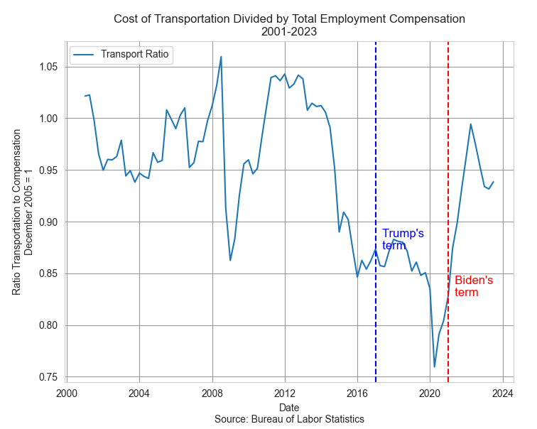
Transportation costs represent the second highest category of spending. These costs have risen far less than income but what people notice are changes in price, particularly if those changes happen over a short period of time. In the first months of the pandemic during the Trump administration, refineries around the world shut down or reduced production. A surge in demand in 2021 caused gas prices to rise. Despite the rise, transportation costs are still less of a burden than they were during the Bush or Obama presidencies.

Neither Biden nor Trump were responsible for increased fuel costs but it happened on Biden’s “watch” and voters tend to hold their leaders responsible for the price of housing, gas and food. In the quest for votes, a presidential candidate will often imply that they can control the price of a global commodity like oil. The opening of national monument land in Utah to oil drilling has a negligible effect on the price of oil but a president can claim to be doing something. Our political system has survived because it encourages political posturing but requires compromise and cooperation to get anything done. This limits the damage that can be done by 535 overconfident politicians in Congress.

Voters have such a low trust of Congress that they naturally pin their hopes and fears on a president. Some are single-issue voters for whom economic indicators have little influence. For some voters party affiliation is integrated with their personal identity and they will ignore economic indicators that don’t confirm their identity. Some voters are less dogmatic and more pragmatic, but respond only to a worsening in their economic circumstances. Such voters will reject an incumbent or party in the hope that a change of regime will improve circumstances. Even though economic indicators are not direct predictors of re-election success they do indicate voter enthusiasm for and against an incumbent. They can help explain voter turnout in an election year. A decrease in these ratios in the next three quarters will mean an increase in the economic well-being of Biden supporters and give them a reason to come out in November.

///////////

Photo by Money Knack on Unsplash

Keywords: food, transportation, housing, shelter, income, election

You can view all three ratios here at the Federal Reserve’s database
https://fred.stlouisfed.org/graph/?g=1ejaY

Example: A household grosses $80,000 income including employer taxes and insurance. They pay $24,000 in rent, or 30% of their total gross compensation. Over a short period of time, their income goes up 8% and their rent goes up 10%. The ratio of the shelter index to the income index has gone up from 1 to 1.0185 (1.10 / 1.08). The increase in income has been $6400; the increase in annual rent has been $2400. $2400 / $6400 = 37.5% of the increase in income is now being spent on rent, up from the 30% before the increase. Had the rent and income increased the same 8%, the rent increase would have been only $1920 annually, not the $2400 in our example. That extra $480 in annual rent is $40 a month that a family has to squeeze from somewhere. They feel the pinch.    

Fish and Bones Investing

January 14, 2024

by Stephen Stofka

This week’s letter is about our portfolios and the return we earn for the risks we take. Flounder is tasty but be careful of the bones. January is a good time to review savings and assets and start making plans for 2024. Did I make any contributions to my IRA in 2023? After the gains in the stock market last year, how has my portfolio allocation changed? I thought I would take a wee bit of time to review the performance and key indicators of some model portfolios over the past sixteen years. We have endured a great recession, a financial panic, a slow recovery during the 2010s and a pandemic in 2020. Despite all those setbacks the SP500 index has more than tripled since December 2007. Huh?! Before I begin, I will remind readers that none of what I am about to say should be considered financial advice.

Allocation

A portfolio can be separated into three broad categories: stocks, bonds, and cash. Stocks are a purchase of equity or ownership in a company;  bonds are a purchase of public and private debt; cash is an insurance policy. Each of these can be subdivided further but I will stick with these broad categories. An allocation is a weighting of these types of assets. A benchmark allocation is 60/40, meaning 60% stocks and 40% bonds and cash. The percentage of stocks in a portfolio indicates an investor’s appetite or tolerance for risk. In this review I will discuss three allocations: 50/50, 60/40 and 70/30. A 70/30 allocation is considered more aggressive than a 50/50 allocation.

Investment Cohorts

The 50/50 portfolio was invested equally in the SP500 (SPY) and the total bond market (AGG) at the start of each 8-year period, beginning with the period that began in 2007. I will refer to these 8-year periods as cohorts, just like age cohorts. The 2007 cohort was “born” on January 1, 2007, and “died” on December 31, 2014. The second cohort was born on January 1, 2008, and died on December 31, 2015. There was no rebalancing done throughout each period to test the effect of a severe financial shock during the life of the investment.

Presidential Administrations

I picked an 8-year period because it aligns with two Presidential terms. A change in administration alters the political climate and presumably has some effect on a portfolio’s returns. The data, however, did not confirm that hypothesis. Presidential candidates try to persuade voters that their candidacy and their party will make people better off. To the millions of people trying to build a retirement nest egg, a change in administrations during the past 16 years had little effect. The market responds to forces much broader than the policies of any administration.

Specific Cohorts and their Returns

Let’s look at a few cohorts. Despite the severe downturn during 2007-2009, the slow recovery and the pandemic shock, the more aggressive 70/30 allocation delivered consistently higher returns than the two safer allocations. Obama’s two term Presidency began in 2009 at a decades low in the stock market, an opportune time to invest. However, that 8-year return had only the second highest return in this analysis. The highest return was the 2013-2020 cohort that consisted of Obama’s second term and Trump’s only term (so far).

Risk vs. Return

In 2008 a 50/50 portfolio cushioned the 37% loss in the U.S. stock market but over an 8-year period, the advantage of a safer allocation largely disappeared. In the period that began in 2008 all three portfolios delivered less than a 6% annualized return. During a severe downturn, a safer portfolio can mitigate an investor’s fears but the best tonic is a long term perspective. Generally the difference in returns is about 1% per year so the 50/50 portfolio earned 1% less than the 60/40 which earned less than the 70/30 portfolio. However the 70/30 investor absorbed more risk than the other two portfolios. In the chart below is the standard deviation (SD) of each portfolio, a measure of the risk or variation in a portfolio.

Performance Metrics

Recall that the 2013 cohort (green dotted line) had a return above 12%. The risk was almost 11%, a nearly one-to-one ratio of return to risk. Financial analysts have developed several measures of the tradeoff between risk and return. The Sharpe ratio is a measure of return that adjusts for risk by subtracting the return on a really safe investment from the return on the portfolio. The benchmark for a risk free investment is a short term Treasury bill (The interest rate on a money market account would be a close substitute).

Let’s use some rounded figures from the 2013 cohort as an example. The 70/30 portfolio earned 12% and a safe investment earned just 1%, a difference of 11%. That is the numerator in the Sharpe ratio. The denominator is the level of risk which is the standard deviation (SD) mentioned above. The SD was almost 11%, giving a ratio of 1. In the chart below is the Sharpe ratio for each cohort and shows that the actual ratio of 1.1 was close to the approximation above. Notice that the safer 50/50 portfolio often had the higher risk adjusted return.

From Peak to Valley

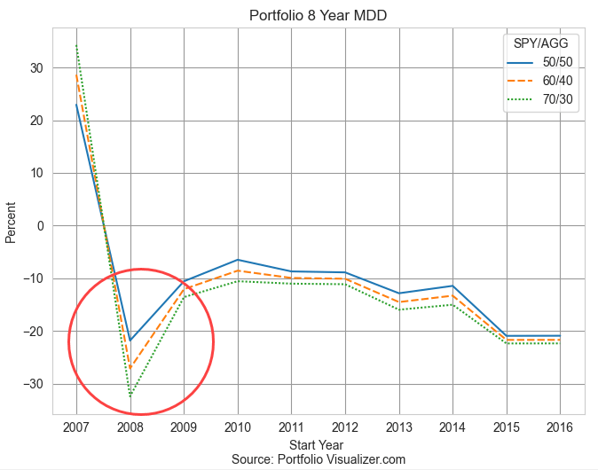
Investors may ask themselves “how much in return can I earn” when the more appropriate question is “how much risk can I tolerate?” The MDD, or maximum drawdown, is the greatest change in the value of a portfolio, regardless of the beginning and ending of a year. A portfolio might have gained 20% by October of 2007, then lost 60% in the next six months. The MDD would be 60%. It can be a gauge of your comfort level. Notice in the chart below that the MDD only varies under great stress like the financial crisis when the difference between the safer 50/50 allocation and the 70/30 portfolio was about 10%.

The Impact of Loss

We feel losses more than we do gains, even if the losses are only on paper. A portfolio that gains 20% only has to lose 16% to return to even. Regardless of our math abilities in a classroom, our instincts can be quite good at percentages. At higher gains, the percentages are painful. A portfolio that gains 50% then loses 50% nets a 25% net loss from our starting position (see notes at end). An MDD is a good indicator of “will this loss of value cause me to sell the investment?” In the early part of 2009 after the market had been battered, some clients could not handle the anxiety and sold some or all of their stocks, despite the advice from their advisors that this was the worst time to sell.

No Two Crises are Alike

Since December 2019, a few months before the pandemic restrictions began, the stock market gained 20% after adjusting for inflation (details at end). During and after the financial crisis, stocks lost 12% during the four years from December 2007 through December 2011 (details at end). The better response of asset prices during the pandemic era can be attributed to two phenomenon: technological advances and high government support of households and small business. During the financial crisis the majority of government support strengthened the foundations of financial institutions at the expense of households and small businesses. During the pandemic, many people could be productive from home. Students were in a virtual classroom with 15-30 other students. Had the pandemic happened in 2007, there was not enough bandwidth to support that kind of access, nor had the software been developed that could run that network capacity.

Takeaways

Households vary by income, by age, by health, circumstances and family characteristics. Each of these factors is a component of a risk exposure that a household faces. A younger couple might have time on their side but family obligations reduces their risk tolerance. Those obligations might include caring for an elderly parent or supporting a child’s educational goals. These models cannot replicate actual portfolios or individual circumstances but they do illustrate the smoothing effect of time even under the worst shocks. Risk tolerance is a matter of time tolerance.

//////////

Photo by Ch P on Unsplash

Keywords: portfolio allocation, standard deviation, risk, return, Sharpe ratio

A portfolio of $100 that gains 50% is then worth $150. If it loses 50%, the result is a value of $75, a net loss of $25 or 25%.

According to multpl.com, the inflation-adjusted value of the SP500 was 4708 in December 2023. This was a 20.6% gain above an index of 3902 in December 2019. The index stood at 2005 in December 2007, the first month of the Great Recession that would become the financial crisis in 2008. In December 2011, the index stood at 1762, an inflation-adjusted loss of 12%.

Seniors Spend, Seniors Vote

January 7, 2024

by Stephen Stofka

This week’s letter examines the spending habits of seniors and the effect of that behavior on the broader economy. The growth of spending in this age group surpasses all others. Seniors spend money and they vote their interests.

In 2020, the Census Bureau estimated the population 65+ at 55.8 million, almost all of them collecting Social Security. One in six people in the U.S. is older than 65 but made up 26% of the 154.6 million voters in 2020, making them overrepresented voters, according to the Census Bureau. They vote to protect their programs, their priorities and preferences. In 2000, Social Security income represented 4% of the country’s total income. Today, it is 5%. Their assets, incomes and spending habits affect the entire population.

In 2000, seniors aged 65+ were just 3% of the labor force, according to the BLS. The 2008-9 recession dealt a blow to the retirement plans of many older folks who continued working past their retirement age. In 2020, when the pandemic rocked the economy, seniors comprised 6.8% of the labor force. Many seniors did not return to the labor force and today, almost four years after the pandemic began, their share of the labor force has remained the same, about 6.8%. Had their share of the labor force continued to grow, seniors in the labor force would total about 13.2 million. The latest data from the BLS indicates an actual level of 11.5 million, a shortage of 1.7 million. Adding in that shortage would raise the unemployment rate above 4.5% from the current level of 3.7%. The chart below shows the approximate shortage.

The Federal Reserve’s Survey of Consumer Finances shows that incomes taper off after middle-age (page 7). Senior workers were part of an age group that was particularly vulnerable to the Covid-19 virus. As many businesses shut down in March 2020, many seniors had few options except to file for Social Security to secure an alternative income source. Monthly payments to recipients rose sharply from $78.1 billion in February 2020, the month before pandemic restrictions, to $89.4 billion in February 2022, according to the Social Security Administration. Also, many seniors who had paid off their mortgages would have an “imputed” income generated by the investment in their house. Restaurants and gathering places reopened in the summer of 2020 then shut down again as Covid-19 cases surged. States reopened these venues on a gradual basis with staggered or outdoor seating only. As vaccines became available in the first quarter of 2021, seniors were the first to be eligible. Personal consumption expenditures jumped almost $1 trillion in March and April of that year and seniors led the spending surge.

Imagine feeling forced to retire and not being able to enjoy leisure activities like movies, golf, travel, museums or dining out. These activities were mostly shut down from March 2020 to the spring of 2021. The New York Fed conducts a triannual (3x a year) survey of household spending that reveals some interesting changes in spending habits in response to the pandemic. Those under age 40 had the highest rate of large purchases. People over age 60 increased their overall spending by the most – 9.1%. In the chart below, that senior age group is the dotted green line at the top. By the first quarter of 2023, seniors were still increasing their spending while the younger age groups had cut back. Notice that spending growth by seniors, the green dotted line in the graph below, were consistently the highest of all age groups.

According to an analysis by the Pension Rights Center, half of all senior households have income less than $50,000. That same household spending survey found that those with low incomes increased their spending by the largest percentage of the income groups. In the first quarter of 2022, households in this low income group increased their spending by almost 10%, as indicated by the red dashed line in the chart below.

In the first quarter of 2023, their spending came down along with all other income groups but then sprang up again during the spring of summer of this past year. This age and income group has contributed to the strength of consumer spending this past year.

This year promises to be one of the most contentious in our history. Elections are won by a coalition of groups and for the past decade, the voting coalitions are evenly matched. The voting rules in a democracy naturally allow some groups to command a dominant voice that is out of proportion to their numbers. One out of six Americans are seniors and one out of four voters are seniors. Their vote will advantage their own interests and priorities at the disadvantage of other groups. That’s democracy.

/////////////////

[20240107TreeBench

Photo by Aaron Burden on Unsplash

Keywords: consumer finances, spending, voting, income, household income