April 7, 2024
by Stephen Stofka
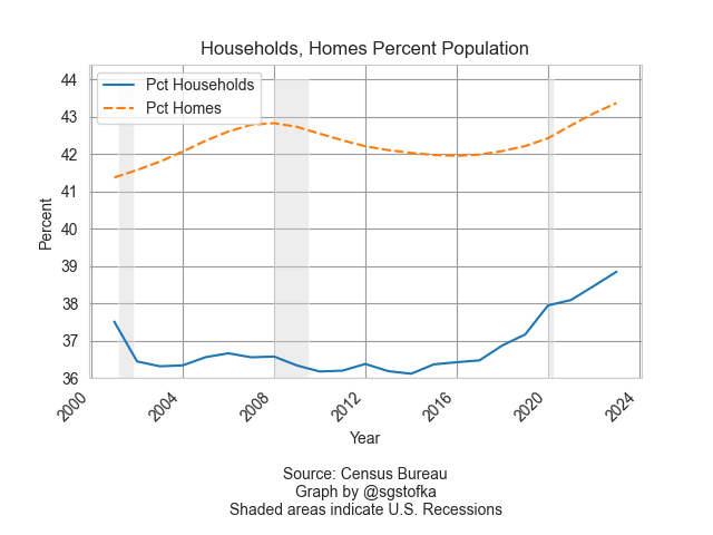
In this week’s letter I will explore the various roles that housing plays in our lives. Last week I showed the divergence of household formation and housing supply during the financial crisis. Home builders responded to the downturn in household formation by building fewer homes. Because the recovery after the crisis was slow, the demand for housing did not pick up until 2014. It is then that a mismatch between housing demand and supply started to appear in the national and some local home price indices. This week I will examine the demographics of homebuyers and sellers in recent history and the secret life of every homeowner as a landlord. A home is a magic wallet where money flows come and go.
Data from the National Association of Realtors (NAR) indicates that the median age of home sellers has increased from 46 to 60 since 2009. I will leave NAR data sources in the notes. In the four decades between 1981 and 2019, the median age of home buyers rose by twenty years, from 36 in 1981 to 55 in 2019. The median age of first-time buyers, however, increased by only four years, from 29 to 33. In 1981, the difference in age and accumulated wealth between first-time buyers and all buyers was only seven years. Now that difference has grown to 22 years. First-timers typically buy a home that is 80% of the median selling price of all homes.
In the past four decades, there has been a divergence in wealth between older and younger households. The real wealth of younger households has declined by a third since 1983 while households headed by someone over 65 have enjoyed a near doubling of their real wealth in thirty years. Accompanying that imbalance in growth has been a shift in capital devoted to housing.
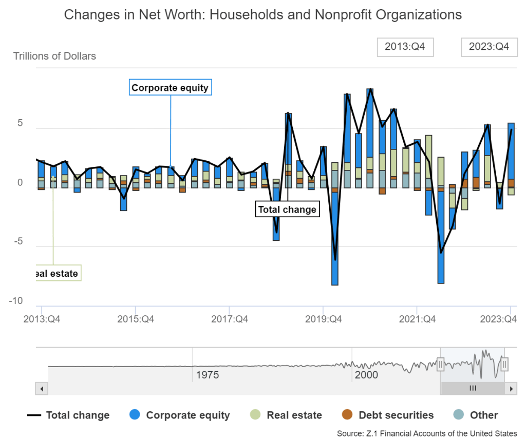
The Federal Reserve regularly updates their estimates of the changes in household net wealth. The link is an interactive tool that allows a user to modify the time period of the data portal. The chart below shows the most recent decade of changes in wealth. The lighter green bars are the changes in real estate wealth for households and non-profits and show the large gains in real estate valuations during the pandemic. The blue bars represent equity valuations and demonstrate the volatility of the stock market in response to any crisis, large or small.
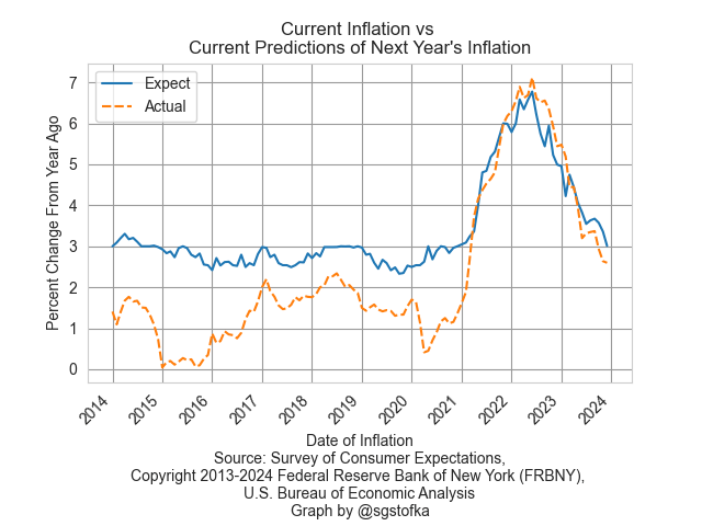
The Fed’s data includes various types of debt as a percent of GDP. Twenty years ago, household mortgages were 11-12% of GDP. Today they are 19% of GDP, a huge shift in financial commitment to our homes and neighborhoods. A city average of owner equivalent rent (FRED Series CUSR0000SEHC) averaged an annual gain of 2% during Obama’s eight- year term, 2.8% during Trump’s term, and 6% during the first three years of Biden’s term. Biden has little influence on trends in housing costs, but the art of politics is to use correlation as a weapon against your opponent. People feel the change in trajectory as a burden on their households.

The Bureau of Labor Statistics calculates owner equivalent rent by treating a homeowner as both a landlord and renter. Property taxes, mortgage payments, interest, maintenance and improvements to a home are treated as investments just as though the owner were a landlord. The BLS uses housing surveys to determine the change in rental amounts for different types of units. A sample of homeowners are asked how much they would rent out their home but this guess is used only to establish a proportion of income dedicated to rent, not the actual changes in the rental amounts for that area, as the BLS explains in this FAQ sheet.
Let us suppose that a homeowner has a home that is fully paid for. If the house might rent for $2000 a month and monthly expenses are $500 a month, that would represent $1500 per month in implied net operating income for that homeowner, an annual return of $18,000. A cap rate is the amount of net operating income divided by the property’s net asset value. If similar homes are selling for $450,000 in that area, the homeowner is making 4% on their house’s asset value, slightly less than a 10-year Treasury bond (FRED Series DGS10, for example).
Long-term assets compete with each other for yield, relative to their risk. A property is a riskier investment than a Treasury bond, so investors expect to earn a higher yield from a property. Before the pandemic, 10-year bonds were yielding between 2-3%. Landlords could charge lower rents and still earn more than Treasury bonds. As yields rose for Treasury bonds, property investors must charge higher rents to earn a yield appropriate to the risk or sell the property and invest the money elsewhere.
When we own an asset that provides an income, it is as though the asset owes us. When a home declines in value, we feel a sense of loss. When the housing market turned down in 2007-2008, homeowners expected to get a similar price as the house their neighbor sold in 2006. They used that sale price to determine what their house owed them. In order to get the listing, a real estate agent would agree to list the home for that higher amount, but the property would get few offers. After a period of time, the seller would cancel the listing and wait for the “market to turn around.”
Earlier I noted the dramatic rise in mortgage debt as a percent of GDP. At one-fifth of the economy, that debt represents capital that is not being put to its most efficient use because most homeowners do not regularly evaluate the yield on their homes as professional investors. A higher percent of capital devoted to housing will help sustain higher housing costs and pressure household budgets. I worry that an inefficient use of capital will contribute to a pattern of lower economic growth in the future, stifling income growth. The combination of these two pressures will make it difficult for younger households to thrive. The generational gap will widen, adding more social and political discord to our national conversation.
/////////////////
Photo by Towfiqu barbhuiya on Unsplash
Keywords: mortgage, housing, owner equivalent rent
Notes on median age of sellers: 2009 data is from the NAR and cited in a WSJ article (paywall). Current data is from the NAR FAQs sheet. Jessica Lautz, an economist with NAR, reported the four-decade trend in home buyers. Median home prices of first-time buyers is from a 2017 analysis by the NAR. The comparison of older and younger households comes from a 2016 NAR analysis.
Notes on Federal Reserve data: The change in mortgage debt as a percent of GDP is in the zip file component z1-nonfin-debt.xls, in the column marked “Noncorporate Mortgages; Percent of GDP.”