August 28, 2022
by Stephen Stofka
Several events this week share a common theme. President Biden announced a partial student loan forgiveness program. Fed chair Jerome Powell announced the central bank’s firm commitment to tame inflation. The justice department is pursuing tens of thousands of fraudulent claims related to the pandemic federal relief programs. California Governor Gavin Newsome announced that the state will completely phase out gas fueled cars by 2035. What do these four events have in common? Government officials taking action to shield or relieve individuals from some oppressive force – a debt burden, rising prices, a pandemic, and a contributing cause to climate change. Government is a raft, an anchor of safety that we must share if we are to keep our heads above the water that connects us.
The physical world does not care whether human beings acknowledge or deny climate change. In 2013 the IPCC released their fifth assessment of the global climate. They were careful to note that they could not project individual small weather events like thunderstorms but that there would be more extreme weather events. Tree ring data indicates that this two decade drought in the west last occurred 1200 years ago. Agriculture uses 80% of the total amount of water humans use and have been severely impacted by water rationing. The federal government and states have spent billions fighting fires throughout the west. In recent days several southern states have experienced “1000 year” floods. They have declared emergencies to trigger federal assistance for cleanup and rebuilding.
The sun pours a flow of energy on the earth. Greenhouse gases like carbon dixoide retard the escape of the heat from that energy. California’s initiative is a key declaration of an aspirational agenda to lessen the release of greenhouse gases. Building an infrastructure for thousands of electric vehicles is a Herculean task. So was the journey from Independence Missouri on the Oregon Trail in the 19th century. More of us are realizing that things have gotten to a point that we have to make some changes whether we like it or not. California has declared its intention to start the journey. Let’s hope more states will follow.
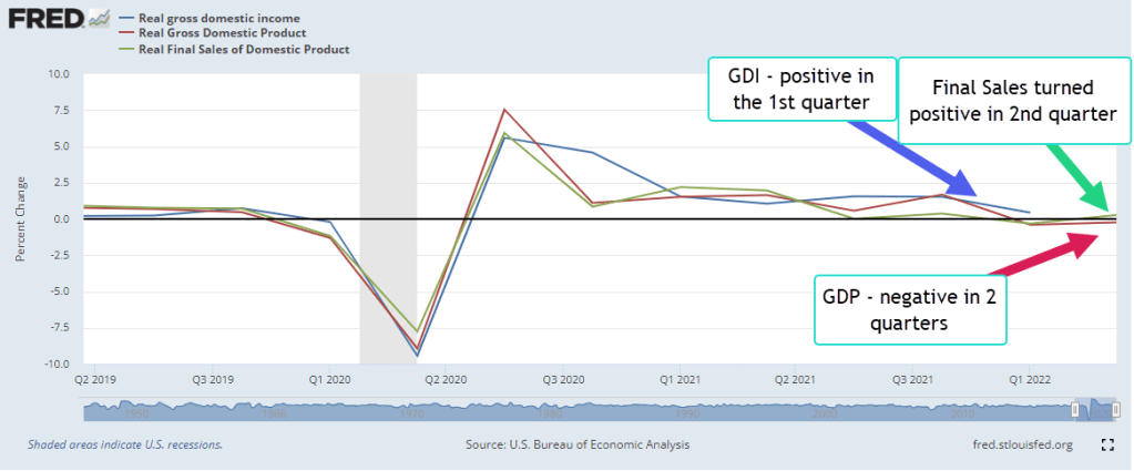
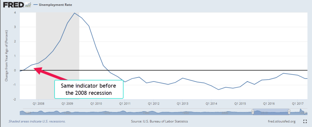
Inflation is oppressive. In a Jackson Hole summit speech this Friday Fed Chairman Jerome Powell stressed the Fed’s commitment to taming inflation. “Inflation feeds on itself,” he said. As people come to expect higher inflation they may buy more now, making choices that actually accelerate inflation. When inflation is low, businesses and people no longer need to factor in rising prices as they make future plans. Former Fed Chairman Allan Greenspan called it “rational inattention.” The Fed has a twin policy mandate from Congress – full employment and stable prices. Because unemployment is so low the Fed feels that they can focus their policy tools on curbing inflation. Powell warned that rising interest rates would have a negative impact on both economic growth and employment. The stock market fell more than 3% in response to the Fed’s determination to keep raising rates until inflation has returned closer to their target.
David Farenthold (2022) reports that the Justice Department is pursuing tens of thousands of fraudulent claims under the CARES act. Three relief programs totaled $5 trillion, $3.1 trillion in the spring of 2020 and $1.9 trillion under the new Biden administration in the spring of 2021. Because there are so many cases, those who stole $10,000 will probably escape prosecution as investigators tackle claims with larger amounts. The Labor Department has 39,000 cases of fraudulent unemployment claims pending. The Small Business Administration has over two million fraudulent claims to investigate and verify. So far, the Justice Department has charged 1500 and secured 500 convictions. During the pandemic, Congress reached out. Many took advantage.
President Biden announced a student loan forgiveness program of $10,000 for each student with outstanding student debt and an income below $125K. The debt relief does not apply to those pursuing advanced medical and law degrees. A surge of college enrollment before and after the Great Recession drove student loan debt much higher. For-profit colleges overpromised well-paying careers to attract lower income students who qualified for federal grants and loans. Those low-income students who qualified for Pell grants will be eligible for up to $20,000 of student loan forgiveness. This will help minority students and women who typically earn less even after earning a BA degree. Most of those who graduate from 4-year schools come from the top 50% of incomes, and are endowed with more financial and educational resources prior to entering college. Whether a president has the power to forgive student loan debt is a matter for the courts. Mr. Biden’s executive action will surely be challenged.
Former President Ronald Reagan once quipped “The nine most terrifying words in the English language are: I’m from the Government, and I’m here to help.” Despite his rhetoric, Reagan headed a big spending government that helped certain groups of people. Communities near military bases appreciated his military buildup in the fight against the Soviet Union. Investment and savings banks appreciated the 1984 and 1986 bailouts from his administration. High interest rates during the early 1980s drove the economy into a deep recession and curbed inflation but crippled debt-burdened farmers. Many family farms were sold to large agricultural holding companies. Military contractors and finance companies got relief. Farmers did not.
The founders of our country thought that the business of government was to protect people from oppressive burdens. Then as now we argue about whose burdens, who pays and how they should be relieved. We are all interconnected, swimming in the same pool. Government is a big raft, a temporary rest from a lifetime of staying afloat. At times we appreciate the hand up when someone says, “I’m from the government and I’m here to help.”
////////////////
Photo by Jong Marshes on Unsplash
Fahrenthold, D. A. (2022, August 16). Prosecutors struggle to catch up to a tidal wave of pandemic fraud. The New York Times. Retrieved August 25, 2022, from https://www.nytimes.com/2022/08/16/business/economy/covid-pandemic-fraud.html
United Nations. (n.d.). United Nations Charter. United Nations. Retrieved August 26, 2022, from https://www.un.org/en/about-us/un-charter/full-text