CPI and Wages

Dec. 24th, 2012

Merry Christmas, Everyone!

This is part two of a look at the CPI, comparing the price index to wage growth.  Part 1 is here

In the years 1947-1980, the average hourly earnings of production workers rose 6.08% annually while the CPI grew 4.03% (Source)  In effect, earnings rose 2% higher than prices.   Since 1980, earnings have risen 3.55% annually as the CPI rose 3.29%, giving workers a real growth rate of less that a 1/3rd of 1%.

The rise in worker productivity fueled gains in worker compensation until the past fifteen years.  Below is a chart of real, that is inflation-adjusted, compensation and productivity.

Increased Productivity means more profits.  For several decades in the post-WW2 economy, workers shared in those profits.  After the recession of 1982-1984, workers’ share of the increase in output slowly decreased.  As incomes barely kept up with inflation, workers tapped the equity in their houses.

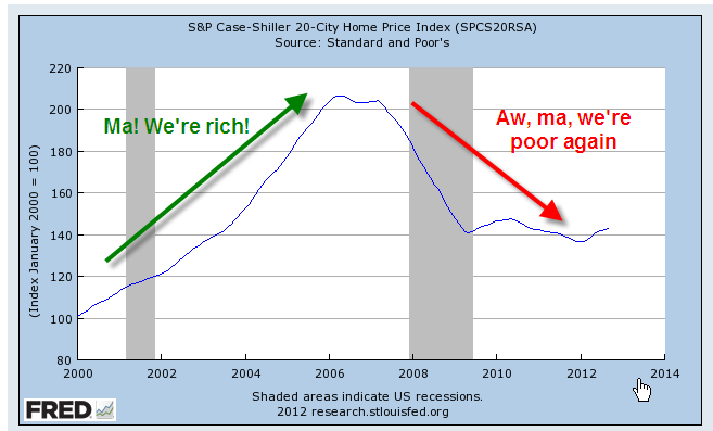
Low interest rates, poor underwriting standards, lax regulations and a feeding frenzy by both home buyers and banks fueled a binge in home prices, followed by the hangover that started in 2007.  Only now is the housing market struggling up out of a torpor that has lasted for several years.

Before the housing bust, magical thinking led many to believe that the rise in home equity was a sure fire way to riches.  Over a century’s worth of data shows that housing prices tend to rise about the same as the CPI.  Housing prices have finally bottomed out at about the same level as the long term trend line of CPI growth.

The boom and bust upended the lives of a lot of people and the repercussions of that “hump” will continue as banks continue to foreclose on home owners whose incomes have flattened or declined. The recovery in the housing market will help some home owners but the real problem is unemployment, underemployment and the decreasing share of workers’ share of the profits from productivity gains.  Until the labor market heals, the housing market will not fully heal.

Those who do have savings have become cautious.  Since 2006, investors have taken $572 billion out of stocks and put $767 billion in bonds, a move to safety – or so many retail investors think.  For decades, home prices never fell – until they did.  For over thirty years, bond prices have been rising, giving many retail investors the feeling that bonds are safe – until they are not.

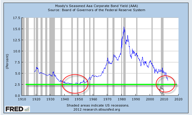
Companies have been selling record amounts of corporate bonds into this cheap – for companies – bond market.  As this three decade long upward trend in bond prices begins to turn, bond prices can fall sharply as investors turn from bonds to stocks and other investments.  We are approaching the lows of interest yields on corporate bonds not seen since WW2.  Investors are loaning companies money at record low rates and companies are sucking up all that they can while they can.  Sounds a lot like home buying in the middle of the last decade, doesn’t it?

Y’all be careful out there, ya hear?

Yield Curve

If you casually listen to financial news, you may hear about a “steepening” or “flattening” yield curve and wondered what the heck that is.  It graphs the difference in yield or interest rate for U.S. Treasury bonds of various maturities.  At the left side of the graph is the yield for Treasury bonds that mature in 3 months.  At the right side of the graph is the yield for 30 year bonds.  In a normal environment with anticipated moderate growth in the years ahead, there will be a difference of about 3% between the short 3 month rate and the long 30 year rate. (Click to enlarge graph in separate tab)

The mutual fund giant, Fidelity, has a brief summary of the different types of curves and what each says about investors’ expectations of future economic conditions.  On the page is an interactive movie of the yield curve for the past 30+ years.

For those of you who have devoted a lot of money to bond funds, you may have noticed the recent 10% drop in the value of any longer term bond funds you have.  From October 2009 to April 2010, long term bonds stayed fairly stable in price.  This summer, as doubts about the recovery emerged, prices for these long term bonds increased rather dramatically – about 16% – as investors became more risk averse and were willing to pay more for long term maturities. Investors were willing to accept lower yields or interest rates on their money.  As interest rates on Treasuries dropped, so too did rates on 30 year fixed mortgages which neared 4% during the summer.  The current downward slope in long term bond prices signals a returning confidence in the economy’s recovery.  We have also seen an increase in 30 year mortage rates to near 5%.

From the Fidelity page cited above, I compared the yield curve now with the curve in mid 2003.  In October 2002, the stock market fell to its low point after the bursting of the internet bubble and the 2001 – 2002 recession.  It see-sawed for several months until the spring of 2003 when it began a steady rise for a year.  The orange line in the graph is today’s yield curve, almost exactly what it was 7-1/2 years ago, suggesting that investors have the same expectations for continuing growth in the economy now as what they did in 2003.

Buffalo Stampede

From the stock market low in March through the end of September, retail investors, who own half of the U.S. equity market, had put only $2.5B into mutual funds and exchange traded funds for equities, largely missing out on the market’s 60% rise. Investors had pumped $254B into bonds during that time, a ratio of 100-1 of bond to equity investment.

Forget about the bulls and bears. Markets, both up and down, behave more like buffaloes.

Bond Surge

In a 9/22/09 FT article, Sam Jones compares hedge fund participation in the market for the past three years. In the fixed income sector, hedge funds that used to comprise almost a third of the trading volume are now only an eighth of the volume. So what is driving the huge inflow of money into bonds in the past few months? Money market rates that are close to zero. Many market funds that paid over 2% interest at the end of last year are paying about a tenth of 1%.

In a 9/19/09 WSJ article, Jason Zweig examines this flood of money out of money market funds and into bonds. He notes that “investors sank over $40B into bond funds in August, an all-time high for a single month, and are on pace to break that record again in September.” Zweig cautions investors not to chase yield by loading up on long term bonds, which will decline in price much faster than shorter term bonds when interest rates rise. Zweig briefly explains the concept of duration and how it affects bond prices and risk exposure.

At gurufocus.com, David Dietze compares money inflows into bond and stock funds this year with the bull market of 2003 – 2006. Since March of this year, $20 has been invested in bond funds for every dollar in equity funds. Dietze notes “More money has found its way into bond mutual funds this year than in the bull market from 2003 to 2006.”

Options to hedge against both inflation and rising interest rates include buying shorter term bonds, stocks that pay consistent dividends, and Treasury Inflation Protected bonds (TIPS).

What A Fool Believes

Thirty years ago, in April 1979, the top song on the Billboard charts was “What a Fool Believes” by the Doobie Brothers.

On April 16th, 1979 the Dow Jones average was 857. In 2009 dollars that was 2502, using this handy inflation calculator. Today, April 14, 2009 the Dow closed at 7920. That is a 7.7% annual return. The yield on a 30 year U.S. Treasury bond in April 1979 was 9.08%.

Do bonds have consistently better returns than stocks over the long run? Not according to Jeremy Siegel who researched owning stocks versus bonds for various periods in his book “Stocks for the Long Run.” Mike Piper, who has written several introductory books on accounting and taxes, reviews some of the details on his Oblivious Investor blog.

As convincing as Siegel’s case for stocks may be, should a person put all their savings in stocks? No. Only a fool believes that the next 30 years will be like the last 30 years. For most of us, the safest answer is to diversify among a range of investments.