May 12, 2018
by Steve Stofka
I have long enjoyed optical illusions. Is that a picture of a rabbit or a duck? Which way is the cube facing, right or left? (Some examples) Is that two people facing each other, or a vase? (Image page) These can be even more fun when shared with a friend or sibling. Can’t you see the rabbit? No, it’s a duck!!!
Moving images present a selective attention deception. When asked to count the number of basketball passes, we may not see the gorilla that walks across our field of view. (Video)
These examples excite our curiosity and fascination as children and carry important lessons for us as adults. We sometimes misinterpret the data our senses receive. Those with a strong ideological bent may focus narrowly on only that data that supports their view of the world, or that makes them feel comfortable.
Let’s look at an example. Real (inflation-adjusted) median (middle of the pack) household income peaked in 1999 at $58,665. In 2016, income climbed to $59,039. However, personal income did not peak till 2007, at $30,821. Like household income, personal income finally rose above that peak in 2016.

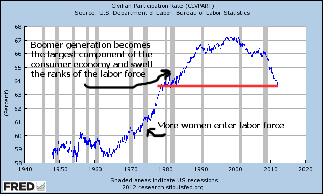
In the household series, the past twenty years have been especially tough. In the personal series, only the past ten years have been that difficult. What accounts for the difference in the two series? Households have grown faster than the population. Population Income / Households will be lower when households increase.
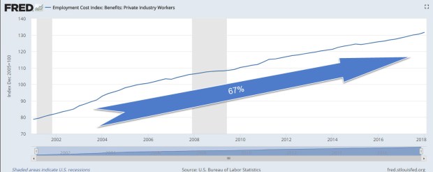
But what is income? Household income is money income received and does not include employer-provided benefits and retirement contributions (Census Bureau Defs). The BLS does track total compensation costs which do include these benefits, and those costs are 67% higher today than they were in 2001.
If an employer gave an employee $500 a month for health care expenses and the employee sent the money to the health insurance company, that would be counted as income in the data. But because the employer sends the money directly to the insurance company, that income is not counted. Because of World War 2 wage and price controls, and to avoid being taxed under the income tax system, most employee benefits never touch the employee’s pocket, and are not counted as income. This becomes important when something not counted, benefits, grows much quicker than the income that is counted, or money received.
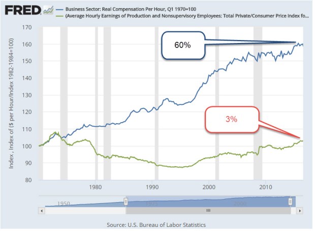
Since 1970, real hourly wages have grown only 3%. Bernie Sanders and other Democrats use a similar figure to press for more social welfare programs. Total hourly compensation has grown 60% (Fed Reserve blog) and most of that is not included in household income.
Is it a rabbit or a duck?
////////////////////////
Do Millennials have it worse than Boomers did at this age?
I’ll call them the Mills and the Booms, so I don’t wear out my fingers. The Mills were born about 1982-2001 so they are 17 – 36 years old today. A decade after the worst recession since the Great Depression, home and apartment prices are rising fast in many urban areas. Mills are now the largest generation alive and are at an age when a majority of them are independent and increasing the demand for housing.
Some Mills are trying to provide shelter for their families when the competition for housing puts constant upward pressure on prices. Some Mills are paying off student loans, while paying $800 to $1000, or more in California, to share a 3 bedroom house with two other people. It is stressful.
The Booms were born approximately 1946 – 1964. The youngest are 54; the oldest are 72. When the Booms were 17-36, the year was 1982, and oh, what a year it was. The Booms had just endured a decade of double-digit inflation rates (it is now less than 2%), four recessions, mortgage rates that were considered a “bargain” at 9% (4% today), and high housing and apartment prices because there was so much demand for living space from this post war baby boom.
Oh, and tax increases. Tax rates were not indexed for inflation till 1985, so higher wages each year to keep up with that double-digit inflation meant that many workers were kicked up into a higher tax bracket each year. One of Ronald Reagan’s campaign promises was to stop the sneaky practice of dipping deeper into worker’s pockets every year. He got elected President, beating President Jimmy Carter who had told workers to turn the heat down and put a sweater on.
How do today’s monthly debt payments compare? Household Debt Service Payments as a percent of disposable personal income are 5.8% today compared to 5.6% in 1982. The 37-year average is 5.7% (Federal Reserve).
What are those average debt service payments buying? Better cars, more education, more square footage of housing space per person, and computers and electronics that didn’t exist in the 1980s. People are paying more for housing but are enjoying 30% more square footage per person (Bloomberg). In 1982, 17% of the population 25 years and older had a college degree. Today, it is double that percentage (Census Bureau table A-1), an achievement that the Mills can be proud of.
The Mills do have it better than the Booms, who had it better than the generations before them. That “good old days” talk that we heard from Bernie Sanders on the campaign trail are based on some foggy memories. The reality was way tougher than Sanders remembers or talks about because his perception is clouded by his ideology. He only sees the data that tells him it’s a rabbit. He doesn’t see the duck.