August 12, 2017
Ratios are important in baseball, finance and cooking, in economics, chemistry and physics, and yes, even love. If I love her a lot and she kinda likes me a little, that’s not a good ratio. I learned that in fourth grade.
Each week I usually turn to one or more ratios to help me understand some behavior. This week I’ll look at a ratio to help explain a trend that is puzzling economists. The unemployment rate is low. The law of supply and demand states that when there is more demand than a supply for something, the price of that something will increase. Clearly there is more demand for labor than the supply. I would expect to see that wage growth, the price of labor, would be strong. It’s not. Why not?
I’ll take a look at an unemployment ratio. There are several rates of unemployment and there is no “real” rate of unemployment, as some non-economists might argue at the Thanksgiving dinner table. The rates vary by the types of people who are counted as un-employed or under-employed. The headline rate that the Bureau of Labor Statistics (BLS) publishes each month is the narrowest rate and is called the U-3 rate. It counts only those unemployed people who have actively searched for work in the past month. In the same monthly labor report, the BLS publishes several wider measures of unemployment, U-4 and U-5, that include unemployed people who have actively searched for a job in the past 12 months. U-6 is the widest measure of unemployment because it includes people who are under-employed, those who want full-time work but can only find part-time jobs. Included in this category would be a person working 32 hours a week who wants but can’t find a 40 hour per week job.
The ratio that helps me understand the underlying trends in the labor market is the ratio of this widest measure of unemployment to the narrowest measure. This is the ratio of U-6/U-3. In the chart below, this ratio remained in a narrow range for 15 years. Unemployment levels grew or shrank in tandem for each group. By 2013, the ratio touched new heights, climbing above 1.9 then crossing 2 in 2014. The two groups were diverging. The U-3 rate, the denominator in the ratio, was improving much quicker than the U-6 rate that included involuntary part-time workers.

What would it take to bring this ratio down to 1.85? About 1.5 million fewer involuntary part time workers. What does that involve? Let’s say that those involuntary part-time workers would like an average of 15 more hours per week of work. That is more than 20 million more hours of work per week, which seems like a lot but is less than a half percent of the approximately 6.1 billion hours worked per week in the 2nd quarter of 2017. These tiny percentages play a significant role in how an economy feels to the average person.
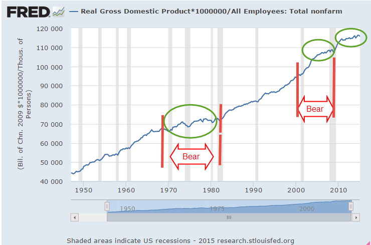
Let’s turn to a ratio I’ve used before – GDP per hour worked. I don’t expect this to be a precise measurement but it reveals long term trends in productivity. In the chart below, GDP per hour has flatlined since the end of the recession.
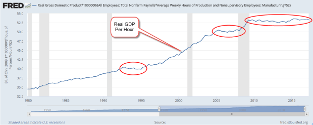
There are two ways to increase GDP per hour: 1) productivity gains, or more GDP per hour worked, and 2) reduce the number of hours worked more than the reduction in GDP. Door #1 is good growth. Door #2 is the what happens during recessions. GDP per hour rises because hours are severely reduced. I would prefer slow steady growth because the alternative is painful. Periods of no growth can be wrestled out of their torpor by a recession, a too common pattern. There were two consecutive periods of flat growth followed by recession in the 1970s and from the mid-2000s to the present day.
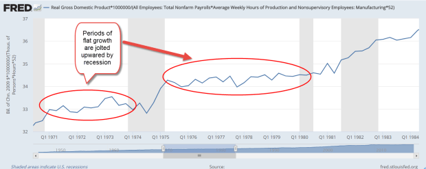
The economy can withstand two years of flat growth without a recession as it did in the early 1990s. It is the long periods of flat growth that are most worrisome. In the early 1970s and late 2000s, the lack of growth lasted three years and were followed by hard recessions. The lack of growth in the late 1970s led to the worst recession since the 1930s Depression. GDP per hour growth has been flat for eight years now and I am afraid that the correction may be hard as well. Maybe it will be different this time. I hope so.
///////////////////
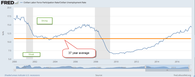
Participation Rate
Some commentators have noted the relatively low Civilian Labor Force Participation Rate (CLFPR). This is the number of people who are working or looking for work divided by the population aged 16 and older. (BLS). The rate reached a high of 67% in 2000 and has declined since then. For the past few years, the rate has stabilized at just under 63%.
A graph of the rate doesn’t give me a lot of information. Starting in the 1960s, the rate rose slowly as more women came into the workforce and the large boomer generation came into their prime working years. So I divide that rate by the unemployment rate to look for long term cyclic trends. Notice that this ratio peaks then begins a downward slide as recessions take hold.
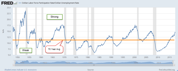
In mid-2014 this ratio finally broke above a long term baseline average and has been rising since. Today’s readings are nearly at the peak levels of early 2007.
Some pundits use the CLFPR as a harbinger of doom that includes: 1) too many people are depending on government benefits and don’t want to work; 2) there is a shrinking pool of workers to pay for all these benefit programs; 3) thus, the moral and economic character of the nation is crumbling. During the 1950s and 1960s, when the participation rate was lower than today, our parent’s generation managed to pay off the huge debts incurred by World War 2. It is true that benefit programs were much less than those of today.
In “Men Without Work” Nick Eberstadt documents a long term decline in the percentage of prime age (25 – 54) males who are working. Some interesting notes on shifting demographics: foreign born men of prime working age are more likely to be working or looking for work than U.S. born males. According to the Census Bureau’s time use surveys, less than 5% of non-working men are taking care of children.
In 2004 the participation rate for white prime age males first fell below those of prime age Hispanic males and has remained below since then. In 1979, 10% of black males aged 30-34 were in jail. In 2009, the percentage was 25%.
So why should I care about participation rates and wage growth? Policies initiated in the 1930s and 1960s instituted a system of inter-generational transfer programs. In simple terms, younger generations provide for their elders. Current Social Security and Medicare benefits are paid in whole or in part by current taxes. We are bound together in a social compact that is not protected by an ironclad law. Beneficiaries are not guaranteed payments.
For 40 years, from 1975-2008, the number of workers per beneficiary remained steady at about 3.3 (SSA fact sheet). In 2008, the financial crisis and the retirement of the first wave of the Boomer generation marked the beginning of a decline in this ratio to the current level of 2.7.
In their annual reports, both the SSA and the Congressional Budget Office note the swiftly changing ratio. Within twelve years, the ratio is projected to be about 2.3. In 2010, benefits paid first exceeded taxes collected and, in 2016, the gap had grown to 7% (CBO report) and will continue to get larger.
Policy makers should be alert to changes in the participation rates of various age and ethnic groups because the social contract is built partly on those participation rates. As with so many trends, the causes are diffuse and not easily identifiable. Economic and policy factors play a part. Cultural trends may contribute to the problem as well.
Congress has a well-established record of not acting until there is an emergency, a habit they are unlikely to change. Fixing blame wins more votes than finding solutions, but I’m sure it will all work out somehow, won’t it?