May 10, 2015
CWPI
The dollar’s appreciation against the euro and other currencies in the first quarter of this year caused a natural slowdown in exports, which has hurt manufacturing businesses in this country. U.S. products are simply more expensive to customers in other countries because dollars are more expensive in other currencies. The PMI manufacturing survey showed a decline in employment for the month. The non-manufacturing sector, which is most of the economy, rallied in April. As I noted last month, the CWPI should have bottomed out in March-April, reaching the trough in a wave-like series that has been characteristic of this composite index during the past six years of recovery. Any change to this pattern – a continuing decline rather than just a trough – would be cause for concern.
April’s resurgence in the non-manufacturing sector more than offset the weakness in manufacturing. In fact, there was a slight gain in the CWPI from March’s reading.

Employment and new orders in the non-manufacturing sector are two key components of the composite index and leading indicators of movement in the index. They have been on the rise since the beginning of the year. While the decline in the overall index lasted 5 – 6 months, this leading indicator declined for only 3 months, signalling a probable rebound in the spring. Now we get some confirmation of the rebound.

*************************
Employment
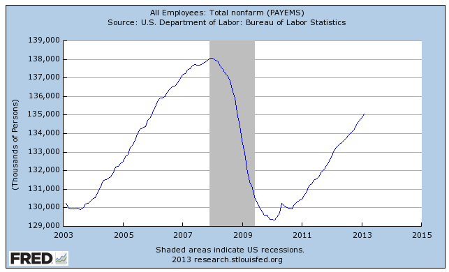
Released at the end of the week a few days after the PMI surveys, the monthly employment report from the BLS confirmed a renewal in job growth after rather poor job gains in March. April’s estimated job gains were over 200K, spurring a relief rally in the stock market on Friday. Gains were strong enough to signal that the economy was on a growth track but not so strong that the Fed would be in any rush to raise interest rates before September.
March’s job gains were revised even lower to below 100K, but the story was that the severe winter weather was responsible for most of that dip. As the chart below shows, there was no dip in year over year growth because the winter of 2014 was bad as well. Growth has been above 2% since September of last year.

During the 2000s, the economy generated plus 2% employment growth for a short three month stretch in early 2006, just before the peak of the housing boom. The past eight months of plus 2% growth hearkens back to the strong growth of the good ole ’90s. Like the 90s, Fed chair Janet Yellen warned this week that asset prices are high, recalling former Fed chair Alan Greenspan’s 1996 comment about “irrational exuberance.” Prices rose for another four years in the late 90s after Greenspan’s warning so clairvoyance and timing are not to be assumed simply because the chair of the Federal Reserve expresses an opinion. However, history is a teacher of sorts. When Greenspan made that comment in December 1996, the SP500 was just under 600. Six years later, in late 2002, after the bursting of the dot-com bubble, a mild recession, the horror of 9-11 and the lead up to the Iraq war, the SP500 almost touched those 1996 levels. An investor who had pulled all their money out of the stock market in early 1997 and put it in a bond index fund would have earned a handsome return. Of course, our clairvoyance and timing are perfect when we look backward in time.
For 18 months, growth in the core work force, those aged 25 – 54, has been positive. This age group is critical to the structural health of an economy because they spend a larger percentage of their employment income than older people do.

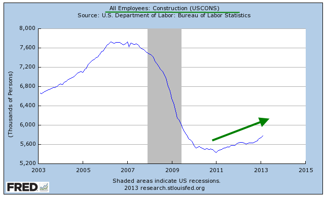
Construction employment could be better. Another 400,000 jobs would bring employment in this sector to the recession levels of the early 2000s before the housing sector got overheated.

In the graph below, we can see that construction jobs as a percent of the total work force are at historically low levels.

Every year more workers drop out of the labor force due to retirement, or other reasons. The population grows by about 3 million; 2 million drop out of the labor force.
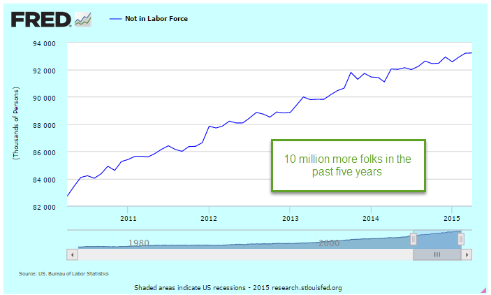
The civilian labor force (CLF) consists of those who are employed or unemployed (and actively looking for work). The particpation rate is that labor force divided by the number of people who can legally work, those who are 16 and over who are not in some institution that prevents them from working. (BLS FAQ) That participation rate remains historically low, dropping from 65% five years ago to under 63% for the past year.

That lowered rate partially reflects an aging population, and fewer women in the work force relative to the surge of women entering the work force during the boomer “swell.” A simpler way of looking at things shows relatively stable numbers for the past five years: those who can work but don’t, as a percentage of those who are working. The population changes much more than the number of employed, and the percentage of those who are not working is rock steady at about 66%. This percentage is important for money flows, the vitality of economic growth and policy decisions. Those who are not working must get an income flow from their own resources or the resources of those who are working, or a combination of the two.

The late 90s was more than just a dot-com boom. It was a working boom where the number of people not working was at historically low levels compared to the number of people working. The end of the dot-com era and the decline in manufacturing jobs that began in the early 2000s, when China was admitted to the WTO, marked the end of this unusual period in U.S. history. Former Secretary of Labor Robert Reich (Clinton administration) sometimes uses this unusual period as a benchmark to measure today’s environment.
Not only was this non-working/working ratio low, but GDP growth was rather high in the 1990s, in the range of 3 – 5%.

Let’s look at GDP growth from a slightly different perspective. Real GDP is the country’s output adjusted for inflation. Real GDP per capita is real GDP divided by the total population in the country. Real GDP per employee is output per person working. As GDP falls during a recession, so too do the number of employees, evening out the data in this series. A 65 year chart reveals some long term growth trends. In the chart below, I have identified those periods called secular bear markets when the stock market declines significantly from a previous period of growth. I have used Doug Short’s graph to identify these broader market trends. Ideally, one would like to accumulate savings during secular bear markets when asset prices are falling and tap those savings toward the end of a secular bull market, when asset prices are at their height.
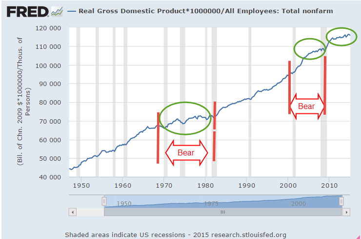
In the chart above note the periods (circled in green) of slower growth during the 1968-82 secular bear market and the last few years of the 2000-2009 secular bear market. After a brief upsurge at the end of this past recession, we have continued the trend of slower economic growth that started in 2004. A rising tide raises all boats and the tide in this case is the easy monetary policy of the Federal Reserve which buoys stock prices. In the long run, however, stock prices rise and fall with the expectations of future profits. Contrary to previous bull markets, this market is not supported by structural growth in the economy, and that lack of support increases the probability of a secular bear market in the next several years, just at the time when the boomer generation will be selling stocks to generate income in their retirement.
Earthquakes in some regions of the world are inevitable. In the aftermath of the tragedy in Nepal, we were reminded that risky building practices and regulatory corruption can go on for decades. There is no doubt that there will be horrific damage and loss of life when the inevitable happens yet the risky practices continue. The fault lines in our economy are slower per employee GDP growth and a greater burden on those employees to pay for programs for those who are not working. The worth of each program, who has paid what and who deserves what is immaterial to this particular discussion. Growth and income flow do matter. Asset prices are rising on shaky growth foundations that will crack when the fault lines slip. Well, maybe the inevitable won’t happen.