December 1st, 2013
While cleaning up some old files, I found a 1999 “Getting Going” column by Jonathan Clemens in the Wall St. Journal. That year was rather turbulent, rocked by Y2K fears that the year 2000 might play havoc with older computers still using a two digit date, and a intensifying debate about the valuation of stocks. Looking away from the hot internet IPOs of that year, Clemens interviewed several professors about the comparatively mundane subject of home ownership.
“A house is not a conservative investment,” says Chris Mayer, a real-estate professor at the University of Pennsylvania’sWharton School. “Any market where prices can fall 40% in three years is not a safe investment.”
Remember, this is 1999. At that time, what 40% decline is he talking about? It would not be till 2009 or 2010 that house prices tumbled down the hill. In the past, declines of this magnitude were confined to particular areas of the country where a fundamental shift in the economy occurred. The Pittsburgh area of Pennsylvania, the Pueblo area of Colorado and the Detroit area of Michigan come to mind. In the first two examples the collapse of the steel industry had a profound effect on home prices as people moved to other areas to find work. In case a homeowner thinks “it can’t happen here,” I’m sure many homeowners in Detroit felt the same way during the 1960s when the car industry was at its peak.
“William Reichenstein, an investments professor at Baylor University in Waco, Texas, suggests treating your mortgage as a negative position in bonds.”
What does this mean? Let’s say a person has $100K in stock mutual funds, $100K in bond mutual funds, owns a house valued at $200K with $100K still left on the mortgage. Subtract the remaining balance of the mortgage from the amount in bonds and that leaves $0 invested in bonds. Why do this? When we buy a bond we are buying the debt of a company, or some government entity. A mortgage is a debt we owe. So, if a person were to pay off the mortgage, trading one debt for another, they would sell their bonds to pay off the mortgage.
Should the house be included in the investment mix? There is some disagreement on this. An investment portfolio should include only those assets which a person could access for some cash flow if there was a loss of income or some other need for cash. An older couple with a 5 BR house who intend to downsize in five years might include a portion of the house in the portfolio mix.
For this example, let’s leave the house out of the investment portfolio to keep it simple. Using this analysis, this hypothetical person has 100% of their assets in stocks, not a 50/50 mix of stocks and bonds.
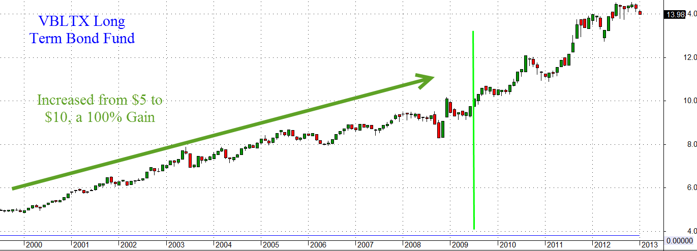
Now, let’s fast forward ten years from 1999 to 2009. An index mutual fund of stocks has lost a bit more than 20%.
A long term bond fund has gained about 100%.
[The text below has been revised to reflect the above bond fund chart. The original text presented numbers for a different bond fund.]
Let’s say the mortgage principal has been paid down $60K over those ten years. Assuming that no new investments have been made in the ten year period, what is this person’s investment mix now? The stock portion is worth $80K, the bonds $200K less $40K still owed on the mortgage for a total of $240K, with a net exposure in bonds of $160K. The person now has 33% (80K / 240K) in stocks and 67% in bonds, a conservative mix. If we didn’t account for the mortgage as a negative bond, the mix would appear to be 29% (80K / 280K) for stocks and 71% for bonds. What is the net effect of treating a mortgage balance as a negative bond? It reduces the appearance of safety in an investment portfolio.
Now let’s imagine that this person is going to retire and collect a monthly Social Security check of $1500. To get a 15 year annuity paying that monthly amount with a 3% growth rate, a person would have to give an insurance company about $220K (Calculator) There are a lot of annuity variations and riders but I’ll just keep this simple. Throughout our working lives our Social Security taxes are essentially buying Treasury bonds that we start cashing out during retirement.
If we were to add $220K to our hypothetical investment mix, we would have a total of $460K: $80K in stock mutual funds, $200K in bond funds, -$40K still owed on the mortgage, $220K effectively in Treasury bonds that we will withdraw as Social Security payments. The $80K in stock mutual funds now represents only 17% of our investment portfolio, an extremely conservative risk stance. If we have a private pension plan, the mix can get even more conservative.
The point of this article was that many people in their 50s and 60s may have too little exposure to stocks if they don’t account for mortgages, pensions and Social Security payments into their allocation calculations.
*****************************
In October 2005, the incoming Chairman of the Federal Reserve, Ben Bernanke, indicated to Congress that he did not think there was a bubble developing in the housing market. (Washington Post Source)
In September 2005 – a month before – the Federal Reserve Bank of New York published a report on the rapid housing price increases of the past decade:
Between 1975 and 1995, real [that is, inflation adjusted] single-family house prices in the United States increased an average of 0.5 percent per year, or 10 percent over the course of two decades. By contrast, from 1995 to 2004, national real house prices grew 3.6 percent per year, a more than seven-fold increase in the annual rate of real appreciation, and totaling nearly 40 percent in one decade. In some individual cities, such as San Francisco and Boston, real home prices grew about 75 percent from 1995 to 2004, almost double the national average.
Remember, these are real, or inflation adjusted prices. Now it is easy, in hindsight, to go “ah-ha!” but it should be a lesson to us all that we can not possibly hope to consume all the information needed to mitigate risk. There is just too much information. A professional risk manager, Riccardo Rebonato, discusses common flaws in risk assessment in his book “Plight of the Fortune Tellers” (Amazon). Written before the financial crisis, the book is surprisingly prescient. The ideas are accessible and there is little if any math.
*************************************
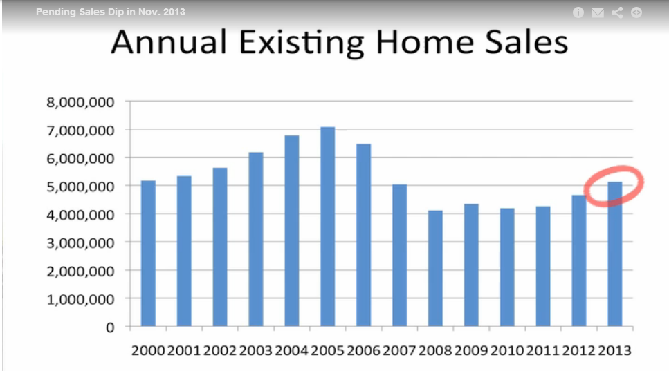
On Monday, the National Assn of Realtors released their pending home sales index. These are signed contracts on single family homes, condos, and townhomes. The index has declined for five months but is still slightly above normal (100) at 102.1. At the height of the housing bubble, this index reached almost 130. At the trough in 2010, the index was below 80.
This chart was clipped from a video by an economist at NAR (Click on the video link on the right side of the page). The clear and simple explanation of trends in housing and interest rates is well worth five minutes of your time. Sales of existing homes have surpassed 2007 levels and are growing.
Demographia surveys housing in m ajor markets around the world and rates their affordability. Their 2012 report found that major markets in the U.S. are just at the upper range of affordable. As Canada’s housing valuations have climbed, their affordability has declined and are now less affordable than the U.S. Britain’s housing is in the severely unaffordable range.
*****************************
Next Friday comes the release of the monthly employment report. I’ll also cover a few long term trends in manufacturing and construction employment that may surprise you.