A Debate On Medicare

December 8, 2024

by Stephen Stofka

This is part 4 of a weekly series of debates on various issues, including climate change, pollution, rent control and market failures in general.

Abel said, “I’d like to pick up where we left off last week, talking about monopolies.”

Cain added, “And monopsonies, you said, where there is only one buyer in a specific market.”

Abel nodded. “There is no better example of both monopoly and monopsony than the health care industry. Your group wants to keep government interference in the market to a minimum. In the health care market, it’s just not possible.”

Cain said, “Private companies offer health insurance. Why do we need government?”

Abel replied, “A product might be labeled health insurance, but insurance companies stay in business by selling risk mitigation. Consumers buy an insurance policy to protect them from a large expense. A for-profit insurance company has an obligation to their shareholders first and they use every legal ruse to reduce the amount they pay on medical claims from their customers.”

Cain argued, “We agree that insurers sometimes deny or delay legitimate claims for care. Congress passed Medicare in 1965 to provide low-cost health care to seniors. The government uses less discretion in paying claims but pays below market rates. That system welcomes fraud and abuse. Health and Human Services estimated that the Medicare and Medicaid programs paid out $100 billion in improper payments in 2023.”

Abel nodded. “The price system doesn’t account for dishonesty by private providers. All the more reason why there has to be greater supervision by government agencies to ensure compliance. A frequent police presence incentivizes people to police themselves.”

Cain disagreed, “No, the government has become a monopsony in the healthcare market. Providers are attracted to Medicare because there is such a large pool of buying power. Providers and suppliers are eager – too – eager – to diagnose and treat older people. Those are resources that cannot be spent on younger people.”

Abel countered, “Younger adults in their prime working years use far less health care services than older people. Without government subsidies, an insurance company would need to charge a prohibitively high rate to insure 70-year-olds.”

Cain asserted, “When people or things get old, they require more service. Imagine if the government funded low-cost auto repairs on cars that were more than ten years old. Car makers would be reluctant to develop improvements in newer car models. Why bother? There is more profit in fixing up the old cars.”

Abel protested, “That’s a stupid analogy. People are not cars.”

Cain nodded. “Exactly. My point is that our society is currently spending a lot of money on old people and the diseases that affect old people. That money is not available to help young people, the newer models of people.”

Abel argued, “Your group sees every problem in dollars and cents. Health care is about human dignity and flourishing as well as the alleviation of suffering, especially for older people who have spent a lifetime working and contributing to their community. What is the price of human dignity? The price system is incapable of measuring the value of intangibles that are precious to us. Government’s role is to protect those qualities we hold dear and that takes regular intervention. Government can’t just step in, assign property rights and let the private market and the price system manage the problem.”

Cain shook his head. “As a share of GDP, healthcare spending in this country continues to grow larger. Per capita spending on healthcare has more than doubled since 2001. The Centers for Medicare and Medicaid Services says that the share was 17.3% in 2022. Out of every $6 of economic activity in this country, more than $1 is spent on healthcare.”

Abel explained, “But that’s because the Boomer generation is so large, and many are seniors. Naturally, healthcare spending will rise because older people use more healthcare services.”

Cain replied, “Yeah, but Medicare spending as a share of total healthcare costs was rising before any of the Boomers became eligible for Medicare. In 2001, Medicare spending was just $1 out of every $5 spent on healthcare. By 2011, that share was more than $1 out of every $4 and the first Boomers had just turned 65 and become eligible for Medicare. In 2021, Medicare spending accounted for almost $1 out of every $3 spent on healthcare (FRED chart and data here). Out of $20 spent in the entire economy, the government now spends $1 taking care of old people. And that doesn’t include Medicaid spending on low- income seniors. That is a burden on younger generations.”

Abel said, “Those costs went up in the 2000s after Republicans revised the Medicare Advantage, Part C, program and added a drug benefit, Part D. Obamacare expanded the program even further. The latest annual report to Congress from the  Medicare Payment Advisory Commission found that Medicare Advantage plans paid providers 122% of the amount paid for similar services to Fee-For-Service plans under traditional Medicare.”

Cain replied, “That illustrates my point. When politicians and government agencies try to improve any program, they don’t make the program more efficient. They spend more money. The people who work in government want to codify their principles, their ideals, their sense of fairness into law. Despite their rhetoric, they do not serve the cause of efficiency. They only make things more expensive and more complicated for the people they are supposed to serve.”

Abel countered, “I’ll repeat, your group looks only at the dollars and cents. In 1965, a 65-year-old male could expect to live another 13 years. In 2021, that same male could expect to live another 17 years. Women have had a similar increase of almost four years in life expectancy. The government is spending more on seniors because they are living longer and living better, thanks to the Medicare program. A 70-year-old Boomer today is far healthier and more active than a 70-year-old was in 1965. The price system can not value improvements in the quality or quantity of life.”

Cain argued, “When the government buys almost a third of the entire healthcare market, that’s effectively a monopsony, which distorts the price system. With a functioning market, seniors would pay more for those healthcare services which improved their quality of life. Instead, the government writes the checks, so seniors overconsume healthcare services. Why not? It’s effectively free. That distorts any measure of value that the price system can determine.”

Abel shook his head. “Seniors on fixed incomes have reduced options. There is too much danger that they will forego needed medical care simply because they can’t afford it. For most of their lifetime, they got over respiratory diseases like colds. After an initial visit, injuries like broken bones healed. It may be difficult for seniors to understand that the diseases of old age will not just go away on their own. High blood pressure and heart disease, Type 2 diabetes, arthritis and chronic respiratory problems need active management. Putting off care for a lack of funds only makes those conditions less manageable.”

Cain said, “Educating seniors is the key. Instead, the government treats old people like children. The Medicare program lacks the discipline that private insurance companies bring to the market.”

Abel objected, “A doctor specializing in breast cancer shouldn’t have to justify his recommended course of treatment to some clerk at an insurance company. That’s not a disciplined approach. That’s abuse by an insurance company and people die from that abuse.”

Cain said, “Some unfortunate cases get all the headlines. The government pays out $100 billion in improper payments. That is taxpayer abuse but there is no identifiable victim so that news story runs on page 6. Everyone is so accustomed to government inefficiency and abuse that another example of it causes little outcry. Politicians depend on a voting public that has become numb to the ineptness and unfairness of the political process. Congress has an approval rating of less than 20% but every two years, over 90% of House members are re-elected.  Voters act like they are wind up toys.

Abel sighed. “Your group has a deep skepticism of government. Is that likely to change? Probably not. What’s the point of debating these issues if you have a fundamental distrust of government?”

Cain replied, “Hope. Hope that together we can struggle toward some compromise that can curb the excesses of elected and unelected officials.”

Abel nodded. “Ok, we’ll try again next week. Try to think of a public goods program you like. I can see that Medicare is not one of them.”

Cain replied, “See you then.”

///////////////

Photo by Dominik Lange on Unsplash

Medicare Spending charted by Federal Reserve https://fred.stlouisfed.org/series/W824RC1

Per capita healthcare spending, FRED Series https://fred.stlouisfed.org/series/HLTHSCPCHCS

Medicare spending as a share of total health expenditures https://fred.stlouisfed.org/graph/?g=1BYRn

Period Life Expectancy 2004 – 2021 from the Social Security Administration https://www.ssa.gov/oact/STATS/table4c6.html

Period Life Expectancy 1940 – 2001 from the Social Security Administration https://www.ssa.gov/OACT/TR/TR02/lr5A3-h.html

Series of Gallup surveys rating Congress https://news.gallup.com/poll/1600/congress-public.aspx

Re-election rates for House members https://www.opensecrets.org/elections-overview/reelection-rates

A Kaiser Family Foundation brief on the annual report from the Medicare Payment Advisory Commission https://www.kff.org/medicare/issue-brief/medicare-advantage-in-2024-enrollment-update-and-key-trends/

A report on improper Medicare and Medicaid payments https://www.justice.gov/archives/jm/criminal-resource-manual-976-health-care-fraud-generally

//////////////////

The Interest Payment Load

November 26, 2023

by Stephen Stofka

This week’s letter is about the federal interest paid on the country’s debt. Why does the U.S. pay more on its debt than other advanced economies? In the second quarter of this year, federal government paid 20% of its revenue in interest, almost three times the average 7.34% percentage of similar countries. High interest payments crowd out spending in other areas. They spark even more debates about the debt itself which is now 120% of GDP. This added interest expense exacerbates animosities in a country that is already fractured by divided perspectives and priorities.

In the second quarter of 2022, before the Fed began to raise rates, the federal government paid 13.6% of its revenues in interest (I/R) to service the debt. That was 6% less than the percentage in 2023 and represented $280 billion, more than twice the $128 billion spent in 2022 for the SNAP (food stamp) program. The higher interest payments, however, were about the same as the 50-year average I/R of 19% (median = 17.8%). In 2021, the 27 countries of the Euro area reported to the World Bank that they paid 3.11% of their revenues in interest (see note below).

Over the past fifty years, the federal government has collected about 20% of GDP in taxes. In the chart below, I have added both averages to the chart of federal interest payments as a percentage of revenue. The average revenue is almost identical to the median so this average is representative of a variety of economic conditions and policy responses over the long term.

As an approximation, the interest expense is 20% of revenue and revenue is 20% of GDP so interest expense has averaged 4% of GDP. However, neither the public nor policymakers are accustomed to average. For two decades, the Fed has kept interest rates low to accommodate economic recovery after the dot-com bust, 9-11, the financial crisis, the slow recovery from that crisis and the Covid-19 pandemic.

The pandemic simulated several critical conditions of a large scale war and the inflation that followed was typical of those inflationary periods following wars. I will cover that in next week’s letter. To curb an accelerating inflation, the Fed began to systematically raise rates from zero in the spring of 2022. In six months it raised rates by 2%, a rapid change that was six times faster than the period from late 2015 to early 2019 when the Fed gradually raised rates by the same 2%. By early 2023, the Fed raised rates an additional 2% within six months.

As a consequence of the higher rates, the government has paid higher interest rates on its debt. (The reasons for that are complex). We have become so accustomed to “easy money” and lower interest rates that the sudden increase in interest payments has caught the attention of both the public and policymakers. Will this further fracture political sentiment ahead of the 2024 elections?

At the beginning of this letter I mentioned divided perspectives and priorities. What are they?  Some give priority to the social programs that promote individual citizen welfare as essential to a general welfare. Their opposition may deride them as socialists but they are more properly called institutionalists because they champion a lot of control and planning by a central government to achieve that welfare. Those who oppose institutionalist policies also care about individual welfare but think that well-intentioned bureaucrats in government can cause more damage to the general welfare than they repair. These might properly be called marketists who believe that the price system distributes resources in an efficient and sustainable manner.  They respond that a centrally planned economy creates moral hazard, rewarding individual needs instead of personal hard work, planning and integrity.

Institutionalists label marketists as capitalists or plutocrats and accuse them of being mean-spirited and driven only by profit and self-interest. Vulnerable communities do not have the resources to help themselves, the institutionalists argue. Marginalized communities need to draw from a central funding pool. They must overcome decades of legal policies that disenfranchised them to benefit other groups. Marketists respond that profits reward people for taking risks. The willingness to accept risk is a key component of technological innovation that benefits all of society.

Interest payments have nudged aside defense spending to become the third largest percentage of federal receipts. The top category is health insurance like Medicare, Medicaid, CHIP and payments under the ACA which take up 30% of federal receipts (see note below). Social Security comes in second. Cuts to either of these programs have been a “hot rail” for conservative politicians. Everyone in Congress talks about cuts to defense spending but not in their district because it supports the local economy. The issue of rising interest payments and the federal debt is a safe one for politicians of both parties to run on in the upcoming election. According to Open Secrets, $14.4 billion was spent on the 2020 election, double the spending of the 2016 election. As candidates complain about excess spending, voters might consider why the major parties will spend about $100 for each of the votes in this coming election (notes below). I would call that excess spending.

//////////////

Photo by Joshua Woroniecki on Unsplash

Keywords: health care, ACA, Social Security, Medicare, defense spending, interest payments

Health Care Note: The health care programs are 24% of the federal budget including deficits, according to an analysis by the Center on Budget and Policy Priorities.

Election Spending: $14,400 million / 160 million voters ≈ $86 per voter in the 2020 election.

World Bank data: https://data.worldbank.org/indicator/GC.XPN.INTP.RV.ZS?end=2021&start=1972&view=chart. You can download an Excel file at https://api.worldbank.org/v2/en/indicator/GC.XPN.INTP.RV.ZS?downloadformat=excel to view interest payments for countries and regions dating back several decades.

Healthcare Inflation

April 9, 2023

by Stephen Stofka

This week’s letter is about health care spending and its effect on inflation. Economists construct a composite price index number out of many components of the economy. While that construction may have a rigorous methodology we struggle to make causal inferences from the data because price movements in an economy are complex.

In 1965 President Johnson signed the law creating the Medicare and Medicaid programs. At that time, health care spending was 6% of total consumer spending. The radical reformers of that age wildly underestimated Medicare’s costs, particularly for inpatient hospital costs. Since the government now paid for the first 90 days of a hospital stay, doctors were encouraged to take a cautious approach and keep a patient in the hospital if there was a chance of infection or accident at home. The deep pockets of the federal government incentivized medical and pharmaceutical companies to develop new drugs and equipment. Hospitals expanded their surgery and rehabilitation units. Doctors increasingly turned to specialization and their numbers tripled from near 90,000 in 1965 to 284,000 in 1990, according to the National Center for Health Workforce Analysis. In 25 years, healthcare spending (https://fred.stlouisfed.org/graph/?g=12f9k) more than doubled as a percent of consumer spending, coming close to 15% of the total. It has risen to 17% in the past decade and now is 16%. Here’s a chart showing the growing contribution of healthcare spending to total consumer spending (blue line) and healthcare inflation’s impact on overall inflation (red line).

Healthcare spending has a large effect on inflation through two channels: first, during recessions healthcare spending does not decline as much as overall consumer spending; second, prices for health care services have grown faster than the prices of many other goods because the demand for healthcare services remains strong and constant. Since 1990 the prices for all goods and services have increased 81%, far less than the 131% of healthcare prices.

During recessions, total consumer spending falls and that puts downward pressure on inflation. But the healthcare component resists that downward pressure. The Federal Reserve, whose job it is to keep prices stable, might delay lowering interest rates because healthcare spending is keeping the price index elevated above the level of all other goods and services. This in turn could prolong the after effects of a recession: less lending and slower gains in employment. This is what happened after the 1990 and 2001 recessions. During the 1990 recession, inflation (the annual change in price) actually rose a bit before falling, spurred on by an 8.5% increase in healthcare prices. By the first quarter of 1991, healthcare was contributing 40% to overall inflation, rising up from 13% in 1989. The same pattern repeated in the 2000-2002 period.

Even though both recessions lasted less than a year, job recovery was slow. The lingering effect of a recession surely cost President George H.W. Bush a chance at a second term. In 1992, both Bill Clinton and Independent candidate Ross Perot reminded voters that the economy was sluggish and it was time for a change of direction. In the 2000s, Bush’s son, George, learned from his father’s misfortune. He urged the passage of tax cut packages and the Medicare Drug program, which helped secure his victory in the 2004 election despite disapproval of the conduct of the war in Iraq.

The ACA, or Obamacare, capped the growth of inpatient Medicare payments at 2% and this helped keep healthcare inflation (https://fred.stlouisfed.org/graph/?g=12f9b)  at or below 2%. Medicaid expansion doubled the contribution level of healthcare prices to overall inflation, but because healthcare inflation was restrained, that helped to contain overall inflation.

The pandemic showed the enduring influence healthcare has on the general price level. When consumer spending had a sharp decline, healthcare prices remained strong. During the 3rd quarter of 2020, healthcare inflation was 2.9% and was responsible for nearly all of the general inflation rate of 1.1%. But here, the paths diverged. As the economy reopened and the general rate of inflation rose during 2021 and 2022, healthcare inflation decreased. That divergence describes the nature of the current overall inflation. It is procyclical, driven by short-to-medium term events, not a fundamental change in the economy.

In a 2017 Federal Reserve Economic Letter, Tim Mahedy and Adam Shapiro (2017) assigned spending categories into two buckets, procyclical and acyclical. Procyclical components that make up 42% of spending are those whose demand and prices vary with the business cycle and changes in employment. These include housing, recreation, food services and some nondurable goods. Acyclical components account for 58% of spending and include healthcare, financial services, many durable goods and transportation. The authors don’t mention energy specifically but I presume that it is an acyclical component of both housing and transportation services.

The pandemic caused shifts within and between these two buckets. During the pandemic demand soared for housing services, but declined for recreation and food services – an example of a shift within the procyclical bucket. We used a lot less energy in our cars but a lot more electricity and gas at home – a shift within the acyclical bucket. We bought a lot of durable goods – a shift between buckets.

I think it is the between  shifts that had the most disruption. Supply chains for acyclical goods and services function on a less flexible timeline that does not anticipate sudden changes. Global shipping rates soared, ports were clogged with traffic, parts inventories were depleted, leading to manufacturing delays and an opportunity for companies to raise prices to make up for decreased profits due to shrinking volumes. With long delays from overseas suppliers, big retailers like Wal-Mart and Target increased their orders. As pandemic restrictions lifted, people shifted their spending again from acyclical durable goods to procyclical recreation and food services.  

Each of us constructs an instinctive index based on our individual buying habits and circumstances. An American who lives for a while over in Europe has to learn to convert Centigrade temperatures to Fahrenheit. Like the CPI price index, there is methodology for making that conversion. However, it is much easier to remember that 0°C is cold, 10°C is cool, 20°C is comfortable,  30° is hot, and 40° is hell. Much of the time we navigate our daily lives without precision, relying on professionals when we do need exactness. Sometimes the professionals can tell us why something is the way it is but sometimes even they can only guess. Complexity is the result of an interlocking causality that is harder to solve than a Rubik’s cube.

///////////////////

Photo by John Barkiple on Unsplash

Mahedy, T., & Shapiro, A. (2017, November 27). What’s down with inflation? San Francisco Fed. Retrieved April 6, 2023, from https://www.frbsf.org/economic-research/publications/economic-letter/2017/november/contribution-to-low-pce-inflation-from-healthcare/

An Extinct Proposal

October 31, 2021

By Steve Stofka

In the past 70 years, America has escalated its health care spending from 5% of GDP to 18% of GDP. Stack up all the money Americans spend on housing, cars, fuel, utilities and food and its less than what we spend on health care. Despite all this spending we have the worst rates of infant mortality and preventable death among developed countries. If we exclude the growth of health care spending in the past few decades, the U.S. economy has been stuck in the same rut that has trapped Japan. In that time, China’s economy has erupted from $.5T to $15T and is now the second largest economy, just $7T less than the U.S. We have averaged 2.4% annual real growth in the past three decades, less than the 3% growth of the post WW2 period. How do we get out of the rut?

Thirty years ago, William Clinton emerged the winner of a three man race for the Presidency. Responding to public concern over rising health care costs, he proposed a universal health care plan that received a hostile reception. Republican groups mounted an effective advertising campaign against a “takeover” of health care by government. Republicans rode that momentum to win control of the House in 1994, ending forty years of continuous Democratic control.

In the fall of that year, two economists proposed a Major Risk Insurance Plan that they estimated would lower health care spending by 20% (Feldstein & Gruber, 1994). However, the market continued to adopt HMOs as the dominant model to reduce costs. Today, the US spends far more than other developed countries and has worse health outcomes. Martin Feldstein was President of the NBER, the nation’s premier economic research institute. Jonathan Gruber was a former researcher with the NBER, an MIT professor with a lot of expertise in the economics of health care. Both had a lot of influence, but their proposal did not win converts.

Their study was based on earlier work by Feldstein and a data sample of six thousand respondents collected in 1987 that provided insight into the choices and value that people place on health care. Feldstein and Gruber concluded that the government could insure people under 65 against major health risks for a mere $150 per person, about $300 in current dollars.

Under their proposal people would be insured for half of their annual medical expenses until they spent 10% of their after-tax income, their maximum OOP, or out-of-pocket expense. This would eliminate or reduce the wastefulness of people being over-insured. Those with small copayments or “first dollar coverage” use more health care because it costs them little to nothing except their time. Many younger workers with employer provided health insurance have far more insurance than they use. Thinking that insurance is a “free” benefit, workers don’t realize that they are paying the insurance premium in the form of lower wages.

The proposal aimed for greater efficiency, more patient involvement and wider coverage. Jonathan Gruber would become instrumental in developing Romneycare and Obamacare, nursing both plans through the political butchery and swollen egos that all major legislation endures. The 10% OOP is a progressive feature that empowers and enables the poorest people to access the full benefits of the health care system after spending a small amount. Those with higher incomes pay more into the system. Because everyone has some skin in the game, they use the system more judiciously. However, sensible proposals are not sensational. They don’t dance and sparkle.

The health care and insurance industry relies on misinformation and the inefficiency in the American system for its profits. The burden of that inefficiency has become a ball and chain on the American economy.  Each generation comes to maturity thinking that it will solve the persistent problems that have bedeviled earlier generations. Those who efficiently rake in the profits protect those inefficiencies. Any system that favors the powerful few resists change. In a sense of frustration, people turn to a populist leader who claims that they can fix it because they know how the system really works. We are drawn to our myth builders like moths to the light of a flame.

////////////////

Photo by Derek Finch on Unsplash

Feldstein, M., & Gruber, J. (1994, September 01). A Major Risk Approach to Health Insurance Reform. Retrieved October 31, 2021, from https://www.nber.org/papers/w4852. A bio of Martin Feldstein https://scholar.harvard.edu/feldstein/biocv.

Budget Perspective

June 2, 2019

by Steve Stofka

How does your spending compare with others in your age group? Working age readers may compare their budgets with widely published averages that are misleading because they include seniors as well as those who are still living at home with their parents or are going to college. Let’s look at spending patterns classified by working age consumers 25-65 and seniors whose spending patterns change once they retire.

The Bureau of Labor Statistics collects data on consumer behavior by conducting regular surveys of household spending (Note #1). These surveys provide the underlying data for the computation of the CPI, the Consumer Price Index. Social Security checks and some labor contracts are indexed to this measure of inflation.

The BLS also provides an analysis of consumer purchasing by household characteristics, including age, race, education, type of family, and location (Note #2). Spending and income patterns by age contained some surprises (Note #3). The average income of 130,000 people surveyed in 2017 was $73K. Seniors averaged $25K in Social Security income. Younger workers aged 25-34, the mid-to-late Millennials, earned $69K, near the average of all who were surveyed. Following the Great Financial Crisis, this age group – what were then the early Millennials in 2010 – earned only $58K, so the growing economy has lifted incomes for this age group by 20% in seven years.

Home ownership is around 62% for the whole population, but far above that average for older consumers. 78-80% of people 55 and older own their own homes. More than 50% of those have no mortgage but too many seniors do not have enough savings. In many states, property taxes are the chief source of K-12 education funding and older consumers have the fewest children in school. Older consumers on fixed budgets resist higher property taxes to fund local schools and they vote in local elections at much higher rates than younger people. Since 2000, per pupil spending has grown more than 20% but most of that gain came in the 2000s.  In the past twelve years, real per pupil spending has barely increased (Note #4). Below is a chart from the Dept. of Education showing per pupil inflation adjusted spending.

Graph link: https://nces.ed.gov/fastfacts/display.asp?id=66

Saving is an expense and working age consumers aged 25-65 are saving 9-12% of their after-tax income, twice as much as the 5.6% average. Wait – isn’t saving the process of not spending money? How can it be an expense?  Call it the imaginary expense, as fundamental to our life cycle as i, the imaginary square root of -1, is to the mathematics of cyclic phenomena. Let’s compare today’s savings percentage with the panic years of 2009-10 just after the financial crisis. Workers in the 25-34 age group – who should have been spending money on furniture and cars and eating out – were saving 20% of their after-tax income (Note #5). That age group will probably carry the lessons – and caution – learned as they began their working career after the financial crisis.

Workers 25-65 spend 28-32% of their after-tax income on housing. Until they are 65, people spend a consistent 12% of their income on food, both at and away from home. Seniors spend less on food but most of that change is because they spend less money eating out at restaurants. Working age consumers spend more on transportation than they do on food – a consistent 15% of after-tax income.

People 65 and older are entitled to Medicare but they spend more on health insurance than working people and the dollar amount of their spending on health care rises by 50%. As a percent of after-tax income, seniors spend 15% while people of working age spend about 6%. Ouch. I’m sure many seniors are not prepared for those additional expenses.

Those of working age should compare their budget averages to other workers, not to the national averages, which include older people and those under 25. Summing up the major expense categories: workers are averaging 30% for housing, 15% for transportation, 12% for food, 11% for personal insurance, pensions and Social Security contributions, 10% for savings and 6% for healthcare.

As Joey on the hit TV show Friends would often say, “So how you doin’?”

///////////////////

Notes:

  1. Explanation of Consumer Expenditure Survey
  2. Consumption patterns – list Table 1300
  3. The most recent detailed analyses available are for 2017.
  4. Dept of Ed data
  5. Spending and income levels for those aged 25-34 2009-2010.

Promises Made and Unpaid

November 11, 2018

by Steve Stofka

A tip of the hat to veterans on this holiday.

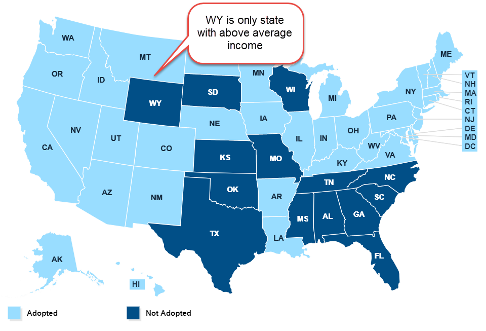
The Kaiser Family Foundation (KFF) regularly updates their map of the states that have not expanded Medicaid under Obamacare (Note #1). Here’s a screen shot.

KaiserMap
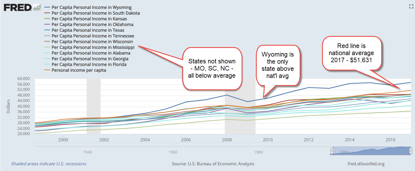
All the non-expansion states except for Wyoming had per capital personal incomes below the national average.

PerCapPersIncByState

Since these states have less per capita income, it is likely that more of the residents in those states qualify for Medicaid. During the initial phase of Obamacare, the Federal government picked up the tab for the additional costs. That share will gradually decrease to 90% in 2020, when the states will have to foot 10% of the expansion costs.

A ten percent share seems light. Why don’t these states expand their Medicaid eligibility? Let’s look beyond accusations of prejudice, which exists in every state.

The populations in most of these states are older. Poor seniors living in nursing homes qualify for traditional Medicaid, which costs each state much more than expansion Medicaid. The national average of state costs is 38%; the Federal government picks up an average of 62% of traditional Medicaid spending. Wyoming pays almost 50%, far above the average. Texas and South Dakota pay 44% and 41%. Oklahoma and Florida pay the average of 38% and the rest of the non-expansion states pay below average (Note #2).

The financial crisis ten years ago crippled state finances for several years and some have still not recovered. Since 2000, average per capita real income in the U.S. has grown only 1.2% per year. Medicaid spending has grown at more than three times that rate (Note #3). Residents in these poorer states have fared worse than the average. Revenues in those state have barely kept up with obligations. Officials in poorer states with older populations anticipate that funding difficulties will continue now that the first of the Boomer generation has turned 70. Given the political pressure to expand, how much longer will some of these states resist expansion?

Thirteen states that have expanded coverage have adopted new revenue sources to fund the additional costs (Note #4). Most states fund their Medicaid spending, original and expansion, out of general revenues which are falling behind state promises. These include infrastructure repairs – roads, bridges, improvements and repairs to schools and other government buildings – as well as pension obligations. Officials of state and local governments made these promises decades ago, when per capita incomes were growing more than 2%. Annualized growth over a twenty-year period has not been above 2% since 2001.

PerCapIncReal

Tax the rich is one solution offered, but that is a short-term solution. In the long-term, higher income growth is the sustainable solution. Until Democratic politicians can craft a coherent policy message that promises to promote stronger economic growth in these states, the voters will reject them.

/////////////////////

Notes:
1. KFF’s map of states that have turned down Medicaid expansion.
2. KFF’s breakdown of Medicaid costs per state.
3. A summary of inflation adjusted Medicaid spending from 2000-2012 showed a 4.1% annual growth rate – pg. 4. A state by state breakdown is on page 35. A 49 page report from Pew Charitable Trust.
4. A recent article showing the various sources of funding that expansion states are using.

Our Legacies

April 29, 2018

by Steve Stofka

Each generation bequeaths the benefits and costs of legislative programs to the following generations.  In the past one hundred years, Democrats have secured a dominant majority in the Congress three times. A dominant majority is one where one party controls the Presidency and both houses of Congress with a filibuster proof majority of sixty in the Senate (History of Shifting Political Power).

Each time, the Democrats have created an entitlement program, a legacy structured so that it would be difficult to undo when Democrats were out of power.  Under FDR in the 1930s, the Democrats created Social Security. Like all entitlement programs, coverage and benefits were expanded in the first ten years after creation of the program.

In the 1960s, LBJ and the Democrats created Medicare and Medicaid. Before these programs, the Federal government paid 11 cents of every health care dollar. In 2013, that 11 cents had grown to 26 cents (CMS history PDF).  As with Social Security, coverage and benefits were greatly expanded the first decade after creation. In 1960, the U.S. spent 5.1 cents for every $1 of GDP. OECD countries spent only 3.7 cents. By 2013, Americans spent 16.4 cents of each $1 of GDP, twice as much as the 8.7 cents spent by OECD countries.

For fifty years, the annual growth of health care spending was 50% more than the growth rate of the economy.  With a dominant majority after 45 years, Obama and the Democrats tried to pass single payer health care in 2009. Democratic politicians in conservative leaning districts balked at the idea. Obamacare was a compromise solution that has been compared by opponents and advocates alike to a Frankenstein contraption of legislation that needs to be fixed. Expansion was embedded in the legislation from the start through the Medicaid program.

When the BLS and Census Bureau compute the Consumer Price Index (CPI), a measure of inflation, they consider the shifting patterns of consumer spending. Since 2000, the Medical spending component of the CPI has doubled its share of the index to about 17%. Increased medical spending is affecting most American families. Regardless of one’s opinion of the solution, Obamacare was a compromised attempt to deal with this trend.

The American health care system is like the 50-year old cars in Cuba that have been patched together with duct tape and ingenuity. The system runs on policy payoffs to stakeholder groups and it will fail most of us because it cannot adapt to the extraordinary advancements in medical care. As technological changes accelerate in the coming decades, this cobbled together system born of World War 2 wage and price controls will grow ever more unwieldy.

Entitlement programs invariably cost a lot more than the designers calculate. Program benefits are easier to sell to voters than raising the funds to pay for them. Following December’s tax reform bill, the non-partisan Congressional Budget Office revised their ten year budget and deficit estimates.

For the past fifty years, the Federal government has collected an average of $17.40 for every $100 of GDP.  The CBO projects Fed revenue will be over $18.00. Here’s the problem: the Federal government has been spending $20.30, almost $3 more than it collects. That’s how the country has run up a debt of $20 trillion. It’s about to get worse. Because of increased Medicare and Medicaid spending, the CBO projects spending will increase to $22.40 for every $100 of GDP. A $3 shortage will soon turn to a $4 shortage. The interest on that steadily increasing debt? By 2023, almost $3, a sixth of what the government collects and more than the defense budget.

Nations can not declare bankruptcy.  Instead, they become failed states and descend into anarchy.  Venezuela has become a failed state and its people are fleeing the country.  Most of the institutions have failed.  Most of the daily necessities of life are in short supply. The government claims that it doesn’t even have the paper to print exit Visas.  Under the Maduro government, truth was the first to abandon the country.

The economy is strong yet Chapter 11 bankruptcy filings have reached the same level as April 2011 when there was talk of another recession. That year, the unemployment rate was still above 9% and housing starts remained at all-time lows. Then-President Obama and Republican House Majority Leader John Boehner battled over a budget compromise and the stock market dropped nearly 20%. In a strong economy like today, we should have lower levels of bankruptcy.


Gangbusters!

December 7, 2014

On Monday, George intended to put the $50K from the CD into the bond market. He couldn’t decide between a long term bond index like Vanguard’s BLV or TLT, the ETF that tracked 10 year Treasury bonds. Both the bond and stock markets opened lower in the morning which confused him and he did nothing. Gallup released their monthly survey of consumer spending for November, showing a respectable gain of more than 4% over last November.

Tuesday’s report of auto sales in November was strong.  Total vehicle sales topped 17 million on an annualized basis. Auto manufacturers reported particularly strong sales over the Thanksgiving holiday.  SUVs were big sellers and that was a double plus for auto companies because those vehicles had larger profit margins.  The American car buyer has long had a short memory.  Six months of falling gas prices prompted many to abandon their economical cars and wrap themselves in a big bubba vehicle.

Construction spending was up 1.1% from the previous month and 3.3% above last October.  The economies of Europe may have slipped into neutral or recession but the U.S. economy was chugging along.  The upbeat reports gave the stock market a minor boost but there was little selling of Treasuries, indicating a growing split in sentiment among investors.  George decided to put his and Mabel’s CD money into TLT.

On Wednesday, the Centers for Medicare and Medicaid Services released their annual report on health care costs.  Spending had increased only 3.6% in 2013, the lowest increase since 1960, and the fifth year in a row that spending had grown less than 4%.  Out of pocket expenses had risen from $293 billion in 2007 to $339 billion in 2013, a 16% increase over six years.  Before the recession, George could remember years when spending rose almost that much in a single year.  CMS reported that consumers’ out-of-pocket spending was only 3.2% of charges, less than the 5.9% of charges in 2007.

CMS published a historical table that caused George to raise both eyebrows.  In 1960, Americans spent $125 ($967 in 2012 dollars) per person on health care. In 2012, that figure had grown eight-fold to $7533 per person.  Administrative and public health programs added another 15% to those costs.  In 2013, the total cost per person was over $9500 for a whopping national total of $2.9 trillion spent on health care, almost 18% of GDP.

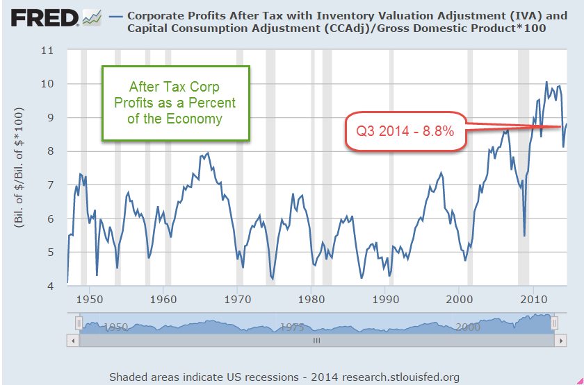
While families were shelling out more for health care, companies were grabbing a larger share of the economic pie.  As a percent of GDP corporate profits had been trending upward since 1990.

The private payroll processor ADP reported private job gains of 208,000, slightly below expectations but still above the 200,000 mark considered a healthy job market. Later that day came the announcement that a Staten Island grand jury decided that there would be no indictment in the death of Eric Garner.  Caught on video, five or six officers had surrounded the man to arrest him for selling bootleg loose cigarettes.  One of the officers put a choke hold on the unarmed Garner, restricting his breathing till he died of asphyxiation.

Later that day, four Denver bicycle cops were escorting a parade of students protesting the grand jury decision in Ferguson.  Acting as a buffer between the students and traffic on the busy street east of the Capitol, the officers were struck by a Mercedes as it ran through an intersection.  The Mercedes dragged one of the officers about thirty yards and that officer was taken to the hospital in critical condition.  On the evening news, George and Mabel learned that the driver of the Mercedes might have been having a seizure when he hit the officers.

Late Thursday morning, George was focused on several economic reports.  Since 2010, the polling firm Gallup had conducted a simple employment survey, called P2P, that counted the number of people who had worked for money in the past week or had looked for work in the past week.  Gallup reported the lowest unemployment rate, 6.2%, since the poll began.  New jobless claims were one again just under 300,000, indicating that the previous week’s 314,000 might have been an anomaly.  The 4 week average of new claims was still below 300,000.

Friday morning the reporters dusted off their sports dictionaries as they searched for words to describe the monthly labor report from the BLS.  Blockbuster.  Gangbusters. Blowout numbers. Spectacular.  Amazing.  George poured another cup of coffee. Yes, 321,000 new jobs sounded great!!! Too great. George got out his magnifying glass, put on his Sherlock cap and went hunting.  First of all, ADP had reported 208,000 private job gains.  The BLS report included new government jobs which the ADP did not include.  So back out the 7000 new government jobs to get private job gains of 314,000 according to the BLS.  Paging Dr. George, number surgeon.  He took out his skeptical scalpel. Take the average of the two estimates, which was 314 +  208 = 522, divided by 2 = 261.  Add back in the 7000 government jobs and probably the more accurate figure was close to 270,000 – 280,000.  September’s job gains had been revised up 20,000 by both ADP and the BLS. The BLS also revised the job gains of October,  getting closer to the averaging method that George used. Sacre bleu!  Averaging really works!  George was a big believer in averages.

Anyway, the employment report was strong, just not as fantastic as it first appeared. Average monthly job gains for the past year had been about 230 – 240,000.  George picked up his magnifying glass.  Hmmm, he said.  Retail job gains were 50,000, far above the 22,000 average of the past year.  At least 20,000 of those job gains were temporary seasonal gains.  Let’s be generous and start with 280,000 jobs. 280 – 20 = 260.  Now job gains were approaching the average of the past year.

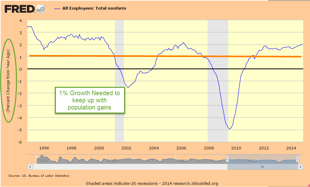
Still, the yearly growth in employment was climbing toward 2%, slowly but surely getting stronger.

Professional and business service jobs had been a leading sector for the past few years and were especially strong this month at 86,000, way above the average gains of 50 – 55,000.  George raised a skeptical eyebrow.  A closer look showed that the strong gains were particularly strong in bookkeeping and accounting.  Take out 20,000 temporary tax jobs, George thought, and now his count was down to 240,000.  Boy, this was quickly becoming an average employment report.

Yearly gains in hourly earnings for the average worker were just under 2.2%, just barely ahead of inflation. For all workers, the gains were 2.1%.

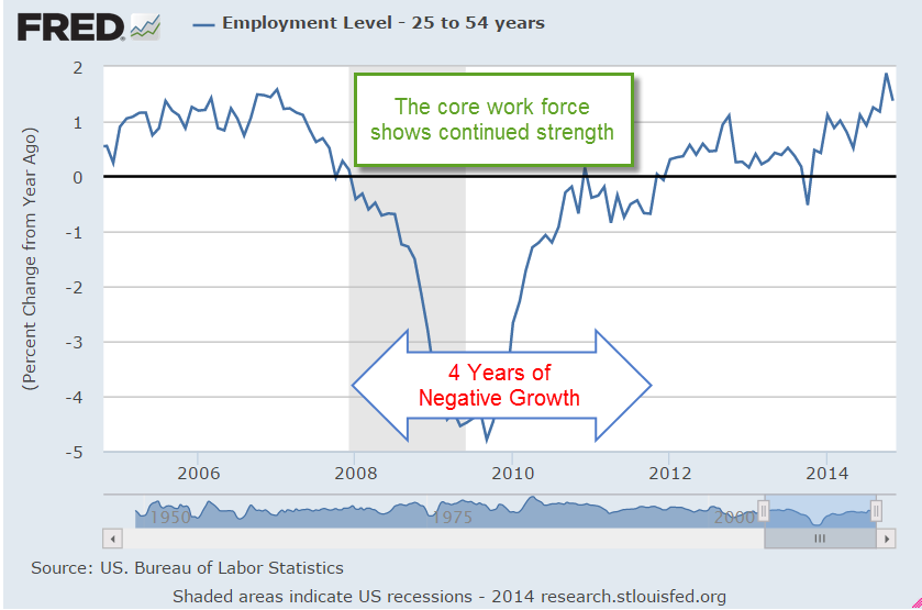
George put away his magnifying glass and put on his rosy glasses.  The average hourly work week had increased .1 hour over the past month, a good sign.  However, that was also the yearly gain.  Not so good.  George cleaned his rosy glasses.  The gains had been fairly broad and the core work force aged 25 – 54 had increased to nearly 96 million.

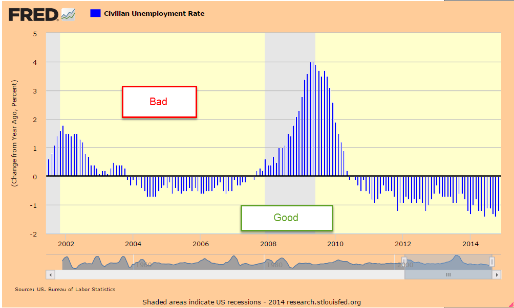
The construction and manufacturing sectors reported strong gains.  Although the headline unemployment rate remained the same at 5.8%, this rate was more than 1% below last year’s rate, a sign of a relatively healthy labor market.

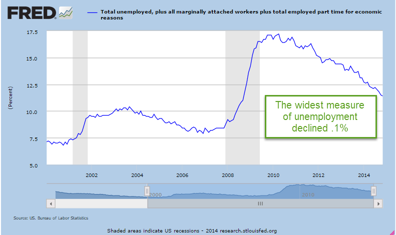
A wider measure of unemployment, the U-6 rate, had declined .1% but was still above the rates in the mid-2000s.  George needed a better pair of rosy glasses.

George checked to see if the Federal Reserve had updated their Labor Market Conditions Index but that would probably come next week.  The market had risen a few tenths of a percent since the high of two weeks ago.  According to a Fact Set report, earnings growth for the fourth quarter had been revised down from 8.3% to only 3.4%.  After rising up almost 14% since the mid-October trough, the SP500 had stalled despite a number of positive reports.  Treasury bonds had lost a few percent in price since mid-October but had stayed relatively strong, indicating some skepticism toward any further stock gains.  The stock market seemed to be treading water ahead of the December 11th deadline for Congress to pass a spending bill.  Despite promises that there would be no government shutdown this time, investors might be a bit less confident in the dependability of promises from the Republican leadership.