Pocketbook Ratios

January 21, 2024

by Stephen Stofka

Thanks to an alert reader I corrected an error in the example given in the notes at the end.

This week’s letter is about the cost of necessities, particularly shelter, in terms of personal income. Biden’s term has been one of historic job growth and low unemployment. Inflation-adjusted income per capita has risen a total of 6.1% since December 2019, far more than the four-year gain of 2.9% during the years of the financial crisis. Yet there is a persistent gloom on both mainstream and social media and Biden’s approval rating of 41% is the same as Trump’s average during his four-year term. Even though there are fewer economic facts to support this dour sentiment, a number of voters are focusing on the negatives rather than the positives.

I will look at three key ratios of spending to income – shelter, food and transportation – to see if they give any clues to an incumbent President’s re-election success (a link to these series and an example is in the notes). Despite an unpopular war in Iraq, George Bush won re-election in 2004 when those ratios were either falling, a good sign, or stable. Obama won re-election in 2012 when the shelter ratio was at a historic low. However, the food and transportation ratios were uncomfortably near historic highs. These ratios cannot be used as stand-alone predictors of an election but perhaps they can give us a glimpse into voter sentiments as we count down toward the election in November.

A mid-year 2023 Gallup poll found that almost half of Democrats were becoming more hopeful about their personal finances. Republicans and self-identified Independents expressed little confidence at that time. As inflation eased in the second half of 2023, December’s monthly survey of consumer sentiment conducted by the U. of Michigan indicated an improving sentiment among Republicans. The surprise is that there was little change in the expectations of Independents, who now comprise 41% of voters, according to Gallup. There is a stark 30 point difference in consumer sentiment between Democrats and the other two groups. A recent paper presents  evidence that the economic expectations of voters shift according to their political affiliations. A Republican might have low expectations when a Democrat is in office, then quickly do an about face as soon as a Republican President comes into office.

Shelter is the largest expense in a household budget. Prudential money management uses personal income as a yardstick. According to the National Foundation for Credit Counseling, the cost of shelter should be no more than 30% of your gross income. Shelter costs include utilities, property taxes or fees like parking or HOA charges. Let’s look at an example in the Denver metro area where the median monthly rate for a 2BR apartment is $1900. Using the 30% guideline, a household would need to gross $76,000 a year. In 2022 the median household income in Denver was $84,000, above the national average of $75,000. At least in Denver, median incomes are outpacing the rising cost of shelter. What about the rest of the country?

The Bureau of Labor Statistics (BLS) calculates an Employment Cost Index that includes wages, taxes, pension plan contributions and health care insurance associated with employment. I will use that as a yardstick of income. The BLS also builds an index of shelter costs. Comparing the change in the ratio of shelter costs to income can help us understand why households might feel pinched despite a softening of general inflation in 2023. In the graph below, a rise of .02 or 2% might mean a “pinch” of $40 a month to a median household, as I show in the notes.

Biden and Trump began their terms with similar ratios, although Biden’s was slightly higher. Until the pandemic in early 2020, housing costs outpaced income growth. Throughout Biden’s first year, the ratio stalled. Some states froze rent increases and most states did not lift their eviction bans until the end of July 2021. In 2022, rent, mortgage payments and utility costs increased at a far faster pace than incomes. Look at the jump in the graph below.

An economy is broader than any presidential administration yet voters hold a president accountable for changes in key economic areas of their lives. Food is the third highest category of spending and those costs rose sharply in relation to income.

Transportation costs represent the second highest category of spending. These costs have risen far less than income but what people notice are changes in price, particularly if those changes happen over a short period of time. In the first months of the pandemic during the Trump administration, refineries around the world shut down or reduced production. A surge in demand in 2021 caused gas prices to rise. Despite the rise, transportation costs are still less of a burden than they were during the Bush or Obama presidencies.
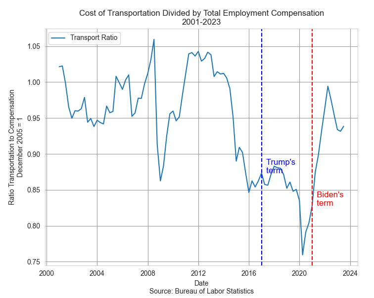
Neither Biden nor Trump were responsible for increased fuel costs but it happened on Biden’s “watch” and voters tend to hold their leaders responsible for the price of housing, gas and food. In the quest for votes, a presidential candidate will often imply that they can control the price of a global commodity like oil. The opening of national monument land in Utah to oil drilling has a negligible effect on the price of oil but a president can claim to be doing something. Our political system has survived because it encourages political posturing but requires compromise and cooperation to get anything done. This limits the damage that can be done by 535 overconfident politicians in Congress.

Voters have such a low trust of Congress that they naturally pin their hopes and fears on a president. Some are single-issue voters for whom economic indicators have little influence. For some voters party affiliation is integrated with their personal identity and they will ignore economic indicators that don’t confirm their identity. Some voters are less dogmatic and more pragmatic, but respond only to a worsening in their economic circumstances. Such voters will reject an incumbent or party in the hope that a change of regime will improve circumstances. Even though economic indicators are not direct predictors of re-election success they do indicate voter enthusiasm for and against an incumbent. They can help explain voter turnout in an election year. A decrease in these ratios in the next three quarters will mean an increase in the economic well-being of Biden supporters and give them a reason to come out in November.

///////////

Photo by Money Knack on Unsplash

Keywords: food, transportation, housing, shelter, income, election

You can view all three ratios here at the Federal Reserve’s database
https://fred.stlouisfed.org/graph/?g=1ejaY

Example: A household grosses $80,000 income including employer taxes and insurance. They pay $24,000 in rent, or 30% of their total gross compensation. Over a short period of time, their income goes up 8% and their rent goes up 10%. The ratio of the shelter index to the income index has gone up from 1 to 1.0185 (1.10 / 1.08). The increase in income has been $6400; the increase in annual rent has been $2400. $2400 / $6400 = 37.5% of the increase in income is now being spent on rent, up from the 30% before the increase. Had the rent and income increased the same 8%, the rent increase would have been only $1920 annually, not the $2400 in our example. That extra $480 in annual rent is $40 a month that a family has to squeeze from somewhere. They feel the pinch.    

Seniors Spend, Seniors Vote

January 7, 2024

by Stephen Stofka

This week’s letter examines the spending habits of seniors and the effect of that behavior on the broader economy. The growth of spending in this age group surpasses all others. Seniors spend money and they vote their interests.

In 2020, the Census Bureau estimated the population 65+ at 55.8 million, almost all of them collecting Social Security. One in six people in the U.S. is older than 65 but made up 26% of the 154.6 million voters in 2020, making them overrepresented voters, according to the Census Bureau. They vote to protect their programs, their priorities and preferences. In 2000, Social Security income represented 4% of the country’s total income. Today, it is 5%. Their assets, incomes and spending habits affect the entire population.

In 2000, seniors aged 65+ were just 3% of the labor force, according to the BLS. The 2008-9 recession dealt a blow to the retirement plans of many older folks who continued working past their retirement age. In 2020, when the pandemic rocked the economy, seniors comprised 6.8% of the labor force. Many seniors did not return to the labor force and today, almost four years after the pandemic began, their share of the labor force has remained the same, about 6.8%. Had their share of the labor force continued to grow, seniors in the labor force would total about 13.2 million. The latest data from the BLS indicates an actual level of 11.5 million, a shortage of 1.7 million. Adding in that shortage would raise the unemployment rate above 4.5% from the current level of 3.7%. The chart below shows the approximate shortage.

The Federal Reserve’s Survey of Consumer Finances shows that incomes taper off after middle-age (page 7). Senior workers were part of an age group that was particularly vulnerable to the Covid-19 virus. As many businesses shut down in March 2020, many seniors had few options except to file for Social Security to secure an alternative income source. Monthly payments to recipients rose sharply from $78.1 billion in February 2020, the month before pandemic restrictions, to $89.4 billion in February 2022, according to the Social Security Administration. Also, many seniors who had paid off their mortgages would have an “imputed” income generated by the investment in their house. Restaurants and gathering places reopened in the summer of 2020 then shut down again as Covid-19 cases surged. States reopened these venues on a gradual basis with staggered or outdoor seating only. As vaccines became available in the first quarter of 2021, seniors were the first to be eligible. Personal consumption expenditures jumped almost $1 trillion in March and April of that year and seniors led the spending surge.

Imagine feeling forced to retire and not being able to enjoy leisure activities like movies, golf, travel, museums or dining out. These activities were mostly shut down from March 2020 to the spring of 2021. The New York Fed conducts a triannual (3x a year) survey of household spending that reveals some interesting changes in spending habits in response to the pandemic. Those under age 40 had the highest rate of large purchases. People over age 60 increased their overall spending by the most – 9.1%. In the chart below, that senior age group is the dotted green line at the top. By the first quarter of 2023, seniors were still increasing their spending while the younger age groups had cut back. Notice that spending growth by seniors, the green dotted line in the graph below, were consistently the highest of all age groups.

According to an analysis by the Pension Rights Center, half of all senior households have income less than $50,000. That same household spending survey found that those with low incomes increased their spending by the largest percentage of the income groups. In the first quarter of 2022, households in this low income group increased their spending by almost 10%, as indicated by the red dashed line in the chart below.

In the first quarter of 2023, their spending came down along with all other income groups but then sprang up again during the spring of summer of this past year. This age and income group has contributed to the strength of consumer spending this past year.

This year promises to be one of the most contentious in our history. Elections are won by a coalition of groups and for the past decade, the voting coalitions are evenly matched. The voting rules in a democracy naturally allow some groups to command a dominant voice that is out of proportion to their numbers. One out of six Americans are seniors and one out of four voters are seniors. Their vote will advantage their own interests and priorities at the disadvantage of other groups. That’s democracy.

/////////////////

[20240107TreeBench

Photo by Aaron Burden on Unsplash

Keywords: consumer finances, spending, voting, income, household income

The Power in Our Pockets

September 17, 2023

by Stephen Stofka

This week’s letter is about wages and income and the real purchasing power in our pockets. The auto workers’ union (UAW) went on strike limited to three auto plants while they continued negotiations with the auto companies. Nurses at Kaiser Permanente have voted to go out on strike by September 30th if they cannot resolve outstanding differences with Kaiser’s management. Executive compensation at the auto companies is now more than 300 times the average worker’s pay, the UAW points out, claiming that workers have as much right to share in the profits as executives and shareholders.

Legislation passed after the financial crisis required that publicly held companies report their CEO-to-Worker pay ratios. A recent analysis of companies in the SP500 estimated a pay ratio of 272-1 in 2022. The auto industry is part of the consumer cyclical industry, whose median executive compensation in 2021 was $13.7 million, as reported by Equilar. In 1965, the pay ratio was approximately 20-1. In the 1980s, the Reagan administration adopted a relaxed regulatory stance to corporate mergers and companies have grown much larger in the past decades. The pay ratio, however, has grown out of all proportion to the growth in corporate size.

A combination of factors contribute to high relative CEO pay. Thomas Greckhamer (2015) identified six paths – configurations of various factors – that are present in countries with high CEO pay and those without high CEO pay. He found that the relative pay of CEOs is high in countries where equity markets are well developed and highly liquid. Ownership is widely dispersed so that the CEO enjoys more power relative to stock owners and can negotiate higher compensation packages. CEOs do not have high relative pay in high welfare states where there are strong worker rights. A cultural acceptance of inequality and hierarchical authority, termed “power distance” by Geert Hofstede in 1980, contribute to high relative CEO pay. Here is a quick explainer. As a comparative example, the power distance factor in the American culture is low, half that of Mexico.  

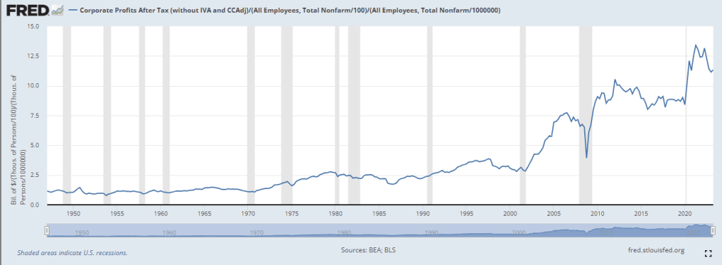
Companies today derive their revenue and profits globally. For that reason it is not accurate to divide corporate profits by the number of employees in the U.S. I am going to do it anyway just to show the profound change that has taken place since the 1970s, a benchmark decade often cited as the beginning of growing inequality in the pay ratio. In the chart below I have adjusted after-tax corporate profits (FRED Series CP) for inflation, then divided that by the number of employees reported by the BLS (FRED Series PAYEMS). The trend is more important than the actual figures. Even though the 2010s were relatively flat the level of profits per employee was about double the level of the 1990s. Let’s compare that to worker incomes.

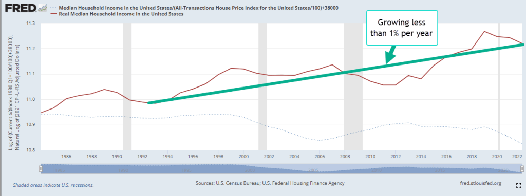
Since 1992, median household income adjusted for inflation has risen 23%, a level that is far below the rise in profits per worker. The chart below shows the gain on a log scale. Real incomes have gained less than 1% per year.

A few weeks ago I proposed adjusting prices by a broad index of house prices instead of the CPI. Two-thirds of American households own their home and home values reflect the discounted flow of housing services that we get from a home during our lifetimes. Housing costs are already almost half of the CPI and trends in home prices capture the feel of inflation on household budgets more accurately than the many CPI measures economists currently use.

During the 1980s and 1990s, housing prices increased 4% annually. The chart below describes the median household income adjusted by the all-transactions home price index (FRED Series USSTHPI). Notice that household incomes during those two decades stayed on an even keel.

Had the Fed structured their monetary policy to keep home price growth at the same level as the 1980s and 1990s, real incomes would be near the level of the green line, 10% higher today. Instead, workers feel as though they are on the path of the red line, regardless of what official measures of real household income indicate. The red line reflects a sense of discomfort and tension in many American households that plays out in our politics. The trend began with housing and finance policies enacted by both parties in Congress across five Presidential administrations.  

///////////////////

Photo by Charles Chen on Unsplash

Keywords: home prices, labor unions, wages, income, household income

Greckhamer, T. (2015). CEO compensation in relation to worker compensation across countries: The configurational impact of country-level institutions. Strategic Management Journal, 37(4), 793–815. https://doi.org/10.1002/smj.2370

The Crack in Our Windshield

May 28, 2023

by Stephen Stofka

This week’s letter is about debt, both public and household. Since 9-11, the public federal debt  has grown five times. The causes include costly wars in Iraq and Afghanistan, a global financial crisis followed by a slow recovery, tax cuts passed under the Trump administration and a once-in-a-century pandemic. Ten percent of the $32 trillion debt was added during the first three months of the pandemic. As the deadline approaches when the government will not be able to make timely payments to vendors and bondholders, we ask why do we have this thing called a debt limit?

Denmark is the only other country in the world to require an approval of a debt limit after the spending has been approved. Their legislators raised the limit so high that it might be a century before the issue comes up again. That leaves only the U.S. in the world where a debt limit debate is a threat. Neither party wants to repeal this century old law because it has the potential to be a powerful negotiating tool. It allows one party to negate or modify the funding priorities that the other party passed in the last legislative session. This is a game of chicken played for high stakes.

Some have criticized the Biden administration for not starting negotiations sooner. However, the House did not put anything on the negotiating table until they passed a bill on April 26th, just a month ago. Given the fractured Republican caucus, it was not clear that Speaker McCarthy could get a bill passed in the House. French Hill, R-Ark., told Roll Call “The whole purpose of this is to compel the president to negotiate — and to demonstrate to Washington, D.C., that Kevin McCarthy has the votes to raise the debt ceiling.” Four House members defected and the vote barely squeaked by at 217-215. Although George Santos, R-NY, is facing prosecution for fraud, money laundering and theft of public funds, McCarthy has allowed him to keep his seat at a time when every vote is crucial.

In 2011, the Republican House balked at raising the limit but the only legislation they could pass was an affirmation that they would not raise the limit without some unspecified spending cuts. Republicans were unable to agree on terms that they could pass in the House. Despite that, President Obama made the mistake of negotiating with Speaker John Boehner, and the two struck a so called Grand Bargain. Lacking anything in written legislation from the House, a bipartisan committee in the Senate came up with a different proposal and Obama tried to negotiate a compromise between the two versions with Boehner. Boehner could not get any changes past the most conservative members in his caucus. According to Politico reporter Tim Alberta (2017), the staff of Jim Jordan, R-OH, had been working secretly with outside groups to sway enough House members to vote against Boehner’s bargain. Jordan apologized but the incident exacerbated tensions between the warring factions within the Republican House. As Vice-President at the time, Biden would have learned a valuable lesson. Get something in writing before starting negotiations.

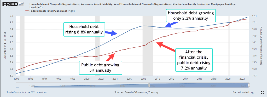
In contrast to the growth of the public debt, the growth in household debt has decreased since the financial crisis and the housing bust. The chart below compares the two types of debt, public and household, in two 13 year periods before and after the financial crisis.  

From 1994-2007, the public debt (GFDEBTN) grew 5% per year while household debt rose 8.7% annually. As a percent of disposable income, household debt jumped from 78% at the end of 1994 to 124% at the end of 2007. Chiefly responsible was the doubling of mortgage debt (HHMSDODNS) during the first seven years of the 2000s. Lax underwriting standards allowed families with poor credit scores of less than 620 to secure mortgages. Millions lost their homes during the housing bust, banks tightened lending standards and Americans were forced to go on a credit diet.

Since the financial crisis, American household balance sheets have improved. Household debt has grown by only 2.2% per year, about half the growth rate of personal income (DSPI). As a result, debt as a percent of disposable income had fallen to 91% at the end of 2022. The public finances have not fared as well. Although federal tax receipts, including FICA taxes, have increased 8% annually, expenditures and social benefit payments have outpaced tax receipts, resulting in a 7.2% annual increase in the public debt since the end of 2009.  

This week David Leonhardt (2023) with the New York Times presented a graph of voter policy preferences derived from recent polls. The fiscal liberals in both parties outweigh the fiscal conservatives, a trend sure to promote the growth of the public debt. In the 2011 debt limit duel, Republican leaders like Paul Ryan championed privatization of Social Security and cutting back on benefit programs. In the decade since, neither of those proposals are popular with the party’s base. Instead McCarthy will appeal to the social conservatives in the party and insist on work requirements for benefit programs. As Leonhardt notes, the fight for Democrat and Republican swing voters is taking place in the quadrant of voters who are socially conservative but fiscally liberal, nicknamed the “Scaffles.”

The government’s spending becomes household income in some form or another, an accounting identity that joins the growth in public and household debt. Our economy, laws and regulatory framework promote financial crises and exacerbate social problems. Policymakers, economists and social scientists can debate the causes, extent and severity of the problems but acknowledge the reality.  We may discover that our experiment in governance does not scale as our population grows and congregates in cities, as our technology advances and we become accustomed to greater energy use. The spread of mass communication and social media since World War 2 has exacerbated rather than resolved our ideological and cultural differences. The growth of our public debt indicates that we expect more from our government than our economy or political framework is able and willing to pay for. Like a crack in our windshield, it will continue to grow.

////////////////////

Photo by Ivan Vranić on Unsplash

Keywords: public debt, household debt, mortgage debt, debt limit

Alberta, Tim. 2017. “John Boehner Unchained.” POLITICO Magazine. https://www.politico.com/magazine/story/2017/10/29/john-boehner-trump-house-republican-party-retirement-profile-feature-215741/ (September 27, 2022).

Federal Reserve Bank of New York. (2023, May). Quarterly report on household debt and credit. https://www.newyorkfed.org/medialibrary/interactives/householdcredit/data/pdf/HHDC_2023Q1

The various FRED data series used in this post were HHMSDODNS Mortgage Debt, HCCSDODNS Consumer Credit Debt, GFDEBTN Public Debt, DSPI Disposable Personal Income.

Leonhardt, D. (2023, May 25). Ron DeSantis and the “scaffle” vote. The New York Times. https://www.nytimes.com/2023/05/25/briefing/ron-desantis.html

Wealth-Income Ratio

January 16, 2022

by Stephen Stofka

Analyses of wealth and income inequality engage policymakers and economists and provoke lively discussion on social media. Thomas Piketty (2013) stirred up debate with the publication of Capital in the Twenty-First Century. Five years later came the publication of After Piketty (Boushey et al., 2019), a series of essays by prominent economists. I wanted to tackle a different aspect of this subject – why the ratio of wealth to income has become so erratic in the past two decades. The answers are too complex for a blog post and beyond my capability to understand. But let’s take a short journey down the rabbit hole.

In the past ten years both stocks and housing prices have more than doubled, moving in a synchronized dance. In the graph below I’ve plotted the two series on top of each other to show the similarity in trend.

The Federal Reserve charts a ratio of household wealth to disposable income, which is income less taxes plus transfer payments like Social Security. Although there are some similar components, the ratio is different than the capital-income ratio that Piketty uses. Housing represents the majority of wealth for many households. Many workers own part of the stock market through mutual funds, 401K plans at work or IRA retirement plans. The doubling of these two asset classes has led to a rise in household wealth and raised the wealth-income ratio to historically elevated levels.

In the graph above I have highlighted past decades where this percentage found a level and remained there. For almost 50 years following WW2 household wealth was about 5x disposable income. Beginning in the mid-90s, this percentage turned erratic, unable to find any stability until the violent recession following the fiscal crisis. In 2013, stock prices and housing began a steady climb that endured the pandemic shock and continues to this day. Will we establish a new level of wealth at 8x disposable income in the next few years? I doubt it. Such a growth curve is unsustainable.

As I search for the underlying causes, I look back to the mid-90s when the wealth-income ratio first turned erratic. The internet first began to grow into our commercial and personal lives. Heady expectations of rocketing business profits led many investors to make wild bets on companies who had little history, a lot of hype and little profit. Out of the carnage of mis-investment emerged an internet platform that has transformed our personal lives. Apple and Amazon are two success stories. In 1997 giant Microsoft made a $150 million investment in failing Apple Computer that kept Apple out of bankruptcy. This year Apple’s valuation passed the $3 trillion mark, about 13% of the entire GDP of the U.S. That same year Amazon went public. It’s business model? Selling books. For years it struggled to make a profit. Amazon’s market capitalization is now over $1.6 trillion. The so called FAANG stocks of big tech have surpassed the industrial and financial giants of the 20th century. Two researchers at Morningstar studied the decade long impact of the ten largest stocks and the impact they made on the overall return of the entire stock market (Solberg & Lauricella, 2021). Perhaps that concentration of market power is contributing to a more erratic wealth-income ratio.

Low interest rates and leverage have affected household wealth. In the mid-90s, bankers at JP Morgan developed the collateralized mortgage to spread risk. In ten years, misuse and overuse of that idea led to a historic meltdown in housing prices and caused a worldwide fiscal crisis. Since then the supply of new housing has not kept pace with demand. Fueling that demand is a large Millennial generation which is settling down. Persistently low mortgage rates have increased the pool of qualifying buyers. Low rates have raised the present value of the future housing services a homeowner receives from the house they buy. Not enough supply to meet demand has led to higher housing prices.

High inflation this year has grabbed headlines and stirred up comparisons to the stagflation of the 1970s. There are too many differences between now and then but that is a subject for another blog post. A rising federal debt has certainly contributed to a rising level of wealth but does not account for the erratic behavior of the ratio itself. In the mid-90s, the federal debt began falling and the wealth-income ratio rose dramatically.

I suspect that finding an equilibrium in this ratio will be a painful process. To reestablish a sustainable ratio, there are two possibilities. The first is a hard landing where asset valuations fall more than incomes fall. The second scenario is a soft landing in which incomes rise more than valuations rise. Let’s hope for the soft landing.

///////////////////

Photo by Ludde Lorentz on Unsplash

Boushey, H., Bradford, D. L. J., & Steinbaum, M. (2019). After Piketty: The agenda for economics and inequality. Harvard University Press.

Cautero, R. M. (2021, December 28). What is disposable income? The Balance. Retrieved January 15, 2022, from https://www.thebalance.com/what-is-disposable-income-4156858

Piketty, T. (2013). Capital in the Twenty-First Century. (A. Goldhammer, Trans.). The Belknap Press of Harvard University Press.

Solberg, L., & Lauricella, T. (2021, December 1). The FAANG Market is Fading. Morningstar, Inc. Retrieved January 15, 2022, from https://www.morningstar.com/articles/1070180/the-faang-market-is-fading

Treasured Myths

March 14, 2021

by Steve Stofka

Some liberal economists promote government welfare policies that would enable one earner to support a household. Former Labor Secretary Robert Reich and Vermont Senator Bernie Sanders are champions of the idea that America was once a nation of one earner households. Does the data support their claims? No. But careful presentation of the data perpetuates a myth that forms the bedrock of a class of liberalism called welfare liberalism.

In the 20 years following World War 2, most of the world’s manufacturing capacity was in the U.S. Workers had greater bargaining power and union membership grew. The number of workers per household dipped slightly, then returned to more customary levels. Was there ever a prevalence of one-earner households? No. It is a myth.

In 1966, hours worked per week in manufacturing industries peaked at 41.6, (AWHMAN see endnote). Many dads worked overtime to support their working-class families. There was more overtime available because the U.S. was the manufacturing capital of the world. When the youngest children started school, mom often took a part-time job to bring in extra income. Only a small percent of families could live on a 40-hour per week paycheck.

In the late 1960s manufacturing jobs were 28% of all full-time jobs (MANEMP); today it is 10%. Rarely discussed is the decline in office and administrative workers from 18% in the early 1980s to 11% today (OFFICE). Some of these were entry jobs that helped young workers develop skills. A woman might leave an administrative job to raise young children, then return to a similar job when the children reached school age. The decline began in the early 1990s as computers became more affordable and computer programs could do routine bookkeeping tasks. That percentage decline represents 10.5 million workers at pre-pandemic employment levels, more than the current number of unemployed workers.

Technological improvements change the mix of skills needed in the job market. Almost 2 million full-time workers are employed in the software industry (Software). Many more data entry workers could be employed if governments updated their archaic system architectures. The pandemic revealed how antiquated many state employment systems are. Because they did not have integrated claim verification built into their systems, many were able to file false claims using data gained from data breaches of private companies in years past. State systems could not handle the extra load of unemployment claims.

Our founding documents are based in part on the 17th century writings of John Locke. In his Second Treatise of Government, he wrote that power arises from duty; the power that parents have over children arises from their duty to take care of their children (58:1). Some people may extend that power and duty relationship to the government and a nation’s citizens. Two groups may argue over taxes, regulations, and benefits when the underlying argument is whether governments have some duty to take care of their citizens because it has some power over them.

This pandemic has shown the extent of government power. When states and cities shut down private businesses for public health reasons, this aroused a centuries old debate about the extent of government power. In Plato’s time 2500 years ago, Athenian citizens first rejected government authority and refused military service. That independent spirit contributed to their defeat against Sparta where all citizens were expected to serve two years military service. 2000 years ago, Roman citizens scrawled graffiti on their bridges and refused to join military campaigns to establish yet another colony. In any century, a state enacts laws and exercises powers that are repugnant to some of its citizens. What is the extent of that power and those laws?

We cherish our myths, but they confuse our debates. The one-earner household is a mid-century favorite for some. For others it is that America’s founding was the first time in history that people established their freedom in relation to their government. Each generation thinks that it is at a special point in history, just like children do. We reject the notion that there is a circularity to our history. Through the centuries we revisit these debates about duty, power, rights and responsibilities. We tell ourselves that generations in the past never dealt with these issues, that it’s all different now. Yes, the historical context is different each century, but the central issues change little because the human spirit is an enduring bedrock that forms our institutions.

/////////////////

Notes:

Photo by Ashim D’Silva on Unsplash

AWHMAN, Federal Reserve (FRED) Series: Average weekly manufacturing hours surpassed the 1966 peak under the Obama and Trump administrations.

MANEMP / LNS12500000: Manufacturing jobs divided by total employees who usually work full-time. These numbers come from different monthly surveys.

OFFICE: Office and administrative worker series divided by total employment, LNU02032207 / PAYEMS Series.

Software: Developers, applications and systems software LEU0254477200A series

Country Roads and the Election

May 12, 2019

by Steve Stofka

I spent the past week traveling with my sister to a family reunion near Dallas, Texas. In our travels, we passed through rural counties in southeast Colorado, western Oklahoma, and northwest and central Texas. In contrast to the signs of a brisk economy in the larger cities, some rural communities show signs of stress. Some roads leading off the main route need repair; some houses could use a fresh coat of paint; some stores have delayed maintenance. In some small towns most of the stores remain boarded up ten years after the financial crisis.

Candidates for the 2020 Presidential election must speak to the two Americas. The Americans who produce the food we eat and the power that lights our businesses and homes are not doing as well as those in the urban corridors. Young people in rural America leave for the larger cities to find a job or pursue an education. Older people with medical needs must move to larger cities with hospital facilities available in an emergency.

Let’s turn to a proposal on the list of issues for the 2020 election – an increase in the Federal minimum wage. A person making a minimum wage of $15 an hour in Los Angeles earns a bit more than half of L.A.’s median household income (MHI). She may work 2-1/2 weeks to pay the rent on a one-bedroom apartment (Note #1). The MHI in rural America is about 20% less than the national average. In Limon, Colorado (population less than 1500), the MHI is about half of the national average (Note #2). $15 an hour in Limon is the MHI.

In 2009 and 2010, the Democrats controlled the Presidency, the House and had a filibuster proof majority in the Senate. They could have enacted a federal minimum wage that was indexed to the living costs in each county or state. Why didn’t they fix the problem then? Because Democrats use the minimum wage as an issue to help win elections. If Congress passes a minimum wage of $15 an hour this year, they will have something new to run on in five years – a raise in the minimum wage to $17 an hour. Voters must begin asking their elected representatives for practical and flexible solutions, not political banners like a federal mandated one-size-fits-all $15 minimum wage.

For decades after World War 2, Democratic Party politicians who controlled the House refused to allow legislation that would index tax rates to inflation. This resulted in “bracket creep” where cost of living wage increases put working people in higher tax brackets automatically (Note #3). The problem became acute during the high inflation decade of the 1970s and the issue helped Ronald Reagan take the White House on a promise to fix the problem.

A week ago, I heard a Democratic Senator running for President say that they knew all along that Obamacare was just a start. The program was poorly drafted and poorly implemented and now we learn that Democrats knew all along that it was bad legislation? Will Medicare For All also be built on poor foundations and require a constant stream of legislative and agency fixes? This provides a lot of work for the folks in Washington who draft a lot of agency rules that require a lot of administrative cost to implement. Democrats are fond of federal solutions but show little expertise in managing the inevitable bloated bureaucracy that such solutions entail.

Some Democratic Party candidates are promising to fix the harsh sentencing guidelines that they themselves passed in the 1990s, which fixed sentencing guidelines enacted 25 years earlier by Democratic politicians in the 1960s and 1970s. This party’s platform consists of fixing its earlier mistakes.

According to a Washington Post analysis of election issues (Note #4), some candidates are concerned about corporate power. A Democratic president would have to work with the Senate’s Democratic Leader Chuck Schumer whose main support comes from large financial corporations based in his home state, New York. While a President Elizabeth Warren might propose regulatory curbs on corporate power, Mr. Schumer would be gathering campaign donations from the large banks who needed protection from those same regulations.

Large scale industrial power production has a significant effect on the climate. The few blue states that supported a Democratic candidate for President in the 2016 election also consume most of the final product of that power production. Have any candidates proposed solutions that lower the demand for power? Temperature control systems in commercial buildings could be set to a few degrees warmer in the summer and a few degrees cooler in the winter. That would have a significant impact on carbon production. Some candidates propose solutions that regulate the production and supply of power – not the demand for power. Most of that production occurs in states that supported a Republican candidate in the 2016 election. Proposals to install wind and wave generating stations in Democratic leaning coastal states in the northeast and northwest have been met with local resistance. Voters in the blue states want green solutions to be implemented in the red states, but not inconvenience residents of the blue states. Voters in the red states see through that hypocrisy.

A viable Democratic candidate must convince independent voters who are wary of political solutions from either party.  Donald Trump won the Presidency without visiting rural folks on their home turf. He landed his plane near a staged rally and the folks came from miles around to hear him. Compare that approach with former Republican candidate Rick Santorum who visited many small towns in Iowa in the months before the 2012 Iowa primary. In small restaurants and rural post offices, Santorum listened to the concerns of voters. Trump’s approach was successful. Santorum was not. Go figure.

Trump convinced rural folks that he was going to go to Washington and drain the swamp. This in turn would help the economy in small town America so that those folks could get themselves a new roof, or a new pickup truck, fix the fence or get a few potholes patched. From what I saw, those folks are still waiting. Some rural folks may run out of patience with Trump by next year. The success of any Democratic candidate depends on that.

//////////////////////

Notes:

  1. One week’s take home pay of $550 x 2.5 weeks = $1375. A 1 BR in L.A. averages $1350 L.A. Curbed
  2. Areavibes.Com assessment of Limon, Colorado.
  3. Tax indexing
  4. Washington Post article on various election issues

Green Incomes


March 10, 2019

by Steve Stofka

Many Americans cross the street if they think a socialist program is walking toward them. We believe that the U.S.A. is the heart of capitalism, but recent history reveals that our financial and legal systems are based on socialism for the very, very rich.

In the past two weeks, I reviewed the infrastructure goals as well as the justice and education goals of the Green New Deal (Note #1). In Part Three this week, I’ll look at the income supports included in the resolution’s economic agenda.

“Guaranteeing a job with a family-sustaining wage.” This is yet another example of clumsy language used to state a goal that some might read as utopian. Some can group the first phrase as ” Guaranteeing a job with a family sustaining wage” meaning that all wages should have a certain minimum. That sounds like the language of Minimum Wage 2.0, but does that mean that each job should be able to support a family of four, or six, or eight?

Others might group the first phrase as “Guaranteeing a job blah, blah, blah” and read the intent as a platform point of a Socialist Manifesto. Is the government going to hand out jobs to everyone that wants one? Only if the government takes over some of the means of production and becomes the nation’s chief employer can it hand out jobs to anyone who wants one. That is the textbook definition of socialism. It is not enough to have good intentions. Clarity of language matters.

Why the clamor for more income redistribution? The real (after inflation) income of poor and working families has lost more than half since 1980. That might not surprise some readers. The trend is even broader and more insidious. Income data from the Congressional Budget Office (CBO) shows that even the top 5% of real incomes have dropped 30%. The real income of a ¼ million families – the very, very rich – have grown in that time. Here are some highlights from the data.

In 2015 and 1980, the number of poor households, or bottom 20%, equaled the number of rich households, or top 20%. In 2015, the government took money from each rich household and gave it to 5-1/4 poor households to raise their income by 65% (Note #2). In 1980, the government took money from each rich household and gave it to 10-1/4 households to raise their income by only 25% (Note #3).

Why did poor households need so much more support in 2015 than they did in 1980? Because their real incomes before transfers and taxes (BTT) lost more than 50% (Note #4). The real BTT incomes of the top 5%, the very rich, have lost more than 30% . It is only the very, very rich, the top 1%, that have fared well in this fight against inflation. Their BTT income has grown 15% in the past 35 years. The bulk of those gains have probably come from the top .1%, or less than ¼ million families.

Why? Where has the money gone? The high interest rates of the 1980s made the dollar so strong that manufacturers began to move their operations to lower cost markets in Asia. Japan kept the value of the yen low relative to the dollar and attracted much of this investment. The Japanese economy and real estate boomed. American exports of manufactured goods declined, and commodity prices crashed, destroying a lot of income producing wealth, particularly in rural areas (Note #5). Bankruptcies during this decade far exceeded those filed during the Financial Crisis ten years ago (Note #6). Older readers may remember the charity concerts to raise money for farmers (Note #7). Today, many commercial buildings in small towns throughout the country stand empty. As rural clinics and nursing homes close, people must move to urban areas where medical services are available (Note #8).

As real incomes declined in the late 1980s, households and governments borrowed to make up for the loss of income. Who did they borrow from? Financial institutions who managed the assets of the very, very rich. As the financial sector grew in proportion to the size of the entire economy, the top managers of financial firms became very, very rich themselves (Note #9).

In the past twenty years, lobbying by the financial sector has quadrupled (Note #10). It paid big dividends during the latest crisis. After the initial bailout by the Bush administration in the fall of 2008, the Obama administration brought in a team led by Robert Rubin, Larry Summers, and Timothy Geithner. The first two helped dismantle the safeguards between deposit banks and investment institutions during the Clinton administration. Geithner was a protégé of Rubin. All were deeply embedded in the interests of the banks, not the creditors and governments who had trusted the judgment of financial managers.

The lack of separation between deposit banks and investment banks helped spread a cancer from the investment banks to banking institutions throughout the world. As Obama’s Treasury Secretary, Geithner continued to protect the bonuses of top managers despite massive losses. To preserve the wealth of the very, very rich, the Federal Reserve loaded up their own balance sheet with toxic bonds bought at full value.

After a 35-year period of rising real incomes and wealth because of favorable fiscal and monetary policy in Washington –
after Washington protected their wealth and income during the financial crisis at the expense of middle-class families who lost their savings and houses –
it is time for the very, very rich to pay taxpayers back.
You have eaten well. Here is the check.

//////////////////

Notes:

1. Politifact article
2. In 2015, the bottom 20% of households (24.3 million) averaged $20,000 in income before taxes and transfer payments. The top 20% (25 million) earned almost $300,000. After taxes and transfer payments, the incomes of the bottom 20% rose 65% to $33,000. CBO report on household income in 2015, updated Nov. 2018
3. Number of households underlying CBO report is in Sheet “1. Demographics” of Supplemental Data spreadsheet linked on last page of report. Dollar amounts are in Sheet “3. Avg HH Income”, of same spreadsheet.
4. The impact of high interest rates on investment and commodities during the 1980s Secrets of the Temple pp.590-604
5. Using BLS calculator to compare CPI January 1980 to January 2016 prices, $1 in 1980 = $3.05 at the end of 2015. Average income amounts from Sheet 3. See Note #3 above.
6. Four decades of bankruptcies chart at Trading Economics
7. Farm aid timeline
8. Nursing centers in rural areas are closing NYT
9. The financial industry’s increasing share of GDP
10. Increase in financial lobbying since 1998

Optical Illusions

May 12, 2018

by Steve Stofka

I have long enjoyed optical illusions. Is that a picture of a rabbit or a duck? Which way is the cube facing, right or left? (Some examples) Is that two people facing each other, or a vase? (Image page) These can be even more fun when shared with a friend or sibling. Can’t you see the rabbit? No, it’s a duck!!!

Moving images present a selective attention deception. When asked to count the number of basketball passes, we may not see the gorilla that walks across our field of view. (Video)

These examples excite our curiosity and fascination as children and carry important lessons for us as adults. We sometimes misinterpret the data our senses receive. Those with a strong ideological bent may focus narrowly on only that data that supports their view of the world, or that makes them feel comfortable.

Let’s look at an example. Real (inflation-adjusted) median (middle of the pack) household income peaked in 1999 at $58,665. In 2016, income climbed to $59,039. However, personal income did not peak till 2007, at $30,821. Like household income, personal income finally rose above that peak in 2016.

PersVsHouseholdIncome

In the household series, the past twenty years have been especially tough. In the personal series, only the past ten years have been that difficult. What accounts for the difference in the two series? Households have grown faster than the population. Population Income / Households will be lower when households increase.

But what is income? Household income is money income received and does not include employer-provided benefits and retirement contributions (Census Bureau Defs). The BLS does track total compensation costs which do include these benefits, and those costs are 67% higher today than they were in 2001.

Benefits

If an employer gave an employee $500 a month for health care expenses and the employee sent the money to the health insurance company, that would be counted as income in the data. But because the employer sends the money directly to the insurance company, that income is not counted. Because of World War 2 wage and price controls, and to avoid being taxed under the income tax system, most employee benefits never touch the employee’s pocket, and are not counted as income. This becomes important when something not counted, benefits, grows much quicker than the income that is counted, or money received.

Since 1970, real hourly wages have grown only 3%. Bernie Sanders and other Democrats use a similar figure to press for more social welfare programs. Total hourly compensation has grown 60% (Fed Reserve blog) and most of that is not included in household income.

HourlyWagesVsTotalComp

Is it a rabbit or a duck?

////////////////////////

Do Millennials have it worse than Boomers did at this age?

I’ll call them the Mills and the Booms, so I don’t wear out my fingers. The Mills were born about 1982-2001 so they are 17 – 36 years old today.  A decade after the worst recession since the Great Depression, home and apartment prices are rising fast in many urban areas.  Mills are now the largest generation alive and are at an age when a majority of  them are independent and increasing the demand for housing.

Some Mills are trying to provide shelter for their families when the competition for housing puts constant upward pressure on prices. Some Mills are paying off student loans, while paying $800 to $1000, or more in California, to share a 3 bedroom house with  two other people. It is stressful.

The Booms were born approximately 1946 – 1964. The youngest are 54; the oldest are 72. When the Booms were 17-36, the year was 1982, and oh, what a year it was. The Booms had just endured a decade of double-digit inflation rates (it is now less than 2%), four recessions, mortgage rates that were considered a “bargain” at 9% (4% today), and high housing and apartment prices because there was so much demand for living space from this post war baby boom.

Oh, and tax increases. Tax rates were not indexed for inflation till 1985, so higher wages each year to keep up with that double-digit inflation meant that many workers were kicked up into a higher tax bracket each year. One of Ronald Reagan’s campaign promises was to stop the sneaky practice of dipping deeper into worker’s pockets every year. He got elected President, beating President Jimmy Carter who had told workers to turn the heat down and put a sweater on.

How do today’s monthly debt payments compare? Household Debt Service Payments as a percent of disposable personal income are 5.8% today compared to 5.6% in 1982. The 37-year average is 5.7% (Federal Reserve).

What are those average debt service payments buying? Better cars, more education, more square footage of housing space per person, and computers and electronics that didn’t exist in the 1980s. People are paying more for housing but are enjoying 30% more square footage per person (Bloomberg). In 1982, 17% of the population 25 years and older had a college degree. Today, it is double that percentage (Census Bureau table A-1), an achievement that the Mills can be proud of.

The Mills do have it better than the Booms, who had it better than the generations before them. That “good old days” talk that we heard from Bernie Sanders on the campaign trail are based on some foggy memories. The reality was way tougher than Sanders remembers or talks about because his perception is clouded by his ideology. He only sees the data that tells him it’s a rabbit. He doesn’t see the duck.

The Poor and the Not Poor

October 15, 2017

No worries. Among the 25 OECD countries, Americans have historically had the lowest percentage of their financial assets in cash and savings deposits. After the financial crisis, we became the second lowest, just ahead of Chile. The percentage for the most recent available year (2015) was 13.5%.

In the heady optimism of the dot-com boom in 1999-2000, Americans had less than 10% of their assets in cash and savings. In the long downturn from 2000 – 2003, Americans bumped up their percentage in safe assets to almost 13%. As the economy recovered, that need for safety declined slightly but not to the levels of the 1990s. The financial crisis in 2008 caused Americans to reach for safety. Safe assets rose to 14.3% of total financial assets and we have still not recovered the level of confidence we once had.

You can click on this OECD link to see a comparison of current percentages. On the bottom right below the chart you can drag the year slider and look at some historical data.

Below the chart on the left is a category labeled “Perspectives.” Select “Total” to see total financial assets, which does not include home equity. Americans have the second highest total, just below Switzerland.

On the other hand, the U.S. has a comparatively high poverty rate of 17.5% using the OECD standard,  a simple measure that an economist would use.The poverty threshold is half the median income.

The U.S. publishes a poverty rate that is several percent lower because it uses a complex definition first set in 1963 when families spent an estimated 1/3 of their income on food. The complexity of the definition hints that politicians had a hand in crafting the definition but it is attributed to one person in the Social Security Administration, who based her standard on a combination of foods that the Department of Agriculture thought would meet minimum nutritional needs. The history of this standard and its many revisions is an interesting read.

The threshold is set at three times the cost of this 1960s era minimum food diet. Efficiencies in food production over the past 50 years have dramatically lowered food costs for U.S. families. In 1978, the BLS estimated that the average family spent only 18% of their income on food. In 2014, it was a bit more than 14% (BLS).

Using food costs as the basis for measuring poverty has enabled politicians in this country to claim success in lowering poverty over the past half century. In 1978, the calculation of the U.S. poverty threshold produced one that was slightly more than the OECD standard. Today, the U.S. threshold is 16% less than the OECD standard.

Let’s look at a family of four making $28K in 2016. They were above the official U.S. poverty threshold of $24,300 for a family of four. By the OECD definition, that American family was below half of the median $59K in income and would be counted as poor.

Housing costs are higher in urban areas, where half of the U.S. population lives. That family of four living in Chicago might pay $15000 per year for a 2 BR apartment in Chicago. Further south in the same state, Springfield, IL, they might pay $11,000. That $4000 difference in housing cost is not calculated into the poverty rate that the U.S. publishes. In effect, poverty is undercounted in urban areas and overcounted in rural areas.

The simplicity of the OECD standard better captures poverty among both urban and rural low-income families because it is based on median income. So why doesn’t the U.S. adopt this much clearer standard? We can turn to the last sentence of the previous paragraph for a clue. Politicians in rural areas want a standard that overcounts poverty in their districts. A higher headcount of poverty equals more subsidies for their constituents. When this standard was set, rural areas in the southern states were primarily Democratic and Democrats dominated the Congress under a Democratic President, Lyndon Johnson. Those politicians wanted the adoption of a food based standard that overcounted those voters.

Today, most rural areas are predominantly Republican and the standard works to the advantage of Republicans and the disadvantage of Democrats. As a rule of thumb, whenever we see excessive complexity in rule-making, there’s usually a very sound political reason for that obfuscation. Former President John Adams lamented this unfortunate characteristic of lawmaking in the crafting of the Constitution itself.

The intentional lack of clarity in lawmaking ensures that any nation’s population will be at odds with each other. A small and smart part of the population makes money from conflict and confusion. People argue on Facebook; Facebook makes money. Trump did what? There’s a video. Got to see that, right? Click bam boom, Google makes money by placing some ads next to the video.  Controversy is profitable. Politics as carnival show.

Crown Publishing, a division of Random House, publishes both the fringe right author Ann Coulter, and the way out on the left author and MSNBC host, Rachel Maddow. Worried that the liberals are taking over the country? Frightened that the conservatives will destroy the very institutions that have made America the greatest nation on earth?  Crown has something for you.

On the other hand, the record low volatility of the stock and bond markets in the past year have made it difficult for financial firms who depend on controversy to make a good profit.  Active fund managers have struggled to outperform their benchmark indexes.  The volume of derivatives and other products that insure against volatility have fallen.  People are not worried enough.  That’s the problem.  We need to worry about not being worried.

And those poor families?  If we lower the poverty threshold even more, we won’t have to worry about those poor people as much.