Invisible Expectations

June 2, 2024

by Stephen Stofka

This week’s letter continues a topic from last week, our expectations of inflation. The high inflation of the 1970s prompted a lot of debate on this topic, and I will try to cover a portion of those ideas. Hypotheses regarding the formation of expectations influence monetary policy and the manner in which the Fed raises interest rates. Different policy approaches reach across the country into the pocketbooks of many Americans. They can mean the loss of many jobs or few jobs, or the viability of buying a home.

The University of Michigan conducts a monthly survey of consumer sentiment in a rotating sample among 500 participants. Respondents are asked to estimate the rate of inflation for the next twelve months (see here, p. 5). Inflation is a rise in the average price of all goods but in casual conversation, we often use the term loosely to refer to a rise in prices of the goods and services that have the most impact on our lives. Each of our estimates are biased but an average of many estimates should approximate a comprehensive survey of the prices of many goods. This BBC five-minute video explains this phenomenon known as The Wisdom of the Crowd when many people try to estimate the number of jelly beans in a mason jar.

The blue line in the graph below is the headline CPI that tracks a basket of goods and excludes expenses like the employer portion of health care insurance. The Fed pays more attention to the PCEPI, the green line in the graph below. That methodology is based on actual expenditures in various sectors of the economy, including employer paid health insurance. Notice how closely the average estimates of inflation approximate this broad measure of price movement. In the April 2024 survey, expectations averaged 3.2%, a big decrease from over 5% in 2022 but a slight rise from 2.9% in March.

How do we form inflation expectations? There are two hypotheses, and they are distinguished by how errors occur in our expectations. Adaptive expectations was a predominant hypothesis until the 1970s. It holds that we revise our forecasts up when actual inflation is higher than we expected, and down when inflation data indicates that our forecast was too high (Blanchard, 2017). Imagine that we are offered a discount at the doctor’s office if we guess our weight within three pounds. We base our guess on a previous weight reading. If it is too low, we lose our discount so the next time we revise our guess higher. Under this hypothesis, our expectations are very much guided by past experience and our forecast errors are systemic. To tame high inflation, monetary policy must act like a shock that induces a recession and alters the expectations of investors and consumers.

In August 1979, during the Carter administration, Paul Volker assumed the position of Fed chair. In October, the Fed raised interest rates 1.5%, then lowered by a half-percent in November, then raised them again by a half-percent in December. In those three months, sales of new one-family homes (HSN1F) dropped 25%. A few months later, in the spring of 1980, came another interest rate shock of a 3.5% increase over two months and new one-family homes sank by 38%. They did not begin to recover until the spring of 1982. This cattle prod approach to taming expectations was influenced by the adaptive expectations hypothesis.

Statistical tests done in the early to mid-1970s showed that we paid much more attention to ongoing conditions than previously thought. This contradicted the notion that our expectations relied mostly on past experience. Two economists, Robert Lucas and Thomas Sargent presented a rational expectations hypothesis claiming that we form the best inflation forecast we can with the information available to us. Rational does not mean perfect. Errors in our forecasts are random and arise from unseen shocks (Humphrey, 1985). The critique against this hypothesis was that people were too naïve or uninformed to form rational expectations. Information frictions blurred the distinction between rational and non-rational (Angeletos et al, 2021).

 Over the past several decades, the rational expectations hypothesis has guided policymaking at the Fed. If the Fed presents a convincing policy commitment to steer inflation toward a particular target, investors will change their behavior in accordance with their belief in the Fed’s commitment. Economist Roger Farmer (2010) has called them self-fulfilling beliefs and devotes a section of his book to rational expectations. Under this regime, the Fed uses steady, incremental rate increases and consistent policy statements to “corral” expectations like a trained sheepdog persistently badgering a flock of sheep to guide them into a holding area. By guiding expectations, monetary policy can tame high inflation without necessarily producing a recession. This has been dubbed a soft landing.

In the spring of 2022, the Fed under Chairman Jerome Powell raised rates a half percent a month, a steady rate to let everyone know that the Fed was serious. From the spring of 2022, the number of new one-family homes did not fall. That was the rational expectations hypothesis at work. The Federal Reserve as sheepdog. As with any comparison, there are a number of other factors. My point here is that ideas about people’s motivations and behavior make a concrete difference in the lives of ordinary people.

We respond to high inflation with behavior that can exacerbate inflation. Next week I will look at several scenarios that illustrate why the Fed is concerned about managing consumer and investor expectations.

///////////////////

Photo by Hassaan Here on Unsplash

Keywords: housing, interest rates, monetary policy, adaptive expectations, rational expectations, inflation

Angeletos, G.-M., Huo, Z., & Sastry, K. A. (2021). Imperfect macroeconomic expectations: Evidence and theory. NBER Macroeconomics Annual, 35, 1–86. https://doi.org/10.1086/712313

Blanchard, O. (2017). Macroeconomics (Seventh ed.). Boston, MA: Pearson Education. p. 337. This is an intermediate economics textbook.

Farmer, R. E. A. (2010). How the economy works: Confidence, crashes and self-fulfilling prophecies. Oxford University Press. This book contains succinct descriptions of various economic theories that have influenced policy and is aimed toward the general reader.

Humphrey, Thomas M., The Early History of the Phillips Curve (1985). Economic Review, vol. 71, no. 5, September/October 1985, pp. 17-24, Available at SSRN: https://ssrn.com/abstract=2118883

A Home Is More Than a Home

March 31, 2024

by Stephen Stofka

This week’s letter is about housing, the single largest investment many people make. The deed to a home conveys a certain type of ownership of physical property, but the price reflects a share of the surrounding community, its economy, infrastructure, educational and cultural institutions. We purchase a chunk of a neighborhood when we buy a home.

These are network effects that influence demand for housing in an area. They are improvements paid for by tax dollars or business investment that are capitalized into the price of a home. Take two identical homes, put them in different neighborhoods and they will sell for different amounts. When elements of this network change, it affects the price of a home. Examples of negative changes include the closing of businesses or an industry, a decline in the quality of schools, the presence of graffiti or increased truck traffic. Positive changes might include improved parks and green zones, better schools and alternative transportation like bike lanes and convenient public transportation.

Zoning is a critical tool of a city’s strategic vision. Zoning controls the population density of an area, the available parking and the disturbance from commercial activities. Many cities have some kind of long-term plan for that vision. Los Angeles calls it a General Plan. In Denver it is called Blueprint Denver (pdf). Homes built in the post-war period in the middle of the twentieth century were often smaller. They feature a variety of building styles whose distinctive character and lower prices invite gentrification. As properties are improved, their higher appraisal values bring in more property tax revenue from that city district and the process of building an improved neighborhood network begins.

A representative for that district can argue for more spending on public amenities to enhance the neighborhood. This further lifts property values and increases tax revenues. Developers get parcels rezoned so that they can convert a single-family property into a two-family unit. This may involve “scraping” the old structure down to its foundation, then expanding the footprint of the structure to accommodate two families. As this gentrification continues, there is increased demand for rezoning an area to allow the building of accessory dwelling units, or ADUs, on a property with a single-family home. Here is a brief account of a rezoning effort in Denver in 2022.

In the past decade, the 20-city Case-Shiller Home Price Index (FRED Series SPCS20RSA) has almost doubled. The New York Fed has assembled a map with video showing the annual change in the index for the past twenty years. Readers can click on their county and see the most recent annual price change. Millennials in their late twenties and thirties feel as though some cruel prankster has removed the chair just as they started to sit down. Analysts attribute the meteoric rise in prices to lack of housing built during and after the financial crisis fifteen years ago.

Each generation faces a set of crises that stifle their ambitions. In the 1970s, just as the first Boomers were entering their late twenties, mass migration from the eastern U.S. to the western states and high inflation doubled home prices in some areas within just a few years. The decade is a comparison tool as in “How bad is it? Well, it’s not as bad as the ’70s.” The 1980s began with high interest rates, the worst recession since the Great Depression and high unemployment. Boomers had to buy houses with mortgage rates over 10%. Following that recovery was another housing scandal and the savings and loan crisis that restricted any home price growth. A homeowner who bought a home in 1980 might have seen no price appreciation by 1990. Gen-Xers who bought a home during the 2000s had a similar experience, leaving some families underwater or with little equity for a decade. Equity growth from homeownership helps support new business start-ups.

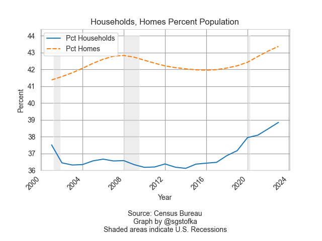
Despite the insufficient supply of affordable housing, there are more homes than households. In the graph below are the number of homes (orange line) and households (blue line) as a percent of the population. The difference is only a few percent and contains some estimate error, but represents many more homes than the number of households.

Graph showing homes and households as a percent of the population.

Household formation, the blue line in the graph above, is a key feature of the housing market. In 1960, 3.4 people lived in each household, according to the Census Bureau (see notes). By 1990, that number had steadily declined to 2.6 persons and is slightly under that today. The supply of homes naturally takes longer to adjust to changes in household formation. That mismatch in demand and supply is reflected in home prices.

During the financial crisis household formation declined as unemployment rose. Home prices fell in response to that change in demand for housing and a come down from the “sugar high” of easy credit and sloppy underwriting. The percent change in the Home Price Index, the red line in the graph below, fell below zero, indicating a decline in home prices, an event many homeowners had never experienced. The fall in home values crippled the finances of local governments who depended on a steady growth in the property taxes based on rising home values.

Graph containing two lines: 1) the percent difference between homes and households as a percent of the population, 2) the home price index. There is a large gap where the two series diverge during the financial crisis.

The thirty-year average of  the annual growth in home prices (FRED Series USSTHPI) is 4.5% and includes all refinancing. We can see in the chart above that the growth in home prices (red line) is near that long-term mark. However, rising wages and low unemployment have encouraged more household formation, the rising blue line in the first chart. Those trends could continue to keep the growth in home prices above their long-term average. Millennials with mortgages at 6-7% are anxiously waiting for lower interest rates, a chance to refinance their mortgages and reduce their monthly payments. Strong economic growth and rising incomes will continue to put upward pressure on consumer prices, slowing any decisions by the Fed to lower interest rates. These trends are self-reinforcing so that they take a decade or more to correct naturally. Too often, the correction comes via a shock of some sort that affects asset prices and incomes. Millennials have endured 9-11, the financial crisis and the pandemic. “Go ahead, slap me one more time,” this generation can say with some sarcasm. The challenge for those in each generation is to try harder and endure.

Next week I will look at the cash flows that a property owner receives from their home investment.

////////////////////

Photo by Scott Webb on Unsplash

Keyword: interest rates, mortgages, mortgage rates, housing, households

Notes on series used in the graphs. The total housing inventory is FRED Series ETOTALUSQ176N divided by Total Population Series POPTHM. Total Households is TTLHHM156N divided by the same population series. These are survey estimates so some of the difference between the two series can be attributed to a normally distributed error. The all-transactions Home Price Index is FRED Series USSTHPI. The FRED website is at https://fred.stlouisfed.org/

The Role of a Rule

December 31, 2023

by Stephen Stofka

This week’s letter is about the role of a monetary rule and the guiding points that help the Fed steer its policymaking. Since the 2008-9 financial crisis, the Fed has purchased a lot of assets, increasing its balance sheet from less than one trillion dollars at the end of 2007 to almost $8 trillion this month. It has kept the federal funds rate that anchors all other interest rates near zero for ten of the last 15 years. The members on its board of governors serve 14 year terms, affording them an autonomy resistant to political influence. From those board members the President and Senate choose and confirm the Chair and Vice-Chair of the board. The governance structure allows them to set and follow a plan of steady guidance but their actions have resembled those of sailors steering against unpredictable winds. What are the guiding lights?

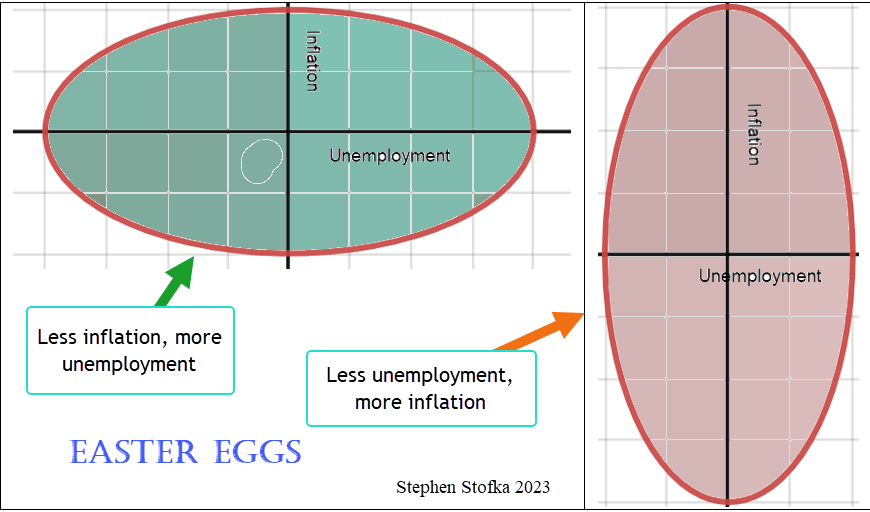
In the late 1950s, economists and policymakers enthusiastically endorsed the concept of the Phillips Curve. Picture an ellipse, a circle that has been stretched along one axis so that it appears like an egg.

Think of unemployment along the x-axis and inflation along the y-axis. More unemployment stretched the circle, shrinking inflation. More inflation stretched the circle in the y-direction, lessening unemployment. Policymakers could tweak monetary policy to keep these two opposing forces in check. In the 1970s, both inflation and unemployment grew, shattering economic models. Nevertheless, Congress passed legislation in 1978 that essentially handed the economic egg to the Fed. While the central banks of other countries can choose a single policy goal or priority – usually inflation – Congress gave the Fed a twin mandate. It was to conduct monetary policy that kept inflation steady and unemployment low – to squeeze the egg but not break it.

Mindful of its twin mission, the Fed later recognized – rather than adopted – a monetary policy rule, often called a Taylor rule after John B. Taylor (1993), an economist who proposed the interest setting rule as an alternative to discretion. The Fed would use several economic indicators as anchors in policymaking. The Atlanta Fed provides a utility that charts the actual federal funds rate against several alternate versions of a Taylor rule. I’ve included a simple alternative below and the actual funds rate set by the Fed. When the rule calls for a negative interest rate, the Fed is limited by the zero lower bound. Since the onset of the pandemic in March 2020, the Fed’s monetary policy has varied greatly from the rule. Only in the past few months has the actual rate approached the rule.

In a recent Jackson Hole speech, Chairman Powell said, “as is often the case, we are navigating by the stars under cloudy skies.” What are these guiding points that should anchor the Fed’s monetary policy? I’ll start with r-star, represented symbolically as r*, which serves as the foundation, or intercept, of the rule. Tim Sablick at the Richmond Fed defined it as “the natural rate of interest, or the real interest rate that would prevail when the economy is operating at its potential and is in some form of an equilibrium.” Note that this is the real interest rate after subtracting the inflation rate. The market, including the biggest banks, consider it approximately 2% (see note at end). This is also the Fed’s target rate of inflation, or pi-star, represented as π*. The market knows that the Fed is going to conduct monetary policy to meet its target inflation rate of 2%.

Why does the Fed set a target inflation rate of 2% instead of 0%? The Fed officially set that target rate in 1996. The 2% is a margin of error that was supposed to give the Fed some maneuvering room in setting policy. There was also some evidence that inflation measures did not capture the utility enhancements of product innovation. Thirdly, if the public expects a small amount of inflation, it adjusts its behavior so that the cost is so small that the benefit is greater than the cost (Walsh 2010, 276). Today, most central banks set their target rate at 2%.

The definition of r-star above is anchored on an economy “in some form of equilibrium.” How does the Fed gauge that? One measure is the unemployment rate and here we have another star, U-star, often represented as un, meaning the natural rate of employment. In 1986 Ellen Rissman at the Chicago Fed described it (links to PDF) as “the rate of unemployment that is compatible with a steady inflation rate.” So now we have both unemployment and the interest rate anchored by the inflation rate.

Another part of that r-star definition is an economy “operating at potential.” Included in the Fed’s interest rate decisions is an estimate of the output gap that is produced by economists at the Congressional Budget Office (CBO). The estimate includes many factors: “the natural rate of unemployment …, various measures of the labor supply, capital services, and productivity.” The CBO builds a baseline projection (links to PDF) of the economy in order to forecast the federal budget outlook and the long term financial health of programs like Social Security. Each of these factors does contribute to price movement but the analysis is complex. A more transparent gauge of an output gap could help steer public expectations of the Fed’s policy responses.

In a paper presented at the Fed’s annual Jackson Hole conference in Wyoming, Ed Leamer (2007, 3) suggested that the Fed substitute “housing starts and the change in housing starts” for the output gap in constructing a monetary policy rule. At that time in August 2007, housing starts had declined 40% from their high in January 2006. Being interest rate sensitive, homebuilders had responded strongly to a 4% increase in the Fed’s key federal funds rate. Despite that reaction, the Fed kept interest rates at a 5% plateau until September 2007. By the time, the Fed “got the message” and began lowering rates, the damage had been done. Six months after Leamer delivered this paper, the investment firm Bear Sterns went bankrupt. The Fed engineered a rescue by absorbing the firm’s toxic mortgage assets and selling the rest to JP Morgan Chase. Six months later, Lehman Brothers collapsed and the domino effect of their derivative positions sparked the global financial crisis.

I have suggested using the All-Transactions House Price Index as a substitute for the output gap. A long-term average of annual changes in this index is about 4.5%. The index is a summation of economic expectations by mortgage companies who base their loan amounts on home appraisals, banks who underwrite HELOC loans to homeowners and loans to homebuilders. The index indirectly captures employment trends among homeowners and their expectations of their own finances. Any change that is more than a chosen long-term average would indicate the need for a tightening monetary policy. Anything less would call for a more accommodative policy. Either of these housing indicators would be a transparent gauge that would help guide the public’s expectations of monetary policy.

Although the Fed considers the Taylor rule in setting its key interest rate, the rate setting committee uses discretion. Why have a rule only to abandon it in times of political or economic stress? The rule may not operate well under severe conditions like the pandemic. A rule may be impractical to implement. A Taylor rule variation called for a federal funds rate of 8% in 2021. This would have required a severe tightening that forced the interest rate up 7% in less than a year. The Fed did that in 1979-80 and again in 1980-81. Both times it caused a recession. The second recession was the worst since the 1930s Depression. An economy as large as the U.S. cannot adjust to such a rapid rate increase.

How strictly should a rule be followed? Some of us want rule making to be as rigid as lawmaking. A rule should apply in all circumstances regardless of consequences. Many Republican lawmakers felt that way when they voted against a bailout package in September 2008. Some of us regard a rule as an advisory, not a straitjacket constraint of policy options. Each of us has a slightly different preference for adherence to rules.

See you all in the New Year!

/////////////

Photo by Mark Duffel on Unsplash

Keywords: housing starts, house price index, stars, output gap, unemployment, interest rate, inflation

All-Transactions House Price Index is FRED Series USSTHPI. The annual change is near the long-term average of 4.5%, down from a high of 20% in 2022.

Housing starts are FRED Series HOUST. The output gap is a combination of two series, real GDP GDPC1, and real potential GDP, GDPPOT.

A gauge of long-term inflation expectations is the 10-year breakeven rate, FRED Series T10YIE. The 20-year average is 2.08%. The series code is T=Treasury, 10Y = 10 year, IE = Inflation Expectations. The T5YIE is a 5-year breakeven rate.

Leamer, E. (2007). Housing Is the Business Cycle. https://doi.org/10.3386/w13428

Taylor, J. B. (1993). Discretion versus policy rules in practice. Carnegie-Rochester Conference Series on Public Policy, 39, 195–214. https://doi.org/10.1016/0167-2231(93)90009-l

Walsh, C. E. (2010). Monetary theory and policy. MIT press.

Home Prices and Monetary Policy

July 30, 2023

by Stephen Stofka

This week’s letter is a proposal for an alternative measure to guide the Fed’s monetary policy. In 1978, Congress passed the Full Employment and Balanced Growth Act which gave the Fed a dual mandate – giving equal importance to price stability and full employment. The Canadian central bank has a hierarchical mandate with price stability as a priority. As with most Congressional mandates, the legislation left it up to the agency, the Fed, to determine what price stability and full employment meant. The Fed eventually settled on a 2% inflation target. Full employment varies between 95-97% and is hinged on inflation.

For its measure of inflation, the Fed relies on the Bureau of Labor Statistics (BLS) who conducts monthly surveys of consumer expenditures.  The BLS compiles a CPI based on the its price surveys of hundreds of items. The Fed prefers an alternative measure based on the Consumer Expenditure Survey, but the weakness in both measures is the complexity of the methodology and the inherent inaccuracy of important data points.

According to the BLS, housing costs account for more than a third of the CPI calculation. Twenty-five percent of the CPI is based on an estimate of the imputed rental income that homeowners receive from their home. This estimate is based on a homeowner’s response to the following question:   “If someone were to rent your home today, how much do you think it would rent for monthly, unfurnished and without utilities?” How many owners pay close attention to the rental prices in their area?  The BLS also surveys rental prices but tenants have six to 12 month leases so these rental estimates are lagging data points. The BLS tries to reconcile its survey of rents with homeowners’ estimates of rents using what it admits is a complex adjustment algorithm. 

The BLS regards the purchase of a home as an investment, not an expenditure so it must make these convoluted estimates of housing expense. There is a simpler way. Buyers and sellers capitalize income and expense flows into the price of an asset like a house. The annual growth in home prices would be a more reliable and less complex measure of inflation. Federal agencies already publish monthly price indexes based on mortgage data, not homeowner estimates and complex methodology. An all-transactions index includes refinancing as well as purchases. Bank loan officers have a vested interest in monitoring local real estate prices so their knowledge is an input to the calculation of a home’s value when an owner refinances.

The Federal Housing Finance Agency (FHFA) publishes the All-Transactions House Price Index based on the millions of mortgages that Fannie Mae and Freddie Mac underwrite. From 1990 – 2020, home prices rose by an average of 3.5% per year. A purchase only index that does not include refinances rose almost 3.9% during that period. As an aside, disposable personal income rose an average of 4.6% during that period.

The Fed does not need authorization from the Congress to adopt an alternative measure of inflation to guide monetary policy. As its strategy for price stability, the Fed could set a benchmark of 4% – 5% home price growth, near the 30 year average. If house prices are rising faster than that benchmark, monetary policy is too accommodating and the Fed should raise rates. Since the onset of the pandemic, home prices have risen 11% per year, three times the 40 year average. This same growth marked the peak of the housing boom in 2005-2006 before the financial crisis. The Fed did not begin raising interest rates until the spring of 2022. Had it used a home price index, it would have reacted sooner.

The annual growth in home prices first rose above 4% in the second quarter of 2013. The Fed kept interest rates at near zero until 2016, helping to fuel a boom in both the stock market and housing market. Since 2013, house prices have stayed above 4% annual growth, helping to fuel a surge in homelessness. Let’s look at several earlier periods when using home prices as a target would have indicated a different policy to monetary policymakers at the Fed.

In 1997, the annual growth of home prices rose above 4% and remained elevated until the beginning of 2007 when the housing boom began to unravel. In 2001, home prices had risen almost 8% in the past four quarters but the Fed began lowering its benchmark Federal Funds rate from 5.5% to just 1% at the start of 2004. The Fed was responding to increasing unemployment and a short recession following the dot-com bust. Near the end of that recession came 9-11. By lowering rates the Fed was pushing asset capital that had left the stock market into the housing market where investors took advantage of the spread between low mortgage rates and high home price growth.

In 2004, home price growth was over 8% and accelerating. Had the Fed been targeting home prices, it would have acted sooner. However, the Fed waited until the general price level began rising above its target of 2%. In the 2004-2006 period, the Fed raised rates by 4%, but it was too late to tame the growing bubble in the housing market. In 2005, home prices grew by 12% but began responding to rising interest rates. By the first quarter of 2007, home price growth had declined to just 3.3%.

The Fed models itself as an independent agency crafting a monetary policy that is less subject to political whims. However, the variance in their policy reactions indicates that the Fed is subject to the same faults as fiscal policy. If the Congress is crippled, then the Fed feels a greater pressure to react and is helping to fuel the boom and bust in asset markets. Let’s turn to the issue of full employment.

The condition of the labor market is guided by two surveys. The employer survey measures the change in employment but does not capture a lot of self-employment. The household survey captures demographic trends in employment and measures the unemployment rate. The BLS makes a number of adjustments to reconcile the two series. The collection of large datasets and the complex adjustments needed to reconcile separate surveys naturally introduces error.

The labor market has experienced large structural changes in the past several decades. Despite that, construction employment remains about 4.5 – 5.5% of all employment so it is a descriptive sample of the condition of the overall market. Declines in construction employment coincide with or precede a rise in the unemployment rate. In the past 70 years, the construction market has averaged 1.5% annual growth. During the historic baby boom years of the 1950s and 1960s, the growth rate averaged 2%. The Fed might set a target window of 1.5% – 2.5% annual growth in construction employment. Anything below that would warrant accommodative monetary policy. Anything above that would indicate monetary tightening. In 1999, the growth rate was 7%, confirming the home price indicator and strongly suggesting that fiscal or monetary policy was promoting an unsustainable housing sector boom.  

If the Fed had adopted these targets, what would be its current policy? The FHFA releases their home price data quarterly. The growth in home prices has declined in the past year but was still 8.1% in the first quarter of 2023. However, the S&P National Home Price index tracks the FHFA index closely and it indicates a slight decline in the past 4 quarters. Growth in construction employment has leveled at 2.5%, within the Fed’s hypothetical target range. The combination of these two indicators would signal a pause in interest rate hikes. This week, the Fed continued to compound its policy mistakes and raised interest rates another ¼ percent.  

////////////

Photo by Rowan Heuvel on Unsplash

The Pause in the Cycle

March 26, 2023

by Stephen Stofka

This week I’ll look at things that are hard to measure and their effect on our lives. Much of human activity is recursive, meaning that the outcome of one action becomes the input to the next iteration of that same action. When we get nervous we may breathe fast and shallow which changes our body chemistry increasing our anxiety and we continue breathing fast and shallow, amplifying the effect. Because of that cyclic process prominent thinkers like Aristotle, Adam Smith, David Ricardo, Karl Marx, and Joseph Schumpeter, among others, have proposed circular models of human behavior.

The 19th century economist David Ricardo modeled the industrial process as a profit cycle. Increasing or decreasing profits mark the division between two phases of the cycle. The first phase is a series of more and higher –

rising profits,
more investment,
leading to more output,
an increased demand for labor,
a rise in wages,
a rise in population and consumption,
an increasing use of less efficient inputs,
higher prices,
then higher interest rates,
and lower profits.

The decline in profits signals the end of the expansion and begins the downward phase, a cycle of less and lower of each of those elements – less investment, output, less demand for labor, lower wages in aggregate, etc. Ricardo assumed that workers received subsistence wages so an individual worker might not work for wages any lower. Like his friend Thomas Malthus, Ricardo assumed that higher incomes would lead to an increase in population. In the early 19th century, less efficient inputs meant less fertile land. As our economy has transitioned to become almost entirely service oriented, the less efficient inputs are labor. It is difficult for a hairdresser or therapist to become more productive.

Since the pandemic companies have been rewarded for raising prices, a strategy Samuel Rines, managing director of the research advisory firm Corbu, called “price over volume” on a March 9th Odd Lots podcast. With this strategy, companies like Wal-Mart keep pushing prices higher, willing to accept lower volume as long as total revenue and profits are higher. After-tax corporate profits (CP) have risen more than 40% from pre-pandemic levels, according to the Federal Reserve.

In Ricardo’s model of the profit cycle, higher prices lead to higher interest rates as investors increase their demand for money to take advantage of the higher prices. In our economy, the Fed controls the Federal Funds interest rate that other rates are based on. As prices continued to rise, the Fed began to lift rates and has raised them more than 4% in the past year. As the Fed raises rates, bank loan officers tighten lending standards, beginning with small firms (DRTSCIS) and credit card loans (DRTSCLCC). The FRED data series identifiers are in parentheses. In the past year, banks have increased their lending standards by more than 50% for small firms and 43% for credit card loans. However, all commercial loans have increased by 15% in the past year and delinquency rates have not changed since the Fed started raising rates. This is part of Ricardo’s model. Investment does not decrease until profits decline. Profits (CP) still grew at 2.25% in the 3rd quarter of 2022. We are not there yet.

In the 4th quarter of 2022, real GDP grew at less than 1% on an annual basis. We won’t have an estimate of 1st quarter numbers until the 3rd week of April but employment remains strong. Since 1980, the population adjusted percent change in employment goes negative or approaches zero just before recessions. In the chart below, notice how closely the employment (blue line) and output series move in tandem. The red line is the annual percent change in real GDP.

We may be approaching the pause point but the point of decline could be six months to a year away. Although the Fed let up on the “gas pedal,” raising rates by ¼% rather than ½%, they showed their commitment to curbing inflation as long as the employment market stays strong. If the Fed had not raised rates this past week, they would have set expectations that they were done raising rates. For now we can look for these signs that the expansion of the business cycle in Ricardo’s model is coming to a close.

///////////////////

Photo by Lukas Tennie on Unsplash

The Money Treadmill

March 19, 2023

by Stephen Stofka

Inflation is a cat’s cradle of mechanisms and motivations as mysterious as time, a simple and puzzling concept that controls our lives. Our minds are caged by this thing that is objectively invariant – a second is a second – but experienced so differently by each of us. It begins when we are very young and ask a parent when we can go to the beach or an amusement park. “Next week,” we are told, and our eyes glaze over. How far away is next week? Albert Einstein was the first to understand time as a distance. Stephen Hawking, one of the most fertile minds of the last century, wrestled with the beginning of cosmological time.  Many of us struggle to knit two concepts together – time and money. To many of us the net present value of a future flow of moneylooks like something inside of a tangled ball of fishing line.

Several banks blew up recently because they mismanaged their exposure to time risk. Inflation is the experience that time is moving faster than our money. It’s like our money is running on a treadmill when someone starts increasing the speed of the treadmill. The Fed cannot directly affect the speed of the treadmill so it raises interest rates, the equivalent of adding weight to our money. More often than not, the Fed damages the treadmill, sending the economy into recession.  

I’ll include some background on the relationship between inflation and interest rates. Irving Fisher was an influential economist in the early half of the 20th century whose ideas continue to influence economic thinking. Several of these are the Quantity Theory of Money, a way of computing a price index, and a hypothetical relationship between inflation and unemployment that later became known as the Phillips Curve. Fisher hypothesized that interest rates rise in a lockstep response to inflation – an idea known as the Fisher Effect. Fisher reasoned that lenders would demand higher interest rates if they anticipated that a dollar would buy less in the future. For the same reason, depositors would demand higher interest rates on their savings. Fisher died in 1947, just after World War 2. In the decades after his death, the data did not support a simple one-for-one relationship between interest rates and inflation.

Despite the lack of a simple relationship, the Fed has limited tools to achieve – by law – two counterbalancing targets, full employment and stable prices. For several decades, its policy objective has targeted a 2% inflation rate as a quantitative mark of stable prices. To counter inflation, the Fed initiates a Fisher Effect by being the first bank to raise the interest rate it pays to all the other banks. The reasoning is that banks will charge higher interest on their loans to cover the higher cost of their funds. That should slow loan demand. Secondly, the Fed reasons that banks will raise the interest rate they pay on deposits. A higher rate should induce people to save more and spend less, thus slowing down the treadmill.

Fisher’s Quantity Theory of Money (QTM) is built on the assumption – an “if” – that interest rates stayed constant. Since interest rates were lowered to near zero during the financial crisis in 2008, there has been little movement in interest rates. This became a natural experiment that Fisher had imagined – a world where interest rates remained constant. As the Fed pumped more money into the economy during the 2010s, the QTM predicted that prices would rise. They didn’t. Just as economists had discovered that the relationship between interest rates and prices was complicated, so too was the relationship the quantity of money and prices.

Banking is the art and discipline of managing the speed and weight of money when an individual bank has no control over either the speed or the weight. Anything that stays still for long becomes invisible or at least minimizes their risk. Cats instinctively know this as they wait still and patient in the hope that a wary bird will relax its guard. The long lack of movement in interest rates tempted those at Silicon Valley Bank to take concentrated risks based on the assumption that interest rates would continue to stay low.

Retail investors are cautioned not to load up on long-term bonds just to get a higher interest rate return. From October 2021 to October 2022 Vanguard’s long-term bond index BLV lost almost 30% in value. Professional bankers broke that cautionary rule. Former Fed Chairman Alan Greenspan admitted his mistake in judgment as the 2008 financial crisis unfolded: “I made a mistake in presuming that the self-interests of … banks … were such that they were best capable of protecting their own shareholders and their equity in the firms.” By holding interest rates low for so long, some banks lost their sense of prudent risk management. The cat pounced.

This experience should guide our own choices of investment, savings and risk management. We can be lulled into thinking that some factor in our lives will stay constant. Some factors are personal – a job, a marriage, our health and the health of our family. Some factors belong to the wider community we are a part of – the local economy, the housing market and the weather. Other factors are macro – interest rates, inflation, state and federal policies. We can do what Silicon Valley Bank did not do – diversify.

/////////////////////

Some have likened the run on SVB to the D&D model presented in a 1983 paper. Douglas Diamond and Philip Dybvig (D&D) won the 2022 Nobel Prize for their model demonstrating the efficiency and appropriateness of government deposit insurance. Douglas Diamond was interviewed this past Tuesday on the podcast Capital Isn’t. Diamond says that the bank run on SVB was not like the ones they presented in their model. In that model the depositor base was much wider and diverse, more like a random sample than the depositors of SVB who were primarily businesses in the tech industry.

Photo by Sven Mieke on Unsplash

The Spread

May 22, 2022

by Stephen Stofka

Consumer spending during the pandemic and in the post-pandemic recovery has been strong. Inflation adjusted retail sales have averaged 5.6% annual growth since December 2019 (FRED, 2022a). However, the disruptions caused by the once-in-a-century pandemic have made the annual growth rates erratic, particularly those in the spring months when the pandemic hit. In spring 2021, retail sales numbers showed an annual increase of 48% over the previous year. Older Americans had been getting vaccines in the first months of 2021, shops were reopening and people were spending money. The economy was recovering but the size of the recovery was a “base effect.” Retail figures in 2021 were compared to retail sales in March and April 2020 when the economy was largely shut down. The American economy is so large that it is not capable of producing 50% annual growth in real sales.

Because the spring 2021 numbers were so strong, the numbers this spring look shaky. When the April retail numbers were released this week, traders began to mention the word recession and the market sank several percent. When people swarmed into stores in the spring of 2021, Target (Symbol: TGT) reported an increase of 22% in same store sales. A realistic portrayal of a customer behavior trend? No, it was an artifact of the pandemic disruption. In the first quarter of this year, the company reported a slight decline compared to those year-ago numbers. The reaction? The company’s stock fell 25%, an overreaction in a thinly traded market, and its worse loss since October 1987 when the broader stock market fell more than 20% in one day.

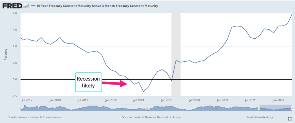
The stock market gets all the headlines each day but it is small in size relative to the bond market where the world’s lifeblood of debt and credit is traded. Over time the differences in interest rates between various debt products indicate trends in investor sentiment. These differences are called spreads. A common spread is a “term spread” between a long-term Treasury bond – say ten years – and a short-term Treasury of three months (FRED, 2022b). Short-term interest rates are usually lower than long-term rates because there is less that can go wrong in the short-term. When that relationship is turned upside down, it indicates a recession is likely in the near-term like a year or so. Why? Financial institutions are now expecting the opposite – that there is more that can go wrong in the short term than in the long term. They will be less likely to extend credit for new investments, business or residential.

For the past forty years, this spread has been a reliable predictor of recessions and it does not confirm the market’s recent concern about a recession. There are a few shortcomings with this indicator. With a wide range of several percent over five years, it has a lot of data “noise” that might obscure an understanding of the stresses building in the bond market and economy. Secondly, Treasury bonds are a small part of the bond market and carry no risk of default. We would like a risk spread between the rates on corporate bonds and those on Treasury bonds. Thirdly, the Federal Reserve has much less influence over corporate bond rates than it does on Treasury bond rates. Comparing corporates and Treasuries would give us a better sense of the broader market sentiment.

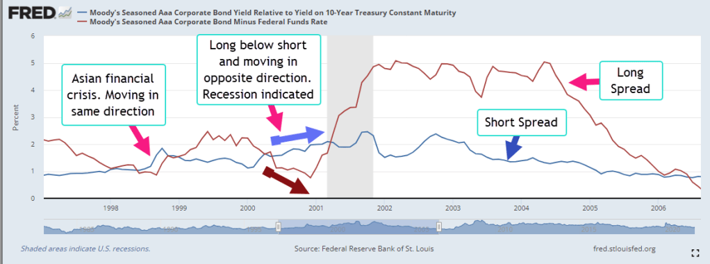
Moody’s Investors Service, a large financial rating company, computes the yield, or annualized interest rate, of an index of highly rated corporate bonds in good standing with a term longer than one year. The yield spread between corporate and long-term Treasury bonds usually lie in a range or channel of 1-1.5%. Like the lane markings on a highway, channels help us navigate data. The upper bound of 1.5% indicates a stress point. Let’s call that the long spread (FRED 2022c).

The Fed Funds rate is an average of rates that banks charge each other for overnight loans and the Federal Reserve tightly manages the range of this rate. For most of the past decade it has been below 1% and has often been close to zero. Let’s call the difference between the yield on corporate debt and the overnight rate the short spread (FRED, 2022d). Most of the time, the short spread is larger than the long spread. Just as with our first indicator of term spread, this relationship flips in the near term preceding a recession. Importantly, they continue to move in opposite directions for a while. The short spread keeps getting smaller while the long spread goes higher. In the graph below is the short recession after the dot-com bust.

In the right side of the graph the pattern will telegraph the coming recession in 2008. The graph below highlights the years after the financial crisis. The short term spread remained elevated above 1.5%, an indication of the persistent stress in the bond market. During Obama’s two terms in office, the short spread fell only once into the “everything is OK” range. Helped by the prospect of tax cuts in 2017, the spread declined to a lasting lull.

In the last half of 2019, the conjunction of these two time-risk spreads indicated a coming recession. The term spread we saw in the first graph also indicated a recession. They suggest that a 2020 recession was likely even if there was no pandemic. The Fed had been raising rates through mid-2019 to curb inflationary trends, then eased back a bit in the final months of that year. Were they seeing signs of economic stress as well?

How would the 2020 Presidential campaign have evolved if there had been no pandemic but a short recession lasting six to nine months? The Republican tax cuts enacted at the end of 2017 would have been shown to be a bust, doing little more than transferring wealth to the already wealthy. Mr. Trump would have certainly blamed the recession on Jerome Powell, the Chairman of the Fed, whom he had appointed. Powell would have been characterized as a Democratic stooge, part of an underground political plot to get Donald Trump out of the White House. The stories of what could have happened are entertainment for a summer’s campfire.

//////////////

Photo by Nadine Shaabana on Unsplash

FRED. 2022a. Federal Reserve Bank of St. Louis, Advance Real Retail and Food Services Sales [RRSFS], retrieved from FRED, Federal Reserve Bank of St. Louis; https://fred.stlouisfed.org/series/RRSFS, May 18, 2022.

FRED. 2022b. Federal Reserve Bank of St. Louis, 10-Year Treasury Constant Maturity Minus 3-Month Treasury Constant Maturity [T10Y3M], retrieved from FRED, Federal Reserve Bank of St. Louis; https://fred.stlouisfed.org/series/T10Y3M, May 19, 2022.

FRED. 2022c. Federal Reserve Bank of St. Louis, Moody’s Seasoned Aaa Corporate Bond Yield Relative to Yield on 10-Year Treasury Constant Maturity [AAA10Y], retrieved from FRED, Federal Reserve Bank of St. Louis; https://fred.stlouisfed.org/series/AAA10Y, May 19, 2022. The “long” spread.

FRED. 2022d. Federal Reserve Bank of St. Louis, Moody’s Seasoned Aaa Corporate Bond Minus Federal Funds Rate [AAAFF], retrieved from FRED, Federal Reserve Bank of St. Louis; https://fred.stlouisfed.org/series/AAAFF, May 19, 2022. The “short” spread.

The Wrong Medicine

August 23, 2020

by Steve Stofka

During this pandemic, the Federal Reserve has been supportive of the asset markets and the government’s stimulus and relief programs. It’s immediate response was to lower interest rates, a boon for home buyers. This week we learned that home sales had rebounded 25% in July and are up 7% over last year at this time. Low interest rates have benefited homebuyers but penalized savers and pension funds who must generate a current income flow from their savings base.

During the 1930s Depression, the economist John Maynard Keynes argued that, because people want to hoard during a downturn, a central bank should maintain an interest level sufficient to induce people to deposit their money in banks (Keynes, 1936). Government-insured savings accounts helped solve that confidence problem. Keynes’ language and sentence construction are laborious, leading some people to think that Keynes argued for a policy of ultra-low rates during economic declines. He did not. Low interest rates are not a Keynesian solution.

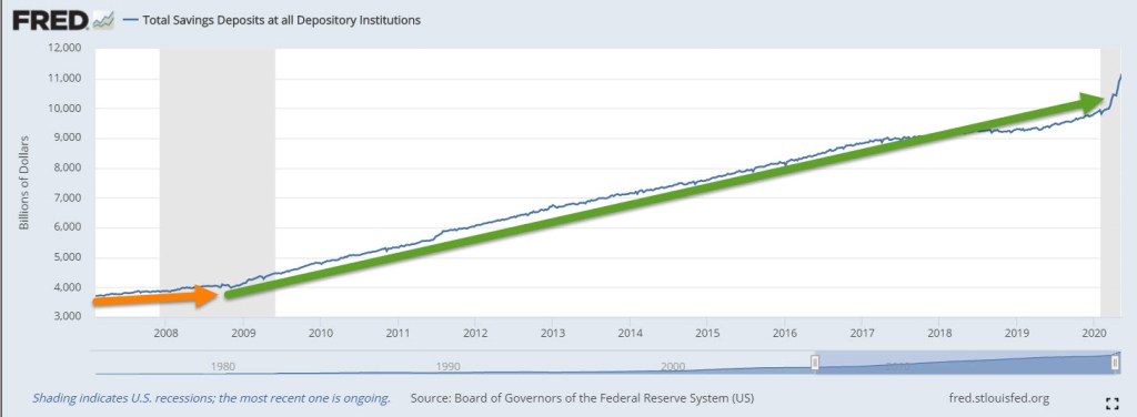
Despite the low rates, the amount of savings has doubled since the financial crisis in September 2008. There is a distinctive change in savings behavior at that important point.

With a savings base of $11 trillion, every 1% decrease in interest rates is a transfer of income of $110 billion from savers to borrowers. Who is the largest borrower? The government. Aren’t low interest rates good for businesses? No, Keynes argued rather unartfully in Chapter 15. Borrowing is a long-term decision, and subject to error. When interest rates are particularly low, like 2%, there is no wiggle room for error in the expectations of businesses who might borrow. For homebuyers, expectations of future business conditions are a small factor.

During an economic decline, people and businesses are guided more by short-term decisions. When interest rates are low like today, banks don’t want to lend because they aren’t confident in the flow of deposits to maintain their liquidity. Banks need that flow of deposits to meet the outflow of money when they make loans (Coppola, 2017). Entrepreneurs are reluctant to borrow for expansion because they are not confident in the accuracy of their long-term expectations. They borrow to pay back more predictable future obligations, particularly current and future stock grants to their key employees. Borrowing money to fund stock grants does not create jobs but helps inflate stock prices.

Keynes badly underestimated the political forces that guide a central bank’s decision making. As it did a decade ago, the Federal Reserve has lowered interest rates to near-zero, the opposite of Keynes’ prescription. Low interest rates do not benefit bank stocks, which have declined by 25% and more. A select group of technology stocks are booming as people consume more digital services at work and play. Borrowing by businesses jumped in response to the CARES act but many businesses kept those borrowed funds liquid to avoid insolvency during this crisis. We can expect slow growth as consumers and businesses continue to make short-term decisions, and asset markets are warped by central bank policy.

//////////////

Notes:

Photo by Christina Victoria Craft on Unsplash

Coppola, F. (2017, November 01). Bank Capital And Liquidity: Sorting Out The Muddle. Forbes Magazine. Retrieved August 15, 2020, from https://www.forbes.com/sites/francescoppola/2017/10/31/bank-capital-and-liquidity-sorting-out-the-muddle/

Keynes, J. M. (1936). The general theory of employment interest and money (p. 124). New York, NY: Harcourt, Brace & World.

What Hides Below

November 3, 2019

by Steve Stofka

Think the days of packaging subprime loans together is gone? Nope. They are called asset-backed securities, or ABS. The 60-day delinquency rate on subprime loans is now higher than it was during the financial crisis (Richter, 2019). The dollar amount of 90-day delinquencies has grown more than 60% above the high delinquencies during the financial crisis. Recently Santander U.S.A. was called out for the poor underwriting practices of its subprime loans. In this case, Santander must buy back loans that go into early default because of fraud and poor standards.

Credit card delinquencies issued by small banks have more than doubled since Mr. Trump took office (Boston, Rembert, 2019). Did a more relaxed regulatory environment encourage these banks to take on more risk to boost profits?

In the last century, geologists have developed new measuring and analytical tools to better understand the structure of the Earth. GPS technology can now detect movements of the earth’s crust as little as ¼” (USGS, n.d.). The same can’t be said for human foolishness. During the past half-century, financial analysts and academics have developed an amazing array of statistical and analytical tools to understand and measure risk. Despite that sophistication, the Federal Reserve has mismanaged interest rate policy (Hartcher, 2006). Government regulators have misunderstood risks in the banking and securities markets.

Earthquake threats happen deep underground. I suspect that the same is true about financial risks. To gain a competitive advantage, companies try to hide their strategies and the details of their financial products. On the last pages of quarterly and annual reports, we find a lot of mysterious details in the notes. After the Arthur Anderson accounting scandal in 2002, the Sarbanes-Oxley Act was passed to bring greater transparency and accountability to financial reporting. Six years later, the financial crisis demonstrated that there was a lot of risk still hiding in dark corners.

The financial crisis exposed a lot of malfeasance and foolishness. Some folks think that investors are now more alert. After the crisis, corporate board members and regulators are more active and aware of risk exposures. Are those risks behind us? I doubt it. Believing in the power of their risk models, underwriters, bankers and traders become victims of their own overconfidence (Lewis, 2015).

Each decade California experiences a quake that is more than 6.0 on the Richter scale. Following the quake come the warnings that California will split away from the North American continent. Still waiting. The recession was due to arrive eight years ago. We did experience a mini-recession in 2015-16, but it wasn’t labeled a recession. The slowdown wasn’t slow enough and long enough. Eventually we will have a recession, and all those people who predicted a recession in 2011 and subsequent years will claim they were right. In many areas of life, being right is all about timing. Few of us are that kind of right.

The data demonstrates the difficulty of financial fortune telling. The Callan Periodic Table of Investment Returns shows the returns and rank of ten asset classes over the past two decades (Callan, 2019). An asset class that does well one year doesn’t fare as well the following year. An investor who can read the past doesn’t need to read the future. Does an investor need to diversify among all ten asset classes?  Many investors can achieve some reasonable balance between risk and reward with four to six index funds and leave their ouija boards in the closet.

///////////////////////

Notes:

Boston, C. and Rembert, E. (2019, October 28). Consumer Cracks Emerge as Banks Say Everything Looks Fine. Bloomberg. [Web page]. Retrieved from https://www.bloomberg.com/news/articles/2019-10-28/consumer-cracks-emerge-as-banks-say-everything-looks-fine

Callan. (2019). Periodic Table of Investment Returns. [Web page]. Retrieved from https://www.callan.com/periodic-table/

Hartcher, P. (2006). Bubble man: Alan Greenspan & the missing 7 trillion dollars. New York: W.W. Norton & Co.

Lewis, M. (2015). The Big Short. New York: Penguin Books.

Richter, W. (2019, October 25, 2019). Subprime auto loans blow up. [Web page]. Retrieved from https://wolfstreet.com/2019/10/25/subprime-auto-loans-blow-up-60-day-delinquencies-shoot-past-financial-crisis-peak

Szeglat, M. (n.d.) Photo of lava flow at Kalapana, HI, U.S. [Photo]. Retrieved from https://unsplash.com/photos/NysO5Rdn7Mc

USGS. (n.d.). About GPS. [Web page]. Retrieved from https://earthquake.usgs.gov/monitoring/gps/about.php

The Association – A Split

August 25, 2019

by Steve Stofka

A few things before I continue the saga of our mountain community. Bond yields have sunk to remarkable lows as the prices of those bonds climb higher in response to global demand for safe assets. Governments have borrowed trillions since the financial crisis, yet there is not enough debt to meet demand.

The private market created a huge supply of “safe” assets called Collateralized Debt Obligations, or CDOs, based on house mortgages. When the housing market imploded, it left a big hole in the market for safe assets. As countries around the world have adopted capitalistic market structures, the living standards of millions of people have improved and that has led to more savings in search of safe investments.

The U.S. still pays a positive interest rate on its debt and that is attracting a lot of foreign capital to our country – capital that is driving down the interest rates on our savings and pension assets. Unlike some other countries, capital moves freely across U.S. borders. It doesn’t wait in crowded spaces behind chain link fences.

Donald Trump’s family business relies heavily on borrowing, and most of that has come from a single source, the German firm Deutsche Bank. No other bank is willing to risk capital on a family business with a history of failure. The family’s business depends on the free movement of capital across national borders, yet Trump himself is adamantly opposed to the free movement of labor across borders.

Capital requires a legal framework of property rights protection, a robust banking system capable of servicing that capital, and a political system that protects the profits generated by investment from graft and corruption. Labor requires a social framework in addition to a legal system that enforces basic personal rights. Capital comes to this country because we spend a lot of money to nurture and protect it more than some other countries. Labor comes to this country for the same reasons – a higher return on their effort, an educational system that nurtures their families, a social and legal system that offers some protections.

“They’re taking our jobs!” some people complain of immigrant labor, yet few Americans are affected by an immigrant labor force that takes mostly lower paying jobs. The flow of capital into our country creates a competition that affects many more Americans – anyone who has a savings account, a pension fund, a 401K, an IRA. Where is the outcry against foreign capital?

Let us return to those dear souls who inhabited an abandoned mining town. In last week’s story, they had formed a homeowner’s association which created Money, Debt, and traded with another community called the Forners.

The board of the homeowners’ association complained often about the expense of handling the Money that it had created. The association decided that it would be more efficient to reduce the use of paper Money. It gave each homeowner a bank account and a Money shredder which scanned and tabulated the Money that each homeowner shredded. Homeowners didn’t have to go to the community center when they needed to pay another homeowner or the association. When they did receive Money, they deposited it in the shredder, which added the amount to their balance. When they wanted to pay someone, they tapped some buttons on their shredder and the amount went from their account to the other homeowner’s account. Paying their monthly homeowner fees was so much more convenient.

A homeowner called Mary decided to re-open the old restaurant, but she would need more Money than she had. What to do? The association could print the Money and loan it to her. Mary would put up 10% of what she needs, and the association would print the other 90%.  She would pay the money back over time with interest. One of the homeowners asked, “How will we be paid if we do work for Mary’s restaurant?” Someone answered, “With the same Money that you get paid when you work for the association.”

That was acceptable to everyone. With the extra Money earned by fixing up Mary’s restaurant, several other homeowners put down deposits and opened businesses with loans from the association (Note #1). The association held a mortgage on each business, but the business owner decided how to run the business and received the profits from the business.

When Stan’s business failed, the homeowners discussed what to do. Stan had spent the printed Money that the association had loaned him, so the Money had not disappeared. Like all the printed money, it was spread around the community. The effect of Stan’s business failure was the same as if the association had started the business, hired people to do work, paid them and then closed the business after a time. The printed Money went out into the community but never made it back to the association in the form of loan payments. Someone said, “There is extra Money in our community because Stan’s business loan won’t be paid back.”

They agreed that this was so but what to do about it? They all had some extra Money because of Stan’s business loan. “What if more businesses fail?” someone asked. “What will we do with all the extra money the association has printed?”

“Prices will go up,” someone else said. “That’s what happened last time.”

“If more businesses failed, I would be more careful and buy less stuff,” another offered. Several heads nodded. “I’d deposit some extra Money in the shredder.”

“Well, that doesn’t make the Money go away,” someone argued. “The money is still in your bank account with the association.”

“But prices won’t go up because people are spending less Money, isn’t that right?” someone asked. That was the confusing part. The last time there was extra Money, prices went up. But in this case, prices were likely to go down if more businesses failed and there was extra Money.

Someone stood up and said, “I’ve got the answer. When we all worked fixing up Stan’s business, the Money was exchanged for our labor and supplies. Since the Money was exchanged for goods and services, there is no extra Money.”

Someone else countered, “What if we all started businesses, borrowed Money from the association and we all failed? There would be a lot of extra Money.”

The other person answered, “Yes, the amount of circulating Money would be suitable for a thriving community. Too many people with a lot of Money and nowhere to spend it would drive up prices. But just one or two business failures has such a small effect that it is negligible.”

They decided to continue printing and loaning money but formed a loan committee whose job was to review an applicant’s business plan before loaning the money.

Bob, the community’s propane dealer, bought his supplies from the Forners. One month, the Forners got very angry at the whole community and would not sell propane to Bob. He contracted with another community for propane but there wasn’t enough for everyone’s needs. Bob raised the price of propane then began rationing propane by selling only to those who were in line at his station at 6 A.M. After two hours, he shut off supplies until the next day. Some homeowners threatened Bob and so he had to hire a few people for extra security (Note #2).

Mary used a lot of propane for cooking, so she had to spend several hours each day buying propane. Naturally, she raised prices to account for the additional time and higher price of propane. Homeowners ate fewer meals at Mary’s and she had to let go of several employees.

As prices rose, some homeowners who had bought association debt at low interest rates began to complain. “We loaned the association money at 5% interest and prices are going up at 10% a year. We’re losing money!”

Everyone agreed that this wasn’t fair, but no one knew what to do about it. Should they cancel the old debt and reissue debt at higher interest rates? That would lead to higher homeowner fees for everyone. “You want us to pay extra so that your interest income will keep up with inflation? Why should I take money out of my pocket and put it in yours?”

Tempers flared. “I’m not loaning this association money ever again,” complained one homeowner and several stormed out of the clubhouse. True to their word, these homeowners would not renew their loans to the association unless it paid much higher interest rates. After several months, the Forners resumed propane deliveries but a vicious cycle of higher prices had started. Homeowners had to pay higher association fees and wanted more money for their labor to pay those higher fees. No one knew how to fix the situation.

“We need to charge high interest rates on the Money we print and loan to homeowners for their businesses and homes,” a board member said.

“Are you crazy?!” Several complained. “Rates are already too high. People can’t afford to start businesses or buy a home!”

“We need to raise them so high that it will hobble the economy for a while,” the board member said. “That’s the only way to bring prices down. It won’t take long.”

It took much longer than anyone anticipated, and the economy declined for almost two years. This period of higher prices followed by high interest rates caused a divide among the homeowners – between those who relied on the association for services and help during hard times, and those who formed a deep distrust of the association (Note #3). No one fully understood how deep the divide would grow.

/////////////////////

Notes:

  1. The process where loans generate income for others which generates more loans is called the Money Multiplier in economics.
  2. In the 1970s, two gas embargoes led to similar circumstances.

This is a retelling of the high inflation of the late 1970s, followed by nose-bleed interest rates that caused back-to-back recessions in the early 1980s. The recession of 1981-82 was the most severe since the 1930s Depression.