Producer and Consumer Prices

February 4, 2024

by Stephen Stofka

This week’s letter is about the inflationary spurt that began a little over two years ago. The causes of the inflation have been a controversial topic among economists and political commentators. Some blame Biden and the Democrats for enacting a third round of stimulus shortly after he took office. That’s fiscal policy on the hot seat. Some target monetary policy, blaming the Fed for leaving interest rates at a pandemic low near 0%. In this letter, I will focus on a price signal that the Fed could have treated with more importance. A combination of the two is more credible. Republicans hope to make inflation and the immigration crisis at the southern border central issues in this year’s election campaign.

I’ll begin with two measures of changes in consumer prices. The Consumer Price Index, or CPI, is a headline gauge of inflation that reflects current price changes. Because Fed policy must anticipate price changes, it uses a  a less volatile index called the PCEPI, or Personal Consumption Expenditures Price Index. I’ll call it PCE. The CPI is based on a static basket of goods that the average family might buy each month. Households adapt to changing prices where they can but the CPI methodology does not measure that. Nor does it measure costs paid by someone other than the members of a household. To address those weaknesses, the PCE measures the actual spending choices that households make. The PCE includes expenses like health care benefits that an employer provides. The Cleveland branch of the Federal Reserve has a deeper dive on the differences between the two measures.

The oldest price index, first charted in 1902, is based on a measure of prices that producers and wholesalers receive at both the intermediate and final stages of production. In the final demand phase, a product is going to be sold to a consumer. In the intermediate stage a producer sells a product to another producer as a component in their product. Each month the BLS surveys thousands of companies to compile the wholesale prices on most of the goods sold in the U.S. and 70% of traded services. The agency then builds hundreds of indexes to measure the changes in those prices. The Producer Price Index, or PPI, is a headline composite of those indexes. As you can see in the graph below, the PPI is more volatile than the PCE measure of consumer price inflation. Government subsidies can increase the prices that suppliers receive with little impact on consumer prices. The PPI is more responsive to changes in transportation and distribution costs.
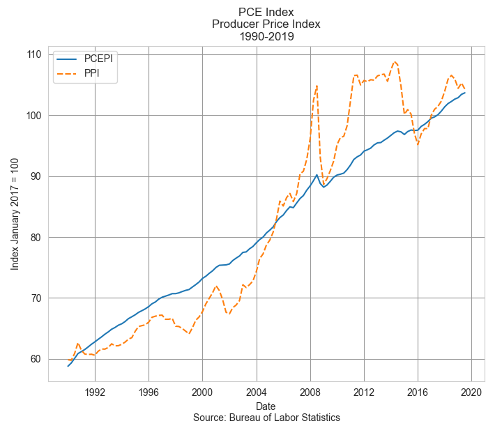
Despite its volatility, the PPI is regarded by the Fed, Congress and the administration as an advance indication of movements in consumer prices, according to the BLS. It indicates producers’ forecast of consumer demand and reflects economic stress and global supply pressures. However, wholesales prices may not be a reliable forecast tool of consumer inflation if the economy is weak and households cut back on their spending where they can. In the recovery years following the financial crisis in 2008, real GDP did not rise above 3% until the end of 2014. Unemployment finally dipped below 5% in the spring of 2016.

In 2021, the PPI indicated a developing surge in wholesale prices that would become apparent in consumer prices by the following year. But the economy still had not fully opened and unemployment did not fall below 5% until the fall of 2021. Would the pandemic recovery follow the sluggish trend of the recovery after the financial crisis? The Fed waited, preferring to keep interest rates low to support the labor market. In the graph below I’ve charted both the PCE and PPI over the past eight years. I’ve marked out the beginning of Biden’s term in the first quarter of 2021 and the Fed’s tightening that began in the spring of 2022.

The PPI (dotted orange line) had already reversed higher before Biden took office. As we can see in the chart above, the Fed did not enact stricter monetary policy until the PPI had peaked. In hindsight, the Fed was late to respond to surge in prices but Congress has given the Fed a dual mandate to maintain stable prices and full employment. During times of economic stress, those two objectives can indicate contradictory policies. During the initial months of the pandemic in 2020, five million people left the work force. In early 2020, the participation rate for the prime work force aged 25-54 stood at 83%. By the fourth quarter of 2021, the rate was still only 82%. 1.5 million workers had still not returned to the labor force. During a severe crisis like the pandemic, the Fed has trouble balancing those two objectives of stable prices and full employment. If they raised rates too soon, they could have damaged a recovery in the labor market.

While the general price level has come down in the past year, the inflation beast is not dead. There is still a residual inflation energy in some intermediate goods. Had the pre-pandemic price trends continued for the past four years, we might expect prices to be 8 to 10% higher than they were at the start of 2020. The prices of a number of goods have stabilized at levels far above their pre-pandemic levels. Meats are 32% higher after four years. Natural gas prices (WPU0551) have declined from the highs of last winter but are 38% higher than pre-pandemic prices. Residential electric power (WPU0541) and gasoline (WPU0571) are up 25% in four years. LPG gas is up 28% in that period. The prices of paper boxes (WPU095103) are up the same amount. Paper (WPU0913) is up 25%. The prices of bakery goods (WPU0211) are up 22% and still rising.

Despite promises made during the upcoming presidential campaign, the general price level is not going to return to its pre-pandemic level no matter who is president. The pandemic shook up the global economy, raised the general price level and there is no going back. A U.S. president may have their finger on the button of an arsenal of destruction but they have little influence on the producer prices of goods sold around the world. A hindsight analysis can identify policy winners and losers made by both the Trump and Biden administrations. The Fed and other central banks waited too long to respond to a worldwide inflation. Finally, the lessons learned from this pandemic will not all be applicable to the next global crisis.    

////////////////

Photo by Ian Taylor on Unsplash

Keywords: PCE, PPI, wholesale prices, consumer prices, inflation

Note: In April 2022 the Fed began raising its key interest rate by .25% or more each month.  

Inflation Measures

“Everyone is entitled to his own opinion but not to his own facts.” – Sen. Daniel Patrick Moynihan

September 30, 2018

by Steve Stofka

The above quote has been attributed to the former Senate Majority Leader. People repeat the quote when discussing a contentious subject. We are often convinced that we have the facts when our facts may indeed be arbitrary. Let’s take the case of real or inflation-adjusted income. Has the average real wage declined or risen in the past decades? The calculation depends on which measure of inflation we choose.

There are two measures of inflation, the Consumer Price Index (CPI) and the Personal Consumption Expenditure Price Index (PCE). The CPI relies on surveys of what consumers buy. The PCE is based on surveys of what businesses sell (Note #1). The CPI uses a fixed basket of goods, regardless of changes in the prices of items in a basket. If the weekly basket of goods includes two pounds of ground beef, that two pounds never changes in response to lower prices. It is static. The PCE does adjust for price changes. If the price of a pound of ground beef went down thirty cents, the PCE calculates that a family bought a bit more ground beef and a little bit less chicken, for example. It is a dynamic measure.

People drive fewer miles and buy more fuel-efficient cars as the price of gas increases BUT only after a certain dollar amount. Our purchasing patterns are both static and dynamic. Because we are creatures of habit, our buying patterns are resistant to change. Within a certain price range, we will continue to buy the same items. Outside of that range, we do make changes because we want to optimize our choices.

In the past forty years the CPI has calculated an annual rate of inflation that is over ½% higher than the PCE rate. That small difference compounded over forty years amounts to 23%. That large difference tells two very different stories. Using the CPI, the average worker has lost a few percent in inflation adjusted hourly wages. Using the PCE, on the other hand, the average worker has enjoyed real gains of 20% in the past forty years (Note #2).

Our most volatile disagreements are in areas where facts are difficult to observe. The household survey data that underlies the CPI is unreliable because people living busy lives are not accurate journal keepers of their daily purchases. On the other hand, surveys based on business sales are inaccurate because people stock up on items whose prices decline.

Even when facts are readily verifiable, the interpretation of those facts varies with context. In arriving at our version of the meaning of those facts and their context, we subtract a lot of observable data.  We must filter reality because we cannot manage such a large amount of information. Because we filter our perceptions, eyewitness testimony is unreliable. Although our perceptions are inaccurate, we must act on those perceptions and hope that they are accurate enough. That same reasoning guides economists, politicians, and those in the social and physical sciences. We would all have more constructive discussions if we understood the imperfection of our perceptions.

//////////////

Notes:

1. The Difference between CPI and PCE {Federal Reserve}

2. Using the average hourly wage for production and non-supervisory employees.

The Phillips Curve

September 27, 2015

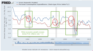
Worries about economic growth in China, in the EuroZone and in emerging markets have prompted fears of a recession in the U.S.  It could happen – it will happen – at some point in the future but not in the near future.  The Fed likes to use a Personal Consumption chain weighted inflation index called the PCE Price Index which more reliably captures underlying inflation trends.  Preceding each recession we see the rate of economic growth fall below the annual growth rate of the PCE index, multiplied by a 1.5 factor.  While GDP growth is not robust, it is far above the growth of the PCE price level.

Speaking of growth, inflation-adjusted GDP growth for the second quarter was revised upwards to a 3.9% annual rate.  Consumer spending was revised higher and inventory growth – a bit worrisome, as I noted earlier – was revised lower.

The SP500 index began the year at a price level ($2068) that was just a bit above the inflation adjusted price level ($2018) of 2000 (Graph here).  Oops! we’re back below that year 2000 level. A sense of pessimism since mid-August has led to an 8% decline in the broad stock index, or 6% below the price level at the beginning of 2015.  A broad composite of bonds, Vanguard’s BND ETF, is also down -about 1.5% – since early 2015.

Some sectors of the market can not find a bottom.  XME, a blend of mining stocks, is down 45% for the year.  Brazil’s index, EWZ, is down a similar amount – about 40%.  Emerging Market stocks (VWO) in general have lost about 17% this year, and are at June 2009 prices.  After losing 5% of their value in the first week of September, they appeared to have found a bottom, regaining that lost 5% in the next two weeks.  This past week they gave up those gains, touching the bottom again.  The second time is a charm.  If this market draws in buyers a second time, this might be a good time to put some long term money to work.

*******************************

Phillips – the curve, not the screwdriver

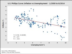
In a speech/lecture at U. of Massachusetts this week, Federal Reserve Chair Janet Yellen voiced her desire to raise interest rates sometime this year.  She included in her remarks some comments on the Phillips curve, a mainstay of economics textbooks during the past 50 years.  In the 1950s Bill Phillips presented one hundred years of unemployment and inflation data in the United Kingdom and showed that there was a trade-off between unemployment and inflation.  Higher inflation = lower unemployment.  Lower inflation = higher unemployment.  When the number of unemployed workers are low, workers can press employers for higher wages.  Higher wages lead to a higher inflation rate.

As you can see in the graph above (included in the Wikipedia article on the Phillips curve), the regression estimate, the red line, shows a tenuous inverse relationship between unemployment and inflation.  The standard error S of the regression estimate is a guide to the reliability of the estimate to predict future relationships in the data. The S in this regression is not shown but looks to be rather large; a lot of the data points are pretty far away from the red estimate line and so the regression model is unreliable.

Within fifteen years after the Phillips curve became an accepted tenet of economics, the stagflation of the 1970s disproved the central thesis of the Phillips curve.  During that decade, there was both high inflation and high unemployment.  This led economists to revise their thinking; the relationship described by the Phillips curve may have some validity in the short run but not in the long run.

For those of you who might like to go down the rabbit hole on this issue, there are several fascinating but challenging perspectives on the relationship between unemployment, the labor market, and inflation, the price level of goods in an economy.  One is Jason Smith’s Information Transfer model version of the Phillips curve.  Jason is a physicist by education and training who uses the tools of information theory to bring fresh insights to economic data, trends and models.

Roger Farmer (whose blog I link to in my blog links on the right hand side) has developed another perspective based on a sometimes overlooked insight in Keynes’ General Theory published in 1936. Roger is the Department Chair at UCLA’s Dept of Economics.  For the general reader, I heartily recommend his book “How the Economy Works”, a small book which presents his ideas in clear, simple terms. His history of the development of central economic theories weaves a concise narrative of ideas and people that may be the best I have read.

For those of you with the background and math chops, his paper “Expectations, Employment and Prices” (also a book) contains a well-developed mathematical model of longer term economical and business cycles that find an equilibrium at various levels of unemployment. Roger undermines an idea predominant in economics and monetary policy: the so called natural rate of unemployment, or NAIRU, that guides policy decisions at the Fed and is often mentioned by Yellen and others at the Fed.