Employment Curves

January 15, 2023

by Stephen Stofka

For millennia people have claimed a power of divination by various methods, including the casting of bird bones on the ground, the magic of numbers or certain word incantations. As the New Year begins, there is no shortage of predictions for 2023. Will the Fed taper its rate increases now that inflation has moderated? Will the U.S. go into a recession? Will falling home prices invite a financial crisis like the one in 2007-9? Will bond prices recover this year? Other animals see only a few moments into the future. We have developed forecasting tools that try to time-travel weeks and months into the future, but we should not judge a tool’s accuracy by its sophistication.

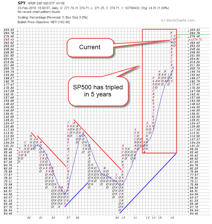
Statistics is a series of methods that constructs a formula explaining a relationship between variables. Each data point requires a calculation, a tedious task for human beings but a quick operation by a computer. Before the introduction of the computer in the mid-20th century, investors used simpler tools like the comparison of two moving averages of a time series like stock prices. These simple tools are still in use today. An example is the MACD(12,26) trend that compares the 12-day and 26-day moving averages, noting those points where the short 12-day average crosses the long 26-day average (Stockcharts.com, 2023). We can apply a similar technique to the unemployment rate.

In the chart below I have graphed the 3-month and 3-year moving averages of the headline U-3 unemployment rate. The left side of each column faintly marked in gray marks the beginning of a recession has noted by the NBER (2023). These beginnings roughly coincide with the crossing of the 3-month (orange) above the 3-year (blue) average. With the exception of the 1990 recession, the end of the recessions is near the peak of the 3-month orange line, after which unemployment declines. Today’s 3-month average is well below the 3-year trend, making a recession less likely. However, except for the pandemic surge of unemployment, the 3-month average is quite low and has been below the 3-year average for the longest period in history.

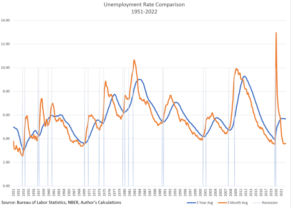
I did not do any laborious trial and error of various averages to find a fit. I chose these periods because they fit my story, something I wrote about last week. A 3-year average should provide a stable long term trend line of unemployment. A 3-month average should reflect current conditions with some of the data noise removed. The crossing should capture an inflection point in the data.

The low unemployment rate implies that workers have more wage bargaining power but wage increases have lagged inflation, robbing workers of purchasing power. If inflation continues to decline in 2023, some economists predict that wage increases may finally “catch up” and surpass the inflation rate.

There are two trends that have weakened the wage bargaining power of workers. Since World War 2, an economy dominated by manufacturing has transitioned to a service economy with lower average wages. In that time, the percent of workers employed in agriculture fell from 14% to less than 2% as production and harvesting became more mechanized. The labor market has undergone structural changes that may invalidate or weaken the lessons of earlier decades.

Since WW2, self-employment has declined. Half of those employed now work for large companies with 500 or more employees (Poschke 2019, 2). Few are unionized and able to bargain collectively for wages. According to the Trade Union Dataset (2023), most European countries enjoy much higher trade union participation than in the U.S. where only 10% of workers belong to a union. Large American companies enjoy a wage-setting power that smaller companies do not have and this enables them to resist wage demands. American workers do not have enough wage bargaining power to make a significant contribution to rising prices. Stock owners, able to move money at the stroke of a computer key, hold more bargaining power.

To keep their stock prices competitive, publicly traded companies must maintain a profit margin appropriate to their industry. Investors will punish those companies who do not meet consensus expectations. Company executives rarely take responsibility for falling profit margins. Instead, they blame rising wages or material costs, shifting consumer tastes or government regulations. Interest groups like the U.S. Chamber of Commerce, a private lobbying organization funded by the largest companies in America, champion a narrative that inflation is the result of rising wages, not rising profit margins. Like any interest group, their job is to assign responsibility for a problem to someone else, to convince lawmakers to act favorably to their cause or industry. The Chamber has far better funding than advocates for labor and it uses those funds to block policies that might favor workers.

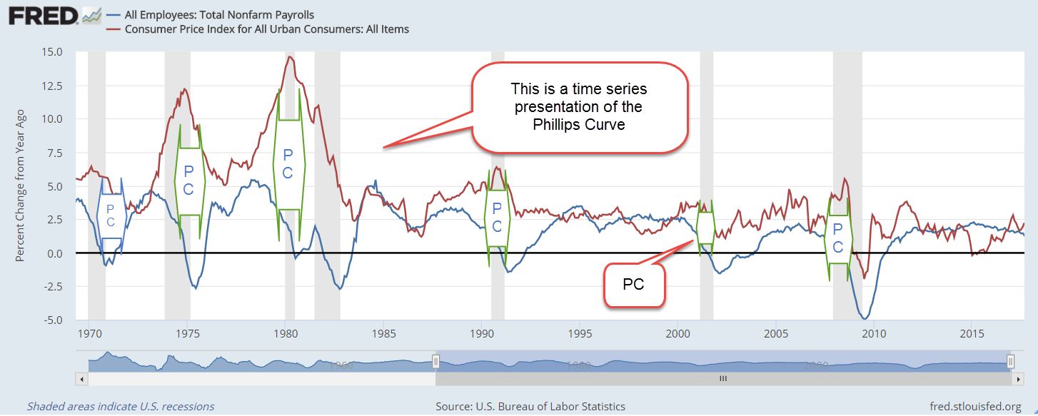
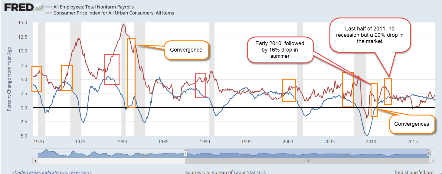
There are economists and policymakers who still believe in the Phillips Curve, a hypothetical inverse relationship between unemployment and inflation. High unemployment should coincide with low inflation and high inflation with low unemployment. Shortly after Bill Phillips published his data and hypothetical curve, Guy Routh (1959), a British economist, published a critique in the same journal Economica, pointing out the flaws in Phillips’ methodology. The chief flaw was Phillips’ lack of knowledge about the labor market itself. Despite that, American economists like Paul Samuelson, who favored an activist fiscal policy, liked the implications of a Phillips Curve. Policy makers could fine tune an economy the way a car mechanic tuned a carburetor.

In the past year, some economists and policymakers have advocated policies to drive unemployment higher and wring inflation out of the economy. Despite rising interest rates, the labor market has been strong and resilient. In January 2020, Kristie Engemann (2020), a coordinator at the St. Louis Fed, explored the debate about whether this relationship exists or not. For the past five decades, the “curve” has been flat, a statistical indication that there is no relationship between inflation and unemployment. Policymakers will continue to cite the Phillips Curve because it serves an ideological and political purpose.

We don’t need statistical software to debunk the Phillips curve. In the chart I posted earlier, there were several points where the 3-month average unemployment rate was near or below 4%. These were in the late 1960s, the late 1990s, and the late 2010s. The inflation rate was 3%, 2.5%, and 1.4% respectively. If the Phillips Curve relationship existed, inflation would have been much higher.

As our analytical tools become more sophisticated we risk being fooled by their power. With a few lines of code, researchers can turn the knobs of their statistical software machines until they reach a result that is publishable. We should be able to approximate if not confirm our hypothesis with simpler tools.  

///////////////////

Photo by Augustine Wong on Unsplash

Engemann, K. M. (2020, January 14). What is the Phillips curve (and why has it flattened)? Saint Louis Fed Eagle. Retrieved January 13, 2023, from https://www.stlouisfed.org/open-vault/2020/january/what-is-phillips-curve-why-flattened

National Bureau of Economic Research. (2022). Business cycle dating. NBER. Retrieved January 13, 2023, from https://www.nber.org/research/business-cycle-dating

Poschke, M. (2019). Wage employment, unemployment and self-employment across countries. SSRN Electronic Journal, (IZA No. 12367). https://doi.org/10.2139/ssrn.3401135

Routh, G. (1959). The relation between unemployment and the rate of change of money wage rates: A comment. Economica, 26(104), 299–315. https://doi.org/10.2307/2550867

Stockcharts.com. (2023). Spy – SPDR S&P 500 ETF. StockCharts.com. Retrieved January 13, 2023, from https://stockcharts.com/h-sc/ui?s=spy  Below the price chart is the MACD indicator pane.

Trade Union Dataset. OECD.Stat. (2023, January 13). Retrieved January 13, 2023, from https://stats.oecd.org/Index.aspx?DataSetCode=TUD

U.S. Bureau of Labor Statistics, Employment Level [CE16OV], retrieved from FRED, Federal Reserve Bank of St. Louis; https://fred.stlouisfed.org/series/CE16OV, January 11, 2023.

U.S. Bureau of Labor Statistics, Employment Level – Agriculture and Related Industries [LNS12034560], retrieved from FRED, Federal Reserve Bank of St. Louis; https://fred.stlouisfed.org/series/LNS12034560, January 11, 2023.

////////////////////

The Puff

February 25, 2018

by Steve Stofka

Each week I’m hunting scat, the data droppings that a society of human beings leaves behind. This week I’m looking for a ghost ship called the Phillips Curve, a relationship between employment an inflation that has had some influence on the Federal Reserve’s monetary policy. The ideas and policies of others, some long dead, have a daily impact on our lives. I’ll finish up with a disturbing chart that may be the result of that policy.

A word on the word “cause” before I continue. As school kids we learned a simplistic version of cause and effect. Gravity caused my ball to fall to the ground. As kids, we like simple. As adults, we long for simple. As we grow up, we learn that cause-effect is a very complex machine indeed. The complexity of cause-effect relationships in our lives are the chief source of our disagreements.

So, “cause” is nothing more than shorthand for “has an important influence on.” The dose-response mechanism is a key component of a causal model in biology. If A causes B, I should be able to give more of A, the dose, and get more of B, the response, or a more frequent response.

Let’s turn to the Phillips Curve, an idea that has influenced the Federal Reserve’s monetary policy since it was proposed sixty years ago by economist A.W. Phillips. Simply stated, the lower the unemployment rate, the higher the inflation rate. There is an inverse relationship between unemployment and inflation.

Inverse relationships are everywhere in our lives. Here’s one. The lower the air temperature, the more clothes I wear. I don’t say that air temperature is the only cause for how many clothes I wear. There is wind, humidity, sex, age and fitness, my activity level, social protocols, etc. While there is a complex mechanism at work, I can say that air temperature has an important effect on how many clothes I wear. If I measure the varying air temperatures throughout the year and weigh the amount of clothes that people have on, I will get a strong correlation. High temps, low clothes.

Now what if the temperature got colder and people still wore the same amount of clothes? I would need to come up with an explanation for this discrepancy. Perhaps there never was much of a relationship between air temperature and clothes? That seems unlikely. Perhaps clothes fabrics have been improved? I would need to look at all the other factors that I mentioned above. If I could find no difference, then I would have to conclude that air temperature had little to do with clothes wearing. Headlines would herald this new discovery. Important areas of our economy would be upended. Retail stores would stop stocking coats or bathing suits a few months in advance of the season. Businesses around the country who depend on warm weather clothing would go out of business.

Unlike air temperature and clothes, the relationship between inflation and employment is two-way. The change in one presumably has some influence on the other. During the 1970s, inflation and unemployment both rose. The hypothesis behind the Phillips curve posits that one should go up when the other goes down. Some economists threw the Phillips curve in the trashcan of ideas. Milton Friedman, an economist popular for his lectures and his work on monetary policy, proposed a concept we now call NAIRU. This is a “natural” level of unemployment. If unemployment goes below this level, then inflation rises.

Some economists complained that NAIRU was a statistical figment designed to fit the Phillips curve to existing data. Economic predictions based on the Phillips curve have been consistently wrong. Still, the Congress has mandated that the Federal Reserve maintain “maximum employment, stable prices, and moderate long-term interest rates” (Federal Reserve FAQs). Economists at the Fed must consider both employment and inflation when setting interest rates. The models may not accurately describe the relationship, but many will instinctively feel that the relationship, in some form or another, is valid.

For the past several years, the economy has been at or near maximum employment. In January 2018, the unemployment reading was 4.1%. Whenever that rate has been this low, the country has either been at war or within a year of being in recession. The puzzlement: only lately have there been signs of an awakening inflation.

Because inflation was below the Fed’s 2% benchmark while unemployment declined, the Fed kept its key interest rate near zero for seven years. For its 105 year history, the Fed has never kept interest rates this low for as long as it did. Low interest rates fuel asset bubbles. Such low rates cause people and institutions who depend on income to take inappropriate risks to earn more income. The financial industry develops and markets new products that hide risk and provide that extra measure of income. We can guess that these products are out in the marketplace, waiting to blow up the financial system if a set of circumstances occurs. What set of circumstances? We will only know that in the rear view mirror.

Here’s a chart that tracks price movement of the SP500 ETF SPY for the past twenty years. I’ve shown the tripling in price that has occurred during the past five years.  Notice the long stalk of rising prices. That growth has been nurtured by the Fed’s policy.  Well, maybe this time is different.  Maybe not.

SPYPF20180223

Phillips Curve

November 12, 2017

For the past 16 decades, there has been a least one recession per decade. Given that this bull market is eight years old without a recession, some investors may be concerned that their portfolio mix is a bit on the risky side. Here’s something that can help investors map the road ahead.

For several decades, the Federal Reserve has used the Phillips Curve to help guide monetary policy. The curve is an inverse relationship between inflation and unemployment. Picture a see saw. When unemployment is low, demand for labor and inflation are high. When unemployment is high, demand for labor and inflation are low (See wonky notes at end).

The monetary economist Milton Friedman said the relationship of the Phillips curve was weak, and economists continue to debate the validity of the curve. As we’ll see, the curve is valid until it’s not. The breakdown of the relationship between employment and inflation signals the onset of a recession.

Let’s compare the annual change in employment, the inverse of unemployment, and inflation. We should see these two series move in lockstep. As these series diverge, the onset of a recession draws near.

In a divergence, one series goes up while one series goes down.  The difference, or spread, between the two grows larger. Spread is a term usually associated with interest rates, so I’ll call this difference the GAP.

In the chart below, I have marked fully developed divergences with an arrow marked “PC”. Each is a recession. I’ll show both series first, so you can see the divergences develop. I’ll show a graph of the GAP at the end.

PhillipsCurveRecession

As you can see to the right of the graph, no divergences have formed since the financial crisis.

Shown in the chart below are the beginnings of divergences, marked with an orange square. I’ve also included a few convergences, when the series move toward each other. These usually precede a drop in the stock market but no recession.

PhillipsCurveDiverge

Here’s a graph of the difference, or GAP, between the two series in the last 11 years.

PhillipsGap

Fundamental economic indicators like this one can help an investor avoid longer term meltdowns. Can investors avoid all the bear markets? No. Financial, not economic, causes lay behind the sharp downturns of the 1987 October meltdown and 1998 Asian financial crisis.

What about the 2008 financial crisis? A year earlier, in October 2007, this indicator had already signaled trouble ahead based on the high and steadily growing GAP.

What about the dot com crash? In February 2001, several months after the market’s height, the growing GAP warned of a rocky road ahead. A recession began a month later. The downturn in the market would last another two years.

Readers who want to check on this indicator themselves can follow this link.

//////////////////

Wonky Stuff

In Econ101, students become familiar with a graph of this curve. Readers who want to dive deeper can see this article from Dr. Econ at the Federal Reserve. There is also a Khan Academy video .

The Phillips Curve

September 27, 2015

Worries about economic growth in China, in the EuroZone and in emerging markets have prompted fears of a recession in the U.S.  It could happen – it will happen – at some point in the future but not in the near future.  The Fed likes to use a Personal Consumption chain weighted inflation index called the PCE Price Index which more reliably captures underlying inflation trends.  Preceding each recession we see the rate of economic growth fall below the annual growth rate of the PCE index, multiplied by a 1.5 factor.  While GDP growth is not robust, it is far above the growth of the PCE price level.

Speaking of growth, inflation-adjusted GDP growth for the second quarter was revised upwards to a 3.9% annual rate.  Consumer spending was revised higher and inventory growth – a bit worrisome, as I noted earlier – was revised lower.

The SP500 index began the year at a price level ($2068) that was just a bit above the inflation adjusted price level ($2018) of 2000 (Graph here).  Oops! we’re back below that year 2000 level. A sense of pessimism since mid-August has led to an 8% decline in the broad stock index, or 6% below the price level at the beginning of 2015.  A broad composite of bonds, Vanguard’s BND ETF, is also down -about 1.5% – since early 2015.

Some sectors of the market can not find a bottom.  XME, a blend of mining stocks, is down 45% for the year.  Brazil’s index, EWZ, is down a similar amount – about 40%.  Emerging Market stocks (VWO) in general have lost about 17% this year, and are at June 2009 prices.  After losing 5% of their value in the first week of September, they appeared to have found a bottom, regaining that lost 5% in the next two weeks.  This past week they gave up those gains, touching the bottom again.  The second time is a charm.  If this market draws in buyers a second time, this might be a good time to put some long term money to work.

*******************************

Phillips – the curve, not the screwdriver

In a speech/lecture at U. of Massachusetts this week, Federal Reserve Chair Janet Yellen voiced her desire to raise interest rates sometime this year.  She included in her remarks some comments on the Phillips curve, a mainstay of economics textbooks during the past 50 years.  In the 1950s Bill Phillips presented one hundred years of unemployment and inflation data in the United Kingdom and showed that there was a trade-off between unemployment and inflation.  Higher inflation = lower unemployment.  Lower inflation = higher unemployment.  When the number of unemployed workers are low, workers can press employers for higher wages.  Higher wages lead to a higher inflation rate.

As you can see in the graph above (included in the Wikipedia article on the Phillips curve), the regression estimate, the red line, shows a tenuous inverse relationship between unemployment and inflation.  The standard error S of the regression estimate is a guide to the reliability of the estimate to predict future relationships in the data. The S in this regression is not shown but looks to be rather large; a lot of the data points are pretty far away from the red estimate line and so the regression model is unreliable.

Within fifteen years after the Phillips curve became an accepted tenet of economics, the stagflation of the 1970s disproved the central thesis of the Phillips curve.  During that decade, there was both high inflation and high unemployment.  This led economists to revise their thinking; the relationship described by the Phillips curve may have some validity in the short run but not in the long run.

For those of you who might like to go down the rabbit hole on this issue, there are several fascinating but challenging perspectives on the relationship between unemployment, the labor market, and inflation, the price level of goods in an economy.  One is Jason Smith’s Information Transfer model version of the Phillips curve.  Jason is a physicist by education and training who uses the tools of information theory to bring fresh insights to economic data, trends and models.

Roger Farmer (whose blog I link to in my blog links on the right hand side) has developed another perspective based on a sometimes overlooked insight in Keynes’ General Theory published in 1936. Roger is the Department Chair at UCLA’s Dept of Economics.  For the general reader, I heartily recommend his book “How the Economy Works”, a small book which presents his ideas in clear, simple terms. His history of the development of central economic theories weaves a concise narrative of ideas and people that may be the best I have read.

For those of you with the background and math chops, his paper “Expectations, Employment and Prices” (also a book) contains a well-developed mathematical model of longer term economical and business cycles that find an equilibrium at various levels of unemployment. Roger undermines an idea predominant in economics and monetary policy: the so called natural rate of unemployment, or NAIRU, that guides policy decisions at the Fed and is often mentioned by Yellen and others at the Fed.