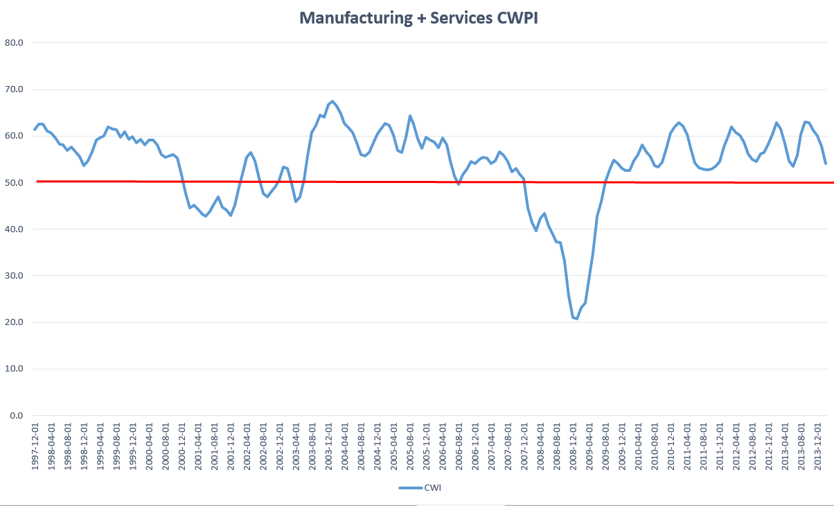
Employment, New Orders, CWPI

CWPI (Formerly CWI)

The Constant Weighted Purchasing Index (CWPI) that I introduced last summer was designed to be an early or timely warning system of weakening elements of the economy.  It is based on a 2003 study by economist Rolando Pelaez on the monthly Manufacturing Purchasing Managers Index (PMI) published by the Institute for Supply Management (ISM).  ISM also produces a Non-Manufacturing index for service industries each month but this was not included in the 2003 study.

The CWPI focuses on five factors published by ISM:  employment, new orders, pricing, inventory levels and the timeliness of supplier deliveries.

The CWPI assigns constant weights to the components of both indexes, then combines both of these indexes into a composite, giving more weight to the services sector since it is a larger part of the economy.  Both the CWPI and PMI are indexed so that 50 is neutral; readings above 50 indicate growth; readings below 50 indicate contraction.  In previous months (here and here), I anticipated that the combined manufacturing and services sector index would move into a trough at this time before rising again in March and April of this year.

A longer term chart shows the wave like formation in this expansionary phase that began in the late summer of 2009.

February’s ISM manufacturing index climbed slightly but the non-manufacturing, or services, index slid precipitously, more than offsetting the rise in manufacturing.  Particularly notable was the huge 9% decline in services employment, from strong growth to contraction.  The service sector portion of the CWPI shows a contraction which some blame on the weather.  A slight contraction – a reading just below 50 – can be just noise in the survey data.  The past two times when the employment component of the services sector has dropped below 48, as it did in this latest report, the economy was already in recession; we just didn’t know it till months later.

A close comparison of the current data with the previous two episodes may sound a cautionary tone.   At this month’s reading of 48.6, the CWPI services portion is not showing as severe a contraction as in April 2001 (43.5) and January 2008 (33.1), when the employment component also dropped below 48.

New orders and employment in both portions of the CWPI are given extra weight. In January 2008, new orders and employment both fell dramatically.  The current decline is similar to the onset of the recession beginning in early 2001, when employment declined severely in April but new orders remained about the same.  Let’s isolate just these two factors and weight them proportionate to their respective weights in the services portion of the CWPI.

Notice that the decline below 50 signaled the beginning of the past two recessions.  Here’s the data in a different graph with a bit more detail.

Some cite the historically severe weather in the populous eastern half of the country as the primary cause for the decline in the services sector employment indicator and it well may be.  If so, we should expect to see a rebound in this component in March.  Basing a prediction on one month’s reading of one or two components of an indicator is a bit rash.  However, we often mistakenly attribute weakness in some parts of the economy to temporary factors and discount their importance because they are temporary – or so we think.

In the early part of 2008, many thought that a healthy correction in an overheated housing market was responsible for the slowdown in economic growth.  In the spring of that year, the bailout of bankrupt Bear Stearns, an undercapitalized investment firm which had made some bad bets in the housing market, confirmed the hypothesis that the corrective phase was nearing its end. As weakness continued into the late spring of that year, some blamed temporarily high gasoline and commodity prices for exacerbating the housing correction.  In the fall of 2008, the financial crisis exploded and only then did many realize that the problems with the economy were more than temporary.

In the early part of 2001, a healthy correction to the internet boom was responsible for the slowdown – a temporary state of affairs.  When the horrific events of 9-11 scarred the country’s psyche, the recession was almost over.  Many were not listening to the sucking sound of manufacturing jobs leaving for China or giving enough importance to the increasing competitiveness of the global market.  Employment would not reach the levels of early 2001 till the beginning of 2005.

This time the slowdown in employment and new orders in the services sector may be a temporary response to the severe winter weather.  Let’s hope so.

********************************

Private Sector employment and new unemployment claims

ADP released their February employment report this week and eyes rolled.  January’s benign reading of 175,000 private job gains was so at odds with the BLS’ reported gains of 113,000.  “Oh, wait,” ADP said this week, “we’ve revised  January’s gains down to 127,000.”  In a work force of some 150 million, 50,000 jobs is rather miniscule.  As the chief payroll processor in this country, ADP has touted its robust data collection from a large pool of employers.  A revision of this magnitude leads one to question the robustness and reliability of their methodology, and the timeliness of their data collection.  For its part, the BLS admits that its current data is based on surveys and that each month’s estimate of job gains is largely educated guesswork.  ADP is actually processing the payrolls, which should reduce the amount of guesswork.

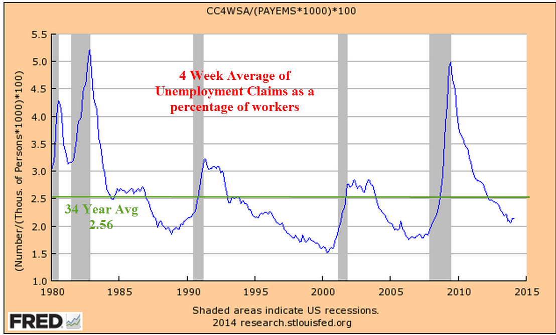
Private job gains in February were 10,000 below the consensus 150,000 but this week’s report of new unemployment claims dropped 27,000, bringing the 4 week average down a few thousand.  As a percent of workers, the 4 week average of continuing claims is below the 33 year average and has been since March 2012.  In this case, below average is good.

********************************

Employment – Monthly Labor Report

This week’s labor report from the BLS carried a banner caveat that the cold weather in February may have affected employment data.  With that in mind, the headline job gains of 175K were above expectations for 150K job gains.  The unemployment rate ticked up a bit.  If we average the ADP job gains with the private sector job gains reported by the BLS, we get 150K plus 13K in government jobs added for a total of 163K total jobs.  The year over year growth in the number of workers is above 1%, indicating a labor market healthy enough to preclude recession.

A big plus this year is the growth in the core work force, those aged 25 – 54, which finally surpassed the level at the end of the recession in the summer of 2009. 

However, there are some persistent trends independent of the weather that underscore the challenges that the current labor market is struggling to overcome.

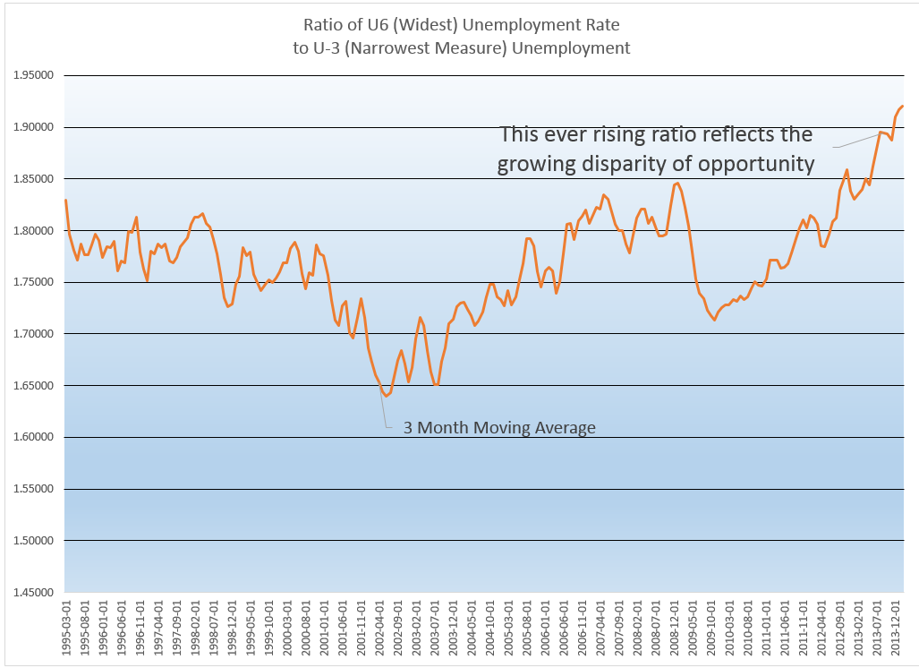
As I pointed out last week, there are several unemployment measures, from the narrowest measure – the headline unemployment rate – to wider measures which include people who are partially employed.  The U-6 rate includes discouraged workers and those who are working part time jobs because they can’t find full time jobs.  For a different perspective, let’s look at the ratio of the widest measure to the narrowest measure. The increase in this ratio reflects a growing disparity in the economic well being of the work force.

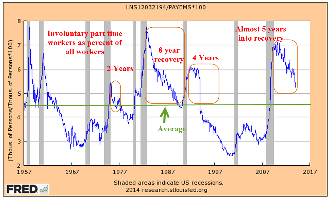
Contributing to the rise in this ratio is the persistently high percentage of workers who are involuntary part timers.  Looking back over several decades, we can see that the unwelcome spike in this component of the work force can take a number of years to decline to average levels.  Following the back to back recessions in the early 1980s, levels of involuntary part timers took 8 years to recover to average, then quickly climbed again as the economy sputtered into another recession.  We are almost five years in recovery from this recession and have still not approached average.

There are more discouraged workers today than there were at the end of the recession in the summer of 2009.  Discouraged workers are included in the wider measure of unemployment but not in the narrow headline unemployment figure.

The median duration of unemployment remains at levels not seen since the 1930s Depression.  Someone who becomes unemployed today has a 50-50 chance of still being unemployed four months from now.  That would make a good survey question:  “In your lifetime, have you ever been involuntarily unemployed for four months?”

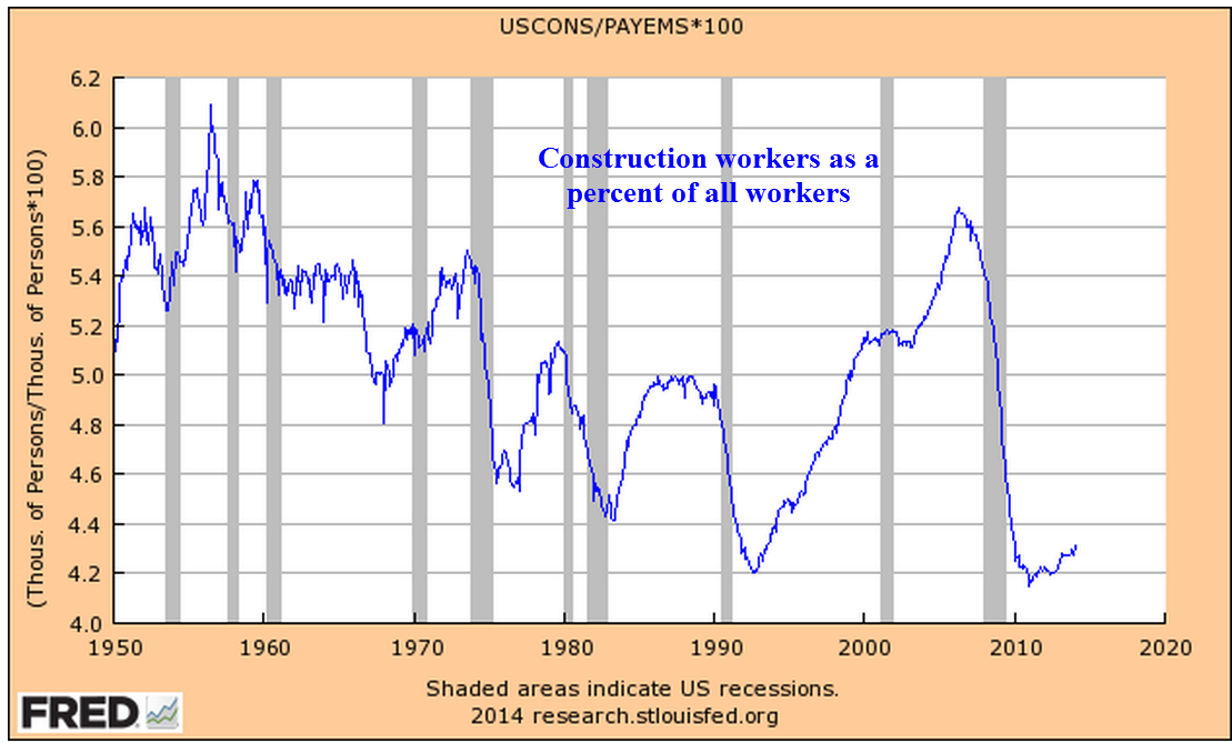
Despite all the headlines that the housing market is rebounding, the percent of the work force working in construction is barely above historic lows.

A recent report by two economists at the New York branch of the Federal Reserve paints a disappointing job picture for recent college graduates.  On page 5 of their report is this telling graph of a higher percentage of recent college graduates accepting low wage jobs.

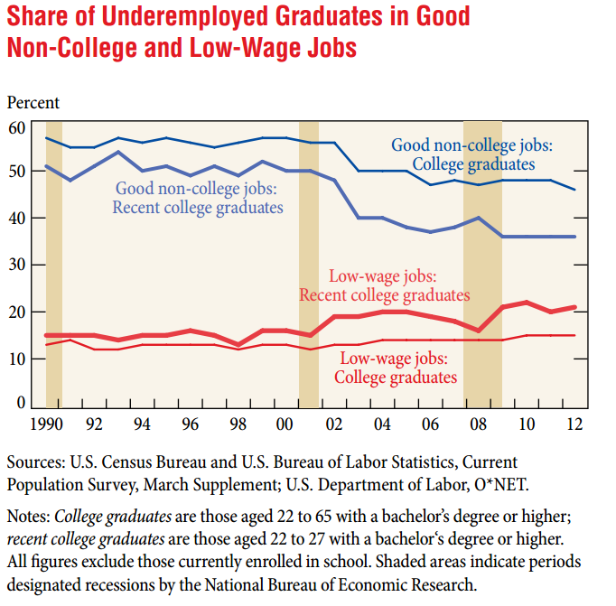
Low wage and part time jobs do not enable a graduate to pay back education loans.  Almost two years ago, the total of student loans surpassed the trillion dollar mark.  According to the Dept. of Education, the default rate in 2011 was 10%.  I’ll bet that the current default rate is higher.

******************************

Takeaways

As is often the case, data from one source partially contradicts data from a different source.  The employment decline reported by ISM bears close watching for further signs of weakness.  The yearly growth in jobs reported by the BLS indicates a relatively healthy job market.

The Market and Growth

March 2nd, 2014

SP500
Some pundits have made the case that the stock market is due to fall this year because of the almost 30% rise in prices in 2013.  On the face of it, it seems logical.  If the average rise in the SP500 over the past fifty years is about 8-1/2% and there is a 30% rise in one year, then the market has essentially “used up” more than three years of the average – all in one year.  But the stock market is the net result of billions of buy and sell decisions by human beings.  My experience has taught me that the connection between sense and the behavior of human beings is tenuous, at best.  The Red Carpet walk at the Oscars Award Ceremony is a demonstration of the nonsensical choices that human beings make.  I mean, can you believe the dress that actress is wearing?  And who told that actor he could grow a beard?  PUH-LEEZ!

So I looked at past history and wondered: what is the average yearly return of the SP500 index over the three years following a 20% rise in the market?  As an example, if the market rises 20% in Year #1, what is the 3 year average of yearly returns in Year #4?  The results surprised me – 9.5%.

But wait! you say.  The late nineties were an aberration of irrational exuberance that skews the average.  Removing those two outliers from the data set gives a yearly average of 6.2%.  Add in 2% dividends and the total comes to 8.2%, a respectable return.

But wait!, you say again.  What about the year after the 20% rise?  Surely, the index must compensate for the above average rise the previous year.  In the year after a 20% rise in the market, the average gain was 13.5%.  Again, there were those crazy years of the late nineties so I’ll take them out, leaving an average gain of 3.7%.  Add in the 2% dividend and it easily outpaces the current return on long term bonds.

This year the pundits could be right and the stock market falls.  However, a successful long term investor must learn to play the averages.

*********************************

GDP and Savings

GDP is a measure of the economic output of a nation but what the heck is it?  A recent presentation by Gary Evans, an economics professor at Harvey Mudd College in California, has a number of wonderfully illustrated graphs that may help the casual reader understand the components of GDP and recent trends in the economy.

On January 30th, the Bureau of Economic Analysis (BEA) released their advance estimate of real GDP growth of 3.1% in the 4th quarter.  As more information of December’s slowdown became available in late January and early February, the market began anticipating that the BEA would revise their advance estimate down.  Slower growth might mean further declines in stock prices, right? Instead, the market anticipated that a slowing of growth in the fourth quarter would calm the hand of the Fed in tapering their bond purchases. As a result, the market  rebounded in February, more than making up for January’s decline.  On Friday, the BEA revised their second estimate of fourth quarter growth downward to 2.4%, almost exactly what the market consensus had anticipated and the market finished out a strong month with a small gain.  The BEA attributed the slower growth in the fourth quarter to reductions in federal, state and local government spending and a slowdown in residential housing.

As the BEA revises their methodology, they also revise previously published GDP data.  In the 2013 revision the BEA adjusted their data going back to 1929.  In the past few years, revisions have added about 1/2 trillion dollars to GDP.  Adjustments to the personal savings rate were substantially higher but savings in the past decade have been at historically low levels.  Personal savings are the amount of disposable income, or income after taxes, that families save.  The rate or PSR is the the percentage of their disposable income that they don’t spend.

When people charge purchases that decreases the savings rate.  Conversely, when families pay down their credit purchases that increases the savings rate.  Despite the explosive growth of household debt in the past thirty years,

the savings rate has remained positive, meaning that the people who do save are more than offsetting those who don’t or can’t save.

Let’s take an example of three families:  the Jones family makes $60K in disposable, or after tax income, saves nothing, but increases their debt $8,000 by buying a new car.  Their personal savings rate is $-8K/$60K, or -13.3%.  The Smith Family also has $60K in disposable income, but is frugal and pays down a few loans and saves some money for a total savings of $2K, or 3.3%.   The Williams family has a disposable income of $120K and has net savings of $20K, or 16.7%. Families with higher incomes tend to save proportionately more of that income.  Total disposable income for the three families is $240K.  Total savings is $14K, or 5.8% of disposable income, but that hides the fact that it is the Williams family that is making most of the contribution to that savings rate.

There is another subtle element contributing to this disparity in savings: inflation.  The Consumer Price Index charts the increasing prices of goods and services – spending.  A higher income family that spends less of its income is less affected by changes in the CPI than a lower income family and this helps a higher income family save proportionately more than the lower income family.  The difference is slight but the compounded effect over thirty years is significant.

During the past thirty years, the personal savings rate has steadily declined.

This doesn’t mean that families are saving less as a percentage of their income but that the number of families with net savings are becoming fewer while the number of families with little net savings or negative net savings are becoming more numerous.  The period from 1930 to 1980 was one of relatively more income equality than the period 1980 to the present.  Let’s look again at the chart above.  In the late 1970s, as income equality begins a decades long decline, so too does the personal savings rate.  The ratio of high income families with a relatively high savings rate to lower income families with a low savings rate also declines.

Savings drives investment in the future.  The low savings rate means that future U.S. economic growth must rely ever more on the savings from those in other countries.  Typically savings rates increase as a recession progresses and then the economy recovers.

Notice that the savings rate has stayed relatively steady in the past three years, indicating neither an increasing confidence or caution.  As shown in the table, only the three year period from 1988 – 1990 period showed the same lack of direction.  GDP growth in that period was stronger than it is today but the savings and loan crisis and the stock market crash of October 1987 had diluted the confidence of many.

****************************

New Home Sales
Here’s a head scratcher.  New home sales rebounded almost 10% in January, after falling 13% in December.  Even the figures for December were revised a bit higher.  As I noted last week, the rather flat growth in incomes has become an obstacle to the affordability of homes. December’s Case Shiller 20 city home price index reported a 13.4% annual increase in home prices. January’s rise in home sales was partially aided by sellers willing to make price concessions, resulting in a 2.2% decrease in the median sales price.

****************************

Durable Goods
Orders for durable goods, excluding transportation, were up about 1% this past month. A durable good is something which has a life of 3 years or more.  Cars and furniture are common examples. The year over year gain, a bit over 1% as well, indicates rather slow growth over the past year after adjusting for inflation.  However, several current regional reports of industrial activity indicate a quickening growth at the start of this year.  Reports from Chicago, Philadelphia and Kansas City hold promise that next week’s ISM assessment of manufacturing activity nationally will show a rebound.

As I have noted in blogs of the past few months, the pattern of the CWI index that I have been compiling since last summer indicated a rebound in overall activity in the early spring of this year.  This gauge of manufacturing and non-manufacturing activity is based on the Purchasing Managers Index released each month by ISM.  I suppose a better name for the CWI index would be “Composite PMI.”  Readers are welcome to make some suggestions.

****************************

Unemployment
New unemployment claims rose, approaching the 350K mark, but the 4 week average of new claims is holding steady at 338K.  In past winters the 4 week average has been around 360K.  If new claims remain relatively low during this particularly harsh winter in half of the country, it will indicate an underlying resiliency in the labor market.

Janet Yellen, the new chairwoman of the Federal Reserve, appeared before the Senate Finance Committee this week.  In her response to questions about the dual mandate of the Fed – inflation and employment – she noted that the Fed looks at much more than just the unemployment rate in gauging the health of the labor market.  One of the employment indicators they use is new unemployment claims.

When asked what unemployment rate the Fed considers “full employment,” Ms. Yellen stated that it was in the 5 – 6% range.  One of the Republican Senators asked about the “real” unemployment rate, without specifying what he meant by the word “real.”  Without hesitation and in a neutral tone, Ms. Yellen responded that if the Senator meant the “widest” measure of unemployment, the U-6 rate, that it was about 13%.  The U-6 rate includes discouraged workers and part time workers who want but can not find full time work.

When George Bush was President, “real” meant the narrowest measure of unemployment to a Republican because it was the smallest number.  With a Democrat in the White House, the word “real” now means the widest measure of unemployment to a Republican because it is the largest number.  Democrats employed the same strategy when George Bush was President, preferring the higher U-6 unemployment rate as the “real” rate because it was higher.  I thought that it would be a good response for anyone when confronted by a colleague at work about the “real unemployment rate” that we steer the conversation to more precise and politically neutral words like “widest” and “narrowest.”

****************************
Pensions
A reader sent me a link to a Washington Post article on the pension and budget woes of San Jose, a large city in California.  I am afraid that we will see more of these in the coming decade.  Beginning in the 1990s politicians in state and local governments found an easy solution to wage demands from public workers: make promises.  Wages come out of this year’s budget; pension promises and retiree health care benefits come out of some budget in the distant future.  For an increasing number of governments, the distant future has arrived.

In Colorado, a reporter at the Denver Post noted that the Democratic Governor and the Republican Treasurer are hoping that the state’s Supreme Court will force the public employee’s pension fund, PERA, to open its books. It might surprise some that a public institution like PERA is less transparent than a publicly traded company.  Actuarial analysis estimates are that PERA’s asset base is underfunded by $23 billion, or about $46,000 for each retiree. It was only last year that the trustees of the fund reluctantly lowered its expected returns to 7.5% from 8%.  Assumptions on expected returns, what is called the discount rate, is a major component in analyzing the health of any retirement fund and the money that must be set aside today to pay for tomorrow’s promised benefits.  Many analysts contend that even 7.5% is a rather lofty assumption in this low interest rate environment.

Readers who Google their own state or city and the subject of pensions will likely find similar tales of past political promises and lofty assumptions running headlong against the realities of these past several years.

Manufacturing Muddle

December 5th, 2012

Tenaciously limping along like Chester on the western TV series “Gunsmoke.” On Monday, the Institute for Supply Management (ISM) released their November Manufacturing Index report, showing a very slight contraction.  The downward trend in manufacturing activity will continue to curtail any employment gains.  The monthly labor report from the BLS is due this Friday.

On the same day, Markit Economics and ISM released their November Manufacturing Purchasing Managers Index (PMI) report, a survey of purchasing managers at manufacturing companies.  An outlook into the near future, the survey showed a solid uptick this past month, giving some hope that the decline in manufacturing may be bottoming or turning upward.  For the first time in six months, exports increased;  new orders and employment showed a faster rate of expansion but inventories dropped a bit, showing that businesses are still cautious.

The manufacturing PMI for the Eurozone also increased but remains at recession levels.  The lackluster demand in Europe will crimp growth in the U.S. 

The effects of Superstorm Sandy continue to muddy both the analysis of existing data and forecasting near term trends but there are no strong signs of growth.

In Washington, the impasse over the fiscal cliff is not helping.  A hundred years ago the Sixteenth Amendment was passed, enabling the Federal Government to levy income taxes.  Until then, the Federal government had a rather limited say in defining “fair.”  The power to collect taxes on income began a century long debate over what is fair.  As any parent knows, each child has their own unique sense of fairness.  As children grow up to be adults, they retain this unique intuitive assessment of fairness, layering rationality on top of the child’s sense.  Thus we have as many definitions of fair as there are people in the world.  The debate will never end until the power to tax incomes is once again removed from the Federal Government, where there are just too many powerful people with too many contending definitions of fairness.  The fractiousness is hurting people and businesses.  Winston Churchill sensed something eternally and unfortunately true about us: “Americans can always be counted on to do the right thing…after they have exhausted all other possibilities.”