Trump To The Rescue

by Steve Stofka

December 10, 2017

This blog post goes to what may be a dark place for some readers. The election of Donald J. Trump may have stopped a year-long slide into recession. I didn’t start out with that conclusion. I meant to point out some interesting correlations in the velocity of money. Yeh, yawn. By the time I was done, not yawn.

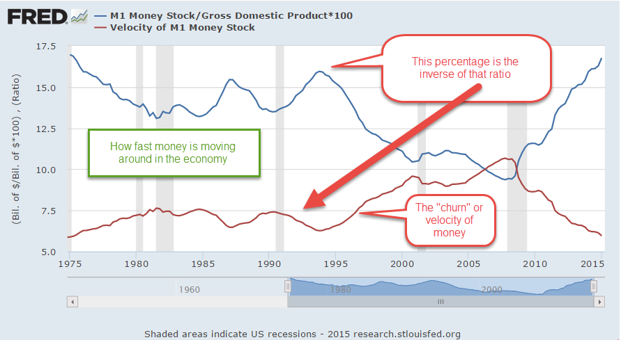
If I mention the change in the velocity of money, do you groan at the prospect of a wonky economics topic? Take heart. Anyone who has slowed down from 65 MPH on a highway to 15 MPH in rush hour traffic is familiar with a change in velocity.

The velocity of money measures the amount of time that money stays in our pockets. It signals the willingness of buyers and sellers to make transactions. When buyers and sellers can’t agree on price, transactions fall and the change in velocity goes negative. In the chart below, the change in the velocity of money (blue line) often has a similar pattern to the change in real GDP (red line).

VelocityVsGDP

Both recent recessions were preceded by declines in GDP growth and the speed of money. Following the financial crisis, the Fed began to inflate the money supply in a series of policies dubbed “QE,” or Quantitative Easing. In 2011, after two rounds of QE, the Fed worried that the recovery might stall out.

Let’s turn to the green square in the chart labelled Operation Twist. Obama and a do-nothing Republican Congress were at odds so there was little chance of Congress enacting any fiscal policy to come to the economic rescue. That task was left – once again – to the Federal Reserve to use its monetary tools.

In Congressional hearings, then Fed Chairman Ben Bernanke advised the Senate Finance Committee that the short term interest rate was already zero and the Fed was out of monetary tools. The Congress should step in with a stimulative fiscal policy. The Committee members somberly hung their heads. We are incompetent, they said, so the Federal Reserve will have to rescue the country.

If it expanded the money supply further, the Fed was concerned that they would spark inflation. In hindsight, that fear was unfounded, but none of us has the luxury of making decisions while looking in the rearview mirror. Economic identities like M*V = P*Q (notes at end) are just that – looking in the rearview mirror.

The Fed resurrected a monetary tool from the 1960s dubbed Operation Twist, after the dance craze the Twist (Fed paper).  Early Boomers will remember Chubby Checker. The Fed began selling the short-term Treasuries they owned and buying long term Treasuries. By increasing the demand for long term Treasuries, the Fed drove down long-term interest rates as an inducement for businesses and consumers to borrow. Despite the low rates, consumers continued to shed debt for another year. How effective was Operation Twist – maybe a little bit (Survey).

As the price of oil declined in late 2014 and the Fed ended yet another round of QE (QE3), there was a real danger of moving into a recession. Notice the decline in GDP growth (red) and money velocity (blue).

The downward trend barely reversed itself in the 3rd quarter of 2016, just before the election, but not by much.

MoneyGDPGrowth2013-2017

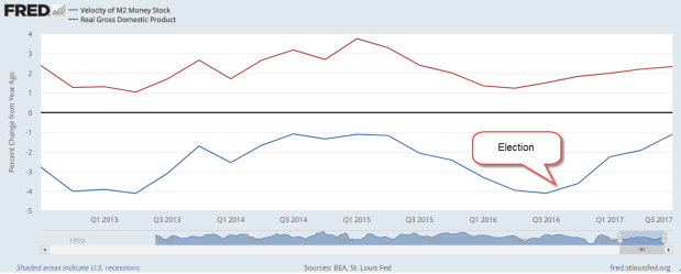
The election of Donald J. Trump and a single party controlling both houses of Congress kindled hope of a looser regulatory environment and tax reform. Only then did the speed of money turn consistently upward. But we are not out of the woods yet. A year later, in late 2017, money velocity is still negative. As I said earlier, buyers and sellers still cannot agree on price. There is a mismatch in confidence and expectations. Until that blue line turns positive, GDP growth will remain tepid or turn negative.

///////////////////

M*V = P*Q is an identity that equates money supply (M) and demand (V) to inflation (P) and output (Q).


Independence is Money

July 5th, 2015

In past weeks I have been digging into a perplexing problem.  Since early 2008, the Federal Reserve has heaped almost $4 trillion of government debt on its books and the supply of money has doubled, yet inflation remains subdued.  Why?

There are several measures of money. For several decades the Federal Reserve branch published Modern Money Mechanics (book or PDF). M1 is a measure of transactional money, and includes cash and money held in checking accounts. This category of money has doubled in the past 7-1/2 years.

Supply of money goes up.  Inflation goes up, right? From the Federal Reserve paper:

Assuming a constant rate of use, if the volume of money grows more rapidly than the rate at which the output of real goods and services increases, prices will rise. This will happen because there will be more money than there will be goods and services to spend it on at prevailing prices. [emphasis added]

If inflation is not going up, then the output of goods and services must be going up as much as the supply of money, right?  It’s not.

Some economists have argued that the various measures of money don’t measure demand for goods and services.  Rather, the money supply measures uncertainty.  Shown in the chart below is the annual percent change in both GDP and the M1 money supply.

The first thing we notice about the M1 chart above – when the growth in the money supply falls below zero, get worried.  People are too confident in the future.  It would be nice if we could craft a long term trading rule like “Buy stocks when the blue line crosses below the red line” but that has not been a successful strategy.  What does stand out is that money growth, the blue line, crossed above GDP growth, the red line, in the summer of 2008 and has not crossed below.  That is the longest period of time since this money measure began. Clearly, there is a lack of confidence among families and businesses.

In the quote from the Federal Reserve paper above, I passed over a key phrase that began the paragraph.  Yes, very sneaky of me to do that. The phrase is “Assuming a constant rate of use.” I wanted to focus separately on the growth in the money supply and the growth in GDP.  Economists often look at the rate of use of money to produce a given level of GDP.  They call it the velocity of money.  In the chart below, I have included the velocity of money, the ratio of GDP/MONEY (red line in the chart), and the amount of money in the system as a percentage of output, MONEY/GDP (blue line) to show how the two are mirror images of each other.

When economists worry that the velocity of money (red line) continues to fall during this recovery, they are worried that there is simply too much money sitting around for the amount of output in the economy (blue line).  Why are people and businesses holding over 17% of output in readily available money today? We are in a low inflation, low growth economy.  In the 1970s we held the same percentage of money but the ’70s was a high inflation, low growth economy.  The similarity of then and now is low growth.

In these past weeks I have looked at two places to put savings – yesterday’s spending, debt, and tomorrow’s spending, equity.  When people and businesses hold onto more money, which kind of spending are they investing in?  They are concerned about tomorrow’s income.  What does tomorrow’s income pay for?  Both tomorrow’s AND yesterday’s spending.

Next week – if saving is just a form of spending, what is income?

***********************

Employment

Good job numbers. Not good labor participation numbers.  Bill McBride at Calculated Risk did a good job this week of putting a long term perspective on the job numbers.  Underscores the theme I just touched on.  Low growth.  For 12 years, from 2000 – 2012, there was almost NO job growth and the effect of that does not pass quickly as things improve.  Caution prompts us to hold onto more money just to be on the safe side.