Labor Productivity

September 24, 2023

by Stephen Stofka

This week’s letter is about labor productivity. The autoworker’s union (UAW) expanded its strike to 38 parts and distribution plants in the hopes that a wider impact will incentivize further concessions from auto executives. Labor constitutes only 10-15% of the price of a car yet labor disputes may give the impression that rising car prices are entirely or mostly the fault of labor union demand.

For more than 100 years, auto plants of the Big Three automakers have been union shops. Foreign manufacturers like Toyota and Honda have built non-union plants in southern states where union organizers have less influence with policymakers. There are almost a million auto workers now in Mexico where wages have been lower. In 2022, GM Mexico paid its workers between $9.15 and $33.74 an hour, but relatively few auto workers in Mexico make more than $16 per hour.

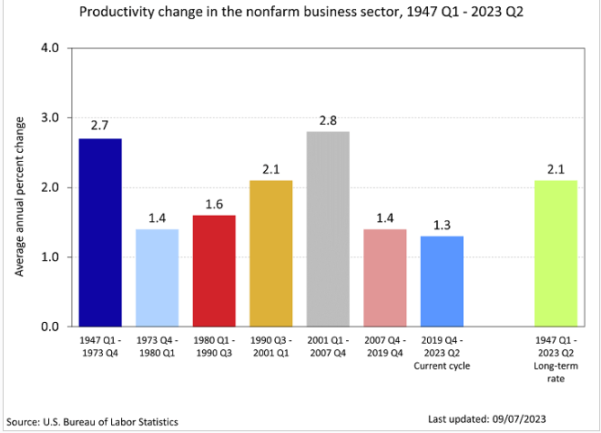
Two weeks ago, the BLS released their productivity figures for the second quarter. Productivity rose faster than labor costs by a good margin – notching a 3.5% annualized gain versus a 2.2% increase in unit labor costs. The manufacturing sector that car manufacturers belong to had a lower productivity gain of 2.9%. In that productivity release the BLS provided a chart grouping productivity gains by decade. The 75-year average is a 2.1% annual growth rate.

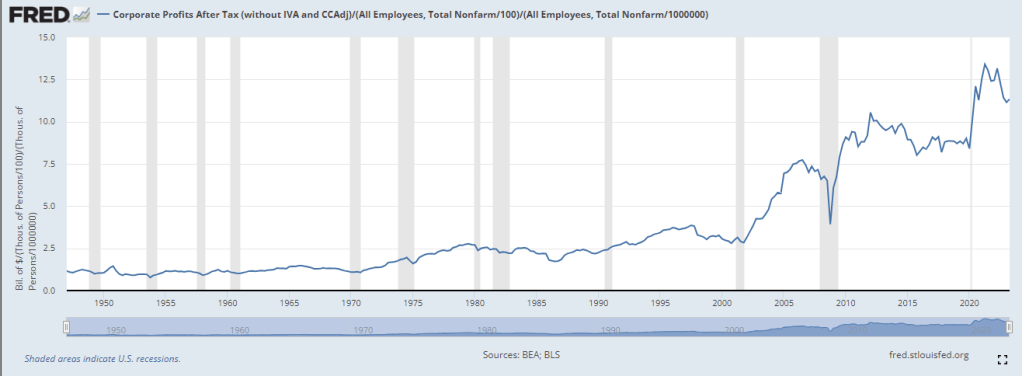
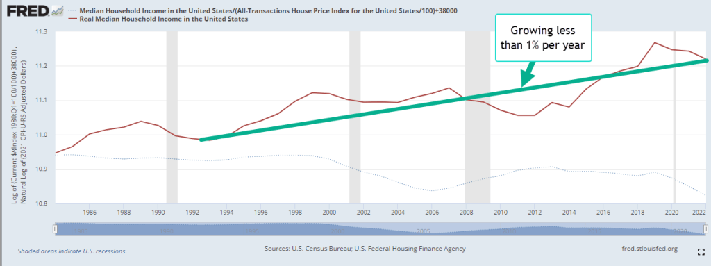
An often repeated theme of union workers and workers in general is that wage gains have not kept up with productivity gains. The BLS charted both series since 1973 and the divergence keeps growing by decade. American workers are competing with lower wage workers in Mexico, China and southeast Asia.

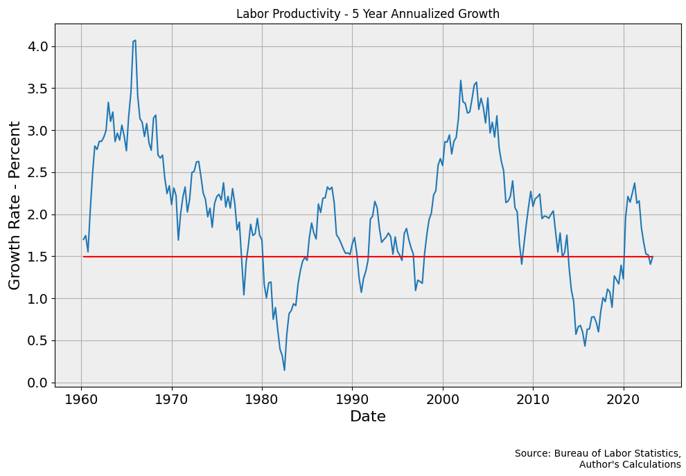
The annual gain in Productivity is erratic, rising sharply at the onset of recessions when workers are let go and the total hours worked declines. Recessions reduce the percentage of hours worked far more than the percentage reduction in output. I charted the annual gain in Labor Productivity (FRED Series OPHNFB) to show the effect of these shocks. The pandemic caused a particularly sharp rise and fall, as shown in the red rectangle below.

A five-year chart smooths out the divergences, letting us see the patterns more clearly. The red line in the graph below is the 1.5% current growth rate.

Trends in productivity growth are a medium term process, longer than any Presidential term. Despite that, candidates promise big productivity gains if they are elected. Republican candidates promise that lower taxes will boost productivity because that claim appeals to Republican voters. When productivity growth declined following the Bush tax cuts in 2001, conservatives blamed the stifling effects of regulatory compliance and called for more tax cuts. Democratic politicians promise more subsidies to an industry that is not nimble enough to respond to changing economic circumstances.

There are many factors that contribute to productivity growth. Some economists claimed that lower interest rates after the financial crisis would raise productivity. It fell. Those believers assert that declining productivity growth would have been worse without lower interest rates. This claim also cannot be disproved. Hypothetical situations are the favorite shield of a believer.

Corporate profits are up sharply since the start of the pandemic. For the past year, GM has enjoyed strong profit growth but they have had far too many down quarters since the financial crisis. Ford has fared better but its profit margin of 2.4% is only slightly more than the high-volume, low margin grocery giant Kroger. Stellantis has struggled to make a profit since 2018. For decades, federal and state governments have subsidized these auto giants with tax breaks and loans because the industry as a whole employs 1.7 million workers and contributes more than 10% to GDP. It is an industry where politics and economics are tightly intertwined. The politics clouds the economic analysis and the economics contorts the political calculations.

///////////////

20230924AssemblyLine

Photo by carlos aranda on Unsplash

Keywords: auto industry, GM, Ford, Stellantis, union, UAW, labor, workers, wages

The Power in Our Pockets

September 17, 2023

by Stephen Stofka

This week’s letter is about wages and income and the real purchasing power in our pockets. The auto workers’ union (UAW) went on strike limited to three auto plants while they continued negotiations with the auto companies. Nurses at Kaiser Permanente have voted to go out on strike by September 30th if they cannot resolve outstanding differences with Kaiser’s management. Executive compensation at the auto companies is now more than 300 times the average worker’s pay, the UAW points out, claiming that workers have as much right to share in the profits as executives and shareholders.

Legislation passed after the financial crisis required that publicly held companies report their CEO-to-Worker pay ratios. A recent analysis of companies in the SP500 estimated a pay ratio of 272-1 in 2022. The auto industry is part of the consumer cyclical industry, whose median executive compensation in 2021 was $13.7 million, as reported by Equilar. In 1965, the pay ratio was approximately 20-1. In the 1980s, the Reagan administration adopted a relaxed regulatory stance to corporate mergers and companies have grown much larger in the past decades. The pay ratio, however, has grown out of all proportion to the growth in corporate size.

A combination of factors contribute to high relative CEO pay. Thomas Greckhamer (2015) identified six paths – configurations of various factors – that are present in countries with high CEO pay and those without high CEO pay. He found that the relative pay of CEOs is high in countries where equity markets are well developed and highly liquid. Ownership is widely dispersed so that the CEO enjoys more power relative to stock owners and can negotiate higher compensation packages. CEOs do not have high relative pay in high welfare states where there are strong worker rights. A cultural acceptance of inequality and hierarchical authority, termed “power distance” by Geert Hofstede in 1980, contribute to high relative CEO pay. Here is a quick explainer. As a comparative example, the power distance factor in the American culture is low, half that of Mexico.  

Companies today derive their revenue and profits globally. For that reason it is not accurate to divide corporate profits by the number of employees in the U.S. I am going to do it anyway just to show the profound change that has taken place since the 1970s, a benchmark decade often cited as the beginning of growing inequality in the pay ratio. In the chart below I have adjusted after-tax corporate profits (FRED Series CP) for inflation, then divided that by the number of employees reported by the BLS (FRED Series PAYEMS). The trend is more important than the actual figures. Even though the 2010s were relatively flat the level of profits per employee was about double the level of the 1990s. Let’s compare that to worker incomes.

Since 1992, median household income adjusted for inflation has risen 23%, a level that is far below the rise in profits per worker. The chart below shows the gain on a log scale. Real incomes have gained less than 1% per year.

A few weeks ago I proposed adjusting prices by a broad index of house prices instead of the CPI. Two-thirds of American households own their home and home values reflect the discounted flow of housing services that we get from a home during our lifetimes. Housing costs are already almost half of the CPI and trends in home prices capture the feel of inflation on household budgets more accurately than the many CPI measures economists currently use.

During the 1980s and 1990s, housing prices increased 4% annually. The chart below describes the median household income adjusted by the all-transactions home price index (FRED Series USSTHPI). Notice that household incomes during those two decades stayed on an even keel.

Had the Fed structured their monetary policy to keep home price growth at the same level as the 1980s and 1990s, real incomes would be near the level of the green line, 10% higher today. Instead, workers feel as though they are on the path of the red line, regardless of what official measures of real household income indicate. The red line reflects a sense of discomfort and tension in many American households that plays out in our politics. The trend began with housing and finance policies enacted by both parties in Congress across five Presidential administrations.  

///////////////////

Photo by Charles Chen on Unsplash

Keywords: home prices, labor unions, wages, income, household income

Greckhamer, T. (2015). CEO compensation in relation to worker compensation across countries: The configurational impact of country-level institutions. Strategic Management Journal, 37(4), 793–815. https://doi.org/10.1002/smj.2370

Groundhog Day

April 24, 2022

by Stephen Stofka

As the press announces the latest inflation numbers, we hear that this is the highest inflation number in four decades. These two periods share few similarities. In 1982, the economy was in a deep recession, the worst since the Great Depression. A clerical position or warehouse job would draw forty in-person applicants. Inflation had been sporadic and persistent for a decade. Two oil supply shocks and a surge of young Boomers into the workforce led to high unemployment and high inflation, a phenomenon termed “stagflation.” Since that time, economists have struggled to understand the peculiarities of that era.

Human behavior produces what economists call simultaneous causality, a recursive loop where event A causes event B which feeds back into event A. Just the anticipation of a policy causes people to act differently before the policy is implemented. This week Fed Chairman Powell strongly hinted that the Fed would raise interest rates by ½% at their May 3-4 meeting (FOMC, 2022). Anticipating that the rate increase could be as high as ¾% and more rate hikes than the market had already priced in, the market sold off on Friday. When in doubt, run, the survival strategy of squirrels and their large cousins, groundhogs.

Uncertainty joins all decades. Policymakers and investors must make forecasts and decisions with less than complete information. The more unusual the circumstances the more likely the flaws. In 1977, Congress enshrined the Fed’s independence in law and gave it a twin mandate of full employment and stable prices (Fed, 2011). A year later, Congress passed the Full Employment and Balanced Growth Act. The text of this act demonstrates how several years of stagflation had confused the direction of causality. The Act reads:

 High unemployment may contribute to inflation by diminishing labor training and skills, underutilizing capital resources, reducing the rate of productivity advance, increasing unit labor costs, and reducing the general supply of goods and services.

(U.S. Congress, 1978)

High unemployment accompanies or is coincident with diminished labor skills, resource utilization and productivity. Unemployed people lowers demand and that contributes to lower prices, not inflation. In 1979, a year after this act was passed, the Iranian Revolution overthrew the Shah and strikes in the oil fields cut global oil production by 6-7% (Gross, 2022). U.S. refineries were slow to switch production to alternative sources. Typical of that time, the Congress and U.S. agencies overmanaged prices, supply and demand in key industries. This regulation contributed to long lines at gas stations and a 250% increase in gas prices.

Today, much of the supply line has been affected by the pandemic and the effects linger. China has again shut down some tech manufacturing regions. The prices of building materials have been erratic. The ratio of home prices to median household income has now exceeded the heights during the housing crisis (Frank, 2022). Millennials have endured the dot-com crash, 9/11, the housing crisis, and the pandemic. Now a housing affordability crisis. The Fed’s survey of household finance reports that the median amount of household savings is $5300 (Wolfson, 2022).

War in Ukraine, crazies in Congress and little accountability. Since the end of 2019, inflation-adjusted wages have not improved (FRED Wages). Low unemployment should have driven wages far higher. Profit margins shrank or turned negative during the pandemic. Supply constraints have presented businesses with an opportunity to raise prices and make up for profits lost during the pandemic. As prices climb, policymakers and economists engage in a round of finger pointing.

Now comes the bit about a recession. Casual readers may have heard of a yield inversion. Time has value. Risk has value. A debt that is due five years from now should return or yield more than a debt due one year from now. There is more that can go wrong in five years. When shorter term debt has a greater yield than longer term debt, that is called a yield inversion. The yield curve is a composite of interest rates over different periods. A common measure is the difference between the 10 year Treasury note and the 2 year Treasury. When that spread turns negative over a period of 3 months, investors show their lack of confidence in the near future. A recession has occurred within 18 months.

Why should this be? As I noted at the beginning, we are a feedback machine. Our anticipation of events contributes to the likelihood that they will occur. The weekly version of the graph above did turn negative a few months before the pandemic struck in the spring of 2020. However, the weekly chart may give false forecasts. The quarterly chart captures sustained investor sentiment.

At the right side of the chart, we see how negative the sentiment has turned. The Fed knows that rising interest rates will drive that sentiment further down. By law – that 1977 law I mentioned earlier – they can’t ignore the force of rising prices. Employment, their other mandate, is strong enough to withstand some rate hikes. What worries the Fed now is a different type of unemployment – idle capital. Worried investors and business owners are less likely to begin new projects. That lack of confidence becomes self-fulfilling, creating an economic environment of pessimism. To Millennials, it feels like Groundhog Day all over again.

////////////////

Photo by Pascal Mauerhofer on Unsplash

Fed. (2011). The Federal Reserve’s “Dual Mandate”: The Evolution of an Idea. Federal Reserve Bank of Richmond. Retrieved April 23, 2022, from https://www.richmondfed.org/publications/research/economic_brief/2011/eb_11-12

FOMC. (2022). Meetings Calendars, Statements and Minutes (2017-2022). Board of governors of the Federal Reserve System. Retrieved April 23, 2022, from https://www.federalreserve.gov/monetarypolicy/fomccalendars.htm

Frank, S. (2022). Home price to income ratio (US & UK). Longtermtrends. Retrieved April 23, 2022, from https://www.longtermtrends.net/home-price-median-annual-income-ratio/

FRED Real Wages, Series LES1252881600Q. Index level 362 in 2019:Q4. Index level 362 in 2021:Q4.

Gross, S. (2022, March 9). What Iran’s 1979 revolution meant for US and Global Oil Markets. Brookings. Retrieved April 23, 2022, from https://www.brookings.edu/blog/order-from-chaos/2019/03/05/what-irans-1979-revolution-meant-for-us-and-global-oil-markets/

U.S. Congress. (1978). Public law 95-254 95th Congress an act. Congress.gov. Retrieved April 23, 2022, from https://www.congress.gov/95/statute/STATUTE-92/STATUTE-92-Pg187.pdf

Wolfson, A. (2022, March 2). Here’s exactly how much money is in the average savings account in America. MarketWatch. Retrieved April 23, 2022, from https://www.marketwatch.com/picks/heres-exactly-how-much-money-is-in-the-average-savings-account-in-america-and-psst-you-might-feel-inadequate-in-comparison-01646168736