June 30, 2024
by Stephen Stofka
This week’s letter is on expectations and alliances. After separating voters into two parties, alliances within each of the parties coalesce to form intra-party squabbles. These alliances can form despite radically different approaches to managing problems: analytical and instinctual. Voting for the same candidate might be a person with an instinctive dislike of government and a business owner who estimates the impact of that candidate’s policy preferences on a company’s bottom line. These two different approaches also produce conflict.
In past weeks I have distinguished between expectations and anticipations, the first being more analytical and the second more imaginative or instinctual. The two work symbiotically in our individual lives but that symbiosis becomes outright conflict in a group. Some prefer a more analytical approach to discussing and solving problems while others rely on their gut, their moral compass. Individuals participating in that debate want to convince others to adopt their perspective and values. Perspective evolves over our adult lifetime and its purpose is to protect our values which have evolved since childhood. Attacking a person’s perspective can be perceived as an attack on their values, so we are resistant to persuasion. A variation of a 17th century quote goes, “A man convinced against his will is of the same opinion still.” The trick to persuasion is to insert your argument into another person’s perspective like a key and let them turn the key.
In the Democrat Party, the center left contends with the radical left who weaponize shame. Advocates of DEI funding and mandates within all public institutions honestly believe that such training will moderate or eliminate racist attitudes. The majority of U.S. colleges and universities require students to take these non-credit classes to graduate. For students with a heavy academic schedule and work commitments, the burden of that mandate multiplies a student’s stress. Those within and without the academic community debate the conflict between these mandates and academic freedom.
Those favoring more spending on affordable housing disagree with voters in the party who prefer the personal space buffer that R-1 Single Family Home zoning gives residents. Proponents of free needle exchange must overcome fears that such tolerance will introduce a moral hazard that promotes more rather than less drug use. Supporters of more resources for immigrant housing, job and medical services encounter principled opposition from those who are mindful of the resources and money that must be diverted from other programs. Should the needs of newcomers take higher priority than those of long- time residents, particularly the descendants of those African-Americans brought to this country centuries ago? Party leaders struggle to manage these ideological conflicts because these issues permeate the leadership ranks as well.
The Republican Party is more dominant in the ex-urban and rural parts of each state. Party leaders and candidates express strong support for religious faith as a cornerstone of American society. According to Pew Research, Republicans attend church more often than Democrats or Independents but the majority of Republican voters do not attend church weekly. Like Democrats and Independents, a third of Republicans rarely step inside of a church. Those who believe that public institutions should be secular confront those who think religious principles and doctrine offer the only sound foundation to good governance. A person supporting their argument with Bible verses may truly believe that they are taking an analytical approach. In their belief framework, the Bible is history, recorded by various authors or sources but inspired by God himself. To those devotees, the Bible is fact, not an arbitrary assembling of oral traditions and myths. Two Republican voters, each with very different religious beliefs, practices and priorities still vote for the same candidates and issues. Leaders within the party must negotiate a compromise between Christian compassion and checkbook constraints.
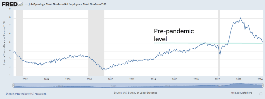
Immigration is a key issue on ideological lines even though most immigrants initially settle down in urban areas where political sentiments skew Democratic. When the labor market is strong in the U.S. relative to other countries, that acts as a draw to legal and illegal immigration. The emphasis is on the “relative to other countries” part. A mismatch in labor market demand between the U.S. and neighboring countries is an important contributor to immigration flows. The strong economy in the late 1990s and early 2000s attracted a surge of immigrants, far more than today’s levels when adjusted for population.
A recent analysis by the Federal Reserve estimated that restrictive immigration policies from 2017 to 2020 made it moderately more difficult for employers to fill job vacancies. Farmers and ranchers, a strong Republican cohort, have long lobbied for changes to the H-2A “guest worker” program that would help them meet seasonal worker demand. The number of slots for foreign workers is not enough to meet demand and the application process is burdensome. Employers have similar complaints about the H-2B program for non-agricultural workers, and are heavily used by janitorial and landscaping services. Regardless of the impact of restrictive immigration policies on their businesses, owners may still vote for a candidate who promotes an immigration crackdown.
Jobs and sustainable wages are the cornerstones of family support, individual self-respect and autonomy. Those in rural areas are keenly aware that urban areas offer a more developed communications and transportation network that attracts companies, jobs and talent. For the past several decades, small to medium-sized manufacturing has migrated to foreign markets which offer lower labor costs. The influx of immigrants is yet another potential threat to community stability and resources. Long established immigrants who came to the U.S. through a legal process may not feel welcoming to those who have jumped ahead in the immigration line. For decades, rural areas have fought to retain businesses and develop more jobs at a sustainable wage. Those who advocate more government spending on infrastructure to attract businesses clash with those having an ideological preference for laissez-faire markets.
Candidates within each party search for and exploit the shifting alliances within their party’s voters. Challenges to incumbents emerge not from the other party but from a primary election by a candidate in their own party. Primary elections attract only a small percent of party faithful whose political passion gives their small numbers a lot of leverage within the party. Fringe candidates with less funding can appeal to special interest groups to further an agenda with a dedicated party base. A candidate can appeal to a single-issue like abortion, immigration, or project a no-nonsense, get-tough persona and attack an incumbent who compromised on a piece of legislation. A Representative must learn to manage different sets of alliances: those in their district and state, and those in Washington. Next week, I will look at several Representatives and how they have navigated relationships of political power within their party.
////////////////////////////
Photo by Ryan Noeker on Unsplash