Two Growth Paths

October 1, 2023

by Stephen Stofka

This week’s letter is about the federal public debt and GDP. This weekend the federal government may experience a partial shut down unless there is some last minute bargain. The Constitution gave Congress, not the President, the power of the purse yet it been unable to pass a budget on time for 29 years, according to Pew Research. Conservatives complain that entitlement programs like Social Security and Medicare have put most federal spending on automatic pilot, taking away much of the power that the Constitution gave to Congress. Democrats complain that too much money is devoted to military spending at the cost of programs that support families.

The conflict over social benefit programs is not new. Congress struggled with pension spending for decades following the civil war. Veterans benefits were expanded to survivors in 1879 and 1890 and by 1893, pension payments were over 40% of federal spending. The passage of the 16th Amendment in 2013 authorized the taxing of incomes to provide a funding source for these pensions.

In 2014, the public debt exceeded GDP, or the country’s annual output. I have charted the annual growth rates of the public debt and GDP below. The growth rate of debt has remained above the growth rate of GDP under both Democratic and Republican presidents. I’ll present the trends and highlights but here is a link to the chart at FRED’s website if you want to explore more.  

During the 1980s, the debt began to consistently grow more than the economy. Republicans excused the deficits under Reagan as a necessary expense to end the threat of the Soviet Union. The 1984 Republican Party platform proposed a multi-front strategy to contain and combat Soviet influence and aggression. Republicans excused the profligate spending of the Bush Administration who pursued two wars in Afghanistan and Iraq in response to the 9-11 attack on the Twin Towers in Manhattan. In September 2008, the Bush administration took extraordinary measures to rescue the banking system. The 2008 bank bailouts first ignited dissent within the Republican party and the Republican Study Committee emerged as a fierce opponent to a pattern of federal spending that was suddenly out of control. Under President Obama, the growth rate of debt increased to handle the fallout from the financial crisis. Democrats blamed the crisis and the increase in debt on the lax financial oversight of the Bush administration.

Economics students are introduced to a lot of unfamiliar concepts. One of these is elasticity, a ratio of growth rates that divides (compares) the percent change in one variable by the percent change in another variable. The economist Alfred Marshall (1842-1924) – the one who popularized the familiar supply-demand diagram – coined the term to compare two growth rates. Responsiveness would have been a better term, I think. Here’s the idea. If the price of bananas goes up 1%, does the quantity of bananas decrease 1%? If so, then the elasticity is minus 1 (Often, the absolute value is used), a unit elasticity. There is an equal response of bananas to changes in price. If there is no change in the quantity of bananas bought, then the demand for bananas is perfectly inelastic, or unresponsive. If a small rise in the price of bananas causes a large drop in the demand for bananas, then demand is very elastic, or responsive. See the notes below for more.  

The critical benchmark for policy makers and business strategists is 1 (using the absolute value), or unit elasticity. A policymaker will ask: if a city increases their police force by 1%, does crime decrease by 1%? If the relationship is relatively inelastic, then the number of crimes will not decrease by as much. That will make it more difficult for a policy maker to appeal for greater police funding. Let’s keep that threshold of 1 in mind as we look at the public debt and GDP.

I will make a reasonable presumption that when GDP goes up, more taxes are collected and there are fewer claims for unemployment benefits and other social support benefit programs. In a blackboard theoretical world, debt would decline when GDP grew. The best we can expect is that debt increases by a smaller percent than the percent increase in GDP. Unfortunately, that’s not the case and the history of debt and GDP provides several paradoxes.

Let’s start with the 1970s, a decade noted for:

  • the Vietnam War,
  • Nixon’s impeachment and resignation,
  • The end of gold convertibility,
  • high gas prices and energy bills
  • high inflation
  • two recessions, one of them severe

For economists, the decade is a benchmark used for comparative analysis. “Are current conditions as bad as the 1970s?” Despite all the political and economic upheaval, the elasticity we are charting was above 1 for only two years, 1975 and 1976. In other words, the growth in debt was less than the growth in GDP for most of the 1970s.

Economists regard the 1980s as a turnaround but the decade marked a new regime of using debt to buy GDP growth. During the period 1980 through 1995, there was only one year when economic growth was higher than the growth of debt.  The Omnibus Budget Reconciliation Act of 1993 raised taxes, reducing the growth of debt as GDP increased during the years 1995 through 2001. When the Bush Administration signed a tax cut package in 2001, the growth rate of debt again overtook economic growth. Two wars and a financial crisis kept the elasticity above 1. 2015 and 2017 were the only two years when the growth rate of debt was less than the growth rate of GDP.  In 2020, the year of the pandemic, the elasticity spiked to almost 15. Low percent of economic growth, high percentage growth in debt. In the past two years, the elasticity has been below 1 only because debt grew so high and so fast during the pandemic.

Can we continue to borrow to buy ourselves economic growth? There is an old adage: anything that can’t go on forever won’t. The question is how long before a change of sentiment turns our present policy into folly?

///////////////////

Photo by Markus Spiske on Unsplash

Keywords: elasticity, growth rate, debt, GDP

Elasticity Note: If the quantity of bananas sold falls 0% for a 1% rise in the price of bananas, then 0% / 1% = 0, a perfect inelasticity, or unresponsive. If the quantity of bananas sold falls 99% for a 1% rise in price, then -99% / 1% = -99.  Often the absolute value is used. Here is an explainer on the price elasticity of demand.

Labor Productivity

September 24, 2023

by Stephen Stofka

This week’s letter is about labor productivity. The autoworker’s union (UAW) expanded its strike to 38 parts and distribution plants in the hopes that a wider impact will incentivize further concessions from auto executives. Labor constitutes only 10-15% of the price of a car yet labor disputes may give the impression that rising car prices are entirely or mostly the fault of labor union demand.

For more than 100 years, auto plants of the Big Three automakers have been union shops. Foreign manufacturers like Toyota and Honda have built non-union plants in southern states where union organizers have less influence with policymakers. There are almost a million auto workers now in Mexico where wages have been lower. In 2022, GM Mexico paid its workers between $9.15 and $33.74 an hour, but relatively few auto workers in Mexico make more than $16 per hour.

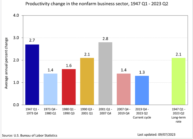
Two weeks ago, the BLS released their productivity figures for the second quarter. Productivity rose faster than labor costs by a good margin – notching a 3.5% annualized gain versus a 2.2% increase in unit labor costs. The manufacturing sector that car manufacturers belong to had a lower productivity gain of 2.9%. In that productivity release the BLS provided a chart grouping productivity gains by decade. The 75-year average is a 2.1% annual growth rate.

An often repeated theme of union workers and workers in general is that wage gains have not kept up with productivity gains. The BLS charted both series since 1973 and the divergence keeps growing by decade. American workers are competing with lower wage workers in Mexico, China and southeast Asia.

The annual gain in Productivity is erratic, rising sharply at the onset of recessions when workers are let go and the total hours worked declines. Recessions reduce the percentage of hours worked far more than the percentage reduction in output. I charted the annual gain in Labor Productivity (FRED Series OPHNFB) to show the effect of these shocks. The pandemic caused a particularly sharp rise and fall, as shown in the red rectangle below.

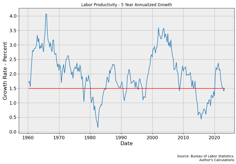
A five-year chart smooths out the divergences, letting us see the patterns more clearly. The red line in the graph below is the 1.5% current growth rate.

Trends in productivity growth are a medium term process, longer than any Presidential term. Despite that, candidates promise big productivity gains if they are elected. Republican candidates promise that lower taxes will boost productivity because that claim appeals to Republican voters. When productivity growth declined following the Bush tax cuts in 2001, conservatives blamed the stifling effects of regulatory compliance and called for more tax cuts. Democratic politicians promise more subsidies to an industry that is not nimble enough to respond to changing economic circumstances.

There are many factors that contribute to productivity growth. Some economists claimed that lower interest rates after the financial crisis would raise productivity. It fell. Those believers assert that declining productivity growth would have been worse without lower interest rates. This claim also cannot be disproved. Hypothetical situations are the favorite shield of a believer.

Corporate profits are up sharply since the start of the pandemic. For the past year, GM has enjoyed strong profit growth but they have had far too many down quarters since the financial crisis. Ford has fared better but its profit margin of 2.4% is only slightly more than the high-volume, low margin grocery giant Kroger. Stellantis has struggled to make a profit since 2018. For decades, federal and state governments have subsidized these auto giants with tax breaks and loans because the industry as a whole employs 1.7 million workers and contributes more than 10% to GDP. It is an industry where politics and economics are tightly intertwined. The politics clouds the economic analysis and the economics contorts the political calculations.

///////////////

20230924AssemblyLine

Photo by carlos aranda on Unsplash

Keywords: auto industry, GM, Ford, Stellantis, union, UAW, labor, workers, wages

The Power in Our Pockets

September 17, 2023

by Stephen Stofka

This week’s letter is about wages and income and the real purchasing power in our pockets. The auto workers’ union (UAW) went on strike limited to three auto plants while they continued negotiations with the auto companies. Nurses at Kaiser Permanente have voted to go out on strike by September 30th if they cannot resolve outstanding differences with Kaiser’s management. Executive compensation at the auto companies is now more than 300 times the average worker’s pay, the UAW points out, claiming that workers have as much right to share in the profits as executives and shareholders.

Legislation passed after the financial crisis required that publicly held companies report their CEO-to-Worker pay ratios. A recent analysis of companies in the SP500 estimated a pay ratio of 272-1 in 2022. The auto industry is part of the consumer cyclical industry, whose median executive compensation in 2021 was $13.7 million, as reported by Equilar. In 1965, the pay ratio was approximately 20-1. In the 1980s, the Reagan administration adopted a relaxed regulatory stance to corporate mergers and companies have grown much larger in the past decades. The pay ratio, however, has grown out of all proportion to the growth in corporate size.

A combination of factors contribute to high relative CEO pay. Thomas Greckhamer (2015) identified six paths – configurations of various factors – that are present in countries with high CEO pay and those without high CEO pay. He found that the relative pay of CEOs is high in countries where equity markets are well developed and highly liquid. Ownership is widely dispersed so that the CEO enjoys more power relative to stock owners and can negotiate higher compensation packages. CEOs do not have high relative pay in high welfare states where there are strong worker rights. A cultural acceptance of inequality and hierarchical authority, termed “power distance” by Geert Hofstede in 1980, contribute to high relative CEO pay. Here is a quick explainer. As a comparative example, the power distance factor in the American culture is low, half that of Mexico.  

Companies today derive their revenue and profits globally. For that reason it is not accurate to divide corporate profits by the number of employees in the U.S. I am going to do it anyway just to show the profound change that has taken place since the 1970s, a benchmark decade often cited as the beginning of growing inequality in the pay ratio. In the chart below I have adjusted after-tax corporate profits (FRED Series CP) for inflation, then divided that by the number of employees reported by the BLS (FRED Series PAYEMS). The trend is more important than the actual figures. Even though the 2010s were relatively flat the level of profits per employee was about double the level of the 1990s. Let’s compare that to worker incomes.

Since 1992, median household income adjusted for inflation has risen 23%, a level that is far below the rise in profits per worker. The chart below shows the gain on a log scale. Real incomes have gained less than 1% per year.

A few weeks ago I proposed adjusting prices by a broad index of house prices instead of the CPI. Two-thirds of American households own their home and home values reflect the discounted flow of housing services that we get from a home during our lifetimes. Housing costs are already almost half of the CPI and trends in home prices capture the feel of inflation on household budgets more accurately than the many CPI measures economists currently use.

During the 1980s and 1990s, housing prices increased 4% annually. The chart below describes the median household income adjusted by the all-transactions home price index (FRED Series USSTHPI). Notice that household incomes during those two decades stayed on an even keel.

Had the Fed structured their monetary policy to keep home price growth at the same level as the 1980s and 1990s, real incomes would be near the level of the green line, 10% higher today. Instead, workers feel as though they are on the path of the red line, regardless of what official measures of real household income indicate. The red line reflects a sense of discomfort and tension in many American households that plays out in our politics. The trend began with housing and finance policies enacted by both parties in Congress across five Presidential administrations.  

///////////////////

Photo by Charles Chen on Unsplash

Keywords: home prices, labor unions, wages, income, household income

Greckhamer, T. (2015). CEO compensation in relation to worker compensation across countries: The configurational impact of country-level institutions. Strategic Management Journal, 37(4), 793–815. https://doi.org/10.1002/smj.2370

Historic Employment Boom

September 10, 2023

by Stephen Stofka

This week’s letter is about the mix of full-time and part-time workers and what it tells us about the economy. Although unemployment remains below 4%, it rose slightly, according to the most recent unemployment report. This was a good sign, however, because much of that increase was due to formerly discouraged people returning to the labor force and looking for a job. This economy is producing historic employment numbers. Let’s dig in.

I’ll be looking at ratios of workers to the working age population so I’ll discuss that briefly before heading into the data. The Bureau of Labor Statistics now defines the working age population as someone 16 years and older. According to that definition, a 90 year old person is working age. The U.S. is part of the OECD group of developed countries, which uses a more traditional definition of the working age population as 15 to 64.  I am going to use the OECD definition to make historic comparisons more accurate. Two-thirds of this working age population is employed full or part time.

The percent of working age people who are employed full time – the red line in the chart below – is about 64%, a historic high that has eclipsed the economic boom of the late 1990s.

Only 2% of working age people are working part time.

The ratio of full-time workers to part-time workers reveals the strength of the economy. When it is high, employers have the confidence to commit resources to full-time workers, including better benefit packages. Workers have more bargaining power. The chart below shows the peaks in that ratio since the 1960s. A rise in investment accompanied each period. Defense spending led the surge in the 1960s. Investment in technology was a major driver of emploment growth in the 1990s. Spending on infrastructure has been a key driver of growth since the pandemic.

In the post-pandemic recovery, employers have sharply increased wages to fill positions, as shown below by the Atlanta Fed’s wage growth tracker. The decrease in wage growth during the past year is more typical of recessions but without a recession. In the chart below, note that today’s wage growth is one percent higher than the peak during the strong labor market of the late 1990s.   

The greater the number of full-time workers, the more the federal government receives in FICA taxes, reducing the yearly deficit in the Social Security Trust Funds. Since the early 1980s, income tax rates have been indexed to inflation but social security taxes have not. Only the earnings subject to social security, the earnings cap, is indexed. According to the latest Trustees report, the drain on the trust fund last year was $22 billion, less than 1% of the $2.8 trillion fund, but a drain, nevertheless. The first of the historically large Boomer generation were eligible for retirement almost a decade ago. The last of that generation will be eligible for retirement in eight years. The era of annual surpluses in the trust funds is over. During the past decade, outlays increased at a 4.5% annual pace while tax collections increased at a 5.3% rate. This was a welcome change of pace from the previous decade 2003 through 2012 when social security tax collections grew at only 3.6% annually, while outlays grew at a 5.4% rate.

The financial crisis had a deep negative impact on the trust funds and the current estimate is that the trust funds will be depleted in 2034. After that date, retirees will not receive full benefits without some legislation to provide additional funding. In 1990, the trustees estimated a depletion date of 2043, almost nine years later than today’s estimate. These long-range forecasts necessitate many assumptions about economic growth and benefits and such forecasts cannot anticipate outlier events like the financial crisis. There is a lot of catching up to do. We need all the boom we can get.

/////////////////

Photo by bruce mars on Unsplash

Keywords: social security, taxes, employment, wages

Note: In the past twenty years, the number of working Americans who are older than 65 has jumped from four million to 11 million, or 6.5% of the labor force.

The Protected

September 3, 2023

by Stephen Stofka

This week’s letter examines the proliferation of lawyers in America and how they are reducing our economic productivity. In grade school civics class, we were taught that America is a nation of laws; that no one is above the law. Since the 1960s we have become a nation of competing rights, not laws. An army of lawyers stands ready to argue the cause of any business or advocacy group with access to sufficient funds. Those who can afford the legal bills can lengthen legal proceedings against them for a decade or more. Conflicts over land use hamper infrastructure projects and housing reform.

In 2018, Steven Brill, author of Tailspin and many other books, wrote an article in Time magazine titled “How Baby Boomers Broke America.” Brill is a Yale educated lawyer who founded Court TV several decades ago. Brill noted that the best and brightest among us, particularly those in the financial and legal professions, have become part of a protected class. They are shielded from the laws that govern the rest of us, the unprotected class. The professional class claims to have the public’s best interest at heart but it often acts to protect itself first at the expense of the public interest and social mobility.   

In 1951 there were 220,000 lawyers for 155 million people in America, according to the American Bar Association (ABA). That represented a ratio of one lawyer to 700 people. is  In the 1960s and 1970s, Congress passed much social and environmental legislation that left the actual rulemaking up to lawyers at federal and state agencies. During the 1970s, businesses hired many lawyers to thwart the impact of this new legislation. By 1984, the number of lawyers had tripled to 664,000 for a population of 237 million, a ratio of one lawyer to 357 Americans. In an annual address to the ABA that year, Chief Justice Warren Burger remarked on this worrisome trend, warning that society would be overrun by hordes of lawyers. By 2018, there were 1.1 million lawyers for 315 million people in America, the highest number of lawyers per capita in the world. Just five years later, there are now 1.3 million lawyers, a ratio of one lawyer for 255 people.

With the advent of Johnson’s Great Society and the Environmental Protection Act in the 1960s, the burden of regulation grew heavy. Large companies hired lawyers to discover and develop loopholes that created a legal safe harbor from the regulatory machine. Burdened by regulation, smaller companies became less efficient, making them less competitive. Wage gains which might have gone to workers now went to accountants, lawyers, government and insurance fees to protect business owners from the fines and liabilities of the new regulations. Larger companies, able to wield more legal power per dollar of revenue, absorbed their smaller competitors, giving larger companies greater pricing power.

In 2021, the American Bar Association listed 175 members of Congress with law degrees, a third of the 535 members of the House and Senate. By design, bargaining or incompetence Congress writes laws in imprecise language, leaving it up to the legal staff of executive agencies and the courts to determine what Congress meant. There is a public outcry against rule by unelected bureaucrats and judges but in an evenly divided electorate, those unelected officials protect the minority of 49 from the abuses of the majority 51. Computer algorithms enable a slim majority in a state to gerrymander voting districts to give one party representative power that enfeebles the 49% who belong to the other party. Those who control the democratic process control the power.

The growing adoption of computer technology in the late 1980s inspired the hope that automation would reduce the need for lawyers. Instead, compliance and regulatory work has increased each year. A 2017 CNBC article speculated that Artifical Intelligence (AI) might replace lawyers. Its doubtful that lawyers would allow that to happen. They write the rules that protect them from the rules, including the rule of competition. John Dingell, former Congressman from Michigan, once said “If I let you write the substance and you let me write the procedure, I’ll screw you every time.” Like an infestation of grasshoppers in a field of plants, too many lawyers diminish the productive vitality of our economy.

//////////////////

Photo by Wesley Tingey on Unsplash

Keywords: finance, law, lawyers, regulations

An Alternative Monetary Rule

August 27, 2023

By Stephen Stofka

This week’s letter is a prediction that house price growth will decline to near zero in the coming few years based on historical trends of price growth and the 30-year mortgage rate. The pattern is similar to that in the late 1970s and mid-2000s. In each case the Fed kept its key interest rate below the annual rate of home price appreciation to achieve a broad economic growth. In each case that accommodating monetary policy helped fuel a bubble that led to severe recessions when the economy corrected.

This week the National Association of Realtors (NAR) reported another drop in existing home sales, the fourth drop in the past five months. At the same time, the Commerce Department reported that new single family home sales in July were up 31% over the same month last year. At first glance, that seems excessive but this past quarter was the first positive annual gain in single family home sales since the second quarter of 2021. Existing homeowners are interest rate bound to their homes until mortgage rates come down. New homes are filling the inventory gap.

Residential investment, which includes new homes and remodeling costs, contributes only 3-5% to GDP, according to the National Association of Home Builders. It varies by several factors. Homebuilders rely on the crystal ball predictions of the banking industry for financing. Homeowners’ remodel plans depend on the growth in home equity and interest rates available for financing. The pandemic sparked a shift in consumer preferences for existing homes. During the pandemic, new home sales decreased but remodeling increased. In this recovery period, the opposite has occurred. Home Depot has reported two consecutive quarters of negative sales growth, the first time since the housing crisis 15 years ago.

Let’s look at two previous periods when monetary policy was a major contributing factor to a subsequent decline in home prices and a recession. In the chart below (link to FRED chart is here), the red line is the average 30-year mortgage rate. The green line is the annual change in a broad home price index. As soon as the green line gets above the red line, homebuyers are making more in price appreciation than they are paying in interest, a form of arbitrage. That signals that monetary policy is too accommodating. The dotted line in the graph is the effective federal funds rate (FRED Series FEDFUNDS). Mortgage rates follow the Fed’s lead. In the mid-2000s, home price growth, the green line in the graph, rose up above the red mortgage interest line. As it did in the late 1970s, the Fed was watching other indicators and was slow to raise interest rates.

The period between the mid-1980s and the financial crisis is called the Great Moderation. From the end of the 1982 recession until the late 1990s, the Fed kept its key interest rate (dotted line) higher than home price appreciation and lower than the 30-year mortgage rate, a moderating balance. Since 2014, home price growth has been above the 30-year mortgage rate. When this latest period of arbitrage unwinds, the effects will disturb the rest of the economy. When will that moment come?

Asset bubbles leave an economy vulnerable to shocks. In an interconnected global economy, disturbances from malinvestment can cascade through one prominent economy to test the strength of institutions and businesses in other countries. The U.S. financial crisis demonstrated that process. The foundations of companies like AIG and Goldman Sachs, thought to be financial fortresses, cracked and threatened a collapse that would bring other large companies down with them.

One of the roles of a central bank is to curb the heady expectations that fuel asset bubbles. In a 1993 paper John Taylor introduced a rule, now called the Taylor rule, to guide the Fed’s setting of interest rates. His rule was based on the actual decisions that had guided Fed policy during the decade that followed the severe 1982 recession, part of a period called the “Great Moderation.”

In their textbook on money and banking, Cecchetti & Schoenhoeltz (2021, 498) describe the rule succinctly: Taylor fed funds rate = Natural rate of interest + Current inflation + ½ (Inflation gap) + ½ (Output gap). I’ll leave the equation in the notes at the end. This policy rule was meant as a guideline so the equals sign should probably be read as an approximately equals sign. John Taylor originally used 2% as the natural rate of interest. To simplify the calculation and understand the relationships, the authors present a simple scenario. If the inflation rate is 2% and the target inflation rate is 2%, then there is no inflation gap. If real (i.e. inflation-adjusted) GDP growth is 2% and potential output is also estimated to be 2%, then there is no output gap. I’ll note the calculation in table format below:

The Congressional Budget Office (CBO) estimates potential GDP based on a full utilization of the economy’s resources. Here’s a screenshot of the two series since the financial crisis. Real potential GDP is the red line. Real actual GDP is the blue line. The financial crisis in 2007 – 2009 had profound and persistent effects on our economy. The graph is drawn on a log scale to show the difference in percent. As a guideline, the gap for 2012 is about 3%.

I propose using the inflation in house prices as a substitute for the inflation part of the calculation. I’ve included the equation in the end notes. Presumably, home price growth implicitly includes the neutral rate of interest so I exclude that from this alternative measure. The price of a home includes a decades-long stream of owner equivalent rent priced in current dollars. It incorporates estimates of housing consumption and long-term wealth accumulation. Home prices include evolving community characteristics and public investment like the quality of schools, parks, transportation, employment and personal safety. They are a broad market consensus. This particular series is compiled quarterly but follows the trend of the monthly Case & Shiller National Home Price Index, giving the central bank timely home price trends.

Fifty years ago, Alchian and Klein (1973) proposed that central banks include asset prices in their formulation of monetary policy. They wrote that a composite index of many types of assets would be an ideal measure but difficult to calculate. A broad stock index like the S&P 500 would capture the current price of capital stock but stocks can overreact to interest rate changes by the central bank (p. 180, 183). The S&P500 index is relatively volatile, with a 10-year standard deviation of 14.88%. The 30-year metric is 15%. The home price index is stable, with a 40-year standard deviation of just 4.74%, slightly above the 4.07% deviation of the Federal funds rate itself.

During the early years of the Great Moderation, this alternative policy rule was approximately the interest rate policy that the Fed adopted. In the graph below is the alternative rule in red and the actual Fed funds rate in blue. Notice the sharp divergence just before the 1990 recession. In the aftermath of the Savings and Loan crisis, the annual growth in home prices fell from 7% in 1987 to 2.5% in the fall of 1990. This was below the 4% long-term average of home price growth, signaling a call for a more accommodating monetary policy. The Fed did not recognize the economic weakness until it was too late and the economy went into a mild recession. For several years following the recession, the labor market struggled to regain its footing and this slow recovery contributed to President H.W. Bush’s defeat in his 1992 re-election bid.

The employment slack of the first half of the 1990s might have been lessened by a monetary easing. In the second half of that decade, the alternative rule called for a tighter monetary policy, which would have curbed the enthusiasm in the stock and housing markets. The divergence between the alternative rule and the actual Fed funds rate grew as the housing bubble developed. By the time the Fed started raising interest rates in 2004-2005, it was too late.

I will finish up this analysis with a look at the past decade. The alternative rule and the Taylor rule would have called for a higher policy rate. Persistent low rates helped fuel a growing price bubble in the housing market. The pandemic accentuated that trend. High home prices have contributed to unaffordable housing costs in popular coastal cities, sparking a surge in homelessness.

 Exiting an asset bubble is painful. Expansion plans are put on hold. As investment decreases, hiring growth declines and unemployment rises among those most vulnerable in the labor force. Withholding taxes decline, reducing revenues to state and federal governments who must carry the additional burden of benefit programs that automatically stabilize household incomes.

Housing costs constitute 18% of the core price index that the Fed uses to gauge inflation, but accounts for 40% of core price inflation. Because housing is a major component of household expenditures, home prices can act as a stable measure of inflation. Home prices capitalize the future flows of those expenses. Persistently low interest rates can distort those calculations, promoting malinvestment and an asset bubble. This alternative rule incorporates that signal into policymaking and should help the Fed make more timely course changes before the disturbances spread throughout the economy.

/////////////////

Photo by Tierra Mallorca on Unsplash

Keywords: Savings and Loan Crisis, Financial Crisis, Inflation, Federal Funds Rate, Taylor Rule, Home Price Index

(1) FFR = NRI +πt + α(πt – πt*) + ß(γt – γt*), where
π is the annual change in the Personal Consumption index (FRED Series PCEPI).
NRI is set at 2.0%.
γ is the natural log of real GDP (FRED Series GDPC1) and
γ* is real potential GDP (FRED Series GDPPOT).
α and ß coefficients are the degree of concern and should add up to 1. If inflation is more of a concern then α would be higher than ½. If output is more of a concern ß would be more than ½.

(2) Alternative Taylor Rule: FFR = hpi +  α(hpi – avg30(hpi)) + ß(γt – γt*), where
hpi = the annual percent change in the All-Transactions House Price Index (FRED Series USSTHPI).
avg30(hpi) is the 30 year average of the hpi.

Alchian, A. A., & Klein, B. (1973). On a correct measure of inflation. Journal of Money, Credit and Banking, 5(1), 173. https://doi.org/10.2307/1991070.

Cecchetti, S. G., & Schoenholtz, K. L. (2021). Money, banking, and Financial Markets. McGraw-Hill.

Price Consensus

August 20, 2023

by Stephen Stofka

This week’s letter is about the formation of a price consensus between buyers and sellers. I’ll introduce a different perspective that might help us understand broad price changes. Visually oriented readers familiar with economics and statistics can listen to this letter and mentally picture these ideas as they walk the dog. However, I’ll present several graphs to illustrate the perspective.

Anyone who has taken an Economic course has been introduced to a supply demand diagram. Quantity is on the x-axis and Price is on the y-axis. The lines may be curved or straight. The intersection of the demand and supply lines is the equilibrium price, the long term average. A capitalist economy promotes change and the supply-demand diagram is a visual aid to understand how price and quantity respond to shifting conditions. Students learn how the supply-demand curves respond to changes in income, to better production technology, to price changes in other kinds of goods. That simple diagram demonstrates responses to government policies like taxes, transfer programs, price controls like apartment rents, and agricultural price supports.

The dotted line represents demand after a period of time, the one component missing from this 2-dimensional graph. While it pictures the formation of an equlibrium price it does not emphasize the broad price consensus that forms between buyers and sellers. To picture that let’s draw a probability distribution of sales at various prices and quantities. I’ll exchange the quantity and price axes so that price is on the horizontal x-axis and quantity is on the vertical y-axis.

I’ll redraw the chart, setting the average price to $0 with a short range of prices above and below that average. The equilibrium price is just the average long term price. The chart below highlights the narrow consensus over price between consumers (blue line) and suppliers (orange line). Rising prices induce more suppliers to enter the market. Declining prices attract more buyers. The supply and demand lines are curved, representing the number of sales taking place at each price level. The total number of units sold is 10,000.

Let’s consider a garden tool whose average price is $30. We will see some customers willing to pay $34, or $4 above that average price, but there are few of them. Likewise, there are few suppliers willing to sell at a price of $26, a price that is $4 below the average price.

To show price and quantity dynamics, the normal distribution graph is not as flexible or as simple as the conventional supply-demand diagram. The normal distribution chart can be viewed as a spread of prices over time, the third dimension. Just imagine that wedge of blue is a piece of pie so many weeks or months thick. Seeing price as a probability distribution does reflect a buyer’s reality in the sense that we prefer to shop with approximate prices in mind. Monthly surveys conducted by the BLS tell us that the prices of two categories – food and energy – are volatile, making it difficult for us to anchor a price expectation. These are the prices we encounter frequently when we fill up our cars, pay our utility bills and shop at the grocery store.

The graph is similar to a 2-dimensional triangle and is missing a critical component – time. The depth of a slice of pie can represent time periods. Demand operates on a shorter time scale than supply, an idea central to the analysis of Alfred Marshall, the economist who developed the supply-demand graph we use today. It’s a thinner wedge of pie.

Imagine that the average of a weekly tank of gas is $40. The blue pie of the normal distribution in the graph is sliced into a 100 vertical strips that statisticians call “bins.” Imagine that every one of those bins is a week and the center, the zero point, is an average of gas prices over two years. That is the time scale of demand. The time scale of supply is thicker, perhaps four times as long in some industries. The chart below shows the 2-year (demand) and 4-year (supply) averages of weekly gas prices for the past 25 years. Current 2-year average prices are at a historical peak. These prices are not adjusted for inflation. Adjusted for inflation, gas prices have declined in the past 40 years. After adjusting for fuel efficiency, gas prices are comparable to those in the 1950s.

The supply chain, including the banks that fund them, must look far into the future. Each one of the bins in the normal distribution chart could represent a month, not a week, forming an eight year average. No one could have foreseen a pandemic that interrupted global production. Coming out of the pandemic, businesses responded to low interest rates and anticipated a surge in demand. In an 18-month period from the fall of 2020 to the spring of 2022, private investment increased by 22%. The inflation that erupted in the spring of 2022 was a combination of growth in short term demand and long term supply investment. As soon as the Fed began raising interest rates, the surge in private investment ended and leveled out.

The normal distribution chart helps us see price as a probability distribution dispersed over time. Any chart that reminds us of pie is a useful and welcome analytical tool.

///////////////

Photo by Michael Dziedzic on Unsplash

Keywords: probability distribution, supply, demand, price

Intended and Unintended Consequences

August 13, 2023

by Stephen Stofka

This week’s letter explores the free market and rule of two laws in our lives. Advocates for a laissez-faire market quote Adam Smith’s mention of the invisible hand in The Wealth of Nations, or WON. In a free market, individuals pursuing their own self-interest unintentionally promote a general welfare, a positive outcome as a result of the Law of Unintended Consequences.

Smith was particularly concerned with what I will call the Law of Intended Consequences. Under the guise of acting in the public interest, individuals furthered their own self-interest at the expense of the public welfare. In Part I of WON, Smith spent several chapters documenting many examples of collusion between business owners and merchants, labor guilds and city magistrates to further the gains of a small minority at the expense of the majority. This included price supports, price fixing, protective trade restrictions and the granting of monopolies through licensing. The only solution was a system of governance that promoted a general law and order with as few laws as possible.

The free market encourages a set of problems that subtract from the general welfare. Individuals pursue the most gain with the least cost. We want to buy low and sell high. We tout the principles of equality, but more often choose to maximize our own welfare. Transportation is most affected by this trait. Railroad, truck and airline carriers would prefer to supply the shorter distance routes which generate the most profits at the least cost. Without regulation and cross-subsidy, long distance routes that connect local or regional markets are underserved. This cripples the formation of a national transportation system. Although Adam Smith died a few decades before the introduction of railroads, he compared shipping goods by water to land based transportation by horse drawn wagon (Chapter 3). The former was far more profitable and explained why the “art and industry” of cities and towns close to water improved at a faster pace than inland communities.

This free market mechanism of the invisible hand fostered densely populated cities whose crude sanitation promoted epidemics of disease. In 1800 London had a population density averaging 30,000 people per square kilometer, a density more than twice as high as present-day New York City. The rich could afford a wagon and horse for transportation and moved to the outskirts of a city to escape the filth, smoke and disease of congested cities. The poor died prematurely. That was the invisible hand at work, subject to the same Law of Unintended Consequences.

In an ideal world, public laws would strike a balance between the laws of intended and unintended consequences. However, the very making of public law invokes the Law of Intended Consequences. Elected representatives tend to serve narrow ideological or geographical constituencies that are aligned with a representative’s own welfare. That is not a condemnation of their self interest but a description of the difficulty an elected body faces when trying to pass any law that claims to serve the public welfare.

In Article I, Section 8 of the Constitution, the framers limited Congress’ lawmaking authority to specific powers and those that promoted the general welfare. To James Madison, the main architect of the Constitution, that wording was clear. It meant only those laws that supported a broad public welfare like the common defense. Richard Lee, one of the anti-Federalists suspicious of centralized authority, protested that the general welfare could include “every possible object of human legislation,” as Michael Klarman (2016) quoted in his account of the making of the Constitution. Lee was worried that a strong central government could expand its power to tax for any reason that it deemed to be in the general welfare. A small class of people or a central government could argue that their welfare was the general welfare.

People in difficult circumstances clamor for a piece of the tax purse. Pharmaceutical manufacturers argue that a liberal extension of profit-protecting patent rights will promote more drug development and advance the general welfare. Advocates of trickle-down economics champion laws that promote lower taxes and fewer regulations, arguing that business owners will spread the wealth to working families. This is the collusion between private industry and lawmakers that Adam Smith documented 250 years ago. Our motivations and machinations do not evolve.

The welfare of the individual and that of the public must ever come in conflict. There is an inherent weighting we attach to each person’s welfare and each of us gives greater value to our own welfare. In the Part II, Chapter 3 of the Theory of Moral Sentiments, Smith remarked that we get more upset over the loss of the tip of a finger than we do over the loss of millions of lives if China were to be swallowed up by an earthquake. We cannot agree on society’s maximum welfare, or ophelimity, because we use different weighting coefficients to measure welfare. Lawmaking is a compromise between competing calculations of interest, both individual and public.

A laissez-faire market, like a pure white paint, is not efficient. A bit of black or umber tint mixed into a white paint base gets a wall covered in fewer coats and the tint is not noticeable. Each participant in a free market gains from cheating so some regulation is necessary as an incentive toward self-policing. We argue over how much regulation to mix into the free market base. We have different personal convictions, values and tastes, ensuring that our disagreements will persist.

////////////////

Photo by Tom Wilson on Unsplash

Keywords: general welfare, trickle-down economics, free market, invisible hand

Klarman, M.J. (2016). The Framers’ Coup: The making of the United States Constitution. New York: Oxford University Press, pp. 322-3. 

Money Exchange

August 6, 2023

by Stephen Stofka

This week’s letter contains some idle thoughts on the exchange of money. Imagine a visitor from outer space who observes the exchange of cash for a $5 ice cream cone at a store. The buyer starts eating the ice cream. The store clerk puts the piece of paper in a black box, the cash drawer. It is clear to the visitor that the buyer has received something useful. What is not clear is what the store clerk received in exchange. The visitor has learned that creatures throughout the universe give up something in response to a reward or a threat. If the piece of paper was a threat, the clerk did not seem alarmed when the buyer offered the piece of paper across the counter. The visitor reasons that the paper is an energy packet which the clerk will consume later. Perhaps the clerk can put the paper into water and it will become food.

The visitor from outer space has realized an essential aspect of money. It contains potential energy that can be released immediately and exchanged for a good or service. It’s like an electrical capacitor ready to deliver an energy packet. We call that exchange energy purchasing power. Immediate release means that money has no maturity period, or a maturity of 0. A one-year CD cannot be spent because it has a maturity of one-year. To spend it, I need to wait until the one year is over or convert the CD to cash and receive a reduced amount, a penalty for early withdrawal.

The charge on that money capacitor can increase or decrease. We use the terms deflation and inflation for the increase and decay of money’s purchasing power. Inflation measures the percent of purchasing power lost over a period of time and that percentage lost cannot be more than 100%. In other words, a $1 bill cannot lose more than $1 of purchasing power. There is no theoretical limit to deflation, the increase in money’s purchasing power.

We use the terms yield and discount rate for the increase and decrease of money’s nominal value at some future time. These rates of change in purchasing power reveal another aspect of money – an exchange of time. What is time? A container of probabilities and that involves risk. Instead of consuming the ice cream cone, let’s say the buyer left the ice cream cone in a freezer for a period of time. What is the chance that some random power outage occurs and the ice cream melted while the freezer was off? When the freezer is opened, will the cone of ice cream be intact and ready to enjoy or will it be a discardable mess of ice cream protoplasm? Readers will note the analogy with Schrodinger’s thought experiment about a cat in an unopened box containing a life-threatening amount of radioactive material.

A lottery winner must decide between a series of payments and a lump sum payment that is far less than the nominal amount of winnings. The difference between now consumption and future consumption is called the discount rate, which includes a rate of risk that the winner does not live to receive all the payments. Social Security allows people to claim benefits at age 62 but the monthly payments are substantially lower than someone who waits until full retirement age. The discount rate is about 8% per year, almost the average annual return on the stock market. The risk is that a retiree dies prematurely and leaves money on  the table, so to speak.

There is no objective or time-invariant value in an exchange of energy. The exchange value of time varies by person and circumstance. In case of death or injury, the insurance industry calculates an average annual loss of income, or purchasing power, multiplied by an average estimate of years remaining in a person’s life. Ken Feinberg worked pro bono as the master of the 9-11 Victim’s Compensation Fund set up by Congress to resolve and expedite the many lawsuits that victims and their families would bring against the airlines. Feinberg agreed that an objective measure like years lost cannot compensate for the subjective loss of a life to a victim’s family. Money cannot measure life.

The exchange of money for goods and services connects buyers and sellers to a tree of information. Transactions take two forms: those that are recorded or “witnessed” by a third party and those that are not. If a buyer uses a check or credit card to buy an ice cream cone, a bank records the exchange of money for ice cream. If the buyer uses cash, only the merchant and the buyer have a record. The merchant records a sale and the buyers gets a receipt if they ask. The merchant reports the sum of sales to a government agency for sales tax and income purposes. In the case of a food-borne disease the USDA will investigate the many branches of that tree, searching the vendors, distributors, packagers and growers to isolate the source of contamination.

The exchange of ice cream for money is a connection to a tree of production. The manufacture and storage of the ice cream involved a network of power plants to generate electricity, machinery and labor for production, as well as natural and artificial ingredients. The buyer has the purchasing power in her pocket because of some past exchange of energy as part of a production process.

The sidewalk and street outside a store connects a buyer to a tree of organizational authority. Some public entity had the ability to gather the resources to build that infrastructure. The use of those public facilities might have cost the ice cream buyer 30 to 40 cents in sales tax. Over decades metropolitan areas have attracted people because cities offer an economic bargain of public benefit for relatively small cost.

The exchange of ice cream for money connects the buyer and seller to a network of rules and expectations of behavior. The clerk won’t sing the Star Spangled Banner when she receives the money. She won’t do a magic trick with the ice cream. The buyer will not give a dramatic reading of the serial number on the $5 bill before handing it to the clerk. Exchange requires a tacit cooperation, an agreement to follow the rules.

As a child I learned that there was electricity inside the walls. The air I walked through and breathed was full of radio waves in addition to light and sound waves. There was literally music in the air, captured and translated by a portable radio. Today our cell phones interpret the microwave radiation emitted by hundreds of nearby cell towers. Our thoughts and senses are connected to each other as we walk through the information stream. The ultimate source of every bit of that information is the effort of another human being. For the monthly cost of a cell phone bill, we have access to that effort, that infrastructure, the taxing and regulatory authority that supports that exchange. The exchange of money connects our efforts, yet talking about money usually introduces dissension. We disagree about the distribution of money, the priorities of public spending and the principles of taxation. Then we blame money instead of ourselves.     

///////////////

Photo by Artem Sapegin on Unsplash