The Conflict in Policy

March 10, 2024

by Stephen Stofka

This week’s letter continues my analysis of the many roles of the federal government, comparing spending, tax revenues and the federal debt that has accumulated since 9-11. Governments accumulate debt by spending more than they collect in tax revenues. Farmers, businesses and households appreciate the subsidies and support from government but resist paying the taxes to fund those programs. The private marketplace depends on government funding of nascent technologies that may take decades to commercialize. Examples include the internet, the development of semiconductors, lithium batteries and the funding of pharmaceutical research. Investment in military readiness has spurred advancements in aerospace and satellite technology, the GPS that connects our phones and the Kevlar clothing that protects our soldiers and police officers. Critics may ridicule a government investment in solar manufacturer Solyndra, but it was also heavy government funding that provided the cash flow for SpaceX and Tesla.

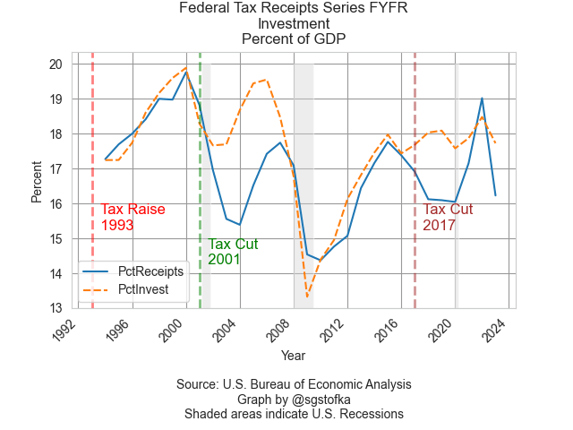
In last week’s letter I showed that private investment and government spending and investment both averaged about 18% of GDP over the past three decades. A closer look at those two series shows how they complement and compete with each other. In the graph below, private investment dipped from 19% of GDP in 2006 to below 14% in 2009. As a percent of GDP, government spending and investment took up some of the slack.

As many people lost their jobs, they became eligible for Medicaid or food stamps. Both of these programs are included in government spending because the programs directly or indirectly provide people with goods or services. The graph above does not include increased unemployment insurance payments during the recession. These are included in government transfers since this is money, not services, transferred from the government to individuals. Policymakers refer to this combination of support programs as automatic stabilizers, providing assistance to households during hard economic times.

A recent analysis by the Congressional Budget Office (CBO) found that these automatic stabilizers were not “key drivers of debt over the long-term.” The federal debt was growing because government spending was increasing at a faster pace than revenues. The chart below shows spending and revenues for the past thirty years in a natural log form to portray the trends of change more clearly.

For most of the past three decades, revenue growth, the orange dashed line in the graph above, lagged government spending, the blue line. Note that this revenue series (FRED Series FYFR) does not include Social Security taxes. The growth in government spending showed some moderation only during Obama’s term and that was the worst time to slow the growth of government spending and investment. The Great Recession of 2007-2009 was the worst economic downturn since the 1930s Depression, surpassing the pain of the back-to-back recessions of the early 1980s.

Biden was vice-President during that recovery and was determined not to repeat that mistake in the aftermath of the Covid-19 pandemic. Although the Democratic majorities in the House and Senate were slim, unified government helped the effort to pass the Inflation Reduction Act and the CHIPS Act. Both pieces of legislation committed government funds to support investment in clean energy development and semiconductor manufacturing. Such commitment spurred private investment in the energy industry. In 2023 field production of crude oil surpassed 2019 levels, according to the Energy Information Administration (EIA). They report that natural gas output was up 2% in the first year of Biden’s term, then accelerated to 5% growth in 2022 and 2023 following Russia’s attack on Ukraine.

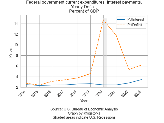
Despite big increases in the deficit after 9-11, and an accumulated debt of $22 trillion held by the public, the interest share of GDP has remained below the levels of the 1990s. In 2001, China was admitted into the World Trade Organization. As imports from China increased, we paid for them with U.S. Treasury debt, helping to keep interest rates low for most of the past two decades.

Unlike individuals and corporations, governments can buy their own debt. Unless a majority of that debt is sold in the private marketplace, there is no independent evaluation of the creditworthiness of that debt. At the end of last year, 65% of the total Federal debt was privately held, the highest percentage since 1997 (see notes). Including the Treasuries held by independent Federal Reserve banks, the percentage is close to 80%. A recent report from the Center for Strategic and International Studies (CSIS) calculates the percentage of debt held by two of our largest trading partners, China and Japan, at 5.8%. The wide ownership of U.S. debt validates it as a low-risk financial instrument.

The global financial system depends on tradeable sound securities. When the financial crisis undermined confidence in mortgage securities, private investment declined sharply, and it would do so again if investors doubted the soundness of Treasury securities. The recent CBO report points out a weakness in public policy that the Congress must resolve or risk damaging the credit of U.S. securities. 1997 was the last year when Congress submitted a budget by the deadline, according to the Congressional Research Service. When is the moment when the private debt market loses hope that Congress can match its spending and revenues? No one can forecast a stampede to safety but in hindsight many will claim to have seen the exit signs.

///////////

Photo by Manki Kim on Unsplash

Keywords: investment, debt, interest, Treasuries, government spending, taxes, automatic stabilizers

According the March 2024 Treasury bulletin, total Federal debt was $34 trillion. $21.7 trillion was privately held – about 65%. See Table OFS-2 of the March bulletin. Privately held debt plus $5.2 trillion of Treasuries held by independent Federal Reserve banks constitute Federal Debt Held by the Public (FRED Series FYGFDPUN) and is close to 80% of total federal debt. For a thirty-year series of the public’s portion of total debt, see https://fred.stlouisfed.org/graph/?g=1hYFV. Until the 2008 financial crisis Federal Reserve banks held less than 10% of total debt. During the pandemic, that share rose to 21%. At the end of 2023, the share was 15.4%.

The Role of Government

March 3, 2024

by Stephen Stofka

This week’s letter is about the federal government, its expenses and the role it plays in our lives. As originally designed in 1787, the federal government was to act as an arbiter between the states and provide for the common defense against both Indians and the colonial powers of England, France and Spain. James Madison and others considered a Bill of Rights unnecessary since the powers of Congress were clearly set forth in Article 1, Section 8 of the Constitution. However, they agreed to attach those first ten amendments to the ratification of the Constitution to soften objections to a more powerful central government (Klarman, 2016, p. 594). After the Civil War, the federal government was given a more expanded role to protect citizens from the authoritarianism of the states. The authority to do so came from the amendments, particularly the recently ratified 13th, 14th and 15th additions to the Constitution (Epstein, 2014, p. 15).

After the Civil War, the Congress awarded pensions to Union soldiers, their widows, children and dependent parents. In 2008, there were still three Civil War dependents receiving pensions! (link below). This program indebted future generations for the sacrifices of a past generation. Aging soldiers sometimes married young women who would help take care of them in return for a lifetime pension until they remarried. The provision of revenues for these pensions provoked debate in Congress. In the decades after the Civil War, the federal government’s primary source of revenue was customs duties on manufactured goods and excise taxes on products like whiskey. Farmers and advocates for working families complained that this tax burden fell heaviest on them, according to an account at the National Archives. There were several attempts to enact an income tax, but these efforts ran afoul of the taxing provision in the Constitution and courts ruled them invalid. Fed up with progressive efforts to attach an income tax to legislation, conservatives in Congress proposed a 16th amendment to the Constitution, betting that the amendment would not win ratification by three-quarters of the states. Surprisingly, the amendment passed the ratification hurdle in 1913. In its initial implementation, the burden of the tax fell to the top 1% so many disregarded the danger of extending federal power. Filling out our income tax forms is a reminder that our daily lives are impacted by events 150 years in the past.

In the decade after the stock market crash of 1929, the government extended its reach across the generations. Under the Franklin D. Roosevelt (FDR) administration, the newly enacted Social Security program bound successive generations into a “pay-go” compact where those of working age paid taxes to support the pensions of older Americans. The government assumed a larger role in the economy to correct the imbalance of a free-market system which could not find a satisfying equilibrium. This expanded role of government and the writing of John Maynard Keynes (1936) helped spawn a new branch of economics called macroeconomics. This new discipline studied the economy as a whole and a new bureaucracy was born to measure national output and income.

Students in macroeconomics learn that the four components of output, or GDP, are Consumption, Investment, Government Spending and Net Exports. In its simplest definitional form, GDP = C+I+G+NX. In the American economy each of these four components has a fixed portion of output. Net exports (FRED Series NETEXP) are a small share of the economy and are negative, meaning that America imports more goods and services than it exports. The largest share is consumption (PCE), averaging 67% over the past thirty years. Government spending and investment (GCE) and private investment (GPDI) have averaged an 18% share during that time. Because these two components have an equal share of the economy, more government spending and taxes will come at the expense of private investment. This helps explain the intense debates in Congress over federal spending and taxes. Federal investment includes the building of government facilities, military hardware, and scientific R&D. I have included a link to these series in the notes.

The Social Security program is as controversial as the pensions to Civil War veterans and their survivors. The long-term obligations of the Social Security program are underfunded so that the program cannot fully meet the promises made to future generations of seniors. The payments under this program are not counted as government spending because they are counted elsewhere, either in Consumption or Investment. They are treated as transfers because the federal government takes taxes from one taxpayer and gives them to another taxpayer. The taxpayer who pays the tax has less to spend on consumption or saving and the person who receives the tax has more to spend on consumption or saving. However, those transfer payments represent already committed tax revenues.

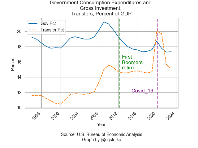
The chart below shows total transfer payments as a percent of GDP. Even though they are not counted in GDP, it gives a common divisor to measure the impact of those payments. The first boomers born in 1946 were entitled to full retirement benefits in 2012 at age 66. In the graph below those extra payments have raised the total amount of transfers to a new level. After the pandemic related relief transfers, total transfers are returning to this higher level of about 15% of GDP. I have again included government spending and investment on the chart to illustrate the impact that the federal government alone has on our daily lives. In one form or another, government policy at the federal level steers one-third of the money flows into the economy.

For decades, the large Boomer generation contributed more Social Security taxes than were paid out and the excess was put in a trust fund, allowing Congress to borrow from the fund and minimize the bond market distortions of government deficits. Outgoing payments first exceeded incoming taxes in 2021 and Congress has had to “pay back” the money it has borrowed these many years. To some it seems like a silly accounting exercise of the right pants pocket borrowing from the left pocket, but the accounting is true to the spirit of the Social Security program as an insurance program. Paul Fisher, undersecretary of the Treasury, quipped in 2002 that the US government had become “an insurance company with an army” but the quip underscores public expectations. Workers who have been paying Social Security taxes their entire working life expect the government to make good on its promises.

We are mortal beings who create long-lived governments that act as a compact between generations. We argue the terms and scope of that compact. What is the role of government? The founding generation debated the words to include in the Constitution and even after the words were on the page, they could not agree on what those words meant. The current generations are partners in that compact, still debating the meaning of the text of our laws and the role of government in our lives.

///////////////////

[20240303Government.jpg]

Photo by Samuel Schroth on Unsplash

Civil War pensions – a National Archives six page PDF https://www.archives.gov/files/calendar/genealogy-fair/2010/handouts/anatomy-pension-file.pdf

Data: a link to the four data series at FRED https://fred.stlouisfed.org/graph/?g=1hxIK. There is a small statistical discrepancy, and that series is SB0000081Q027SBEA.

Social Security: Notes on the adoption of a 75-year actuarial window used by the trustees of the Social Security funds to assess the ability of the program to meet its obligations. https://www.ssa.gov/history/reports/65council/65report.html. In 2021, the Congressional Research Service published a three-page PDF explainer for the choice of a 75-year term.

Epstein, Richard Allen. (2014). The classical liberal constitution: The uncertain quest for limited government. Harvard University Press.

Keynes, J. M. (1936). The general theory of employment interest and money. Harcourt, Brace & World.

Klarman, M. J. (2016). The Framers’ Coup: The Making of the United States Constitution. Oxford University Press.

Crystal Ball

February 25, 2024

by Stephen Stofka

This week’s letter is about the public’s expectations of inflation. The interest rate setting committee of the Fed indirectly controls the borrowing costs on our mortgages, credit cards and auto loans. The committee pays attention to public expectations of inflation because we respond now to what we see as potential threats. A fear of “making a mistake” in a job interview can make us nervous, increasing the chances that our behavior will decrease our chance of securing that position. A consumer who expects higher gas prices next year may buy a more fuel efficient vehicle this year.

Consumers must anticipate their future circumstances and income when they decide between different consumption bundles. Should they spend more on housing and live closer to work or get more house for their dollar and have a longer commute? Invest time and money in college, including the loss of income while attending school. Consumers must decide how much to spend and how much to save. Despite the difficulty of such decisions, many consumption choices are made on a shorter time scale than the suppliers who provide those goods and services. To survive, a business must live in the future, anticipating the trends of customer behavior that shape demand for its products or services. Since the pandemic, the shift to work at home has hurt many downtown businesses that depend on foot-traffic. There aren’t enough office workers to support some types of businesses.

In his General Theory published in 1936, John Maynard Keynes gave a prominent role to investor expectations. John Muth (1961) presented a more formal model that he termed “rational expectations.” In the 1970s, Thomas Sargent and Robert Lucas developed more extensive models to understand how people responded to the stagflation of the 1970s. The formation of expectations is an important economic variable and remains a hotly debated topic among economists.

Each month the New York branch of the Federal Reserve surveys a rotating sample of 1300 people to gauge their expectations of overall price changes as well as principle expenses like housing, food and gas (questionnaire pdf here). The Fed provides data on the past decade of surveys which allows us to assess changes in public expectations. As I explored this data with graphs, I was surprised at how closely expectations conformed to a textbook model that students are taught in an intermediate macroeconomics class. Macro is hard because there are few natural experiments to test theories and models. The pandemic led to a series of events that provided such a natural experiment.

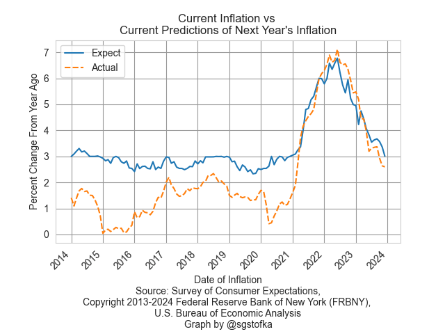
I’ll begin by comparing actual inflation to public expectations of inflation a year earlier. The first graph is actual inflation and the predictions of that inflation from a year earlier. From 2014 to 2020, the median value of expected inflation, the blue line, stayed anchored in the 2.5% to 3% range even when actual inflation, the orange dotted line, was below that. Lower inflation was not a threat to people’s pocketbooks so there was little reason to revise their estimates downward. We have a well-studied risk aversion, meaning that we place greater weight on loss than we do on gains. In this case, lower than expected inflation is a gain. Economists and the general public were both caught off guard when inflation surged higher in 2021.

As soon as inflation rose above long-term averages, as it did in 2021, survey respondents revised their estimates of next year’s inflation. Higher inflation is a threat to our finances, so we pay greater attention. However, survey respondents based their estimates of next year’s inflation on this year’s actual inflation. Is that a good estimating procedure? Maybe not, but estimating trends requires knowledge, practice and error checking to improve our skills. Many times we use shortcuts, called heuristics, instead. I will leave a textbook explanation of the formation of inflation expectations in the notes.

How do we survive using shortcuts? One of those shortcuts is our degree of uncertainty. There are fewer traffic accidents at roundabout intersections because they introduce a degree of uncertainty that causes us to be more cautious. The median percent of uncertainty jumped in March 2020 when pandemic restrictions were announced. When Biden took office a year later uncertainty remained at this elevated base. As the economy reopened in the spring of 2021, supply disruptions became apparent. “When are you going to get more of these in stock” was met with “We don’t know. They’re on a boat somewhere in the Pacific.” While people sat at home during the pandemic, they bought a lot of goods from online retailers like Amazon. The reopening of service-oriented businesses caused another price shock as the economy transitioned from goods-heavy back to one that relied heavily on services.

The peak of uncertainty occurred in mid-2022, shortly after the Fed began a series of consecutive interest rates increases that would lift the benchmark lending rate by 5%. The uncertainty of survey respondents decreased in reaction to the Fed’s intention to keep increasing rates until rising inflation was tamed. I’ll zoom in on the past three years of uncertainty and the Fed’s “get serious” campaign of interest rate increases.

Despite criticism of the Fed, its intentions were credible to the public. Expectations are as difficult to measure as animal pheromones but they are real. They cause responses. Surveys are an imperfect gauge of expectations but they will have to do until someone invents an expectarometer that detects the mental disturbances in the sub-ether caused by expectations. That’s a world similar to Philip K. Dick’s Minority Report and I’m not sure we want that.

////////////////////

Photo by Jan Huber on Unsplash

Keywords: federal funds rate, inflation, expectations

Note on inflation expectations: A textbook explanation is

πet = (1- θ)π̅  + θπt-1, or in words
πet   is current expectations of future inflation,
π̅   is average inflation,
θ is the weight people give to recent inflation πt-1 (Blanchard, 2017, p. 162).
From 2014-2020, survey respondents gave little weight to recent inflation, such that θ was close to 0 and expectations of inflation were close to a long-term average. As soon as inflation rose above the long-term average, θ went quickly to 1, resulting in an equation that looked like πet = (1-1)π̅ + 1π̅t-1   which simplifies to the most recent reading of inflation.

Blanchard, O. (2017). Macroeconomics (Seventh ed.). Boston, MA: Pearson Education.

Muth, J. F. (1961). Rational Expectations and the Theory of Price Movements. Econometrica, 29(3), 315-33512

Changing the Rules

February 18, 2024

by Stephen Stofka

This week’s letter continues to take a historical look at survey data. Every July the polling organization Gallup publishes a mid-year assessment of sentiment toward political institutions like Congress and the President, and the civic institutions that help bind our society together. These include our schools, the medical system and organized religion. Institutions are a set of rules and relationships, of rights and responsibilities. The company provides historical tables of these surveys that show a declining trust in our institutions.

Graphing the positive responses against a background of seminal events like 9-11 and the start of the Iraq war reveals the volatility of the public’s confidence in the president. Over 50% of respondents to Gallup’s survey  expressed a “great deal” or “quite a lot” of confidence in George Bush before and after 9-11.  His ratings fell  sharply after the invasion of Iraq. The justification for the war collapsed when the public learned that there were no WMD, or weapons of mass destruction, in Iraq. By the end of 2006, positive sentiment was just 25%, less than half the results at the start of the Iraq war. In 2007, the Bush administration committed troops to ensure security in the capital city of Baghdad and this helped turn the momentum of the war. The success of this strategy called the surge helped lift confidence in the president. Notice that confidence in Biden’s presidency is about the same as the confidence in the Bush presidency in 2006.

According to Ballotpedia, 94% of Congressional members are re-elected yet survey respondents have a low confidence in Congress as an institution. On a bipartisan vote 22 years ago, Congress authorized the Iraq war. Within a year, confidence ratings sank and have never recovered. Today positive sentiment is less than 10%. The rules of both the House and Senate are designed to let a few key people in either body control the flow of legislation to the floor of each chamber. Party leaders are more concerned about their own power and reputation than the voices of the people who elected the members of the House and Senate. Almost 250 years after fighting the British over taxation without representation we have lots of taxation and little effective representation.

Medical

The Affordable Care Act (ACA) was supposed to restore public confidence in our very expensive and bloated medical system. Judging by the responses to this Gallup survey question, the creation of this bureaucracy in 2010 has had little effect on the public’s confidence in the system as a whole. Many of the provisions in the act known as Obamacare rolled out slowly and the marketplace for insurance did not open until the beginning of 2014. When the online public exchange opened, its inability to handle the surge of applicants was a humiliation for the Obama administration. Despite the improving functionality of the public exchange and the greater access to health insurance, there was little effect on public confidence. In the initial months after the Covid-19 shutdown, confidence spiked but fell again to its former level the following year.  

Schools

Gallup’s 2020 survey of confidence in schools also saw of surge of support that declined to a pre-pandemic average the following year. The decline in confidence began after the onset of the Iraq war and continues to this day. At 26%, positive sentiment is only two-thirds of the level at the start of the Iraq war and matches a low set during Obama’s second term.

Banks

At the height of the housing bubble in 2006, almost 50% of survey respondents expressed strong confidence in banks. In the following two years, confidence plummeted and has barely recovered in the 15 years since.  This lack of confidence may explain the growing support for a digital currency alternative like Bitcoin.

What is the takeaway? A declining confidence in institutions can spark a revolution just as it did in the Progressive era a century ago. As people become discontent with the rules that govern their daily lives, they look to change the institutions that embody those rules. The people within those institutions are regarded as corrupt. Groups turn to violence in an attempt to restore the integrity of those institutions as they perceive it. In the years leading up to World War I, there were hundreds of bombings of prominent buildings and frequent riots to protest working conditions for adults and children, as well as living conditions within America’s growing cities. People were beaten and jailed for wanting freedoms that we now take for granted. Sixty years ago Bob Dylan wrote The Times They Are A-Changin’, heralding an era of protest and reform in the 1960s. This may be another seminal moment when people will demand a change in the rules because the old rules are serving so few.

/////////////////

Photo by Sean Pollock on Unsplash

Keywords: Congress, President, schools, banks, medical, healthcare

Survey Signals

February 11, 2024

by Stephen Stofka

This week’s letter takes a detour toward political polling. NBC News recently posted a story summarizing its latest opinion poll on the overall state of the country and the favorability of presidential candidates. Hart Research Associates regularly conducts this poll for NBC News and asks the question “All in all, do you think things in the nation are generally headed in the right direction, or do you feel that things are off on the wrong track?” One of the reporters at NBC News was kind enough to post the survey data on a central repository, and included in Hart’s survey data were the results of past surveys. A visual depiction of those survey trends contradicted some of my beliefs.

For a decade, the majority of survey respondents regularly answered that they don’t like the direction the country is going. More than half of these surveys were conducted among registered voters only and it doesn’t matter who the President is. The wrong track responses outnumber those who think the country is on the right track. In the graph below I’ve charted a four survey average to smooth the trends in the results. The orange dotted line is the percentage of those who answered wrong track. The blue line indicates those who answered right direction. Less than 10% of respondents have a mixed opinion or are not sure and I did not include those responses in the graph.

Toward the end of Obama’s second term, the percentage of wrong direction responses declined to about 55% before Trump took office in January 2017. From there, the survey responses became increasingly pessimistic. In the final year of Trump’s term negative sentiment shot up in reaction to the pandemic and it kept rising during Biden’s term. The percentage of those with a negative outlook this past month is over 70%, but just a few percent higher than a peak toward the end of Obama’s second term.

Favorability

Given such pessimism about the direction of the country, it is no surprise that a President’s favorability ratings rarely exceed 50%. Survey respondents were routinely asked to rate their feelings toward several public figures. Although both Biden and Trump are subjects of this question for more than a decade, I focused on the responses while both men were in office. The survey has five categories of feelings, from very positive to very negative. I chose just the two favorable categories, very positive and somewhat positive. A chart of the response numbers indicates stark differences in the trend of feelings toward each person. I’ll begin with Joe Biden.

In the first few months of Biden’s term, the sum of positive responses increased from 44% to 50%. Although the Democrats had a political trifecta, their majorities in the House and Senate were slim and prevented passage of controversial legislation like comprehensive immigration reform. The realities of the political process dampened the ardor of progressives who hoped for reforms in immigration, as well as education and child care. The level of moderate feelings, those who answered they were somewhat positive toward Biden, remained anchored at about 20%.

Unlike Biden, the percent of respondents with very positive feelings toward Trump continued to grow during Trump’s term. His disruptive style won him more appeal from ardent supporters than he lost among moderates. Trump’s overall favorability increased slightly during his term from 38% to 40%. Unlike Biden, Trump has a zealous voter base which affords him room to make reckless political postures.

In contrast, Biden’s support is more tempered and results oriented. After an initial positive rating among half of respondents in the early months his very positive ratings in this survey dropped by almost half. The passage of the Inflation Reduction Act in August 2022 helped revive his favorability ratings but the bloom faded after the Republicans won a slim majority in the House a few months later. For Democratic voters, policy choices trump party and person loyalty. With little prospect of further legislative gains in a divided Congress, voter enthusiasm waned.

Party loyalty has long been a central characteristic of Republican voters. Like an operator switching a train track, Trump has steered that loyalty to himself as a person. As such his favorability has been more resilient. In November 2018, midway through Trump’s term in office, the Democrats won the House Majority. Just before Christmas, the Republican-led Congress and Trump were unable to pass an Appropriations bill or a Continuing Resolution. The federal government shut down all non-essential services for a month, the longest government shutdown on record. Trump’s favorability ratings should have taken a hit.

Unlike Biden, Trump’s favorability increased in reaction to the shutdown and the swing of power in the House to Democrats. A wing of the Republican Party, fervent and defiant, continue to fight for control of the party and its agenda. Trump is their champion. The party has evolved from a party holding the political center – think of Mitt Romney – to a reactionary movement of None of the Above. No taxes, no immigration, no Obamacare, and no restrictions on guns to name some prominent issues. Nikki Haley, a Republican challenger to Trump, lost the Nevada primary to a candidate on the ballot named None of these candidates.

After the January 6th riot at the Capitol, fervent support for Trump waned. By June of 2023, survey responses of  very positive had dropped by half to a low of 17 and his total positive sentiment was less than Biden’s numbers. His success in the upcoming election will depend on whether he can re-engage strong sentiment among Republican voters.

These polls demonstrate the strength of Trump’s support in the party. Those in the Republican caucus are afraid of a primary challenge that will cost them their seat. In 2014, the Republican House Majority Leader, Eric Cantor, lost a primary to a Tea Party challenger who received a boost from conservative media. Trump wields a big trumpet and blows it daily. As any parent of a two-year old knows, saying no is easier than making choices that involve compromise. With only a slim majority in the House, loyalty to Trump has made it difficult for Republicans to pass any legislation in the House. Republican congressman Chip Roy from Texas worries that his party will have few accomplishments to attract voters in the upcoming election. However, voters in the coming election will likely cast a rejection vote as in Not Trump or Not Biden. The media will be bombarded with even more negative advertising than usual. Grab a big box of popcorn and settle in.

//////////////

Photo by Emily Morter on Unsplash

Keywords: election, survey, opinion poll, ratings, favorability

Producer and Consumer Prices

February 4, 2024

by Stephen Stofka

This week’s letter is about the inflationary spurt that began a little over two years ago. The causes of the inflation have been a controversial topic among economists and political commentators. Some blame Biden and the Democrats for enacting a third round of stimulus shortly after he took office. That’s fiscal policy on the hot seat. Some target monetary policy, blaming the Fed for leaving interest rates at a pandemic low near 0%. In this letter, I will focus on a price signal that the Fed could have treated with more importance. A combination of the two is more credible. Republicans hope to make inflation and the immigration crisis at the southern border central issues in this year’s election campaign.

I’ll begin with two measures of changes in consumer prices. The Consumer Price Index, or CPI, is a headline gauge of inflation that reflects current price changes. Because Fed policy must anticipate price changes, it uses a  a less volatile index called the PCEPI, or Personal Consumption Expenditures Price Index. I’ll call it PCE. The CPI is based on a static basket of goods that the average family might buy each month. Households adapt to changing prices where they can but the CPI methodology does not measure that. Nor does it measure costs paid by someone other than the members of a household. To address those weaknesses, the PCE measures the actual spending choices that households make. The PCE includes expenses like health care benefits that an employer provides. The Cleveland branch of the Federal Reserve has a deeper dive on the differences between the two measures.

The oldest price index, first charted in 1902, is based on a measure of prices that producers and wholesalers receive at both the intermediate and final stages of production. In the final demand phase, a product is going to be sold to a consumer. In the intermediate stage a producer sells a product to another producer as a component in their product. Each month the BLS surveys thousands of companies to compile the wholesale prices on most of the goods sold in the U.S. and 70% of traded services. The agency then builds hundreds of indexes to measure the changes in those prices. The Producer Price Index, or PPI, is a headline composite of those indexes. As you can see in the graph below, the PPI is more volatile than the PCE measure of consumer price inflation. Government subsidies can increase the prices that suppliers receive with little impact on consumer prices. The PPI is more responsive to changes in transportation and distribution costs.

Despite its volatility, the PPI is regarded by the Fed, Congress and the administration as an advance indication of movements in consumer prices, according to the BLS. It indicates producers’ forecast of consumer demand and reflects economic stress and global supply pressures. However, wholesales prices may not be a reliable forecast tool of consumer inflation if the economy is weak and households cut back on their spending where they can. In the recovery years following the financial crisis in 2008, real GDP did not rise above 3% until the end of 2014. Unemployment finally dipped below 5% in the spring of 2016.

In 2021, the PPI indicated a developing surge in wholesale prices that would become apparent in consumer prices by the following year. But the economy still had not fully opened and unemployment did not fall below 5% until the fall of 2021. Would the pandemic recovery follow the sluggish trend of the recovery after the financial crisis? The Fed waited, preferring to keep interest rates low to support the labor market. In the graph below I’ve charted both the PCE and PPI over the past eight years. I’ve marked out the beginning of Biden’s term in the first quarter of 2021 and the Fed’s tightening that began in the spring of 2022.

The PPI (dotted orange line) had already reversed higher before Biden took office. As we can see in the chart above, the Fed did not enact stricter monetary policy until the PPI had peaked. In hindsight, the Fed was late to respond to surge in prices but Congress has given the Fed a dual mandate to maintain stable prices and full employment. During times of economic stress, those two objectives can indicate contradictory policies. During the initial months of the pandemic in 2020, five million people left the work force. In early 2020, the participation rate for the prime work force aged 25-54 stood at 83%. By the fourth quarter of 2021, the rate was still only 82%. 1.5 million workers had still not returned to the labor force. During a severe crisis like the pandemic, the Fed has trouble balancing those two objectives of stable prices and full employment. If they raised rates too soon, they could have damaged a recovery in the labor market.

While the general price level has come down in the past year, the inflation beast is not dead. There is still a residual inflation energy in some intermediate goods. Had the pre-pandemic price trends continued for the past four years, we might expect prices to be 8 to 10% higher than they were at the start of 2020. The prices of a number of goods have stabilized at levels far above their pre-pandemic levels. Meats are 32% higher after four years. Natural gas prices (WPU0551) have declined from the highs of last winter but are 38% higher than pre-pandemic prices. Residential electric power (WPU0541) and gasoline (WPU0571) are up 25% in four years. LPG gas is up 28% in that period. The prices of paper boxes (WPU095103) are up the same amount. Paper (WPU0913) is up 25%. The prices of bakery goods (WPU0211) are up 22% and still rising.

Despite promises made during the upcoming presidential campaign, the general price level is not going to return to its pre-pandemic level no matter who is president. The pandemic shook up the global economy, raised the general price level and there is no going back. A U.S. president may have their finger on the button of an arsenal of destruction but they have little influence on the producer prices of goods sold around the world. A hindsight analysis can identify policy winners and losers made by both the Trump and Biden administrations. The Fed and other central banks waited too long to respond to a worldwide inflation. Finally, the lessons learned from this pandemic will not all be applicable to the next global crisis.    

////////////////

Photo by Ian Taylor on Unsplash

Keywords: PCE, PPI, wholesale prices, consumer prices, inflation

Note: In April 2022 the Fed began raising its key interest rate by .25% or more each month.  

Cycle of  Expectations

January 28, 2024

by Stephen Stofka

This week’s letter is about the decisions people make in connection with their compensation. Guided by the strength of the job market and expectations of inflation, employees seek higher compensation by switching jobs or by wage and benefit demands. Like fish in the sea, these individual decisions form schools that follow and shape the currents of economic growth and inflation.

There are two main components to employee compensation. The first category includes wages or salary, some of which is reduced by income and FICA taxes. The amount left over is called disposable income. The second component of compensation is loosely categorized as benefits that are already dedicated to a single purpose and are non-disposable. These include paid time off, pension plan contributions and health care. They also include government mandated taxes that the employer pays for the employee. These include workers’ compensation, unemployment insurance and the employer’s half of FICA taxes. Except for paid time off, employees do not pay income taxes on benefits.

As I noted last week, the Bureau of Labor Statistics calculates an Employment Cost Index (ECI) that includes both wages and benefits. This composite can give us different insights than tracking the growth of wages alone. Comparing the ratio of the wages portion to the total index allows us to spot trends when wages grow more than benefits or benefits grow faster than wages. I’ll call this the Wage Ratio.

In the chart below, we can see three distinct periods: 2001 through 2007, 2008 through 2015, and 2016 through 2023. In the first and third periods, wages grew faster than benefits but their growth patterns are distinct. In the first period growth was coming into balance with benefit growth. In the third period, wage growth was accelerating. In both periods there was a strong correlation between the wage ratio and an inflation measure that the Fed uses called PCE inflation (see notes).

When inflation is low, employees may desire more of their compensation in benefits. Most of these are tax-free so employees get more “bang” for each dollar of benefit. In the second period, there was a rebalancing of wages and benefits. As the nation recovered from the housing and financial crisis, low inflation reduced the pressure to seek higher wages. During the last year of Obama’s second term in 2016, that inflation rate began to rise from near zero to 2%. The Fed raised its key interest slightly above zero, happy to finally see inflation nearing the 2% target rate that the Fed considers healthy for moderate growth.

The Fed also has a target for its key interest rate that is 2% or above. For eight years it had kept that interest rate near zero to help the economy recover after the financial crisis. The Fed knows that such a low rate has two disadvantages. It gives the Fed less room to respond to economic crises because they cannot adjust rates lower than the Zero Lower Bound (ZLB). Secondly, sustained near-zero rates lead to high asset valuations, or bubbles, which are disruptive when they pop. The housing crisis was a recent example of this.

During the first three years of the Trump presidency, inflation leveled out near that 2% target rate as the Fed continued to raise rates in small increments, finally ending near 2.5%. In 2018, Trump went on a tirade against the Fed, accusing it of sabotaging his Presidency. Low interest rates had fueled an annual rise in housing prices from 5% at the end of Obama’s term to 6.4% in the first quarter of 2018. Trump was not the first President who wanted a subservient Fed willing to enact policy that enhanced the Presidential political agenda. Because a President wins a general election, they may convince themselves that their desires reflect the general will. They do not. Congress gave the Fed a twin mandate of full employment and stable prices to separate Fed policy from Presidential control. It did so after several episodes where Fed policy served the desires of the President rather than the public welfare.

In 1977, Biden was in the Senate when Congress enacted the legislation that gave the Fed a twin mandate. Unlike Trump, Biden has not pounded his chest like a belligerent gorilla as the Fed raised rates by five percentage points within a year. The results of the Republican primaries in Iowa and New Hampshire make it likely that this year’s election will be a repeat contest between Biden and Trump. The Fed has hinted that they might lower rates this year if inflation indicators remain stable and the unemployment rate remains low. That would be the proper response and in accordance with the Fed’s mandate.

Should the Fed lower rates even a small amount, Trump will certainly complain that the Fed is helping Biden win re-election. He will protest that “the system” is opposed to him and his MAGA supporters. If Republicans can gain control of both houses of Congress and the Presidency this November, Trump will likely pressure McConnell to change the cloture rule so that Senate Republicans will need only a majority to pass a bill making the Fed an agency subject to Trump’s control. In 2022, seven Republican Senators introduced a bill to condense the number of Federal Reserve banks and make their presidents subject to Senate approval. Should the Fed lose its independence from political control, we can expect the high inflation that has afflicted Venezuela and Argentina, countries where a political leader has used monetary policy to win political support. Workers will demand higher wages to cope with rising prices and those demands will help fuel the inflationary cycle. We actualize our expectations.

/////////////////

Photo by Erlend Ekseth on Unsplash

Keywords: inflation, wage growth, housing prices, Fed policy, monetary policy

Correlation: In the eight year period from 2001thru 2008 when wage growth was high but declining, the correlation between inflation and wages was -.63. From 2016 through 2023, as the wage ratio was rising, the correlation was .85.

Pocketbook Ratios

January 21, 2024

by Stephen Stofka

Thanks to an alert reader I corrected an error in the example given in the notes at the end.

This week’s letter is about the cost of necessities, particularly shelter, in terms of personal income. Biden’s term has been one of historic job growth and low unemployment. Inflation-adjusted income per capita has risen a total of 6.1% since December 2019, far more than the four-year gain of 2.9% during the years of the financial crisis. Yet there is a persistent gloom on both mainstream and social media and Biden’s approval rating of 41% is the same as Trump’s average during his four-year term. Even though there are fewer economic facts to support this dour sentiment, a number of voters are focusing on the negatives rather than the positives.

I will look at three key ratios of spending to income – shelter, food and transportation – to see if they give any clues to an incumbent President’s re-election success (a link to these series and an example is in the notes). Despite an unpopular war in Iraq, George Bush won re-election in 2004 when those ratios were either falling, a good sign, or stable. Obama won re-election in 2012 when the shelter ratio was at a historic low. However, the food and transportation ratios were uncomfortably near historic highs. These ratios cannot be used as stand-alone predictors of an election but perhaps they can give us a glimpse into voter sentiments as we count down toward the election in November.

A mid-year 2023 Gallup poll found that almost half of Democrats were becoming more hopeful about their personal finances. Republicans and self-identified Independents expressed little confidence at that time. As inflation eased in the second half of 2023, December’s monthly survey of consumer sentiment conducted by the U. of Michigan indicated an improving sentiment among Republicans. The surprise is that there was little change in the expectations of Independents, who now comprise 41% of voters, according to Gallup. There is a stark 30 point difference in consumer sentiment between Democrats and the other two groups. A recent paper presents  evidence that the economic expectations of voters shift according to their political affiliations. A Republican might have low expectations when a Democrat is in office, then quickly do an about face as soon as a Republican President comes into office.

Shelter is the largest expense in a household budget. Prudential money management uses personal income as a yardstick. According to the National Foundation for Credit Counseling, the cost of shelter should be no more than 30% of your gross income. Shelter costs include utilities, property taxes or fees like parking or HOA charges. Let’s look at an example in the Denver metro area where the median monthly rate for a 2BR apartment is $1900. Using the 30% guideline, a household would need to gross $76,000 a year. In 2022 the median household income in Denver was $84,000, above the national average of $75,000. At least in Denver, median incomes are outpacing the rising cost of shelter. What about the rest of the country?

The Bureau of Labor Statistics (BLS) calculates an Employment Cost Index that includes wages, taxes, pension plan contributions and health care insurance associated with employment. I will use that as a yardstick of income. The BLS also builds an index of shelter costs. Comparing the change in the ratio of shelter costs to income can help us understand why households might feel pinched despite a softening of general inflation in 2023. In the graph below, a rise of .02 or 2% might mean a “pinch” of $40 a month to a median household, as I show in the notes.

Biden and Trump began their terms with similar ratios, although Biden’s was slightly higher. Until the pandemic in early 2020, housing costs outpaced income growth. Throughout Biden’s first year, the ratio stalled. Some states froze rent increases and most states did not lift their eviction bans until the end of July 2021. In 2022, rent, mortgage payments and utility costs increased at a far faster pace than incomes. Look at the jump in the graph below.

An economy is broader than any presidential administration yet voters hold a president accountable for changes in key economic areas of their lives. Food is the third highest category of spending and those costs rose sharply in relation to income.

Transportation costs represent the second highest category of spending. These costs have risen far less than income but what people notice are changes in price, particularly if those changes happen over a short period of time. In the first months of the pandemic during the Trump administration, refineries around the world shut down or reduced production. A surge in demand in 2021 caused gas prices to rise. Despite the rise, transportation costs are still less of a burden than they were during the Bush or Obama presidencies.

Neither Biden nor Trump were responsible for increased fuel costs but it happened on Biden’s “watch” and voters tend to hold their leaders responsible for the price of housing, gas and food. In the quest for votes, a presidential candidate will often imply that they can control the price of a global commodity like oil. The opening of national monument land in Utah to oil drilling has a negligible effect on the price of oil but a president can claim to be doing something. Our political system has survived because it encourages political posturing but requires compromise and cooperation to get anything done. This limits the damage that can be done by 535 overconfident politicians in Congress.

Voters have such a low trust of Congress that they naturally pin their hopes and fears on a president. Some are single-issue voters for whom economic indicators have little influence. For some voters party affiliation is integrated with their personal identity and they will ignore economic indicators that don’t confirm their identity. Some voters are less dogmatic and more pragmatic, but respond only to a worsening in their economic circumstances. Such voters will reject an incumbent or party in the hope that a change of regime will improve circumstances. Even though economic indicators are not direct predictors of re-election success they do indicate voter enthusiasm for and against an incumbent. They can help explain voter turnout in an election year. A decrease in these ratios in the next three quarters will mean an increase in the economic well-being of Biden supporters and give them a reason to come out in November.

///////////

Photo by Money Knack on Unsplash

Keywords: food, transportation, housing, shelter, income, election

You can view all three ratios here at the Federal Reserve’s database
https://fred.stlouisfed.org/graph/?g=1ejaY

Example: A household grosses $80,000 income including employer taxes and insurance. They pay $24,000 in rent, or 30% of their total gross compensation. Over a short period of time, their income goes up 8% and their rent goes up 10%. The ratio of the shelter index to the income index has gone up from 1 to 1.0185 (1.10 / 1.08). The increase in income has been $6400; the increase in annual rent has been $2400. $2400 / $6400 = 37.5% of the increase in income is now being spent on rent, up from the 30% before the increase. Had the rent and income increased the same 8%, the rent increase would have been only $1920 annually, not the $2400 in our example. That extra $480 in annual rent is $40 a month that a family has to squeeze from somewhere. They feel the pinch.    

Fish and Bones Investing

January 14, 2024

by Stephen Stofka

This week’s letter is about our portfolios and the return we earn for the risks we take. Flounder is tasty but be careful of the bones. January is a good time to review savings and assets and start making plans for 2024. Did I make any contributions to my IRA in 2023? After the gains in the stock market last year, how has my portfolio allocation changed? I thought I would take a wee bit of time to review the performance and key indicators of some model portfolios over the past sixteen years. We have endured a great recession, a financial panic, a slow recovery during the 2010s and a pandemic in 2020. Despite all those setbacks the SP500 index has more than tripled since December 2007. Huh?! Before I begin, I will remind readers that none of what I am about to say should be considered financial advice.

Allocation

A portfolio can be separated into three broad categories: stocks, bonds, and cash. Stocks are a purchase of equity or ownership in a company;  bonds are a purchase of public and private debt; cash is an insurance policy. Each of these can be subdivided further but I will stick with these broad categories. An allocation is a weighting of these types of assets. A benchmark allocation is 60/40, meaning 60% stocks and 40% bonds and cash. The percentage of stocks in a portfolio indicates an investor’s appetite or tolerance for risk. In this review I will discuss three allocations: 50/50, 60/40 and 70/30. A 70/30 allocation is considered more aggressive than a 50/50 allocation.

Investment Cohorts

The 50/50 portfolio was invested equally in the SP500 (SPY) and the total bond market (AGG) at the start of each 8-year period, beginning with the period that began in 2007. I will refer to these 8-year periods as cohorts, just like age cohorts. The 2007 cohort was “born” on January 1, 2007, and “died” on December 31, 2014. The second cohort was born on January 1, 2008, and died on December 31, 2015. There was no rebalancing done throughout each period to test the effect of a severe financial shock during the life of the investment.

Presidential Administrations

I picked an 8-year period because it aligns with two Presidential terms. A change in administration alters the political climate and presumably has some effect on a portfolio’s returns. The data, however, did not confirm that hypothesis. Presidential candidates try to persuade voters that their candidacy and their party will make people better off. To the millions of people trying to build a retirement nest egg, a change in administrations during the past 16 years had little effect. The market responds to forces much broader than the policies of any administration.

Specific Cohorts and their Returns

Let’s look at a few cohorts. Despite the severe downturn during 2007-2009, the slow recovery and the pandemic shock, the more aggressive 70/30 allocation delivered consistently higher returns than the two safer allocations. Obama’s two term Presidency began in 2009 at a decades low in the stock market, an opportune time to invest. However, that 8-year return had only the second highest return in this analysis. The highest return was the 2013-2020 cohort that consisted of Obama’s second term and Trump’s only term (so far).

Risk vs. Return

In 2008 a 50/50 portfolio cushioned the 37% loss in the U.S. stock market but over an 8-year period, the advantage of a safer allocation largely disappeared. In the period that began in 2008 all three portfolios delivered less than a 6% annualized return. During a severe downturn, a safer portfolio can mitigate an investor’s fears but the best tonic is a long term perspective. Generally the difference in returns is about 1% per year so the 50/50 portfolio earned 1% less than the 60/40 which earned less than the 70/30 portfolio. However the 70/30 investor absorbed more risk than the other two portfolios. In the chart below is the standard deviation (SD) of each portfolio, a measure of the risk or variation in a portfolio.

Performance Metrics

Recall that the 2013 cohort (green dotted line) had a return above 12%. The risk was almost 11%, a nearly one-to-one ratio of return to risk. Financial analysts have developed several measures of the tradeoff between risk and return. The Sharpe ratio is a measure of return that adjusts for risk by subtracting the return on a really safe investment from the return on the portfolio. The benchmark for a risk free investment is a short term Treasury bill (The interest rate on a money market account would be a close substitute).

Let’s use some rounded figures from the 2013 cohort as an example. The 70/30 portfolio earned 12% and a safe investment earned just 1%, a difference of 11%. That is the numerator in the Sharpe ratio. The denominator is the level of risk which is the standard deviation (SD) mentioned above. The SD was almost 11%, giving a ratio of 1. In the chart below is the Sharpe ratio for each cohort and shows that the actual ratio of 1.1 was close to the approximation above. Notice that the safer 50/50 portfolio often had the higher risk adjusted return.

From Peak to Valley

Investors may ask themselves “how much in return can I earn” when the more appropriate question is “how much risk can I tolerate?” The MDD, or maximum drawdown, is the greatest change in the value of a portfolio, regardless of the beginning and ending of a year. A portfolio might have gained 20% by October of 2007, then lost 60% in the next six months. The MDD would be 60%. It can be a gauge of your comfort level. Notice in the chart below that the MDD only varies under great stress like the financial crisis when the difference between the safer 50/50 allocation and the 70/30 portfolio was about 10%.

The Impact of Loss

We feel losses more than we do gains, even if the losses are only on paper. A portfolio that gains 20% only has to lose 16% to return to even. Regardless of our math abilities in a classroom, our instincts can be quite good at percentages. At higher gains, the percentages are painful. A portfolio that gains 50% then loses 50% nets a 25% net loss from our starting position (see notes at end). An MDD is a good indicator of “will this loss of value cause me to sell the investment?” In the early part of 2009 after the market had been battered, some clients could not handle the anxiety and sold some or all of their stocks, despite the advice from their advisors that this was the worst time to sell.

No Two Crises are Alike

Since December 2019, a few months before the pandemic restrictions began, the stock market gained 20% after adjusting for inflation (details at end). During and after the financial crisis, stocks lost 12% during the four years from December 2007 through December 2011 (details at end). The better response of asset prices during the pandemic era can be attributed to two phenomenon: technological advances and high government support of households and small business. During the financial crisis the majority of government support strengthened the foundations of financial institutions at the expense of households and small businesses. During the pandemic, many people could be productive from home. Students were in a virtual classroom with 15-30 other students. Had the pandemic happened in 2007, there was not enough bandwidth to support that kind of access, nor had the software been developed that could run that network capacity.

Takeaways

Households vary by income, by age, by health, circumstances and family characteristics. Each of these factors is a component of a risk exposure that a household faces. A younger couple might have time on their side but family obligations reduces their risk tolerance. Those obligations might include caring for an elderly parent or supporting a child’s educational goals. These models cannot replicate actual portfolios or individual circumstances but they do illustrate the smoothing effect of time even under the worst shocks. Risk tolerance is a matter of time tolerance.

//////////

Photo by Ch P on Unsplash

Keywords: portfolio allocation, standard deviation, risk, return, Sharpe ratio

A portfolio of $100 that gains 50% is then worth $150. If it loses 50%, the result is a value of $75, a net loss of $25 or 25%.

According to multpl.com, the inflation-adjusted value of the SP500 was 4708 in December 2023. This was a 20.6% gain above an index of 3902 in December 2019. The index stood at 2005 in December 2007, the first month of the Great Recession that would become the financial crisis in 2008. In December 2011, the index stood at 1762, an inflation-adjusted loss of 12%.

Seniors Spend, Seniors Vote

January 7, 2024

by Stephen Stofka

This week’s letter examines the spending habits of seniors and the effect of that behavior on the broader economy. The growth of spending in this age group surpasses all others. Seniors spend money and they vote their interests.

In 2020, the Census Bureau estimated the population 65+ at 55.8 million, almost all of them collecting Social Security. One in six people in the U.S. is older than 65 but made up 26% of the 154.6 million voters in 2020, making them overrepresented voters, according to the Census Bureau. They vote to protect their programs, their priorities and preferences. In 2000, Social Security income represented 4% of the country’s total income. Today, it is 5%. Their assets, incomes and spending habits affect the entire population.

In 2000, seniors aged 65+ were just 3% of the labor force, according to the BLS. The 2008-9 recession dealt a blow to the retirement plans of many older folks who continued working past their retirement age. In 2020, when the pandemic rocked the economy, seniors comprised 6.8% of the labor force. Many seniors did not return to the labor force and today, almost four years after the pandemic began, their share of the labor force has remained the same, about 6.8%. Had their share of the labor force continued to grow, seniors in the labor force would total about 13.2 million. The latest data from the BLS indicates an actual level of 11.5 million, a shortage of 1.7 million. Adding in that shortage would raise the unemployment rate above 4.5% from the current level of 3.7%. The chart below shows the approximate shortage.

The Federal Reserve’s Survey of Consumer Finances shows that incomes taper off after middle-age (page 7). Senior workers were part of an age group that was particularly vulnerable to the Covid-19 virus. As many businesses shut down in March 2020, many seniors had few options except to file for Social Security to secure an alternative income source. Monthly payments to recipients rose sharply from $78.1 billion in February 2020, the month before pandemic restrictions, to $89.4 billion in February 2022, according to the Social Security Administration. Also, many seniors who had paid off their mortgages would have an “imputed” income generated by the investment in their house. Restaurants and gathering places reopened in the summer of 2020 then shut down again as Covid-19 cases surged. States reopened these venues on a gradual basis with staggered or outdoor seating only. As vaccines became available in the first quarter of 2021, seniors were the first to be eligible. Personal consumption expenditures jumped almost $1 trillion in March and April of that year and seniors led the spending surge.

Imagine feeling forced to retire and not being able to enjoy leisure activities like movies, golf, travel, museums or dining out. These activities were mostly shut down from March 2020 to the spring of 2021. The New York Fed conducts a triannual (3x a year) survey of household spending that reveals some interesting changes in spending habits in response to the pandemic. Those under age 40 had the highest rate of large purchases. People over age 60 increased their overall spending by the most – 9.1%. In the chart below, that senior age group is the dotted green line at the top. By the first quarter of 2023, seniors were still increasing their spending while the younger age groups had cut back. Notice that spending growth by seniors, the green dotted line in the graph below, were consistently the highest of all age groups.

According to an analysis by the Pension Rights Center, half of all senior households have income less than $50,000. That same household spending survey found that those with low incomes increased their spending by the largest percentage of the income groups. In the first quarter of 2022, households in this low income group increased their spending by almost 10%, as indicated by the red dashed line in the chart below.

In the first quarter of 2023, their spending came down along with all other income groups but then sprang up again during the spring of summer of this past year. This age and income group has contributed to the strength of consumer spending this past year.

This year promises to be one of the most contentious in our history. Elections are won by a coalition of groups and for the past decade, the voting coalitions are evenly matched. The voting rules in a democracy naturally allow some groups to command a dominant voice that is out of proportion to their numbers. One out of six Americans are seniors and one out of four voters are seniors. Their vote will advantage their own interests and priorities at the disadvantage of other groups. That’s democracy.

/////////////////

[20240107TreeBench

Photo by Aaron Burden on Unsplash

Keywords: consumer finances, spending, voting, income, household income