
May 28, 2023
by Stephen Stofka
This week’s letter is about debt, both public and household. Since 9-11, the public federal debt has grown five times. The causes include costly wars in Iraq and Afghanistan, a global financial crisis followed by a slow recovery, tax cuts passed under the Trump administration and a once-in-a-century pandemic. Ten percent of the $32 trillion debt was added during the first three months of the pandemic. As the deadline approaches when the government will not be able to make timely payments to vendors and bondholders, we ask why do we have this thing called a debt limit?
Denmark is the only other country in the world to require an approval of a debt limit after the spending has been approved. Their legislators raised the limit so high that it might be a century before the issue comes up again. That leaves only the U.S. in the world where a debt limit debate is a threat. Neither party wants to repeal this century old law because it has the potential to be a powerful negotiating tool. It allows one party to negate or modify the funding priorities that the other party passed in the last legislative session. This is a game of chicken played for high stakes.
Some have criticized the Biden administration for not starting negotiations sooner. However, the House did not put anything on the negotiating table until they passed a bill on April 26th, just a month ago. Given the fractured Republican caucus, it was not clear that Speaker McCarthy could get a bill passed in the House. French Hill, R-Ark., told Roll Call “The whole purpose of this is to compel the president to negotiate — and to demonstrate to Washington, D.C., that Kevin McCarthy has the votes to raise the debt ceiling.” Four House members defected and the vote barely squeaked by at 217-215. Although George Santos, R-NY, is facing prosecution for fraud, money laundering and theft of public funds, McCarthy has allowed him to keep his seat at a time when every vote is crucial.
In 2011, the Republican House balked at raising the limit but the only legislation they could pass was an affirmation that they would not raise the limit without some unspecified spending cuts. Republicans were unable to agree on terms that they could pass in the House. Despite that, President Obama made the mistake of negotiating with Speaker John Boehner, and the two struck a so called Grand Bargain. Lacking anything in written legislation from the House, a bipartisan committee in the Senate came up with a different proposal and Obama tried to negotiate a compromise between the two versions with Boehner. Boehner could not get any changes past the most conservative members in his caucus. According to Politico reporter Tim Alberta (2017), the staff of Jim Jordan, R-OH, had been working secretly with outside groups to sway enough House members to vote against Boehner’s bargain. Jordan apologized but the incident exacerbated tensions between the warring factions within the Republican House. As Vice-President at the time, Biden would have learned a valuable lesson. Get something in writing before starting negotiations.
In contrast to the growth of the public debt, the growth in household debt has decreased since the financial crisis and the housing bust. The chart below compares the two types of debt, public and household, in two 13 year periods before and after the financial crisis.
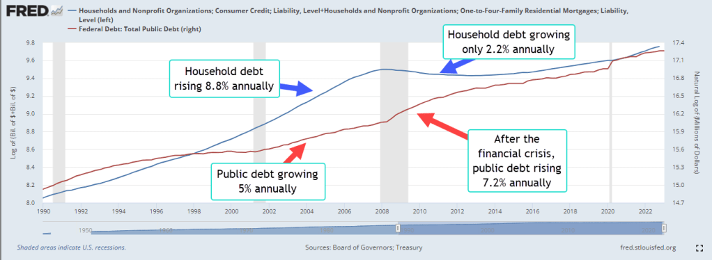
From 1994-2007, the public debt (GFDEBTN) grew 5% per year while household debt rose 8.7% annually. As a percent of disposable income, household debt jumped from 78% at the end of 1994 to 124% at the end of 2007. Chiefly responsible was the doubling of mortgage debt (HHMSDODNS) during the first seven years of the 2000s. Lax underwriting standards allowed families with poor credit scores of less than 620 to secure mortgages. Millions lost their homes during the housing bust, banks tightened lending standards and Americans were forced to go on a credit diet.
Since the financial crisis, American household balance sheets have improved. Household debt has grown by only 2.2% per year, about half the growth rate of personal income (DSPI). As a result, debt as a percent of disposable income had fallen to 91% at the end of 2022. The public finances have not fared as well. Although federal tax receipts, including FICA taxes, have increased 8% annually, expenditures and social benefit payments have outpaced tax receipts, resulting in a 7.2% annual increase in the public debt since the end of 2009.
This week David Leonhardt (2023) with the New York Times presented a graph of voter policy preferences derived from recent polls. The fiscal liberals in both parties outweigh the fiscal conservatives, a trend sure to promote the growth of the public debt. In the 2011 debt limit duel, Republican leaders like Paul Ryan championed privatization of Social Security and cutting back on benefit programs. In the decade since, neither of those proposals are popular with the party’s base. Instead McCarthy will appeal to the social conservatives in the party and insist on work requirements for benefit programs. As Leonhardt notes, the fight for Democrat and Republican swing voters is taking place in the quadrant of voters who are socially conservative but fiscally liberal, nicknamed the “Scaffles.”
The government’s spending becomes household income in some form or another, an accounting identity that joins the growth in public and household debt. Our economy, laws and regulatory framework promote financial crises and exacerbate social problems. Policymakers, economists and social scientists can debate the causes, extent and severity of the problems but acknowledge the reality. We may discover that our experiment in governance does not scale as our population grows and congregates in cities, as our technology advances and we become accustomed to greater energy use. The spread of mass communication and social media since World War 2 has exacerbated rather than resolved our ideological and cultural differences. The growth of our public debt indicates that we expect more from our government than our economy or political framework is able and willing to pay for. Like a crack in our windshield, it will continue to grow.
////////////////////
Photo by Ivan Vranić on Unsplash
Keywords: public debt, household debt, mortgage debt, debt limit
Alberta, Tim. 2017. “John Boehner Unchained.” POLITICO Magazine. https://www.politico.com/magazine/story/2017/10/29/john-boehner-trump-house-republican-party-retirement-profile-feature-215741/ (September 27, 2022).
Federal Reserve Bank of New York. (2023, May). Quarterly report on household debt and credit. https://www.newyorkfed.org/medialibrary/interactives/householdcredit/data/pdf/HHDC_2023Q1
The various FRED data series used in this post were HHMSDODNS Mortgage Debt, HCCSDODNS Consumer Credit Debt, GFDEBTN Public Debt, DSPI Disposable Personal Income.
Leonhardt, D. (2023, May 25). Ron DeSantis and the “scaffle” vote. The New York Times. https://www.nytimes.com/2023/05/25/briefing/ron-desantis.html


