The Spread

May 22, 2022

by Stephen Stofka

Consumer spending during the pandemic and in the post-pandemic recovery has been strong. Inflation adjusted retail sales have averaged 5.6% annual growth since December 2019 (FRED, 2022a). However, the disruptions caused by the once-in-a-century pandemic have made the annual growth rates erratic, particularly those in the spring months when the pandemic hit. In spring 2021, retail sales numbers showed an annual increase of 48% over the previous year. Older Americans had been getting vaccines in the first months of 2021, shops were reopening and people were spending money. The economy was recovering but the size of the recovery was a “base effect.” Retail figures in 2021 were compared to retail sales in March and April 2020 when the economy was largely shut down. The American economy is so large that it is not capable of producing 50% annual growth in real sales.

Because the spring 2021 numbers were so strong, the numbers this spring look shaky. When the April retail numbers were released this week, traders began to mention the word recession and the market sank several percent. When people swarmed into stores in the spring of 2021, Target (Symbol: TGT) reported an increase of 22% in same store sales. A realistic portrayal of a customer behavior trend? No, it was an artifact of the pandemic disruption. In the first quarter of this year, the company reported a slight decline compared to those year-ago numbers. The reaction? The company’s stock fell 25%, an overreaction in a thinly traded market, and its worse loss since October 1987 when the broader stock market fell more than 20% in one day.

The stock market gets all the headlines each day but it is small in size relative to the bond market where the world’s lifeblood of debt and credit is traded. Over time the differences in interest rates between various debt products indicate trends in investor sentiment. These differences are called spreads. A common spread is a “term spread” between a long-term Treasury bond – say ten years – and a short-term Treasury of three months (FRED, 2022b). Short-term interest rates are usually lower than long-term rates because there is less that can go wrong in the short-term. When that relationship is turned upside down, it indicates a recession is likely in the near-term like a year or so. Why? Financial institutions are now expecting the opposite – that there is more that can go wrong in the short term than in the long term. They will be less likely to extend credit for new investments, business or residential.

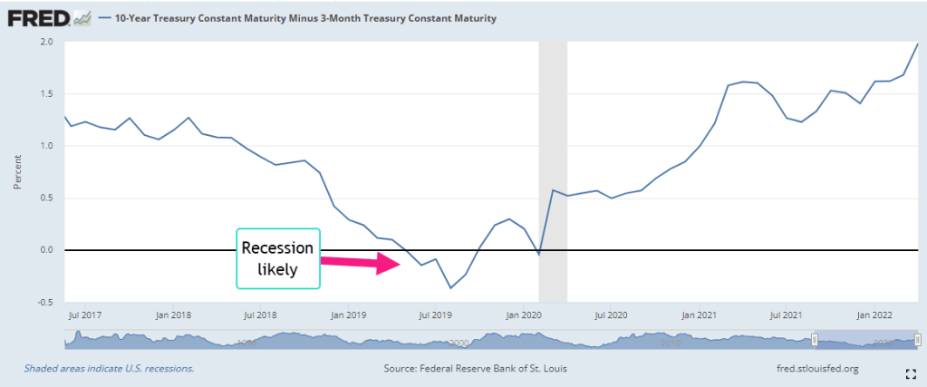
For the past forty years, this spread has been a reliable predictor of recessions and it does not confirm the market’s recent concern about a recession. There are a few shortcomings with this indicator. With a wide range of several percent over five years, it has a lot of data “noise” that might obscure an understanding of the stresses building in the bond market and economy. Secondly, Treasury bonds are a small part of the bond market and carry no risk of default. We would like a risk spread between the rates on corporate bonds and those on Treasury bonds. Thirdly, the Federal Reserve has much less influence over corporate bond rates than it does on Treasury bond rates. Comparing corporates and Treasuries would give us a better sense of the broader market sentiment.

Moody’s Investors Service, a large financial rating company, computes the yield, or annualized interest rate, of an index of highly rated corporate bonds in good standing with a term longer than one year. The yield spread between corporate and long-term Treasury bonds usually lie in a range or channel of 1-1.5%. Like the lane markings on a highway, channels help us navigate data. The upper bound of 1.5% indicates a stress point. Let’s call that the long spread (FRED 2022c).

The Fed Funds rate is an average of rates that banks charge each other for overnight loans and the Federal Reserve tightly manages the range of this rate. For most of the past decade it has been below 1% and has often been close to zero. Let’s call the difference between the yield on corporate debt and the overnight rate the short spread (FRED, 2022d). Most of the time, the short spread is larger than the long spread. Just as with our first indicator of term spread, this relationship flips in the near term preceding a recession. Importantly, they continue to move in opposite directions for a while. The short spread keeps getting smaller while the long spread goes higher. In the graph below is the short recession after the dot-com bust.

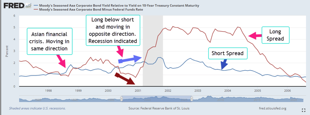
In the right side of the graph the pattern will telegraph the coming recession in 2008. The graph below highlights the years after the financial crisis. The short term spread remained elevated above 1.5%, an indication of the persistent stress in the bond market. During Obama’s two terms in office, the short spread fell only once into the “everything is OK” range. Helped by the prospect of tax cuts in 2017, the spread declined to a lasting lull.

In the last half of 2019, the conjunction of these two time-risk spreads indicated a coming recession. The term spread we saw in the first graph also indicated a recession. They suggest that a 2020 recession was likely even if there was no pandemic. The Fed had been raising rates through mid-2019 to curb inflationary trends, then eased back a bit in the final months of that year. Were they seeing signs of economic stress as well?

How would the 2020 Presidential campaign have evolved if there had been no pandemic but a short recession lasting six to nine months? The Republican tax cuts enacted at the end of 2017 would have been shown to be a bust, doing little more than transferring wealth to the already wealthy. Mr. Trump would have certainly blamed the recession on Jerome Powell, the Chairman of the Fed, whom he had appointed. Powell would have been characterized as a Democratic stooge, part of an underground political plot to get Donald Trump out of the White House. The stories of what could have happened are entertainment for a summer’s campfire.

//////////////

Photo by Nadine Shaabana on Unsplash

FRED. 2022a. Federal Reserve Bank of St. Louis, Advance Real Retail and Food Services Sales [RRSFS], retrieved from FRED, Federal Reserve Bank of St. Louis; https://fred.stlouisfed.org/series/RRSFS, May 18, 2022.

FRED. 2022b. Federal Reserve Bank of St. Louis, 10-Year Treasury Constant Maturity Minus 3-Month Treasury Constant Maturity [T10Y3M], retrieved from FRED, Federal Reserve Bank of St. Louis; https://fred.stlouisfed.org/series/T10Y3M, May 19, 2022.

FRED. 2022c. Federal Reserve Bank of St. Louis, Moody’s Seasoned Aaa Corporate Bond Yield Relative to Yield on 10-Year Treasury Constant Maturity [AAA10Y], retrieved from FRED, Federal Reserve Bank of St. Louis; https://fred.stlouisfed.org/series/AAA10Y, May 19, 2022. The “long” spread.

FRED. 2022d. Federal Reserve Bank of St. Louis, Moody’s Seasoned Aaa Corporate Bond Minus Federal Funds Rate [AAAFF], retrieved from FRED, Federal Reserve Bank of St. Louis; https://fred.stlouisfed.org/series/AAAFF, May 19, 2022. The “short” spread.

Year In Review

January 5, 2013  2014

The start of any year presents an opportunity for reflection on the past year as well as the upcoming one.  At the start of the year, few, if any, analysts called for such a strong market in 2013.  The S&P500 closed the year at 1850, a 30% gain. After a correction in May – June of this year, the index rose steadily in response to better employment data, industrial production, GDP increases, and the willingness of the Federal Reserve to continue  buying bonds and keep interest rates low.

I was one of many who were mildly bullish at the beginning of the year but got increasingly cautious as the index pushed past 1600.  Yet, month after month came not only positive or mildly positive reports but a notable lack of really negative reports.  Leading economies in the Euozone, teetering on recession, did not slip into recession.  Fraying monetary tensions in the Eurozone did not explode into a debt crisis.  China’s growth slowed then appeared to stabilize.  Although the attention has been on the Eurozone the past few years, the sleeping dragon is the Chinese economy, its overbuilt infrastructure, the high vacancy rate in commercial buildings in some areas of the country and the high housing valuations relative to the incomes of Chinese workers.

A year end review is an exercise in humility for most investors.  Some fears were unfounded or events unformed which confirmed those fears.  People are story tellers – stories of the past, imaginings of the future.  An investor who keeps all their money in CDs or savings accounts is predicting an unsafe investing environment for their savings.

Perhaps the best strategy is the one that John Bogle, the founder of Vanguard, advocates.  He doesn’t try to predict the future or be the best investor.  He aims for that allocation of stocks, bonds and other investments that, on average, forms a suitable mix of risk and reward for his goals, his age and the financial situation of his family.  He looks at his portfolio once a year.  I do think that a good number of individual investors had adopted the same outlook as Mr. Bogle advocates – until the 2008 financial crisis.

Since the financial crisis, too many investors have adopted a paralyzed strategy, a “deer in the headlight” reaction to the financial crisis that has been hugely unrewarding. Part of this year’s rise in the stock mark can be attributed to individual investors moving cash back into the stock market but I would guess that many of those investors are ready to pull it back out at the first sign of any trouble.  This shows less a confidence in the market but a frustrating lack of alternatives.

Long term bond prices took a significant hit in the middle of the year on fears of an impending rise in interest rates.  Bond prices had simply become too high, driving down the yield, or return, on the investment. Lower bond yields and meager CD and savings rates provided little return for investors, leaving many investors with little choice but to venture back into the stock market.

*************************************
The Coincident Index of Economic Indicators remains level and strong.  A decline in this index below the 1% average growth rate of the population indicates the start of or an impending recession.

Note the index in 2002 – 2003 as it fell back, never rising above the 1% level.  I have written about this economic faltering before.  Much of the headlines were focused on the lead up to and start of the Iraq war.  The recovery from the recession of 2001 and 9-11 was very sluggish.  Fears that the country was entering a double dip recession similar to that of the early 1980s prompted Congress to pass the Bush tax cuts in 2003.  It was only the increased defense spending of 2003 that offset what would have been a decline in GDP and another recession.

***********************************
A worrisome rise in new unemployment claims has puzzled some analysts.  Typically, new claims for unemployment decline at the end of the year, particularly in a year such as this one when reports of strong economic growth have been consistent.  Since 2000, rises in claims at the end of the year have been a cautionary note of things to come.  Mid-term investors and traders will be paying attention to this in the weeks to come.

However, the decline this year may be more of a leveling process that has been forming for most of the year.  On a year over year basis, the long term trend is down – which is up, or good.

In March 2013, I wrote “when unemployment claims go up, the stock market goes down … On a quarterly basis, this negative correlation has proved to be a reliable trading signal for the longer term investor.  When the y-o-y percentage change in new unemployment claims crosses above the SP500 change, sell.  When the claims change crosses below the SP500 change, it’s safe to buy. ”  The percent change in SP500 is still floating above the change in unemployment claims.

**********************************
Sales of motor vehicles in November were above even the most optimistic expectations.  The ISM manufacturing index showed a slight decline but is still in strong growth mode and the already robust growth of new orders continues to accelerate.  The manufacturing component of the composite index I have been following since last June is at the same vigorous levels of late 1983 and 2003 when the economy finally breaks free of a previous recession.  I’ll update the chart when the non-manufacturing report is released this coming Monday.

*********************************
In a healthy economy, the difference between real GDP and Final Sales Less the Growth in Household Debt (Active GDP) stays above 1%, which incidentally is the annual rate of population growth.  As the chart below shows, this difference dropped below 1% in late 2007.  Finally, six long years later, the difference has risen above 1%, indicating a healthy, growing economy.

**********************************
And now a brief look at the year in review.

At the end of 2012, the price of long term bonds had declined slightly from the nose bleed levels of the fall but there was more to come.  I wrote “As this three decade long upward trend in bond prices begins to turn, bond prices can fall sharply as investors turn from bonds to stocks and other investments. We are approaching the lows of interest yields on corporate bonds not seen since WW2. Investors are loaning companies money at record low rates and companies are sucking up all that they can while they can. Sounds a lot like home buying in the middle of the last decade, doesn’t it?”

During the past year, long term bonds declined another 10%.  They seem to have formed a base over the past several months.  Intermediate term bonds are less sensitive to interest rate changes so they are the safer bet.  They lost about 6% in price over the past year.  Short term corporate bonds are a good alternative to savings accounts.  They pay about 1% above the average savings account and they usually vary very little in price so that the principal remains stable.

At the end of 2012, I wrote “the underlying fundamentals of the economy give reason for cautious optimism.” A month later, “As the saying goes, ‘The trend is your friend.’ When the current month of the SP500 index is above the ten month average, it’s a good idea to stay in the market.”  In January 2012, the monthly close broke above the 10 month average. This is a variation of the Golden Cross that I wrote about in January and February 2012.

Let’s look at this crossing above and below the 10 month average.    When this month’s close of the SP500 index crosses above the 10 month average of the index, it indicates a clear change in market sentiment.  I have overlayed the percent difference between each month’s close and the ten month average.

As you can see, the close near the end of December is near 10% above the 10 month average.  If the above chart is a bit too much information for you, here is a graph of the percent difference only.

Is the market overheated?  As you can see the market has sustained a robust (or some might call it exuberant) 10% for 6 – 9 months in 2003, 2009, and 2010-2011.  From 1994 to 1999, the market spent a lot of time in the 10% percent range. Some pundits are talking about this market as a bubble but we can see that this market has not penetrated the 10% mark.  At the end of January 2013, the market closed at more than 7% above it’s 10 month average, over the 4 year positive average of 5.6% (the average when the difference is positive).  The market is 20% up since then.

******************************
In March I introduced the “Craigslist Indicator,” the number of work trucks and vans for sale in a local area, as a gauge of the health of the construction industry.  It was a funny little indicator that indicated a growing strength in the construction industry at the beginning of the year.  Now for the amended version of the Craigslist Indicator: when there are a lot of older work trucks and vans advertised for sale on Craigslist, that indicates a robust construction market.

*****************************

On March 24th, 2013 I wrote ” For the past year, the Eurozone has been in or near recession, yet some are hopeful that increased demand in this country and some emerging markets are helping to balance the contractionary influence of decreased demand in the Eurozone. Let’s hope that this surge in the first part of the year does not fade as it did in 2012.”  Instead, emerging markets began to contract and the Eurozone expanded slightly. Investors who bought emerging markets in March 2013 witnessed a more than 10% decline during the summer but the index ended the year at about the same level as nine months ago.

******************************
I thought that home prices in the early spring has reached a peak and wrote on March 31st, “The upturn in home prices is still above the trend line growth of disposable income and until personal income can resume or surpass a 3% growth rate, any rise in home prices will be constrained.” The Purchase Only House Price Index (HPIPONM226S) rose steadily throughout the year.
In late summer, I noted the falloff in single family home sales that began in the spring.  But prospective buyers were incentivized to make the deal as interest rates began to climb from their historically low levels.  Home sales surged upward; a lack of inventory in many cities also formed a support base that propped up prices.

A sobering note in September, “Rising home values are good for those who own a home but increasing valuations make it that much more difficult for buyers trying to buy their first home.  People in their twenties and early thirties who are most likely to be first home buyers have been hit hard by the recession.”

*******************************
After a decline in the stock market in June, I wrote “For the long term investor, periods of negative sentiment can be an opportunity to put some cash to work.”  Although I took my own advice, I wished I had acted with more conviction.  Of course, if the market had declined 10%, I would have been patting myself on the back for my cautious stance.  Smiley Face!!

*******************************
In July I noted the rather dramatic decrease in the value of securities held at the nation’s largest banks “Recently rising bond yields have contributed to banks’  operating profit margins but the corresponding value of banks’ bond portfolios has fallen quite dramatically.  This decline in asset value affects bank capital ratios, which makes them less likely to increase their lending … [and] will be an impediment to economic growth.”  The rising stock market and a respite in the decline of bond prices helped stabilize those portfolios in the second half of the year.

********************************
In September, I noted “Despite all the daily and weekly responses to political as well as economic news, the SP500 stock market index essentially rides the horse of corporate profits.”  Profits have more than tripled in the past ten years.  We should stay mindful of that stock price to profit correlation as we look out on the investment horizon.

********************************
From time to time I comment on the venality of our elected representatives.  Although they might appear to be idle rants to some readers, they are a caution.  Politicians make promises to get votes.  People become more dependent on those promises.  Inevitably, the day comes when the promises can not be met – as promised.  Those nearing or in retirement become increasingly dependent on political promises and should leave themselves a cushion – some wiggle room – if possible, when they make income and expense projections.  This Washington Post article on proposed budget cuts to military pensions is a case in point.  As long as “they” come for the other guy, we don’t pay too much attention – until they come for us.  Over the next ten to twenty years, we can expect many small cuts to promised benefits.  The cuts have to be small or target a small sector of the population so that they don’t anger voters too much.  In several blogs, I have shown how a simple recalculation of the Consumer Price Index eats away at the incomes of workers and retirees.  Expect more of these “recalculations” in the future as politicians follow a long standing tradition of making promises to win votes and bargain patronage to gather financial support for their campaigns.

We have the midterm elections to look forward to this year!  OK, calm down. Republicans will be hoping to take the Senate and make President Obama’s life miserable for the following two years.  I am guessing that the political campaigns for some Senate seats will vacuum in more money than the GDP of a lot of small and poor countries.

CPI and Wages

Dec. 24th, 2012

Merry Christmas, Everyone!

This is part two of a look at the CPI, comparing the price index to wage growth.  Part 1 is here

In the years 1947-1980, the average hourly earnings of production workers rose 6.08% annually while the CPI grew 4.03% (Source)  In effect, earnings rose 2% higher than prices.   Since 1980, earnings have risen 3.55% annually as the CPI rose 3.29%, giving workers a real growth rate of less that a 1/3rd of 1%.

The rise in worker productivity fueled gains in worker compensation until the past fifteen years.  Below is a chart of real, that is inflation-adjusted, compensation and productivity.

Increased Productivity means more profits.  For several decades in the post-WW2 economy, workers shared in those profits.  After the recession of 1982-1984, workers’ share of the increase in output slowly decreased.  As incomes barely kept up with inflation, workers tapped the equity in their houses.

Low interest rates, poor underwriting standards, lax regulations and a feeding frenzy by both home buyers and banks fueled a binge in home prices, followed by the hangover that started in 2007.  Only now is the housing market struggling up out of a torpor that has lasted for several years.

Before the housing bust, magical thinking led many to believe that the rise in home equity was a sure fire way to riches.  Over a century’s worth of data shows that housing prices tend to rise about the same as the CPI.  Housing prices have finally bottomed out at about the same level as the long term trend line of CPI growth.

The boom and bust upended the lives of a lot of people and the repercussions of that “hump” will continue as banks continue to foreclose on home owners whose incomes have flattened or declined. The recovery in the housing market will help some home owners but the real problem is unemployment, underemployment and the decreasing share of workers’ share of the profits from productivity gains.  Until the labor market heals, the housing market will not fully heal.

Those who do have savings have become cautious.  Since 2006, investors have taken $572 billion out of stocks and put $767 billion in bonds, a move to safety – or so many retail investors think.  For decades, home prices never fell – until they did.  For over thirty years, bond prices have been rising, giving many retail investors the feeling that bonds are safe – until they are not.

Companies have been selling record amounts of corporate bonds into this cheap – for companies – bond market.  As this three decade long upward trend in bond prices begins to turn, bond prices can fall sharply as investors turn from bonds to stocks and other investments.  We are approaching the lows of interest yields on corporate bonds not seen since WW2.  Investors are loaning companies money at record low rates and companies are sucking up all that they can while they can.  Sounds a lot like home buying in the middle of the last decade, doesn’t it?

Y’all be careful out there, ya hear?

The BUT Economy

December 9th

An eventful week in what I will call the BUT economy:  GDP revisions, Corporate Profits, Consumer Confidence and the Labor Report.  Let’s get into it!

At the end of last week, the Commerce Dept issued their customary revisions to 3rd quarter Gross Domestic Products (GDP).The first number that came out in October was a preliminary estimate.  As more data comes in, the Commerce Dept. revises its figures, and will have another revision in December.  From the initial estimate of 2.0% annualized growth, the Commerce Dept revised 3rd quarter GDP growth up to 2.7%, below the historical average of about 3% but good news is YAAY! Right?  Wait for it now…BUT upward revisions were due largely to companies building inventories.  Final sales actually declined from the initial estimate of 2.1% to 1.9%.  Excluding exports, final sales were revised from a growth of 2.3% to 1.7%.

The boom in natural gas production has led many power generators to convert their plants from coal to natural gas, when they can.  Total coal production is down this year (Source) but exports of U.S. coal to the rest of the world have surged, so that we are exporting a record 25% of the total coal production in this country.  The U.S. Energy Information Administration (EIA) estimates that coal exports will total about 133 million short tons this year, or 2-1/2 times the average of the past decade. (EIA Source)

The process of drilling for natural gas, called Fracking, has also led to a high production of crude oil (EIA source).

GDP includes both exports (+) and imports (-), what is called “net exports” and it has been negative for several decades as we import far more goods than we export.  This serves as a negative drag on GDP growth.

Exports have risen over the past decade.  As natural gas prices have fallen, surging coal exports in the past few years have helped buoy up lackluster GDP growth.

Another contributor to GDP growth has been a more confident consumer, in contrast to the rather cautious attitude of businesses in the past six months.  An upswing in student debt and car loans has halted the decline as households have shed debt (delevered) either by foreclosure, default, paying down balances or not charging as much.  Household Credit Market Debt outstanding (includes mortgages, car loans, student loans, revolving credit) indicates a growing willingness of consumers to take on more debt. 

On a per person basis, our debt has declined slightly from the peak of 2007 but is still way too high, leaving many of us vulnerable to a subsequent downturn, slight though it might be.

Just how bad has this recession been?  In previous recessions, households cut back their debt to “only” a 5% growth rate.  For the first time ever, the American people reduced their debt growth rate below 0. It is only in the past two years that this rate of negative debt growth is approaching 0.

Here’s the BUT. The underlying fragility of confidence was revealed this past Friday when the U. of Michigan Consumer Sentiment poll showed a plunge in confidence from over 82 in September to 74 in October. For the first time since the recession started in late 2007, the consumer confidence index had finally surpassed 80, only to fall back again the following month.  In a relatively healthy economy, this index is above 90.

To summarize so far, we have a consumer slowly and haltingly gaining more confidence, spending more and keeping the growth rate of her debt in check.  We have an overall economy that is behaving rather tiredly, growing tepidly as though on the downhill of a long boom cycle; that’s a problem since this has not been a boom cycle in the past few years.  So how are corporate profits doing?  Fine! Thank you!

In this past quarter, profits rose by 18%.

Starbucks, the coffee giant, announced this week that they would voluntarily pay some British income tax this year instead of moving the profits to some low tax country and avoiding British income taxes.  It appears that their customers discovered that they had been (legally, mind you) avoiding paying income taxes and were mobilizing to boycott Starbucks’ stores in Great Britain.

Interest rates kept near zero by the Federal Reserve have been a feast for many international corporations.  At the end of October, U.S. companies have issued $1.1 trillion in investment grade and high yield bonds (Source), responding to investors’ thirst for higher yields. That is an increase of 26% over last year’s bond issuance. International companies are, quite rationally, borrowing at the lowest interest rate they can find around the world, then spread that money to their subsidiaries in other countries.  They pay the lowest income taxes they can find internationally and shuffle the paper profits around the world. 

Ok, where were we? Oh yeah, cautious but more confident consumer, tepid but possibly improving GDP growth and record corporate profits.  Oh yeah, and record Federal Debt – over $16 trillion and counting.

Pity the poor corporations who pay the highest income tax rate in the world – except that they don’t.  In 2011, it was about 20%.

Record corporate profits, record low effective corporate tax rates, record low borrowing costs for corporations and record high Federal Debt.  The largest companies heavily lobby Congress to keep their tax rates low.  No matter how high profits are, companies publicly worry about their profit forecast and the economic outlook.  These large companies have become adept at convincing Congress that they are struggling.  Half of the Congress thinks that they must help these poor companies create jobs; key committee members craft more tax goodies and bury these goodies inside large appropriations bills.  Congress underfunds regulatory agencies so that they are effectively outmanned by corporate legal departments.

The lack of corporate tax revenues contributes to the Federal debt; over the past fifty years that share has declined from 20% of Federal revenues to about 10%.  If the share of Federal revenues had remained at the 20% level of the 1960s, the Federal Debt would be $7.4 trillion today, not $16 trillion.  Calculating savings on interest paid on the smaller debt would lower the actual debt to about $6.8 to $7 trillion.

Big increases in productivity have helped fuel the strong rise in profits.  Investments in technology as well as higher skill and education levels have enabled American workers to record levels of production but they have not shared in the gains from those increasing levels of production.  The U.S. has risen to the same levels of income inequality as some emerging countries:  China, Venezuela, Ecuador and Argentina.

To recap:  record high corporate profits due to record high worker productivity which has not benefited the workers, record low effective corporate tax rates and share of the costs of government, record low borrowing costs for corporations, and record high Federal Debt.

All of this largesse to multi-national U.S. corporations begs the question: Where are the jobs? But that I’ll leave for next when we look at the November Labor Report released this past Friday.

Debt Mountain

There has been a big rally in corporate bonds in the past few months. Decreasing fears of defaults has sparked a huge inflow of money into these bonds. The U.S. corporate bond market is large, with $9.8 trillion in outstanding debt – 1.5 times the amount of outstanding Treasuries, or about 70% of the nation’s GDP.

According to Federal Reserve data, the U.S. mortgage market is even bigger – $14.7 trillion at the end of 2008, of which $8.2 trillion is securitized. The three government agencies Fannie Mae, Freddie Mac and Ginnie Mae now back 90% of mortgages.